


Happy New Year to Maria’s colourful community!
Each one of you contributes so much to the Colour Me Happy blog just by being here, and we are all so very grateful for that. Both Maria and her team love reading your comments because so many of them turn my posts into so much more! If you don’t usually read comments, you should start!
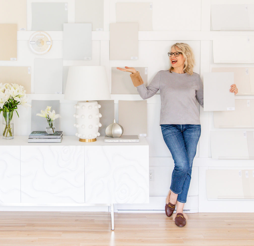
I’m Kristy, Maria’s social media director, and to kick off a shiny new year, I thought it would be fun to gather our team’s thoughts on our very favourite “Maria-isms” and share them with you – you know, Maria’s bossy but charming juicy bits of advice that we’ve all come to rely on. They are the quotes we replay in our heads to help us make smarter decisions about colour and decorating.
There are so many wonderful ways we have all grown with the benefit of her design wisdom and gift for teaching. Be sure to click on the highlighted links. You might find an article you missed or maybe you want to PIN some of the best ones for later.
Tricia, Director of eDesign
I have been working with Maria since 2015. And because I have wholeheartedly on-boarded her system and teachings, it’s hard to remember how my design brain was furnished before. But among all the amazing things she has taught me, the piece I needed most is her timeless maxim: boring now equals timeless later.
As an artist and creator, I have a tendency to have way too many competing “interesting” ideas – trend, colour and pattern crushes – and my challenge has always been in practicing restraint. I’m so grateful that I got on board with simple and timeless before making updates to our bathroom and kitchen. Phew! I would probably be giving them both another go if I had gone with some of my more creative impulses.
It’s such a wise maxim. It shifts the common misperception that the hard finish choices are the finished look and should be full of interest, to the idea of the finishes being a canvas, a versatile backdrop for decorating. That’s a game changer, and it prevents so much waste. It’s hard to get tired of a clean and simple backdrop, changing up the decor and styling is so much more fun than living with a tile pattern you are so over. Making timeless and simple choices for the greatest versatility and longevity is a concept I am highly motivated to share with our eDesign clients to save them from endless wasteful renovations.
→ Read more: Classic & Timeless Design Tips for a Home You’ll Love Forever
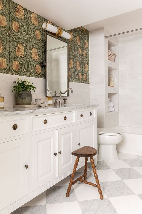
A timeless white bathroom design by House of Jade Interiors
Terrence, Chief Technology Officer
My name is Terrence Murtagh. I have been working with Maria Killam since 2016 so I have heard my fair share of Maria-isms. However, the one that stuck with me early on was “Ugly Is On Sale.”
A lot of times when doing a home project we get overly price-conscious and forget that ugly is on sale. Maybe the cheap backsplash, countertop, tile, flooring, etc… is cheap (or on sale) for a reason. She is right. When it comes to any changes that I make in my home I always apply this rule.
I am not saying to go over budget or to spend frivolously, but rather to plan accordingly to get the better or best of something— especially if it is going to be permanent. And, as you probably know, Maria’s products or services are RARELY EVER on sale either… because, well “Ugly Is On Sale.”
If you want a pretty home that you will love, it would be smart to use Maria’s eBooks, Courses, eDesign Services, or Virtual Events to help you accomplish that.
→ Read more: How to Choose Exterior Stone (Ugly is On Sale; Don’t Buy It) | Ugly Costs the Same as Pretty
Timeless light natural wood look floors are always a good choice, don’t get seduced by the sticker price of dated grey wood look flooring. Via Home Bunch
Kristy, Social Media Director
There are sooooo many witty nuggets of wisdom from Maria that have made me a much better decorator. But one of my favourites is “every decision is a colour decision.” It’s become the benchmark for all my design or home decor choices.
My husband and I are longtime DIY renovators and decorators. Over the years we’ve tackled lots of projects around the house. But since finding Maria, we affectionately refer to rooms as either before Maria or after Maria. Because, through Maria, I’ve learned (and then, in turn, I’ve re-educated my husband) so many essential design fundamentals that can be applied to any house, even our century-old Indiana home.
Thinking back to when my husband and I renovated our kitchen ourselves, not only did we make all the wrong decisions, but every decision we made was in isolation. We foolishly didn’t compare anything. And, Maria’s simple rule of pattern allowance would have had us rethinking most of our choices immediately! I really wish I had found Maria sooner, but when you know better you do better.
And if you’ve been following Maria for any length of time, I’m guessing you’re a lot like us… there are so many things we can’t UNSEE as a result (ex. too many patterns in one room, bad off-the-shelf white trim paint, dismal grey flooring everywhere, unnecessary stone cladding, shutters that aren’t wide enough). Of course, now we enjoy pointing out these flaws while watching home shows on TV. #IYKYK
PS – Maria really is so generous with her colour advice. Most recently I referenced this post to help me navigate my wall-to-wall carpet purchase at my house (and also my mom’s carpet at her new house). The results are beautiful and timeless. This post is a must-save-for-later, I promise.
→ Read more: Before You Renovate or Decorate, Ask Yourself 2 Questions
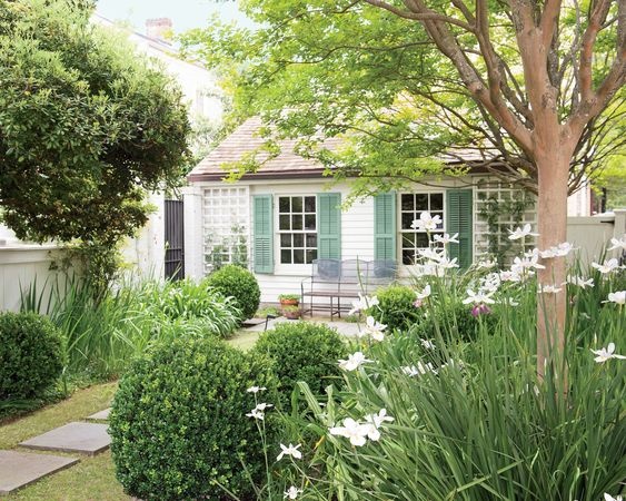
Perfectly proportioned shutters by Architect Ben Reed via Southern Living
Sheila, Colour Designer and eDesign Customer Service
I was introduced to Maria several years ago by an instructor in a colour theory class I was taking. The instructor had added Maria’s two ebooks to the list of required reading for the course.
Maria’s books were the ones that taught me the most useful and practical lessons on colour! I completely related to Maria when she wrote that you can have ‘spidey senses‘ where you just “know” what works (or doesn’t) in a room. But what I have learned, and continue to learn, is how to justify and explain just what these ‘spidey senses’ are.
I now have a language to explain all of the nuances between the 9 different undertones of neutrals in clear language. I can see pink beige a mile away and I can tell you whether a colour is too clean (or dirty) and what the better option would be. Talk about spidey senses now!
Maria’s genuine thirst for knowledge is inspiring and it’s easy to learn from someone who is always expanding her expertise. This is another great lesson… Never stop learning and growing.
→ Read more: The 9 Neutral Undertones in the World
Carly, Colour Designer and eDesign Customer Service
Where do I start? In the last 4 years of following Maria, I really was drawn in by her teaching on white.
We installed stark white replacement windows on our brick and Tudor style split-level home (yes, I did just combine those two style descriptions 🤣 ). Those windows just “poked me in the eye” every time I drove up.
White really is a snob and just installing them on a warm earthy exterior or slapping it on your trim and walls with warm earthy flooring tile will not look fresh. It will look like “old meets new” and everything else looks dingy and dated In comparison.
Later, when we moved into a new historic home I have found myself saying many times, “I’m so glad I’ve been working with Maria or I would have ruined this house.”
I initially wanted to try and make the historic colonial home “open concept” and have pale Scandinavian-looking floors. But thankfully, while I still love light floors, I realized a medium brown would be more suitable and a more divided dining and kitchen better fit the era of the home. Remember, the house is the boss!
I’ve also come to appreciate the other aspects like generous trim and balanced large windows, even if I’ll never have an open concept-lounging-eating-cooking-style home. But, I can still enjoy dinner with adult friends while kids play in the closed-off living room. Open concept suits some houses, but not others.
→ Read more: Which Is Better: Open or Closed Floor Plan?
It’s important to stay true to the architecture when updating a historical home by EmilyClark.com
Lisa, Colour Designer and eDesign Customer Service
There are so many of Maria’s teachings to choose from it’s hard to just pick one! But I will tell you the one that sticks with me the most is her perfectly coined description of herself the “Lamp Tramp.”
Never had I realized how important balanced lighting truly was until I started following Maria. Lamps really do make a huge difference in creating a look and a feel.
I can’t tell you how many times I thought a paint colour was wrong because I expected it to do all the heavy lifting. When in reality all the spaces really needed were MORE lamps and of course decorating goes a long way too, which Maria has taught me.
So many instances I went straight to thinking a room needed to be repainted before I even started decorating or adding pretty lighting. Now when I tackle a room refresh I know not to throw in the towel until the space is completely decorated and packed full of pretty lamps 😉
→ Read more: 5 Lamps Everyone Should Have in Their Home | Lamps vs. Overhead Lighting: Which Camp are You?
There’s always room for more lamps – room by Mark D. Sikes
———-
How about you? What are your favourite Maria-isms? Has Maria ever saved you from a colour mistake? Please share it below!
Cheers to the New Year! In an extraordinary year, we are grateful for your extraordinary support and we look forward to another exciting year ahead and hope to meet you in one of Maria’s virtual workshops.
Wishing you and yours a very happy, healthy, and abundant 2022!

Happy New Year to Maria and her team! The first Maria-ism I learned was very timely (and many more useful nuggets have followed). My daughter had just purchased a house with great bones when covid hit in 2020 and she wanted to update the design preferences of the very elderly prior owners. The house has beautiful 1950s wood floors and was otherwise a blank slate. Since my daughter works crazy hours,she asked for help with the design and renovations, something I enjoy especially with all the great advice from Maria. If I hadn’t read about her experience as a new designer of choosing a paint color to match the floor of her sister’s empty apartment, I would have gone the same route. So, my first Maria-ism is that wood floors are like blue jeans: they go with everything! I think I’ve read every post, and refer to her e-books again and again, as recently as today!
Yes! Reading Maria’s blog and learning more about undertones helped me zero in on stone for an outdoor fireplace in a new screened porch.
My typically methods would have me focussing only on samples that wowed me. (Interesting patterns etc.) Thanks to Maria I’ve learned that stone is bossy and would dictate decorating choices within this space forevermore. I located a “boring” (but beautifully classic) stone with less variability in pattern and a green gray undertone that coordinated with the bluestone flooring and would still allow flexibility in selecting outdoor fabrics and other decorative elements.
Plus, I was more confident pulling it all together because I understood the”whys” (and the “why nots”).
Thank you!
Like everyone, it is a real blast to find yourself using the maxims and -isms and finding that the world of color can make sense!
But I wonder if word-choice could help: instead of ‘clean’ and ‘dirty’, what about using ‘clean’ and ‘seasoned’. It feels so off-kilter for a Maria system to throw in a value judgment, when a more neutral or even charming term seems more the vibe from her and also the staff members writing here.
(Very happy former customer, first-time commenter)
Hi Ivy, that’s a great question, I wrote a post to answer it here: https://mariakillam.com/colour-scheme-dirty/
Hope that helps! Maria
It does help, thank you for responding and interesting post. The term still makes me uneasy, yet after reading the post, I cannot think of a better way to describe what’s happening when comparing colors than the clean/dirty dichotomy. The terms certainly make it easier to spot!
I’ve followed Maria since late 2013. At that time we were starting construction on our custom home. I was going to tile shops trying to make all the tile decisions, and was very frustrated, especially regarding floor tile. I happened to read a post where Maria said her mother had hardwood in her bathroom. That was a light bulb moment for me. Now we have the same beautiful medium brown hardwood flooring in most of our home, including the master bath, powder room, and guest bath. The only tile is on our shower floor, in the laundry room and tub/commode area of a jack and jill bath. And, of course, all baths and the kitchen have subway tile. I love our home, and I’m still happy with all the choices we made, many of which were influenced by Maria’s blog and ebook.
Hi Linda,
I’m really happy to hear your story, especially since that was almost 10 years ago. Maria has given me a lot to think about. After buying her color wheel and two books, boy am I glad I did. We’re starting a new build this summer and I’m devouring Maria’s teachings. I’m so grateful to feel confident about the color choices that I’m choosing…with her help.
I found Maria’s blog in February of 2021 when I googled, ‘Timeless wood flooring”. Best. Google. Ever. Maria’s advice saved me from buying gray LVP flooring because I thought since gray is a neutral it would make a timeless floor. Reading more of her blog led me to purchasing all of her eBooks and just in the nick of time because we also started renovating our kitchen and bathroom as well and I was able to choose classic and timeless hard finishes and tile and match my window trim, baseboards and doors to my white cabinet color.
My only caveat to being “Mariafied” is realizing my master bedroom ensuite has a hodgepodge of tile in my shower that is not classic and timeless and is the only part of the upper level of my house that we did not renovate so I chose SW Pearly White, a green-gray greige to help freshen and update the space until I can convince the hubby in a few years to tear it out and do a white hex tile shower floor with white subway tile walls and niche. Thank you, Maria, for an eye-opening year of color discovery. Here’s to many more!
I’ve been following Maria’s blog since about 2013 and can hardly remember ever disagreeing with her advice and wisdom. I’m so glad she talks a lot about the importance of lamps and the atmosphere that can be created with the right lighting. I’ve been drumming it into my daughter to buy more lamps for her home and she’s finally taking it on board. Both daughters ask what Maria would say when they’re trying to make a decorating decision.
Keep the advice and info coming Maria and happy new year!
I have been following Maria since 2010 or 2011. I was wanting to do something about my oak kitchen cupboards. My daughter showed me Maria’s post on oak cabinets and although I was horrified at first about painting the oak, I was soon convinced. I bought an hour of Maria’s time in Aug of 2011and it worth every penny! I did the painting myself and followed her advice regarding countertops, etc. The end result was beautiful and a major improvement. I’ve since moved from that house but have just finished the kitchen in this house, and I went with the timeless hard finishes, of course.
Like other readers, I can’t unsee in the post-Maria world, and I can now identify what’s activiating my ‘spidely senses’. Maria gives so much incredible advice it’s hard to pick one idea (a list in logical order would be a useful blog post?). But for those working around previous design commitments two related ideas stand out: identify and obey the boss(y surface), and; make it (the colour) intentional by repeating it.
If everyone would follow Maria’s “one pattern rule” it would save a ton of materials from the landfills!
One of my favorite Maria-isms (pretty sure she says this anyway!) is “pretty costs the same as ugly.” When I see people spending all this money on renovating only to have three or four different patterns or undertones in one room it makes me want to pull my hair out! Or I see a perfectly good bathroom ruined with a dated accent tile. Sometimes I bet pretty (basic subway tile) is even less than ugly (trendy accent tile)–even if “ugly is (often) on sale.” 🙂
I have a question about painting in the actual shower. Ours is painted, at least we think it’s paint. We’d love to change the color though and have NO idea of what kind of paint/product to use.
We’ll tile down the road, but can’t swing it right now.
Any suggestions? Thank yu