


Thank you so much to all of you who took advantage of our Black Friday Sale! We have donated $11,175.00 to our neighbours who were devastated by the November floods and will be donating more in the months to come.
**Please note, before you contact our customer service department with inquiries, shipping will be considerably delayed because of the floods. Although our home and office wasn’t affected, our shipper, who was located directly in the flood zone, sustained some damage.
So, you’ve painted your walls white. And now? Your white walls seem to reflect the colour outside (or even inside) and it’s super annoying. It’s not what you wanted, but does that mean you need to repaint your walls? Today I’m sharing a few reader questions about this exact issue and the secret way to work around it.

Now that white walls are here, questions about reflections are a constant too. Here’s the latest one that I received:
I recently stumbled across your amazing blog as I was searching for a solution and found your post “4 Reasons your white walls look BAD”.
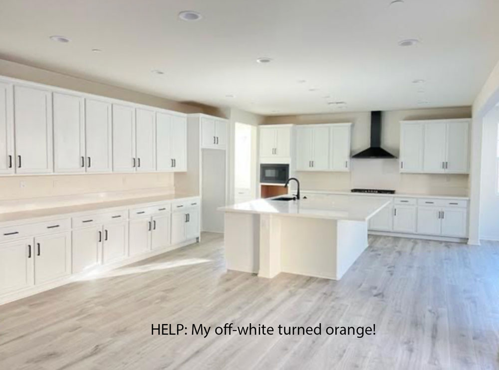
We are building a new home with SW Alabaster white walls (builder’s default paint)…however, our HOA didn’t allow us to choose the exterior color so our very orange-ish stucco is reflecting on the alabaster walls & making them look orange, especially in the north facing rooms (attaching a photo of the kitchen in progress, if it helps).
We are in Southern California, so we get a good amount of sunlight, except in the kitchen which unfortunately does not have windows, except the rooms surrounding it. What tones/colors would be a better solution for our interior paint? I really like bright/pale neutral paint…I would have preferred alabaster if it would have looked the way I was hoping (creamy white).
We had SW Accessible Beige in our last home and I loved how neutral it was, but the shade was a tad too dark for me. I’m not sure if you have time to respond to each email you get, so thanks in advance if you respond to this one!
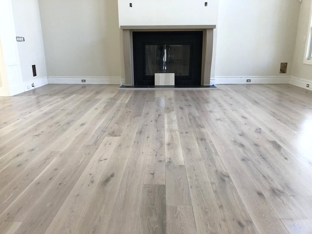
I also received another set of photos about a similar dilemma from another follower on Instagram recently. I tried to find the photos but they are buried in my messages, so I found this one online instead.
This reader had just installed a similar shade of LVP in her basement. Her new grey sofa was sitting in the room and she was super annoyed that this grey flooring had a slight yellow undertone.
And why was she suddenly noticing that undertone?
Because everything else in the room was the same shade of green grey – that is, the floors, the sofa and the walls.
Is there a white paint colour that won’t reflect the outside or other colours in the room?
So what do you think? What’s the answer?
Take a moment to think about it before you read my response.
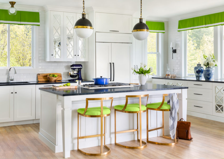
The first thing I want you to notice about the white kitchen above is that there isn’t a larger black hard finish to ground all the little black accents, such as the hardware, sink, hood fan, or microwave. The eye is now jumping around the little bitty black in this kitchen.
Notice how this makes the hood fan look especially distracting and pointy. A stainless steel hood in this shape would not look so harsh, because the contrast would be softer.
Also, if we’re going to critique this kitchen, let’s talk about the island.
Islands built circa 2021 should simply look like furniture, the end. If you’re not going to make it special with millwork and pretty legs and details, it would be better to leave it out and add a pretty baking table instead.
And really, this kitchen has enough space to be a cozy eat-in kitchen. A liveable look that would warm it up considerably.
Also, the days of endless countertops that you’ll never do any food prep on are over. The cabinets on the left of the kitchen would be much more useful as a pantry wall, like in my kitchen below.
How to decorate with black
Let me say this again. If you don’t have any black in your tile floors or countertops, then adding little bits of black accent colour with the hardware makes no sense. Just because black hardware is trending, doesn’t mean it’s the right choice for your kitchen. Don’t simply make black the default hardware choice.
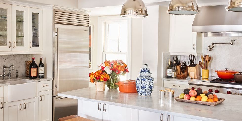
The black in this kitchen below RELATES to the black countertops. There is a significant amount of black to help make the black hardware fit into the design. That’s why it works well here (below):
Styling & Colour by Maria Killam
Ok so let’s get back to the questions above. Do they need to repaint their rooms?
What is the answer?
The secret to ignoring the colour reflection on your white walls
So first, with love, help me understand why we would want to eliminate ANY hint of colour from both rooms?
Ok, so there’s a slight orange undertone in your all-grey and white kitchen? This reflection of colour actually adds some much-needed warmth. And, there’s nothing wrong with that.
When decorating with white walls, the goal shouldn’t be complete desaturation. No need to eliminate anything warm, yellow or orange.
Don’t judge your wall colour if you haven’t decorated
In fact, the first thing I would add to this kitchen is some warm wood tones, especially ones that are gold, beige, or orange and brown. Then, I would add a pretty accent colour. Find a pattern you love and choose an accent colour to decorate with.
Once you’ve added barstools and styled the kitchen with your accent colour and some warm wood, you’ll stop noticing the walls at all. Staring at a blank room with no decorating will never make you happy but in fact will make you highly critical of anything that is there. Remember these three tips for adjusting to your new paint colour? Next, make sure you furnish the adjoining rooms as well.
Sherwin-Williams Alabaster is an off-white in my Foundation Collection (available here). And in this kitchen, it relates well to the off white quartz. In order to eliminate the orange reflection, she could paint the walls a complex cream with a green undertone, or a green grey greige I suppose, (find the curated list of these neutrals here) but I’m not convinced that is necessary.
There is so much more this kitchen needs first.
Or you could even add some hits or orange accents to really make it work (below).
Douglas Friedman via Elle Decor
And what about the all-grey room with the LVP that’s looking comparatively yellow? It’s true that these taupe-y grey floors will never be as neutral as a timeless hardwood floor. And, of course, if they looked more like natural wood, we would not need them to match the walls.
However, in this case, the answer is the same. Once the room is decorated, you will NOT notice the yellow.
I would guess that many of my readers are dealing with a lot of grey (in furnishings, floors, wall colours, etc.). And, because most of us can’t replace or repaint EVERYTHING at once, the secret is to WARM THINGS UP. More warmth (adding wood tones and/or colour) will make all that grey look better. Remember my reader who didn’t like all the grey flooring in the homes she was shopping for?
Having colours relate is an important design principle. But let’s remember not to take it too far and end up painting ourselves into a completely monochrome box–especially an all-white box.
Instead, let’s aim for quite the opposite of that. Add warm beige, orange, yellow and brown tones to work with grey colour schemes. This will help make them look more balanced, liveable and current.
You could even add a sisal rug to pick up those undertones.
Michael Lee via Good Housekeeping
And remember, you can’t apply brightening filters to real life. You can bet that many of those picture-perfect white rooms on Instagram reflect oodles of orange and green from their surroundings in reality, but the photo filter makes them disappear.
Tweaking your off white paint won’t create magic, but decorating will. And, that’s something you can start today (no waiting on painters)!
Over to you my lovelies, do you agree or disagree with my advice today? I’d love to hear from you in the comments.
If you have a question for my Ask Maria column, clean up your room, take photos with natural lighting and send them here. And make sure you’re a subscriber so you’ll see the answer when I post it.
Or, if you’d like my help selecting the perfect colour for your room, purchase my custom colour advice here.
Become a True Colour Expert here.
Related posts:
23 Decorating Secrets (Only an Interior Designer will tell you)

Hi Maria. I couldn’t agree more. When I installed pink-beige wall-to-wall carpet, I absolutely freaked out. The paint color you suggested went a very long way in making the carpet livable and then it was time to decorate. I love the walls and the decor, still don’t love the carpet but I don’t fixate on it now. Until I can replace it, and I’ll be checking in with you first, it’s quite nice. Thanks for the positive and creative advice.
I disagree that the white paint reflecting orange should be met with more orange, and I disagree because that we were in a very similar scenario with our new home. The previous owners *loved* orange and saturated the kitchen in it … maple cabinetry, orange oak floors, orange kitchen tiles, and orange and peach wall colors. The orange surfaces all reflected off of each other, making them even more orange. While I love a few hits of bright orange here and there as accents, orange is not an appetizing color for a kitchen and it made the space feel very small. I almost didn’t want the house because it felt SO small. Playing it up with even more orange was unthinkable! I wanted to tone the orange down, just as this reader does. I think her best option is to repaint … her kitchen is very builder basic and just doesn’t have the great architectural detailing that could help the orange through texture and competing visual interests. We repainted a green toned greige and introduced blue accents in art and furniture, and it really helped peel some of the orange (I couldn’t help myself … the joke was sitting there) out of the wood flooring, the cabinets, and the tiles. The orange floors still reflect off the white ceiling, but the green-greige neutralizes it on the wall so it looks like sunlight. We have a yellow-wood breakfast table that pulls the maple cabinet coloring into the breakfast nook, then we painted the adjoining dining room a deep blue-green and the remaining orange has been successfully toned down. Adding more orange could be a good idea if she loves orange, but if she doesn’t … repainting is the best idea.
Oh, and orange closes a space in … after we repainted, the comments we got were “oohhhh my gooosssh, it feels so much biiigggeeer you guuuuyyys!!!” Even though the colors we chose were significantly darker than the original orange!
There is a pretty big difference between your kitchen and the kitchen shown in this post. Of course, you wouldn’t want to add more orange to your kitchen when everything existing is already in that colour range! Maria mentioned picking an accent colour to decorate this ALL WHITE kitchen with, or as an alternative to that, to play it up with orange accents. I am sure if the kitchen in this story looked anything like yours, she would offer different suggestions. The point of this post is to show the reader what a little decorating can do to help a fairly stark colour scheme — your situation is quite different and it sounds like what you have done to circumvent the orange is perfect!
Brenda, you said it best thank you! Maria
This is a hard core critique, and I absolutely appreciate that! Thanks for being the bossy sweetheart that you are.
Maria- would your large island lights be big enough to
Then use black knobs in a kitchen ?
And not have the bitty look ?
How much and how big does it take ???
Thank you
Possibly, but I think black hardware needs black in the fixed finishes in general for it to stop being bitty. Hope that helps, Maria
Great advice as always!!
I really enjoy these “Ask Maria” posts…solving a problem feels so relatable because we have ALL made one or two bad choices, and you show how to “fix” the problem so that it becomes less noticeable and can be lived with (as most of us have to do when we make a mistake).
Before I started reading your blog and your books, I used to be paralyzed about choosing a paint color -because I knew I would have to live with it even if I didn’t like it. It drove my husband crazy because we would have to live with paint swatches painted all over the walls for months (and of course I know now that that isn’t the way to choose a color!!)
I can’t help but be reminded of the orange kitchen walls of my childhood! Walnut colored wood cabinets, white counters, bright sunny yellow fabric on the wood director’s chairs around the table and the fabric shades above the windows. My mom adored that kitchen and it was ORANGE!! Definitely not timeless, but if you appreciate Mid-C style, it was absolutely modern and fantastic! Thanks for the memory!
Maria, I’m going to end up with a dated kitchen island in my brand-new kitchen! How did I miss your post on kitchen islands from 2011? It seems the only thing I’ve done right with my kitchen island is that it’s rectangular. Next Thursday I’m having my cabinets measured for my countertops and for a kitchen “Island” I installed two identical 30″ white shaker cabinets side by side, each with a 30″ drawer and two doors, because it was pleasing to my eyes. It doesn’t have legs, but I was going to purchase shaker door panels to go all around the island (and on the exposed sides of the cabinetry). That to me looks like furniture. Is it enough? I was also told to go with an 11″ overhang for my black granite island so I wouldn’t need the decorative corbels. Wondering if I got corbels something like yours if it would dress it up a bit… The reason we kept the island with our remodel is because I use that thing for absolutely everything, from food prep to folding my laundry lol! I’m not giving it up! S
Side note: I liked the pretty baking table you showed in the pictures above even better. Damn it all.
Holly, I don’t think your island will be dated. If it’s rectangular and big enough (too small for the space looks like a mistake) it is fine. Having an island that looks like furniture as the one above would not suit all kitchen styles. Dare I say it is more suited to farmhouse style or French country? Your island will look better if it has some millwork detail on it though. There is lots of inspiration on Pinterest or Instagram of beautiful islands.
Joanna, our island will be 36″ x 62″ with the island overhang, with 2 stools. It’s definitely proportionated to the rest of the kitchen. Pinterest is my go-to and I’ll definitely be checking that out. Thanks for the words of encouragement! 🙂
A question for anyone out there who is as neurotic about the placement of cabinet hardware as me: I have 30″ drawers on my kitchen island. I’m using classic Amerock 3″ center to center cup pulls. Should I put two cup pulls instead of one on the drawers? I feel like two looks better than one and everything I’ve read about this is so contradicting. the struggle is real! Thanks in advance for any well-informed opinions! 🙂
I understand what you’re going through. Just a few months ago I installed hardware on my kitchen cabinets after painting them. There was no hardware previously and so I got to choose exactly where I wanted to put them. Because I wanted a look that was more custom I ended up doing handles of varying sizes. Depending on the size of the drawer determined the size and amount of handles. One of the best things I did was to take painters tape and cut out the shape and length of the various handles\knobs. I then placed the tape ‘handles’ & ‘knobs’ on each of the drawers cabinets to make sure I liked the size and number of handles that I was choosing. I love how my kitchen turned out and I’ve had so many compliments. Everything looks intentional and that is probably my favorite part!
Thanks for the advice, Rachel! I’m going with Amerock classic 3″ chrome cup pulls. I also like the larger Amerock transitional cup pulls but they didn’t have them in chrome so I was forced to keep the 3″ center to center pulls. I know they say to use 4″ center to center (or larger) but I wanted classic and although putting custom pull sizes in like you chose to do looks gorgeous, the thought of going with all different sizes started to make me feel so stressed I considered doing all knobs. Another reason I went with the classic cup pull size is I can change out the color to black down the road (my granite countertop is black) if I get sick of the chrome cabinet hardware and change out my black lights to chrome. I also made the decision to switch to a chrome faucet instead of spot free stainless so I will always be able to repeat a finish to keep it cohesive and intentional and give myself options.
Holly, I accidentally posted just below your message instead of directly replying to your comment. Look below for that and yes, I think you will definitely need two of those 3” pulls on a 30” drawer.
30″ drawer isn’t all that wide. I have 27″ wide drawers and only used one per drawer. I thought 2 looked too crowded and busy. This would be especially true if you have 5 piece drawers instead of slab drawer fronts. Stylistically, it’s a matter of person preference. There’s no right answer. It’s what looks better to you.
Functionally one in the center is better. Why? Because more often than not, if you have 2 pulls, you’ll only be using one to open the drawer anyway. Pulling from the center balances the force as you open the drawer. But if you have quality drawer glides, with a 30″ drawer that, pulling from side probably will do no harm.
My brother is a furniture maker and said he prefers function over form. He gave me the same argument about using two pulls and only opening the drawer with one causing the drawer to become unbalanced and that got me thinking do I want to take that chance? Then I had him on FT and he asked me to show him the drawer with two pulls and said darn that looks good too, making my decision even harder. I do have quality drawer slides but don’t know if I want to be a glutton for punishment and risk ruining the drawers. This is the last time I will install a new kitchen in this house. I’ve got a lot to think over. You’ve got some great points. Thanks for weighing in!
I used 2 pulls on my kitchen drawers because I never open a 2-pull/knobbed drawer with one hand. It felt too odd to me to use one pull on a 30″ drawer, probably because a wooden dresser drawer will get stuck if you pull it open from just one end.
I do wish I had varying sized hardware on my cabinets. I had a nightmare kitchen remodel just 4 years ago. The cabinet maker is a thief. Every issue I addressed with him he had a lame excuse. So I have water damage spot on pantry door interior, all my shelves are 1/8″ too high on one end and rock, handles are crooked, paint chipped from 1 week post I nstallation, wrong lazy susan cabinet style, and more. 😭 So my dream kitchen with white cabinets is unfinished but 90% paid for. I keep hoping to get it all fixed but with depleted funds, I need a miracle.
So, be sure your kitchen cabinet guy(s) know what they’re doing. My remodel nightmare took away a lot of joy.
God bless your holidays everyone. Stay safe and healthy. ❤️
Christine, I’m so sorry about your kitchen experience. If your cabinet maker is registered, you could file a lawsuit and get your money back. We have also had a nightmare kitchen experience. We ordered a “Luxury Aveley Kitchen” from an American big box store that rhymes with “nose”. We ordered the first kitchen on March 29, 2021. Well, TEN MONTHS LATER during the week of January 15th, 2022 we will finally have our countertops installed and our kitchen will be complete. If I wouldn’t have had a previous daycare business in the lower level of my house 25 years ago which has a mini kitchen, we would’ve returned the whole kitchen and went with another company. In hindsight, we should’ve done that.in the first place. We had numerous cabinets that were damaged during the shipping process and although the plywood box construction was excellent, there were paint quality issues that made the cabinet doors and boxes look second quality. After many disputes with the company and getting the store manager involved, we got door and box replacements and have the kitchen we paid for. We have a daughter in college, and we were trying to save money, but if we had to do it again, we would’ve had my brother make our cabinets and pay the extra money for the wood and extra money to have him drive them from Florida where he lives to us, or go through a specialty cabinet store, not a big box store. This has been a very hard lesson.
Sending positive thoughts and energy towards a resolution for your kitchen, Christine!
I have a single pull cup on my 30″ drawers, but the base (the party that touches the cabinet) is 4 1/2″. It looks good. For you, I would get a bigger size, to see if you can size up, or else using 2 might be best? You could cut painters tape to size and stick on there if it helps you visualize it. I’m not a professional, but I recently built a new custom home, and we get many compliments.
I had a similar issue, which involved the white ceiling in my newly repainted master bedroom. I painted my walls a fairly bright aqua/turquoise with white trim, which I love for sentimental reasons. Since I’m a mature single and I have no one else to please, I did just what I loved. The issue was the ceiling looked greenish all around the edges for a foot or more. I have triple floor to ceiling windows that face a large private back yard. My verticals stay open all the time. I talked to someone at the paint store who recommended a light gray. We tried a large size swath. Nope! It took the life out of the room. Tried a cream which didn’t look good next to the white crown molding. I tried several very pale pinks. Found one with just a hint of pink which looks like a very pale violet or lavender on the ceiling. It works beautifully because it doesn’t look green/blue and it is subtle enough that no one notices it but me when I’m lying in bed. I love it! It makes me smile.
Maybe she should paint the island black and add some legs to the counter overhang. Adding black in the large room would anchor it
I’m not a pro, but maybe adding black or very dark espresso stools and dining table set will help pull together the black metal finishes. Also, the cabinet color looks nice. Maybe you could paint the walls the same white or use white tile backsplash if the all white kitchen is your goal. Trimming out the island cabinets and adding legs would look nice too.
No..no amount of decorating will save my sis..
I wish I could send you a photo of her room when the TV is on. The wall looks like a light show…the wall flashes purple..blue..red.. yellow.. She just painted so nothing is on the wall .. but I do not think it will help all it needs to.