
Over 60,000 sold!
The Key to Cracking Neutral Undertones
A double‑sided, real‑paint tool that helps you identify the 9 most useful neutral undertones on the front and the 4 essential whites on the back, so you can choose finishes and paint that truly belong together.
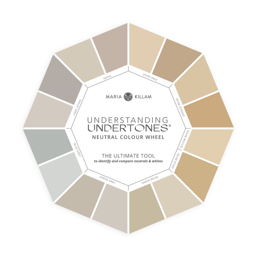
9 Neutral Undertones & 4 White Gradations
Made with Real Paint
TRUSTED BY PROS & HOMEOWNERS
Free Shipping to Continental US + Canada

Get the Neutral Colour Wheel
If you can’t see undertones, neutrals clash and rooms feel “off”
The Neutral Colour Wheel helps you to see colour correctly so choices get faster, easier, and more beautiful.
Compare
Hold the wheel up to your sofa, countertop, tile, flooring, or paint swatch.
01
Identify
Narrow it down to the top one or two—while colours can coordinate, neutrals must match and relate.
02
Decide
Use the wheel to guide your paint, finish, or fabric choices—to make sure all your colours belong together.
03
Shop
Boost your confidence by pairing the wheel with my eBooks or large painted colour boards to confirm your perfect neutral.
04
How The Neutral Colour Wheel Works


what's on the wheel

The 9 Most Useful Neutral Undertones:
Pink Beige

Orange Beige

Yellow Beige

Gold Beige

Green Beige

Green Grey

Blue Grey

Violet Grey

Taupe


The Only 4 Whites You'll Ever Need:
Blue White

True White

Off White

Cream


Maria's Tip
The whites on the back are the ONLY range of whites you need to consider. Make sure your whites relate to your finishes—this is why I added them to the wheel!
Everything you need to start choosing colour with confidence.
Front
BACK
See The Colour Wheel In Action
Watch how the tool compares real undertones so your decisions become fast and confident.
“I am on my second wheel. I used it quite often as I picked out countertops, tile and now paint. I raved to friends about how confident I felt. The system works. I know now that picking color requires some thought and planning. She teaches things in a way that makes it applicable to real people. Thank you Maria!”
-JEN M., VERIFIED BUYER
“I love this neutral color wheel. I used it to choose trim and wall color in my bedroom and to recover an extremely well-built sofa. It made finding a complex cream easy, and it was super easy to coordinate with what I already have. It’s amazing how many undertones come out in light colors—especially white, off white, complex creams, and even light pink beiges.”
-JULES, VERIFIED BUYER
“Your expertise gave me the confidence to insist my daughter try Manchester Tan, and that is the neutral she went with. It’s used in all the major areas along with the various accent colours. Your insights have saved a very time-consuming and expensive mistake!”
-DIANE C., VERIFIED BUYER
OVER 60,000 wheels sold worldwide
Who It’s For
Match your goal with the perfect starting point

Homeowners & DIYers
Choose with confidence.
No more costly guessing.

Designers/Consultants
Speed up consults and build trust with clients.
Products that work together to make every colour choice faster, easier, and more accurate.

eDesign Consults
Maria’s expert one on one guidance makes every colour decision easier. No house visits. No overwhelm. Just clear advice that works.


Colour Boards
My Colour Boards build trust, make decisions faster, and elevating your client experience.
The wheel helps you identify undertones so you can confidently find the ones that belong with your finishes. For related paint colours, download my ebooks or get the wheel for free with my curated colour boards.
Yes! Even if you’re new to decorating, the wheel makes undertones easy to see and compare.
Absolutely. It’s sturdy, lightweight, and easy to take with you to stores or client appointments.
Yes, because they’re made with real paint deposits! The design changed, but accuracy didn’t. See this blog article for more details.
Ships from the US. Shipping is free to the continental US & Canada.


About Maria
Maria Killam pioneered virtual colour consulting in 2010, long before the industry caught on. She's trained thousands of design professionals since, guided more than 10,000 virtual colour and design projects, and is the creator of The Killam Colour System® and the Understanding Undertones® Neutral Colour Wheel.