


The smart way to do anything is to ask better questions. Colour trends send us looking outward for ideas and confirmation. And they get us asking all the wrong questions.
Whenever I talk about trends, I always get questions like this:
“Is it okay that my house is White Down with Simply White Trim?”
First, there is nothing wrong with this colour combination.
But if you’re asking me this question, this is what you’re really worried about:
- Is my paint colour current?
- Is my paint colour TOO trendy?
And what’s likely really going on, which is making you question the entire situation, could be one or more of the following:
- Your paint colour seems to clash with your house.
- It’s just there, in the background not doing much for you or your furniture or finishes (often the case with white walls).
- You’re asking too much of your paint colour and not doing enough decorating and styling
If you focus on what the colour is doing for your specific space, instead of polling for opinions on the colour out of context–hey, I see you Googling all the trending paint colours and whites 😘–you’ll start asking much more useful questions.
This week in my Create your Dream Home series, I’m sharing 6 paint colours – that are so much better than white – to consider if you’d like your walls to say HELLO when you walk in the door.

I’m also sharing what makes them work in these specific rooms. Starting with this living room.
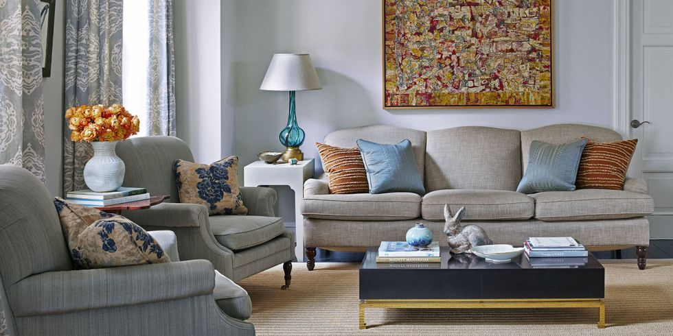
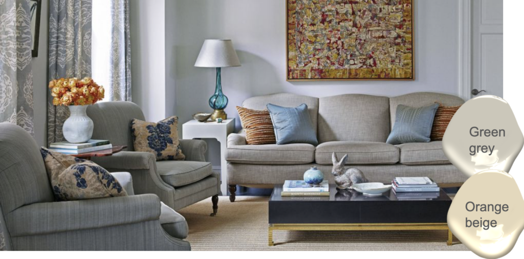
Notice that the paint colour is blue (I’ll tell you what it is in this weeks episode) but what I also want you to notice is that the paint colour could also be an orange beige complex cream since the natural fibre rug has an orange undertone and the cognac pillows do as well.
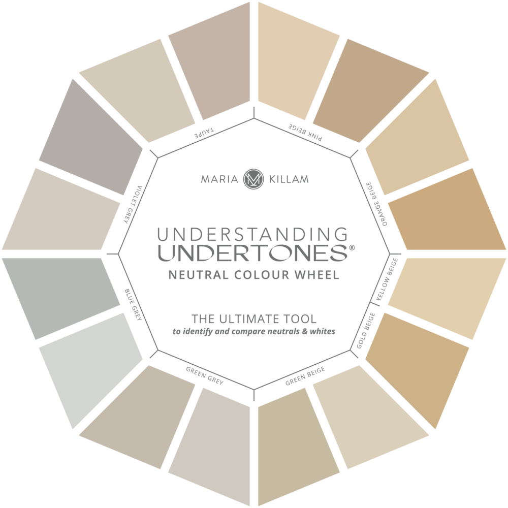
And the sofa is a green grey so the walls could also be a green grey greige from my system.
So check out this weeks video here:
And don’t miss these two videos because there’s a theme here that will help you choose the perfect neutral whether for your walls or your cabinets:
If you would like my help with the perfect paint colour for your room, you can do a consultation with me via email for less than the price of all those tester pots! Find my eDesign paint packages here.
Related posts:
What Everyone Should Know About Warm Neutrals
23 Decorating Secrets only a Designer will Tell You
I’m an Interior Decorator NOT An Interior Designer

Where do you land on color drenching a room where all walls, ceilings, trim are same color — but trim in satin, not matte, sheen? Is this a trend?
Hi Maria,
We just finished our new build with a complete design, build team. I would have been in big trouble if a friend had not referred me to your posts.
We were already started when I realized the designer and I had very different ideas of what our new build should look like. I was not on board with most of the options they offered.
Your posts, exterior master class, and mood board class gave me the confidence to tell the designer that I wanted something different than the trendy white/ grey at the time.
I have always loved warm undertones and have a house painted in canvas tan inside and out. With a sw creamy trim inside to match my cabinets. The outside has native limestone and using your curated collection matched the stone to canvas tan with shoji white trim. We get so many compliments.
So thank you!
Maria, would you want to go with a green grey greige wall color with natural concrete floors in a walkout basement living room? Any posts in what wall colors look good with concrete floors?
So, I’m trying to find a nice “neutral” but not white paint to flow from my kitchen to the family room (shared space). My kitchen cabinets are a knotty alder with a warm undertone and warm/brownish granite on the counters. My backsplash is a cream with darker yellow hand thrown tile (orange beige from the color wheel is the best match). Built in 2007, so darker wood style. I’ve got dark wood stained trim and wood beams in the kitchen going into the family room. I chose “Croissant” SW paint to go with a fabric sample and to pull the warmer wood tones together. However, the Croissant paint pulls really yellow in the natural light! Not sure I’m loving it…..waiting for drapes and other fabric finishes to hopefully pull this color together. IS there another neutral color you’d recommend? I don’t want a white paint because my trim is a dark stained wood and the ceiling/beams are a dark stained wood. I think it would be too strong of a contrast.
Hello Maria
I know that Neutral Ground is the perfect colour for the ground floor and up the stairs of my open plan home. It relates beautifully with the background in both the green area rug (DR) at the front of the house and the blue area rug in the livingroom at the back. And also with my honey oak floors. But the floors distort
every light neutral that I have tried up the
stairs. I’m keeping the floors – I happen to like them. Can you suggest a solution?
Perhaps the answer is a colour that is less reflective, sounds like s ahde of green might be the answer? Super pale shades of white reflect, that’s what white does. Hope that helps, Maria