


Maria, I have a brain teaser for you – Or, maybe it is an example of where paint can’t fix ugly, and paint can’t do all the heavy lifting….
My question is: How do you choose one wall paint color that relates to several bossy fixed elements in a large, open floor plan?
To put this house in perspective, it is on a ranch, in a rustic setting. It has some beautiful, majestic features, but certainly needs updating. I apologize in advance for the overabundance of photos. I know you only asked for one, but I wanted to give you a more comprehensive picture (maybe this would be better for your blog?) Some of the fixed finishes can be changed, and some cannot because of budget constraints. Below is further detail, along with an abundance of pictures!
Things that CAN change:
- Paint all walls – would prefer for the same color to be throughout
- Countertops, backsplash (I am liking a Taj Royale by Caesarstone)
- Island color
- MAYBE the stone on the pizza oven and/or the stove hood detail
- The black sinks, faucets and black oven can be changed when the countertops are changed
Things that CAN NOT change:
- Floor Tiles – they are all radiant heat
- Perimeter cabinets (at least for now). They are all knotty alder with a glaze. I do not like the fussy rope detail or glaze, and painters are not sure they can successfully smooth, and cover the knots – we live in a remote area with limited tradesmen. I welcome a cabinet color/wall color combo suggestion if this is really hindering a solution.
- Beams – they are stained a dark, opaque brown
- Mantel, stone work
I have updated my color wheel with your suggested BM colors. Here are the prominent colors I am seeing:
Floor Tiles: dark orange beige, yellow beige, dark gold beige, dark green beige, dark green gray, taupe
Cabinets: gold beige, orange beige
Pizza Wall: pink beige, green gray, green beige
Stone Mantel: pink beige on horizontal ledges, green gray on vertical stone above fireplace doors
Stone Walls: gold beige, green gray, taupe. Grout: green gray, blue gray
THEREFORE, would I be correct in specifying Natural Cream, OC-14 (griege) as a solution? My second choice is Edgecomb Gray, HC-173, but of course, I want a light color! (In my pictures of the color boards, Natural Cream is on the left, and Edgecomb Gray is on the right). I have tried your complex creams, as well as a plethora of other colors, and there does not seem to be one that plays well with all the bossy fixed finishes which have to stay. Also, for the most part, the furniture, rugs, lamps and art have to stay…What am I missing?
See below for all my pictures, and THANK YOU in advance for your recommendations!
I was delighted to receive Mary’s question and photos because, although I will tweak her conclusion on the right wall colour to use and tell you why, she used the colour wheel and the large painted boards in exactly the right way. Bravo!
The Right Way to Use my Colour Wheel
![]()
I can’t stress enough how much more powerful a tool my colour wheel becomes when you gather the recommended paint chips to represent the undertone categories rather than relying on the printed versions of the colours. Due to colour calibration limitations in printing, they will never be as accurate as the corresponding paint chips.
It’s best to stick actual paint chips on it exactly like this:
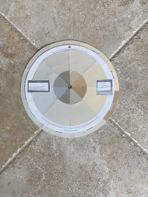
The most effective way to use the colour wheel is to stick actual paint chips on it.
Don’t have your copy of my Neutral Undertones Colour Wheel yet? You can get yours here FREE (just pay shipping and handling) we will be out of them soon, we have less than 500 left.
When You Have Various Neutral Undertones in your Finishes, How do you Choose the Right One for your Walls?
It’s such a great question. When you’ve used the colour wheel and my large painted colour boards to identify the different neutral undertones in your fixed finishes it’s common to find that you have several competing undertones.
Now what?
It’s most often the case that you will have competing undertones in earthy tile and stone. This is what makes them so bossy. Because if you already have 3 undertones in your tile or granite, it becomes very difficult to introduce yet another colour like a pretty white or blue, because you already have so much going on.
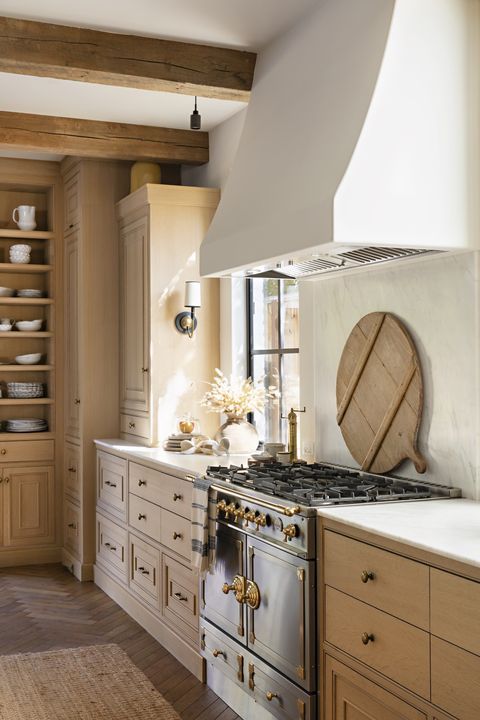
Mary’s house is a great example of a space with lots of bossy earthy finishes, so I’m not surprised she’s not sure which direction to take. Here’s her kitchen below:
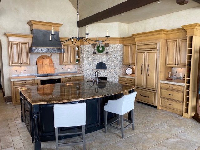
Mary’s kitchen has earthy granite, tile AND stone all with various neutral undertones
And here’s the rest of her open plan great room and dining room with another different combination of stone below:
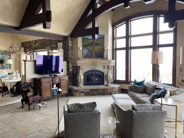
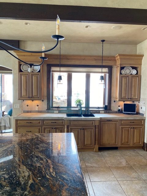
She has different stone again on her fireplace and as a valence over the dining room window.
Her kitchen cabinets really are lovely if some of the other elements can be toned down
Take the Macro, Not the Micro View: What’s the Overall “Read” of the surface
While it’s fine to get out your reading glasses and identify all the various earthy undertones in your tile and stone by dissecting them microscopically, it’s more important to zoom way out and get a feel for the overall “read” of those tones all mixed together.
It’s a common mistake to get bogged down in the trees and ignore the forest when identifying undertones in busy earthy finishes.
If you look at the photos with the colour wheel plunked on her floor tile, you can see that the overall read of the tile connects most closely to the taupe chip on the wheel.
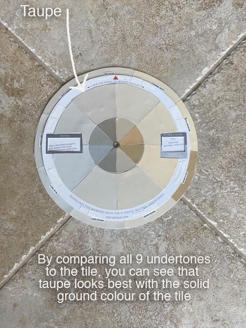
The overall read of the floor tile is Taupe
Don’t worry Mary, it does take some practice! You have a lot going on here and it’s pretty easy to confuse Green Grey and Taupe because the distinctions between the neutral undertones in my system are SUBTLE. That’s why, even when you have all the tools, the wheel, the boards and the training, you still need to PRACTICE and train your eye.
Decide which of the Neutral Undertones will Tie all Your Elements Together
After you narrow things down with the colour wheel (or as in Mary’s case, discover just how many undertones you are dealing with), the large painted test boards are most effective at this. You can compare a few large boards of colours in each undertone category you identified to all of your elements to see which looks best overall.
If you look carefully at the photo below, you can see that the Green Grey boards she is testing, Natural Cream and Edgecomb Gray, look a bit too green compared to the floor tile. That’s because, as I mentioned, the overall read of the floor tile is Taupe.
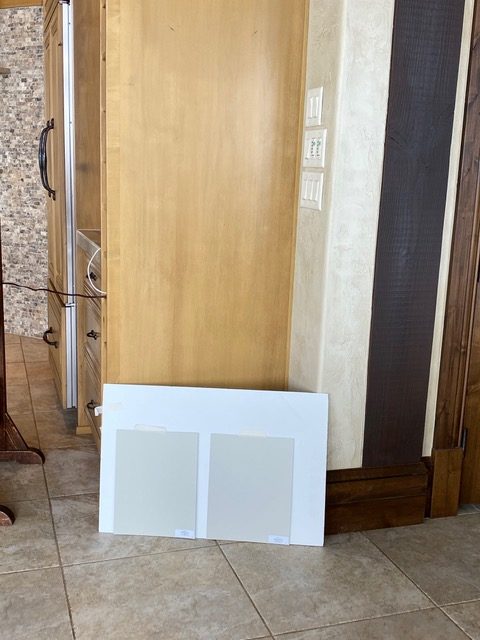
Her floor tile is too pink taupe to look perfect with the green greys she is testing
In Mary’s house, the floor tile covers the most area and is the most visual. The stone is bossy too, but fortunately, the taupe and orange undertones in the stone will also look good with Taupe.
Don’t forget to turn the wheel to the back (as shown here) if you are comparing it to darker neutrals.
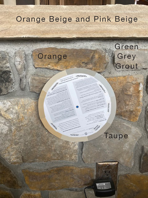
So if Mary painted the walls Green Grey as planned, it would not be as perfect as a fresh and current neutral with a Taupe undertone to perfectly coordinate with her floors and the orange, taupe and pink undertones in her stone.
It’s important, when you are faced with finishes in competing undertones, to identify which finishes are most prominent visually. In other words, of all the bossy elements, which one is THE BOSS?
Look at the one that covers the most surface area in most cases, often the floor. Any finish that goes up the wall such as tile or stone will hit your eye directly, and is going to be extra bossy too. Mary is lucky that a fresh, pale taupe will get along with both of her most bossy elements.
Go with the Freshest, Most Current Option
It is often easier to identify the undertones in your finishes using the mid tone to deep colours in the large colour board collections where the distinctions between undertones are easiest to see. You then need to work up from there to the lightest, most current possible colours in the correct undertone category.
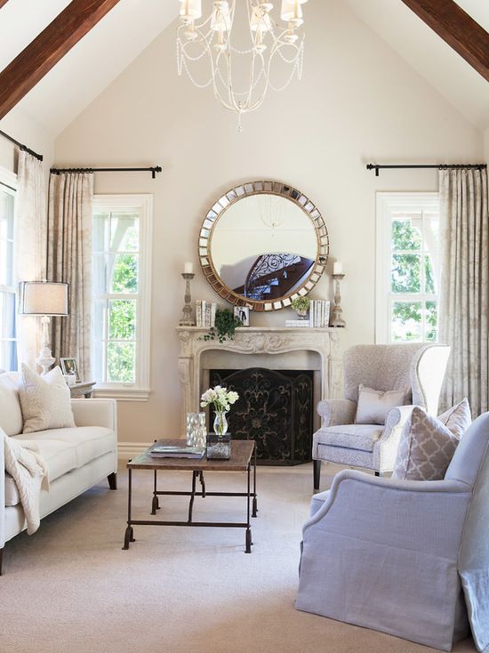
The fresher taupe colours I would look at in my collection of large painted colour boards for Mary’s space are BM Pale Oak OC 20 (similar to SW 7570 Egret White) and Elmira White HC-84 (similar to SW 9109 Natural Linen). She could potentially even go as light as BM Fossil AF 65 (SW 6098 Pacer White is similar), a very pale, creamy taupe greige that would give her a fresh “cream” look for her walls.
To see all the colours in my large painted colour boards, you’ll need my White is Complicated; A Decorators Guide to Choosing the Right White ebook. You’ll find all the colours in my Bonus Book of Colours which comes with it, It’s still 50% off until Monday, April 13, 2020.
BM Elmira White HC 83 (Similar to SW 9109 Natural Linen) a fresh, creamy taupe in an
interior by Tracy Mckee
A pale fresh colour with a taupe undertone would transform the kitchen and living area.
And Mary, I think Taj Royale is a good one to consider for your new countertops. It is fresh and creamy with subtle pink beige and taupe undertones, I would also consider Dreamy Marfil (Be sure to test them both to confirm by placing them directly on the floor tile).
Even with the existing knotty alder cabinets, you will have a much fresher, more current look with light countertops and walls. And I would change out the black fixtures to chrome or polished nickel to lighten up the look too.
I would also replace the pizza oven stone. It just adds too much busy texture adding to the sense of visual overwhelm. The eye needs some calm, smooth and quiet surfaces to rest on. A pretty plaster finish in the wall colour would be lovely and you can treat the hood the same for a creamy smooth contrast to your warm wood cabinets.
Clean and pretty plaster hood in a wood kitchen by Molly Britt via House Beautiful
I would also paint the island brown to relate to the brown wood beams. Since the entire house is so earthy, brown is better than black in this case anyway. The change would be subtle, but the island does need to stay a darker accent colour since the wood stained cabinets are staying. BM Silhouette which is found in my VIP Collection is one I would sample.
I have been WAITING for SOMEONE to send me such good photos of my colour wheel in action! Thanks so much Mary for finally being THE ONE!
I hope this was helpful to EVERYONE. Don’t forget you need to customize the wheel with either Benjamin Moore, Sherwin Williams or Farrow & Ball colours, you can find them about halfway down the landing page here. The best way to do this would be to pick up the colour chips from the paint store instead of cutting up a fan deck.
AND, if you’re painting your exterior this year, or you’re a design professional, my Masterclass for Exterior Colour Selection is still $200 off until tomorrow night (Monday, April 13, 2020).
I added a new module last Friday, Module 13: Porch, Deck, Fencing and Paving module and April 24 Module 14: What would Maria Do with THIS House (I’ll walk through what I’m thinking to arrive at the colour) and then May 15, Module 15, What would Maria Do with THIS Porch or Deck?
I just received this review today:
Maria answers questions I didn’t even know I had. Or, rather, she gives solutions to problems that I would not recognize until it’s too late (test at least 2 colors on exteriors, what composite colors work best, color and style of railings, for just a few examples). This is such important information. Every builder/developer in North America should take this course.
You can watch the first module for free and buy it here.
Now more than ever, it’s important to get colour right the first time!
You can download both my eBooks here for 50% off until tomorrow night here too!
Related posts:
Now Available: Masterclass on Exterior Colour Selection
How Much Heavy Lifting Can a Paint Colour Handle?
3 Best Ways to Choose a Fresh Paint Colour for your Tuscan House

Yes!!! I love your advice, Maria. This is perfect, and I am finally getting the hang of things with looking at the big picture, finding the bossiest boss of the room, and then finding a fresh, current paint color to work with it. I thought of most of the things you suggested. This was a great article, and super helpful with the homeowner’s pictures, wheel, and questions.
Let’s hope that lucky homeowner who lives on a ranch shows us her “after” photos too. Great question and great advice!
Wow, wow, wow!! I really hope Mary sends you her “after” pics! If she does, pretty please share them with us! Great post! Thanks, Maria!
This was a great, informative post Maria! I was so pleased to see you work with the pretty wood cabinets. I do hope she sends you afters to post. I switched our entire condo from BM Thunder (builders choice in 2013) to SW Egret White and it is so fresh and pretty! Thanks to your TCE training, colour wheel and ebooks I knew Egret White was the correct choice.
This was a great, comprehensive problem solving post! I have been intending to get to the paint store and pick up chips the next time I have the babysitter come- whenever that may be, now!
I printed off the page listing appropriate color chips of various paint manufacturers when I go my wheel and I was so glad to see Behr on it, because that’s what we mostly use (although I often color match to SW), but you don’t mention it at the end of the article here.
Chrome and polished nickel finishes would look terrible in that rustic kitchen… chrome and polished nickel are too “bathroom” for her space.
That chandelier she has over her island is about $1000… Currey & Co.’s Saxon chandelier.
The problem with the kitchen is the proportions of that pizza oven (in addition to the stacked stone)…covering it in plaster is not going to help that small opening. The openings and the mantle above are too small in scale given the width of the wall. Darker stone trim around the opening and beefier ledges could help.
Maria,
Thanks for a great lesson in balancing colors and composition! When I looked at the original picture, what kept jumping out at me was the style and material on the two chairs at the bar. Wondering why you didn’t recommend changing that material or the entire chair to something that works with the overall presentation?
Thanks!
Karen
Oh,my, Maria. I just downloaded the White is Complicated eBook. How generous of you! I assumed I was downloading a pamphlet, not over 140 pages of wisdom! And a bonus book for half-price! I ordered the color wheel a while ago, thinking I might like to freshen up my neutral paint colors – now I really know how to use it. Although the paint stores are all closed until at least May where I am, I can dream and get started. Thank you!
LOVED this!!! I have had your color wheel for almost a year and I wasn’t sure exactly how to use it. Now I am starting to “get it”. Thanks so much, Maria. Happy Easter to you and your family.
Loved seeing the color wheel in action! Great suggestions as always from Maria, especially plastering over the pizza oven stone which is so busy. I hope the homeowner sends after pictures so we can see the transformation!
Wonderful article!! Need more of these to help clarify the value of using the color wheel….and that it takes practice!! Thanks.
Great post. Somehow I ‘missed’ getting the real paint samples and putting them on the color wheel. I also am waiting on the results of the consult. Thank you Maria!
Hi Maria,
I know that you should hold your paint samples vertically, like they would be on a wall, because the different plane makes the paint color change. Yet I don’t see you recommending this. And it depends on your light source, as well as time of day, sunny or cloudy, etc. thoughts?
Hi Nancy, my reader placed her paint samples exactly how I would have recommended. And yes, colours should always be finalized in good natural light whenever possible. It doesn’t really matter if it’s sunny or cloudy as long as you don’t have the sun shining directly on the samples! Thanks for your comment, Maria
Brilliant as usual!
Can someone tell me what style the original kitchen represents? Is it a variation of Tuscan or a blended hodgepodge of French Countryside? Mediterranean? Traditional? I’m not afraid of the cabinets or the floor, in fact they could be the perfect backdrop to something fresh and spectacular, but that pizza oven surface looks like it’s trying WAY too hard. Also, that island color + granite color just adds to the mismatch. These design elements as single focal points would be OK, but it’s just too much. I’m a fan of beige, but we have a running joke in our family about the ‘beige’ phase of Mom and Dad’s life, which lasted about 10 years too long. Their carpet, sofa, table cloths, curtains, kitchen tile, walls, trim, blinds and even their CLOTHES, CAR and DOG were all beige. Happy to say, the only thing left beige is the dog and one of the cars.
This is great to see an example in real life. I have ordered my wheel and can’t wait to receive it. I live in Australia, and recommend Dulux or Haymes (local Aussie company) mostly, so I was just wondering if you have ever done a Dulux Curated List of Neutral Paint Colours coordinated with your colour wheel? Thanks so much
Hi Britt, Dulux will not ship me a fan deck from Australia because they don’t sell that paint here. Maria
The stone over the DR windows seems over powering and wrong. Could it be painted same as walls to help it to “ disappear.” ?
Wonderful post. So clear now that you have pointed out and I now see why Edgecomb Gray is a green gray and is not working above my brown tweed couch that seems to have a red or pink undertone. I was wondering if Elmira White would be better for that wall or would it enhance the pink. Thank you.