Hey it’s Kristy again, Maria’s social media director. Today, I want to share my recent kitchen update with you. We repurposed our breakfast nook, freshened up some styling, and added a muted blue hue to our beadboard for a nostalgic twist.
And because Maria’s colour system was such an essential part of this refresh, I thought I would share my story with you here.
Vintage Kitchen Refresh
We live in a historic home built in 1914. The last time I shared a glimpse inside my house was during the holidays, where you got to see my eclectic, colourful style in my living room. It’s sort of my solution to decorating around the original orange-y oak woodwork throughout our home.
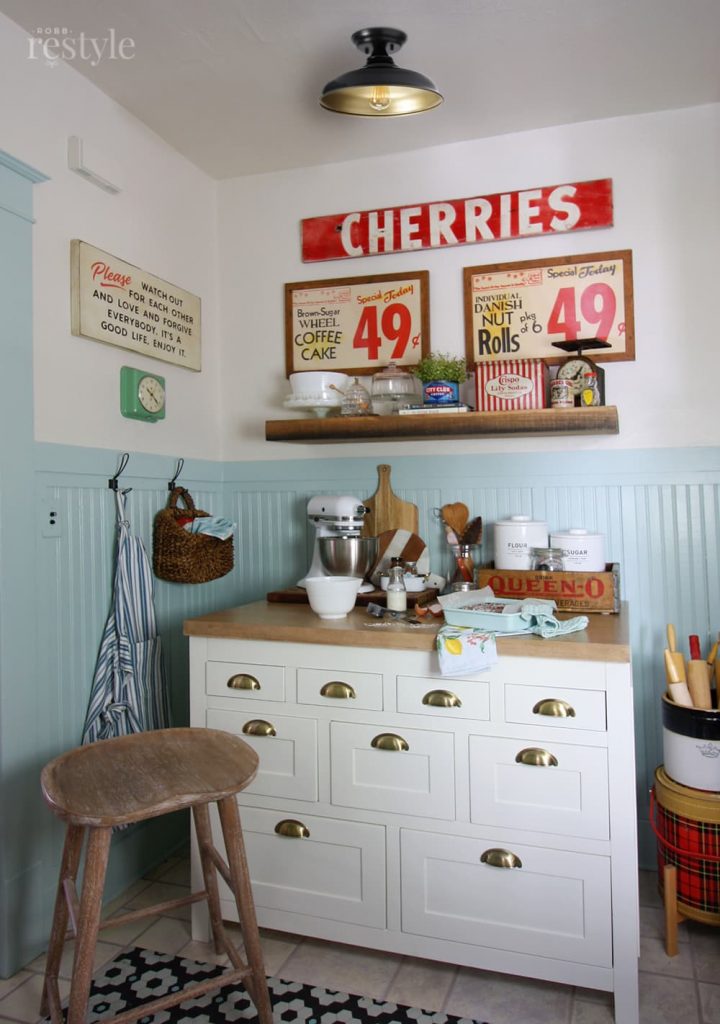
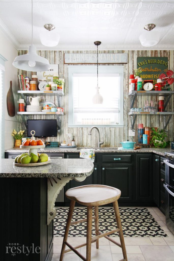
Here’s a look at my freshly painted and styled kitchen.
Shop: Counter Stool | Kitchen Island | Vinyl Floor Mat | Floating Shelf
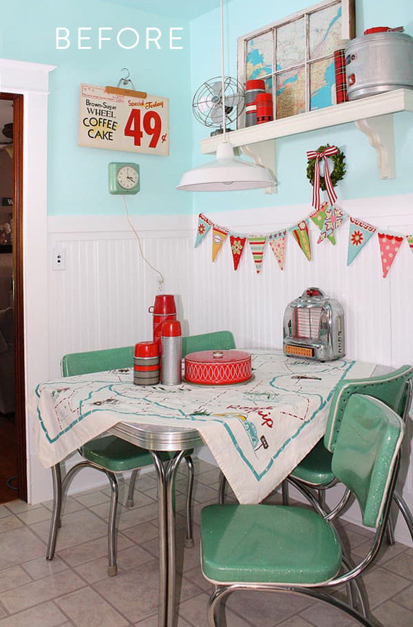
Before Maria…
The kitchen was what I affectionately like to call “Before Maria.” Anyone else have a space in your home that is still in the “before you learned from Maria” phase? You know, the room that just wasn’t perfect, but you couldn’t quite put your finger on it until you started reading this blog?
And now? You so badly want to change that detail you missed or make all new choices for your finishes. Because when you know better, you do better. And that’s what this kitchen update is for me.
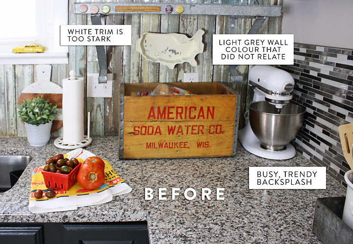
Once I understood the subtle differences in whites, I couldn’t unsee the stark bright white paint on my trim – that did NOT relate to my countertops, backsplash or creamy floors.
And, once I realized my granite countertops maxed out my pattern quota, I couldn’t unsee the busy, trendy pencil tile we installed years ago… Learning Maria’s system can have a snowball effect.
Read more: How to Work with Your Dated Granite: The Ultimate Guide
But, we weren’t in a position to renovate all of our design mistakes and start over. So instead, I found clever ways to pull it together with some paint colour, creative styling, and a little backsplash ingenuity.
Choosing the right paint colours
My husband is a naturalist and refuses to paint over any of the original stained wood trim in our old home. However, the woodwork and trim in our kitchen has always been painted white. The last time it was painted, we used the ubiquitous white trim paint sold in hardware stores. #SMH
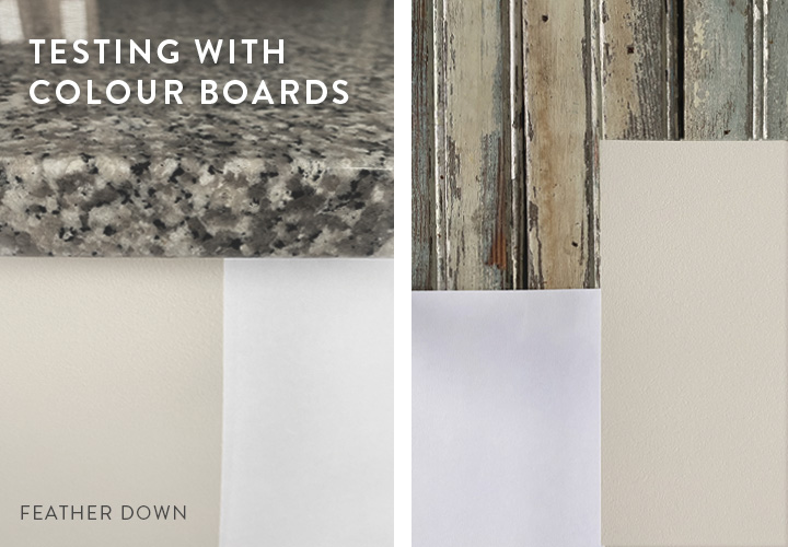
I knew I wanted a pale colour for the walls above the beadboard. As soon as I received Maria’s colour boards, I started holding them up to finishes and furniture around the house, getting to know all the undertones. It really is empowering.
And my kitchen was no different. I held up various boards in the palest colours to identify which neutral undertones were in my countertops.
Without Maria’s colour boards, if you would have asked me what colour my countertops were, I might have said black, white and grey. But, next to that white piece of paper, they are clearly not white. And actually, they lean a bit warmer than I realized.
I noticed right away that a green beige complex cream related nicely to my countertop and also the chippy painted wood backsplash we installed on one of the kitchen walls. If you’re curious, here’s the story about our reclaimed wood backsplash that ended up getting my kitchen in a magazine.
So, I landed on Sherwin Williams Shoji White as the wall colour.
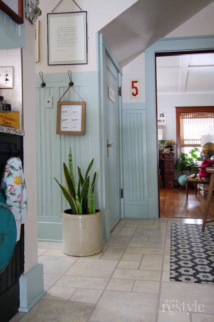
For the trim and beadboard, I wanted more contrast so I opted for a muted colour instead of a pale neutral. Sherwin Williams Copen Blue is a historic color that also feels a bit vintage. Plus, this shade of blue is echoed in the chippy reclaimed wood wall on the other side of my kitchen.
I really am in love with this colour combination!
Wall Colour SW Shoji White | Trim Colour SW Copen Blue
Adding a Baking Station
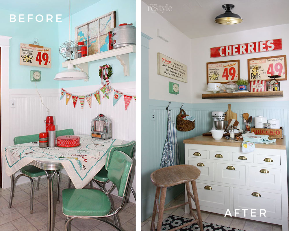
It’s not a huge kitchen but I have always appreciated having this little nook carved out beside it. However, it was time to say goodbye to the stark white beadboard and aqua wall colour. It also needed more function.
Side Note: You can totally see how “dirty” my floors looked next to the “clean” white trim colour in this photo. Geesh. I also see clean and dirty everywhere now.
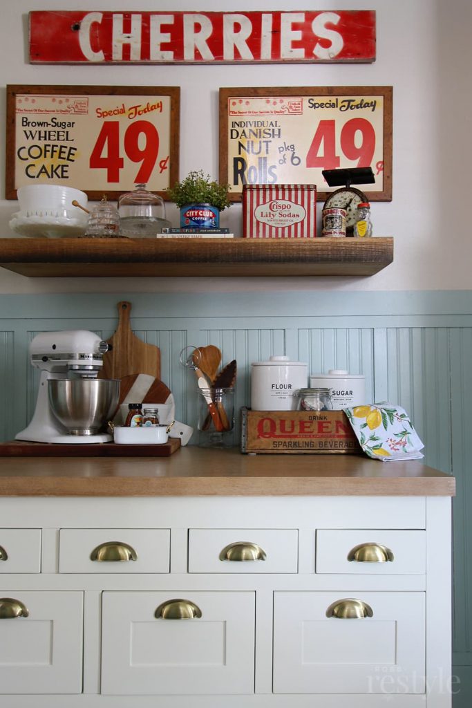
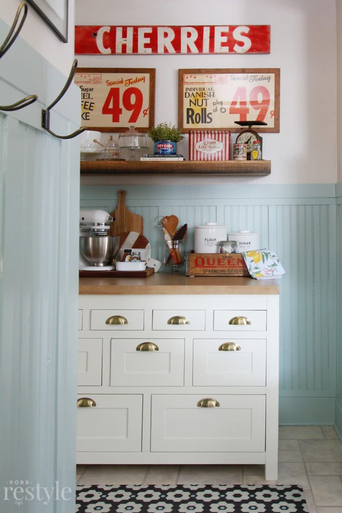
We weren’t using this space to eat, so I decided to add this Millstone Kitchen Island from Ballard Designs and turn it into a baking station. This also gives us more countertop space for food prepping.
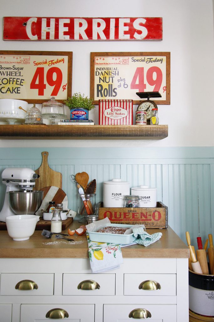
Few design changes are ever really a hit with my family, but creating a space where I can bake more has been pretty popular. You can see more about how I used the drawers for all my baking supplies here.
It was easy to add pops of red by decorating with vintage baking finds I had curated over the years.
And, that clever vinyl floor mat that looks like vintage hex tile is a great way to take the attention away from my cream and taupe floors that are on the list to be replaced… someday.
Shop: Kitchen Island | Vinyl Floor Mat | Floating Shelf
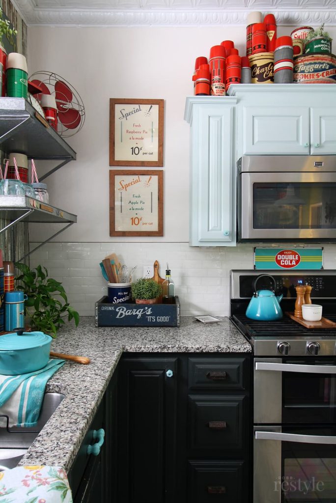
Quick Fix Subway Tile
I’m going to let you in on a little secret about my pencil tile backsplash fix. When I shared with my husband that the backsplash tile he painstakingly installed needed to go, he was not on board. At all.
So, I searched and searched for a solution. Why didn’t I choose subway tile? Oh right, I was one of those “my kitchen must be different” people. #BeforeMaria
That’s when I discovered these dimensional subway tile stickers. Yes, stickers! I ordered a sample in every shade of white to determine the right one for my kitchen. This creamy off-white colour looked the best with my countertops.
Shop: Peel and Stick Subway Tile
And then, I installed them myself over my existing tile without a stitch of help from my husband. I’m not sure how they will hold up over time, but I’m loving the transformation for now. If you need a quick fix, this is it. Installation is easy.
I also painted the uppers above my stove and the window trim SW Copen Blue. The combination of paint colours and subway tile (even if it is fake) is such a cleaner look overall.
Shop: Counter Stool | Vinyl Floor Mat
I cannot even put into words the reassurance I felt from having a colour system in my back pocket to guide these decisions about my kitchen. I’m not a trained interior designer, but I love DIY projects and decorating my home.
And with what I’ve learned from Maria, I’m so much better at it.
I hoped you enjoyed touring my kitchen refresh. Does anyone else cherish old homes as much as I do?
________________
Thanks Kristy for the wonderful post, I love your colourful kitchen!
Which part is your favourite?
Related posts:
How to Choose Colours that Flatter your Orange Wood Trim



LOVE your make over! I’m a huge fan of 1940’s-1960’s vintage, particularly love 1950’s. Colors are great, your floor looks so much better with the new paint colors. Inquiring minds want to know – was that dinette set original/vintage and what did you do with it??! Great job, thanks for sharing!
Thank you Jo! So, I kept the dinette set – it is super near and dear to my heart! I completely restored it myself and added the turquoise sparkle vinyl. Someday, I’ll find another home for it 😉
My first thought was that the original tile backsplash was the element that broke the camel’s back. It’s so much better now.
Kristy, I love that you kept your decorating personality while bringing in colors that work!!! BTW, I think your current floor actually works now that you have harmonious colors. Love those plaid thermos.
Yes, Lorri! I feel like there were a few elements that broke the camel’s back. HA! But, the tile was certainly one of them! Thank you for your kind words… and I agree about the floors. They don’t bother me as much anymore either.
Beautiful, Kristy! Love it!
Thanks Carla!!
I love your backsplash tip. Mine was brown mini (and I mean mini) subway tile. I painted them my trim colors (after trying to decide on the perfect white, I used what would coordinate, which was the right choice), is it perfect? No, but I didn’t have to wait 5 years and plan my brains out to get to “better” and sometimes that buys you much needed time and lets you know if your vision is going to work. Sometimes you can’t wait for an entire kitchen redo to do what needs to be done today to exist in the same space without feeling anxious and depressed (is that just me??). Great job! And that blue is happy and calming without screaming “I’M BLUE LOOK AT ME” and works so well with your red!
Yes, yes, yessss! To all of this! I’m so impatient that I often make choices before I consider the bigger picture. And it has come back to bite me more than once. We also considered painting our tile, but some of them are metal and I wasn’t sure if the paint would adhere. Thank you so much!!
Looks Great!! Calm and peaceful! And FUN with the pops of red!! So smart to cover up the pencil tile! I was curious about the stick on subway tile-good to know that it is an okay option until you can get the real thing!
Yes, totally! This is one of the better brands I tested – it had the most realistic look and feel. Great temporary fix!
I am excited to check out your link to this. I just couldn’t decide at the point when we were adding on (and actually have just one corner by the stove that needs a backsplash) so I did black chalkboard paint and then did a checkered border with chalk.
Bold and unexpected to paint your bead board and trim that lovely shade of blue. Also, good job at neutralizing the backsplash. What color did you use on your lower darker cabinets? Thanks for sharing – wonderful makeover!
Thank you so much! The lower cabinets are painted VALSPAR MEDALLION IN CAVIAR, however I’m getting ready to paint them SW Urbane Bronze. I’m loving the soft, matte-like finish of their Emerald Urethane Trim Enamel. It’s also a durable choice for painted cabinets.
I had painted kitchen cabinets about 10 years ago and it was a traumatic experience, but I recently painted cabinets again with the SW trim enamel and my mind was blown at how smoothly the paint applied with a small roller!
Yes! It’s my go-to for cabinets!! And it’s also what I used on the beadboard/trim. Never going back.
I am a newbie to this blog and am trying to choose colors for a slow remodel. Your pictures have really helped me see the differences in whites which has always been a source of bewilderment for me. Your after photos are gorgeous and really illustrate the need to choose the one that has the correct undertone! Slowly but surely I am determined to learn this. I’ve always been the person who can identify what I like but have absolutely no idea how to get there. I once (after ignoring the yellow tile in the kitchen) worked and worked to get the exact color of coral for the walls. We painted it and I realized all I had needed to do was take a box of aspergum in and have them match it. It was hideous and if you don’t know what aspergum was ask someone near 70.
Oh my gosh, I had to google Aspergum and I’m cracking up. I’m glad this post helps… it takes patience but you will get there! 🙂
Hello Kristy! I love your kitchen redo especially your pencil tile update. I too thought I HAD to have this tile (ten years ago when we did a major kitchen reno) and now I see it is way too bossy with my quartz countertops. My question is was your tile totally smooth or did it have some texture to it? Mine has glass and ceramic tiles and the ceramic tiles have a bit of a rough surface. Would it be worth it to try the peel and stick subway tiles?
Thanks for your help!
Jennifer
That’s a great question, Jennifer! So, old house = uneven plaster walls – thus, there was some unevenness to the pencil tiles on the wall. Plus the pencil tile was a DIY, so the grout wasn’t perfectly smooth either. It definitely had some texture and bumpiness in spots. But these peel and stick tiles are thick and rubbery (if that makes sense) and so they form nicely over the bumps without making them stand out. You can order 1 pkg, which is what I did and stick it over the bumpy part to see how it covers. Good luck!
Thanks Kristy! I have put them in my Home Depot cart!
I’m glad the backsplash, turquoise paint and white are changed! BTW Maria’s photo of the red sofa looks like it could be your living room to match your kitchen!
Thank you! And you are so right about that red sofa! I’m saving that idea for later!
I can relate to the #beforemaria and knowing something wasn’t quite right but not being able to place my finger on it so much! (I actually just said that in my response to the reader survey before I read this post! 🙂 )
Right?! You can feel good about finally knowing what it is that’s not quite right!
Great makeover. My sister used those subway tile stickers in the dated kitchen of her rental. They made a huge difference and lasted the two years she was in that apartment.
Good to know. Based on how easy and cheap this fix was, I’d be happy with two years too!
Your floors now look so good with your granite counter top and chippy wood back splash! Great Post!
Thanks Judy!
Love your bright and colorful kitchen decor, Kristy! Especially the signage and the shelf decor above the baking station. You know that’s right up my alley!
Oh, totally Beth! 😉
Subway tile stickers?????!!!!! This is life changing. Thanks for providing the link. Lovely restyling of your space. And yes, before Maria Killam….or BMK as I refer to those times. We have all learned so much from Maria!
BMK – so clever!! I love it! It’s such an easy fix – you won’t be disappointed. 🙂
Re: seeing clean/dirty everywhere. Just today I was stopped at a red light, behind a white car, and the first thought that popped into my head was, “The colour of that licence plate is too dirty to go with the clean white of the car!”
ha, ha! Yes, the things you cannot UNSEE now! 🙂
This is a great post! I love the color changes, but I have to say that your accessory collections and styling stole the show! These are wonderful photos. Stick-on subway tile? Wow!
I would love to see more of your home, including how you are working with wood trim! Thanks for sharing your transformation. Your kitchen has such a strong sense of personality and style. So fun!
Thanks Karen – you are too kind! I’m kinda obsessed with my vintage collections, so I’m happy they stole the show. 😉 I have a few more rooms that are still #BeforeMaria so maybe I’ll share them as they get updated…
Hi Kristy! This is Kristin Dimmich. Your update is great! Thanks for sharing your cute kitchen with us. I am also a fan of Maria and never miss a post. Hope your family is well❤️
Oh hi Kristin!! Thank you so much! Maria is one of a kind, isn’t she! 🙂
I absolutely love the way you brought elements of the predominately warm honey Oak color from your window trim and floors into your kitchen. The wooden sign frames, the salt & pepper shakers, the shelf above your baking center, the baking center counter, the bar stool, the utensils and cutting board all speak to the fact that you’re embracing your Oak for the time being. It’s wonderful that the kitchen keeps the spirit of the rest of your home. I have a lot of oak also, so it’s nice to see thoughtful use of that wood color. Even if you intend to restain or paint it later, it certainly shows that you’ve learned how to make it work in a very pleasing way. That SW Copen Blue paint just sings paired with those warm wood tones!
Thank you so much Sunshine! And you are right, adding those frames and shelf in that wood tone was a deliberate nod to the oak in the rest of my house and something I learned from Maria. It seems so simple now, but it’s definitely a learning curve that I didn’t know before! 🙂 And when you can’t change it, you might as well embrace it. 😉
OMG – so fun. Love it. 🙂
This is still a favorite post. I just enjoyed rereading. I may try that peel and stick subway tile😀