I’m here to remind you that when colour goes wrong, usually the LAST thing to blame is the lighting. Instead, keep reading to find out what the biggest paint colour mistake really is…
Before I hop on my colour wisdom platform today, I wanted to pause in this moment and be present with you to the events happening around us. In a world that feels so unbalanced and heartbroken right now, it’s hard to find the right words. However, I want to share my wishes for acceptance and inclusion and freedom. For everyone. There is much work to be done to make sure everyone feels fairness and love. As a community, I know we can do better.
The biggest paint colour mistake
I received this question last week and realized that we might need a reminder that when colour goes wrong, usually the LAST thing to blame is ‘the lighting’.
More often, you simply chose the wrong colour, the end. Here’s the question:

“I have been reading your very helpful and excellent color blog and stumbled across your post on “5 reasons your paint color is wrong.”
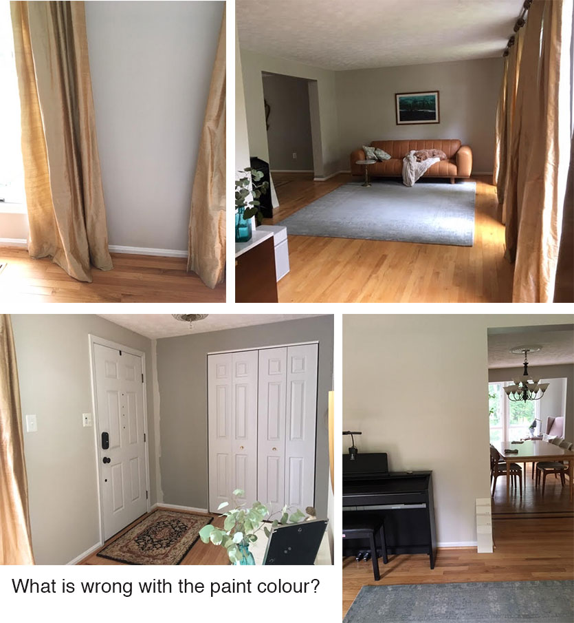
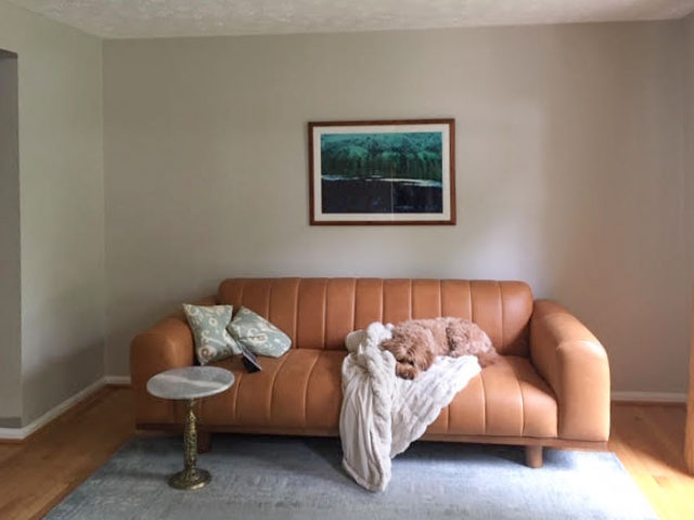
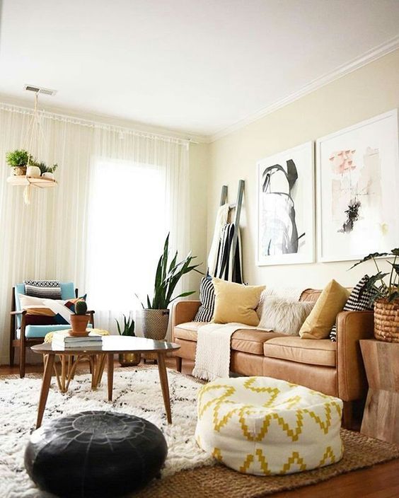
I wondered if you might help me pinpoint what isn’t quite right with this color for the walls, which I’ve been taking from a darker grey to BM pale oak. The room is a west facing entry/living room adjoins the east facing dining room which had been previously painted with Behr foggy london.
Outside the windows are a lot of greenery which gives a greenish cast to some of the walls. You can see the previous grey since I’ve not quite finished one wall and the other color samples I’ve tried out. I was wondering if I should have gone with ballet white instead.”
What’s wrong with my paint colour?
So in general, this is how I expect Pale Oak walls to look. If you start searching this colour on Pinterest, this is pretty much it.
BUT, why isn’t this colour happiness yet?
Scroll down and think about it for a second. My advice was spelled out in this post about 5 reasons your paint colour looks wrong.
Did you figure it out yet?
The paint colour in no way relates to anything in the room. And therein lies the problem.
It’s easy to assume the paint colour isn’t right if you haven’t decorated yet.
This is the biggest paint colour mistake that many of you keep making.
This topic has been talked about so many times on this blog I have lost count. However, there may be a new issue coming to light here.
Because we’ve moved into this new world of ‘pale’ and ‘white’ and ‘light’ and ‘bright’, I wonder if perhaps you might be thinking, “The old rules don’t apply.”
Your paint colour must be repeated in your room.
I’m here to tell you that the old rules still apply. I’m concerned with the number of clients who are simply arriving home with a generic white to throw up on their walls because right now, “brighter just seems the trendiest and the freshest.”
Here’s the other tricky part. In this house, Pale Oak paint still obviously reads like a neutral and doesn’t overtly clash, which leaves this homeowner stumped.
But that’s always when we criticize any colour the most because, IT DOES NOT BELONG in the room it’s painted in.
Why is it important to get your paint colour right?
Your paint colour should look like it “pulls the room together.”
And often, that means the paint colour is chosen last. Not first.
So, if you look at the colours in the above room, can you think of some better options?
Well, let’s look at the curtains which appear to be ‘orange beige’ – it’s coming back isn’t it?
And then the other colour I’m making a note of in this room is the blue grey area rug making that is the second obvious choice:
And then of course we still need end tables, lamps and a gallery wall here.
But let’s photoshop the walls a a blue grey that better relates to the rug, shall we?
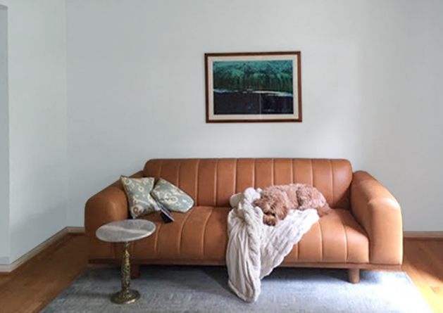
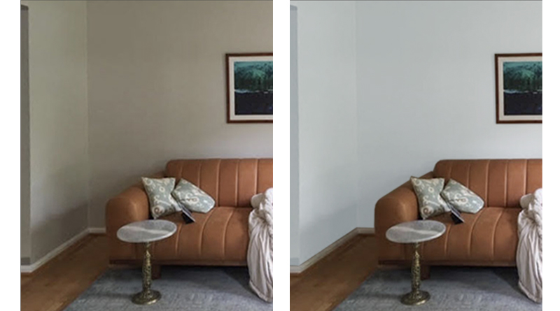
So much better.
If you find yourself fixated on the wall colour, look around the room. It’s likely that decorating is seriously missing. Your wall colour needs to relate to other items in the room.
Here’s some inspiration:
Notice how the inspiration photo has two much larger pieces of art AND a ladder layered with throws that makes the room feel finished?
Her room needs something similar to the gallery wall I created for my nephew last year (below), if you click on the post, you’ll see that the before photos also had one lonely piece of art above the sofa.
This room is painted BM Wickham Grey. A fresh blue-green that relates beautifully to the blues in the room.
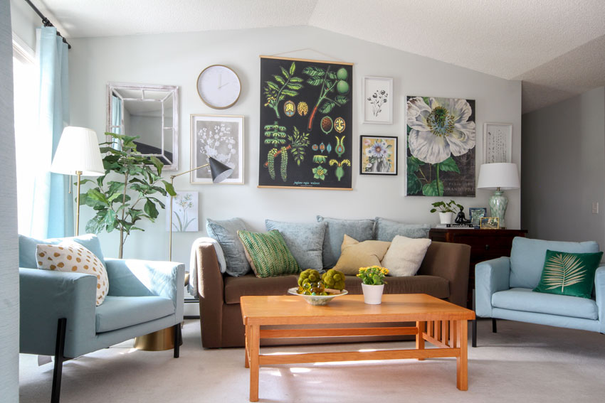
Paint Colour: Benjamin Moore Wickham Gray | Decorated by Maria Killam
How to get your wall colour right
I admit, there is the small, 5% group where the light REALLY DOES TURN THE COLOUR into something it shouldn’t be.
However, in my experience, MOST OF THE TIME it’s because the wrong neutral paint colour was chosen to begin with. So before you go blaming the mysterious alchemy of lighting issues that are largely beyond your control, consider the things you CAN fix.
How to tell if your wall colour is right (ask yourself):
- DOES THIS COLOUR RELATE to any significant elements of the room? (And yes, this applies for white too)
- DID I CHOOSE THE CORRECT NEUTRAL UNDERTONE to relate to my room? Because most of the time, these are the issues.
- DOES MY ROOM HAVE A LOOK AND A FEEL? And even if there is a reflection from outside for example, if the colour otherwise relates to your decor, it’s not going to bother you.
Before you paint your walls a basic white…
My biggest cautionary tale right now would be that instead of just painting your house or the room in question a basic white, consider the palest of beiges – known in the Killam Colour System as Complex Cream™ – or the palest of greys (aka greige) to relate to the colours in your room INSTEAD.
It will look more custom and in most cases way better than a white, which often relates to nothing in the room. Especially if you really don’t have any white furniture. If you’re painting and want to make sure you choose the correct colour, check out my virtual Open Layout Paint Colour Consultation package here.
To help you choose either category, download my White is Complicated; a Decorators Guide to Choosing the Right White ebook here.
Related posts:
5 Reasons Your Paint Colour Looks Wrong (It’s NOT the Lighting)
Ask Maria: Now that I’ve Painted, How do I Make this Furniture Look Good in the Room?


Hi Maria, Nice post, but I think some photos are missing. I only see one picture of the client’s room. Is that picture the one photoshopped with a light violet color? I’m stumped. Thanks!
Hi Jackie, the photos in question are all grouped together at the start of the post! Maria
Maria – thank you for your word of encouragement.
We all need to pull together .
Thank you for sharing your color knowledge with us
So agree – mostly! But I’d also walked into clients’ homes with cheap, low kelvin (dim), low index CRI, builder grade lightbulbs, and beige lampshades or frosted or yellowy light covers, and switching the bulbs and the covers transformed the light from muddy to clean – especially when there were no windows so it always looked funky. Usually it would be just one room – most often the kitchen or entryway, but sometimes elsewhere.
Yes that also makes a big difference, thanks for your comment! Maria
Hi Maria,
As usual, you are right on target and succinct.
Your blog is wonderful.
Maria, I’ve so enjoyed following you and your wisdom ever the years 🙂 In reading your advice in response to the question Why does this color not work I was surprised by the tone of your response. Typically you guide the reader through the realities of color and light, make helpful suggestions and wish them well. But here you sound more annoyed by having to give repeated advise. Given your choice of words and phrasing I’m wondering why you even chose to post this reader’s question. People ‘tune in’ at different times and may not have heard or read your advice/guidance before.
Hi Jo,
The tone you heard might be more that I worry about boring people with the same advice over and over, rather than that I’m annoyed. But I certainly didn’t meant to sound that way. You’re totally right that not everyone has read everything and therefore it’s okay to say it again! Thanks for your comment, Maria
Good post indeed! So many times when I walk into a new clients home they have been watching HGTV and feel like they are experts on everything. It is a tough road to tell them that what they see and hear on TV or someone else’s blog is wrong for them. Everyone wants to be a rockstar. You have to re educate them on the why’s of color and design. You so aptly do just that and that is why we keep following your no nonsense blog. We have to look at the big picture first in everything we do.
Keep posting. We love you!
Thanks for taking a moment to reflect on the sad events of the past week, Maria.
I think for me the big problem is the rug, which seems disconnected from the sofa and curtains, and is dictating wall color. The gray you chose is lovely and works with everything, but I’d love to see the homeowner rethink the rug first. The inspiration room is gorgeous and happy!
With art, my motto is “go big or go home!” The gallery wall works perfectly to achieve that effect.
One more thing…the darling dog is a pink beige and clashes with the sofa. 😀 What would you recommend? LOL
Haha, yes if the homeowner replaced the rug with something that picked up her taupe walls or was even more of a creamy greige, then her walls would look right! Thanks for your comment! Maria
Maria, Can you help me understand why you chose to coordinate the paint with the rug and not the sofa? Still trying to learn!
Hi Diana, I didn’t have the room photoshopped to match the sofa, rather I showed a room painted in a colour that was more of an orange beige which also would have worked in that room yes! Good question, Maria
Ah, the perfect post. So . . . if your parents just repainted most of their open floorpan with a very light/white color that does not relate at all to their orangey wood floors, orange-toned wood cabinets, or orange and gold, busy granite, how long do you bite your tongue? Bonus, the new paint does relate to their cool-toned, whitish rug and cool-toned sofa. Of course those don’t relate to anything else in the house.
I really like the reader’s BM Pale Oak color. It’s one of those Taupe paint colors that acts like a chameleon! It has a Light Reflective Value of nearly 70, so it does pick up reflected color more so than a lower LRV paint. It’s a lovely true Taupe that really changes with the Kelvin (color temperature) rating of the lighting. I have a few shades darker than Pale Oak in my main living areas, custom mixed. It’s a Taupey color of dried clay, and I love it. Once I applied the paint to the walls, my kitchen seems to have the most ‘true’ grey beige color. I have 5000K bulbs in the kitchen. My living room has the same paint color, but because I went with much warmer 2700K bulbs in table lamps, the paint color reflects more of the ‘yellow grey’ ever so slightly and warmly. My previous Taupe paint color was called Driftwood, and it heavily went to Violet in the shaded areas and at nightfall. I really didn’t want Violet walls in the evening, so I searched for quite a while to find a true Taupe than went more yellow/grey in the light and green/grey in the shade. My dining room is also painted my custom color, and it gets full sunlight all day long. It also looks like a true Taupe, like dried clay. I chose this color because it reflects my design esthetic, which is Southwest meets Far East. Also, it’s worth noting that I had my paint store custom mix because I didn’t want my painted walls to show any PINK or Violet in the shadows. Any paint store can custom mix a color from a swath of fabric or even a photo. Paint in itself is complicated when it comes to removing any of the undesired undertones. I would highly recommend Maria’s painted large samples to give yourself a big helping of confidence before you decide to go a custom route. This is a local homeowner I found who dove into deciphering paint can labels. https://dearshari.com/2018/understanding-sherwin-williams-and-kelly-moore-paints/ Like this homeowner, I did my own custom mix, but I don’t recommend it unless you have some design schooling or innate talent. My daughter (in my photo) has a bachelor degree in art, with an emphasis on art education. I’m a photo-realist artist with only a few color classes under my belt, but I’ve been able to draw realistically since I was a young child. Being able to draw and then successfully apply color are two very different things. My ‘color theory’ class at the local community college gave me a tip-of-the-iceberg introduction to understanding color. That’s why I follow Maria, she really has an expert grasp of what color can and cannot do. And her real-world question and answer blog posts are my very favorite.
I’m still surprised how good my BM Acadia White (Ivory) looks in every room of my house, no matter what color is used there. What colors/undertones look bad with ivory?
Well, picture the same house we are talking about in this post in Ivory White? It would make no sense. With a cognac sofa, orange beige drapes and a blue rug? It would look like she had just moved in and hadn’t painted yet.
In the case of whites or creams, it’s less about ‘clashing undertones’ and much more about ‘does this colour pull the room together’. When I was in my early 20s (many years ago) everything was painted ‘apartment beige’ which was in the realm of a dirty ivory colour, it looked terrible with most peoples furniture.
There’s absolutely nothing wrong with Ivory White if it is the right shade of white to make all your whites sing which apparently is what is happening at your house! Hope this helps, Maria
Hi Maria,
I agree with you here, I love the combination of cognac or gold with blue, violet or grey .. 💙💜🧡 Blue could pull the room together better than the oak white .. 👌though some people adore oak white ..💗 I think white is universal color, but it’s hugely affected by the house location .. 🏘
I was immediately interested when I saw this post because BM Pale Oak is a color I was considering for our bathroom (to also go with BM Moonlight White, a soft grey & black tile floor (Bedrosians Allora Fiore), wood vanity (signature hardware danenberg) with Arctic White quartz counter. So after reading your article I started googling for other images where Pale Oak was used. One of the first posts that pops up says it can have a purple-pink undertone! However, I do not see that at all, several of the photos above shout GREEN undertones to me. Why? Am I crazy? Then I searched some of your posts and see you describe Pale Oak as taupe. Can you explain the BM Pale Oak color? Now I’m really rethinking the bathroom color. I don’t want anything to say pink, but I don’t want cold greys or a cold/stark feeling bathroom either. A warm gray with the barest light-purple hint would probably work though (which is what Pale Oak is starting to sound like), but that thought makes me cringe just a little. Sigh, everything just got complicated.
Pale Oak is a taupe which would look pink if you paired it with green undertones. If your bathroom has taupe undertones then this is a good colour. If you have a grey floor and you don’t know which grey/taupe it is, get some colour chips from my system and test them with your tile (they can be found in the back of either of my ebooks in my bonus book of colours). In this post, the reason this colour looks ‘green’ in this interior could be that the outside is adding green, however if the room was decorated in taupes, they would all have the same reflection which wouldn’t be a problem.
Your only job is to figure out which undertone your tile currently is. Then you coordinate from there. Reading about random popular colours and what their ‘undertone’ is if you don’t know the undertone of your tile will not be helpful.
Hope that helps,
Maria
I’ve been in a couple of paint (painting company) posts. Trust me I’ve been screaming at them when I see people unhappy with their color choice and people pop in telling them to change their light bulbs, grrr. For my sanity, I tune out and seek your posts for serenity, lol.
Hello Maria, Thank you sharing your great ideas. I love your color combination.
I love this post! I wish I had known you before painting the outside of my house:( The first mistake I made was choosing the brick and putting tan grout with it. I originally painted the trim and stucco beige, and that wasn’t too bad. After 20 years it was time to repaint and I chose a dark green. Why? We live in the middle of the woods and have a pine tree farm…go figure. I think I wanted to bring the focus less on the brick and more on the trim and stucco. People who are building should get advise from a professional and drive around and see what looks best to them. I tell everyone about your services and hope someone has contacted you for a consultation. Your blog is so helpful.