Contrary to popular belief, TIMELESS design does not mean decorating with all neutrals. It DOES mean creating a versatile backdrop for decorating with COLOUR! Here are my 5 best design tips for creating a timeless home you’ll love forever.
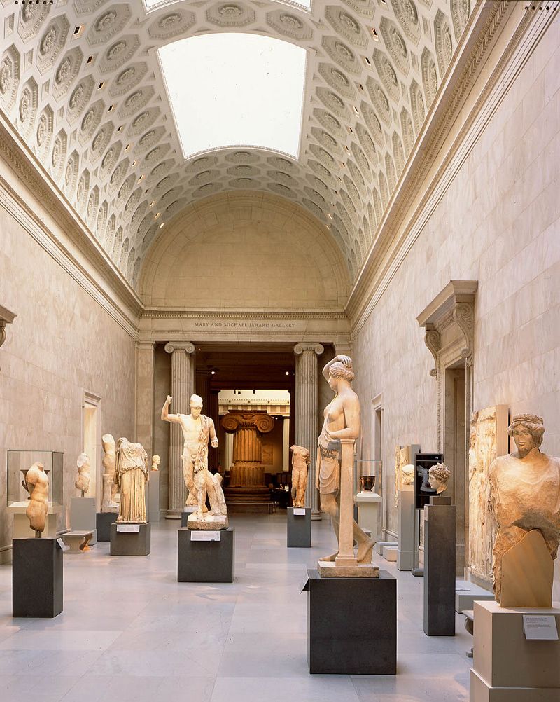
Classical Sculpture at the Metropolitan Museum
What makes design classic and timeless?
Here’s what it isn’t. Timeless design is not about not about Classicism, or, as I said, about sticking with neutrals and safe decorating. For me it’s quite the opposite. Timeless design is about creating a fresh and versatile backdrop for decorating with colour.
To clear any confusion, today, I’m defining my “Timeless” design philosophy, and sharing tips for creating a home you’ll love forever.
I have given a lot of thought to what is timeless and why. And how it became the core of my design aesthetic.
Timeless design doesn’t mean decorating with safe neutrals
My personal ‘design aesthetic’ is about creating styled and colourful interiors and exteriors (below). And, despite my innovations with neutral undertones, I LOVE vibrant and lively COLOUR.
While I help many clients choose the right neutral to coordinate with their stone (that’s all you can do if you’re not painting it), I love when a client asks for colour!
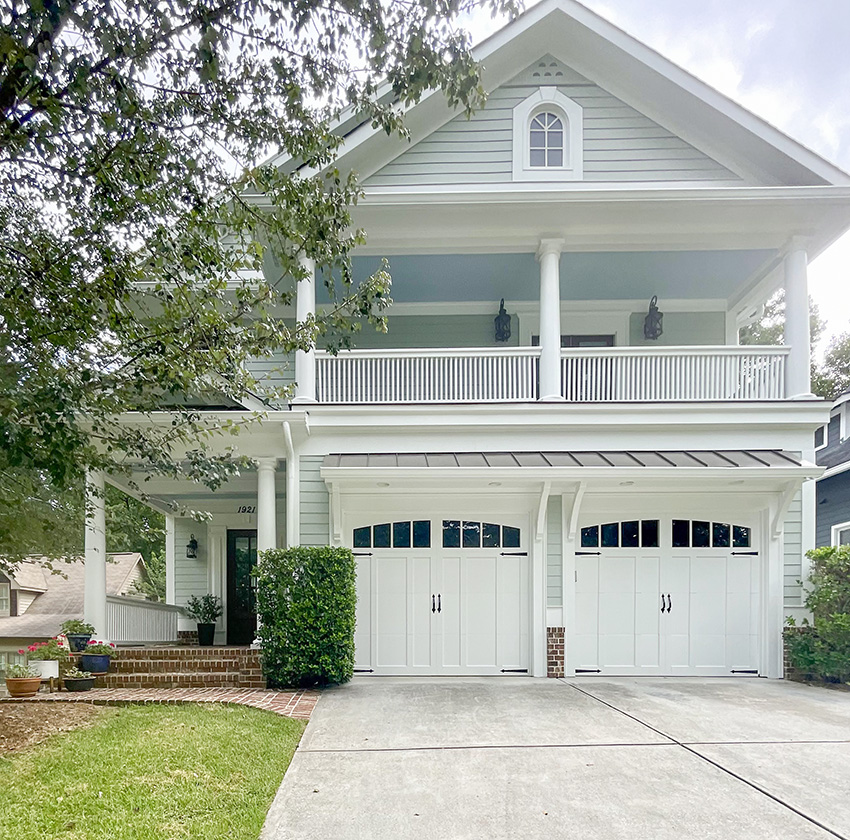
Sure, I’m known as an expert on neutrals and undertones…
But I’m ALSO best known for inventing the Killam Colour System. Which covers how to choose COLOURS and WHITES as well as Understanding Undertones, or getting NEUTRALS right by recognizing 9 distinct neutral undertone categories.
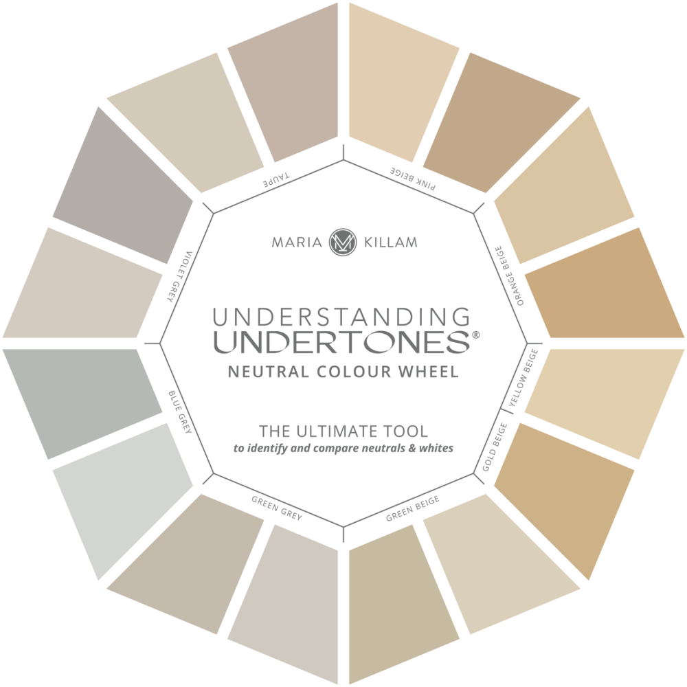
Maria Killam Understanding Undertones Colour Wheel
Do you see more neutral exteriors than colourful ones on this site? Yes you do. It’s because that’s where most people get colour wrong – they choose the wrong neutral. So, I spend a disproportionate amount of time talking about neutrals on this blog. At least for a gal so very in love with COLOUR.
Neutrals are where people need the most help.
A neutral does not simply go with everything
That is why you will see many posts dealing with choosing the right neutral colours to relate to fixed elements such as existing earthy countertops, tile, stone or brick – even Carrara Marble has an undertone.
A home exterior with lots of earthy stone or brick, for example, is one that simply cannot handle a colour because you can’t ignore those finishes.
Like this exterior below with lots of earthy stone.
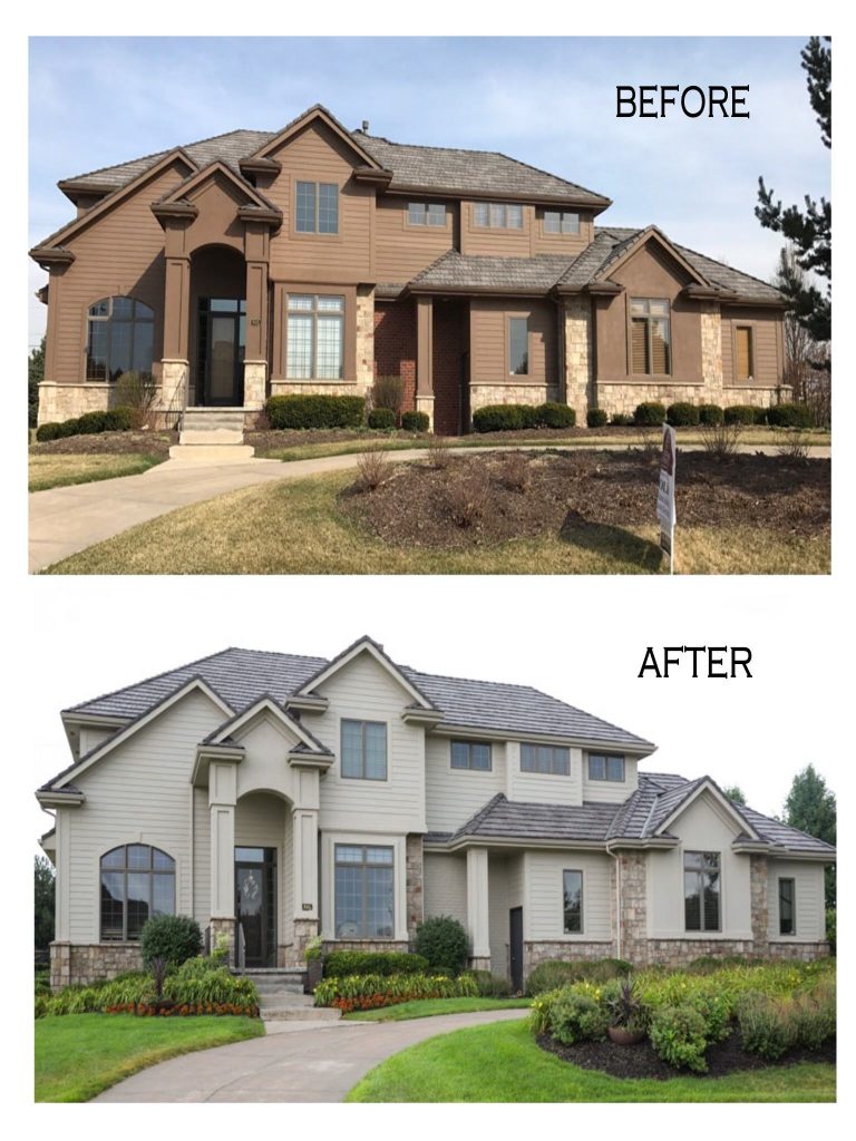
A key insight to the Killam Colour System is that neutrals need to RELATE to look right. You cannot choose a colour from the sky that doesn’t already exist in the multicolour stone on the house above because it would not relate.
It’s similar with interiors. The more hard finishes like tile, stone and countertops you have installed in neutral colours other than white or cream, the more difficult it is to decorate with COLOUR.
A fresh backdrop for colour is also timeless
Creating versatile canvas, that is, a home with simple timeless wood floors and lots of fresh white and cream finishes, is the perfect TIMELESS backdrop for COLOUR. And that often means you can choose ANY colour you like!
In my conversations with my team about the ‘Maria Killam aesthetic’ I came to realize that timeless is not so much an “aesthetic,” but more a value system and a MOVEMENT.
One that needs to catch on in this wasteful world of trendy finishes that no one ever likes forever. Timeless stands in opposition to the relentless need to renovate in order to keep up with whatever is trendy and current.
It’s an oasis of sanity.
And the reason why I think it’s a ‘movement’ more than simply the Maria Killam aesthetic, is because once people find my blog and start reading my advice, they realize it just makes sense.
I recently consulted with a client on her new build. She was building a home on the same property as her son and his wife. And while they were happily choosing ‘current and trendy’ finishes, my client, who was obviously older and had already lived through a few trends in previous houses, was totally on board with choosing ‘timeless’ finishes and colours instead this time.
Timeless is simply good design wisdom.
It’s knowing what will stand the test of time. It’s creating a home that isn’t timestamped.
5 Essential design elements for a timeless look
Right about now, you might be thinking, ‘Where’s the checklist?’ Can you just give me one?
Well yes I can, and here it is:
Let’s just start in the order you need to choose your finishes in shall we?
1. Choose a timeless hardwood floor colour
There are two timeless colours that you should consider. Natural wood tones in pale and medium brown. Basically, make sure there is no grey or taupe in the floors you’re choosing. Which one you should choose, though, depends on the style of your home.
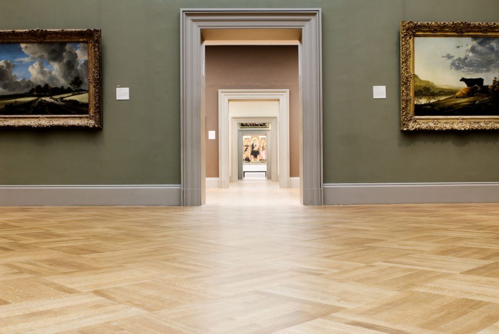
But seriously, what could be more timeless than the pale natural wood floors of the Metropolitan Museum? This is the look (below) that goes with EVERYTHING. FOREVER. They look bit golden in this lighting, but I think they are white oak. They might be red oak. Really, any pale, natural wood floor like maple, white or even red oak is a timeless choice.
You don’t have to get hung up on the undertones of natural wood (except to avoid trendy grey stains) because wood is BROWN or GOLD or even PINK BEIGE. And it doesn’t matter. A timeless wood floor is like a pair of jeans, it goes with everything.
The Metropolitan Museum NYC via Artsy
And if you like a richer look, neutral medium brown floors are versatile and timeless too. I refinished the floors in our new house to a medium brown and replaced the builder grey tile in the entry to herringbone stained to match.
Read more: What if I don’t like the grey flooring that’s everywhere?
2. Match the fireplace mantel to the style of your home
Stacked stone should only be installed if you are building a rustic home like a lake house or a ski cabin.
The main problem with stacked stone is that it bosses around your colour palette options. Because typically there is a range of neutrals in stone blends and it becomes difficult to introduce colours that don’t exist in the stone. Decorating with fresh colour becomes almost impossible if you have rustic stone fireplace.
I would also avoid trendy linear fireplace inserts for a transitional or traditional interior. A square insert is more traditional and timeless and will relate better to a timeless kitchen.
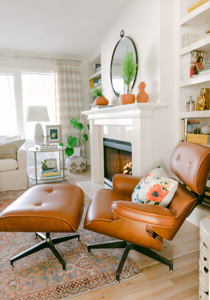
I was so lucky to inherit perfectly timeless white fireplaces in my last house (below). Despite everything else being clearly from the 80s and needing updating. It had two simple white mantels that I was able to style in endless different ways.
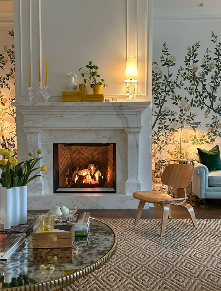
And our new house came with a pretty cast stone surround that I had faux painted to match the Calacatta Gold marble backsplash in my kitchen (below). It’s also a delight to style.
3. Choose white or cream for your hard finishes
I can’t say this often enough: Boring now equals timeless later.
Just like with fireplaces, rooms that require a lot of stuck down, permanently installed (at least until the next renovation) finishes like tile and countertops, (kitchens and bathrooms), need to be as fresh and simple as possible.
Kitchens and bathrooms are most versatile in a mostly solid white or cream palette. I already know what you are thinking… But Maria, isn’t that BORING??
Well, what’s more boring? A white bathroom that can be painted and decorated in essentially ANY colour? Or being stuck decorating with grey, well past its time in the trend spotlight, because you chose all grey for your tile?
And yes, that means subway tile. Or some other timeless and versatile white or cream tile that won’t boss you around well past the tile trend you installed it in.
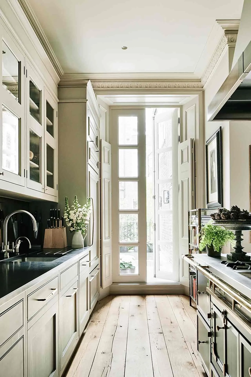
The most timeless look for a kitchen is one where you could not precisely say when it was installed. Like this cream galley kitchen with soapstone countertops and wood floors below.
Aside from light or white, black quartz, black granite or soapstone is also a timeless choice for countertops. It’s a great way to introduce a bit of black because black countertops are not overpowering the same way all black cabinets or floors can be. This look has been around for ages, it’s as classic as the LBD. It can even look historical as in the kitchen above.
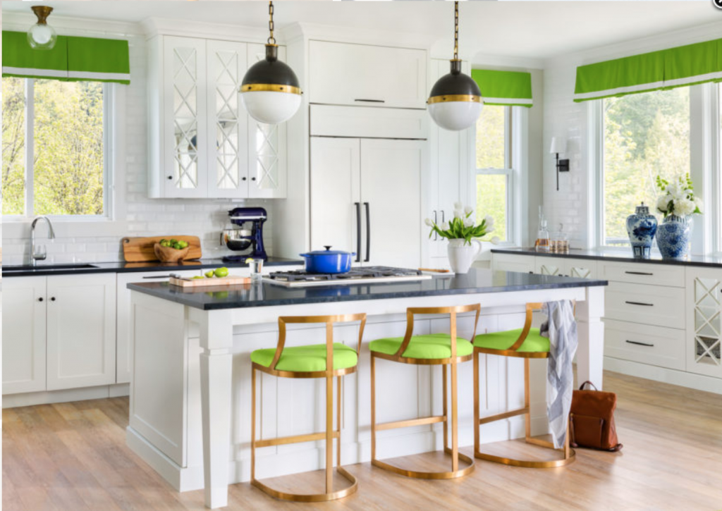
The honed black countertops, white cabinets, white tile backsplash, and pale natural floors I specified for this project below, will allow this client to change up her colour scheme endlessly if she wishes – and without an expensive and wasteful renovation. Changing colour is as easy as swapping out valances and bar stool upholstery.
Maria Killam – How to Detuscanize Your Home; Before and After
4. Choose your paint colours last
Paint and decorating is where you can indulge a bit more in a trend. That’s because they don’t required a renovation to change.
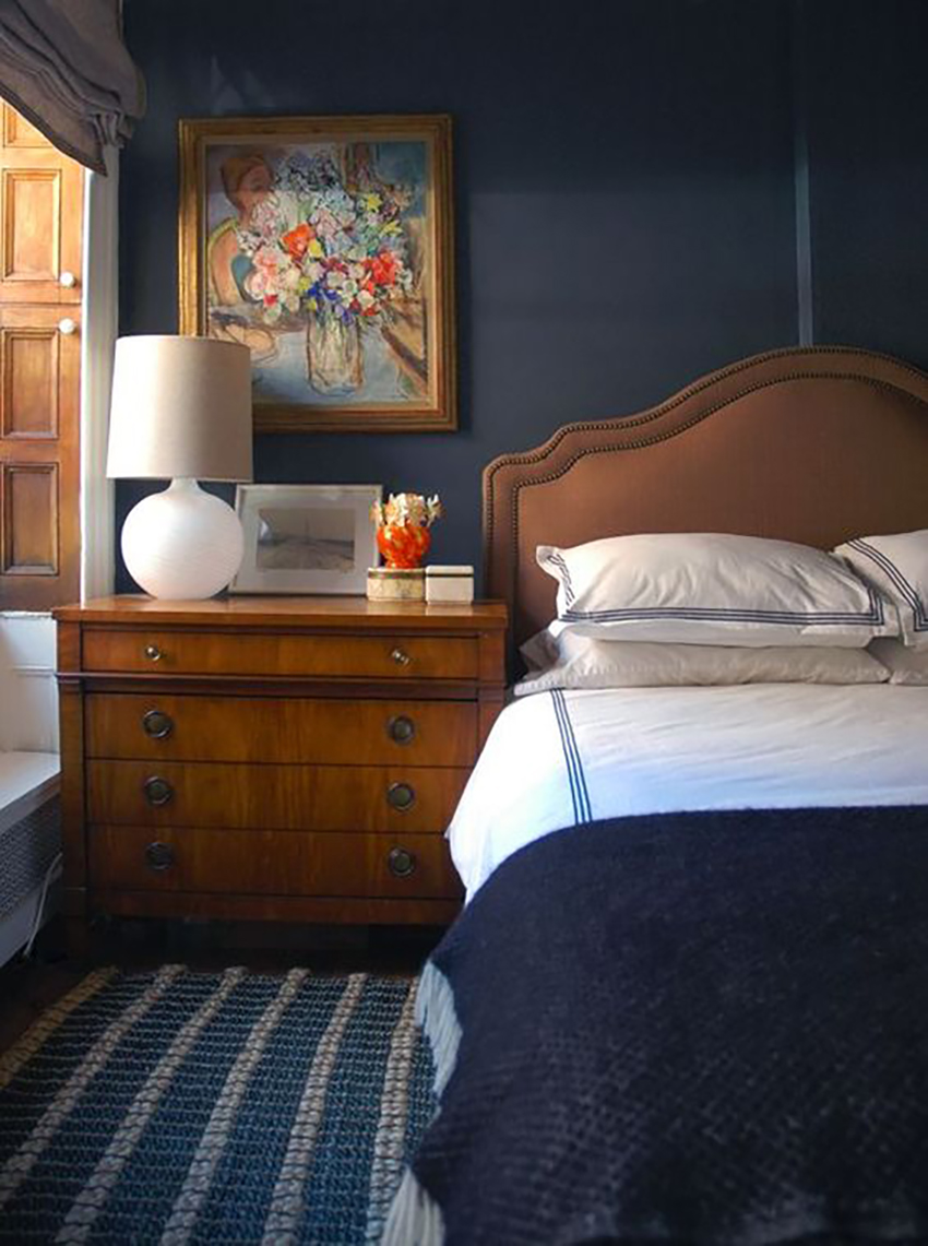
Want to paint a room a deep moody colour? Or fall in love with the Pantone Colour of the Year? Go for it … in paint, textiles and accessories. Elements that are easy to swap out when you tire of them or they simply get worn is where to give in to a trend or two.
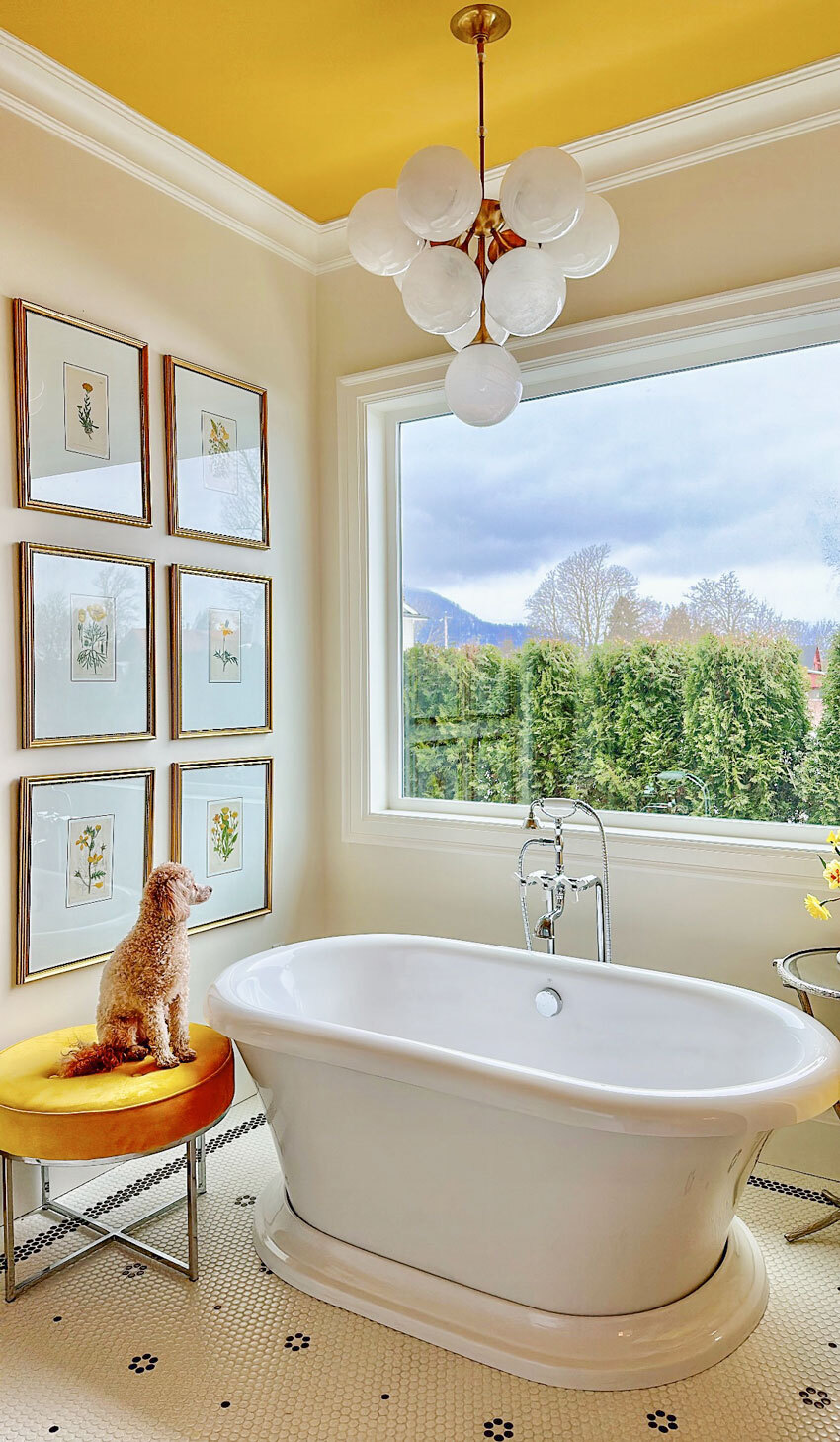
If you are someone who really isn’t interested in painting your walls on a whim, and you want to paint your walls a versatile colour that will stand the test of time, choose a pale, barely-there neutral like a greige or a complex cream. My new bathroom and primary bedroom are painted an orange beige complex cream. The ceilings, however are colourful!
5. Save money for styling your home
Don’t forget to add interest in your home with decor and colour!
The styling details are where all the charm and personality comes to life in your home. It really is the goal of my timeless design philosophy – giving you more options for adding colour in your decorating.
You can have fun with vibrant saturated colour, or moody muted tones. Just make sure they have similar intensity, that is don’t mix CLEAN and DIRTY colour, and have fun with it!
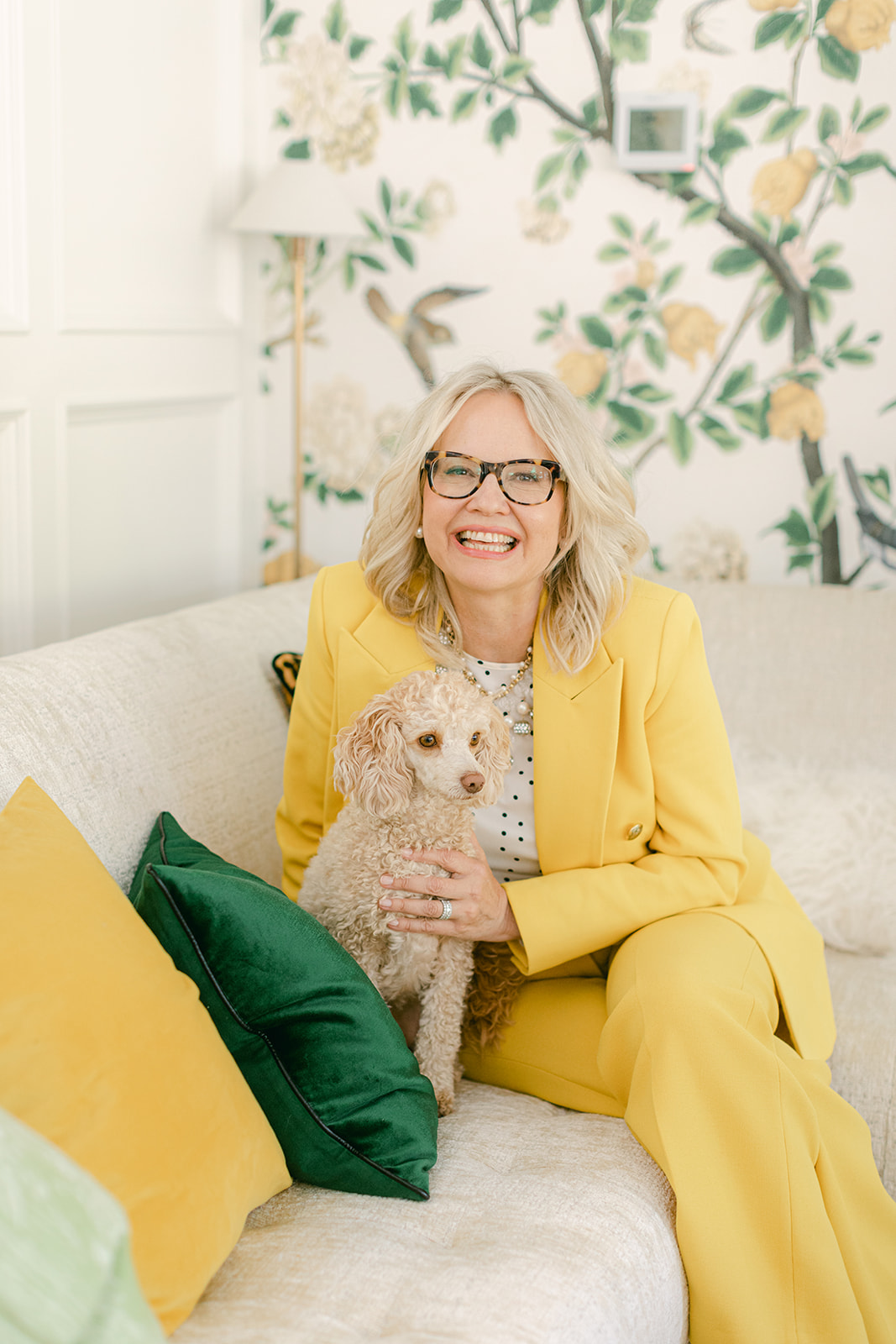
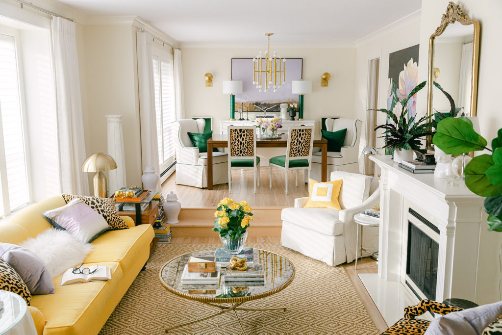
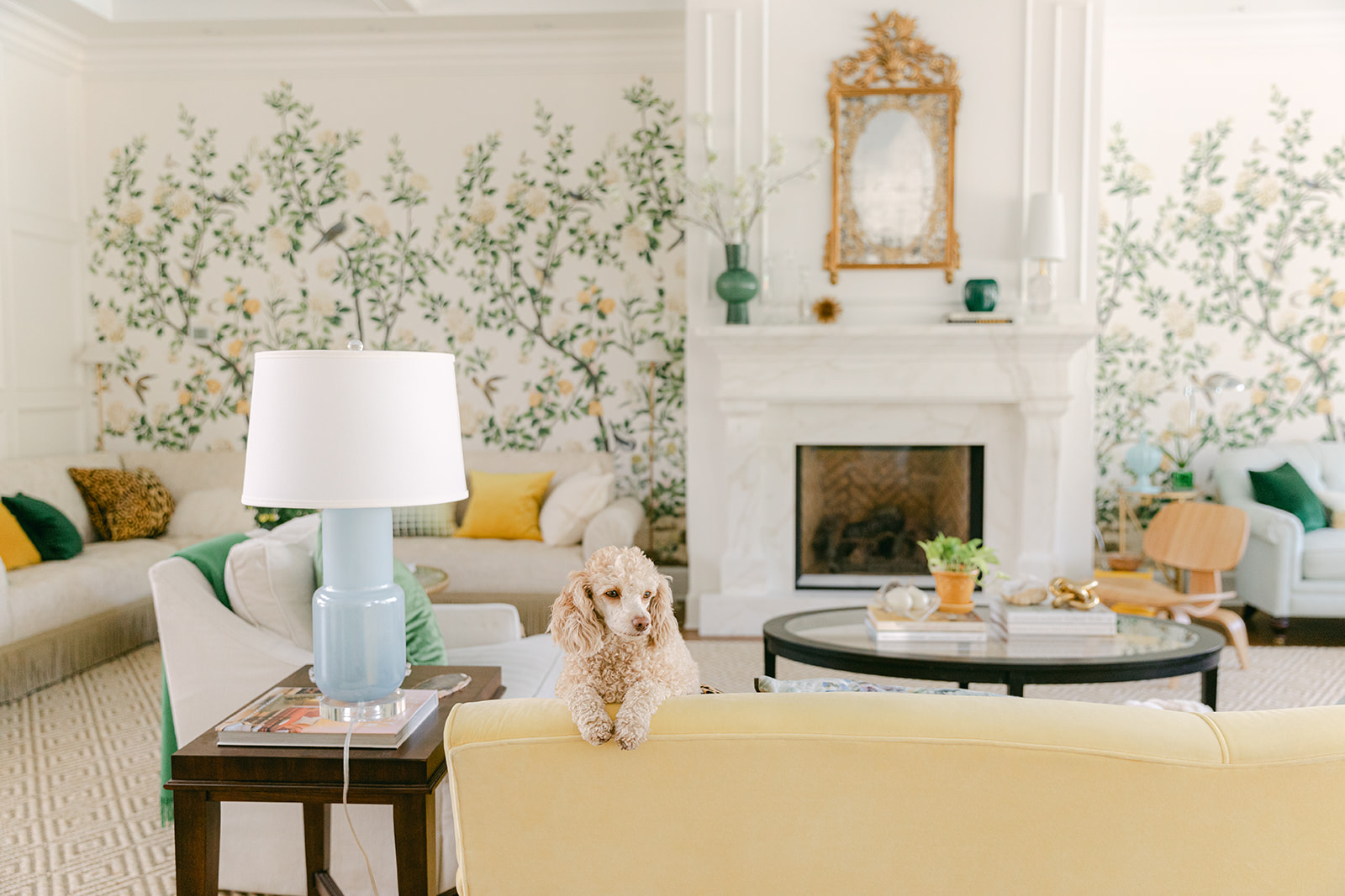
And speaking of decorating with colour, I still love my vibrant yellow sofa which has been in several different versions of our living room!
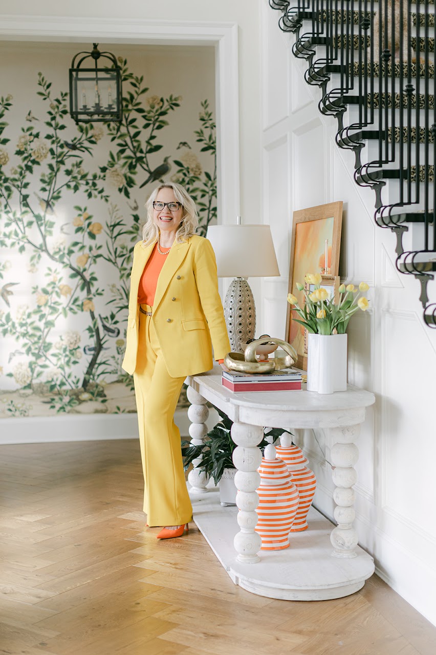
But, since I have timeless and versatile medium brown wood floors, a fresh kitchen, white bathrooms and a white fireplace , there is no TIMESTAMP. The sky is really the limit for decorating with colour!
Want your next renovation to be your last?
You can find my Complete Renovation eDesign consultation here. I also offer packages for Kitchen and Bathroom renovations and New Builds!
Here’s what clients are saying:
I love the clarity and the organization with which the information is presented. I feel confident that I can move forward now that you’ve helped me put my ideas into a useable format. I had read her blog posts and appreciated the fact that her advice was meant to help you decorate with your style, without getting stuck with something trendy that would feel worn out in a couple years. Now I feel that I can incorporate trendy items that I like within an overall timeless design scheme.~ Emma
I really appreciated Maria’s great advice! There are so many choices in a new build it can be overwhelming, and a mistake could cost thousands to fix. This is the second new build house Maria has helped me with, and both times it was a great experience! Thank you so much Maria and team!!~Carol
PS. I recently received an email from a reader asking if I could choose a colour that was NOT timeless? The answer is, the colour I choose for you, will be the colour that works best, period. And, obviously the colours you receive are also based on YOUR preferences, likes, dislikes, etc.
And, having said that, if you ask for a colour that I KNOW based on my 20 years and 20,000 consultations will not work at all, I will be the first to tell you.
Does a creating a versatile and timeless “envelope” to pour your personality and creativity into with decorating and styling resonate with you? Please tell me about your upcoming home project and how you will use the idea of “Boring now equals timeless later” below!
Related Posts
The Truth About the most Popular White Paint Colours
First Rule of Design: Boring Now Equals Timeless Later
Maria’s Timeless White Master Ensuite Reveal; Before & After

 Studio McGee


what is a good source for MURAL wallpaper suited for higher ceilings? Most I see are only suitable for standard 8′ ceilings.
Thank you.
Check out Laurel Bern’s blog. She has a wealth of info on murals.
Please consider the basic design elements of when designing a rustic ski cabin.
I meant consider doing a post for a timeless ski cabin! Sorry; I didn’t know to edit.
What an awesome post distilling down the elements that I’ve learned from five plus years of reading your blog, taking all your courses, and becoming a TCE! I can’t thank you enough for your guidance. You’ve helped me steer clear of big mistakes in two home renovations now and most importantly…helped me creates spaces that bring me so much JOY. As a home body, this means the world to me. Thank you, Maria!
Oh, how I wish everyone knew about you and the information you share! There would be so much less waste and so many more beautiful, timeless spaces! I’m so grateful for the knowledge and advice you impart. Keep preachin’ it, Maria 🙂
Check out Aqualille for hand painted wallpaper. Endless options because you can select one of their standard selections or you can change what ever you want.
I just love this distillation of your philosophy. We are redoing a bathroom right now and chose white and black hex tile and white subway tile like you suggested. I love it. I’m thinking of fuchsia paint for the walls and ceiling, and it feels very freeing to know the simple design of the hard finishes will support just about any wild flight of fancy on the walls.
Enjoyed this helpful summary. Thank you!
About number one, we are contemplating building a new home slab on grade. Although I love solid hardwood and have had it, I have been thinking about using flooring throughout that our 80 plus pound dog will not scratch when he has bursts of speed. Is there a timeless non wood tile or stone equivalent?
Brenda, I have the same question. Hardwood doesn’t hold up to large dogs, wet dogs, and the humidity and moisture of Florida. I’m considering marble look porcelain throughout the house.