If you’re asking yourself what’s wrong with your room, it may not be a clean or dirty issue. HINT: it’s all in the undertones. Once you learn my system for identifying the undertones of neutrals, you can apply it to all your decorating dilemmas.
To learn more about clean vs. dirty colours in a room, read 3 Surprising Reasons Your Colour Scheme Looks Dirty
This morning, I posted a story on my Instagram on my sisters piano/library room that I’m working on.
Elizabeth’s wing chairs had just arrived and I announced that the room was being painted pink. Then, one of my lovely followers commented that she couldn’t see pink working well with the carpet, which in her mind looked ‘dirty’.
I got to thinking that there is a lot of confusion about this concept of clean and dirty colours. And, also WHEN they apply to any given decorating situation as well as WHEN you should be concerned enough to DO SOMETHING about it.
I also think this confusion is due to the fact that there aren’t too many other colour designers who distinguish colour this way. In fact some designers out there, have great arguments as to why this is very wrong indeed.
However, this doesn’t bother me, what I teach is a system, not a theory.
If what I’m talking about doesn’t make sense and doesn’t resonate with your aesthetic, it’s easy to keep clicking.
And, the reason why my system works for so many people is because a system is the quickest and most efficient way for a newbie to get really good at something, really fast.
It took me 20 years to invent and perfect my system, so that it doesn’t have to take anyone else that long.
And my large following all over social media and the blog you’re currently reading, is proof that my system works and makes colour something you feel you can wrap your arms around and actually get right, for once.
Clean or Dirty?
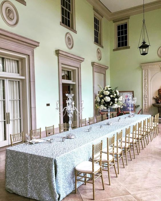
In this image below, you’ll notice that all the moulding and trim work has been painted pink beige, to coordinate with the floor tile. However, in doing that, the mint green walls make it all look dirty in comparison.
Is this bad? Can we all still love this Parisian inspired dining room? Of course we can. However, was there a BETTER trim colour that could have been here instead?
Well, YOU be the judge.
For those of you who are new to this idea, I’ve written a few posts about clean and dirty colours here, here and here.
Image source
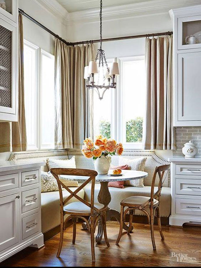
In this kitchen below, you’ll notice that the drapes are a stronger pink beige than the banquette which appears to be more of a natural linen colour.
In this case, would I call the drapes ‘dirty’ in comparison to the much whiter cabinets?
You could, and if the walls were the identical shade, then you might be bothered. However, in this instance, you might notice that the backsplash is more green gray, and that the drapes need to be changed.
And, it’s a well decorated room so we’re much more distracted by that, than the nuances of the colours.
Often, during my Specify Colour with Confidence events, students will approach me to ask about their homes, or their clients homes and they’ll say things like “I think this is clean and that is dirty”.
But that’s actually not the problem. And as soon as I tell them what it is, they get it.
It’s all in the undertones.
The beautiful thing about teaching the nuances of neutral undertones is that you can’t ‘unsee it’ once I tell you what you’re looking at. And that’s why it’s so teachable. Lucky for me!
Anyway, I would love to write a post with your burning questions about this.
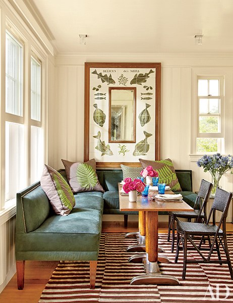
Another example is below. The pillows are a screaming pink beige again, which you could argue, do, in fact relate to the brown in the carpet. But, the green leaves on the pillows obviously pick up the green in the room making it look like it belongs.
And, of course, clean and dirty colours combined in fabric or area rugs are the quickest and easiest way to fix a clean and dirty issue that might be bothering you in any given room.
However, in this case, the clean and dirty combination of colour in these pillows were not necessary to ‘fix’ a colour issue. They would have been even better if they were white and green.
My opinion. Doesn’t mean it’s right. You be the judge.
So, if you have a space in your home that’s bothering you, or maybe you’ve seen one online, and you’re thinking “I think this is a clean and dirty issue, but I’m not sure” clean up your room, take a photo–without flash and in natural light–and send it over! Or tag me with your photos on Instagram
And I’ll write a post about it to help clear things up!
Also, don’t forget to give me your thoughts about the above photos in the comments!
Related posts:
The Difference between an experienced Colourist and a Novice











I love the last image. I just bought a sofa in a colour very similar to that banquette and am thinking of painting my walls cream and am happy to see it looks so pretty. It looks good with the touches of green, too. Pillows, shmillows. Maybe there is something purple across the room, anyway.
To be blunt-I hate everything about the first image color wise. Lifeless.The mint green ? against the drab pink beige and the blue flowery tablecloth and the yellowish spindly chairs against the pink floor all seem like they do one another no favors.
To my eye the proportions seem odd as well. I think the large scale (fabulous) millwork and large scale flooring makes the chairs visually rickety though they are li,rly very good antique chairs.
The other two images look fine ?
Right on target, as always. Taking your course seven years ago (can it really have been that long???) completely changed the way I look at color (and color combinations). Now, when something is ‘off’, I know why. And, I know how to fix it! :–)
AMEN !!!! YESSSSSS!!!!! Maria’s course is BY FAR the BEST DECISION I EVER MADE on the many, many seminars I have taken. (ughhhhhhhh). I cannot tell you how many times I think about the fact that before I enrolled in the course, I wondered if the cost was too high. !!!!!!! ??? I mean, THE FACEBOOK GROUP ALONE is worth the cost of the entire course, not to mention the knowledge gained, the people I learned from and the way I see color now. Basically, my design-life became divided into two parts : Before I became a True Colour Expert and After. My story – I call this “channeling my inner Maria” and it goes like this: I swoop in to see sweet client buried in 10,000 tiny paint chips, hair standing on end w/dark under-eye circles and has changed mind at least 20 times on the “right” color / how to get the room right. My inner Maria stands in midst of chaos and saunters over to large paint board, gently hands to exasperated client and say “here’s your color’. Oooooo it’s the BEST!!!!!!! heehee!!!!
I agree with you. And all of the rooms don’t bother me in the least. They do tie in and somewhat “fit”. I agree that the last picture’s pillows could have been green and white to make it perfectly perfect. However it still “works” well enough. You have taught me so much and—I’m still learning. I also hear your voice (and your words lol) in my head when I have a design dilemma. I sometimes tend to overthink it, but am getting a bit better there as time and experience mesh together. I see everything as a color now and following your advice and my own intuition, usually land me on point. Great article Maria.
I still react to rooms before I think about them, and my reaction to the first room was negative. The mint green makes an otherwise lovely room look terrible. The tablecloth looks blue, which works very well with the pink beige trim and chairs, and I can’t imagine the thinking that led someone to believe that mint green was the perfect wall color.
The kitchen is lovely, despite the lack of undertone perfection.
Some sunny morning I’ll take a pic of my living room, which mixes it up enough, I think, for you to find clean and dirty coexisting!
Not my favorite colors, but the first room reminds me of mint & mocha ice cream with all pastel colors. In that sense, it works better than the third room with its blue green and bright yellow green contrasted with the orangy wood and pink-beige pillows. Like all he leftover crayons no one else wanted. Pillow change, plus how about a black post on that table? All the white in the second seems to unify the look despite the undertones.
Hi Maria, I have a topic suggestion I don’t believe you’ve covered yet. I have your how to choose paint colors e book. I’m 63. Have a house that I’ve decorated room by room over the past 26 years, without thought to how trim and wall colors flow throughout the house. It’s not an open floor plan home, so furniture was selected by what I could afford and what I liked. So colors selection was specific to that room alone. I can’t change the furniture so how does one choose a trim color that works throughout when you’ve been decorating little bits a time. Currently I’m paralyzed decoratively speaking, with how to choose a trim color in family room, with bookcase. I unfortunately chose a sofa I loved without regard to the paint color I would be forced to choose that doesn’t work in my adjacent kitchen. I love BM White dove for the trim with SW Avenue Tan on walls with the sofa, but it’s too grey(a bit dirty) and wouldn’t work with kitchen clean white tiles, which of coarse I can’t change. I’m thinking of switching to BM Simply White as it’s a bit cleaner as a compromise.
???
Grazie mille,
Rosella
I hope Maria can offer some suggestions that will make you happy, but my guess is that your home is beautiful. Color is amazing, but it can’t make a home and it sounds like you’ve made a beautiful place to live.
My White is Complicated eBook covers whites, and you can download it here: https://mariakillam.com/product/white-is-complicated/
It’s almost 200 pages of instruction and photos, way better than what any blog post could cover! Maria
I love the first room. It gets away with all sins because it’s old and “lived in”. Second picture the undertones don’t bother me. May not be perfect but it was skillfully done. Last one is just ugh. Architectural Digest?? Not cohesive on any way. No thanks!
Bravo to Maria for another clear and easy to understand lesson undertones!
I love the first two images even though my eye did go straight to the “problems.” The design elements did not allow my eye to linger on the dirty/clean aspects and everything French is OK in my book. In the second image, it may be my computer monitor, but I see the back splash color as a nice grey and not at all green. I do see the pinky beige of the soft goods but it is not confusing nor displeasing to me. I just tell myself that color shows itself differently in diverse materials, soft fabric vs hard painted wood and tile. I think they were lucky to get as close as they did. Even though I am a green freak I do not care for the third image; I like the colors but in this case, for me, the design elements detract from the clever use of color. Besides the green and champagne colors the single design element I like is the over-sized print. Everything else can go to the curb. My take away here is that if your paint colors aren’t perfect but don’t scream at you, it is the design elements that can make the dissonance worse or can save the room from itself.
Vive la difference!
Karen
IN my system, there is no such thing as ‘grey’. Grey is ALWAYS either blue, violet or green. That’s why I called it a green grey. Maria
Hi Maria,
I’m loving all I’m learning from your blog posts and the ebooks I’ve purchased. I have a question for you regarding skylights and how they affect wall color. Not only the skylights themselves, but the fact that I have this sneaking suspicion that the new Velux skylights I have in my family room may have a UV protectant on them that gives the glass a greenish cast. I have BM revere pewter (50% dilution) on my walls in that room and I swear it’s the skylights that are making the revere pewter pull green in there (the same color is in my kitchen, where I see no evidence of the green tones). What do you think? Do new skylights have a greenish glass to protect fabric from fading? What do skylights do to wall color? How can I use that knowledge to help me make wall color decisions? Thank you for sharing so much of your knowledge with us readers!
It could be, but also Revere Pewter is a green grey so that’s why it looks green. And I would guess probably Revere Pewter is not the correct undertone for your family room which is why it looks greener. If you have a taupe sofa for example, Revere Pewter would not have been the correct choice. In your kitchen, RP reads more neutral because you are likely not comparing it to anything else and it’s the right colour in there. Hope that helps, Maria
I can’t stand the first room because of the clean mint walls- terrible choice. Room 2 works fine for me if a bit safe in the design choices, and room 3 I love! In the minority so far 🙂 it looks eclectic and welcoming to me. 3’s pink beige pillow background aren’t the best choice but the green leaf does make it work and the light value of the mid beige fits in well. White or cream would be too light for the space IMO but a pale yellow beige would have been ideal.
I’ve always been aware and sensitive to clean vs dirty ever since my mom introduced me to the Color Me Beautiful system in the 80’s (I must have been about 7). I don’t know what they call that system now but I still see people my age talk about being a deep winter or whatnot so I’m glad it’s still out there.
I’ve seen a lot of kitchens done with dirty colors and “ooohhh I love a beachy blue/green!” paint on the walls. Nope, doesn’t go together IMO. That Parisian photo would have been fine with a green, but not THAT green. Slightly “dirtier” would have been better. Once you see it, you cant unsee it.
I just specified colors for a house exterior on one where I’d done the interior, and the colors were tested, but when the painters–spraying, not rolling–got to work, they had the paint formula mixed at 1.5 times. Now the color looks wrong and they’re going to have to fix it.
So sometimes, it’s not the fault of the choice, but the application, whether photos, time of day, computer monitor, etc.
The top room should have been painted a dirty green like soft ferm in the BM series in order to keep that same cloor and trim. This i know as i just finished your buidling online course as planning a large reno soon. You did ask however for a better trim colour and that has me confused as dont see how anything would work with that clean colour wall and dirty floor and look good. CLARIFY PLEASE.
Hi Therese, well the usual, off-white trim would have been perfect with that wall colour, and it would still look clean compared the the floor but still much better overall! Good question! Maria
Argh! Just when I think I’m starting to ‘get it’, I’m all messed up again! Third room….I see two different, unrelated greens: artwork & pillows; upholstery. I think the background of the pillows isn’t right, but because I see nothing “clean” in this space, I wouldn’t have thought white would be a good choice. Maybe an off-white with the same color of the upholstery…but then the artwork would be off. I’m confused…again!
Hi Martha, in most cases, unless I say ‘true white’, or ‘off white’ or ‘cream’, just assume I mean any one of those when I say WHITE. It would be hard to read my blog if every time I said ‘White’ I had to write all 3 gradations of white at the same time.
Don’t overthink it is my advice, Maria
I love the images. I love that they challenge my conventional colour choices. I love that they are visually interesting with layers and narrative. I do not think I make all the correct choices, but I am definitely led by what speaks to me as a whole. I plan to enroll in your course to learn a system and in all likelihood, will still indulge myself with the occasional delightful rule breaking room.
Good designers break the rules all the time and do it well! Thanks for your comment! Maria
You ask could there be a better trim color in the top photo? – NO NO NO. That’s stone trim. That’s not pink beige painted millwork trim. See the grouted joints? Stone like this should never be painted. It’s a natural stone, perhaps the same stone as the floor, the carved wall medallions, crown moulding and wall frieze. It’s the walls that have to change if you want change. How could anyone paint a quarried and cut stone door surround? much less the other stone features in the room? And, fortunately, no one has ever painted it.
I have to laugh because you constantly make us think! Sometimes it is hard to use old brain cells like mine. If I had walked into the first room I probably would have just noticed the architecture. Maybe I would have thought something was off but not realizing fully what it was. Now with new eyes I pick up the clean/dirty aspect immediately. I don’t like the dirty casings with the cleaner looking floor. The wall color could have been a pink beige. The second picture does not bother me at all and the third picture the pink in the pillows doesn’t relate to anything!
You train us very well! LOL
I guess I am in the minority, but I think the first image works and it is by Michael Sikes, one of the big interior designers these days. To me, the color scheme looks early 60s–all frosty tones. I actually think the green brings a note of freshness to the scheme, and the very large volume, lots of light and achitectural detail make it work.
I actually have a somewhat similar scheme in my dining room, on a much less grand scale of course! I inherited an early 60’s scheme with platinium finished woodwork and pale mint paint and an adjoining pink tiled kitchen and I just went with it, with some darker green and wood accents and plants and pinky-beige wainscotting (!) and a heavy dose of European folk pottery. Somehow, it works. I also have lots of windows and a view of the backyard, and the combination makes it my favorite room of the house.
If you look at historic interiors, you see all kinds of color combinations, some of which may not be current taste, but have a way of working on their own terms. Like Maria says, a lot depends on the materials, the light and pattern/textiles to bring it together. And things look different in 3-D than in 2-D.
Sorry, Mark Sikes is the designer.
So to be clear, I am not saying any of these rooms are wrong. It’s pretty hard to take any Parisian inspired room and find fault with it truly. However take that same pink beige and the same mint green install it in countertop and floors in a bathroom with those mint green walls and no one would say that the same colour combination was beautiful.
Clean and dirty and distinguishing the difference is a huge distinction students learn in my courses where there are many more scenarios and images that we go through in 3 days.
I’m simply teaching something here, and the ONLY way to do that is to show a photo. Thanks for your comment, Maria
The bright yellow villa stands out too bright
Maria,
Another excellent blog post! I love them all….I think the top photo works because the patio has so much light.
The color combo in the first photo makes me want to ..(how to say this politely)– hurl! It appears that the trim work is stone- or at least trying to imitate it, and doing a good job of it. It would be much better to change the wall color, so the diners don’t loose their appetites. imho.
I don’t like the taupe drapes next to the white cabinets in the second photo, though everything else is so gorgeous, I could live with it!
On my monitor, the pillows in the third photo appear like a muted purple, not beige at all. Perhaps a useful future post topic for you, Maria, would be some tips on how to calibrate our monitors (beyond the regular adjustment in Windows’ settings), if you know of any that don’t require lots of time and expensive equipment! I love that teal banquette, however! (Or is it green?)
TOP photo: At first glance, I thought the large border around the windows needs to be a proper white. But then I noticed the large borders are a concrete or cement or some kind of stone. Oy… So that makes me wonder if the green on the walls needs to change? I wouldn’t know where to begin on that one.
Middle Photo: obviously I need training because i just can’t see it. I know it’s a jumble of colors, but where to begin? Since curtains are easier to change than a banquet, i guess I’d go with curtains and pillows. Someone likes orange, so I’d keep the tags on new pillows with a touch of peachy/orange and try a peachy/orange curtain…lol. Probably entirely “out there” but an easy try.
End photo: The easiest thing for me would be to pick up the colors in the artwork and let the pillows mirror that white and green and maybe even the color of the frame.
I really love all of the rooms today because they evoke a mood. I want to eat a huge bowl of Pistachio ice cream in the first photo, a bowl of Vanilla Caramel in the second, and finish it all off with a scoop of Mint Chocolate Chip in the third. There’s something about these sherbet-type colors that are just delicious to me.
My home is decorated in the near exact opposite… a very masculine, almost Asian influence, with lots of oil rubbed bronze fixtures in and out, huge, dark ceiling fans with white marble glass hades, deep rust leather sofa, burlap colored walls, white marbled glass torchieres, concrete gray floor tiles with a white wash, dark blinds, bright white ceilings and trim with an ebony and stainless steel (in progress) kitchen. It doesn’t sound like it should work, but it does, at least for my husband and I. Plus, people say they really like our house! Well, maybe we just have friends who have the same taste as us. Kind of like these wonderful spaces Maria has posted today. Not exactly how I would decorate my home, (I would never stop eating ice cream, lol), but I can certainly appreciate and admire the intent/purpose/goal/target/objective these designers were going for!
Thanks for another great post, Maria!
That first room is architecturally beautiful, but I think a different trim color, or different wall color with the current trim would do it more justice. I wonder if the trim in the first pic is stone?
I really like the second picture. I don’t get the “something isn’t quiiiiiite right” feeling even though when you point it out the undertones are different.
In the third pic, and this might seem nitpicky, I don’t like the bright pink flowers and clean blue vases in that space. That’s an easy fix! To my eye the pillows could be better. The green looks almost fluorescent compared to the green in the print. The purple-y gray background of the pillows, I think, would look better cream. Also, I’m not entirely sure about the black chairs on the right, but I’m no designer, and it could be my phone screen distorting the color.
Thanks again, Maria!
There isn’t anything wrong with the second image but I often get questions related to this kind of image which is why I posted it. Thanks for your comment! Maria
Muddy and clear colours live together in the world and nature every day. Think of shadows. It is the muddy colours that draw focus to the clear colours and make them pop. The Amish often artistically use this combination of muddy/clear colours in their quilts.
Hi Bonnie, They certainly do and this post is NOT saying they don’t live together, but simply if you have a room that’s bothering you, this is one place to look at what might be wrong. Clean and dirty colour combinations are wrong more often than NOT. Thanks for your comment! Maria
I will say, Maria, that when I saw ur Sis’s library I also had the thought ‘why did Maria choose that rug with such clean-coloured chairs?’ But ultimately I know that u have a good eye & will pull it all together so it looks great, and that u have reasons 4 the choices u make.
I bought a quick dinner at a fast food chain last nite [not something I do often, truth! 😉 ] & the very ‘clean’ red-undertoned wood-looking porcelain tiles on the facing side of the register console were a horrible match with the muted (dirty) dark mushroom floor tiles.
I find it interesting that the ‘clean / dirty’ thing seems to also be a factor in wood stain? When it comes to wood stain colours, do u feel a certain ‘undertone’ is needed for it to be the most neutral (like a pr of jeans, as u’ve written b4)?
Thx 4 all ur fab colour lessons! ?
The pillows in the last are a good choice. It provides a circle for the eye fron the carpet to the chairs to the picture frame to the pillows. The table becomes the center of the circle. This creates a nice balance & harmony to the design. Cream background pillows would cause the walls to step forward which I think might detract from the rug & table.
The first picture just seem very French. The moldings appear to be stone so if you buy the house you buy the stone color. The green does work. The richness of the linens set pull the entire room together. The floor in the first room is amazing.
The middle room is a yawn. It seems like this deign is everywhere kind of like shiplap. I would have loved to see a gorgeous print on the windows and a couple throw pillows/seat cushions. A breakfast table should make you smile as you grab a cup of coffee and thumb through the paper before the day starts.
The last photo with the fishy framed picture is the one that bothers me. I wouldn’t know where to begin to untangle my visual confusion. I keep searching for something in the picture that feels right or makes sense to me, but, I can’t.
Well, I consider myself color sensitive, (although I defer to my sister for that same ability in spades!), but I like the top picture. It would not have struck my eye that there is anything “wrong” with it. If anything, I might have thought “only in another country would they pick that color. . .” but I don’t really, I still think it’s nice. When you use it as an example, however, I can see that the minty yellow is off somehow. I guess I should keep paying attention because I don’t see it yet.
It’s actually the Cheekwood which was built in Nashville!
There are elements in all three rooms that I have to question. In the first photo as the architectural detail is impressive, the flooring appears to be stone (both fixed elements) and as the garish green wall colour is most likely historical; I would have to nix the table cloth … ☺. Whereas in the 2nd photo I agree with you Maria however feel what has occurred is that the (linen ?) curtains were trying to be tied-in with the natural wood tones in the chairs, table pedestal and flooring more so than the banquette or green under-toned back splash therefore out they would go. In other words, with the multitude choice in fabrics I feel they could be improved. Last but not least; keeping in mind that computer monitors can read differently; IMHO if the toss cushions aren’t outrageously priced I would not have even have chosen them for this particular space not only because of their colour but also for their theme and sizing. Also dare I even admit that I would also consider painting out the table’s four pedestals (wood portion only) in a soft black. -Brenda-
P.S.: Are you sorry you asked? (SMILES)
Yes, the first pic is the originally open air but now enclosed loggia at Cheekwood, and it is all stone and stucco. So all the “painted” trim and molding and the floor “tile” is the original limestone. Not sure if that is the original stucco color.
The green room w/pink-beige tile is an eyesore! If all we can do is change is the trim I’d go with a brown to mellow the floor and pop the green. Maybe SW Warm Stone. Or the simple choice of SW Creamy to match the sliders. White’s nice but you’ll still be stuck with that floor shouting for a glaze or refinish to calm it down.
I think the banquette is shouting for color. A colorful floral would be great, so many choices. A rich green like SW Jadite or any medium blue would probably work.
For the green couch, it does depend on what’s nearby. Maybe green and white is the only option. Otherwise, I’d like to use the table colors, such as SW Forward Fuscia, SW Sunset or easy to match SW Friendly Yellow. Yellow kind of plays on the table legs.
Hello Maria,
I have a house with a red roof which I love. In a near future we would need to have the shingles replaced but I am finding out that the red shingles that we currently have on the house have been discontinued and a blotchy red replacing it. I know for sure that I won’t be choosing the new red. It leaves me with a dillema:will my new roof colour make my house exterior look dirty as we have white windows and trim, beige pink stucco and a bit of orange brick? Husband would like to go with the Euroshield in Beaumont shake style(very uniform colour,not blotchy) but it only come in three colours:black ,brown and grey. I am afraid that either of these colours might be wrong and create clean dirty combination. My gut tells me go with black as my windows are white and won’t be changed anytime soon but the orange brick and stucco limits and complicates my choice but can be repainted. Oh I wish the old red was still available so I would not have to make a drastic change to my house. Maria if you would like to use my house as an example for your dirty/clean post please feel free. I can to send you some pictures of my house.
Regards,
Viola
Your notions of “clean” and “dirty” changed everything for me – it was the missing element in decorating, to my eye. As well as the most important. For me it doesn’t matter that the first image is French – the mint walls mixed with the “dirty” trim turns my stomach. I found your blog 8 years ago when we were renovating our beach house in Southern California and you saved us a boatload (pardon) of money when selecting chantilly lace paint and other basic items so that it all blended seamlessly. Thank you for that.
Currently I struggle with mixing in “less clean” fabric elements for some variation. You are so right that once you “see” colors this way you can never “unsee” it.