


There is so much to consider in finding the perfect colour palette for your exterior.
Once you work through the fixed elements that need specific colours to coordinate, and what works in the context of the style of architecture and the neighbourhood, you’re often left with very little, if any, room for personal preference.
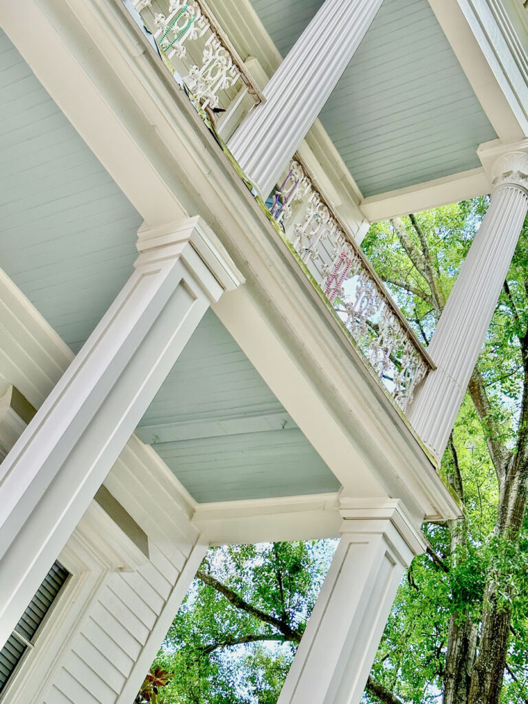
Haint blue ceiling in New Orleans
Also this is a reminder that since eDesign packages are not totally ‘done for you’, I’m not there to take photos and style up the space–so it’s hard to get good after photos–however, I we recently received two before and afters that I’m so happy to share with you!
Adding timeless colour to an all-white exterior
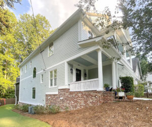
First up this sweet house that’s looking a bit tired in all white. As I’ve said many times recently, while white exteriors are technically timeless, in the context of the current black and white modern farmhouse trend, they are looking a bit… well, boring.
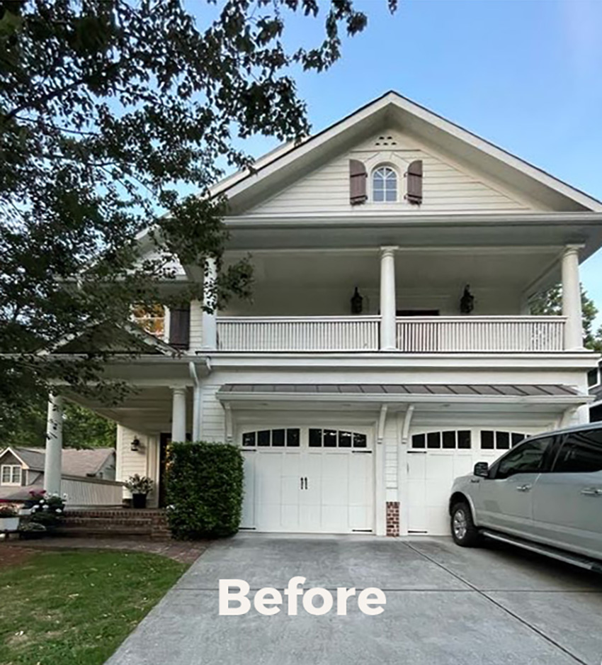
I absolutely love choosing colour for a house like this one. It has virtually no bossy fixed elements (the brick steps are completely versatile) and it has the potential to look absolutely stunning in a pretty colour.
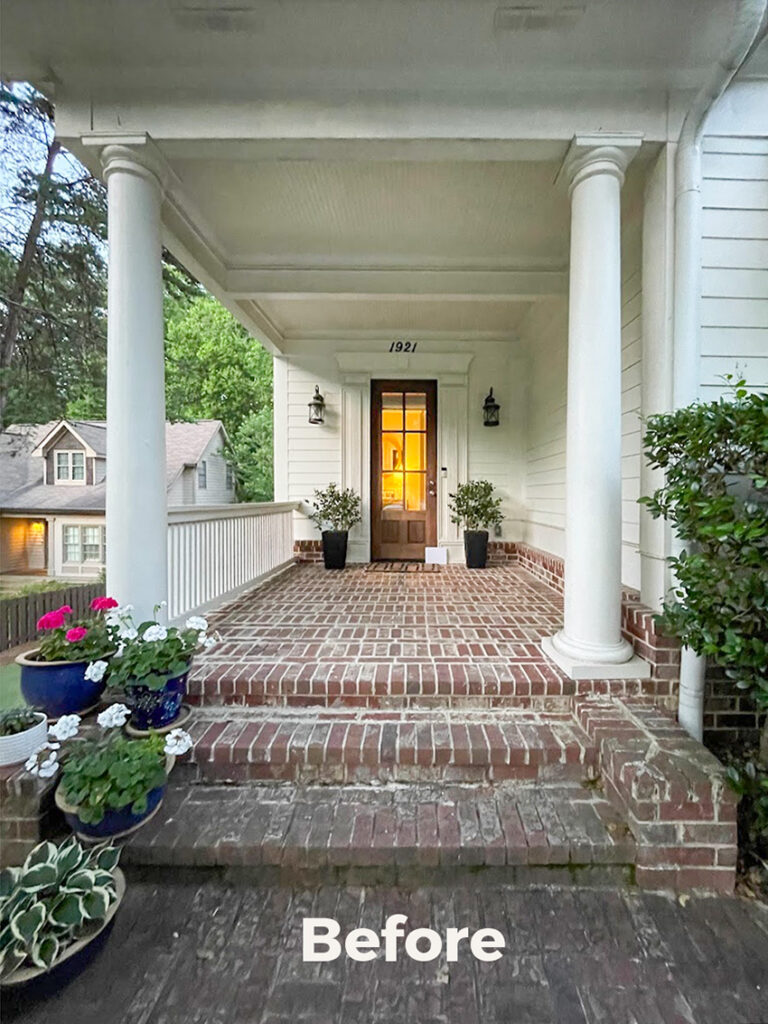
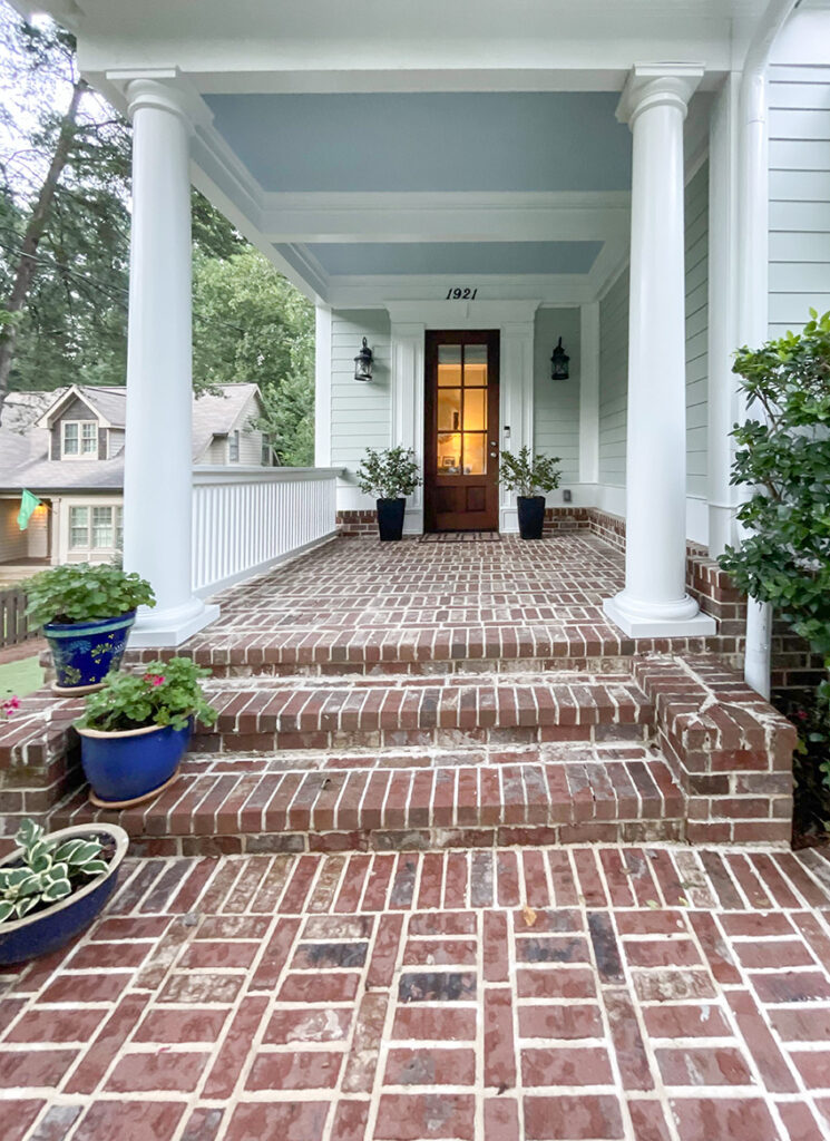
Here’s the charming front entrance below. When I look at this, I straight up see potential surfaces for gorgeous colour.
We gave her a range colour colour choices, and she chose a soft and muted blue green that looks so much fresher and shows off the trim and details much better than white.
The house looks so fresh now!
And she went with our suggestion to paint her porch and balcony ceilings a beautiful haint blue. Because why not??
She loves it so much, she’s working with us on her interior now too.
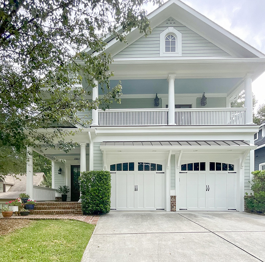
All this house needs now is a great foundation planting, and it looks like the garden beds are ready to go.
Even the brick pavers look refreshed and her choice to leave the rich wood door unpainted to relate to them is perfect.
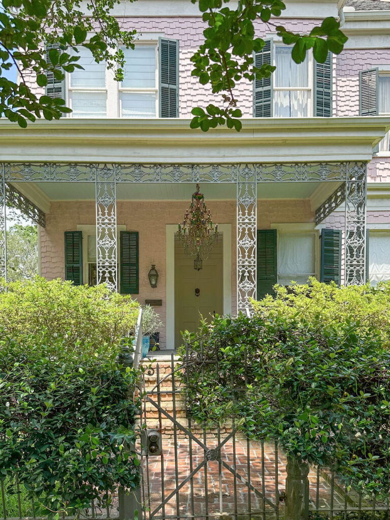
Here’s another house I snapped while in New Orleans this past Summer with a Haint Blue ceiling.
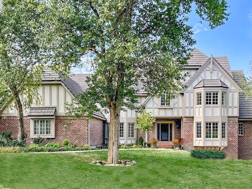
A timeless colour palette for this tudor home
And sometimes, a bit LESS of your favourite colour is what is needed. This client inherited this somewhat eccentric blue trim on her Tudor exterior and wasn’t in love with it. While it’s definitely not the worst I’ve seen, the Tudor style looks so classic in a pared back neutral palette.
She wanted to update her exterior, but NOT to go with something that looked black and white like many houses in her neighborhood.
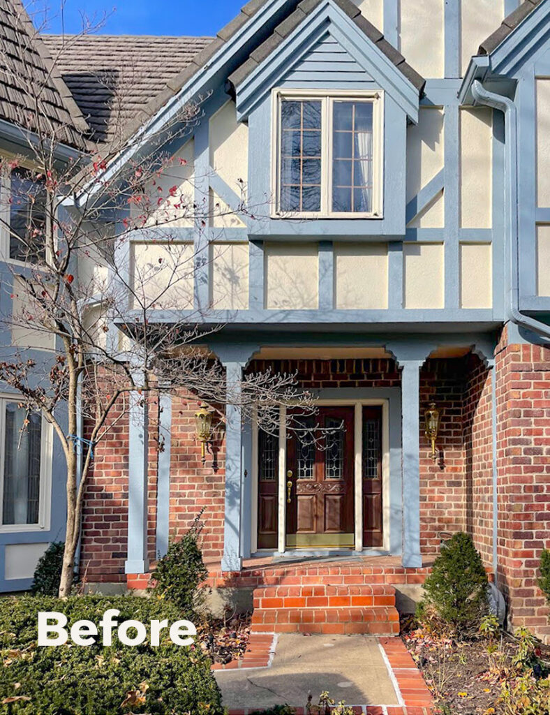
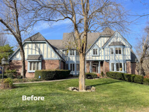
While it’s common to see high contrast chocolate brown (and now in the black trend black or charcoal) timbers on a Tudor, one of my favourite ways of updating this style is to soften the contrast between the stucco and the timbers while making sure the colours are still rich enough to relate to the brick.
My eDesign client’s response:
You all nailed it. I nearly cried when the trim was painted, it’s so beautiful.
Here’s the lovely after below.
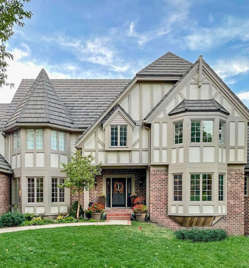
Now we’re back to timeless yet still sophisticated and fresh!
Get customized colours for your exterior!
If you’d like help with your exterior colours, see our eDesign packages here.
And, if you’d like a breakdown of the colours that we specified on these projects, you’ll find them on the Exterior Materclass facebook page that you will have access to when you purchase the course here. It’s a game changer for learning all about how to specify and choose exterior colours for you or your clients home.
Related posts:
The Black and White Exterior Colour Mistake EVERYONE is Making
Update the Brick Columns on your Exterior; Before & After
Historic Log Cabin Renovation: eDesign, Before & After

Fantastic! So pretty. Maria Killam and her team always showcasing the best of a home, inside and outside.
Both houses look happier and fresher!!!
The Tudor looks like it breathed a sigh of relief. 😉
Love the blue-green color on the first home! All the details look so fresh, especially the top window without the shutters. The front entry is gorgeous.
Love this. I just did the haint blue type idea on the front step of my bungalow. Used Sea Salt which doesn’t necessarily pop like your pics but gives a subtle change to the doorway. Think it’ll show better when my new light eventually gets put up.
Love, love, love! Especially the first one with the gorgeous blue/green and haint blue ceilings-it’s absolutely charming! And the second one is so soft but still shows off the Tudor styling. How do you do it, Maria? I will absolutely hire you if I ever make changes to my house, or move! Haha!
Maria,
Both houses are beautiful! Please thank your clients for sharing. So good! 😍😍
Gosh, I love to see it when you do your magic, Maria! So grateful to the homeowners for sharing these transformations with us. They both have lovely homes which have been made even more beautiful!
great. its beautifull design. love it
What is that lovely blue green color? It’s so soft and pretty!
The all white house was beautiful but now…WOW! Love the colour choices and makes the house just sing with joy. I actually had to go back to look at the original before photo…I could not believe only the colour was changed. I would have bet other features were changed as it just looks fantastic!
Both houses are so beautiful now! I’ve always disliked Tudor, but as I was reading, I thought what if there was LESS contrast? Scrolled down, and bingo! Perfect! I could live with that!