


Thank you so much to The Washington Post for featuring my bathroom on their Timeless Paint Colours article, October 13, 2020 here.
Everyone wants a fresher paint colour, but white isn’t always the answer. When you understand the world of complex creams, you’ll find they are a more versatile and softer alternative to white when you want to lighten things up. Let me explain.
**BUY THE BOOK: White is Complicated (It also includes a bonus book of my most popular go-to whites, categorized by undertone.)
Three years ago I renovated my master ensuite, and revealed it here. And this summer, I’ve made a slight update. Can you spot what it is? Take a look below.
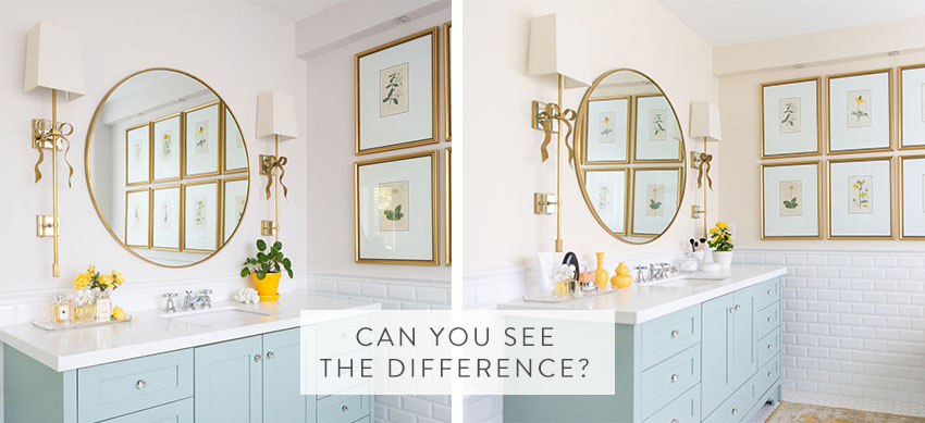
Here’s the after:
Keeping up with colour trends
What’s fascinating about the world of colour, is that when you literally do volumes of colour consultations (like my team and I do in our eDesign department) you can instantly speak to where colour trends are right now and the direction that they are moving.
Years ago I was a member of a colour association and whenever I was in a group setting talking about where colour was going, I was usually the most vocal (are you surprised – ha, ha). And that was because I conducted so many consultations, I could confidently speak to where colour was trending.
And as you all know, I love to share my insights. Writing a colour and design blog for the last 12 years obviously helps.
The Black and White Trend
It’s been approximately four years since I started talking about the black and white trend. I announced it first when I went to Maison & Objet in September of 2016 here.
Back then, black was strictly a fringe conversation, only for those in the know.
Now, I’m constantly trying to rein my clients’ enthusiasm for black into balance.
The demand for white is the biggest colour trend we’ve seen
And white walls and their refreshing simplicity were gaining a following that eventually exploded into the most all encompassing colour trend we have ever seen.
Remember this post about white I wrote in July 2018? I wrote about the America’s white obsession because it the trend was at its height, and was a constant request from clients in my eDesign department.
When white officially became the new grey, I understood why. It was just too soon to go back to beige (we’d been doing beige for 30 years leading up to the Tuscan trend) and white seemed the newest and freshest choice.
It’s why the most popular colour choice for new builds right now is white, white and more white. Inside and out.
In fact, in our eDesign department, when we receive the elevations and specifications for a new build exterior, it’s not uncommon for us to get this request :
“Maria, our neighbours on both sides have white houses but we want white too. How can we make it look different?”
This is often where random installations of stacked stone come in (much to my chagrin). And, I talk about this at length in my Exterior Masterclass here.
In my 20 years of being in the colour/design industry, I have never seen a trend take over quite like this one. Usually, I look at the neighbours homes and it’s easy to come up with a colour for your exterior that you like in addition to complementing your neighbour’s home.
But, when everyone just wants the same colour, now what?
Right about now, is when I need to insert my usual qualifier. I know when I say EVERYONE, it sounds like this applies to YOU as well and you might be thinking, “Not me. I don’t want my house to be white?” Please know that when I say EVERYONE, I’m referring to a majority. The white trend has won an overwhelming majority for sure.
Distinguishing the palest almost white neutrals by undertone
Anyway, I digress. In the last four years since white has come onto the scene, we’ve been splitting hairs even further with the palest of neutrals. Because, most often, it’s a very pale neutral that will give you the ideal white walls or white exterior look.
I’ve already been specifying GREIGE for most of the grey trend. In my system, a greige is not a warm grey like Revere Pewter, it’s the palest of the pale warm greys. When I say ‘greige’, I’m basically referring to warm greyed whites. They are the palest colours in the green grey, violet grey and taupe categories.
But these greyed whites, while impressively versatile, and softer than starker whites, look too cool in many contexts.
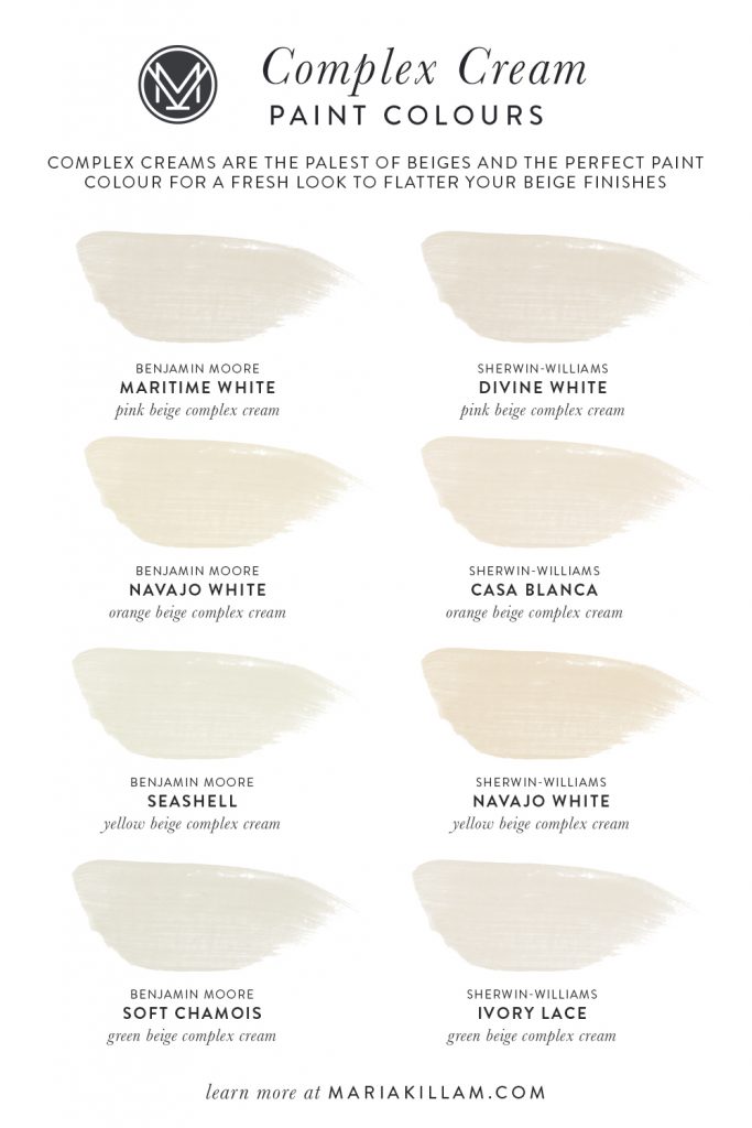
What is a Complex Cream?
Cream is the answer when you want or need a warmer look, but you still want light and bright. Like when you want to create a fresher look in a room that has earthy beige, brown and gold finishes. Or your “white” furnishings are really cream (this is almost the rule, not the exception).
But just as greyed whites (greiges) are more versatile for walls than starker whites, creams that have some complexity of pigment (complex creams) are softer and more flexible than cleaner creams that read mostly pale yellow.
And how do you get a cream that looks richer and more complex (meaning there’s more varied pigment in the colour)? Well you choose the very palest of beiges to get there.
Back to my classic and timeless master ensuite update
This brings me back to my bathroom renovation which I completed three years ago.
Back then, when I pulled out the botanicals I wanted to use in the ensuite bathroom to help me choose the paint colour, I could instantly see that the background of each botanical was an orange beige.
So, I pulled out an orange beige that has been a part of my collection of large samples for 20 years. It’s a colour I specified in the 90s when I first started colour consulting. And, it’s a colour I have NOT specified for 15 years. You can tell it’s an old board (below), it’s hand painted by me, that’s what I did before I started selling them here.
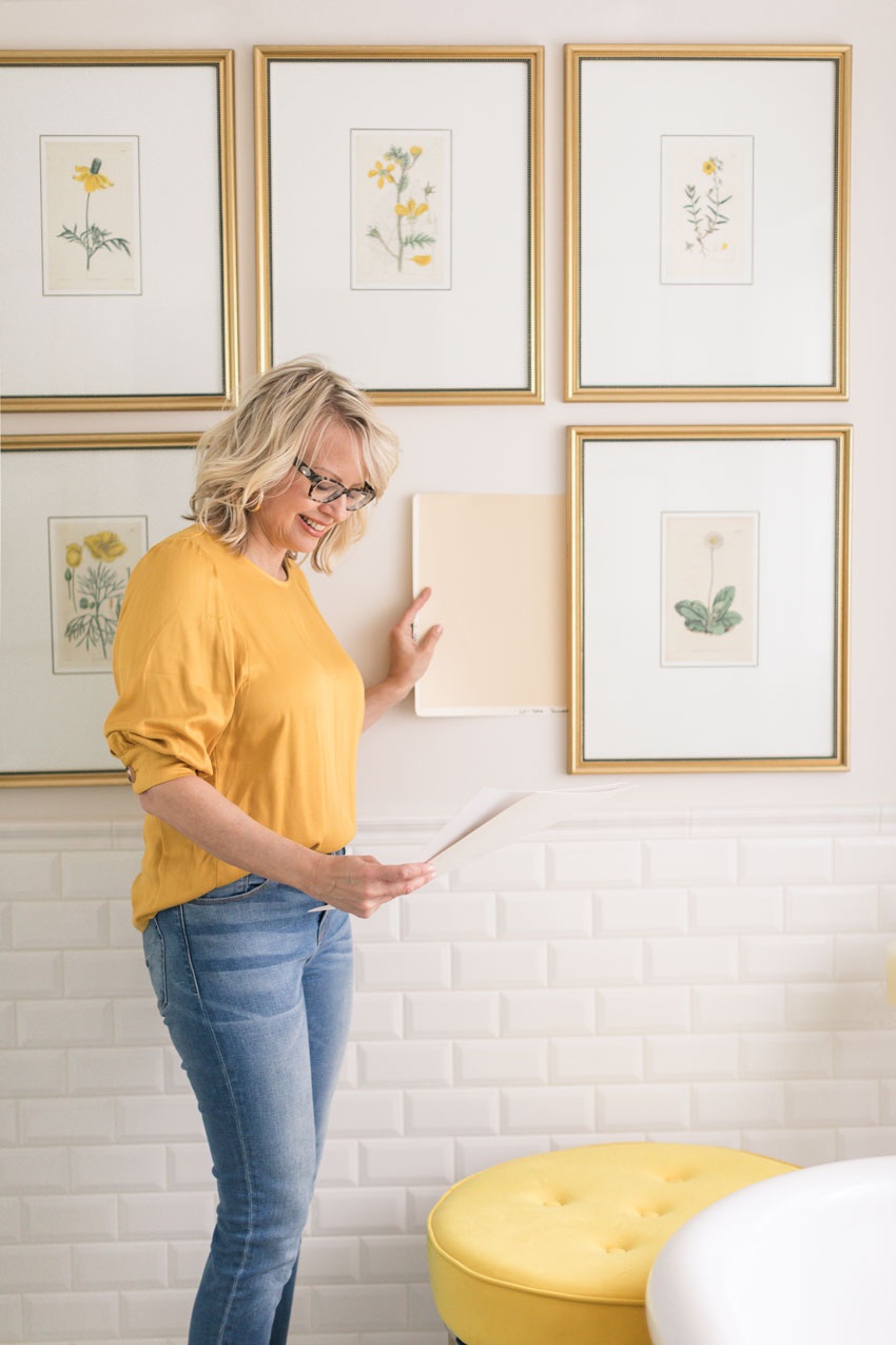
The colour, Benjamin Moore Sundial CC-400 (a light orange beige) matched my botanicals
So I wrinkled my nose and thought, “Ugh I can’t paint my bathroom a 90s orange beige!?!”
For this bathroom, I didn’t want any shade of grey. Turquoise was out because it was already my cabinet colour (BM Wythe Blue HC-143), so after going through all the other possible options, I choose SW 7028 Incredible White because it was a barely-there greige. And it ended up being quite pretty in this room (oh, and it was also repeated in my small area rug).
My readers barely noticed what colour the bathroom walls were. The decorating was the feature in this space. It had a look and a feel.
Here is what it looked like before:
By the way, early on in my identification of greiges, I didn’t distinguish their specific undertones. They are so pale and versatile that it was not critical. It was enough to know that they were shaded whites.
Now that we are splitting hairs on whites and the palest of the pale colours, I have identified SW 7028 Incredible White, the original paint colour of my bathroom (above), to be violet grey greige.
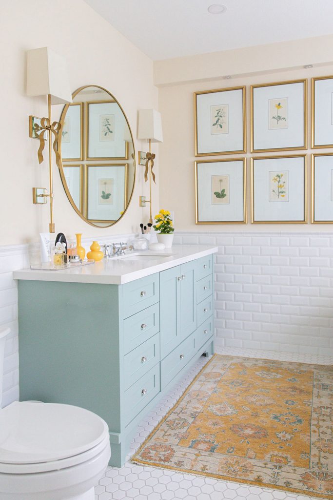
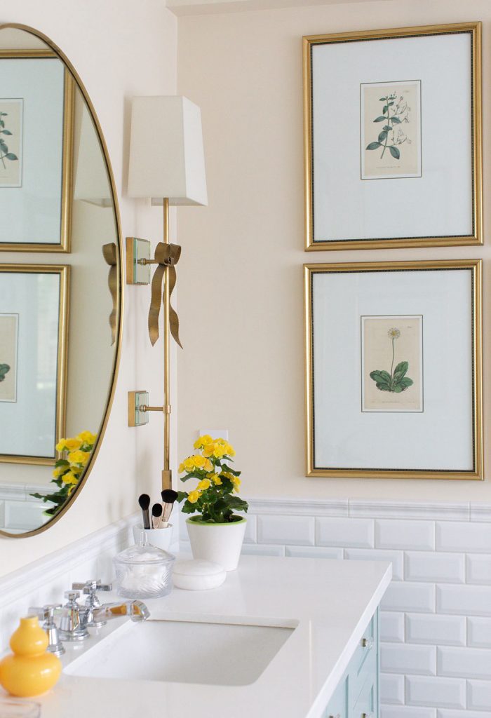
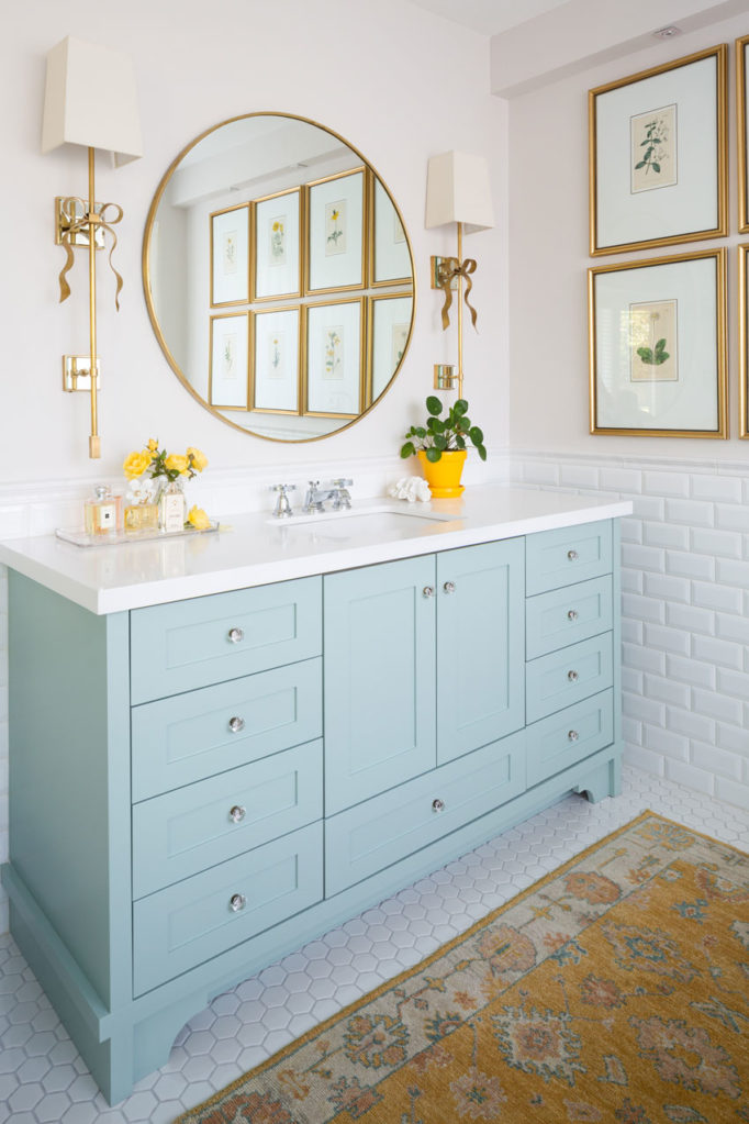
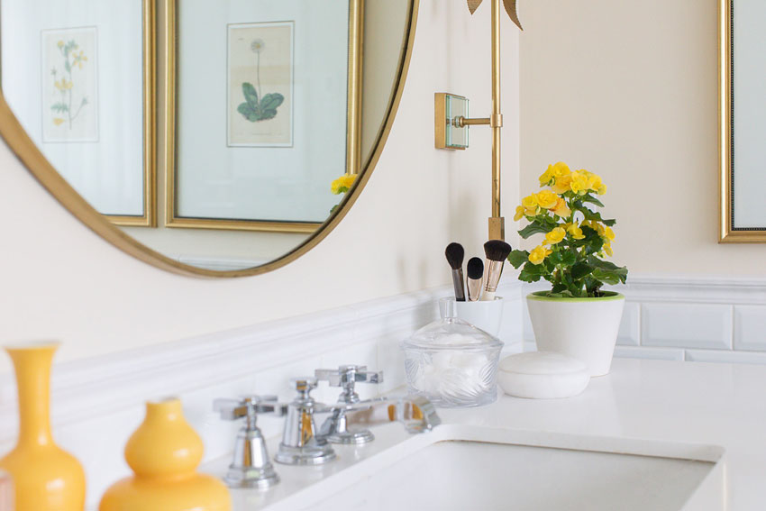
My new bathroom walls in Benjamin Moore Indian White OC 88 (orange beige complex cream), Vanity in BM Wythe Blue HC-143
Fast forward to today. Since we’re now specifying the palest of beiges and beige has five undertones (see the wheel below) I now have four complex creams in my system (because pale gold beige is really just yellow beige).
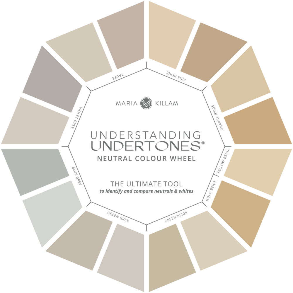
You’ll find the palest beiges basically read cream with whichever undertone that works with your finishes or furnishings. Kind of magic right? When everyone is trying to sidle up as close to white as they can, knowing the perfect cream that will give you the same look while still flattering your finishes is a WIN!
I love the new warm, creamy walls in my ensuite. And of course, I’m delighted that the walls now have the same undertone as the ground of my vintage botanicals.
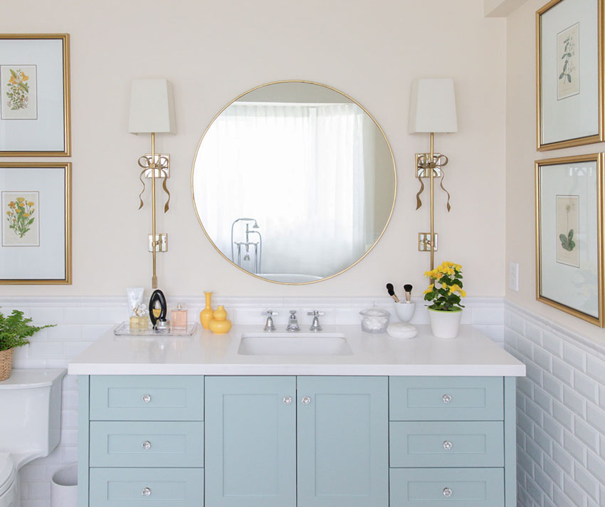
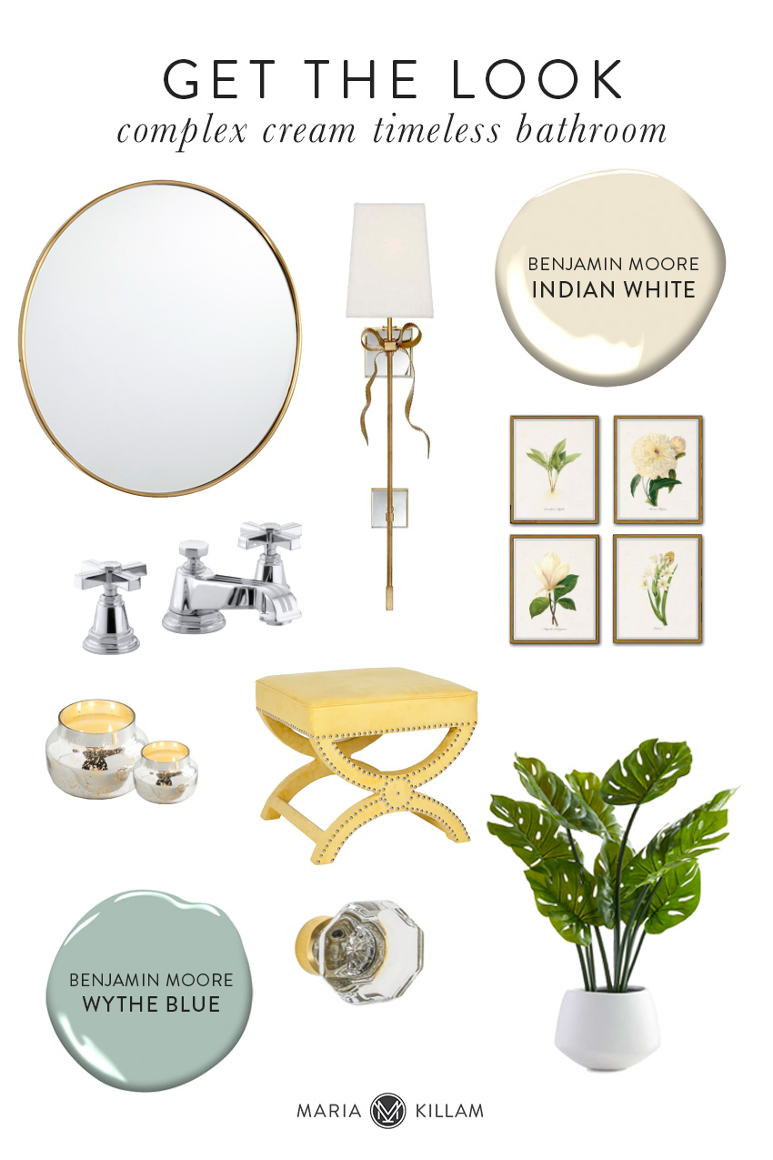
Round Mirror | Kate Spade Sconce | Similar Botanical Prints | Gold Frames | Pinstripe Faucet | Candles | Glass Knobs
If you have a Tuscan bathroom filled with pink beige travertine, in the past I would have asked you to try BM Muslin 1037 or SW 7555 Patience to make it fresher. Now that the trend has moved to WHITE, these two shades of pale pink beige still feel too dark for most people. So, now I specify a pink beige complex cream instead (SW 6105 Divine White or BM Maritime White 963).
Complex creams are a whole shade lighter, but still warm enough to relate to the undertone. The sweet spot.
And I have done the same with the rest of the beiges in my curated collection of large samples and updated both ebooks to reflect this shift in paler colour trends as well.
Wall Colour: BM IndianWhite OC 88
![]()
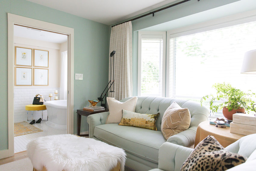
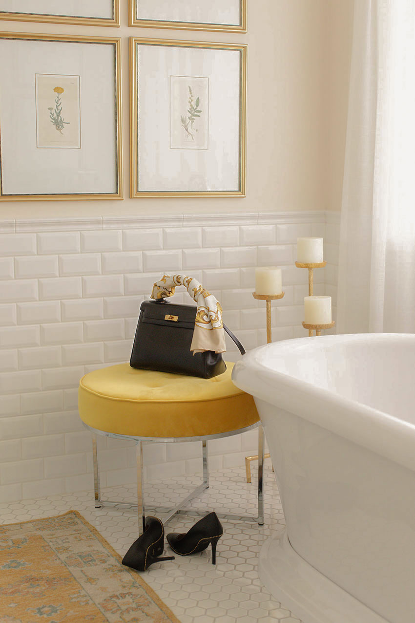
Similar Botanical Prints | Gold Frames | Similar Yellow Ottoman | Glass Knobs
My design clients often lament that an all white or cream bathroom won’t be warm. Instead, think of a white bathroom as a versatile canvas for styling and decorating. Don’t forget to add colour with art, flowers and even a lovely area rug! And, you can change it up whenever you like!
Get the Look
Shop My Bathroom Design
Round Mirror | Kate Spade Sconce | Botanical Prints | Gold Frames | Pinstripe Faucet
Candles | Yellow Ottoman | Glass Knobs | Monstera Plant
I anticipate that the complex creams will continue to grow in popularity as the colour trends warm up again. Because I’ve noticed that even though the colours are warming up, the overriding look is still FRESH and LIGHT. While mustard, sage, cognac and even browns and beiges begin to trend again, the best balance will still be struck by generously layering in lots of white and cream.
I’ve needed a good example like this for a while to properly introduce this new update to my system in a visual way, so if you don’t have my ebooks yet which will place this entire conversation into much better context for you along with all the other colours in my system, get them here.
Here’s what people are saying:
Unfortunately my husband and I were of the schooling that white paint was the one labeled “gloss white trim paint” on the can. Sure, it makes the decision easier, but it doesn’t have the Pinterest-worthy look I was trying to achieve in those spaces. After reading this book I have a much better understanding of the different degrees of white and how they relate to my existing fixtures (especially the ones I can’t change right now).
And most importantly, when it’s the right white, it looks deliberate and updated – not plain and dated. This book simplifies what can be a paralyzing decision at the paint store. It’s a reference book that every homeowner-turned-decorator should have in their toolbox
Related posts:
Now that ‘Beige is Back’ is Painting my House Greige a mistake?

What happens if I have purchased the ebooks previously? Do I still have to buy the updated ebooks again?
If you bought them after February they will be current. If you purchased them previously, check your spam folder for an update that was sent out April 28. Hope that helps, Maria
I’m wondering about this too. Will we be sent a new link to download the update ebook?
Repainted the kitchen during lockdown. Sadly you weren’t taking orders for smaller jobs. We had to pick the colour on our own using your ebooks and colour wheel.
The countertops were a gold and brown flecked granite with a green undertone and the floors are pink beige travertine. We went with BM’s Clay Beige and it works. So pleased!
That sounds like a great colour for pink beige travertine! Good job! Maria
Hi Maria!
Such a GREAT and TIMELY article! I have been a LONG time reader, and former client from California (before you sold the color boards, I made my own on your recommendation!). I purchased the Ebooks several years ago with the understanding that we get the updates for free. However, for the life of me, I can’t figure out how to get the updates. I emailed your staff but with no response…can you please advise Maria? I’ve a reader/client since 2009 🙂
Email [email protected], some emails are a problem, check your junk mail as its very unlikely my team would not have responded intentionally. Maria
We just closed on a “new to us” home, built in 1978. One owner for almost 40 years. Guess the decor!? Pink, mauve, beige, sage, burgundy, wallpaper borders, stencils, etc.. oiled bronze fixtures and door knobs switch plates and door HINGES! I used BM Athena in two of the bathrooms and it looks fantastic. Sort of a Swiss cream. I also had to pick colors when you were not doing small ejobs and I am pleased with my choices. Thanks for all the great information you have shared with us over the last 10+ years 😊
I’m interested in your thoughts on SW 6091 Reliable White in light of this article.
Thank you.
I am between maritime white and dove wing myself. Did you choose yet? What did you decide on?
Hi, GREAT post!
I am also a two-time purchaser of your older e-books and several eDesigns…I have same question, how do we get the revised, updated versions that include complex creams, etc. Hope I just overlooked a download link along the way!
Yes you would have received it April 28, please check your spam email. Maria
I purchased your color boards and White is Complicated (2 of them) several years ago. I noticed your ebooks are on sale, do they contain your new complex creams?
Yes they have the complete list 🙂
As much as I think of myself as a “Hater Of Beige”, your new color does make the bath look more interesting.
Small tweak. BIG difference! 👍🏼
Would you say that whites and complexes creams have overtaken light greiges (those with LRVs in the 70’s)? Trends are moving on and it’s ironic that everyone wants some level of off-white. I’m still considering a light greige in a family room that has enough contrast with swiss coffee trim. BTW, Love your new bathroom color, as it coordinates so well with everything!
Yes I would say that where the trends are, not to be confused with that greige is still the right option if it pulls together a room and makes it look finished! Just because something is trendy, doesn’t mean everyone needs to do it. Maria
Love the colors…why did you keep the ss fixtures?
I chose chrome faucets because they tend to be more timeless than other finishes so I chose to mix both chrome and gold for this reason. Repeat each finish twice and it looks intentional. Maria
I’m the weirdo that likes the before better than the after. Both are pretty. But I like the whiter white.
Hi Maria! Great post, one of your best yet. For your Canadian readers, would you happen to have a link for the botanical prints that ships to Canada? This link takes you to an Etsy shop that only ships to the States. Thanks!
What a great blog post!
Going to my save box!
Just like the other comm-mentors I would like to know how to update my current books with this important update?
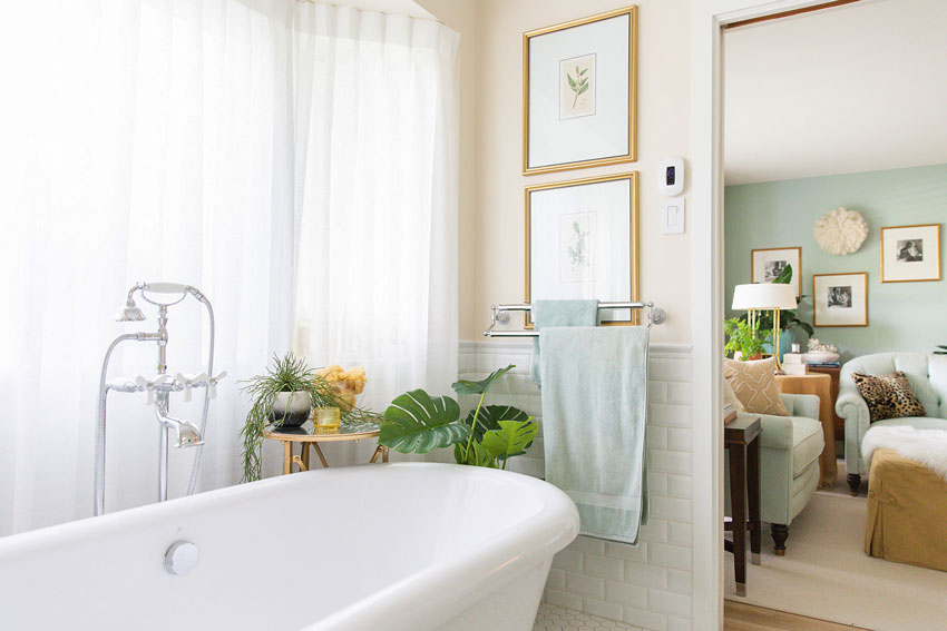
Great post as always! I have a question about the beveled subway tiles that I see you have on the walls. Do they also go behind your vanity or are only on the sides & above the vanity only? I was told by my contractor that if I place beveled tile on the wall behind the vanity there will be a gap between the cabinet & the wall.
Looking forward to your guidance!
Yes they were continuous behind the vanity but to do that, the tile installer had to start at the top (which they never do) so that takes a very skilled installer. My tile installation cost a fortune because I had a really good tile guy. No there is no gaps? That would be very bad. Sounds like he just wants to install the tile first (starting from the bottom) and then push the vanity up against it. Maria
Thanks for your post! And your follow-up email about color names – what a visceral reaction one has to a name! I use a wonderful resource when I have hunches like this about colors being the same, or if I’m struggling to find the undertone of a color. This is the page for Edgecombe Gray / Baby Fawn and – wait for it – BM Alaskan Skies! All three are the same color 🙂
https://encycolorpedia.com/dad4c5.
I agree with Diane – I liked the before better. It seems crisper to me. Probably just personal preference.
I have to admit I’m with Kaylee and Diane in preferring the old colour. I agree that the cream works much better with the prints, but it works less well with the blue cabinet and the bright white tile. To my eye the new room is divided into two parts: a warm upper half and a cool lower half.
Hi Maria, -long time reader, -wondering what your thoughts are about Sherwin Williams Creamy #7102. I have thought that this may be an orange-beige? I have been considering this one-i do have your ebooks but don’t recall getting an update, I’ll check my spam folder. Maybe you addressed this color in yur update. Thanks
I like both gorgeous colors. But would love to see them both on the wall in a stripe, a stencil, or wallpaper! White on white is twice as nice. It feels unfinished to me in such a beautiful posh space.
Beautiful! I am looking for glass knobs for our new bathroom project and just love the ones you used here. However, the link to the glass knobs in 3 places is taking me to the indoor/outdoor rug on overstock. Can you post the link to where these glass knobs are sold? Thank you!
Did you see your room is featured in the Washington Post?
https://www.washingtonpost.com/lifestyle/home/five-paint-colors-that-will-never-go-out-of-style/2020/10/12/5c4421ae-0714-11eb-a166-dc429b380d10_story.html
Yes I did thank you, I should add it to this post! xo
What do you do when your entire house trim is an extra creamy color? My floor plan is very open and EVERYTHING- doors, trim, windows, kitchen cabinets, every built-in book case and storage plus, every bathroom cabinet (3800 sq ft worth). It’s too costly to completely repaint all of that. Our house was built in 2003— This is our first house so we knew we would like to change the paint but we didn’t realize how creamy our trim really is until we started picking wall colors. It drives me crazy. We’ve now been in our house for 4 years and the only room we painted is our kitchen…. the rest is sage green to darker sage – which I’m now calling booger and diarrhea. If you have any color advice, I would be grateful. My hard woods are super dark, the trim is Sherrington Williams Crisp Linen. Our kitchen gets lots of light and gets full sun all day. We painted the walls Benjamin Moore Smoke Embers at 75% (thanks to our painter!) it comes across blueish during parts of the day, while this is happy and fun for the kitchen/ hearth room area, I wouldn’t want the rest of my house this color. I want something light but doesn’t highlight the yellow in the trim. What undertones in paint should I look for to combat the yellow? Any suggestions, I would be so grateful.
You can only go much lighter or darker if you don’t want to paint the house the same colour because your cream trim will look dirty if you choose a colour too close to the cream but which way to go I can’t say, I would need to see photos, I’d recommend my open layout paint colour edesign package here: https://mariakillam.com/product/interior-open-layout-paint-colour-consultation/
María has some great old posts on yellows and creams with examples. Use the search above. I loved this one: https://mariakillam.com/combiningwhites-2/ Hope it helps!
I’ve purchased both your BM color boards to help me pick out a color for our pink beige tile flooring in our bathroom, and I LOVE them!! I’m an addict now! They’ve helped me chose the BM color Maritime White for my walls.. my question is: for our shower tile, can I have pure white subway tile in my shower? Or, does it need to be an off-white subway tile so that it doesn’t make my floors look “dirty”?
Can complex creams ever be “dirty”?
Also, is this covered in your ebook?
Thanks so much for this article on complex creams! Your bathroom is just beautiful by the way! Can you tell me if Navajo White by Benjamin Moore is considered a complex cream? And is there a lighter version of Indian White? Thanks in advance!
Thank you Maria – what a great article. do complex creams always fall in a warm category or could they have a balance of grey and yellow undertones such as BM Dove Wing (OC 18). I have a typical early 2000 kitchen with orangish brown maple cabinets and a beige granite with pink undertones with yellowish pink travertine. I know!!!
I am thinking of a calming neutral such as BM Dove Wing as wall paint to pull everything together and tone down the sea of brown.
What do you think? Would you still recommend BM maritime white?
Need help with 2000 remodel and she wants to now update her paint color. She purchased a off white leather sofa that pulls green..but has a gold tined travertine floor. gold toned kitchen cabinets mustard yellow leather bar stools and an island painted black the granite is the 20 yr old speckled granite w black browns etc. Trim color is Acadia White..cottage facing west….there is SO much going on in that space..every time I find a color it either pulls pink against that sofa or looks horrible against her kitchen cabinets!..I went to the paint store and asked what color is a shade or 2 deeper than Acadia..thinking its best to keep walls same tone as the very wide trim..thus quite a bit of Acadia white is already fairly dominant….would LOVE any advice.
[…] if she needs either a complex cream or greige colour to work with her kitchen or bath finishes, or maybe she might love to paint a […]
In 2018 (I think) my fiance and I decided to move back into my home that I had been renting out. The renters had painted the living rm (including the inside of the gas fireplace) a horrible baby blue color.🤦♀️I knew right away that repainting was #1 priority. This was during the grey and greige trend, but my 1940’s home was just too small for anything dark, so off to Lowe’s I went. I must have foreseen the future b/c I decided on SW Divine White and I couldn’t be more pleased w/the result! It goes with just about any color combo you choose even w/the pink undertones. Now I’m redoing the guest rm w/ a retro/eclectic feel and need a white/cream paint for the walls that will sort of be a blank canvas for all of the other colors in the rm. Whats your take on Valspar’s Swiss Coffee?
Thanks in advance!
What is the undertone of BM White Down?
[…] Image source mariakillam.com […]
[…] Photo: Maria Killam […]
Why do you not include the lovely OC-18, which appears to me like a warm complex cream with yellow and grey undertones, in your curated list? It seems like it is just one step darker than the very popular OC-17 (White Dove)?
Because you only need the neutrals and whites in my system. The minutiae of difference is not enough to include it because another colour will be close enough to do the job. That’s why it’s a system that is used by hundreds and thousands of people worldwide. Hope that helps, Maria