


Trying to find the right exterior colour to match stone on your house? If you have stone on your exterior, it completely dictates the colour palette. If you ignore it, it will most likely look that way. Here’s how to determine which siding colour looks best with your stone.
Choosing colour for your exterior is very tricky. Colour behaves differently in bright exterior light, so the right level of contrast does take some experience.
And of course, there is always the small matter of getting the neutral undertones right.
If you have no fixed elements except white windows and trim, that’s when there are lots of options.
However, if you have stone on your exterior, it completely dictates the colour palette. If you ignore it, it will most likely look that way.
Did you know that every selection for your exterior is a COLOUR decision first? The most valuable lesson you’ll gain in my Exterior Colour Selection Masterclass is how to narrow down your choices to a select and optimal few.
This is the dated way to choose colour.
In the 90s and early 2000s you would often see three or four earthy colours ‘coordinated’ in an exterior ‘colour palette’.
Paint stores are still filled with brochures that show this kind of combination.
Brown, with slate blue and a touch of muted orange. Or rust with olive green and beige.
But stick those colours on your house, and it is sure to look dated and disjointed with all the other colours and elements vying for attention.
To create a more current AND classic look for an exterior, it’s much better to go for a fresh and unified look. This means picking a colour for any siding that needs to coordinate with stone to provide some contrast, but still relate.
It’s not about choosing colours that are complimentary.
Which Siding Colour Looks Best with Stone?
My lovely eDesign client recently sent this note and some lovely after photos of her exterior after completing an eDesign Exterior Consultation with us.
I just wanted to write and say thanks for y’alls help with picking the colors for my house! My husband and I had been going back and forth for MONTHS about what colors to pick and had driven through countless neighborhoods trying to see something that we liked.
Finding something that would work with the stone on our house was just giving us fits.
I had heard Maria on the How To Decorate Podcast from Ballard and I knew that if I came to her that I’d get the right answer. I debated spending the money for the consultation but ultimately, I’m spending thousands of dollars painting the exterior of my house; I need to get it right the first time. I knew if I spent the money to paint my house and hated the end result I’d be kicking myself for not contacting y’all.
I’ve been getting so many compliments on the house and how great it looks. The painters even said to me after they were done that they were nervous about the purple door (poetry plum) because usually the purple that people ask for is a red-y purple and they thought that it was going to look bad but the Poetry Plum looked great.
Thank you again!
Here’s the before photo.
It’s a pretty and classic house with a timeless black roof and shutters. But the orange and pink stone is very very bossy. And the olive green colour on the siding was not relating to it in any way. If anything, it was making the stone look even pinker by comparison.
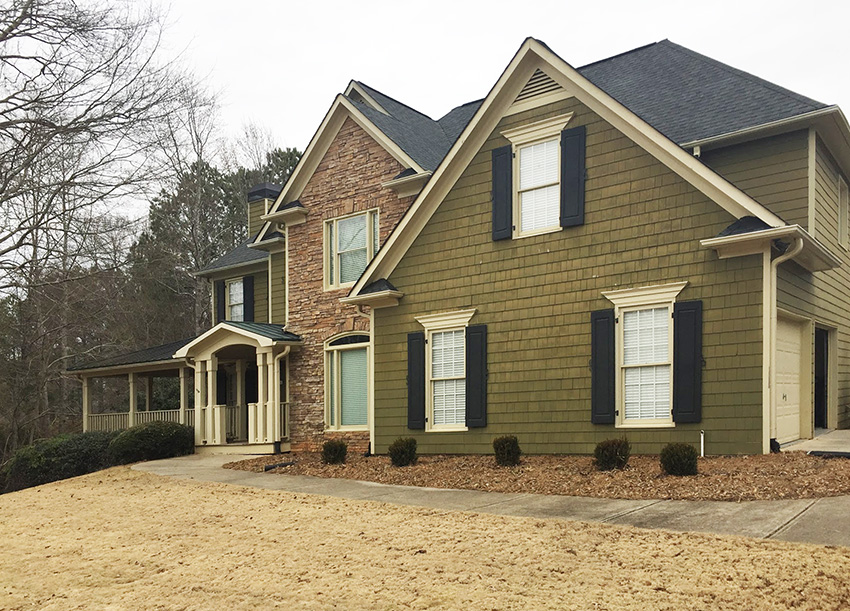
Before
If this house had no stone at all, it could be virtually any pretty colour, greige, white, blue, yellow. But stone is bossy and the siding needs to coordinate with it perfectly or it will never look right.
Obviously, painting the siding a matching rusty colour would not be the most current choice.
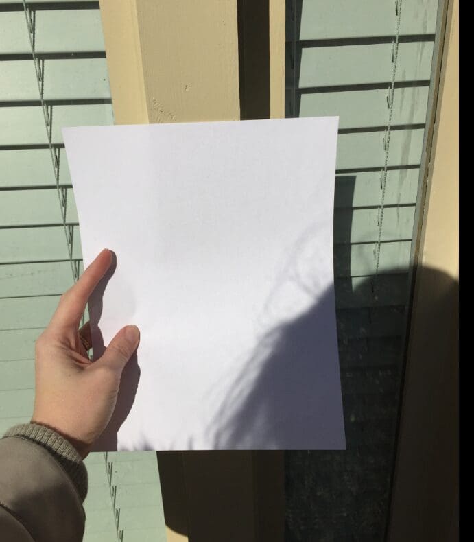
Here is a close up of the stone with white paper.
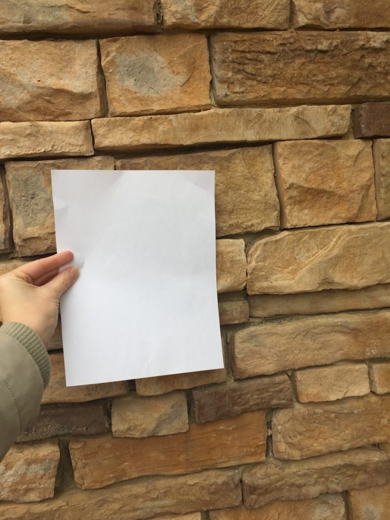
to accurately identify neutral undertones, it helps to hold up a white piece of paper in natural light
How my eDesign consultation works.
For eDesign consultations, we request that you send photos of any fixed elements with white paper so I can accurately identify the neutral undertones. This is what makes my eDesign department unique. It is the only place you can come to get your colours right with the help of my System of Understanding Undertones plus my over 20 years of experience.
The overall read of this stone is orange. The siding needs to be as fresh and current as possible while still relating to the earthy stone.
In order to get the perfect creamy colour for the shakes that is not too stark for the warm stone, but fresh enough to contrast nicely with dark shutters, I go through a process of elimination of the possible undertones like this:
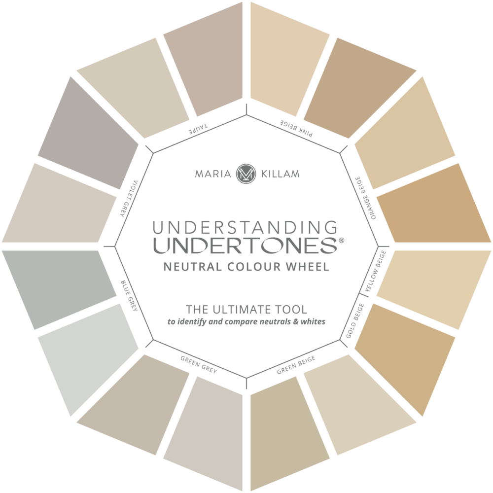
Maria Killam Understanding Untertones Colour Wheel
How to find the right undertone.
Process of elimination:
A pale Green Beige would read cream and could possibly work, but it won’t be perfect because it won’t look warm enough to relate perfectly to the orange stone. If this stone was only on the foundation, it would be an option, but the stone is right in the middle of the house, so the siding colour should relate as perfectly as possible.
A pale Green Gray would look too cool next to the stone.
A pale Pink Beige would not look quite right with the orange. Orange beige and Pink Beige together tend to just look like a mismatch.
A pale Yellow Beige would look too clean and yellow to work with the earthy orange stone.
Gold Beige, would not be warm enough to relate to the stone and would also be a dated choice because it would not look fresh.
A pale Orange Beige would technically coordinate, but being beige, it would read quite yellow so it would not look very current.
Violet Gray or Blue Gray would not relate in any way and would definitely look like a mistake, eek!
What’s left? Taupe. Taupe works beautifully to update peach and orange finishes. A pale taupe will read creamy and warm without looking too yellow.
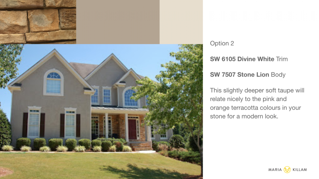
Here are the slides we sent this client to help her visualize the colours I recommended.
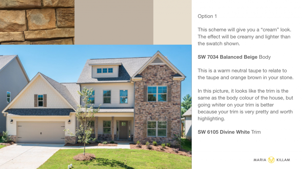
I always give at least two options, where there are two equally viable possibilities. In this case, I recommended a both a lighter and slightly deeper taupe to test.
You can see in the picture below with white paper that the existing windows and trim are a deep almond/beige colour. I recommended that she lighten them up with a soft, creamy white to work better with the fresher new body colour without being too stark for the stone.
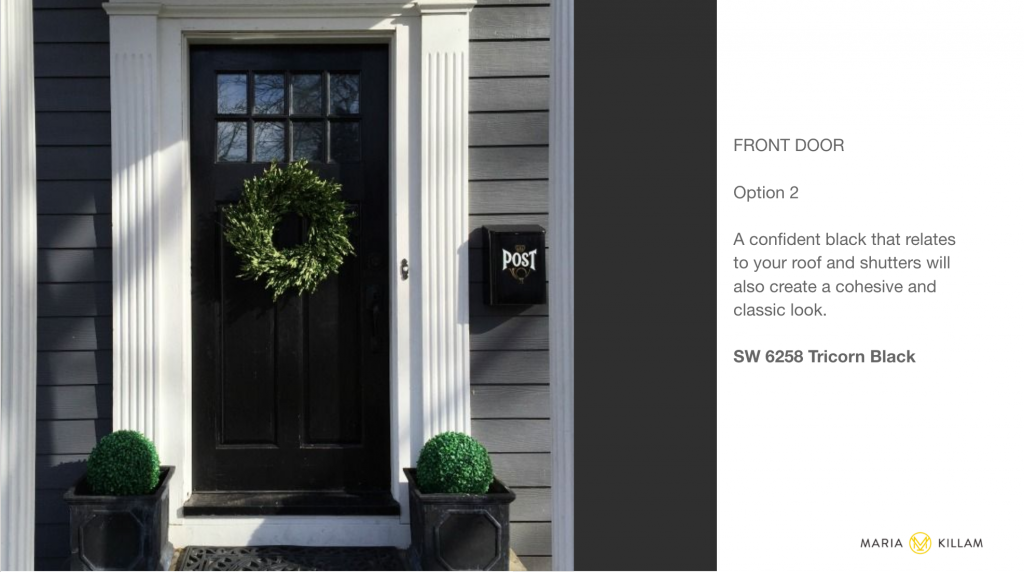
Here’s what I specified for the front door:
For her front door, I recommended a muted eggplant to compliment the orange stone for a sophisticated look.
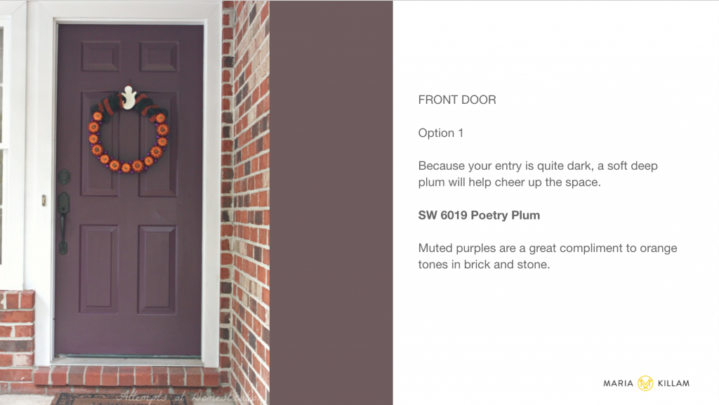
I also included an option for a black door to match the shutters in case she preferred that.
So once again, here is the before:
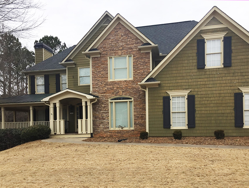
Before
And here is the beautiful after!
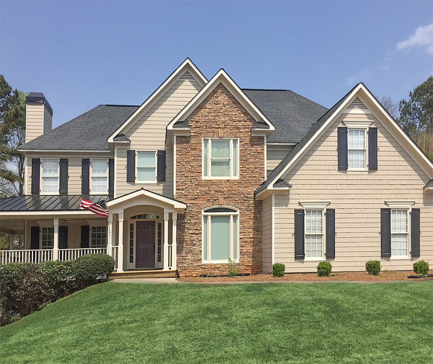
After: Body Colour SW 7034 Balanced Beige Trim SW 6105 Divine White
If you’d like help with your exterior colours, check out our eDesign packages here.
To learn how to choose the right colour to coordinate with your stone house, buy my Masterclass for Exterior Colour Selection here.
Related posts:
Exterior With Orange Stone and Brick; Before & After

What a huge difference! 100% improvement.
I just love these Before & Afters of exteriors! This is a fantastic transformation. So inspiring!
IMHO; a definite ‘drab to fab’ transformation! Looks absolutely amazing but do have a question; were the soffits (under-eaves) also repainted as often they are a standard white? -Brenda-
What a wonderful transformation!
I also found you through the How To Decorate Podcast from Ballard!!!! Thank you Maria, this is a great post, I appreciate the detailed process of elimination, what recommendations you sent the client, and the before and after photos.
Has anyone successfully faux painted exterior stone?
Use Romabio paintm lots of examples here: https://romabio.com/masonry/
Wow, Maria! I did not see that coming at all! I’m pretty good at color naturally, but I never knew that taupe looked good with gold.
Since you identified orange as an undertone, I would have thought orange beige . . . ugh, this is so confusing!
Oh that looks beautiful, Maria! ????
Warm and inviting!
Wow! It made that whole house come alive! What a transformation! It goes to show how color can either make or break a look.
Good job!
Beautiful! Classy and elegant! Great job.
Wowzer! What a difference!
Your talent, and the system that you have perfected, always amazes me Maria! What a beautiful transformation.
Wow! What a difference the right colours make. Before it was just so drab and nothing related and now the house is just stunning. But, just one thing is, I thought the shutters were just a tad too stark and could have been a softer black/grey to match the roof. Anyway, the house looks lovely either way.
I love the after! It looks cheerful and inviting. Such a great update. You are always amazing Maria!
Paint the brick
Wow ! I love the updated fresh look. Thanks Maria for walking us through on how you specify color options with this home.
You are truly THE Truest of Colour Experts!!!!!!
You’re system is completely, absolutely on point. I love how you’re the only color expert that has a method / a science / a real SYSTEM of testing to ensure the best results every time. Plus, you are able to work with people on THEIR terms – it’s not “you have to re-do the entire room/exterior/etc” if they don’t want to. It’s “let me help you make your room/exterior look fresh changing what you want”. I really hope that made sense considering I have not yet finished my 1st cup of coffee and usually I do not attempt anything until the caffeine hits my bloodstream. My brain is in that warm cup of coffee every morning!!!! As my son says, I’m a “Mombie” (Mom Zombie) until I’m finished with my cup! Haha. Great post!!!!
This before and after made my heart sing. I literally went WOW! when I saw the after photo. Thanks for the boost!
I’m just glad to see that black, white and gray are not taking over every. single. remodel. uggh. Don’t get me wrong, I love black, white and gray in appropriate doses.
Taupe and Beige are still very relevant colors and will never go away. It’s a matter of wisely using them. Artfully using taupe and beige is Maria’s specialty. The way she uses those colors actually enhances the beauty of the structures or interiors. Beige and Taupe can be the quiet glue that holds a look together, creating a backdrop for stunning architecture or furniture to shine. Same goes for black, white and gray…I’ve seen it done well and done poorly. You know it when you see it!
Marvelous! It not only looks better, it looks like a much newer house!
Looks like an entirely new home, very nice.
Wow! That was cool, how you figure it all out!!!! Love it!
Your transformation makes every transition appear seemless, from the stone to the wood to the shutters and front door. The green on the original is actually very pretty but it was not coherent to the stone as you mentioned. Great job!
Looking for a color for with a warm red break and gray grout with onyx black roof half siding half brick