


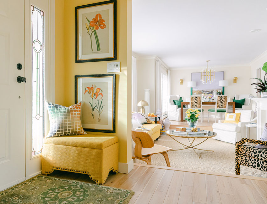
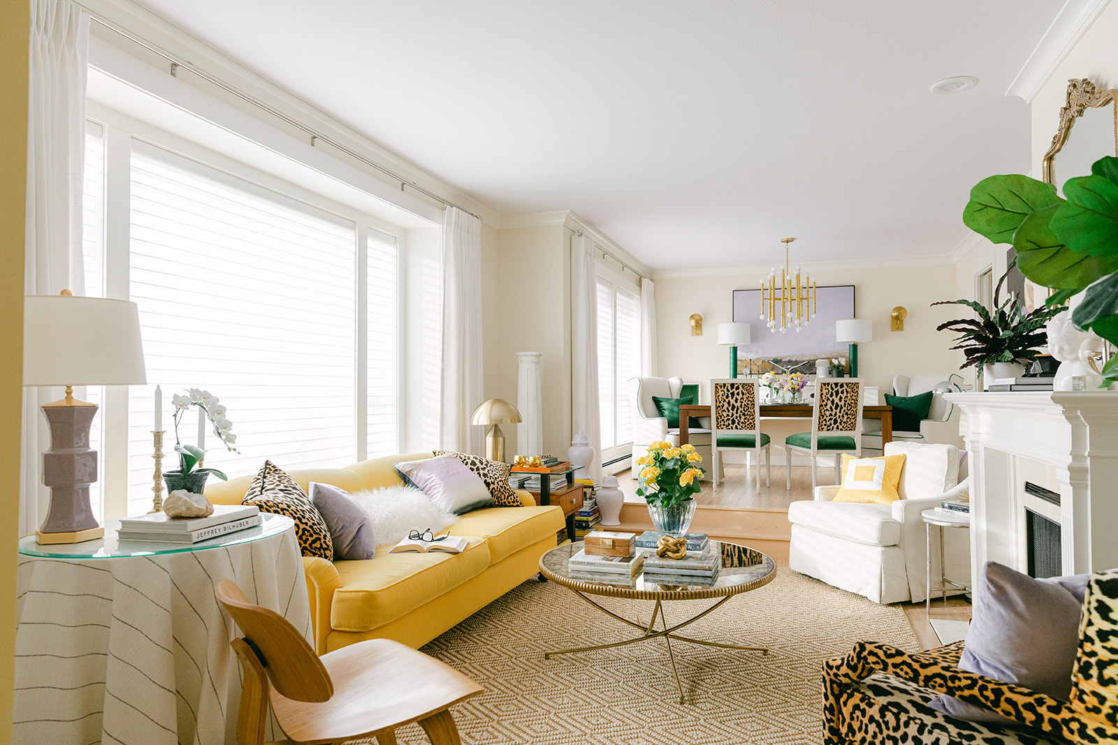
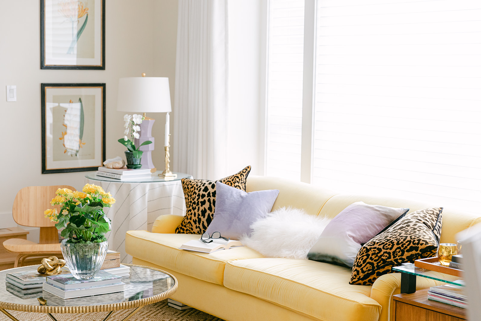
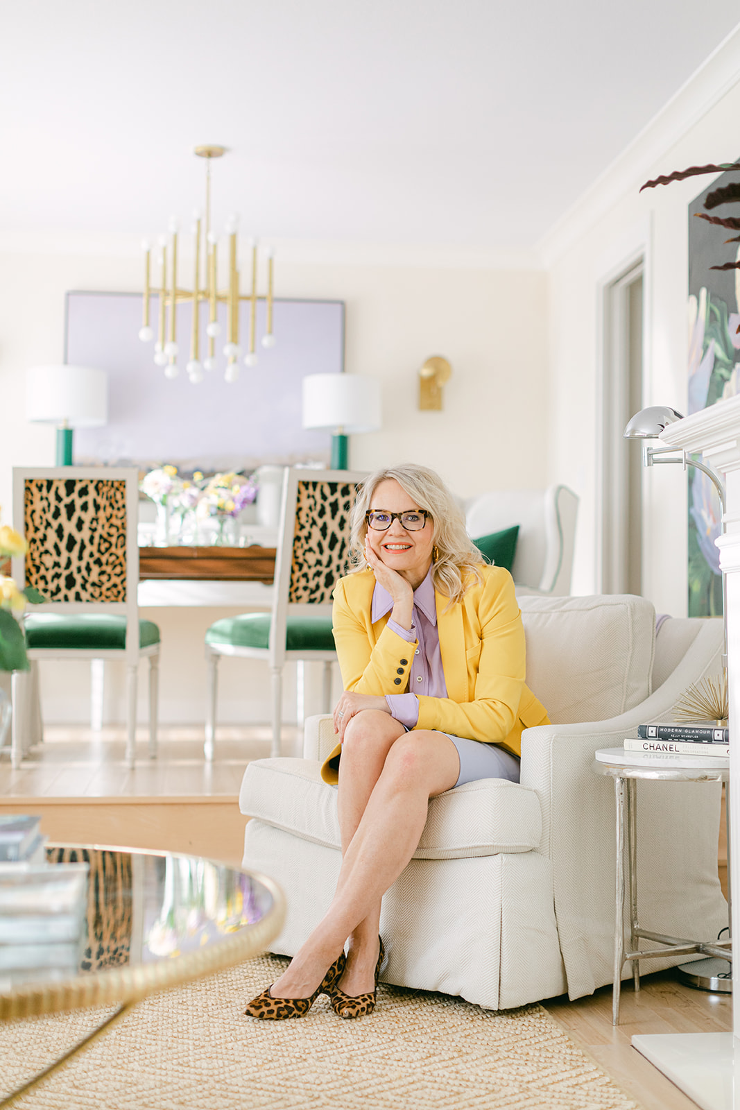
I reimagined my living room starting with a colour palette from some of my existing furniture and art and adding some new furniture and decor from Ballard Designs. Rich greens, a pretty lavender, and a versatile leopard print give my living room a new glam vibe that I can’t wait to share.
I’m so thrilled to finally reveal my living room makeover! Many of you have been asking about it and I appreciate your patience. Can you believe I’ve been planning this collaboration with Ballard Designs since November 2020? Believe me, it’s well worth the wait!
How to mix old and new when redecorating your room
Unless you are starting completely from scratch, one of the big challenges in any re-decorating project is the furniture and decor edit. In other words, deciding which items you want to keep in your room and which items need to go. The furniture and decor you decide to keep will influence the new items you choose. These initial decorating decisions shape the outcome of your makeover entirely.
Let me walk you through how I chose all new decor pieces from Ballard Designs to coordinate with the two existing pieces in my living room: my yellow English roll arm sofa and my oversized custom floral painting.
I always say you can never go wrong with a sofa in your favourite colour! And I have never regretted my yellow sofa. One of my things about Ballard Designs is that they offer hundreds of custom fabrics for all their upholstery.
And that’s a big deal because it means you can get your sofa or accent chairs in that perfect custom colour to coordinate with your existing decor.
Choose a colour palette from the pieces that are staying
My yellow sofa is almost 12 years old but still in good shape. That’s because it’s been in my formal living room which wasn’t heavily used. In addition to the sunflower yellow, I decided to pull out the emerald green and lavender tones from my large-scale floral artwork as my living room colour palette.
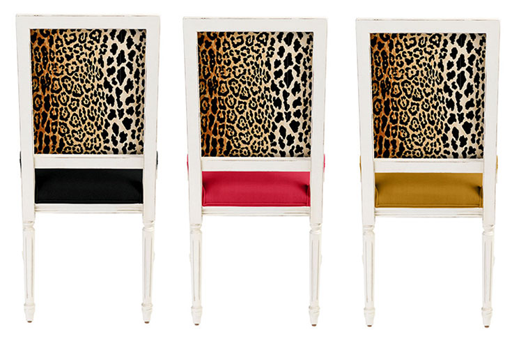
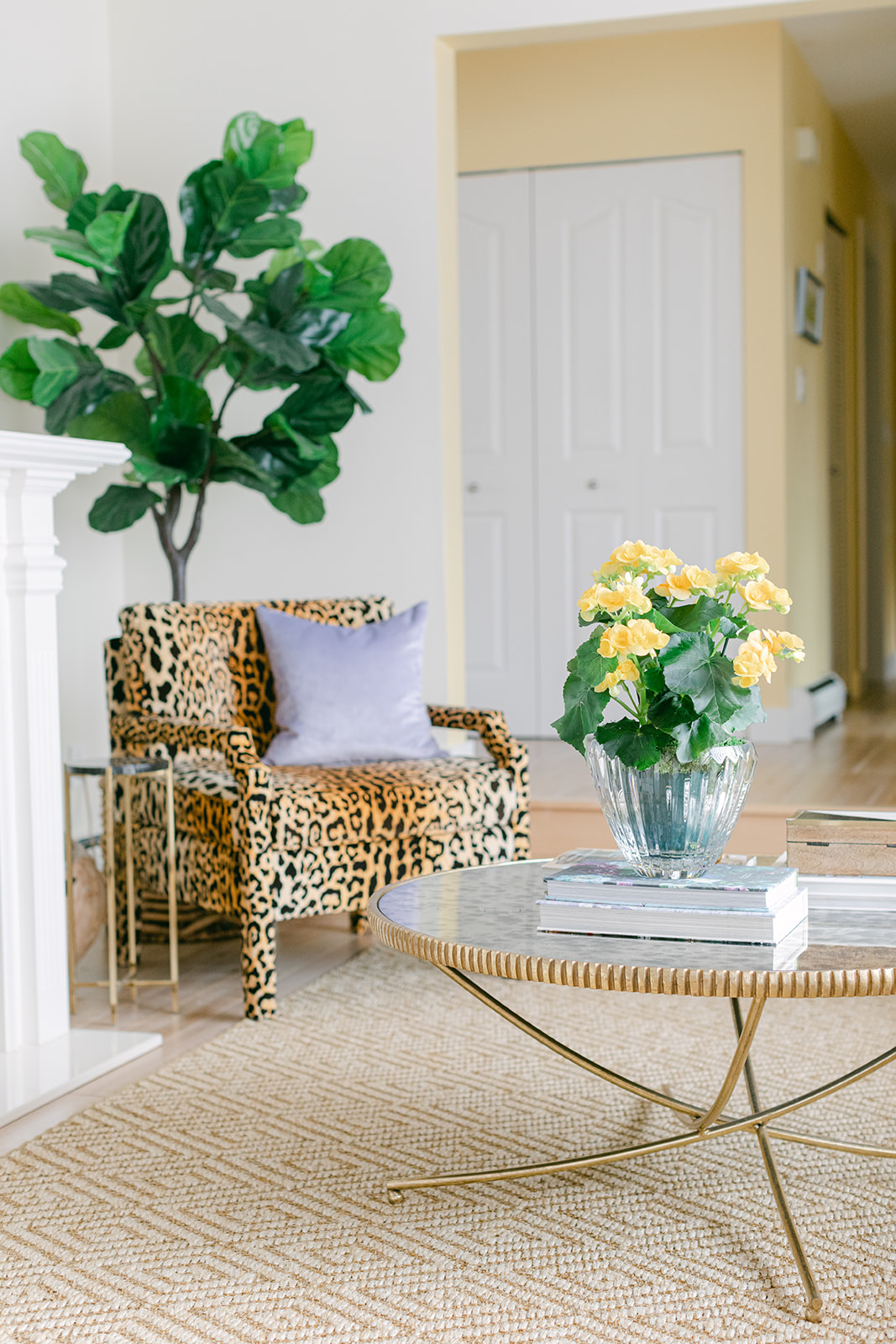
Speaking of gorgeous custom fabric options, this fabulous leopard print from Ballard Designs is such a glam and timeless way to repeat the yellow in my sofa. The yellow is visually repeated in the leopard print that’s sprinkled around the room in the backs of the dining chairs, throw pillows and the upholstered chair in the living room.
What I love most about a leopard print, is that it looks good with so many colours!
For example, if you have a gold beige sofa from the brown trend you can add some leopard pillows along with white ones for an immediate fresh update! Since so many of us have a touch of black in our living rooms because the black and white trend is here, this Serengeti leopard from Ballard has black in it too!
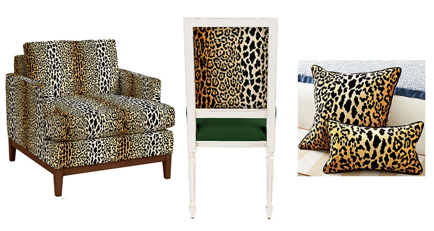
Robbie Chair no longer available similar here| Dining Chair | Leopard Pillow
Here are a few fabric colours from the collection that also look amazing with this leopard print. Ballard also has 350 fabrics plus many other designer details you can choose to customize your timeless Louis XVI side chair.
Their website makes it easy to mix and match looks, so you can add them directly to your mood board to find out which ones look best.
Square Back Louis XVI Side Chair
Adding new decor and accessories
I love the Robbie chair so much! Not only does it hide EVERYTHING, but it looks good in any room. I highly recommend it. Remember my rule for chairs? For a chair to pass the test of whether it should be purchased, it should look good BY ITSELF with nothing on it.
Just like a leopard coat works with most of your outfits, this leopard print chair is the same. And the upholstered arms and legs make it totally refined and an excuse to show off even more of a pretty print.
Read more: Rule for Chairs
All shades of orange look fabulous with this print as well! So I couldn’t resist showcasing the Robbie chair on the homepage of my website when it was time for some new photos last month:
Robbie Chair (no longer available) Similar here (comes in 350 fabrics)
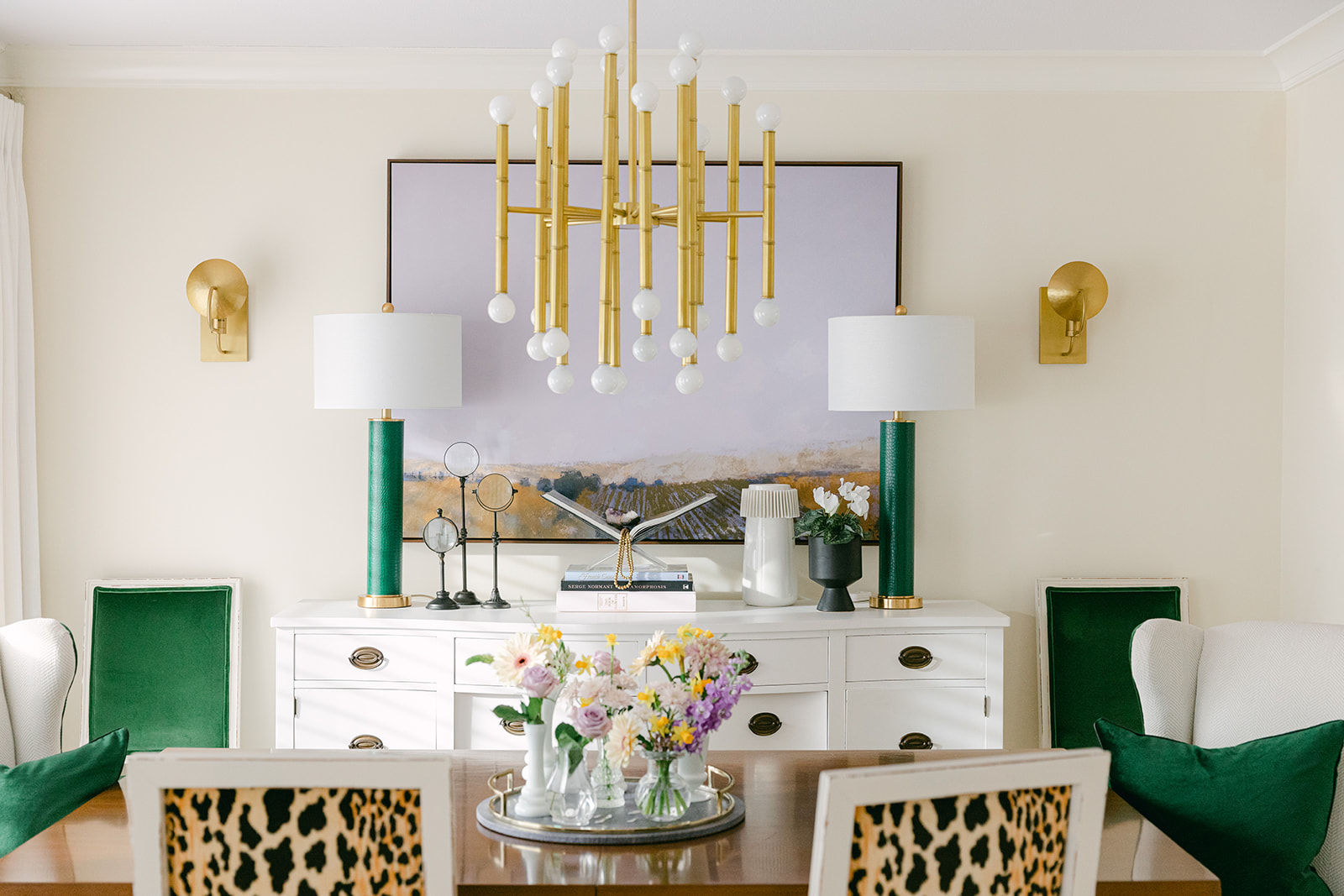
Coordinating new dining room chairs
Since my dining room is adjacent to the living room, I made a few updates here to coordinate with my living room makeover. Again, the leopard print was repeated on the backs of the dining chairs, combined with emerald velvet seats. I also ordered these fabulous captain’s chairs. They are cream (a green beige complex cream to be exact).
But the real magic is that they are upholstered in a performance fabric called Justify Salt Inside Out, so I’m not worried about splashes and spills. I added the emerald green velvet detail in the piping, along with some coordinating pillows to make them feel super lux and custom.
Unfortunately, since these chairs were ordered, they are no longer in stock, but here is a similar chair in the same fabric.

I also had the Candace skirted chair upholstered in the same performance chenille with a yellow and white colour-blocked pillow. It adds a lovely, graceful note in the corner for curling up by the fire. But it doesn’t visually take too much attention away from the view to the dining room, or the painting. It’s such a timeless chair for any room.

You can see the subtle chevron texture of the fabric up close in this image (above).
More glam details from Ballard Designs
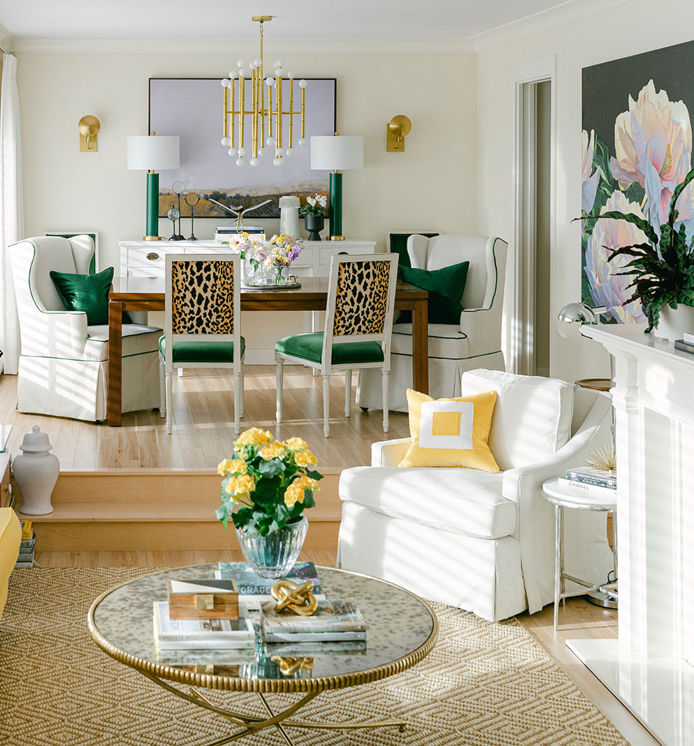
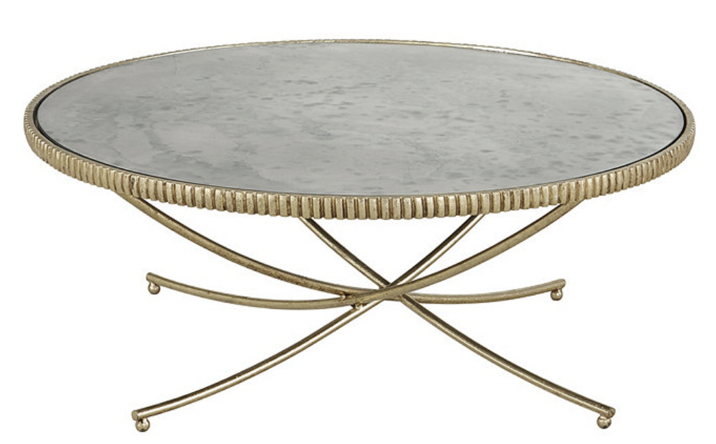
The Loren Coffee Table has such fine detail to draw the eye without being fussy. I love how the antique mirror tabletop reflects anything pretty sitting on top of it and the curved legs keep it feeling light and airy. It’s like a piece of jewelry in the center of the room.
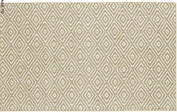
The diamond, sisal rug completes this look so beautiful! It reads cream and orange beige, which again visually picks up the leopard in colour and adds another layer of pretty texture to the room. If you are trying to mask your grey flooring, this rug is an excellent choice to warm things up.
And, I’ve had the faux Bunny Williams Fiddle Leaf fig (above) sitting in my studio for years! I decided to move it here. This is a nice way to repeat a touch of emerald on this side of my living room!
Looking for something even more understated? The other classic tree you can’t go wrong with is the olive tree. Get it here.
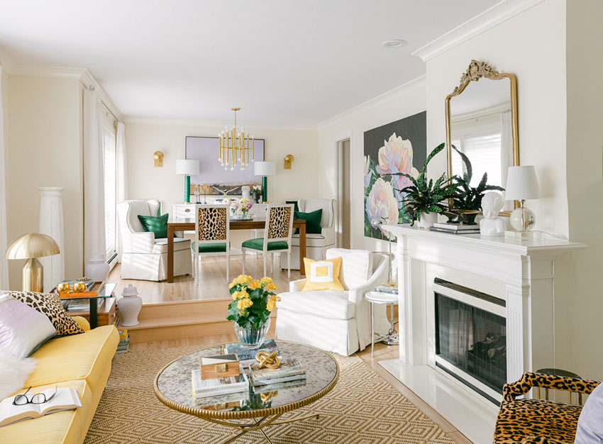
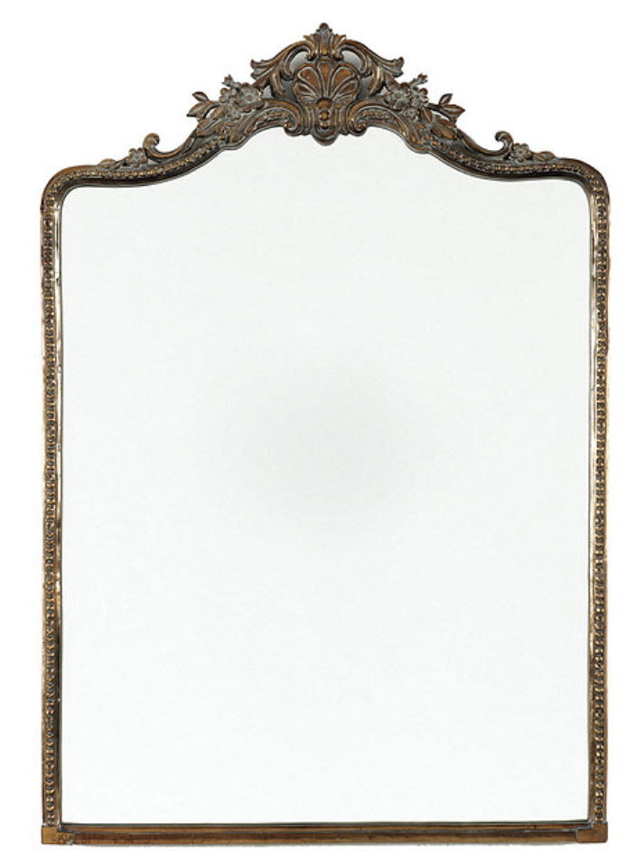
Ballard’s Parisian-inspired Beaudry mirror above the fireplace adds more sparkle and glam to the room. And did I mention it is SOLID METAL? So heavy and gorgeous! I love the delicate and understated flower details too.
My favourite styling tips
We all know a room full of new furniture is wonderful but it’s the styling touches that really give it a look and a feel!
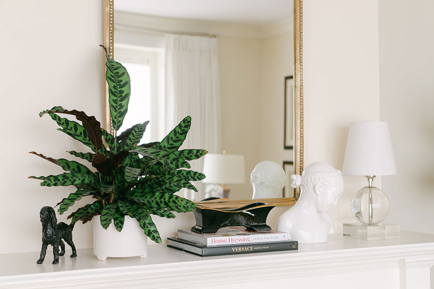
When you’re styling a mantel or creating a tablescape, the relative heights of things is important. This is why coffee table books are so useful. It’s also more polished to have things elevated on a stack. It makes them seem special.
Read more: The Easiest Way to Style a Fireplace Mantel
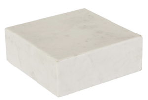
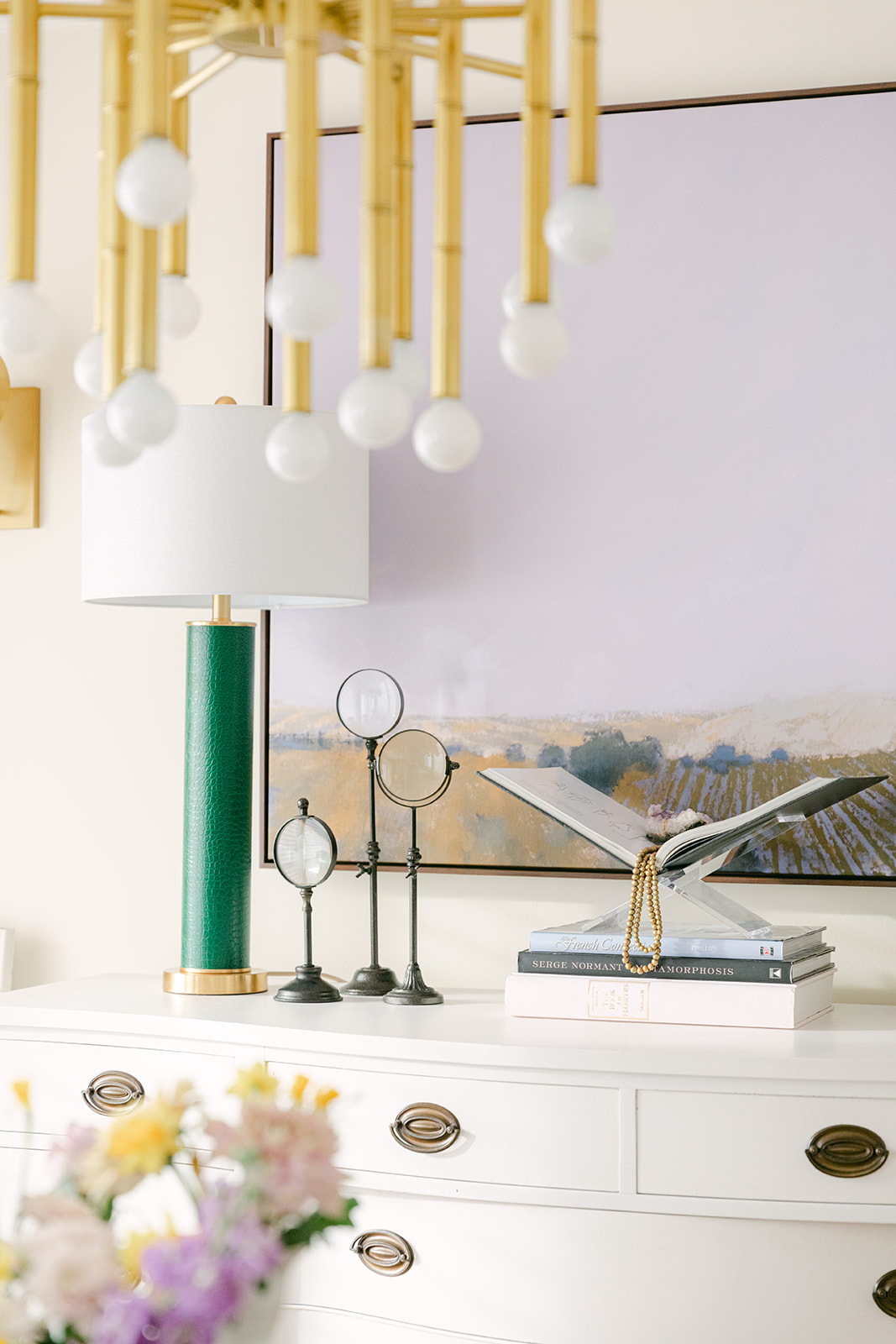
There are lots of options for accomplishing this range in height. See the glass riser underneath my little table lamp on the mantel (above)? Well Ballard has a pretty marble one that’s the same size! Such a clever way to elevate a small lamp (or anything else that needs elevated) and make it look even more elegant:
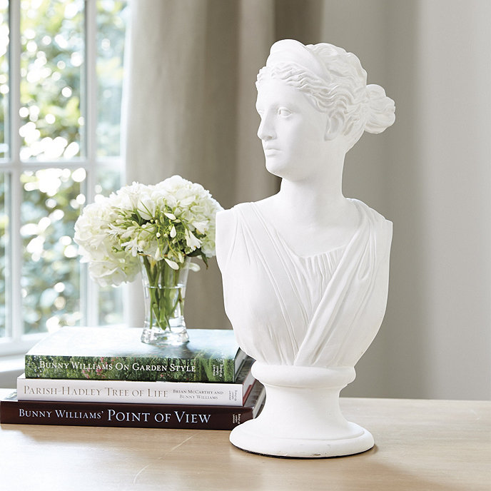
Have you noticed that Greek busts are everywhere these days? Place one of these on your mantel (like I did above) then combine it with a stack of books and a plant for a simple but timeless look!
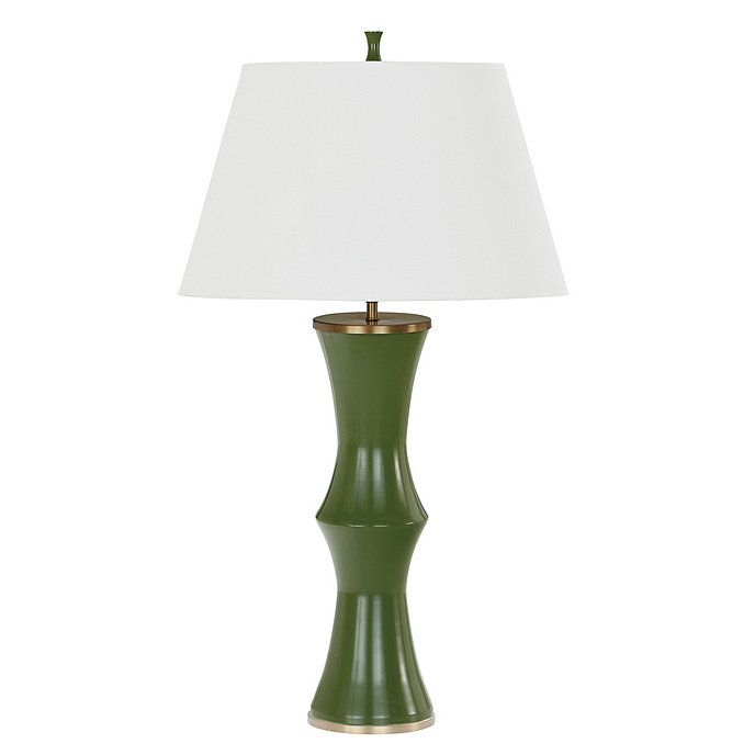
A dining room buffet or sideboard is another important opportunity for styling. The best place to begin is with a beautiful pair of bold lamps. I love adding lamps with colour to my room.
Here’s a similar green lamp to the ones on my buffet, it also comes in 3 other colours:
Need a glamorous, instant tablescape? Here’s a beautiful decorating threesome. Add an acrylic book easel in between the table lamps on your dining room cabinet!
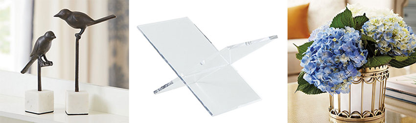
Birds | Acrylic Book Easel | Cachepot
I found some birds that have a similar look to my magnifying glasses and a fabulous mirrored cachepot that just needs some fresh flowers, a Kalanchoe, or some faux greenery to complete the look!
Read more: 6 Ways to Style a Bookshelf for the Perfect Shelfie

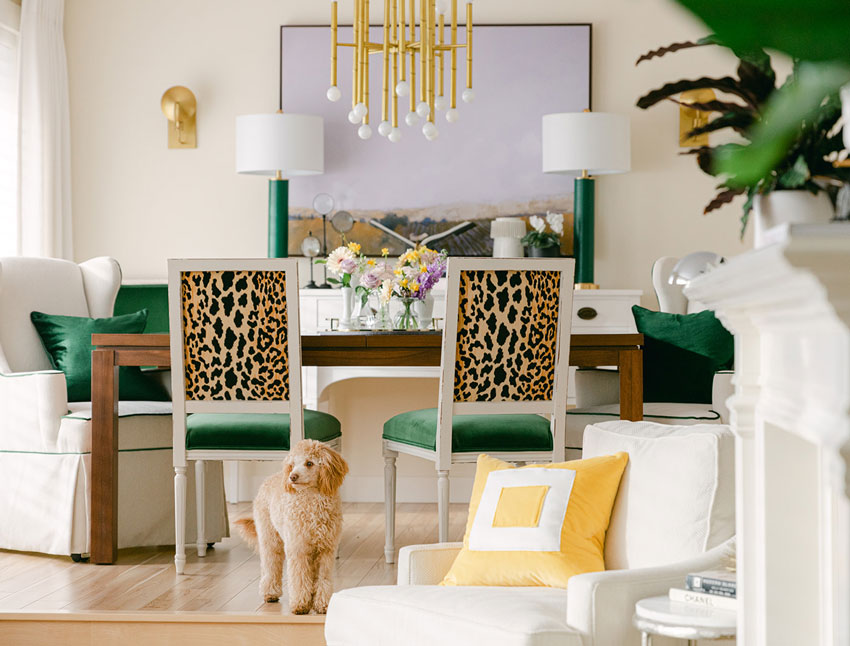
Our Lucy also made a guest appearance during the photoshoot!
I made a few other changes to note in this room. My wall colour went from greige to a warmer orange beige complex cream (SW Casablanca). I also painted the ceilings a pale shade of lavender which showed up a little too pale in these photos because it was a bright day when we photographed the room. But it repeats the artwork and other lavender accessories so nicely.
Wall colour: Sherwin-Williams Casablanca (orange beige complex cream) to relate to the orange yellow in the room! Ceiling is 1/2 strength SW 6554 Lite Lavender, but I wish I would have done it full strength, I might repaint it at some point.
To see the rest of the curated system colours in BM and SW, they come with purchase of either of my ebooks.

Photography by Macy Yap
I’m so happy with how this room turned out! And this new colour palette is so refreshing and on-trend, even though I kept some of my key pieces to coordinate with.
Here’s a quick mood board you can save for later:
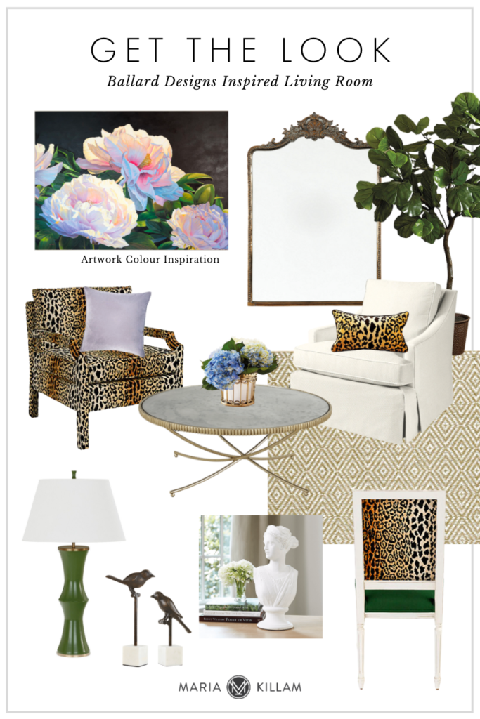
Beaudry Mirror | Fiddle Leaf Fig | Serengeti Camel Hartwell Chair | Loren Coffee Table | Bunny Williams Vase
Candace Skirted Chair | Diamond Sisal Rug | Green Li Table Lamp | Birds | Bust | Square Back Dining Chair
Thank you so much to Ballard Designs for partnering with me on this makeover and giving me the amazing opportunity to redesign my living room with your beautiful furniture and decor!
Let me know if you have any questions in the comments! I’ll do another post soon with the before pics so you can see what the room looked like before the makeover!
**At this time Ballard does not ship to Canada, however, I found this site that could help.
Related posts:
How to Get the Perfect Piece of Artwork for your Home
Kristys Vintage Kitchen Refresh; Before & After
Don’t Make this Common Mistake When Choosing an Accent Chair

Looking stunning. I didn’t think anything could take attention from a yellow sofa but I have to say the leopard print is stunning and is the first thing that jumps out at me.
This looks so fresh! I love the whimsy and animal nature of the leopard and well, you had me at lavender. I love the warmth of the new wall color and how it pulls together all the other elements. What color light lavender did you paint your ceiling? Lavender is my favorite color and I’m thinking of painting my gym lavender, just because I love it. Of course, Lucy makes everything perfect!
I added the ceiling colour to the post! Thanks for the compliment! Maria
What a gorgeous makeover Marie! The attention to all the wonderful details and personality in this room make me smile 🙂 I’ve been a Ballard Designs fan for a long time because they’re so classic and stylish- and affordable too! In my decorating and design business they’re often a no-brainer. This collaboration is Spot-on! Wonderful job as always~
Wow wow wow I think stunning is the word here! It’s house beautiful stunning really! Thanks for the round up at the end, I want that mirror and coffee table had!!!
Your living room makeover is stunning! I love the vivid pops of emerald green and that lavender ceiling is beautiful. Thanks for sharing how to incorporate new furnishings into old, rather than buying all new, which not many can afford. My favorite pic out of all of these is the one of you and Lucy cuddling.
Hi Maria, Your living room refresh is beautiful! Thank you for breaking down how you styled everything and mixed your current furnishings and decor with the new Ballard pieces. For us homeowners (not pros) it’s so helpful to understand why your room looks so pretty! I am a big fan of Ballard Designs and have found their pieces to be timeless in my own home. Two questions: how do we style a dining room table when it’s not in use? And, where did you find the adorable black poodle statue on the mantle? I lost my beloved poodle to cancer after 16 years together and seeing you and Lucy warmed my heart! I hope you enjoy your lovely rooms for a long time!
P.S. I’m tracking delivery of my Colour Wheel and can’t wait to own one! Thank you for making it available to all of us!
It is beautiful and vibrant and welcoming, just like you. Congratulations to you and your wife and Ballard Designs on creating such a happy space.
I would love a comparison between your wall colour and BM Navajo White, which I painted my living room and dining room in, in 2020.
Maria, this is such a gorgeous makeover! I love how you used existing pieces in timeless shapes and colors and added carefully curated new pieces to create a new look. Really beautiful layering of pattern and color! I know anyone walking into your home must instantly get an emotional lift with all that happy color. Well done!
Gorgeous is the word for your living room makeover! There is however one thing that you didn’t talk about that my eyes immediately went to when I saw the pics… Your dining room table chandelier! I love it! For whatever reason it reminds me of bamboo. Just stunning! I also love that you chose to incorporate colors from the floral painting, which is what used to grab my attention first with your last living room makeover. I love that you kept your botanical paintings and yellow couch as well. Thank you for sharing!
The light fixture looks like the Jonathan Adler “Meurice”.
Simply lovely Maria, and a very sophisticated look and feel to your home!
Maria
I am still intimidated with the warm/cool and clean vs dirty mix of colors but it seems to me that you have done a brilliant mix of it all, I would love to see a post from you explaining this as you have colored me happy!
Hi Carla, I would love to know what you think is ‘clean vs. dirty’, I don’t see that. Maria
My eye is drawn to the large artwork over your buffet! It also seems to have the perfect combination of colors especially the lavender!
WOW! That is a fabulous refresh!! I loved your raspberry drapes but having a quiet look for the current drapes pulls all the attention into the center of the room!!
Yes, I loved the raspberry drapes, too. I’d miss them if the room didn’t look so great! The minimal white window coverings look really fresh and light.
This is wonderfully done! It’s colorful but the tight palette keeps it from being too busy. Glam isn’t my own vibe yet I really would enjoy being in this room.
Lovely makeover…you even dress to match your home!😌
Lucy also matches your color scheme 😉
This is so beautiful and such a joy to look at! I’m curious how your paint color, SW Casablanca ,compares to BM Navajo White? Are they both orange- beige complex creams?
Yes they are! The full curated list for both SW and BM are available in either of my ebooks, get them here https://mariakillam.com/products/#ebooks
Maria
It’s gorgeous! So light and fresh! I’m so impatient so I end up doing nothing. LOL! Such as, I know that I need to repaint my living area (currently Agreeable Gray ) I had someone come over from SW and go over the colors and what I didn’t want. Somehow it still ended up being such a blah color for a north-facing space with only one wall of sliding doors to the outside (think narrow townhouse). It took SO long to come up with that one color that I don’t want to go through it again. Haha!
How did you get all the Ballard stuff if they don’t ship to Canada? Such a shame.
Maria, I love this version of your living room. You have taken it to the next level. Total decorating genius.
SO Happy to see your introduction of brass pieces to your life!
Excellent job. The color combination is really nice. Love that green.
Love, love love your living and dining rooms! Love yellow, it’s such a straightforwardly happy color. I LIVE for leopard. Love the lav on the ceilings. And giant love for the fur baby! Thanks for being inspiring and so yellow
Looks lovely! I enjoy color so much and it’s pretty and fresh in your living room. That Robbie chair is hubba hubba. Too bad it isn’t available.
Fresh!!!
My favorites are the lavender accents, the lavender ceiling, the coffee table, the classical bust, and the new artwork over the buffet.
It is so powerfully refreshing and calming at the same time! I love how it all works with the beautiful wall and flooring backdrop. Do you mind sharing what flooring you used? Wish I would have had that floor and wall color combo in my dreary northwest days!
Thanks,
Carrie M.
What a nice makeover – a breath of fresh air!
I was given a great tip from an artist years ago that can be really helpful when arranging anything with faces (such as busts, figurines or hanging a group of pictures) or painting anything with faces. Always have them face the middle of the arrangement or the focal point. It leads and draws the eye and reinforces the vignette. If they are facing away from the arrangement, it leads the eye away. Once you know that principle, it can be a small but impactful difference maker!
Beautiful living and dining rooms Maria! Love too how Lucy coordinated so perfectly with your new finishes too!
Always enjoy learning through your amazing design work! Curious, how did you decide on orange beige as the category for the wall color? It looks so nice, just curious how green beige was eliminated or why the lavender wasn’t used on the walls. Thank you so much for all you teach and share – appreciate you and learning from you!
Any possibly of you creating Sherwin Williams Large Color Boards, like the BM VIP Collection? 🙂 I’ve been holding off buy BM ones because I’m hopeful for SW (the preferred brand of my area). Thank you!
The walls were greige before so it was time for a change! The room could have been lavender but I chose the ceiling for it instead. And the reason the walls are an ‘orange beige complex cream’ is because the yellow in the room is an orange/yellow. We are considering a VIP for SW yes! Stay tuned. Thanks for your comment! Maria
Hi Maria,
I love how the rooms seem sophisticated, yet inviting. You certainly have provided a master class in how to pull everything together. I especially love the lavender artwork over your dining room sideboard. Could you tell us more about that? Thanks, Barb
I love it, and I am so glad you finally got the dark green velvet from your inspiration picture so many years ago!
It’s so beautiful Maria! I’m in love with the green and leopard. One of my favorite combinations to wear. This run definitely has your special stamp on it that we’ve come to know and love. Fabulous!
Maria, I am a purple fan to the core(My first furniture purchase was a grape sofa in 1985). I painted my master bath ceiling a pale lavendar (though not nearly as pale as your dining room. I vote for full strength ) and It has been a constant source of joy… as is your blog! Can you tell me where your stunning lavendar lamp is from. You probably already know how frustrating shopping can be when looking for purple. Thanks!
Gorgeous and fun, with a big hint of sophistication too. That coffee table! And those leopard chairs! Bravo!
What your trim color with the Casablanca walls and Lite Lavender ceiling? (I’m thinking you use Chantilly Lace in your home.)
Could BM White Dove be used with Casablanca walls or does one need something brighter like Simply White or Chantilly Lace when using a complex (orange beige) cream?
I’ve always found leopard print patterns to be risky. Here it turned out brilliant.
Your living room has so much character, it looks amazing. I love that they are pieces from different catalogs but you managed to make mix them all harmoniously.
This green velvet couch is goals! I love it so much <3