


Let’s take a closer look at the colour trends and forecasts for 2023. And, I’m sharing my thoughts along with how you might incorporate them into your home.
THIS is the time of year when excitement ripples through the design community. You know, when the paint companies reveal their colour palettes trends. Do this year’s predictions jive with your expectations? Which are hits? Which misses?
I’m going to share my take with you. Please post yours in the comments below!
What’s the use of colour predictions?
AND, every year when this topic comes up, I need to state the disclaimer: no one is saying these trends are some kind of rule you need to follow to be “current”.
It’s also not a conspiratorial marketing ploy to get you to buy all new things and repaint your house every year. Marketing is a big part of it and the trend colours will influence colour for products coming to stores near you. But it’s important to remember that the forecasters’ crystal balls are largely informed by YOUR collective colour choices. That’s right, you help decide – see it explained in this video.
Trend predictions are always offerings you can take or leave.
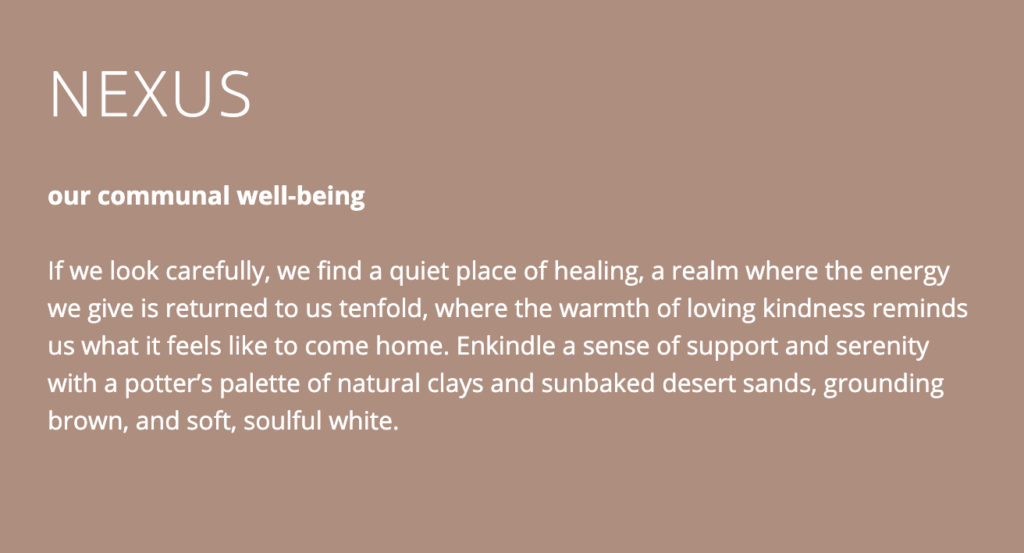
There are all kinds of lofty, abstract cultural theories about why this colour or that is trending. Like this one below from the Sherwin Williams Nexus trend palette for 2023.
Personally, I think it’s simpler than that. Collectively, we get tired of something that has been overplayed and look to the charms of its opposite.
Grey on grey, to minimal neutral WHITE modern farmhouse, to stark black and white is where we’ve been for almost two decades now. Which means almost unanimously, COLOUR is in the forecast.
A solo colour of the year is not very telling. But, what I like about the paint companies’ approach is they generally release whole palettes. And while there is way too much to cover, here are some of my overall impressions.
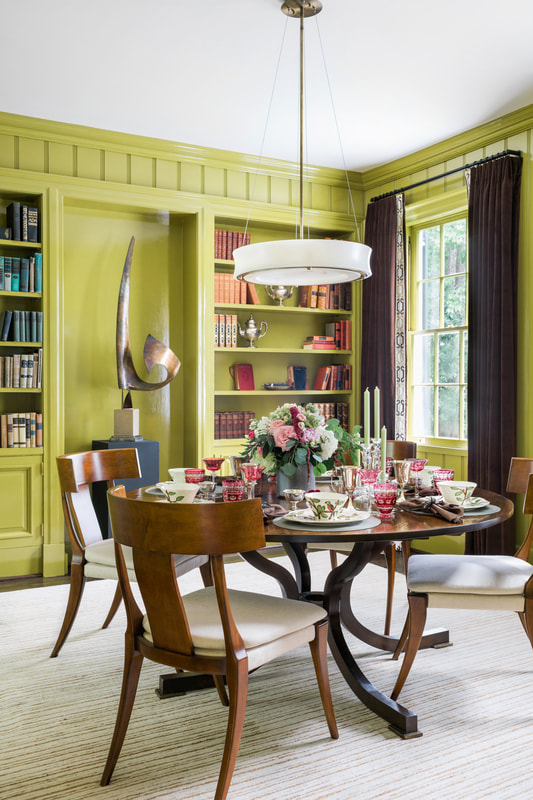
There appears to be two colourful directions being proposed. Earthy and warm: terracottas, earthy reds, natural greens, warm beiges, taupes and browns. And a much more saturated punchy range of colours that include jeweled reds, pinks and teal.
A warm red colour story
Sherwin-Williams’ colour of the year for 2023 belongs to their Nexus palette, which is an all-in-embrace of earth tones. These desert rose, mauve, terracotta and beige tones have had a long run in fashion. And now it looks like Sherwin-Williams predicts they will be more popular than some of the more saturated colours being promoted by other brands this year.
Sherwin Williams COTY 2o23 Redend Point
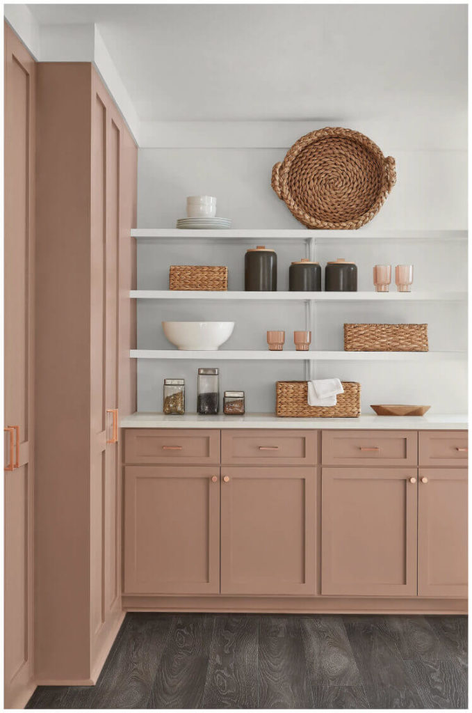
While this range of mostly pink-based tones is not for everyone, they are very useful for warming up an overdose of charcoal, grey, black and white, as it does nicely for the floors in the image above.
When SW launched Redend Point as THE colour of the year (COTY), the buzz on all my feeds was that it is the dreaded pink beige. First, there is nothing wrong with pink beige in the right context. But most importantly, while this colour certainly is very muddy with a red undertone, it is not a beige in my system.
Here it is below compared to a system deep pink beige, BM Bradstreet Beige HC-48.
SW COTY Redend Point (right) compared to a Killam Colour System Pink Beige (left) – learn more here
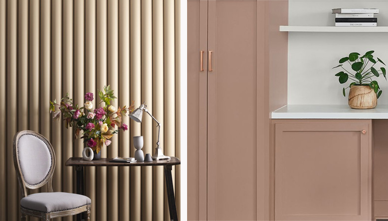
If this 2023 SW earthy palette appeals to you, keep in mind that an abundance of crisp off white or cream is the easiest way to keep it looking fresh and current.
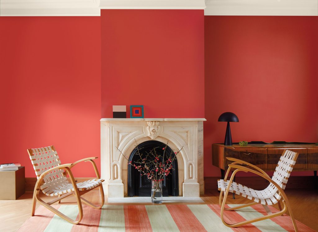
Benjamin Moore took the bolder approach, predicting a move towards much more saturated colour. Their feature colour is also red-based, a much more saturated raspberry coral. Not unlike the colour I love in my powder room.
This is a seriously happy colour (obviously, I tend to prefer more saturated colour as you can see in both recent versions of my living room here and here).
Benjamin Moore COTY 2023 Raspberry Blush
It doesn’t get much warmer than red-based colours and there is a range of them in this year’s trend palettes (see what I mean about swinging to opposites?). They range from a cinnamon burnt red, to coral, and mauve. Dunn Edwards also picked an earthy deep pink, Terra Rosa. Overall these colours are much more intense and committed than the blush pinks that have been around to sweeten grey for a long time now.
Pantone is also calling it in the red range with Viva Magenta. Since Pantone is not coming up with liveable paint colours, this is a much more saturated colour. But if you like drama, it is a dramatic accent to use in a room. It’s a pink that leans into violet (blue) and it’s one of the primary colours of the subtractive CMYK colour system (often using in printing, along with Cyan, Yellow and Black).
Palest lavenders, deepest plum browns
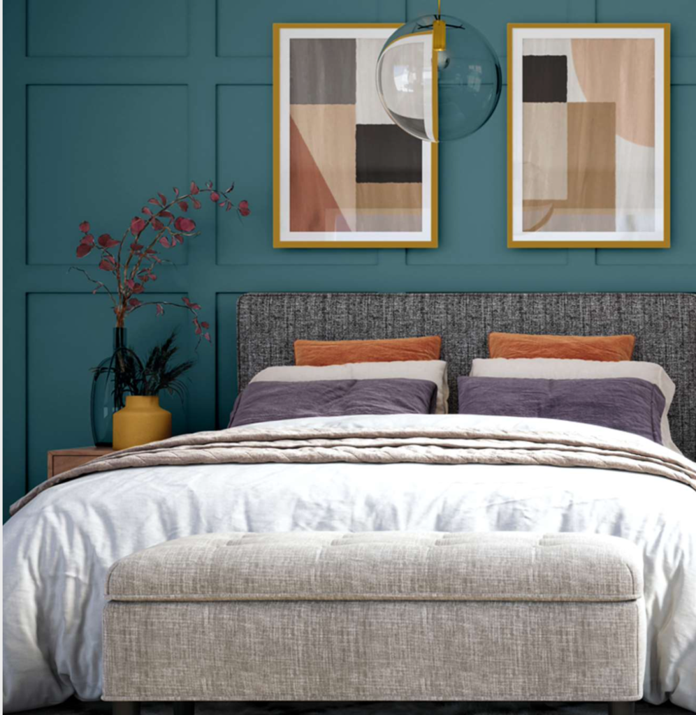
Magenta can lean quite purple and violet is a subtle but consistent presence in the trend palettes this year.
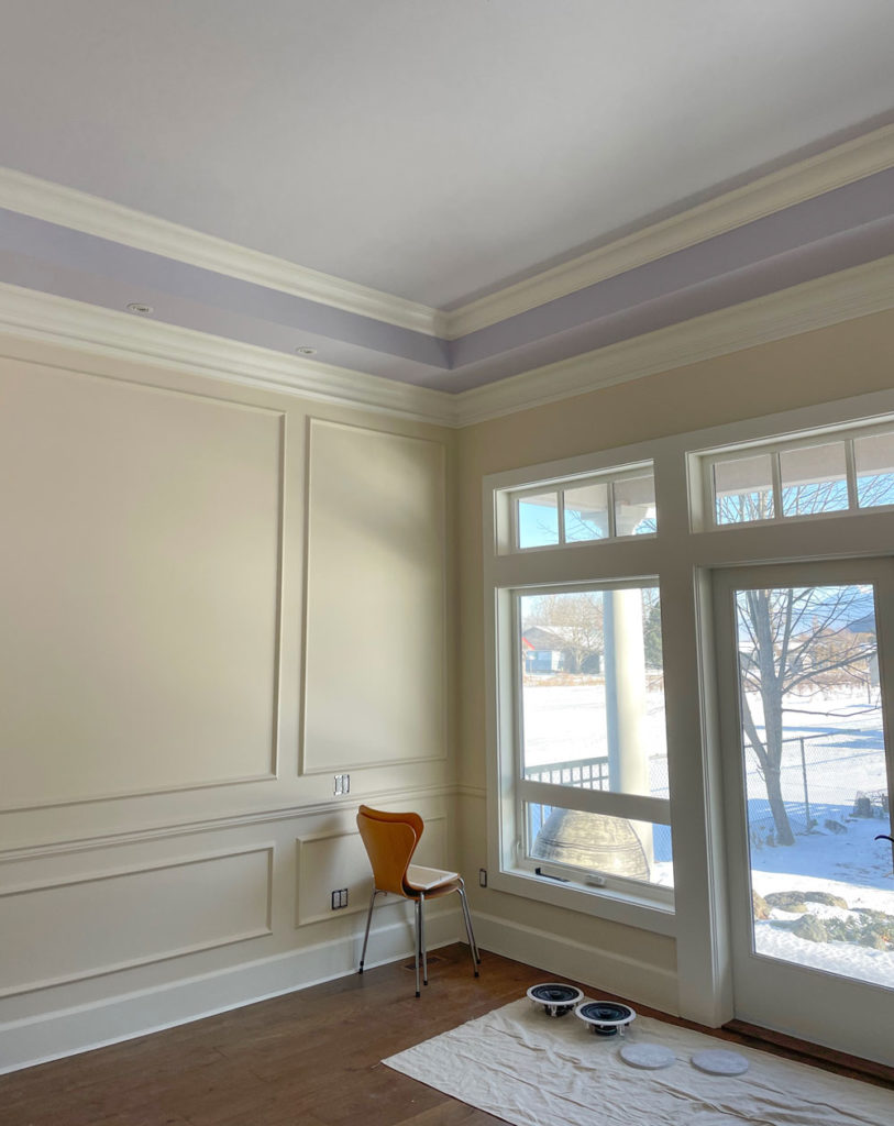
There are pale lavenders (BM New Age, SW Wallflower), which I’m all for. Of course I’m doing lavender again, this time in our new primary suite tray ceiling (see above)!
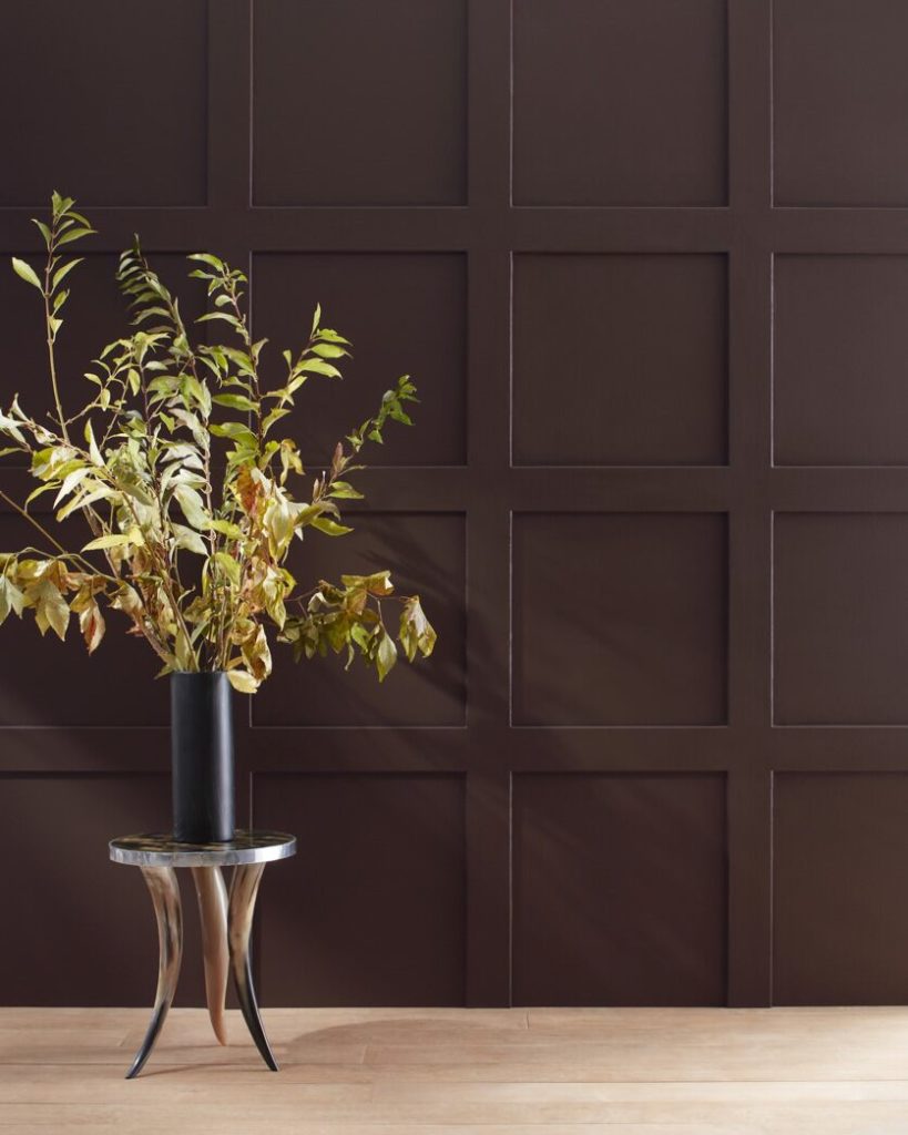
Wrapping walls in a deep moody tone is still going strong and the deep tones are moving away from achromatic charcoals into warmer, brown-toned versions. These dark browns are mostly leaning violet as well.
Green is the colour of the decade
Recent year’s trend palettes have been heavy on GREEN. From emerald and leafgreen, to more grounded and muted greens like sage, olive and equestrian greens, it’s easy to see that greens have dominated the trends lately.
One green we haven’t seen as much of in the last decade though is expected to make a comeback in 2023. According to forecasters, greens are going citrine to avocado again. Are you ready for it? These yellow-based greens are bold, and certainly not for everyone.
But they make sense as accent colours in the context of some of the red, coral magenta and violet based colours in the palettes.
Hello yellow?
As you know, yellow is my fave. And while it’s not featured prominently in many palettes for the coming year, yellow certainly is both vibrant and warming and for those brave souls who embrace it, And yes, there is a range of yellows forecasted from buttery to warm orangey tones, leaning into earthy ochres (Behr Spiced Mustard) and citrine (SW Chartreuse).
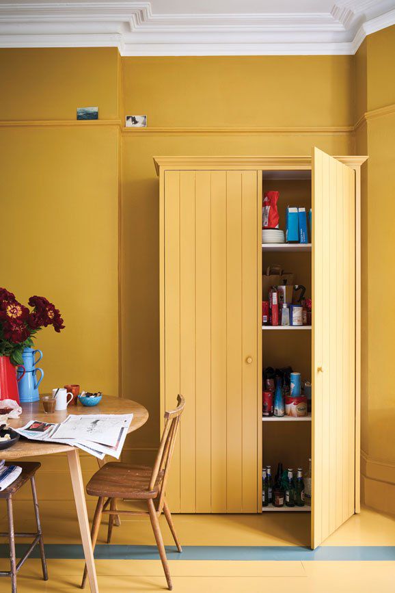
Behr Spiced Mustard
Not completely off white (and not completely news)
Behr is a bit behind the ball in my opinion with their off white with a hint of greige, Blank Canvas. Not because there is anything wrong with off white. It’s just that it is in no way NEWS. However people will walk into home depot and pick it up if they want a soft white wall, just the same.
So from a marketing standpoint maybe it’s a decent strategy. Hopefully, they at least test it to see if it relates to their finishes and decor, because white is not just white as we all know.
Behr COTY 2023 Blank Canvas DC-003
Bold teal colour predictions
There are a consistent callouts for deep blue greens. Glidden called a deep teal, Vining Ivy, their COTY for 2023. Benjamin Moore and SW both have similar colours in their trend collections (BM Deep Sea Green and SW Blue Peacock).
I included a lot of beautiful blue greens in my Benjamin Moore VIP Collection and Sherwin-Williams Premier Collection of large painted colour boards.
My overall take on 2023 colour trends? It’s back to COLOUR!
It’s clear that there is consensus that rich, playful colour is what’s coming. An this is expected, considering that we went from grey-on-grey-on-grey to an OBSESSION with ALL white, and then WAY TOO MUCH black. As you know, my aesthetic is always full of colour, so I’m all for it.
So my advice is to have fun in 2023 experimenting with colour! I encourage you to relax and take a playful approach. And while it does take a bit more skill to pull off a stronger colour palette versus the neutral white-on-white with black and tan that we’ve been seeing, I’m here to help! With all this colour coming, there has never been a better time to sign up to get colour confident in one of my upcoming true colour expert training workshops!
It will be interesting to see whether we completely move away from white and pale neutral walls. My prediction is we won’t since the average home is open concept with little opportunity to transition colour. That means white, complex cream, greige and beige will likely still be the dominant choices for main neutral wall colours.
If this is your situation but your heart is throbbing for bold colour, consider smaller enclosed rooms like your office, powder room, bedrooms, etc. And then create flow by sprinkling your bold new colours into your neutral areas in rugs, upholstery and decor for good flow (something I teach you how to do in my virtual SCWC courses!)
Happy decorating in 2023! I’m so grateful to be entering another brand new year with my favourite colourful community!
So what do you think of the 2023 colour predictions? Post your favourite hits and misses below. Will you be adopting any of these colours in your home?

Green is my favorite color, and I use it liberally throughout my home (trending or not). I was never a fan of the grey or the black-and-white trends. I’m thrilled to see a return to color!
Me too! My whole house is some shade of green or teal or mint! I hate neutrals. They are so uninspiring. I’m very excited about magenta, though. I hope that carries through to clothing.
Yes to magenta clothing!
Green is the best! 😉
Literally, none of these appeal to me. Thankfully, I trust your advice and will be staying with a white kitchen with some warm wood tones (my house is too old to suit the very nice light wood touches I see in many beautiful kitchen photos) and cognac touches.
I’m not a fan, esp of the first color, Redend Point. So blah. So flat. Those cabinets could have been gorgeous in their natural wood tones. And no, I don’t think the color balances the cool-toned grey floors. Instead, I think it clashes.
Luckily for me, I listened to Maria’s advice long ago and created classic white rooms with colorful accents. I’ll look for some new pillows and curtains when I want to change it up. Done!
Agree! Redend Point gives me 80’s flashbacks. Unfortunate.
You’re exactly right. I don’t hate any colors in the right context but SW’s selection of images for this color do not put it in the best light. The gray floors are not the choice I would have made. I think the problem is Redend Point would probably work well as a supporting color for more show stoppers, but then you’re selling those other colors, not Redend.
Wonderful article Maria. Your expertise shines through so well here. Every year we see the COTY releases, but by writing about them collectively and giving context for the choices, you add so much knowledge for readers. This was so interesting.
I especially liked how you showed the SW image with the gray floors (on the SW website they also show this color with timeless brown floors). Smart by SW to select a color and market it as working with the gray floors that so many people (unfortunately) have today.
Love your blog posts and thank you for writing them.
I’m so excited about colour coming back! I just painted my library sage/eucalyptus green. The main bedroom will be painted a rose quartz colour, the guest bedroom will be pale terracotta and the upstairs hallway a colour somewhere between chartreuse and olive. The living room will painted olive green and the kitchen/dining room/garden room will be a colour I call dijon mustard cream sauce. I can’t wait for the painting to be done!
Wow! That sounds so lovely!
Maria I am obsessed with your primary suite colors. Love the lavender ceiling! What is the wall color?
Also when are the color wheels back in stock? I am having my kitchen cabinets refinished and will not decided on a color until I have your color wheel in hand.
YES! Color, color, color!
Color should be grounded with neutrals, and neutrals should be supported with color.
There are no bad undertones, just bad combinations.
Be careful – Trends always go to the extreme.
Balance is key.
These points have always worked for me.
BTW, I love Redend Point with that floor 😉
Thanks for the article! Under “Bold Teal Color Predictions” there’s one mistake. The color in the Benjamin Moore 2023 Color Trends palette is actually 2053-30 North Sea Green, not 735 Deep Sea Green. Just wanted to let you know!
Everyone looks to get something different from their homes. I prefer a relaxing home that is a respite from a hectic work and world, and for my collected and own artwork to stand out, so my choice would be soft neutrals and timeless colors on walls and expensive to replace fixed elements. Others prefer an energizing home, which bright colors suit. Some prefer a period home featuring colors of the era. There is no right or wrong, and one look at celebrity homes or those in luxury magazines often shows that even those with immense budgets and access to whichever designer pieces they choose do not throw everything out or repaint their entire interiors to follow trends. Most feature combinations of timeless pieces with current or modern accents and artfully placed color.
I prefer your advice, Maria, using timeless neutrals for the backdrop and beautiful color that appeals to you to highlight architecture, in artwork, and trendy colors and pieces for that which is easily changed out so one has the best of both worlds.
Such good observations @JJ. Our daughter, with a high pressure career, recently decorated their new home in beautiful and restful neutrals. It perfectly suits her need to relax and be at peace. I, on the other hand, am at an age with a more limited, low energy life and I need bright, energizing colors in my furniture and accessories against a neutral backdrop. Personally, I ignore trends and do what makes me happy, as do you.
So well written JJ. I couldn’t have said it better. I, too, prefer soft neutrals on my walls and main furniture pieces. I want to come home to a respite from the busy outside world. A restful, peaceful environment. I like a piece of antique furniture in a room. If I add colour, it is in soft pieces such as throws, pillows, bedding and, of course art. I like to add new lighting and decor pieces to update my space and keep it fresh. My daughter is the complete opposite. Every room is a different high energy colour. She thrives on colour. I love her home but it’s not for me.
I do hope some of these colours hit the fashion industry. I love teal and fushia which are so hard to find.
You didn’t mention Canadian company BeautiTone Paint’s colour of the year – Moments. It’s a saturated blue with a hint of green and it’s a beauty. Looks like it will play well with so many other colours. And funny enough, they had a pinky orange colour for 2022 that is a little less bright than Benjamin Moore’s colour this year. Ahead of their time!
Both are beautiful colors @Donna Robertson. Thanks for sharing!
As someone who decorates with neutrals splashed with color as my mood dictates, I’m dismayed at these examples, especially the Redend Point, which I think is a terrible miss. As someone also commented, it is so much easier to change a few accents (draperies, pillows, etc.) than repaint an entire room or buy new or reupholster furniture. I appreciate your expertise, Maria, and I love your guidance and comments, but this one has my eye brows raised and a bad taste in my mouth. Can’t do it.
I cannot do that first color Redend Point. Just reminds me of a 70’s Dr’s office.
I would be delighted to see a return to vibrant colors!!!!!!
That Sherwin Williams color is the color of despair, if despair had a color. 😉
As someone who happily rents and can’t change hard surfaces, I’m ALL about color in my furnishings. I see that I’m right in sync with some of these colorful trends (except for yellow-green). This year I purchased a fairly inexpensive area rug from Wayfair for our living room to replace an expensive one that was never quite right. It’s an abstract, blurry Southwest design reading orange and yellow, incorporating touches of bright pink, purple, red, aqua and teal. Only pink, aqua and teal are not represented in our furniture or accessories…yet. Color me happy! And thank you, Maria, for giving me “color courage.” It really is beautiful…unless you’re into neutrals. 🙂
But we’re at the age where I’m in the market for two attractive recliners and I hope some of these color trends trickle down into the boring recliner market. There are a few in teal (my preference) or red, but not in the type of recliner or fabric I want or at a price I’m willing to pay. So I will wait impatiently and refuse to settle. Such a challenge!
Have you gone to a furniture store or are you shopping for recliners online? Furniture stores usually offer a ton of fabrics you can choose from.
Thanks belatedly @Lorri. So far I’m looking online, as furniture stores that offer lots of fabrics are limited in our area to La-Z-Boy and one other off the top of my head. But I will try those before making a final decision.
Hey Liz! Have you looked at Lazy Boy for recliners? Honestly, they have great new transitional styles and fab fabrics to choose from. I have used LB for a number of clients and they have always been pleasantly surprised at how updated the brand is now.
Looking forward to more color. I hope at some point you likewise increase the number of more saturated color offerings in your color boards. I have all the current sets and love them, but would buy more saturated colors if you sold them. Just sayin’!!
Red paint is energizing in a purposed room – office, den…powder
The SW color is truly a nothing burger – maybe a coat of lacquer would help?
It’s a collision between marketing and reality, IMO…
Maria – love your newsletter…
awaiting updates on your new home…
Nope, won’t be using any of these colors. Not my taste.
I’m so excited to see the return of colour!
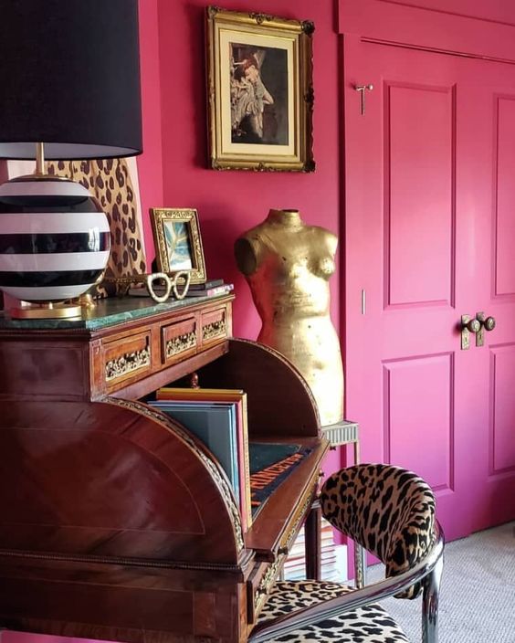
My favourite combination at the moment is deep pinks combined with rich old gold and luxe leopard print. Shouldn’t work but it does! Having said that, I’ve been a huge fan of leopard print from the days before it became fashionable 😂
So tired of 20 years of blasé colour trends. Very happy with the return to colour! There was no way that I was painting my warm brick fireplace surround white or gray. I love the natural tones. They blend beautifully with my denim blue couch and accents of magenta and coral. Yummy!
So happy to see deep plum represented here (BM Wenge). Always my favourite dramatic colour. I am planning on using this colour on my fireplace wall mosaic, draperies and accents. Everything seems to go with it-cognac, blues, chartreuse, pinks…I agree with Maria on the open concept walls being some version of the pale beige cream family which I plan to do, but the rest will be ‘go-for-it’ colour! Another informative review-thanks Maria!
I can’t help but see uncooked hot dogs when I see SW Redend Point (shudder). I would definitely lean toward the punchy, saturated jeweled tones (love teal and raspberry) and I run far far away from the mauves, terracottas, beiges.
What a great summary of the current paint trend. I’ve had a lavender bedroom for almost 40 years and I haven’t tired of it. My first house started with lilac mist and my new retirement house has BM Violet Sparkle. The bedroom is on the north west side of the house which means I am waking up to a white ceiling that appears gray in the morning with the lack of light, so I am contemplating painting the ceiling a color.
I love the magenta. What a lovely color to pair with lavender. I also hope it hits the clothing market. I’m so glad to see bold colors coming back in our lives. It just puts a smile on my face and happiness in my heart!
I’m in the process of zushing up a basement guest room and the only fixed element is grey, polished concrete floors. So, I’ve been looking for the perfect earthy pink hues to add a little warmth to the mix. I’ll definitely be swatching that SW palette! There are several wood tones in some of the furniture pieces (walnut and teak), but I think Redend Point might be a good start. My other thought was Dead Salmon (F&B). Thanks for sparking a new idea!
Those top two photos make me want to vomit.
They don’t make me want to vomit, but they do remind me of vomit! Not a fan of Redend Point. I would find another way to warm up the grays (or black and white). But, I am happy that color is coming back! Maria, thank you for sharing all this info and your thoughts!
Oh I am so glad to hear we are heading into color! I couldn’t have completed a recent basement kitchenette that incorporates as lot of the colors mentioned in this article without learning from Maria over the years on color, undertones and whites!! Thank you again for the wealth of information. I would highly recommend anyone to take the TCE course. It is well worth it into making so many decisions with finishes and decor!
Not quite sure I’m ready to adopt these colours into my own home, but it’s fun working with the warmer tones for my clients!
Yay for teal and magenta! Not sure I’ll use on my walls but more for accents and furniture. The avocado green reminds me of appliances in the 70’s and the “antiquing” craze. My parents antiqued every small piece of furniture it felt like 🙂 – hate avocado green!
Overall not impressed with paint companies 2023 color of the year selections. But in general most of their selections throughout the years are fine for inexpensive, easily replaceable accessories, but not for more costly ventures like cabinets, home exterior paint, sofas, tile, etc. They are trying to sell paint and have you paint long before needed. Overall, most of their selections would create a hard to sell home, make rooms seem smaller, and darker as well. A home should flow, and the walls, floors, ceilings, built-ins, should be the background, an anchoring palette to the furnishings. Should not be the feature.
That Redend Point has to be the ugliest colour I have ever seen except, perhaps, a lot of browns. It has no personality and it can’t decided what it is. I can’t believe someone would purposely choose this colour. YIKES. No thanks. The rest of the colours are interesting although I find the mustardy ones and that acidy green one off-putting. Recently, I took my husband shopping for some new pants and shirts at The Bay. I have never in all my years of shopping at The Bay seen such BORING clothing. The “colours” were all muted and limited to brown, black, and grey, some green in pants and the shirts were even worse! To make matters worse, they no longer sell Ralph Lauren Polo. You can always depend on RL to have great shirts in all kinds of vibrant and exciting colours. Someone told me this is a trend in clothing – few if any logos and really muted and boring colours and designs. YUCK!