


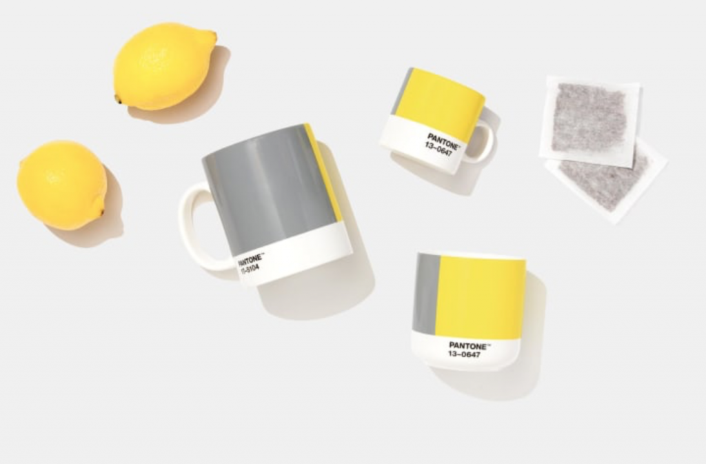
For only the second time, two colours were chosen as the 2021 Pantone Colour of the Year. Did Pantone miss the memo on the grey trend? Here’s why a colour expert thinks a grey with “no undertone” and a yellow is a remarkable choice for colour of the year, and what other colours are trending.
What is most remarkable about this colour of grey? For 20 years I have been waiting to see this grey with no undertone.
And, here it is.
When I saw it first posted last night I thought. . . Hmmmm. . . is it blue or green?
Well, it’s neither. Not really. It’s a non colour, made with only black and white, like a black and white photo. It’s “achromatic”.
As quoted by CNN, “It’s the first time an achromatic shade (gray) has been selected.”
And being completely desaturated, or “achromatic” it is not a colour you will often find in any paint deck or fabrics.
It’s closest to blue grey in my system. In the context of warmer greys, you can bet it will look relatively blue.
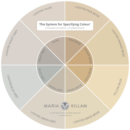
In practice, where cooler desaturated greys tend to lean blue (think battleship grey porch and floor paint), the most neutral and versatile greys are the green greys, because they are the colour of natural stone and concrete. Check out my demonstration here.
Throughout the grey trend, the world was looking for the “most neutral” grey.
And I think that’s because, like the current white walls trend, people assume that the best white or perfectly neutral grey wall colour lets them off the hook when it comes to coordinating colour.
But let me just tell you, there is no magical neutral grey that doesn’t need to be related to your decor.
“Ultimate Gray” is a completely artificial and desaturated grey, more of a digital colour for graphic design. To mix it in paint, you would use only black and white, no nuance or life at all.
In real life, most greys you’ll decorate with, will show an undertone.
And that’s a good thing, because the prettiest greys to decorate with have undertones, that bit of colour is what gives them life.
And regardless of whether you have a flat desaturated grey, or a more lively and subtle blue, green or violet grey, you STILL need to make sure it relates to the other greys in the room or it will look, not like the magical and easy “most neutral grey”, but like the WRONG grey.
So looking for the “most neutral grey” is simply the wrong question in decorating.
However Pantone, as always, has a highly abstract spin. And I was pleasantly surprised, this year’s rationale feels more honest.
2021 Pantone Colours of the Year
“Though Pantone is known for its color forecasting and trend reports, Pressman said the Color of the Year is not driven by data. “What are we looking for? What do we need? And what are the psychological characteristics of that color that can give us what we’re looking for?” Pressman posed.
The decision is informed not only by the state of the world, but also what’s happening in the fashion and art spheres. But this year, she said, “You can’t get away from the overwhelming influence of the pandemic.”
According to Pantone’s press statement, Illuminating is associated with optimism and vivacity, while Ultimate Gray encourages “feelings of composure, steadiness and resilience.”
Much better.
Now we don’t have to wonder if Pantone missed the memo that the grey trend ended three years ago when the black and white trend arrived. They are not pretending to forecast colour trends, but rather anoint a pair of colours to lead us forward with an inspiring story.
Ultimate Gray and Illuminating
Every colour has positive and negative meanings and associations. You can spin them to suit the economic mood no matter what it is.
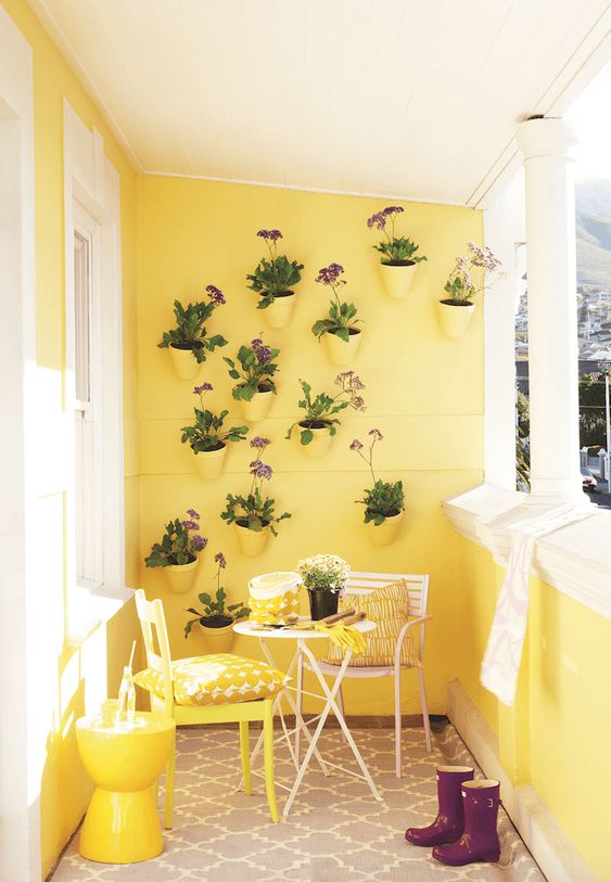
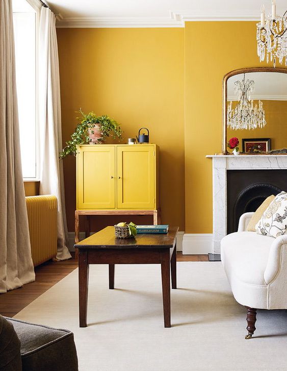
But yellow does say happy the best. And, we sure need more of that in this world, both this year and definitely going forward in 2021.
You may already know yellow is my favourite colour. Here’s a collection of posts about yellow.
Before I go on, here’s a little reminder… likely those of you who have been reading this blog a long time already know this! 😉
There’s NOTHING wrong with grey as a background to colour. The reason the grey trend arrived right after the brown trend is because the consumer (which is YOU) started craving brighter, fresher colours. Because prior to that, we’d been decorating with earth tones for 30 years. And grey was the perfect, crisp backdrop to those cleaner colours.
Grey is not going away, it is simply quickly receding in importance for interiors.
What Colours Are Trending?
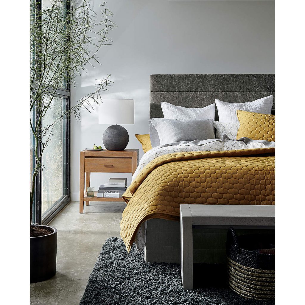
Colours are getting warmer, earthier, muddier (or dirty) again. Starting with this particular shade of richer yellow that actually is TRENDING big time. I would describe it as a mustard/ochre shade:
It’s about time yellow came back in as a trend colour. 🙂 Add in some yellow to your colour scheme and that just equals joy.
It’s also the perfect colour to bring grey to life if you find yourself bored with your recent passion for grey all over your house.
Read more: 4 Ways to Decorate Around Your Charcoal Sofa
Over to you my lovelies. Since this is the time of year where everyone is talking about decor trends that are either IN or OUT, I’d love to know what you think. What do you see that is OUT, and what you see that is trending NOW?
After all, colour trends do not get chosen by colour marketers in ivory towers with crystal balls.
The future of colour is ALWAYS driven by YOU.
And I find my readers to be the most current, because it’s y’all keep me on trend with your comments on the blog, as well as in your questionnaires for eDesign consultations all over North America (and sometimes even around the world).
My team and I have the privilege of virtually being in your home, helping you choose your paint colours, hardwood floors, countertops, home decor, really every colour for the home. So when I get asked by reporters if colour trends vary from East to West, I can answer confidently that the same colours get chosen all around the country. That is, for my readers anyway.
For the rest of the world, colour trends start in the East (where people have the most money and can adopt them quicker), then they jump over to the West, and then trickle down to the middle of the country before they are accepted as mainstream. And, that generally takes more time.
Which is why when colour experts declare that a colour trend is OUT, it takes a lot longer for that message to land depending on where you live.
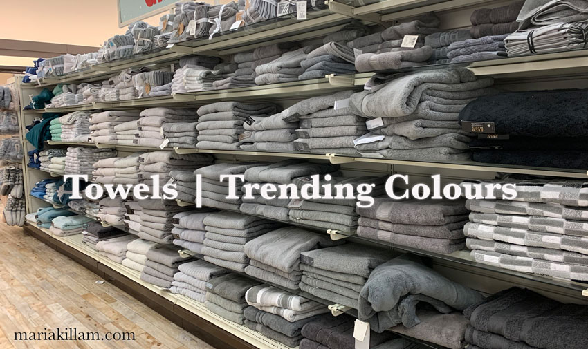
Incidentally, the best place to look for where colour is RIGHT NOW, is the towel section of any home store because they turnover faster than other bigger items.
Obviously they had other colours too but the grey section at my local home decor store last week, was the biggest.
When I shopped with my childhood friend Nancy for her living room refresh last month, we noticed how much espresso furniture (from the brown trend, that ended over 10 years ago) was still abundantly for sale in big box stores.
That’s because they obviously still have containers full of espresso furniture, because it was still being manufactured, even though trends had already moved to grey (10 years ago).
Here in the west coast, it’s only been in the last two years that even outdoor furniture was available in shades of grey (that is, in big box stores). It means that it took almost the full 10 years of the grey trend to sell off brown outdoor furniture. Yikes.
Read more: Ask Maria: What if I don’t like the grey flooring that’s everywhere?
This brings me back to why I never stop talking about classic and timeless colours and design.
Okay, over to you! Please give me your thoughts!
What’s IN? What’s OUT? And, make sure you include WHERE you live!
That will make this even more interesting. Then, I’ll create a post including your comments, so I can’t wait to see what you have to say!
Related posts:
Classic & Timeless Design Tips For a Home You’ll Love Forever

Grey (or gray, depending on the manufacturer) is still in, but definitely in warmer tones. The cool silver gray era seems to be out. Cognac is popular, and minimalism still is (although, I suspect that will change as we continue to move through covid). And I’d agree that the more muted (I’m sorry, I hate the word muddy to describe colors) colors are slowly making a comeback.
Personally, I can’t wait for COLOR to return in interiors. Pretty please!
As to the grey made from black and white? It’s an awful grey. When teaching art students about color theory, we try to convey that it’s a lazy choice (say, for mixing paint colors) because it lacks depth and is harsh. Greys mixed with complementary colors are generally more pleasing and relatable.
I often used toned down instead of muddy. Too many clients thought muted meant pastel, and while it doesn’t, since that’s how many seemed to translate it, I dropped it from my vocabulary when helping them see color. Clients vs. students.
Maria mentioned gray from solely black and white isn’t alive, and would be more for digital use. Graphic designers, clients, students – different paradigms.
I’m with you, I bought new drapes and they are yellow the inner drapes are leaf with yellow gray a really subdued pink and blue. The general foreman that built our house came in to fix some things they missed and he said “I really like your curtains.” How often do men notice? They are a linen type material and I just love them! The background on the leaf drape is a cream or off white.
This has been a long hard year and I needed something a little more cheery. Not bright but uplifting. I’m from Minnesota but last month our home was finally finished and we are living in Indiana near the grandkids while they are still young. I don’t need to go with trends, if I like it and it makes me feel good I’m game. We can still make our homes look great. Like you’ve said it’s the undertones that you need to pay attention to.
Thanks so much for keeping us up to date Maria! I have to say as a quilter and someone who is exposed to a LOT of color, this combination (for me at least😉) feels very dated and old. I saw this in quilt shops 5-7 years ago and you can find a plethora of gray/yellow quilts on Pinterest from back in the day.
I love your timeless esthetic and can’t want for your next posts!
I called Ultimate Grey the most shadeless shade of grey and the duo was super popular for wedding colors … In 2010. The comments on Pantones SM are priceless entertainment! Believe it or not, our master bath is that exact shade of yellow (previous homeowners picked it along with brown) and its a super gross shade. Super gross. Reminds me of what happens after taking a vitamin and using the bathroom. Its illuminating all right, but not in a way anyone wants in their decor! It actually hurts my eyes, actual physical pain, to see the colors together because it feels like a desaturated photo with pops of yellow, which also went out of trend in graphic design 10 years ago. It feels like they’re trying to make Fetch happen.
Amy – this comment is pure gold. 😉 So funny and so true.
I also thought the yellow and gray was very 2010
Thanks, Maria, for another great post. I, for one, am happy to see grey kicked to the curb. No judgement for those who love grey, but i find it oppressive and depressing even with not pops but BLASTS of color.
Imagine my reaction when the stager of our soon-to-be listed for sale specified grey to be painted in EVERY room of my house.
Imagine my reaction when, because of circumstances beyond anyone’s control, we can’t list the house until NEXT YEAR.
I’m living in a grey house that, no matter the undertone (thank goodness it’s not this year’s achromatic battleship grey!) is a total bummer.
Next house, I’m painting every room a different color, like it just popped out of Freida Kahlo’s brain pan (not really, but right now in this grey house it brings me comfort to picture it).
Thanks for listening, it had to be said. I feel better now…as long as my eyes are closed. ; )
Curious…how do Pantone colors relate to paint? Is there a BM color that is Ultimate Gray?
In the realm of Brewster Grey and Sweatshirt grey which are blue greys. Maria
Thank you! I’m not a big fan of grey/gray but having a “no undertone” one could be helpful for a client I am working with right now. It just seems so FLAT to me….
We’re in the process of building a house and the colors I’m loving are: soft greens, moody blues, rich cognac, natural wood, delicious creams, and a bit of blush. I want to feel calm, cozy and warm in my home, like a sanctuary. We had the cool grey walls, white trim, and dark brown wood floors in our last home. I’m over it. I like a blend of natural colors balancing some warmth and coolness—bringing the feel of nature into my home. I like the way white walls look on Instagram, but I know I would not like coming home to stark, white walls.
Sounds lovely!
What wonderful colors! Please post when you are done.
Wow, I love how you describe colors!
Yellow has been my favorite color for years. My partner says that when he met me, I wore yellow shirts, drove a yellow car, had a yellow sofa and even had a yellow telephone. My last house was yellow and I’ve painted plenty of rooms yellow over the years. I am in Naples FL. There is a lot of new construction and many model homes. The color I never see now- drumroll- is yellow. I may be the last to realize this, yellow is OUT.
I live in Upper Michigan. We are historically behind the times, but with the internet, it has improved some:). I recently went to some local furniture stores, one being a chain, looking at dining room furniture. Everything was espresso brown. I was shocked. I was expecting more of the ceruse, grayed down finishes. In the locally owned store, looking across the living room furniture, it was a sea of gray. It was depressing. It just made me wonder if people actually like it, or they just buy it because that is what’s available. Target seems to be the most up and up store in our town.
I personally have an aversion to yellow. I can handle it in small doses, but I would tire quickly if it was a large furniture piece. My daughter recently picked a buttery yellow for her bedroom wall color. It’s fun for a 10 year old with all her colorful furniture and bedding, but I do not like how it looks with most wood stains. That gray color makes me think of galvanized metal and computer hardware. Even if it’s supposed to be an abstract idea, why encourage it?
Hi Maria, I was always told that there is a committee who chooses all colors for the year. It would be for clothing, automobiles, home furnishings etc. We are dependent on “thier” color choices and not ours.
I do like yellow and grey together. What I have specified usually is a blue grey or more often a green gray which pairs nicely with yellow.
I live in California where the new trend is black and white just like HGTV.
All a committee does is curate colours they are ALREADY seeing that the consumer wants! I wrote more about that in this post: https://mariakillam.com/pantone-ultra-violet-2018/
Hope that helps, thanks for your comment Lucy! Maria
I live in the southern Appalachian mountains. Houses here are some form of traditional, Craftsman, or rustic lodge style.
In the early 2000s, all the lodge/cabin style houses were decorated in warm autumn colors. I never understood why that color scheme was designated as more suitable for the mountains than any other. After all, we have four seasons and our springs and summers feature plenty of cool-toned flowers and green trees.
Thankfully (for me anyway), the last few years have introduced a change. Many people are whitewashing or painting their wood walls or building with cooler tones in the first place. These lighter airier rustic houses look BEAUTIFUL. There are still plenty of wood tones in the flooring and furniture, but we are seeing more blues and greens in fabrics and kitchen cabinets. In some cases the palette is white/ivory and black. Many new houses have paler flooring. Have seen older wood rustic houses remodeled and the exterior painted charcoal or black or even a dramatic dark blue, and every one of them look fantastic.
It doesn’t mean the rustic houses decorated in warm palettes are going away – it’s just that a cooler palette has gained ground here.
Not to be dramatic, but I had a visceral reaction to these colors! I just do not like that gray, and for all the reasons you said, it looks like a prison or a battle ship. Not somewhere I’d like to live. For me, the yellow is less offensive, but I’m just not a huge yellow fan. The yellow feels harsh and bright, and I’m just not loving the combo!
As to trends – I’m seeing all neutrals/creams everywhere. It’s pretty, but for me it lacks room for personality or soul. I like the eclectic look more, but find it hard to get guidance on how to make that look “work.” I’m also seeing (hoping?) a move towards muted/earthy color against more neutral whites and creams.
Hi Maria,
I live in London, England. We just painted the dining room Clay Beige with a palladium blue ceiling and dove white trim. When we get to the curtains and recovering the chair seats, I’m looking for a dash of tomato red.
The old stove room is now a laundry room. We painted the floor to ceiling cabinets in Tarrytown Green and the walls Clay Beige.
There is a lot of grey here. It’s moved down market though.
We are starting to see old fashioned dark Clay tiles (5”x5”) making a comeback in designer kitchens that lean traditional.
I’m so interested in seeing how the pandemic is affecting our aesthetic, and if someday we will look back at this time and say, “Yup, that was popular during the Covid era”. I’m guessing it’s making for a more cozy vibe because so many of us are hunkered down at home.
That being said, I concur that warmer muted tones are popular here (I’m in California), but they are being done with lots of natural wood elements so it feels fresh. I like it a lot.
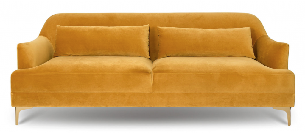
I feel grey paired with yellow is a trend long past its use-by date. There is still plenty of grey about here in the shops though. But to look at the Pantone colours separately I find the grey dead and the yellow life-giving. I l.o.v.e yellows that are clear, clean and fresh, so the current dirtier shades I can pass on. I can easily live with soft yellow walls, and have, it feels like being wrapped in sunshine. Would I today? No. I’ve changed and now there is not a skerrick of yellow in my home, except for the yellow cliveas in my garden. But your yellow sofa is still high on my faves list Maria.
Grey is still very popular here (Toronto area) and in my local home store the towel, bedding and throw pillows are still showing mostly in grey. I have been surprised by that and I have a feeling it won’t disappear any time soon. Perhaps it does have a timeless feel to it depending on how it is used. I have always loved yellow. As an artist, I see colour as a reference to something in nature. It’s such a warm, cheerful colour and definately underused. It’s about time it came into focus. As always Maria….a wonderful post! Thank you for keeping us all informed.
Thankfully, I’d just started reading your blog before we started our new build. I’ve remembered to think “timeless, not trendy” and it’s served me well. We’re building a traditional w/ a little contemporary vibe farmhouse. Interior walls will be SW-
Alabaster. I’m thinking about painting the interior doors black just like the front door. What do you think? I bought a gorgeous muddy blue cross between royal and navy with an upholstered square ottaman/coffee table covered in a linen mix of some of the rug’s colors so, yes, there will be color.
Me? I haven’t been a gray girl since I put pale gray carpet in our bedroom with a soft yellow comforter in the 80’s. Even with the yellow, it was cold and I inviting. I think the Pantone gray and yellow are both awful and would be difficult to live with on a day to day basis.
Thank you, Cyndy
Hi Maria, This is intriguing to me. In my color theory classes, as an artist and when taking interior design classes, we talked a lot about tones on the color wheel. Tones could be the most vibrant because they started with a neutral grey, a mixture of equal parts of red, blue and yellow. Add a drop of any color and the new color would just pop. I assume you probably know this. Of course we’re not talking about gallons of paint but small amounts for paintings. You can’t get that with any grey just made from black and white. But I can imagine other colors next to it would be very vibrant. I am a TCE from your Los Angeles class several years ago. That knowledge made picking out hard finishes for my kitchen remodel so easy! Thanks!
I don’t know if I’m helpful in determining where trends are going because I’ve skipped the gray trend entirely, as even most warmer grays still feel too cool for me to live with. For the past ten years our living and dining room has been Philadelphia Cream with green and raspberry accents, the kitchen is OC-118 Snowfall White cabinets with black granite and lime green walls (the closest to the 21st century we’ve gotten), and the master bedroom has been a gold/caramel color. I now find it’s time to update our master bedroom (though DH thinks there’s no need to redecorate) and we’re going to be going with cream, blush, and bronze. Since I’ve been hearing blush in several of the comments, perhaps that’s trending, but I think perhaps it’s been trending for awhile? As far as my local big box stores, they’ve got tons of grey all over the place. I guess we’re in a trendy enough area that I don’t recall seeing any espresso wood!
When I glanced quickly at the Pantone mugs in your first photo I wondered why they had duct tape on them! 😀 I guess that tells you my opinion of that particular gray…and the yellow is too bright/clear for me. So much for Pantone.
I don’t pay much attention to trends because I don’t care. I like what I like…and my soft, easily replaced finishes have to be colorful. I like the walls to be a warm off-white, so I would never paint walls gray as I find it depressing.
I’m in southern Oregon and haven’t been in a furniture store or even Target since way before Covid, so I don’t know what is trending here. A friend nearby painted her walls “Agreeable Gray” last year, after overdosing on Pinterest, so I guess gray is still around. It’s actually a pretty color (for gray) and she said it makes her feel “hugged by a cloud.” 🙂
I’ve been doing grey and ochre for years waiting for it to become a ‘thing.’ Thank you Pantone, for the grey, but not the bright yellow. I prefer a more mustard or ochre shade.. much richer. Grey walls are wonderful as a canvas for art work and yellow (ochre or a pale yellow) side panels against the grey walls is outstanding, classic and elegant. I found a grey that does not show undertones at all. I’ve had people ask me what it is because it really seems to be a true grey. I brought home an oversized sample and hung it for days, moving it around to test in various light and it worked. I found it at a BM store here in Collingwood, Ontario but it’s not actually a BM paint. The brand is C2 and the colour is called ‘Hailstorm.’
Maria, with your expertise in this area, you may find it has undertones that I can’t see, but I swear it reads true grey in my condo. My friends who’ve also used it in their main rooms love it for that reason.
It’s likely a green grey which in the right environment (without purple or blue undertones around it) would look like a true grey, but start comparing the paint chip to blue greys or violet greys and you’ll see it. I don’ have a C2 fan deck otherwise I’d check it! Some people, expecting blue grey to be a true grey (because they are a blue person) would paint their walls green grey and assume that was wrong so what a ‘true grey’ is, is personal in my experience. Thanks for your comment! Maria
Thank you, Maria, for another post with so much insight! Ugh, this color actually feels like the color of the year 2020 – they could not have chosen a more depressing one, whatever they may say about resilience and blah blah. I live in Europe, and the interior design trends here have been dominated by a Scandinavian influence for years. While ‘scandi’ still might spell minimalism in some parts of the world, the tides have turned and a more colorful, nostalgic maximalism is taking over in Scandinavian decorating. The earthy and muted backgrounds are still going strong – walls, sofas and large items are chosen in dirty colors or light neutrals – but there is a lot more color everywhere in terms of accessories and fabrics, and an overall more traditional and ‘cottage’ aesthetic. There are also lots of famous designers who seem to be mixing anything with everything! British Beata Heuman, for example.
Thanks to your wisdom and advice I no longer struggle with colors in my home. It is nice to be able to help my friends who are in love with grey and trying in vain to make them work.
I am tormented by my hair! I have been trying to grow out the color gradually for several years. My hair stylist has been helping me with lighter colors and toners. I stopped all treatments with COVID-19 quarantine, but now I find my clothing is difficult to work with. My hair color turns against the colors of my clothing. Hair has undertones. Hair stylists need you!
I tried over 20 greys before I found the most PERFECT one: VALSPAR NOTRE DAME 5006-1B, it has a LRV (light reflector value) of 57, and has a faint green undertone so it looks fantastic with wood furniture in any shade. It’s a light grey, but looks darker depending on which way your room face. I have only received positive feedback and 2 friends ended up using it as well after they saw it in my house. We have an open plan so painted kitchen, living and dining room as well as a long hallway in Notre Dame. Very happy with it even 2 years later. We always use flat paint and got this color mixed in Sherwin Williams paint.
Maria, When you helped me with choosing paint colours 10 years ago, I had been living with soft yellow for perhaps 15 years. I love the shade because it’s so cheerful but not overpowering. Not long before I met you, I had heard on a decorating show that yellow walls of any shade are not at all flattering to women’s complexions in artificial light. I was doubtful of the veracity of that comment so I checked some photos we had and, sure enough, yellow walls really age women. That’s when I decided to make a change because I was not getting younger and my youthful glow had disappeared long ago. I still have yellow in wall art and cushions as well as bright green. They’re my happy colours.
Like you Maria, I love yellow but I strongly dislike the mustard colour. That is one colour that is not at all flattering for most brunettes or anyone that does not have a fairly white complexion. Yet, it’s all over the place now… clothing, accessories and furniture. Personally, I find it a depressing shade and hope that women are not going to buy that colour just because it’s in style.
When you were here, we had already chosen the black countertops for my white kitchen and I had already ordered the pale maple hardwood floors as well as the soft grey love seats that would be adjacent to the kitchen. You suggested that I go bold in the powder room with BM Chelsea Grey HC-168. Once I painted some of the areas in the powder room from a sample pot, the purple undertone really jumped out at me. I returned to my BM store and we worked on taking out the undertone. As a result, we achieved an undertone free deep grey paint with depth. It’s not just a mix of black and white. Most experienced colourists are willing to work with customers to achieve a particularly shade. (Although, they don’t necessarily see undertones; Maria you need to design a workshop aimed at those colourists.) Since I have done this a few times, I just ask them which colour mix they are using; I make suggestions and we start experimenting from there. It is important to go in at a slow time when there’s ample time to play with the paint. N.B. Definitely stay away early mornings when painting contractors go in.
Black and white is in here as far as new homes built. I’m not walking into everyone’s living rooms to see what those are like. Salt lake county, Utah. The espresso is still out. Gray is out for a few years but still plentiful. I think there is a trend of oak and accompanying colors happening ir maybe its just being worked with better since the 90s for those of us that never fully updated everything. 🙂
I think that Pantone Grey looks like concrete. But I am also glad to see yellow. I like the muddy yellow in your pictures, but the painted yellow wall reminds me of Concord Ivory, which I had on my walls 20 years ago. It is still too saturated for me now. I guess I like to mix it with the white trend and have pale yellow beige walls (like Standish White.)