


The last post I wrote about beige was May 2022 because my clients have been asking for ‘darker whites’ and ‘warmer neutrals’ for a couple years now.
And I had to include this comment from a follower who works in a paint store who confirmed that yes, people are starting to ask for paint colours to ‘warm up’ their stark white homes:
“I work as a color consultant in a paint store and I can definitely agree that beige is back. About a year ago, I had a few people come in asking for mid-tone beiges and I thought, “Wow, beige is truly back??” Yes. Yes, it is. Now, I get questions daily from customers wanting to “warm up” their stark white homes, or wanting something “light, warm, and not gray”. We’ve definitely turned the corner on another trend. I’m so grateful I’ve taken your courses, otherwise I’d be very nervous right now. Thanks for always keeping us informed!”
The first thing everyone should know about warm neutrals is that it’s not just about beige.
Light to medium green greys and taupes also fall into this category.
However, what you should know is that beige undertones are the most difficult to coordinate.
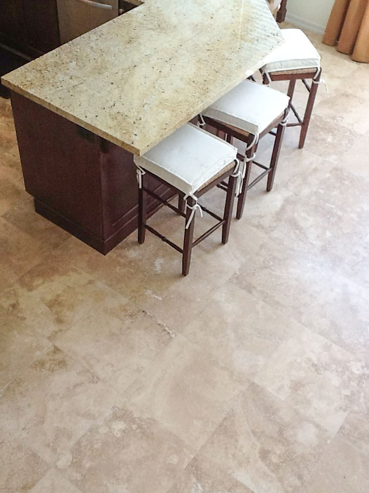
Some of us still remember the cliched tuscan kitchen from the 2000s with the pink travertine floors and yellow granite countertops that was everywhere.
Read more: How to be Smart in a World of Dumb Designers
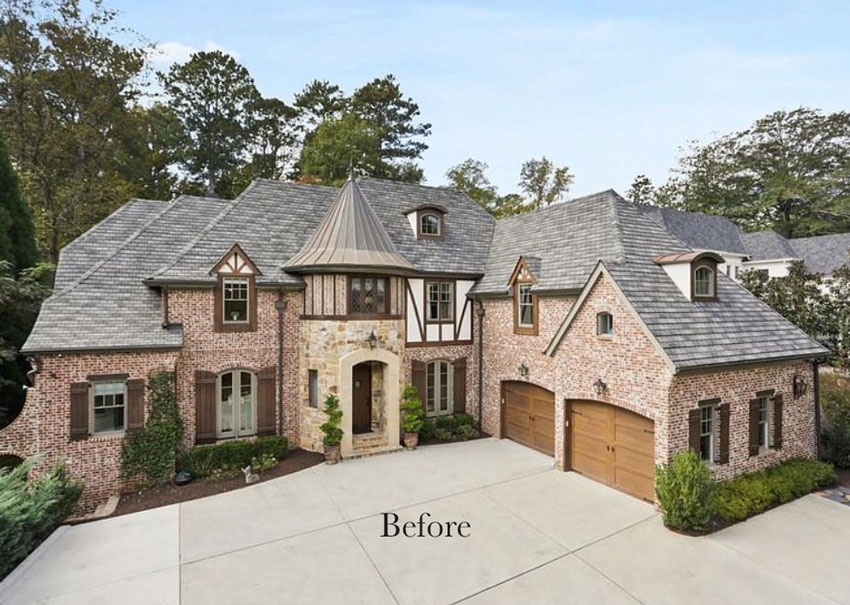
Exteriors from this trend were not much better:
Read more: How to Coordinate Exterior Colour and Stone
However when any new trend arrives on the scene, at first it’s just beautiful everywhere. Because it’s new, so we first see it done well, by designers just like the Devol and Jean Stoffer Kitchens.
But then as the trend takes off, and everyone starts to copy the designer kitchens, the perfect kitchen starts to get diluted into the cliched kitchen/bathroom/trendy home that everyone starts to dislike more and more until there are so many bad ones everywhere you look, that you start getting fatigued of the same look.
And the so sad part about getting to the stage where the trend is overdone and at the end is even IF you installed black tastefully in your home, you get tired of looking at it there when it’s also EVERYWHERE else.
We’ve all heard about the 7 year itch.
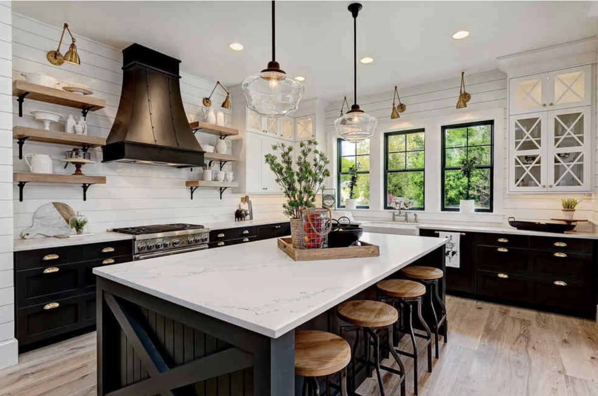
Well it’s here. We are 7 years into the black and white trend where the first few black and white farmhouse kitchens were fabulous.
We loved them, they seemed so fresh until manufacturers figured out how to paint everything black including hardware, faucets, hood fans, fences (we never had black fences before), someone even sent me a photo of a catamaran her brother had rented and it was, you guessed it, black. Oh, and should we mention black concrete? OUCH.
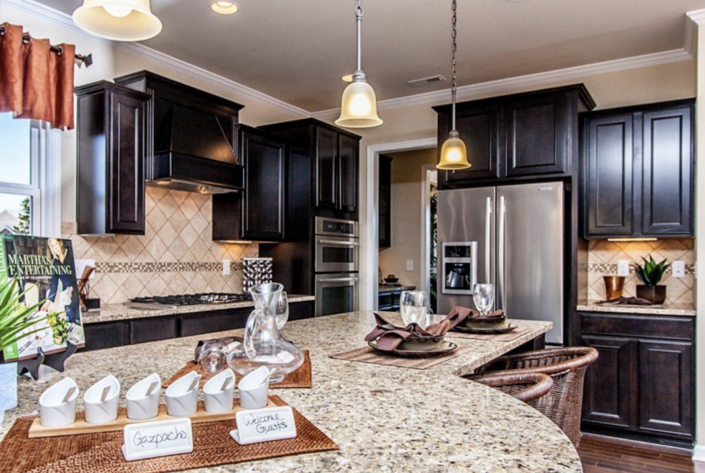
So the pretty black and white farmhouse kitchens that inspired everyone went from this:
To this:
I know you’re thinking, “But Maria, this isn’t even a farmhouse kitchen?”
That’s exactly right.
This is what it looks like when everyone starts to think black is the answer for every paint project.
For example, I was in Victoria this past weekend and on the ferry home, I looked out the window to see these freshly painted tables and chairs.
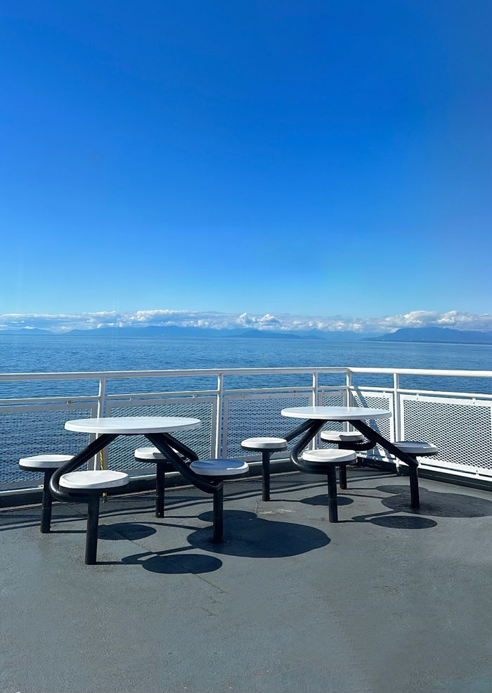
It’s a boat. How about blue and white instead of black and white? Which dies against the battleship grey painted deck anyway. A marine blue would have been much better.
So then, those in the know–like you–just get tired of seeing the same thing everywhere. Again, it’s not that black or white is not timeless. It’s just that now that they are so overdone, we get tired of looking at the same house over and over again.
And this, my friends, is why the warm neutral kitchen trend is coming in hot! It’s the perfect antidote to the pitfalls of the black and white look – harsh, stark and boring.
So since we haven’t been dealing with warm neutrals for at least a decade and a half (not anything warmer than the warm greys and taupes anyway), it’s pretty easy to forget how off the wrong beige can look.
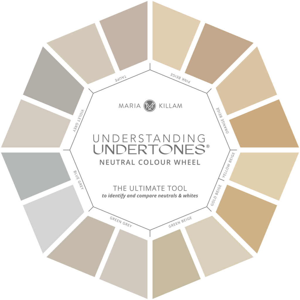
So here’s a round up of some of my deeper dives into the warm neutral undertones in my system.
What You Should Know about Beige in 2022
Click here to read the post. This is a deep dive into how you can wrap your arms around the seeming mysteries of beige. By breaking them down into the 5 undertones of beige in my system as shown on my Understanding Undertones Colour Wheel.
Modern Travertine Kitchen by Montana Labelle | Gozlan Group
What Everyone Should Know about Pink Beige
Click here to read the post. Latte, mocha, sand – these are common terms that refer to pink beige. If it looks like “light brown” or linen, it’s likely pink beige. One of the most vilified undertones in my system, it’s a perfectly useful and pretty one when used right.
What Everyone Should Know about Orange Beige
Click here to read the post. Khaki, gold, camel and caramel are all colloquial terms for beige. Caramel is often the toasty warm orange undertone beiges like this pretty room below by Suzanne Kasler.

Caramel walls by Suzanne Kasler
Complex Creams and Why You need to Understand Them
Click here to read the post. What’s the easiest and most versatile way to dip your toes into the warm neutrals trend you ask? Look no further than the very palest colours in the categories of beige undertones in my System, the complex creams.
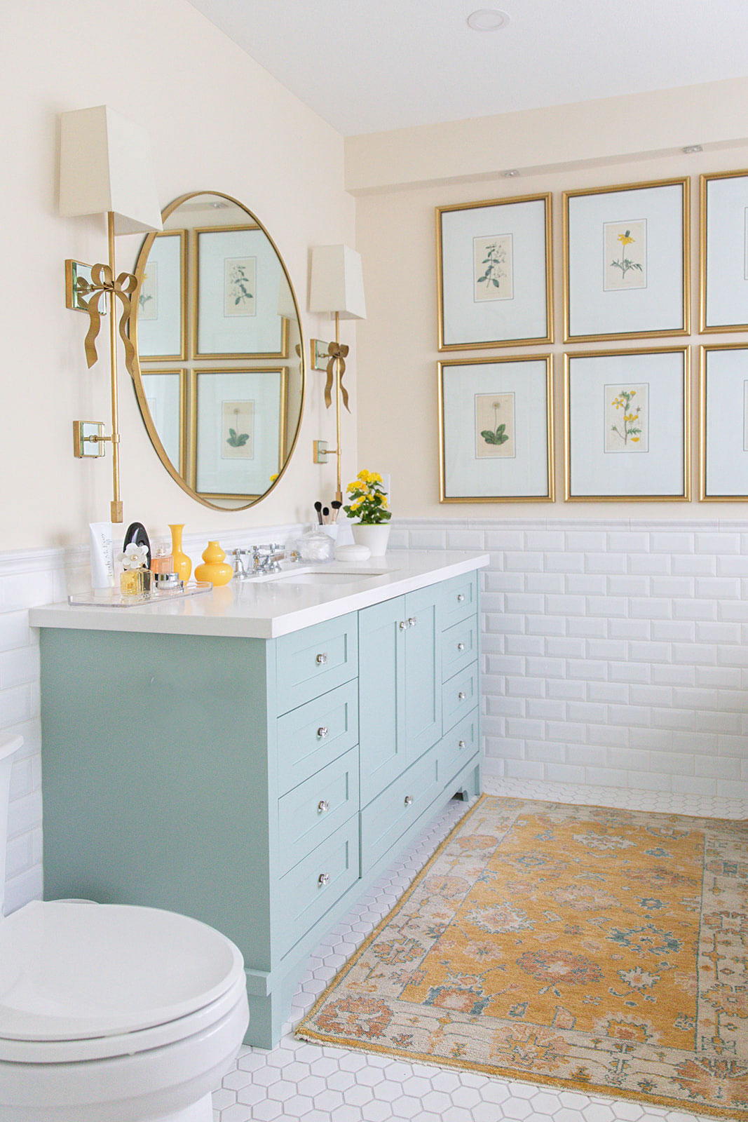
Primary bathroom in my last home
So there it is. Almost everything you need to know about navigating the next trend. Stay tuned for upcoming posts about the most versatile undertone of beige – green beige. And the sunniest undertone of beige, yellow beige (and gold beige).
But Maria, you might be thinking, isn’t a beige kitchen a trend? Well that advice is coming next. But the one thing I know for sure is if you’re a designer who is in the business of choosing paint colours and finishes for clients or you have a gift that you want to turn into a side hustle and eventually a career, you’ll want to join me in Dallas this November, learn more here.
Homeowners, learn to choose the right colours and finishes for your projects in my virtual workshops here.
Related posts:
A Tour of the Black Accents in my Home

Maria-
I have not taken your class, but I do follow your blog, and I have consulted with you on a couch color selection ( which was extremely helpful!).
We purchased our Condo in 1999, and everything was beige, with BM White Dove Trim color. Ubatuba counter top.
We repainted most of our interior in 2014, and to accommodate the color pallet of our furniture and artwork, and the kitchen counter top, I selected Revere Pewter, and Chelsea Gray for the walls in the open kitchen, dining and living area, and stuck with White dove on the trim. I painted the wall behind my oven black, which made the space a bit more elegant. To tamp down the warm undertone, I replaced the warm white lighting fixtures with Full Spectrum daylight fixtures. It seemed more modern, and aligned with the cool gray trend.
With the color trend changing, I have again installed warm white lighting fixtures. I am now focusing of decorative elements and maybe some hardware updates.
Margret in Boston
Funny you should mention Jean Stoffer, she currently has a show on the Magnolia Network called The Established Home. It’s so nice to see an actual designer doing classic design on TV.
The black-and-white trend is so stark and is everywhere. Hopefully it will end soon! although it’s still being used in new builds.
Can you add a link to the taupe article and update this article once you have the green beige and yellow beige articles up?
Here’s a link to a post about taupe: https://mariakillam.com/all-about-taupe/
Hi Maria, Love your blog and common sense approach to design. My question is about achieving a timeless kitchen backsplash. I am very drawn to the v popular solid surface backsplash (be it in quartz, dekton or porcelain) as long as the pattern is classic (ie. very subtle veining, neutral color etc.) would you still consider them timeless? How about a glossy zellige tile? I have a carrera marble subway tile in my current kitchen and have always found it timeless. I am doing a new build that is a bit more contemporary and want to ensure it remains timeless….
Post about countersplashes: https://mariakillam.com/dos-donts-installing-countersplash/. And two posts about zellige: https://mariakillam.com/favourite-backsplashes-not-subway-tile/ and https://mariakillam.com/a-10-year-review-of-accent-tile-should-you-install-the-current-fad/
It makes great sense to describe the shift as a seven year itch.
I just want to say thank you so much for this blog. We could not have afforded a designer when we built our home, but I think I read every single blog post you wrote and it was so, so, so incredibly helpful. With your advice I picked a violet grey from your most useful whites list.
And now that we are moved in….I still can’t stop reading it! Thank you for doing this work.
Hi Maria, I am remodeling my kitchen and am considering GE Cafe appliances in matte white. The only drawback I have is that they are a cool white. I was hoping to go with warm white cabinets. Do you have any blog posts or recommendations I could read as to how to deal with this situation? Thank you so much for sharing your awesome knowledge with all of us!!
Very old post with advice about white appliances: https://mariakillam.com/whiteappliances/
I am doing a new build. Small 3 bedroom 2 bath, 1500 sq ft. Lots of windows in open kitchen, dining, living room facing west, south, north. Vaulted ceiling. I want “white” cabinet with a either walnut island or white oak island? My dining table is walnut kinda a western flair. Dark chocolate leather seats. I really like SW evergreen for walls, alabaster for trim, doors ceiling throughout. I want antique brass for hardware throughout into light fixtures maybe some black or bronze in corporate. What beige could I do along with the evergreen? Is evergreen to dark ? Accent wall? I live in Wyoming kinda going for a craftsman somewhat look. It’s a ranch house.