


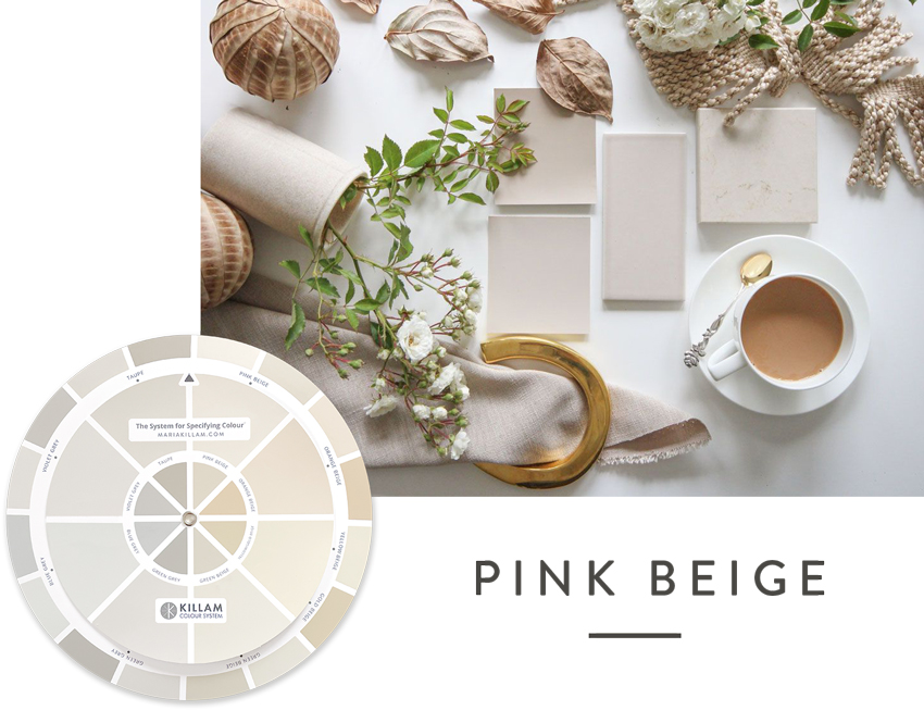
Now that beige is trending again, it’s time to revisit the pink beige undertone because we’re about to see more of it. And that’s ok, if it’s paired correctly with other finishes and colours in your home. Here is some additional guidance for working with pink beige.
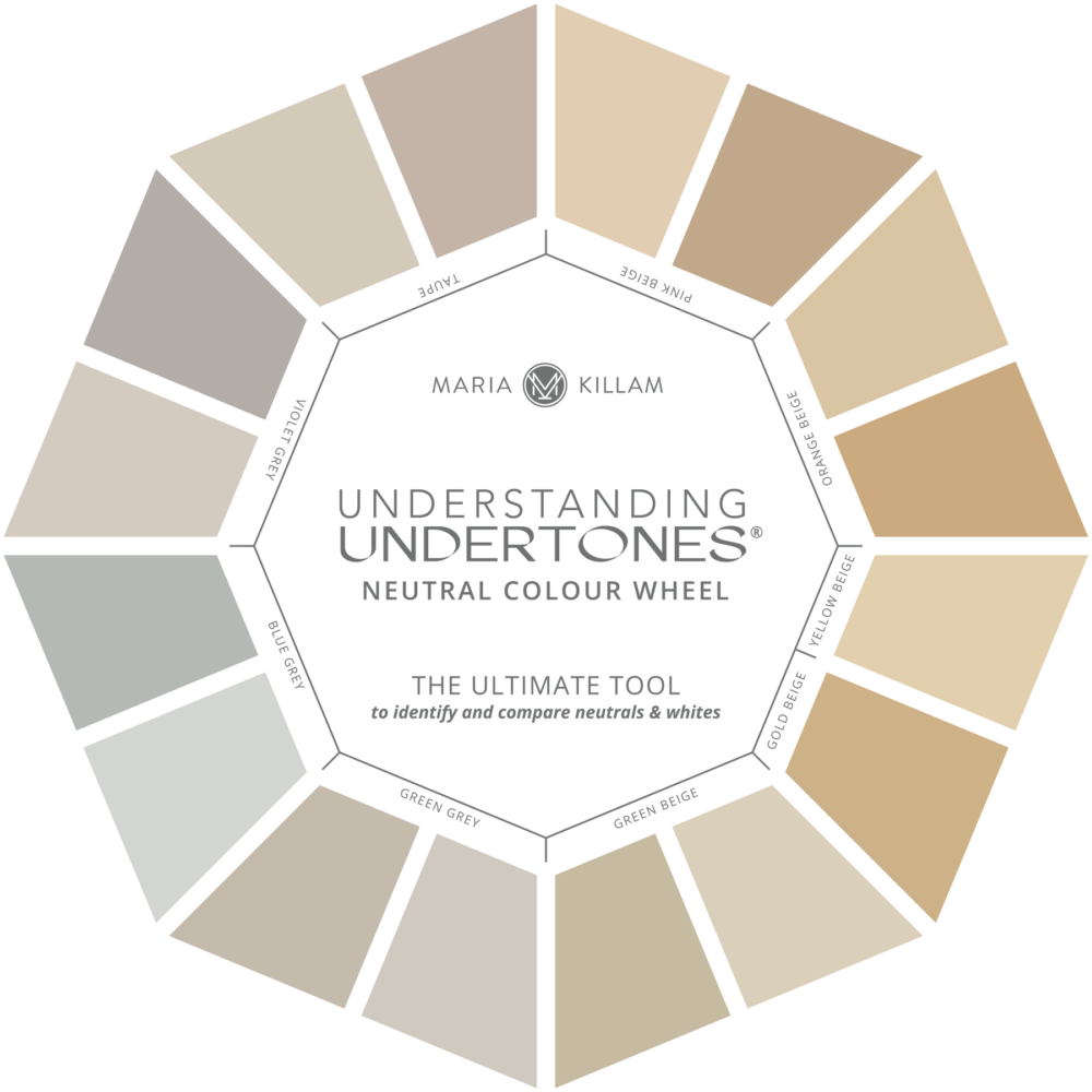
Maria Killam Understanding Untertones Colour Wheel
Get your ‘real paint’ Understanding Undertones colour wheel here.
There is little in my colour community that causes more hand wringing than PINK BEIGE. #truestory
When I started this blog, beige was very much in the range of neutrals people were grappling with. And thus PINK BEIGE became the default neutral for every selection. So I wrote a number of posts, here, here & here, warning good people not to fall for the warmest undertone of beige just because it was WARM. I also cautioned that it is the most limiting undertone of beige. I (might have) even said it should be BANISHED.
These are still among my most popular posts.
Fast forward to today, and I constantly get frantic messages worrying about pink beige finishes in my readers’ homes as well as from my eDesign clients.
Pink Beige is Ok
I want to put this whole fear of pink beige back into perspective because beige is trending again. I’ve posted about it a few times over the last couple of years. And this year, beige is starting to dominate my Instagram feed.
That’s how I know that it’s not just on the fringes anymore. It’s HERE.
Trending beige colours
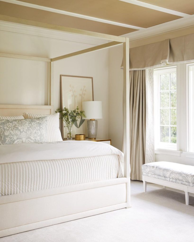
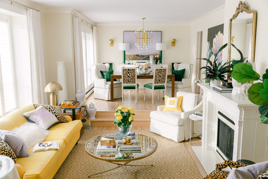
Beige is back, but differently. Now it’s here to warm up the countless black and white rooms. Typically you see beige paired with fresher contrast from the lightest and darkest of colours already mixed in. See the balance of fresh white in the bedroom above with the gold beige ceiling and pink beige linen drapes. That’s a perfect strategy for keeping the addition of beige fresh and current.
We haven’t seen many rooms wrapped head to toe in beige, yet. But if it really catches on, it will inevitably get overused again in beige-on-beige rooms with no light or airy balance.
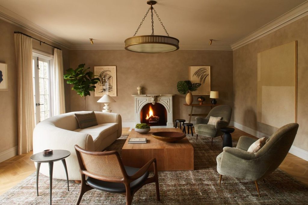
Interestingly, where I’ve seen the most heavy-handed use of beige recently is in the new “warm minimalist” look. See this room below, where the entire room is wrapped in beige and earth tones, but the furniture shapes are so modern and current that you can’t mistake it for a dated room, right? It’s a fascinating tendency since minimalism can be quite sterile. This is another interesting way to create balance with warm neutrals.
Gold beige, taupe and orange beige are being used in the new beige colour trend. But pink beige, once again, seems to be a popular choice. This is likely for the same reasons it was before. It’s simply warmer and looks “light brown” more than yellow.
Order the new real-paint colour wheel here
Some important popular materials also have pink beige undertones
Timeless natural linen ranges from pink beige to taupe. Travertine is usually pink to orange beige. And while natural wood can be treated as a true neutral in most situations, the popular pale oak flooring and cabinetry is also pink beige (light brown).
Limestone can be green beige or pink beige, as well as green grey. At this time (and I expect this will change as beige becomes a bigger, more mainstream trend) light beige to cream quartz options for kitchens and bathrooms are extremely limited and the best ones have slight pink undertones.
Plus, a vast number of homes in North America have pink beige tile, granite and carpet installed through thousands of square feet.
So here’s the thing. There is nothing inherently wrong with latte-coloured, light brown, mocha, or linen. These are all popular terms for describing PINK BEIGE.
And, pink beige has a special affinity for the warm terracotta, blush and salmon accents that are trending. Benjamin Moore featured a pink beige in their trend palettes for both 2021 and 2022.
What if the finishes in my home are already pink beige?
If you have pink beige finishes in your home it’s MUCH more preferable to try to work with the pink undertone in the best paint colours and finishes – that is, those with subtle, creamy pink beige undertones – than it is to try to ignore the pink beige and switch over to taupe or green beige.
The reason why it’s better to work with your existing pink beige by adding more pink beige is because it’s not possible to “tone down the pink” by switching to a taupe or green beige, or green grey. That’s not a thing. Switching to beige or taupe undertones does not tone it down, but rather it usually highlights your pink beige finishes even more.
This is why I’m still specifying pink beige for my eDesign clients. And there’s nothing wrong with it when used correctly.
But if I had a blank slate, let’s say I was building a new home or starting a complete renovation, pink beige finishes would not be my first choice. In fact, my house has NO neutral finishes in beige or grey undertones. The finishes in my home include black and white tile, white hard finishes and a wood-look floor.
Why? Because I don’t want to be stuck with a specific neutral undertone when I decorate. I love to decorate with vibrant colours that look best with crisp white and subtle hits of black. The palest beiges, the complex creams, as well as pale greys and greiges, are also very accommodating of colour. But when you get into those mid-toned greys and beiges in your tile or countertops, you have to be more careful in coordinating your decor with them.
So really, that means that beige, in general, is a more limiting choice for finishes than timeless white. However, among all 4 undertones of beige, the pink undertone is the MOST limiting because it doesn’t look good with yellow and yellow beige.
You already know that yellow is my favourite colour. So I would have a very hard time being happy in a house with pink beige finishes because yellows make them look dirty by comparison. In other words, pink beige is too muddy to work as a backdrop for my colourful decorating, which always has some happy yellow.
I just completely redecorated my living room around my yellow sofa for the third time (below).
If you are in the majority of people who don’t care for yellow, and you have a house with pink beige finishes, go ahead and work with the pink beige. It’s a beautiful backdrop for many other popular accent colours, particularly greens and blues. At the end of the day, the world tends to favour those colours anyway.
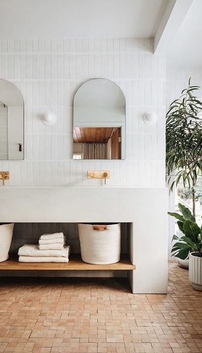
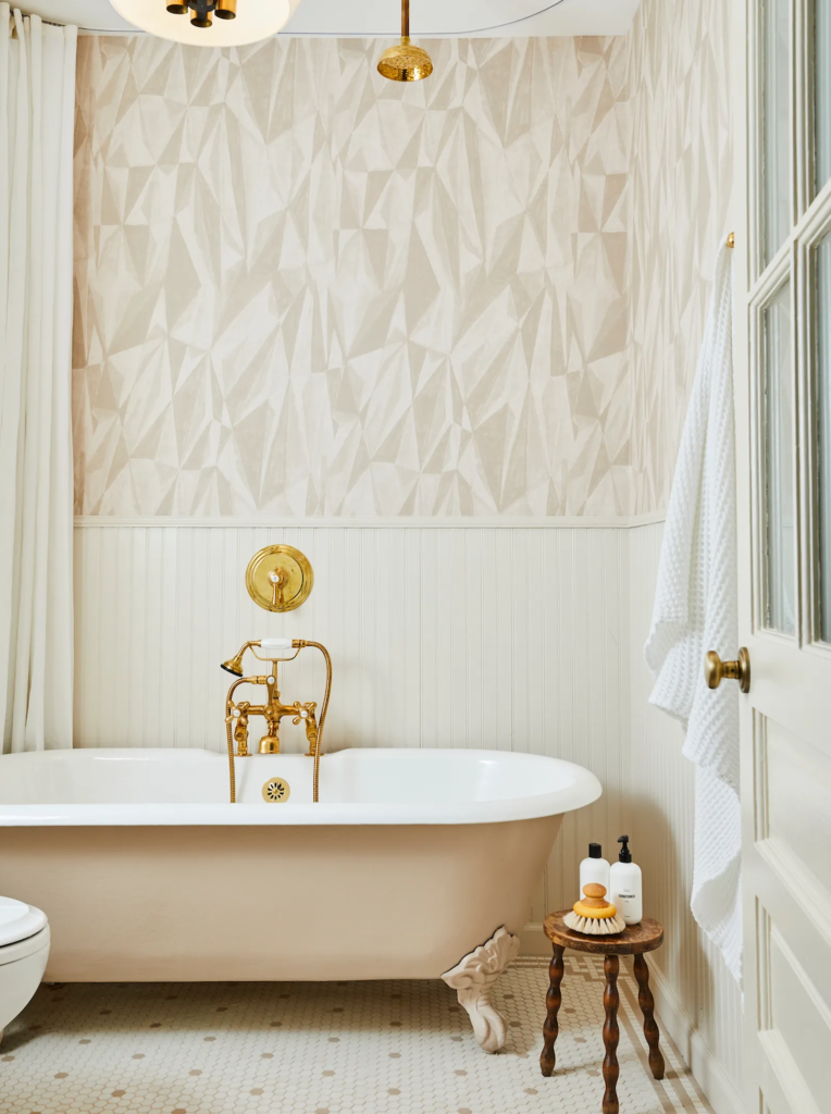
Here’s a good example of pink beige of the bathtub repeated beautifully in the hex tile and the wallpaper (below). If you look closely, the wallpaper is actually primarily taupe and the pink beige here is lighter but it all still works to create a harmonious look.
Have I talked you off the ledge yet?
If you’re reading this blog you already have an eye that is more trained than most people and if you’d like to train your eye even more join my brand new colour community and make sure your projects don’t fall off the rails. Sign up here.
If you’d like your home to fill you with happiness when you walk in the door see my eDesign packages here.
Related posts:
Why Pink Beige Should be Banished Forever
The Easy Way to Decorate around a Pink Beige Sofa
Ask Maria: How do I Decorate around my Bossy Pink Beige Driveway?

Since so much beige carpet is really pink beige, it’s particularly awful to see rooms where people painted the walls gray. And often, they choose a dark gray. It’s like they think the beige carpet is such a neutral that it goes with anything. But to your point, pink beige carpet would look just fine with a blue or a green wall color. It’s as if people are completely afraid to commit to a color so they pick two neutrals, but those neutrals don’t work together. Just look at any real estate listing today, and you will see many examples of this.
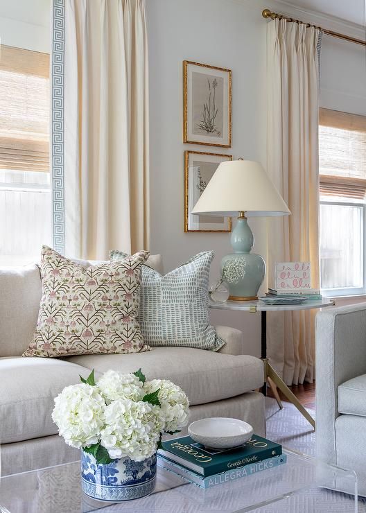
I have a strong aversion to darker pink beige, but the very light pink beige doesn’t bother me as much or at all if decorated properly. I love the photo above with the pale pink beige couch and the green and blue accents. That is probably the prettiest example of a pink beige that I’ve ever seen.
My small amount of kitchen floor tile is a pink-beige tan (not very pink, thankfully) and my bedroom carpet is light pink beige. I ignore them successfully- I think it’s much easier to ignore it on the floor than walls or counters or stone, that kind of thing. Other than that, my home is free of pink and taupe! I have cream, white, yellow and orange beiges, a dash of black, with midtone blues, greens and terracotta/rust for accent colors. And natural wood colors of course. I admit I rather dread the possibility of moving someday to a home with a lot of pink beige hard finishes… I would probably do any kind of temporary fix/paint/demo in the main areas I have to look at all the time, rather than try to work with it. I like a 70s kind of color palette as far as neutrals go. Give me all those straw and cream neutrals.
Yes i would do the same. Paint that tile (or chalk paint your stone) ya’ll, rather than suffer with it and be held hostage to it forever in your decorating. Maria
Avoiding pink beige is similar to saying to avoid anything grey. It’s how everything is put together that counts.
I agree, when I make statements like “avoid pink beige’ it’s kind of the equivalent of telling people ‘what not to wear’. Yes someone who is an excellent eye for fashion can wear anything because they know and have all the pieces that make it work, but if you’re not that person, it’s more helpful to have someone say “don’t do this’ rather than “Wear what you love it’ll all work out”, “Buy what you love for your house and it’ll all work out” when we all know those statements are not true for most people. Thanks for this question. Maria
Hi Maria
Thanks for another great informative post even though it makes my head want to exploded into a rainbow of undertones!
If pink beige is the least versatile what is the most versatile? Is there a least and most versatile white undertone too?
What is the white color (and undertone) you use for the hard surfaces in your home, and by that do you mean doors, trim, baseboards and ceilings? Are your kitchen cabinets the same white?
Are your living room and family room walls a shade of white and in the same undertone as all your hard surfaces?
i always love seeing posts about your own home and transformations over the years!. Inside and out!
Thanks!
The most versatile is green beige and green grey with off-white also being the most versatile. My living room walls are an orange beige complex cream to relate to my orange yellow sofa. In the past my walls were a greige to provide a crisp and neutral backdrop to my raspberry, yellow and green bright pops of colour. Thanks for your comment, Maria
Thanks for your response, but can u please tell me what color your hard surfaces are? Doors, trim and baseboards? Same throughout your home I imagine? Did u have to redo all of that when u changed wall colors from greige to your current complex cream?
I would hate ti have to change color of those surfaces!
I have been enjoying your blog and e-books, and following your sage advice for years. In previous posts, you suggested using Benjamin Moore’s Manchester Tan (a green beige) to update pink beige finishes, especially as a wall color with pink beige tile or carpet. Do you still advise this color?
Great question Wilma, Manchester Tan was a colour I specified all through the grey trend when someone had dated Tuscan finishes and wanted a cooler, fresher look. Now someone in the same house with the same dated finishes might choose to paint their walls the same cream as their tuscan cabinets because now the trend is pale and airy. Hope that helps, Maria
This is a great question that I wish hadn’t been asked!! I repainted the interior of my “Tuscan” home (I prefer Mediterranean) to Manchester Tan based on your advice. So nice to know I spent over five figures and two years later I’m already outdated again!!??
May I add, the two years of research and angst I put into it, trying to find the right color with the right undertones, which is how I found your blog Maria. Apparently I spent too long agonizing over it and trying to convince my husband it was the right thing to do because in the meantime, the trends changed yet again? I despised the gray trend and refused to go down that road. We are just now recovering from the financial strain as well as marital strain since he was against repainting our dream home that we built from the ground up. Now refuses to let me change the granite because of the tizzy from the repainting. And what would I change it to, anyway?? Who knows what will be in style next, and for how long?
I wish I could be as light hearted those of you who can redecorate on a whim. It truly saddens me that even though we earn a good living, we cannot afford to keep up with trends and even if we could, my husband does not deal well with change. I guess it is easy and fun to redecorate when you don’t have to worry about these things.
Honestly this depresses me that less than two years ago I painted my home an outdated color! :((
I know everyone says “it’s just paint” but this is exactly why so many of us who love color will still not take any big chances and end up with analysis paralysis. I picked the best neutral I thought I could, based on a color expert and I still got it wrong. Ugh.
Do you like the way the room looks all together? Because if you do, then it doesn’t matter if it’s ‘outdated’, or ‘fresher and cooler’ than the current fad. She only talks about trends because we all unconsciously absorb them, and often want to make a change without gutting the house.
Manchester Tan is a beautiful neutral colour and I am sure your home looks lovely! The paler walls aren’t for everyone. Accessorize in your favourite colour, add some creams (if you want) and enjoy your home. With social media I think the trend cycles are going to continue to get shorter and shorter . . . I love having Maria keep me informed of current trends . . .I decide if/how I implement them. I agree, painting is not cheap!
Hi Patricia, there is nothing in the world wrong with Manchester Tan.
And if we’re splitting hairs, because it’s a pale green beige and beige is coming back, now you’re technically ahead of the trend with your wall colour anyway.
However, chasing paint colour trends will never bring happiness to your home.
I would encourage you to do what a few readers have already posted, add some lamps and styling, that will make a much bigger difference than switching out granite or having super pale walls which really doesn’t work that well in most homes with Tuscan finishes because those finishes were so rich, dark and devoid of white.
In addition, painting your walls cream or white means you need cream or white furniture as well. Cream walls in a house with brown tuscan inspired furniture would quickly start looking too stark. Hope that helps, Maria
I just started painting my bedroom Manchester Tan this afternoon! I was trying to find a colour to go with curtains I made (autumnal greens and some orange) and looking at advice in a blog from sometime back, decided to try green beige. I’d already tried a very light green because it appeared to go with fabric, but it looked to clean. I live in the Caribbean so M Tan’s looking a bit drab – but the bit of wall I’ve done does appear to look right with the curtains – tiles are I think pink beige but they could be yellow for all I know as I seem to be a bit colour blind with some of the undertones! Am half wishing I’d never bought the fabric for curtains. I don’t even like green much; I just liked the painterly print.
Patricia, I don’t think Manchester Tan is wrong for your home or outdated – merely that there is another option that’s popular right now. Honestly, once we invest money in updating our homes it would probably be wise NOT to read redecorating blogs or magazines LOL!
I know, I know, I hate it too. But for some crazy reason I love that bathroom with the painted slipper tub. Color me crazy, lol
Hi Maria! As you know, two years ago my husband and I purchased a condo in Florida with pink beige floors (from 2011) that I didn’t want to rip out due to cost and mess. Thanks to your help, we are loving the apartment with the Maritime White walls that make the floor look a creamy beige. With accents of watery blues and green, coupled with our water view, our home is coastal, sophisticated and serene. Now I’m doing the guest room in taupe (Pale Oak), navy, other blues and pinkish red (Nantucket red). I am so grateful to have taken your workshop and signed up for the Facebook group. I have met many wonderfully helpful people there and have forged some special friendships. P.S. My husband no longer teases me about undertones because he sees them now. Thanks again!
I thought of you as soon as I saw this blog headline! Your condo is a perfect example of a pretty pink beige that really gives a coastal feel.
Yes and it looked so pretty in the end! Thanks for your comment Cynthia! Maria
I did the same thing with a similar color to Maritime White and it definitely makes my pink beige tiled floors look almost cream by contrast.
Oh Cynthia I’d love to see some photos. Watery blues, greens, coastal and serene is what I would love! Do I have a blog yourself? Thanks.
I have a bossy living room fireplace tile- travertine-ish, that looks quite creamy and pretty during the day and definitely pink at night! After studying your blogs and getting a color wheel I would call it a pink beige tile. The fireplace tile on my downstairs surround has an orange undertone. Problem is whatever paint color I pick has to work with both because the stairway wall from the 2 levels is open and share the spaces. I have 14 foot vaulted ceilings on the main level with only east windows, but lots of light so it can get pretty washed out in the daytime. Downstairs is only east windows and door to a covered walkout with deck above, so not much natural light down there. My couch upstairs is oatmeal- with pink undertones (I think) and my couch downstairs is a fabric that is light light gray with a blue undertone. Do I look for a green beige to try and marry it all together? OR do I go with a pale pink beige anyway that might fight with the orange tile downstairs? I’ve been looking at Canvas Tan, but I’m so confused, it’s been 2 years of trying to figure it out.
Perhaps your surround tile should just be ignored in order for the paint colour to look right everywhere else in your home? Or it could be painted if changing it out is not an option. If I had bad bad or blotchy surround tile, blacksplash or tile floors I would paint them in a heartbeat rather than suffer with them. Hope that helps, Maria
The way I’ve dealt with irritating stone fireplaces if not covering it up is pick an accent color that looks GREAT with the stone and then pick a paint color that goes with the soft furnishings for the rest of the room and looks ok with that one wall. I did something similar in my guest bath because one color looked better with the tile and a different one looked better with the marble countertop. So I used two different whites that no one will ever be able to discern the difference. But I will know, and I like it better than knowing that one area would be irritating each time I went in there.
What about a pale grayer greige since gray and pink look good together, and orange and gray look good together. Just a thought.
I think Canvas Tan is a great choice.I used a very similar color and even look into that color when choosing to combine with my pink beige floors and my rust orange curtains. I love the results.
Oh gosh. Maria, we need a whole post on the lighter wood floors that are in vogue today.
I love the lighter flooring, but I was recently looking at flooring choices and some of the “light brown” floors did seem to have a pink undertone.
Light brown flooring would be my choice, but the pink undertone threw me. The light brown floors with the pink undertone were beautiful, but what would Maria do?
Most people would just think they are light brown floors and therefore the timeless choice.
Hi Lorri, I’m glad you asked this question. If you look closely at my maple laminate floors they mostly read pink but they are still fundamentally like jeans because their a wood stain, AND I’m not trying to match them with other wood finishes. If I was installing a wood stained island to COORDINATE with my floors then I would definitely need to pay attention to the undertone to match them up. Hope that helps, Maria
Thanks, Maria
In the personal color analysis world, when people have their “colors done” to learn their palette for clothes and accessories, we learn that many people feel most comfortable and are most flattered surrounded by their colors in decor as well. Used on a sofa, wall colors, fabrics, etc. our homes and offices can use color to flatter, express and amplify ourselves.
Many people are instinctively drawn to their best colors. As a “Summer”, the pink beiges and cocoas are mine, so those feel good to me and work with the other colors in my palette. Whether or not they are in trending, they will always suit my personal color palette and be right for me.
It appears that you, Maria are a Spring, and I love the warm clear and bright Spring colors you choose for your personal space.
That is all true, however most people still don’t decorating with the colours that most flatter them because they are afraid of colour. The wrong beige or grey in a sofa seems to be less threatening for most people than orange, or pink or kelly green, for example. And in all fairness, colour is NOT what is available in most furniture stores unless it’s a special order. And, what I know for sure is that when people don’t know which colour to buy, they make colour decisions based on ‘warm and cool’ which is why pink beige has been overused and will continue to be overused now as it starts trending again. Thanks for your comment, I definitely decorate in the colours that I wear 🙂 Maria
I completely agree with that statement, Maria! But I personally think you are a Dusty Soft Spring or Dusty Soft Autumn. From what I’ve seen in the pictures you post of yourself, your eyes are dusty and not bright, and they look to be a soft hazel shade to me. I think your coloring and chroma is light, soft and warm. Which is why you look so pretty in that light soft mustard shirt (turtleneck sweater?) I saw you in one time in a photo you posted, and you also look amazing in that soft cognac jacket you are wearing that I see posted all the time in your advertisements for your online color classes. I’ve actually been trying to figure your coloring out for a year lol! Anyway, just my humble opinion. 🙂 I also do not decorate with orange or yellow and look like death itself when I wear cognac because I have Cool Summer coloring and when I’m decorating, I definitely lean towards cool colors.
Jess, you are so right, have you heard of Carole Tuttle’s energy profiling, she has taken the colour concept to another level, you can do her online profiling at her website. She names them to type ! 2 3 4 which correspond with the Spring, Summer, Autumn, and winter. Her book ‘just my nature’ is so insightful, design lines as well as colour how we deal with the outside world. Yes, I am sure Maria is a type 1 I am a type 2 which corresponds with my 1980s Summer profile. The interesting thing is my home is instinctively styled as a type 2 with lots of soft fluid lines, no hard contrasts, definatly no triangles, that would be a type 3! The designer Sarah Richardson is a type 1 also, I heard her talk at a home show and she said she was a Spring! you can see it in her decorating. Hope this is a help.
Interesting, I need to look into this color typing that goes beyond the spring, summer, fall and winter. I’m the latter, but those aren’t the colors that I’m attracted to when I see rooms I live in magazines.
Is the “pink beige doesn’t work with good beige” one of those safety rules for us ordinary people to follow that designers can successfully break? Gold beige ceiling and pink beige curtains…
Well I frankly don’t think it makes sense that the ceiling is gold beige, however could be wallpaper that is reflecting in the light for the camera. Darker colours on ceilings, especially in neutrals do behave differently. Also it almost looks more gold than ‘gold beige’ and it’s separated from the drapes visually by the moulding which is why it technically works. Good eye and good question! Maria
Hi Maria, I’ve read many of your posts but I guess I am color challenged! We bought an open plan house with gold/yellow beige (? I think!) walls which I finally have discovered are BM 1110- Tawny Bisque and #1111- Gingerbread. . I am not a fan of greys and this color looks good with my warm colored landscape paintings and my chocolate ( chair) and cognac ( sofa) leather furniture and oriental rug with warm reds, blues, beiges. However, I’d like to nail down how you would describe my paint color. Am I correct that it’s gold/yellow beige? Is there much of a difference between the two as far as color choices are concerned for a new kitchen countertop to work with natural/ not stained maple cabinetry? Call me crazy but I think they look great with the wall color! Thank you! Love your blog!
As soon as I received Maria’s color wheel a few weeks back, I was so excited and went around my house looking at undertones. About 20 years ago, I bought new shutters from Lowes, and they were called cranberry. To me, the color is wine and it’s one of my favorite colors. Anyway, I never bothered about the pink and charcoal landscaping stones that I chose a good 23 years ago because it looked cohesive with my shutters when I changed them from hunter green and was delighted that the shutters matched my stones and looked great with my GP Clay vinyl siding. Up until now. I wanted to paint my shutters SW Sea Mariner to update my exterior and create flow into my interior (last year we fully renovated and painted the top floor of our home and it’s now decorated with navy blue accents) but I’m not sure if the pink stones will stick out and I will have too many undertones going on. I also realize the cranberry shutters relates to the brown in my roof which is predominantly a more neutral to cool brown (think SW Sealskin) with flecks of light blue and charcoal. I think I may be stuck with my cranberry shutters forever because the hubby said absolutely no to replacing the stones after all the money we spent renovating the interior. It took me YEARS to let go of decorating with wine as it was and now that I’m ready to let go of it on my exterior, I don’t think I can because of my limiting pink stones, So, nope, pink is not my friend at the moment. Very limiting to say the least!
Hi Maria,
Thank you for saying pink beige is OK. You and Tricia specified Maritime White for my house a few years ago, (right after I had painted it all Standish White) to coordinate with my pink beige hard finishes. Since then, I bought wall to wall carpet for the stairs and upstairs. I matched it to other hard finishes in the house and so now there is more pink beige! After looking at large paint boards leaning around the house for a year, I have decided to paint it all Muslin, because I think the large space needs more chroma to hold it together. (Before moving in, 15 years ago, we had the whole thing painted a complex cream (Wheat Sheaf) and all the high walls and ceilings felt too non-cozy. You painted a pool house in the Fraser Valley Muslin a few years ago (on your blog) and it looks lovely. The painters are coming this week. I hope I am right. It is just paint, but it is a lot of it, and good painters aren’t cheap.
When I moved into my house I HATED the pink beige everything. Thanks to you, my friend pointed out that I could simply decorate with blues, my fave colour. I have come to love my pink beige walls, and appreciate the tiles, pink cabinetry etc – and appreciate that they marched undertones (except for the yellow cream aluminium windows. They co-ordinate with the exterior. We’ll just ignore them.) I’m thrilled it’s all become trendy again!
Hi Maria, I ordered my color wheel and I am excited to use it. I love hearing you talking.
I have a question that might be obvious, but I am confused.
Once you had identify the undertone of a carpet or walls, the idea is to design everything around base in the same under tone or opposite undertone?
Thank you!
Hi Maria – I have your color wheel and I love walking around my house to see what undertones I have! My question is now that COLOR is coming back how do we coordinate all this pink beige tile, etc. with color paints, not just neutrals that are listed in your e-books?
If you are asking this question, I recommend my Virtual Specify Colour with Confidence workshop, It will give you the entire picture of designing, decorating, styling vs. choosing paint colours: https://mariakillam.com/virtual-event-specify-colour-with-confidence/
Hi! What do you do about pink beige wood (LVP) floors? I read somewhere that wood floors are like ‘jeans’ in that they go with everything, but I wasn’t sure if that applied her – thanks!
BLUSH has always been a neutral for me! Recently I remodeled/redecorated my home in my fav soft teals, pinks, greens and whites. I never tire of using these colors in shades and hues, connecting rooms with wallpaper, furniture, soft materials and it is delightful. Trends are not to be followed, simply they are crazy making.
In my finished basement we have an open floor plan with a bar/kitchen area, dining area and living/entertainment area. The existing tile on the bar/kitchen backsplash and counter isI natural blue stone tiles, which are green, blue and some some rust color. The floor in the dining and bar area is a beige ceramic tile with yellow and green undertones. We wanted to do a refresh by painting the cabinets in the bar area and painting the walls and ceiling. We painted the cabinets SW 7034 Status Bronze, the walls, SW 7036 Accessible Beige, the trim and ceiling SW 7008 Alabaster. There are some wood pieces in the area that are medium to dark brown. The upholstered sofas and chairs are beige. The carpet in the living area is beige. I was surprised when the finished project, the walls are pinky beige. Now after researching why and seeing your blog, I realize the green and yellow in the room is creating the unintentional color of pinky beige on the walls. I wanted to add a few accent pillows, plus bar stools. Is there a color I can add that would make the walls look less pink? Thanks.
PS. I wish I saw your blog before we started the project.
What if your new built house has pink undertone? Antique white with rockweed brown columns has red undertones and this is reflecting on front of house. So in afternoon house looks slightly pink,..Doesn’t do any good to show picture because it doesn show up. Looks normal? You can only see in person.
We were thinking to add blue hydrangeas and more greeney to counter tone down pink, we have nice landscsoping already, but inwanted to get 75 gallon oak tree but HOA say we any large trees in front must be deciduous. May just repaint columns.
Help! I used a designer and somehow my beige field tile bath tub walls are showing pinkish. The fluted beige back splash looks like a light linen pink so I was able to stop that part of the install. The installed travertine floors now pickup up the pinks. The cabinets are white with a busy gray and white quartzite counter. What can you suggest to tone the pink out in the backsplash wall?
Can you go into depth about the difference between Pink Beige and Taupe? I get confused on the Pink part of them. Thank you
Hi Maria,
My bathroom counters are an orange beige marble and my bathroom tiles are pink beige (exact match to the darker pink beige on your beige wheel. The walls are cream (Ivory White) like the accent tile and usually it looks heavenly, but sometimes I wonder if another complex cream would pull everything together better.
Hello, love your blog. I have a pink beige backsplash in my kitchen and I can’t seem to decide on what color I should do the countertops.
What would you suggest? Always appreciate a professional opinion.
Thanks
Beverley