


The new Understanding Undertones Neutral Colour Wheel is finally in here. We’ve made a few design changes to make it an even more useful tool for identifying and comparing neutrals and whites. Plus, I’m answering some of your top wheel questions.
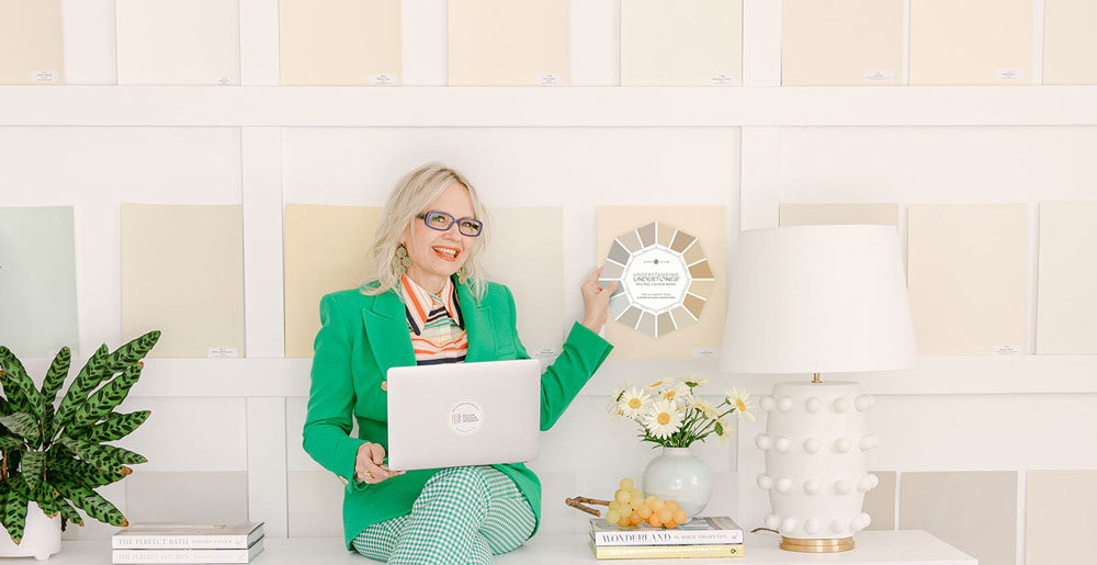
Hooray! My new colour wheel is finally here!!
We’ve been promising it for months and because of the supply chain shortage we waited and waited for paper and almost thought we wouldn’t have it until January but then miraculously our supplier was able to send us a small supply just in time for Christmas!!
But don’t worry, if you miss this one, we have more on the way after the holidays!
First, you’ll notice that the design of this wheel is different from the last one.
However, the colours are IDENTICAL. So if you have the first edition of the real painted wheel (which is the one we’ve had for sale since early this year) then it’s still good!
What the first edition wheel has that this one does not is when you turn the wheel, it gives you a little description of each undertone. We eliminated that for this round because the turning of the wheel itself caused a lot of confusion.
Many people thought that turning the wheel magically gave you ‘neutral colour combinations’ when that’s not the case at all.
It strictly gave you more information about the wheel which we have now added to the explainer page.
But if you have the old one, that’s a benefit that the new one doesn’t have attached to it.
The number one reason why you are not looking for ‘neutral colour combinations’ from the wheel is this guideline for neutrals (that I teach in depth in my True Colour Expert Training):
Guideline for Working with Neutrals #1
Limit the number of neutral undertones you decorate with in one room to one (or two at the most)
This guideline is the primary reason the wheel was never designed to give you a ‘combination’ of neutrals. Because you shouldn’t have that many in any room.
Here’s why we changed it:
Q: I put the colour wheel on my (sofa, countertop, floor, wall) and I still can’t figure out what the undertone is.
First, place the neutral colour wheel directly on your upholstery to eliminate the undertones that aren’t there and narrow down the ones that are a close match.
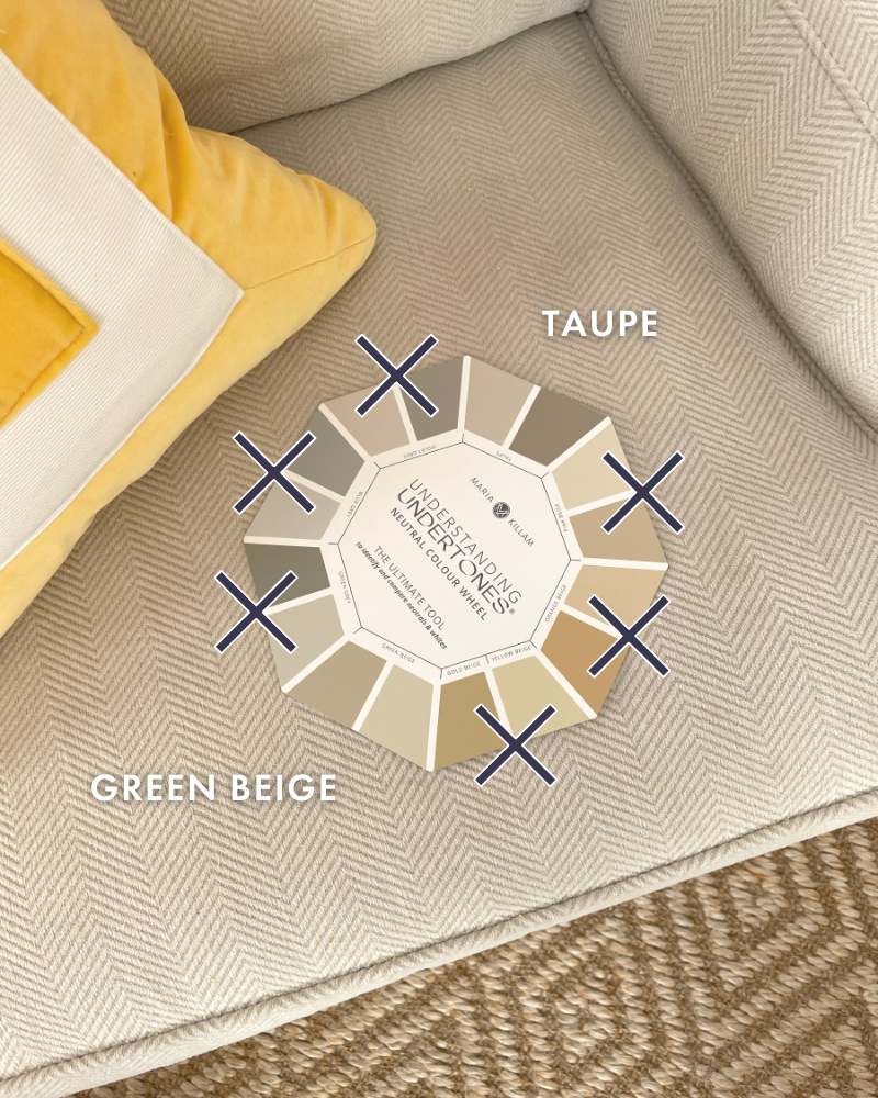
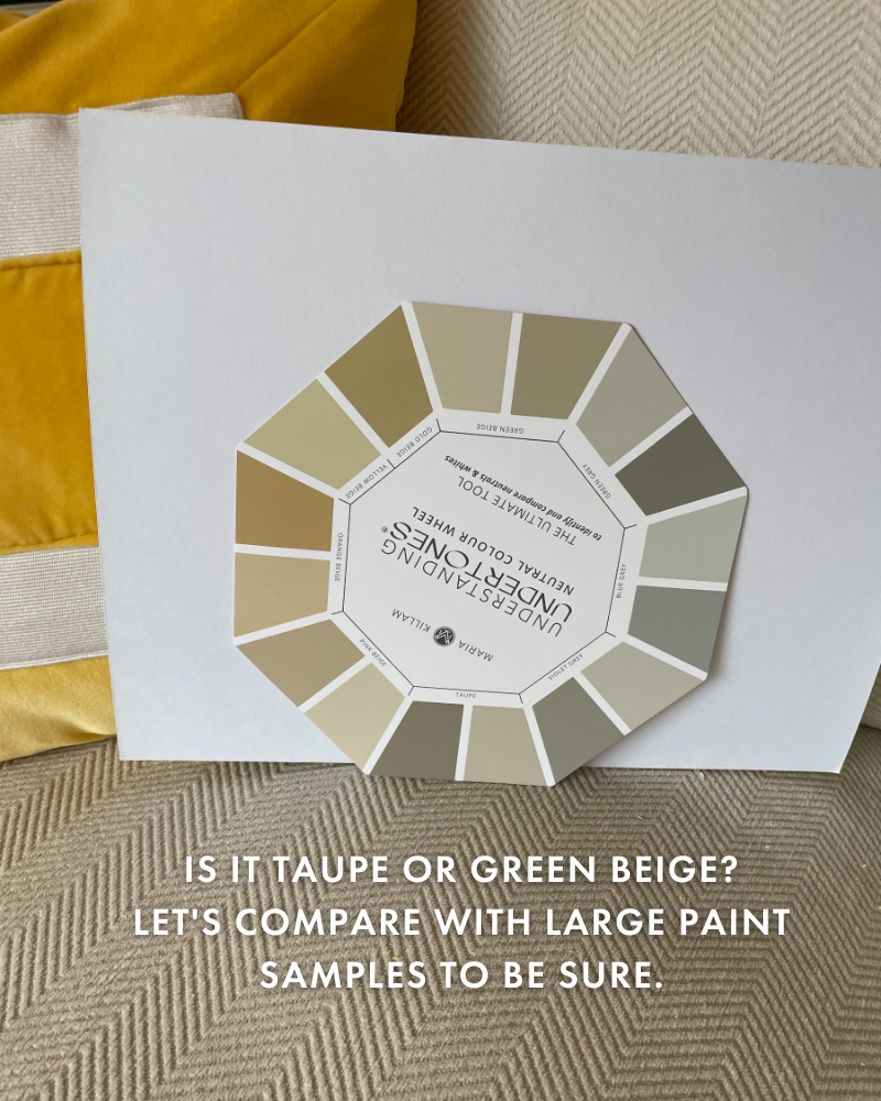
Next, hold the neutral colour wheel up vertically (paint goes on the wall vertically, after all) with white paper behind it (so you’re not comparing to anything else) and so you can see it even clearer.
Consult the list of taupe and green beige neutrals inside the Killam Colour System found inside either of the eBooks and bonus lists of colours.
If it looks like it could be a green beige or a taupe for example, you’d gather both paint chips or large colour samples and compare to see exactly which undertone is the best match.
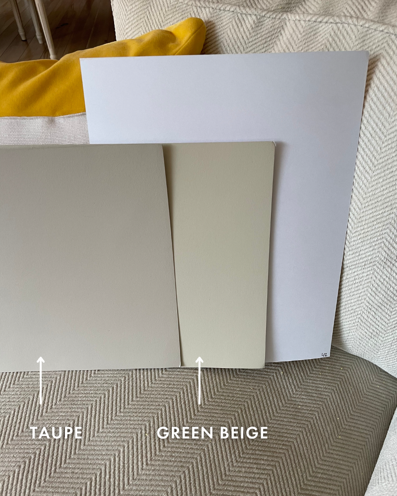
Here, green beige is looking a little too yellow. And now you can see that the right undertone is, in fact, taupe.
Q: How do I know what colour to paint my walls after identifying the neutral undertone of my sofa (for example):
Easy! Consult my curated list of Killam Colour System neutrals and whites located in the Bonus Book of Colours that comes with either of my ebooks and test a few of them to find out which one looks the best.
Remember, you’re always looking at the largest items in the room to find out which colour will pull your room together!
Q: I don’t see the neutral colour of my sofa/countertop/tile, etc. on the colour wheel. Now what?
This wheel obviously does not have EVERY single neutral undertone or gradation of white that exists in this world, however it does have the most USEFUL ones.
The ones you’ll find in most finishes and fabrics, over and over and over again.
If you don’t see the “exact” neutral or white you have in your home, what the wheel will do is eliminate the obvious ones that don’t work at all.
So if that means you’ve eliminated all the beige undertones, when you pull out the grey or taupe samples in my system, one of them will most likely be right.
However, the difference between the right neutral and the wrong one is so subtle, comparing the neutrals in my system is still the BEST WAY to find the right one.
Q: Ok, my new colour wheel just arrived but I don’t know what to do with it?
I’ll be doing a lot more videos exploring all the different ways to use the wheel so stay tuned. If it’s not obvious now, we’ll figure it out together! Head on over to our explainer page for more tips and helpful guidance.
We have a limited supply until the first of the year, so get your very own Understanding Undertones colour wheel today!

That new Color Wheel looks amazing! Great changes! I can’t wait to use it. Thank you!
Hello Maria, I’m going out on a limb here but honestly, the lighter shade in the violet grey category in the first photo looked like a possible colour choice as well. How were you able to discern that this was not a possible choice….perhaps my computer screen is showing something slightly differently? I was able to see that the greenish taupe wasn’t correct in the first photo….I would have leaned towards the lighter neutral in the violet grey combo. Thank you for the update & new information. I love playing with undertones. Thank you and wishing you and your family a Very Merry Christmas and Happy New Year! Happy Moving Day! Cheers.