


Changing your wall colour every time new paint colour trends are revealed can be a frustrating endeavour. Today I’m responding to an upset reader and addressing the one thing that paint colour cannot do for your room. It’s a lesson we can all learn from.
Interior Design by Maria Killam
Last week I received this comment underneath my recent post about pink beige:
“I have been enjoying your blog and e-books, and following your sage advice for years. In previous posts, you suggested using Benjamin Moore’s Manchester Tan (a green beige) to update pink beige finishes, especially as a wall color with pink beige tile or carpet. Do you still advise this color?”
This was my response:
Great question, Manchester Tan was a colour I specified all through the grey trend when a house had dated Tuscan finishes and my client wanted a cooler, fresher look. Now for the same house with the same dated finishes I might consider the same cream as the tuscan cabinets because now the trend is pale and airy. Hope that helps.
Then another reader read the above response and posted this comment:
This is a great question that I wish hadn’t been asked!! I repainted the interior of my “Tuscan” home (I prefer Mediterranean) to Manchester Tan based on your advice. So nice to know I spent over five figures and two years later I’m already outdated again!!??
May I add, the two years of research and angst I put into it, trying to find the right color with the right undertones, which is how I found your blog Maria. Apparently I spent too long agonizing over it and trying to convince my husband it was the right thing to do because in the meantime, the trends changed yet again?
I despised the gray trend and refused to go down that road. We are just now recovering from the financial strain as well as marital strain since he was against repainting our dream home that we built from the ground up. Now refuses to let me change the granite because of the tizzy from the repainting. And what would I change it to, anyway?? Who knows what will be in style next, and for how long?
I wish I could be as light hearted as those of you who can redecorate on a whim. It truly saddens me that even though we earn a good living, we cannot afford to keep up with trends and even if we could, my husband does not deal well with change. I guess it is easy and fun to redecorate when you don’t have to worry about these things.
Honestly this depresses me that less than two years ago I painted my home an outdated color! :((
I know everyone says “it’s just paint” but this is exactly why so many of us who love color will still not take any big chances and end up with analysis paralysis. I picked the best neutral I thought I could, based on a color expert and I still got it wrong. Ugh.
Let me just start by saying my heart hurts when I read comments like this. 💔 Having been in this business for 25 years, I know the reason why she’s really upset and it has nothing to do with the paint colour.
The thing about trends
There are a few other points I’d like to make before we dive into responding to this comment. And, here’s the first one:
When I worked in the paint store way back in the beginning of my colour consulting days, there is no brochure that would fly out of the store faster than the “colour trends brochure.”
And this is because as human beings, we are obsessed with all things NEW.
That is, anything recent or fresh and not part of the former is basically the definition of new. Most of us tend to be attracted to “new.” And that is how trends begin moving in one direction or another. Remember this video I made about who decides trends? Interior designers, decorators and colour experts are not the enemy, just the messengers. 😉
So, if you (or the previous homeowner) did not build or renovate your home using timeless finishes, will a new paint colour make your dated finishes go away?
Unfortunately, the answer is no.
I’m going to take a page right out of Day 1 of my true colour expert training to illustrate this point.
To decorate, or not to decorate?
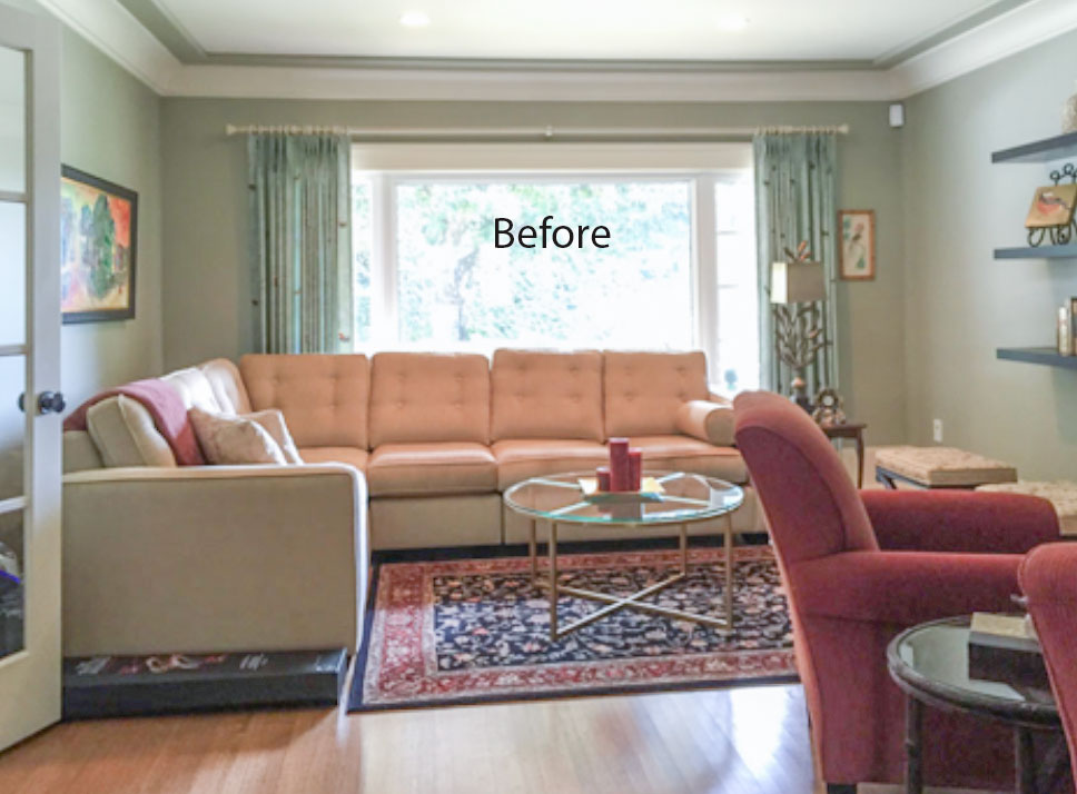
A few years ago, I arrived at a client’s home who was renovating her kitchen and re-decorating her great room. See that project right here.
As we toured her home, she paused when we stood at the entrance of her living room. She sighed wearily and said, “I know this room is dated but we never use it, so my husband doesn’t want to spend any money on re-decorating in here.”
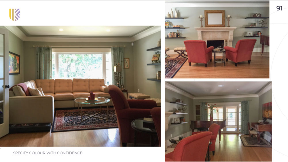
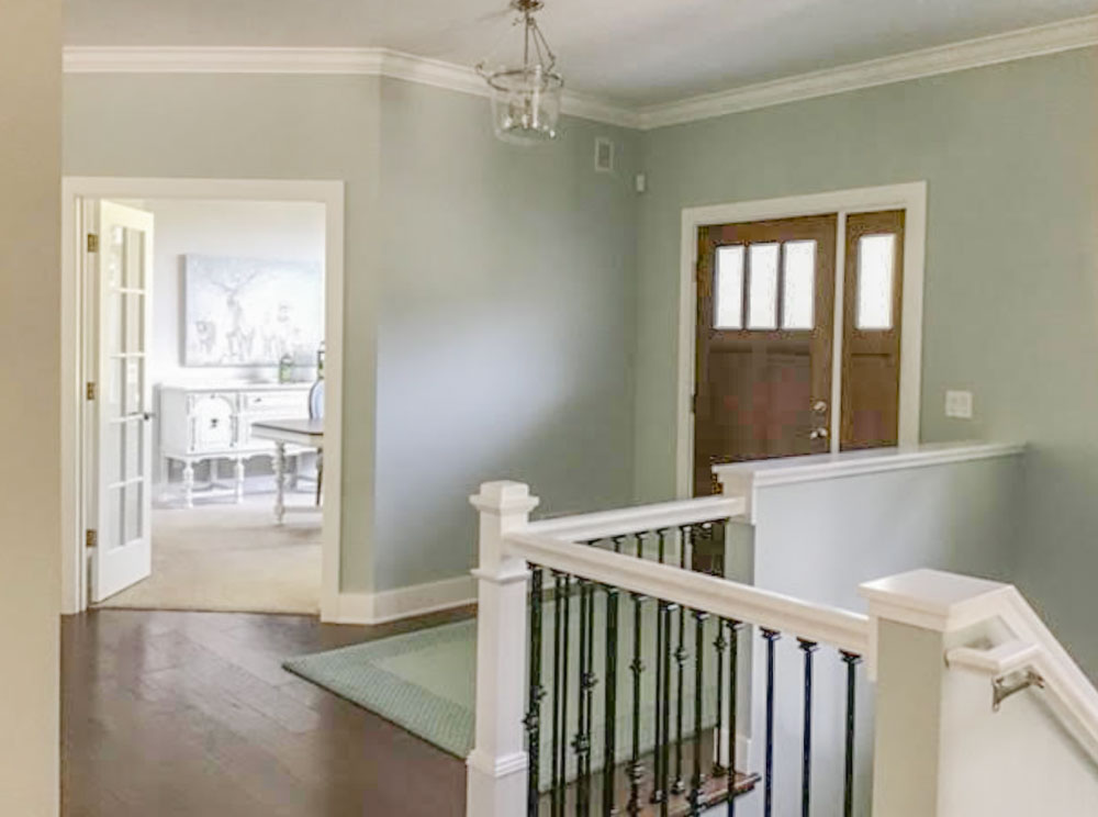
Before
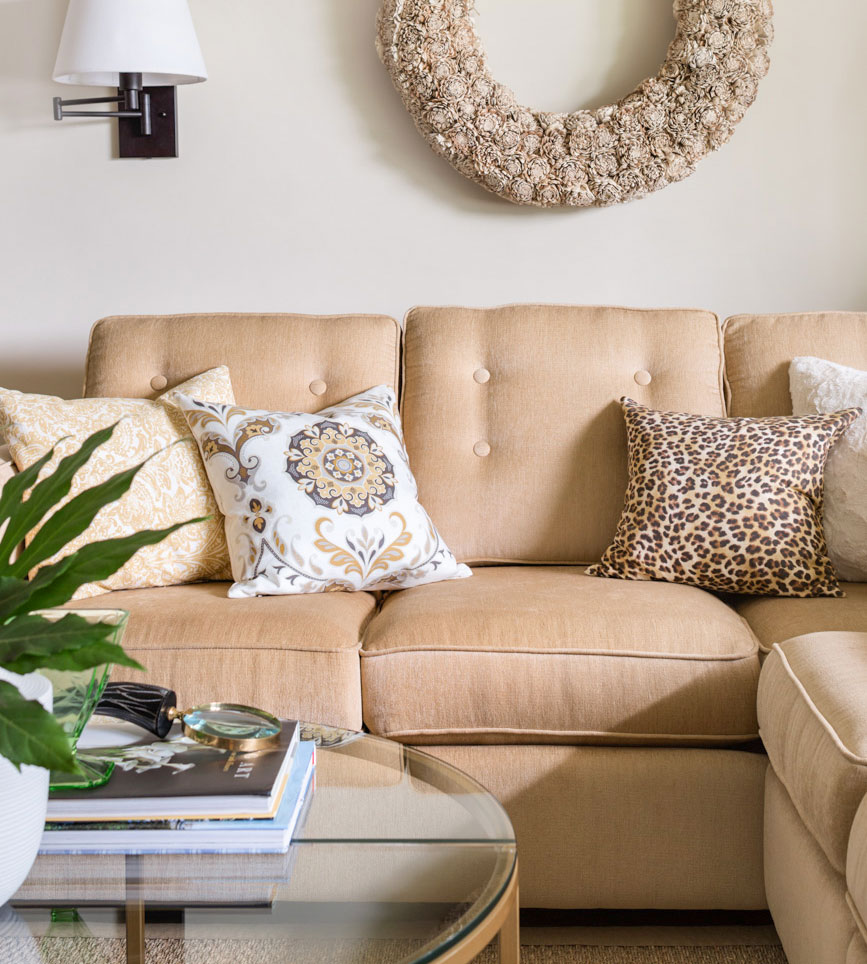
My response: “It really wouldn’t take a lot of money. All we need to do is paint the walls, remove the rust chairs and rugs, get some inexpensive off-white linen drapes, add in some seagrass rugs, take down the modern shelving that doesn’t work in this traditional room, move the antique desk to the other side of the room, and finally bring in some white and leopard pillows.” Done!
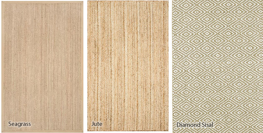
Seagrass Rug (22 sizes) | Jute Rug | Diamond Sisal Rug
Remember to review these rugs in the photos where they are laying down. Here the diamond sisal looks more green than the other two but this is how it really looks when it’s installed.
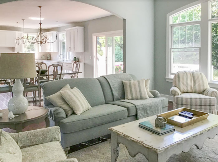
Anyway, we chose a seagrass rug, which was both inexpensive and neutral. Look how it freshened up this room after:
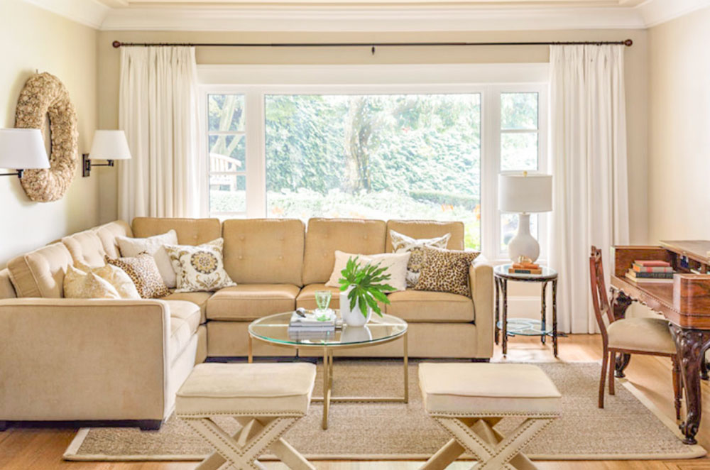
Notice the swing arm lamps? Absolutely essential installed behind a sectional or any sofa up against the wall.
You can buy lamps with a cord or hard wired:
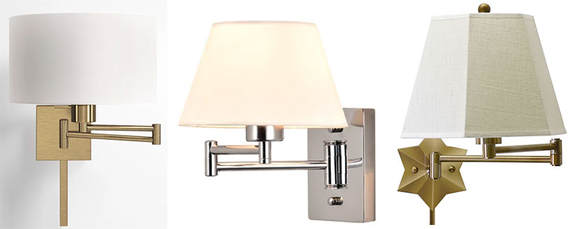
Drum shade | Hardwired | Star light
Notice I’m showing only lamps with shades here. That’s because if your living room is already lit up with recessed lights, what you need is ATMOSPHERE. This is only achieved by the glow you get from a lamp with a shade. Adding yet another spotlight is not helpful, which is all this kind of lamp will give you.
I know, I can’t resist yet another lecture about lamps and how important they are to your mental health. I’m not kidding. The last two years has taken a toll on us all and everyone needs at least ONE ROOM that makes us happy.
It’s called LAMPS. I cannot overstate this enough because so many of you still don’t believe me.
If I had to choose between repainting my house from dated paint colours vs. lamps and accessories, I’d choose to decorate first every time.
That’s exactly what we did with my sister’s kitchen a couple of years ago. We had a $5000 budget, which meant we had a choice:
- Painting her dated, glazed, pink beige tuscan cabinets, a fabulous complex cream (which would have eaten up the entire budget)
- OR, updating light fixtures, adding accessories and a new table with upholstered chairs along with new valances and wall paint.
Which one do you think we chose? See that kitchen here.
Anyway, back to my story.
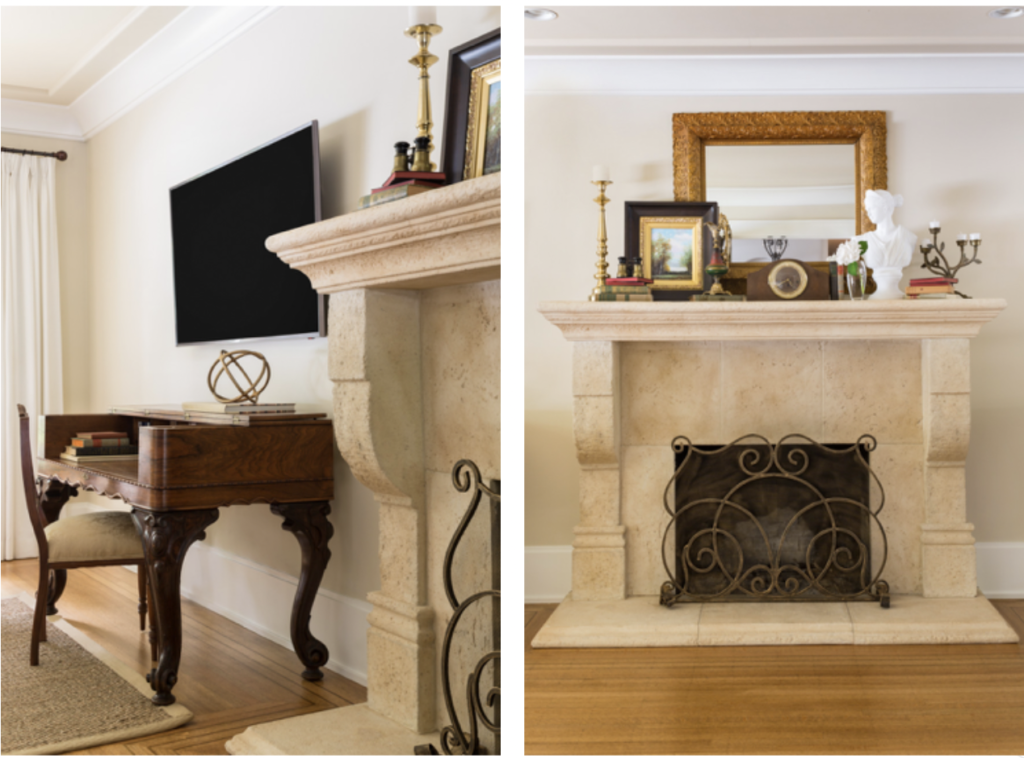
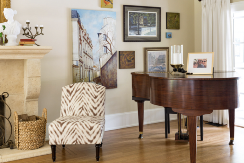
My client’s husband loved the makeover so much he immediately added a flat-screen TV (below left). I styled up the mantel, re-hung her artwork by the grand piano and TA-DA – so much better!
Notice her pink beige Tuscan fireplace (which by the way you could paint if you really wanted to) looks great with the versatile beige I specified.
And you might be asking by now, so what’s the paint colour in this room?
Maybe you guessed it? That’s right… it’s Benjamin Moore Manchester Tan (or its equivalent Sherwin-Williams Wool Skein). Both of these paint colours are in my Bonus Book of Paint Colours located at the back of either of my ebooks. And, it’s probably one of the most versatile green beiges there is in this world.
I cannot tell you how many times I have been in a colour consultation that when all else failed, Manchester Tan won yet again. After I place my large painted colour board down on the carpet or behind the upholstery or existing drapery, or next to a kitchen tile or countertop – this colour was a fit, hands down.
This takes me right back to why my reader is upset.
It’s not about the paint colour
She is not upset about Manchester Tan, which quite frankly, is just one shade darker than a green beige complex cream.
And, if in fact, we are going to split hairs here on trending paint colours, I’ll remind you that beige is back, as I’ve been saying for a couple of years now. This means that within a few short years, all the stark white walls we’re seeing will also feel DATED and colour (including mid-tone beiges) will be all the rage.
Therefore, my reader’s light green beige will actually be trending again. So, perhaps she needs to consider that she’s actually ahead of the trend? 😉
I don’t know about you, but all this discussion about trending paint colours is totally exhausting. Would you agree? (especially considering my lovely reader’s anger has nothing to do with paint)
For starters, it has to do with the fact that she’d like to change her granite, which is not in the world of marble. And, technically would have been the most timeless countertop.
But what this all comes down to is decorating. Or, what I like to call creating a look and a feel.
We’ve all been there
If we had taken the above room in the before state, and just painted it white or cream would my client have been any happier? Immediately NO.
There are many, many homes right now painted stark white just because it’s trending. And many of these homes have no business being white in the first place. Whether the paint colour is of the moment or not is of minimal consequence, what matters is whether the room looks and feels beautiful and inviting.
And that my lovelies, still comes back to decorating.
I mentioned this on my Instagram stories Sunday afternoon right after I wrote this post and one of my followers sent me this listing with a Tuscan house painted white:
This homeowner or real estate agent thinks that if they just paint the house the current trend colour, ie. stark white, that it will sell the house when all it does is highlight how dated it is, and on top of it all, the abundance of stark white walls make the earthy finishes look dirty in comparison.
Read more: 3 Surprising Reasons your Colour Scheme looks Dirty
Can I just say dear reader, I feel your pain.
There are way too many homes, built with Tuscan (or what my reader refers to as Mediterranean) finishes at great expense. We see them every day in my eDesign department. It’s the reason Terreeia and I still haven’t moved, because the area we live in is filled with expensively updated homes built in the 70s or later with zero charm or character. We’ve looked at house after house with extremely dated and bad finishes, so, as my reader below stated, we’d have to build to get what we want.
The last time I received an email like the one we’re talking about, I also wrote a similar post about styling here.
Read more: What’s Missing if Your House is Not Trendy (Who cares?)
This was the comment I received on one of my posts 5 years ago:
“I have been reading your blog for about a year now, and I have learned quite a bit about color and undertones from your books. However, I regret that I have to unsubscribe from your blog.
You see my house was built in the Tucson brown trend and believe it or not it seems to be still going strong here in Oklahoma. As a result, I get depressed looking at all the beautiful fresh and clean white interiors, and until I am able to build a house I won’t ever have a house that is fresh, clean and white.
I finally talked my husband into painting the kitchen (used your book of whites and big samples to pick the color) and it looks so much better but the counters and floors are still brown. He refuses to paint the trim and replace the doors especially since nothing is wrong with them.
I thought we could move but most of the houses in this area are the same, so every house I look at, I want to change everything in it. Hence, the reason I am giving up until we can build.”
Do you notice a theme here?
Underneath my first reader’s comment, one of my long time subscribers came to the rescue, she posted this comment:
Manchester Tan is a beautiful neutral colour and I am sure your home looks lovely! The paler walls aren’t for everyone. Accessorize in your favourite colour, add some creams (if you want) and enjoy your home. With social media I think the trend cycles are going to continue to get shorter and shorter . . . I love having Maria keep me informed of current trends . . .I decide if/how I implement them. I agree, painting is not cheap!
In addition, the responding reader also sent me this note:
Stop chasing paint colour trends
Related posts:
My Sister Elizabeth’s Fresh (but still Tuscan) Kitchen Makeover
How to work with your Dated Granite Countertops; The Ultimate Guide

The earthy finishes make the ‘Tuscan house painted white’ look pale blue-grey (on my monitor at least). Is that a lesson in compare compare?
These types of comments blaming husbands/spouses make me (extra) thankful for my husband. He admittedly has no eye for style, but knows it’s my passion (and profession) so he’s so great at trusting me with house related decisions. Our house is in no way where I’d like it to be, because we’ve lived here 6 years and things take time (and money!). I agree with Maria, focus on one room and work towards completing it so you have a room that brings you joy. It’s impossible to make an interior completely, 100% timeless. Because even if you managed to find a colour scheme that was fool proof, furniture styles and accessories go in and out of trend too. Even things in the car industry go in cycles, from boxy to organic and curved and back again. As humans we get bored easily (the good old web makes it even worse because we are constantly reminded of what the Jones’ have), so we need to focus on what we truly love looking at and spend less time following every trend. You’ll drive yourself, and your spouse crazy!
Such a good post! Loved seeing your kitchen islands in 3 colors, the transformations in your living room, dining room, and family room and your client’s gold-beige sectional with different wall colors. For those of us who are visually challenged, this is so helpful. Also, appreciate the tip about using swing arm lamps with couches on the wall. Your response to the person unhappy with Manchester Tan reminded me of your advice that I’ve taken to heart to select major items in colors you love and choose paint around them. It becomes less about what’s trending and more about what feels good personally. My favorite room is our family room which was decorated with this in mind, starting with the new sofa color. Thank you!
Decorating is the key to any room. I totally agree! I love your adding white drapery and a light rug. Totally changed the room. I have been on a budget with decorating my whole life but I save up for an important piece that will change the whole room like a rug. I also have taught myself how to paint walls and make my own drapery to save thousands when a room needs a refresh. YouTube will teach you how to do anything yourself! I’ve even made drapery from bedsheets before in a really tight pinch. I am also living with previously installed granite but this blog has helped me not focus just on that. Thanks Maria for all the great advice!
5 figures plus on painting?? Jiminy. Who does that unless you are building from the ground up or doing a massive complete reno on a home that you have enjoyed for many many years?
Paint is a great way to update, but as is stated, chasing current trends is silly and will cost a lot of money and time.
Feel free to delete based on what I am saying next, I don’t mean to sound cruel, but I am pointing out the obvious.
I just read the lady’s whole post and there’s far more at work than just trend chasing. Maria, you’re a designer and colour expert, not a marriage counselor. All the paint and new granite (sorry, porcelain! 😀 ) in the world won’t fix what’s going on in that post. Content and happiness isn’t in a can of paint or a new countertop.
If her house is big, I’m not surprised. I had to spend an appalling amount to have my kitchen walls, ceiling, and moldings in kitchen and dining room painted—something like $3500. The lead painter had two assistants and charged me his personal hourly rate for them as well as for himself, which was probably at least twice what he actually paid them. The job was very well done, but what a ripoff!
I agree. And I don’t think it’s necessarily overcharging on the painter’s part. I guess, where my thoughts lie are it’s not generally wise to do a complete paint job of every room in the house at one time. And it sounds like the same colour.
And $3500, ouch! I feel you!! But done correctly- that will last for a very long time. I am a huge fan of FPE paints and I follow a lot of the certified painters. They show their work 10 years later when they go back to clients houses to do other jobs and their 10 year old jobs look just as beautiful 10 years later.
It was almost the entire first floor of my home because it’s open concept. Designers don’t recommend breaking that up into different colors. That is why I was looking for a timeless neutral, because I wouldn’t be able to change it again easily. If you have that kind of home, you understand the agony.
Patricia, I am sure it’s gorgeous. And the choice is a timeless neutral.
I would choose a home with thoughtful choices, curated lovely items, and classic colors over anything new and trending always.
It is quite difficult to choose a paint colour in that situation.
We are about to pay close to $5000 for our open concept house to go from yellow beige to pink beige or pink complex creme. I am agonizing over lighter or darker as the day draws closer. We have two story walls and huge sloped ceilings in some places, so it is a lot of drywall. My daughter, who lived in Denmark for a year, said every single house was white there but they didn’t have these huge stretches of drywall like our house and she thinks Maritime White will be too stark……
Thank you for understanding. He charged $40 an hour and he was the best rate of all the quotes I received. He did an excellent job. Because painting is so expensive here, the pressure was even greater to get the paint color right.
In my town it is a minimum of $50k-$100k to paint a house interior.
Got to admit, I did a double-take at that, too. Painting a whole house has always cost me just a few weekends and less than $250 (paint, supplies, and pizza for celebration 😉 ). And that includes trim! If you’ve got some sort of disability, I understand hiring it out, but really…
Maria – this was such a good read .
We feel bad if our homes don’t look like we see on Instagram or what ever social media we follow .
. We chase the latest color the latest trend .
We read this is out Or no don’t do that .
And we feel bad .
When gray was trending we were reading paint you walls gray
it’ is the perfect back drop color .
Now that gray isn’t trending we read it’s the worse color to use .
So we dump gray and move on to painting everything white..
A tastefully classic well designed home will always stand the test of time longer then any paint color …
If you decorate your home and your paint color relates to your design elements
It will
Always look better then just adding in the trendy color of the moment .
Choice your hard surface wisely that will
Mean most of the time the hard surfaces won’t be trendy .
But they will give you longevity.
I’ve given up
On chasing the trendy cause I can’t ever catch it as it moves quickly .’
So I’ve decided to chase timeless classic .
Paint is never the miracle worker some want it to be. I updated my Tuscan kitchen by painting the cabinets a beautiful complex cream, but I still hate my granite too. I can’t blame the paint! Even thought the granite looks better with the update it would never have been my first choice (thank you previous owners) It is all still fresher and updated and thanks to you I know what countertops would go best when we can update it. Comparison steals our joy because if beige was everywhere she would be feeling ok. I agree, don’t chase trends and Manchester tan is a beautiful choice!
After reading this post and the part where you say the modern shelving needed to be taken out of the readers “traditional room”, it has me pondering the question, what is “Classic and Timeless” because in my mind, Classic = Traditional. But I think you’re going to tell me that’s not the case, so where is the line, exactly?
This question has been coming up over and over for me during the past year while renovating my home and I was wondering what do you specify as classic and timeless as far as mouldings go throughout a home?
Here’s what sparked these questions. I thought shaker cabinets were classic and timeless, so we installed true white full overlay shaker cabinets in our home with black granite countertops a few months ago. Now it’s time to choose my cabinet crown moulding and I’m wondering what classic and timeless is for cabinet mouldings, or does it matter? I don’t have a stitch of ceiling moulding throughout my ranch home, and I plan on keeping it that way. I’ve gone through my cabinet moulding choices and I’m wondering if I should choose cove moulding which has no ornamentation, or what the cabinet company describe as “classic” mouldings, which are pared down and simple with one small curve that would put it in the realm of traditional and I’m thinking with the square lines of the 3″ rail and style shaker cabinets I have with the more traditional moulding style might look out of place and do I need to stick to cove mouldings. I would love opinions on this. And the shaker style moulding that they recommend is weird and in my opinion is not moulding lol!
I guess what I’m asking is your definition of “Classic and Timeless” and Traditional design style and where do mouldings fit in as far as classic and timeless go because these can make up a large area of one’s home.
I see that the paint color made no difference in trends because both of you readers rooms looked classic and timeless to me! 🙂
What I meant to say in closing was is your definition of classic and timeless somewhere in the realm of traditional or is it something else entirely?
Perhaps this will help:
https://www.ruckdoors.com/the-3-most-popular-crown-moldings-for-shaker-cabinet-doors/
Thank you, Kay! I actually got my idea for cove moulding as an option from this exact website that you suggested. I guess cove cabinet moulding will be the one I go with because it keeps coming up in google searches as one of the best choices for shaker cabinets and since my cabinets don’t go to the ceiling, if I go with straight top case, I think it will look too farmhouse. Trying to keep it classic!
What an interesting article, and I don’t even have Shaker cabinets!
I would say that the style that is classic and timeless is the one that matches your houses’ architectural style. If you have a ranch, I’d definitely go with the plainest crown possible.
Of course Maria often writes for more newly built homes that have less of a defined style, which makes this more challenging. She did write a post a while back about how traditional decorating is the most timeless., and posted some really old magazine spreads to illustrate the point. I’ll see if I can find it.
Thanks, Amber! I actually have a raised ranch, the one Laurel Bern specifically hates lol, but I like it just fine . 🙂
Maria has referred to a post in the past written by Joni Webb regarding the bones of a classic and timeless house. If you do a search I am sure you will find it. A great in depth post that will always apply.
Here’s the definition of classic: A classic is an outstanding example of a particular style; something of lasting worth or with a timeless quality; of the first or highest quality, class, or rank or judged over a period of time to be of the highest quality and outstanding of its kind. – something that exemplifies its class. Good question Holly! Maria
Thanks, Maria! If you haven’t already posted what I’ve been questioning about, and I missed it somewhere on your blog, I would love you to do a blog post with your take on what makes the cut for classic and timeless in other aspects of design, such as mouldings, faucets, kitchen tables, etc… I guess I’m sold on what you’ve already specified for what you think is classic and timeless for hard finishes and I’m wondering what more you have up your sleeve that you can share! 🙂
This was such a good read! Thank you for reminding me how much I love living in my white living room! There are white walls, one white sofa and one beige, white curtains, white windows and doors, white lamps and white overhead lights, white tv furniture oh and one white piano! Is this too much white? Not really! Because there is also a timeless beige hardwood floor, jute rugs, wood furniture in a light brown color and lots of organic texture with pillows, candles, books, baskets etc
So yes…the final feeling you get from a room or a house is what matters! And mine feels airy, beachy, calm and relaxing!
What bugs me still though is the adjoining pink beige kitchen that yes…feels dirty next to all that white! I think I may have to repaint the kitchen walls and add more white in there as well.
I rarely notice the paint color in a well decorated room, just the feel and coziness. I love your attitudes towards trends, Maria. Your blog is always so positive and practical.
Good for you for sharing, one could easily read and agree! But yes, it comes down to decorating and also you were nice…an expert cannot tell you your taste and she must have made some decisions along the line if she paid you to help her, I.e. you were helping her pick something she will LIKE and which works for the room. Unless she said specifically that she wanted something on trend or coming up trend, which is a different conversation.
She did not pay me to help her; however there is still nothing wrong with the paint colour she chose unless it truly doesn’t work with her house. As I said in my post a paint colour CANNOT do all the heavy lifting. And In the real estate photos above, Manchester Tan would have been 100 times better than the stark white the house ended up being painted. Thanks for your comment! Maria
So yes, now I remember that I did read that part and it was someone reading the blog, not even paying for advice. Thanks for the correction. And also one more thing — 2 years to decide…wow! Barry Schwartz wrote a book called The Paradox of Choice. In his book, maximizers have to look at every option and satisficers go into a choice with criteria to meet, e.g., I need a paint color that better suits my fixed elements and stop once they find something that meets the criteria. Over the long run, satisficers are happier than maximizers for a variety of reasons. One of them is that maximizers look at too many options and are always aware of what they didn’t choose and more likely to experience regret and buyer’s remorse. Her dissatisfaction has nothing to do with your blog post/comment!
This is why we LOVE YOU, Maria!! You are not one to shy away from criticism or controversy! Just plunge right in-and handle it! We also should remind ourselves that these design choices have to suit the type of house-otherwise it is “square peg-round hole”
I live in a place in Florida that has so many Tuscan-Mediterranean finishes!! They can be updated with a little decorating magic! White and cream-and pale beige really moderate that old finishes!!
Thank you Maria!! I have been able to make my old house look fresh with styling that I learned from this blog! Blessings to you! You have been a blessing to me!!❤️❤️
It’s so frustrating how customers and clients will try to hold ANYONE personally responsible for all the things they cannot fix in their own lives. Maria is just being scapegoated by hurt women. In their comments, it’s clear that they’re suffering more pain than simply decorating. There is the pain of keeping up with The Jones, of negotiating with their spouse, of paying for it all… and then feeling like after all that, they’re still behind. If they’re dealing with all of that, (a) What decorator would want to take on the risk of having them as clients when they’re so likely to be difficult to please? and (b) There’s no decorator in the world who could give them the house of their dreams. Especially for clients who don’t deal well with change… How can they even be considering redecorating **at all**? So yeah, maybe that one lady unsubscribing from Maria Killam’s blog was the wisest choice of all.
For my home, Manchester tan is as light as I can go. I need the warmth. The lighter tones were depressing and flat!
What a great way to use a disgruntled reader’s comments, to make a helpful post from. It takes courage to repost negative feedback, but your clarifying her angst & providing great solutions, helps so many other people with the same problems.
You’ve said it before, a new paint colour cannot do all the heavy lifting. Decorating to the rescue!
Great post Maria! It was good to see the comparisons… the upset voice and why compared to the couple you helped with basically the same need; how to tackle the new “trends” and not feel like we need to build a new home every 5 years! Thank you so much for your very helpful advice as usual!
I echo all those who talked about not obsessing over paint color. If a room is already decorated, you want a color that sets off what you have. We had our dining room and hall painted a clear yellow at least 15 years ago and see no reason to change it. It makes a great backdrop for the furnishings (which are not yellow), and my sister says all you notice is what a pretty room it is. We had our bedroom painted blue at the same time, and it has faded to a lovely, soft sort of no color—not noticeably blue, nor gray, just soft and soothing.
It’s a waste of time and money to keep up with trends, unless you’re a decorator and use your own home as an example for clients, I suppose. But aren’t there rooms done by top decorators that haven’t been changed in decades and still look gorgeous?
Wow this is a powerful and clear post that informs on so many levels! You are a master of analysis communication, Maria!
I began specifying BM Manchester Tan and SW Wool Skein YEARS AGO and I would do so today! They are chameleons and look good in so many rooms. Those paint colors are always going to be classics. I am looking forward to using beiges again.
BM Bennington Gray and BM Grant Beige were also favorites of another designer in the design studio I worked in.
Maria,
Can you share the lighter shade of Manchester that you used for your client’s refresh?
I’ve used Manchester tan for years now and have refreshed the look with changes to textiles and accessories over the years. We just sold our home and although some realtors we spoke with urged us to paint the walls white or grey, based on your advice in the blog, I just updated the decor with some trending accessories and textiles in complex creams and off-whites. We sold the house during the open house and had to choose between 11 bids! I would be comfortable taking this color with us to the new home we are building – but perhaps in a lighter shade. Most of the hard finishes in the new build are mid-toned wood, warm white tile, a mix of warm white and natural wood cabinets, carrara venatino quartz countertops and white and charcoal hex tile on the bathroom floors. The builder will paint the walls SW pure white to start and then I will play with colors once I get the feel of the light in the space.
Thank you for sharing all your knowledge with us. You are a natural teacher.
BM Feather Down, from caption under one of the After photos. Xoxo
Thank you :-}
If you can paint your nails, you can paint trim and baseboards and especially walls. Get a good quality paint brush, some blue painters tape, and a good roller and do it. It’s so cathartic.
I’m with you, Sandy. I painted the whole interior of the house we used to own, one room at a time. And this was various shades of wood paneling I painted over, so it was WORK! Plus sheetrock, cabinet doors, fireplace brick and trim. I also was pretty good at hanging wallpaper back in the day. 😀 I’d put on music and paint away…everything from Neil Diamond to Pavarotti. Fond memories and I saved a ton of money!
Sandy, I imagine you live in a home with 8, 9 or 10 foot ceilings. If you live in a home with cathedral ceilings that are 20 or 25 feet high, you absolutely can NOT paint yourself as it requires scaffolding.
Wow,it is really REALLY hard to feel sorry for thos vacuous, self absorbed woman. Sounds like she needs some kind of real struggle in her life.
Such a rude comment and totally unnecessary.
I feel for that lady who painted her whole home Manchester tan and was disappointed with the color choice. I just had my entryway ,library ,living room ,and upstairs hallway painted Manchester tan and I am thrilled with this color. It has freshened my historic home, it looks wonderful with my navy dining room and colors of aqua and khaki. In the fall I add a rust color with some of the accessories and pillows. I have a huge collection of blue and white pottery and flow blue and it all goes together. In other words, I have no plan to go a lighter color, I do not care what the trends are-I want a lovely home and I feel I have it with Manchester tan. (however, I still wish I had Maria‘s knack for that final decorative touch that makes it perfect…!)
It was almost the entire first floor of my home because it’s open concept. Designers don’t recommend breaking that up into different colors. That is why I was looking for a timeless neutral, because I wouldn’t be able to change it again easily. If you have that kind of home, you understand the agony.
I feel your pain, Patricia! I too have an open concept kitchen/dining/living room and well knowing from blog posts that the color Maria was specifying this past summer were greiges, I went ahead and painted my open concept room Sherwin Willimas agreeable gray because my granite is Black Pearl and I knew it had green gray tones in it (because of Covid, my countertops weren’t installed until January). My family balked at Benjamin Moore’s classic Gray and said it looked too beige as well so I didn’t go with it (my first choice). We did all the painting in our home and my husband made makeshift scaffolding which nearly gave me a nervous breakdown every time he got up on it.
That being said, Maria says in her eBooks to choose a paint color that matches your hard finishes for the most classic and timeless look and that’s exactly what I did. In another 5 years when I get sick of my agreeable gray on my walls, I will paint them BM Classic Gray or SW Heron Plume and I won’t give a damn what color is on trend because it will be the paint that matches my hard finishes. It would seem paint trends are changing every two years now and I just don’t care for the stress of trying to keep up.
I’m not actually disappointed with it at all. Just disappointed to hear it was no longer recommended!
Thank you for the encouraging post instead of calling me names as someone else did or saying I have/need other problems. I was here to learn from an expert, just as others are here as well. I’m so glad you are happy with it!
I have never understood this idea that everyone should paint their home with the newest trend color or whatever new neutral is touted to be the perfect neutral.
When did we forget that we are individuals and that our homes should bring us joy, not make someone shooting pictures for in a magazine happy.
I go shopping with my sisters and sister in laws all the time. My blond haired blue eyes sister in law that has that creamy skin that tans beautifully the first day of spring is forever trying to get me to buy the same clothing as her. “We could have matching pajamas!” I have ivory skin and very dark brown hair with red highlights and my skin can burn walking from the car to the front doors of the grocery store.
None of us have similar coloring and we don’t look good in the same color clothing. Funny thing is, that when you look around our homes those same colors that make us feel like a 10 are also found in our bedding and art and area rugs and décor. My home is filled with purples, teals and deep wine reds. Lisa (my SIL) has a home filled with cornflower blues and peach and pastel yellows. My one sister has olive toned skin and light brown hair and looks great in fall colors. Her house has a lot of greens and coppers and golds and some deep orange reds.
My neutral of choice is taupe (Violet Gray/Pink Beige mix). Lisa’s is cream and Susie’s is greige (Green Gray /Green Beige mix).
Manchester Tan isn’t the best neutral backdrop for any of our colors. My other sister has light brown hair and hazel eyes and wears a lot of tan and navy with shirts that have either tan or navy and some brighter colors in the pattern. Manchester Tan would be a great neutral in her home.
So why start with whatever color is one trend. Why not start with the perfect backdrop for the colors you love?
Indeed. A society of copy cats.
Along with repainting, I updated every lamp, lighting fixture, rug and pillow. I painted bar stools, console table and breakfast table myself. I have nothing left in dark brown except my dining table and kitchen island which I happen to like. Everyone is assuming I didn’t update these things. Also my sofas have always been cream not brown.
It is honestly not the granite that bothers me the most or I would have spent 12k on that and not the repainting. My walls were a color much worse than the granite that ruined every room, not just the kitchen. Yes, painters are very pricey in my area, where homes are $600/sq ft. I received many quotes and chose the best. The two story foyer that required scaffolding was the main cause of the price. I’m sure many of your readers can’t relate to that. My home is open concept with 12-14 ceilings and I needed to paint most of the first floor in order for it to be cohesive. This did not even include repainting crown moldings, trim or ceilings. What TRULY bothers me is that I spent 12k on painting recently, only to read you now advise against Manchester Tan:
“Now someone in the same house with the same dated finishes might choose to paint their walls the same cream as their tuscan cabinets because now the trend is pale and airy.” Yet in your follow up blog you mention beiges coming back. Forgive me if my head is spinning.
As to other reader comments: I don’t chase trends. I chose Manchester Tan based on your advice that it was the best fit for an “outdated Tuscan” home. Interestingly, I chose Feather Down for a nearby room. I also happened to paint a cabinet in Narragansett Green even before my happy surprise to read about it on your blog and it does work well with travertine!
Yes, it was disheartening to hear you now recommending cream to match the cabinets. Call me angry, but I called it depressing. That is what I felt. After all the effort I put in to find the closest thing I could to timeless. I never should have mentioned a reluctant husband because that took everyone off track. My main disappointment was the money spent, possibly in the wrong color. Who can’t relate to that concern?
I’m sorry if this seems to belabor the issue but I feel quite misunderstood. I want to
thank everyone who replied with positivity and encouragement.
I’m sorry some have made such negative comments. Yes, painting a house is expensive! I just did just that. I didn’t go with any recommended complex cream colours mentioned on the blog. I bought some testers of white and decided they were too white for MY home, instead picking BM Fossil for the bedrooms. main bath & laundry room. It looks different depending on the light in the room but is perfect in all. Manchester Tan is not OUT. It’s a lovely colour and I’m sure looks nice in your home. We can’t follow trends. They are ever changing. If not, how do they sell more paint, more clothing, more furniture, etc. That is Maria’s job to put forth the new trends. But, we need to pick the colours that suit our home, our furnishings, what we love, even where we live. If Manchester Tan suits your home, love it. Forget trends or you’ll never be happy with your home. I’m sure it’s lovely. I hope you can look around your home and appreciate the new colour.
If it makes you feel any better, I was in the same boat 5 years ago trying to decide between 2 colors…Manchester tan being one of them.
The only reason I didn’t choose Manchester Tan was because my painter said it would require 2 coats (which meant way more money).
I don’t think Maria was advising against Manchester Tan, just updating her advice.
I’m sure your paint looks great! Don’t let it discourage you! Keep moving forward with your decorating and making your home look the best it can be.
🙂
Hi Patricia. I’m sure Manchester Tan was a great choice, and it still is. It’s just that there is more than one timeless way to deal with Mediterranean and Maria gives us that information. Your choice wasn’t wrong. Believe me, no one is going to come into your home and say that your wall paint isn’t trending or classic. If they do, kick them out! 😀 Your comment was a valuable learning experience for me, so thanks for having the courage to say what you feel. 🙂 I hope you will feel better about your Manchester Tan walls soon.
Sounds like Manchester Tan wasn’t the wrong color and never could be anything but a timeless choice since it is a color that relates to your finishes. Maria’s updated color recommendation is a nod to the current trend, so it’s just another option, and it’s not even *the best thing* that could ever be chosen for all time because that doesn’t exist since trends change so much. You did the best you could with good information, and it wasn’t a wrong decision. If you liked the way it looked when it was painted, you’re the only one to please, regardless of the trend. If you don’t like it yet, then there’s still hope because, as Maria said, good decorating can finish the job very effectively.
I’m in the process of choosing paint for my house, with some very bossy finishes, and I feel your pain. “It’s just paint” but changing it still requires a major sink of money for professionals or of time and energy for DIY.
TBH I’m very curious now, and would love to see your house if you’re willing to share!
When our tract home in California was built in 1998, we had to choose one paint color for the entire house- walls, ceilings, and trim. So we chose BM Decorator’s White. It went with our furniture and was decidedly better than the builder’s yellow-cream. The painters joked that it looked like a hospital, but once it was decorated, we loved it. Years later we tired of the white walls. We painted the kitchen (white cabinets, lots of blue and white chinoiserie) BM Straw and the rest of the house, with the exception of the master bedroom (BM Palladian Blue) we painted Manchester Tan, diluted 50%. It is the perfect neutral and goes with everything. I enjoy all the modern farmhouse white walls I see on social media, but our home does not have steel windows or beautiful moldings, so having some color on the walls definitely gives it a cozier feel. I’m not sure why people feel that they have to be ‘on-trend.’ If it feels like home when you walk in the door, that should be enough.
We built our house in 2012 and painted the main floor (kitchen great room, halls) BM Edgecomb gray a warm griege- not gray! With white trim throughout the house. It is still timeless and I can’t tell you how many people have asked for the color and used it in their own home. I was tempted to do the white wall thing because of the trend but I knew it wouldn’t work with the rest of my finishes. Glad I didn’t waste the money…it would have been a mistake.
In a nutshell – decorative TRENDS last for about a 10 year cycle. The Tuscany look has long been off trend. Years and years. The gray and all white farmhouse trend once so popular, is now morphing into the English Country House look aka Grand Millennial. That writing is on the wall. I venture to say Patricia sees it all over Instagram and probably loves that revival trend but, she is stuck with the browns and tans of her Tuscany styled house instead of the beautiful blues and greens of the current trend.
As Maria said – Paint is not the issue. It’s the house that she probably no longer loves and probably hasn’t for a long time. She thought painting it would change all that and of course – it’s still a Tuscany styled house just with the paint she accuses Maria of choosing. Paint that she worries is no longer trending.
Rule Number One. ALWAYS hire a competent professional decorator for an hour or two to help you choose the paint. A $100 fee is a small price to pay to avoid a $12,000 mistake. That way, you can blame the professional and not the blogger who never saw your walls, your house, your furniture.
The overdone Tuscany look has had its ten year span extended. Suburbs are filled with Tuscan styled houses that no one wants to buy as is. That style is not going to come back for another few decades, at least. If you are in a Tuscany styled house that you once loved but don’t anymore, why not downsize and move? Paint will NEVER be the answer. Paint will never change all the decorative accents, only a large renovation would do that.
I really felt badly for Maria. She wasn’t hired for the job yet she was blamed for its poor outcome and she took that blame gracefully, more than I would have.
100% spot on.
Patricia wasn’t saying anything about not liking her home or being displeased with it.
She (if I understand correctly) took great pains to try and choose the correct color based on Maria’s advice per Maria’s blog.
When Patricia read Maria say she would update the paint to a cream color, she felt that meant Maria was saying that Manchester Tan was now “out”.
This is what upset her….that a paint color she so painstakingly chose was now considered “out” by a color expert.
I think it was all a misunderstanding and hope the homeowner will embrace and continue to love her Manchester Tan walls as I am sure they are beautiful!
I’m sure Maria used this as a teaching moment, not to embarrass or call the women out. Obviously Patricia is stressed by the whole thing. Picking paint colours is challenging and stressful to the layman and an expensive endeavour in a big house. Perhaps, she overreacted. ✔️Yes, Tuscan has been over for years.✔️ Yada! Yada! Yada!
I believe she sent that email in confidence yet it has been published and some on here have shamed her. Can we not give her a little grace, Joni? I for one am embarrassed by how many have attacked her on this forum. Maria was graceful in her reply, can you not be also?
Modern Tuscan is not over.
No one wants to buy them, yeah ok. Come to Florida, not everybody really cares here to be on trend all the time. I bought my house here with beautiful wood tone cabinets and not a drop of boring white or trendy stuff.
No one wants to buy them, yeah ok. Come to Florida, not everybody really cares here to be on trend all the time. I bought my house here with beautiful wood tone cabinets and not a drop of boring white or trendy stuff. There are people that appreciate other classic styles too.
All I can say is, don’t be a slave to trends. Listen to Maria, pay attention to undertones, and get the color you like that works with your hard finishes, and that you can live with for a long time, and doesn’t scream the 2020s! Then you’ll be happy. 🙂
So true.
What can I do about my traditional coffee table and end tables? Should I paint them or strip the old varnish? I like the style but I feel like I need to refresh the look. I do have dark leather sofa and chair and use green accents.
Maria:
I prefer being on the receiving mode for your blog but given your paint topic, I wanted to comment.
I have been following you since 2016 and prior to moving from CA to NC, in preparation for painting I knew would be needed in my new home, I purchased your color samples, both Core and VIP. I recently purchased your small color wheel too just because it is so darn handy to help me identify undertones.
Since my sample purchases, I have used the samples stress-free in both my new home and a remodel of our small condo in MI where family resides. I also used the Core set to assist my sister in her remodel and loaned the Core samples twice to friends to help them select paint. We all agree they took the angst out of paint, fabric & wood selections.
Now the reason for my taking the time to comment. Man Tan, as it is fondly called here, is wonderfully soothing and versatile color. So is its lighter partner, Feather Down. I continue to be amazed at the atmosphere that is created with those 2 simple colors. It allowed me to introduce some lovely warm and cozy colors into both my living and gathering rooms — everything from a wonderful burnished leather set of chairs in cognac across from a subtle gold and ivory geometric swivel/glider to a soft shade of ivory, blue and coral with sage accents in the living room. And those fabrics were confidently chosen because they worked well with the Man Tan or Feather Down samples. In MI, ivory, a touch of gold and black accents work beautifully with Feather Down and Man Tan in the foyer is the perfect introduction to the space. (BTW, I realized immediately that a sofa transplant in MI had a pink undertone that I was able to “design around” so it looks like it belongs, even on a high wall of Feather Down.) I truly love both homes because the overall atmosphere is simple yet elegant and timeless; the colors bright yet warm and soothing.
It’s not that I didn’t experience a bit of anxiety in placing my orders and commencing painting. I too cannot afford to make expensive mistakes. But seeing the results gave me a tremendous amount of confidence — so much better than going with my gut. I want to thank you for that and the marvelous tools you created for people like me who understand what you are trying to share and have had success in implementing a few of your valuable lessons.
Maria, another wonderful column. I learn so much from you. thank you.
And thank you to EVERYONE who has commented and expanded her points. You are an amazing and unique group. This column is also posted on Facebook and the difference in responses is truly striking.
I painted Man Tan in my last house and absolutely loved it. So warm and inviting. My new house is painted white, matte, on smooth plaster. This is a classic finish for Southwestern homes. I believe I will never repaint. Our global style, collected antiques and textiles look so fresh and to me never date.
Manchester Tan is part of Benjamin Moore’s historical paint collection, HC-81, which means it is a TIMELESS color! No one can be “on trend” with every trend, why make yourself crazy, (and broke), trying? Life just doesn’t have to be that hard 🤷🏼♀️
Exactly.
That is what you get for trying to keep up with every trend. Wood color cabinets are not outdated and with a wall color and decor refresh you could have had a better, classier, classical place that would have last you way longer than any trend will. For much less.
I have always liked the look of Manchester Tan but went with Shaker Beige a while back but now is time to update and would like a colour that is a bit less dark and orange toned for my living room dining room entry and hallway and wondering if Manchester Tan might work. I also thought about Edgecomb Gray which I have in my bedrooms but really like that beige is back trending so my question is would it be possible to have Manchester Tan in the entryway and hallway and Edgecomb in the adjacent living room or would they clash. Thanks so much.
We have a Tuscan home with orange oak cabinets, pink travertine backsplash, and pink floor tile and pink tile on our fireplace. A few years ago we painted our sunroom Manchester Tan with Newburyport Blue cathedral ceiling. Kitchen is the original Bleeker Beige and living room is original Alexandria Beige. I’m thinking, based on what I’m reading here, to continue the Man Tan into kitchen and living room. Appreciate your blog, Maria!
It’s so true that a paint color, even the perfect paint colour, can’t do all the heavy lifting in a room, decorating to the rescue! It seems almost every week I need to coach my clients that often we need a little bit more decorating to bring the perfect paint color to life. Along with plants, which liven up most every space. Great article as always!