You can freshen up a Tuscan kitchen without a complete renovation. Here’s a look at my sister’s fresh (but still Tuscan) kitchen makeover. It’s full of pretty blue accents.
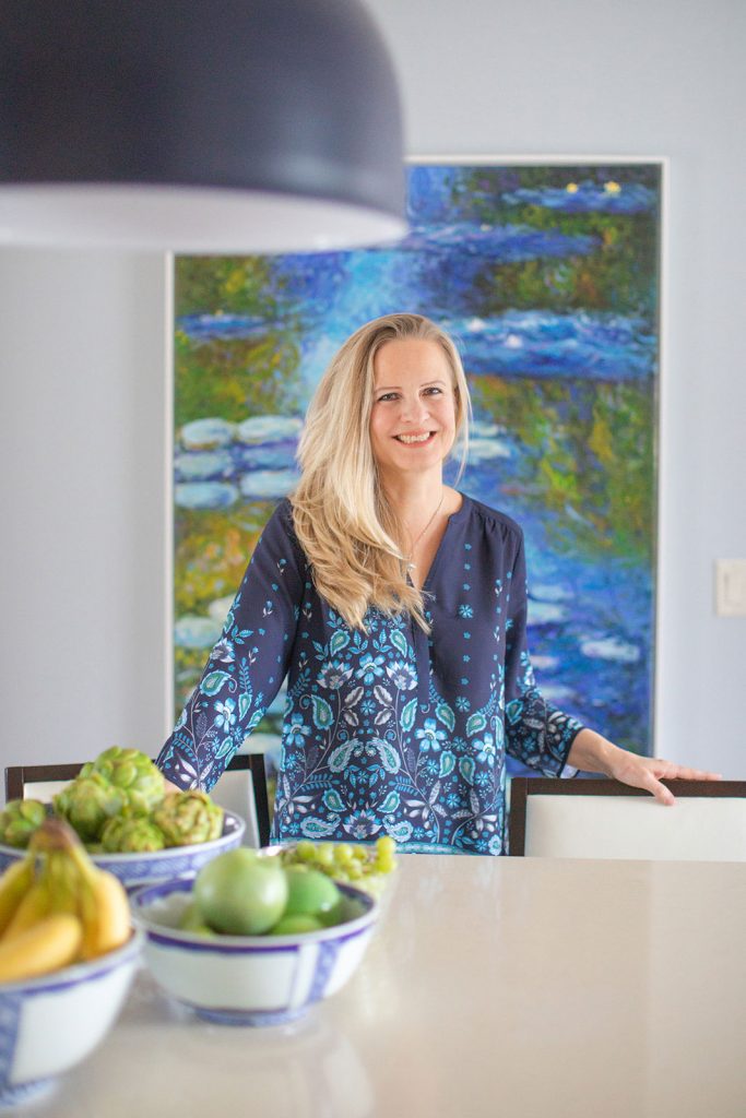
My sister Elizabeth and her family have lived in their current house for almost 10 years.
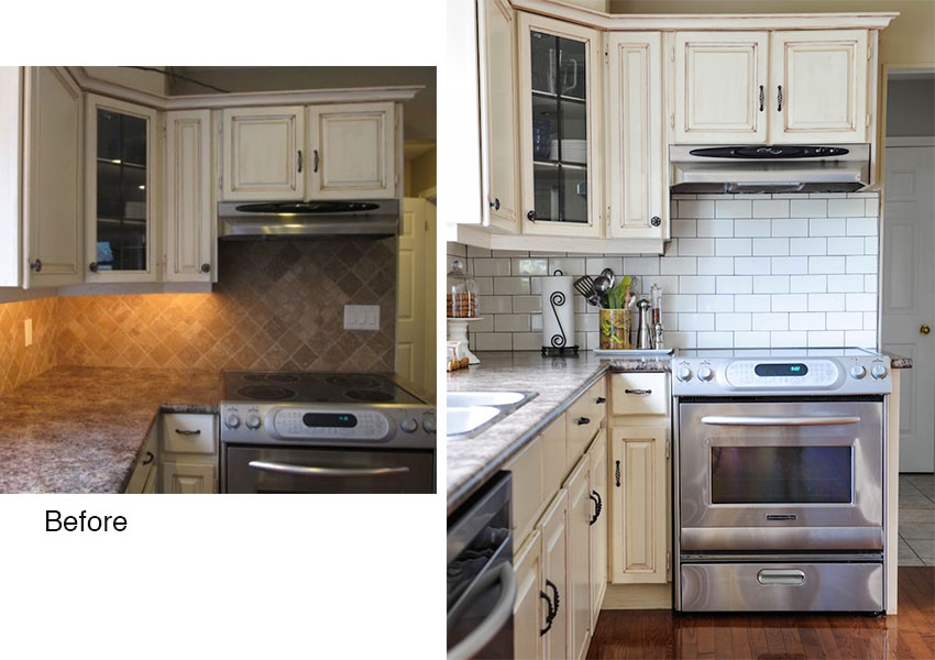
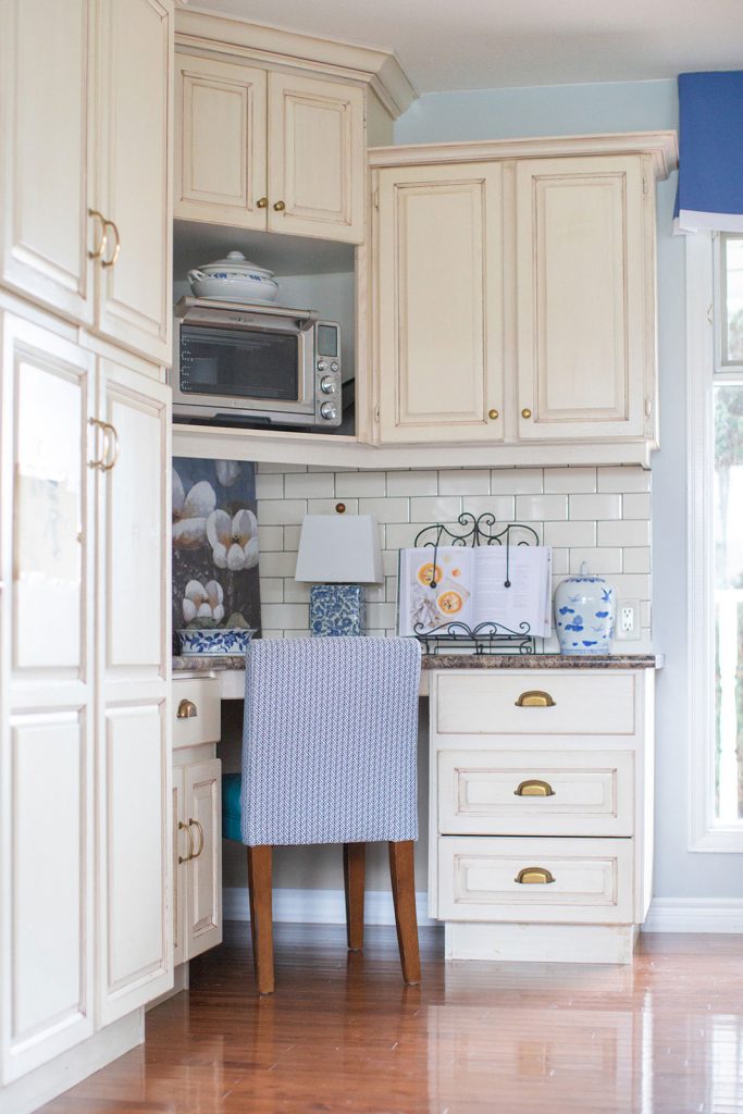
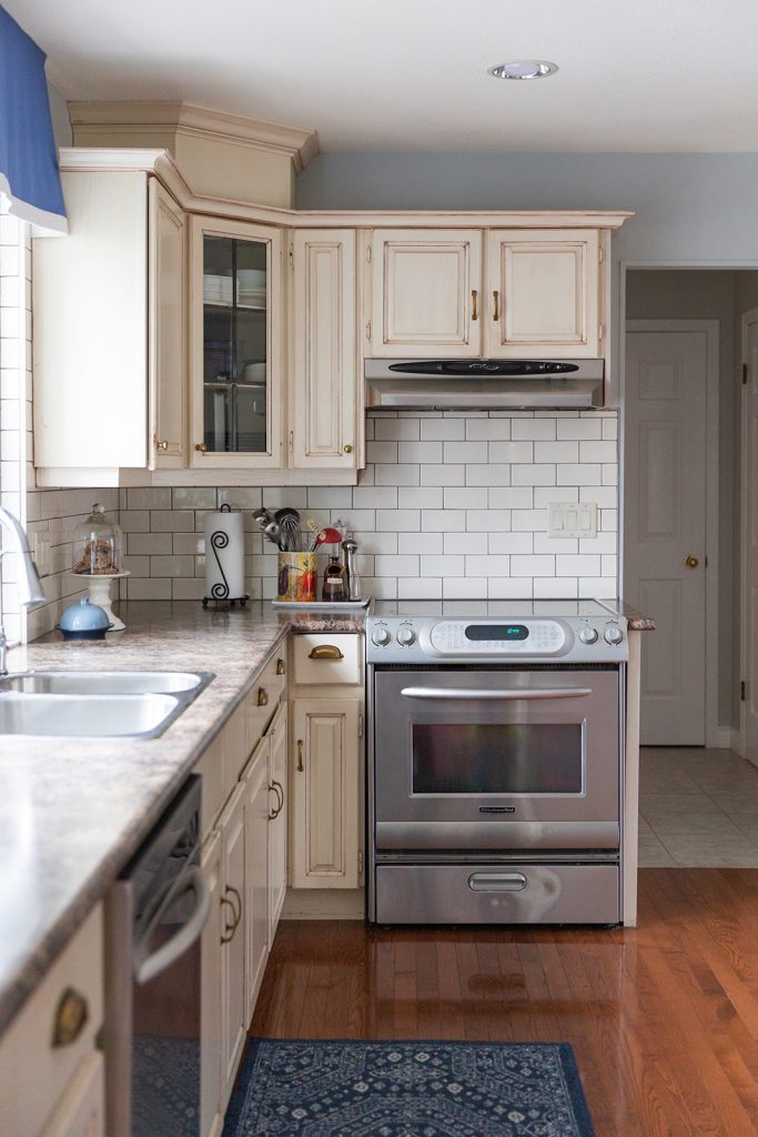
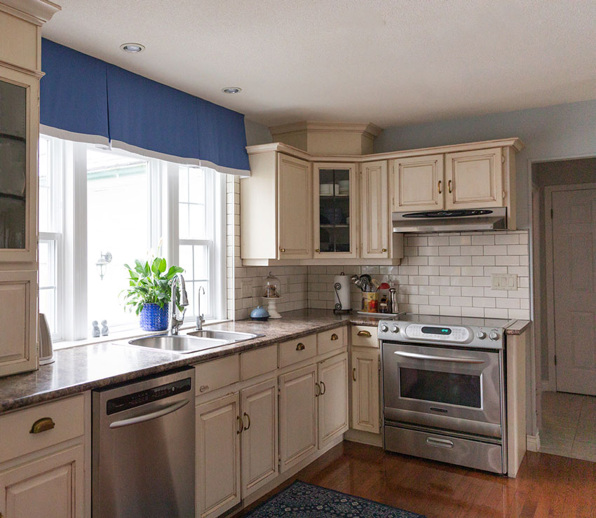
The first update in the kitchen happened in 2012. We replaced the Travertine backsplash with cream subway tile (below).
That made a big difference!
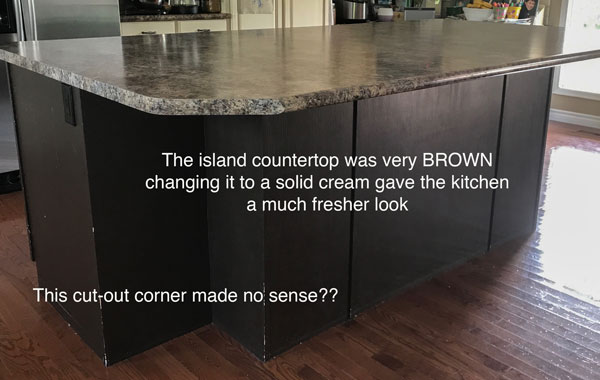
Then, two years ago (at the same time I was having quartz delivered to my house during my bathroom renovations), I talked my sister into replacing the tuscan laminate on her island with cream quartz.
Since this is where she preps food every day, she loved the idea!
Before
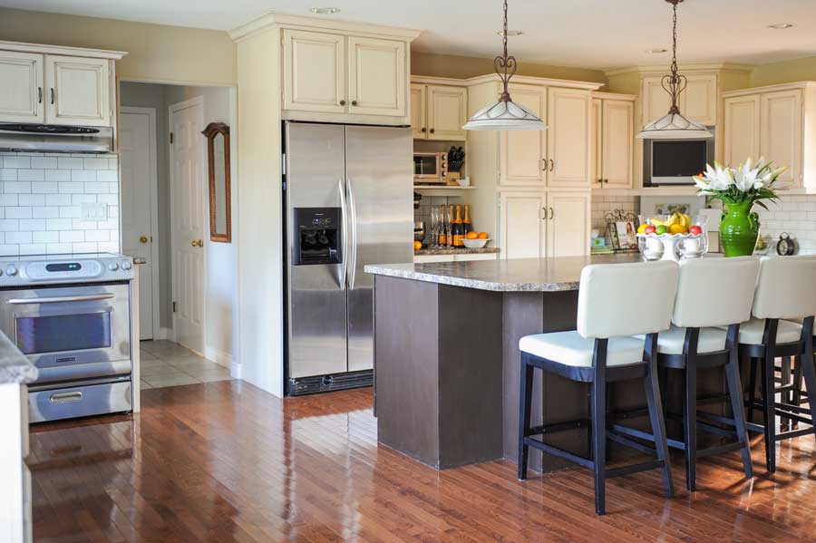
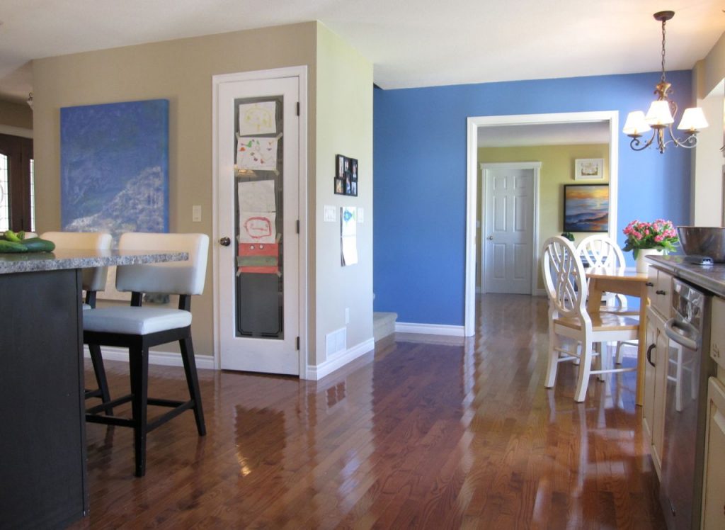
This is her kitchen before.
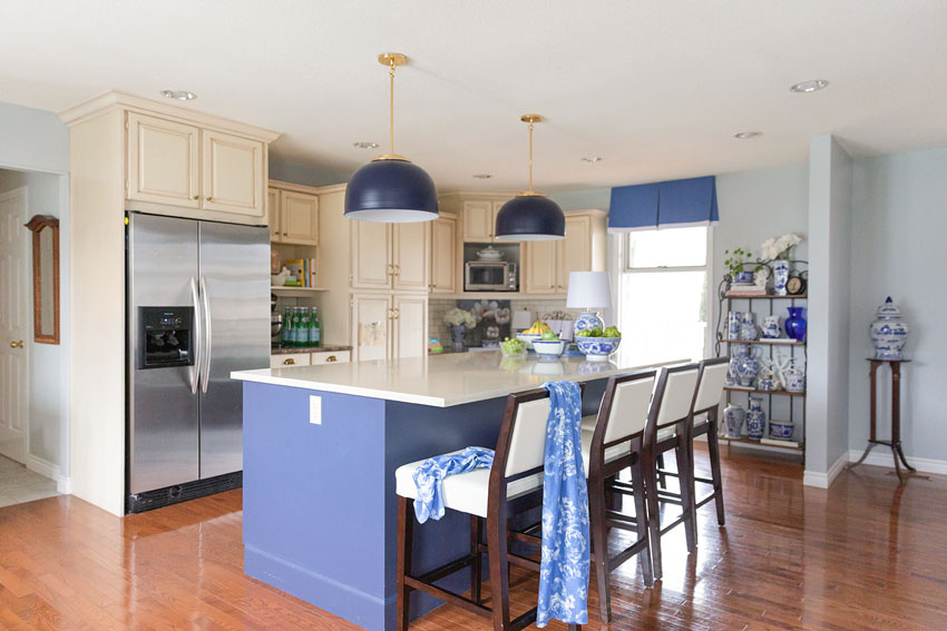
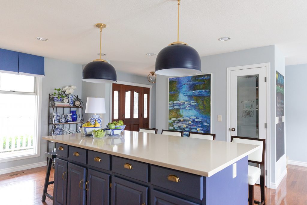
Since we replaced the island countertop, we have slowly replaced the lighting, barstools, hardware and painted this kitchen blue.
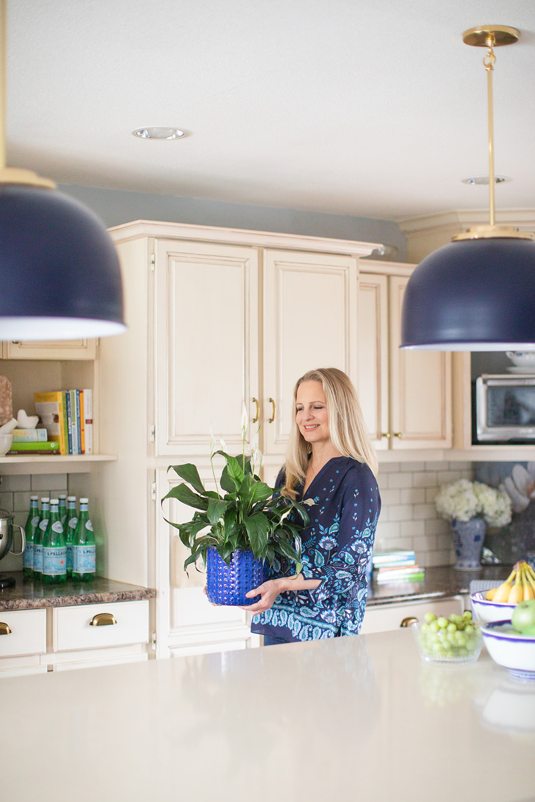
The cabinets have a mocha glaze on them which turned them pink beige and blue is a great colour for freshening up anything pink beige.
We added panels to make it look more like furniture
Then this past summer, we also added panels to the island along with baseboards to get rid of the corner cutout and make it look more like a piece of furniture. We also painted it a deep purple blue! In this case, we couldn’t paint it cream because her original kitchen had a mocha glaze and that would have been impossible to copy. Also, we wanted to move forward with the colours and repeating the glaze on the island wouldn’t have achieved that.
If you have an old kitchen and a complete renovation is not in the budget, updating the island makes a huge difference!
If you are considering painting your island a different colour though, read this post first.
An even more upgraded look would have been adding door panels to this island, but we were on a budget!
Why not just paint them white?
Right about now, you might be thinking, ‘Why not just paint the cabinets white if you’ve come this far’? But along with painting the cabinets white, the cream/gold/brown tuscan laminate would also need to be replaced (which was not in the budget and won’t be for a few years) so we chose to ignore it and decorate instead. A trick I often like to implement.
Desperate times call for desperate measures.
However, look around your home (or your clients home) and ask yourself where decorating and styling would make a bigger impact than simply replacing everything.
Often it’s hard to have both because even just replacing the lighting, hardware, new lighting, furniture, accessories, adds up quickly!
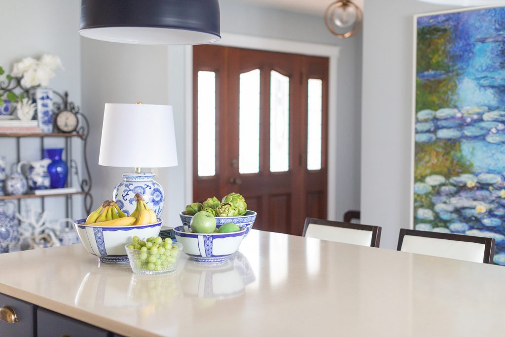
Dome Light (comes in a few different colours and combos) Island BM CC-950 | Walls SW Evening Shadow 7662
We bought the pendant lights first and that’s where the island colour and custom blue valance came from.
Counterstools here, similar here and here | Island quartz Caesarstone Buttermilk
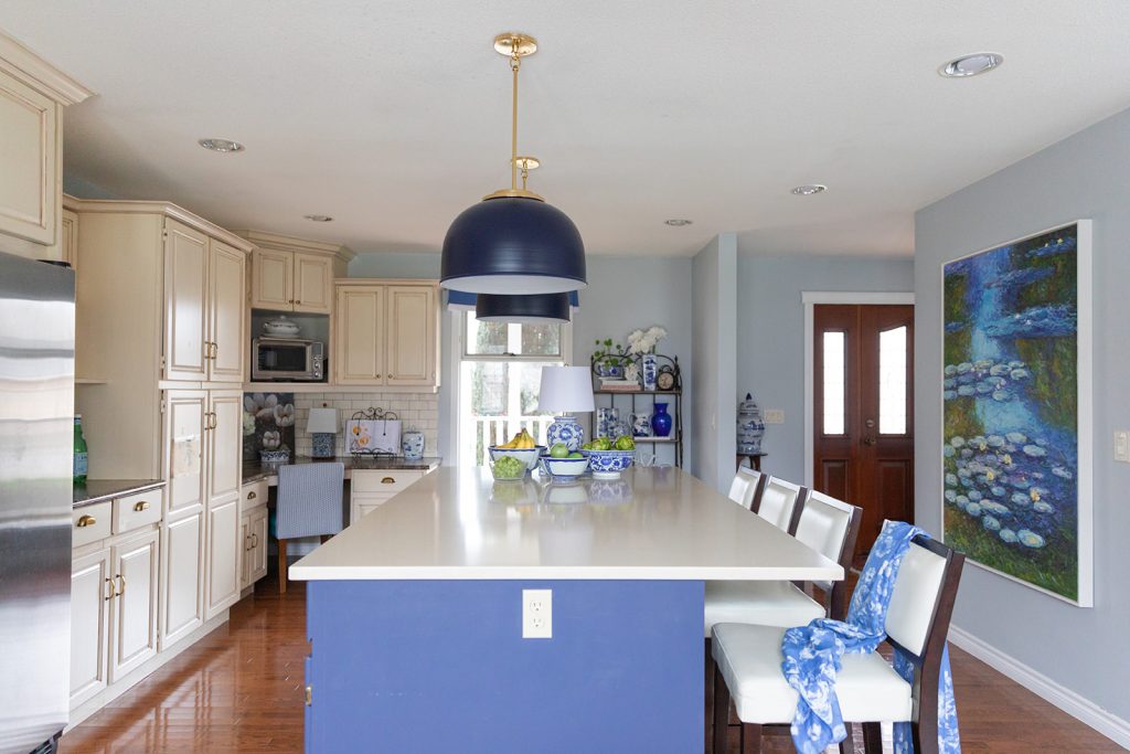
Notice that we’re basically ignoring the cream, glazed cabinets except for repeating it twice on the island and the counter stools! Everything else, is blue and white.
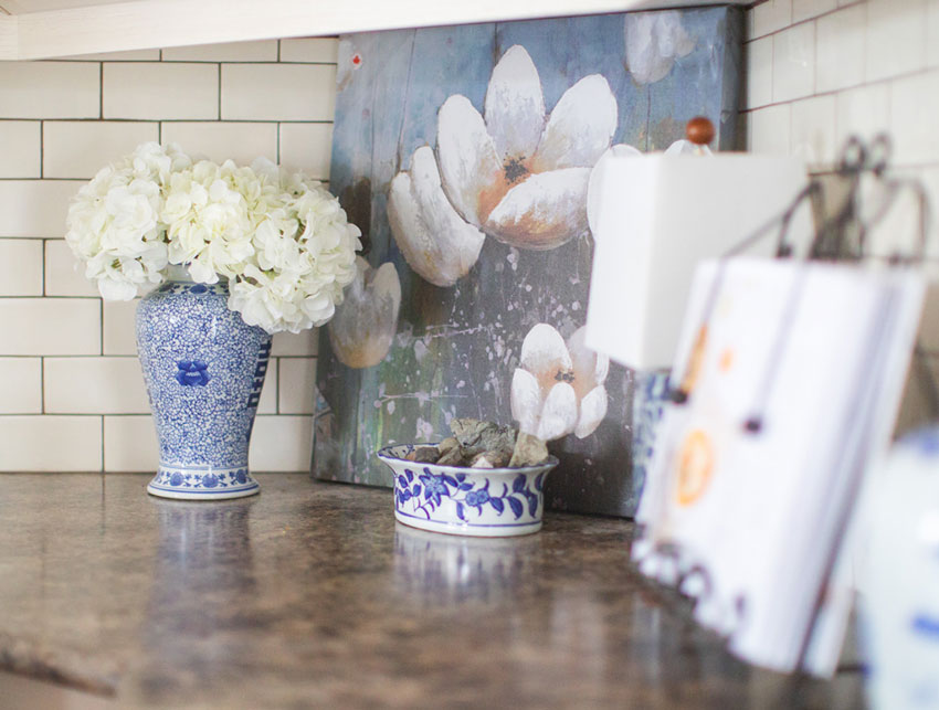
Blue and white table lamp | Cookbook stand
All the casings and trim in this house had originally been stark white (which always looked wrong until now) so with this makeover, it now looked planned with all the blue and white decor we added to this kitchen.
Here’s another view of the kitchen before. With the door to the homeschooling room (back then storage room) firmly shut. The blue accent wall was too much with all the new hits of blue we added to the kitchen with the new makeover so it was painted out.
Before
After
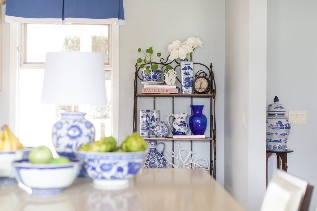
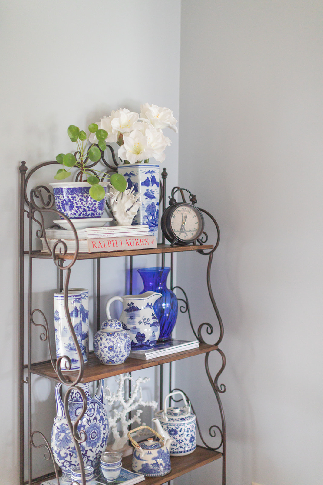
Bakers Rack | Blue and White Pots |Tall Urn Short Urn | Vase | Teapots
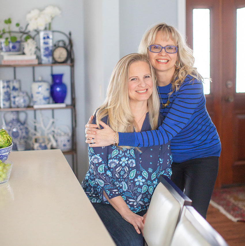
Elizabeth always has an abundance of fruit in her kitchen (except for the faux artichokes for this photo shoot :). She is the @juicygreengirl after all!
This is what the breakfast area used to look like (below). This house does not have a dining room so the latest update needed comfortable chairs and a dining table that could be expanded for dinner parties!
Before
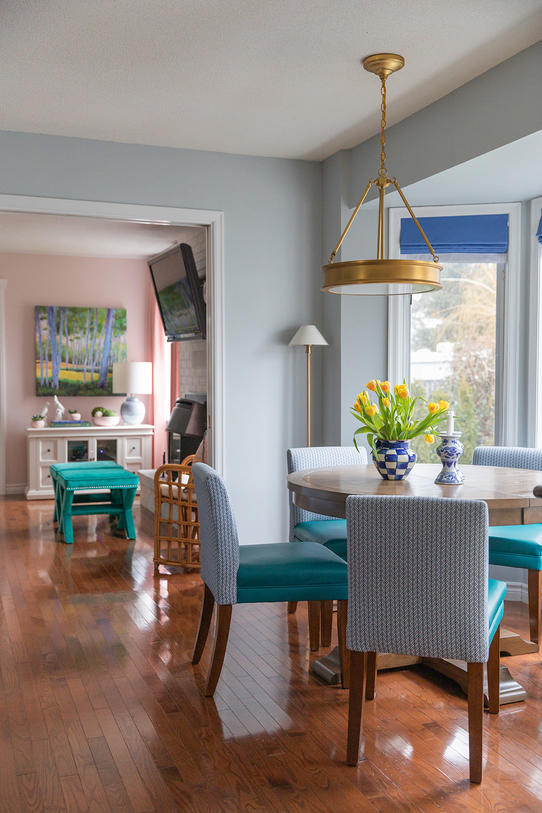
Here’s what it looks like now (below).
Extendable dining table from Wayfair (They call it grey but it’s really a medium brown shade)
Since this kitchen already had lots of blue in it and because this room visually flows into Elizabeth’s Library room, we had the custom dining chairs covered in faux leather to repeat the teal blue from this room.
Notice that the stained wood legs do not match the dining table but they relate to her existing cherry floors. This looks more collected than a matching set.
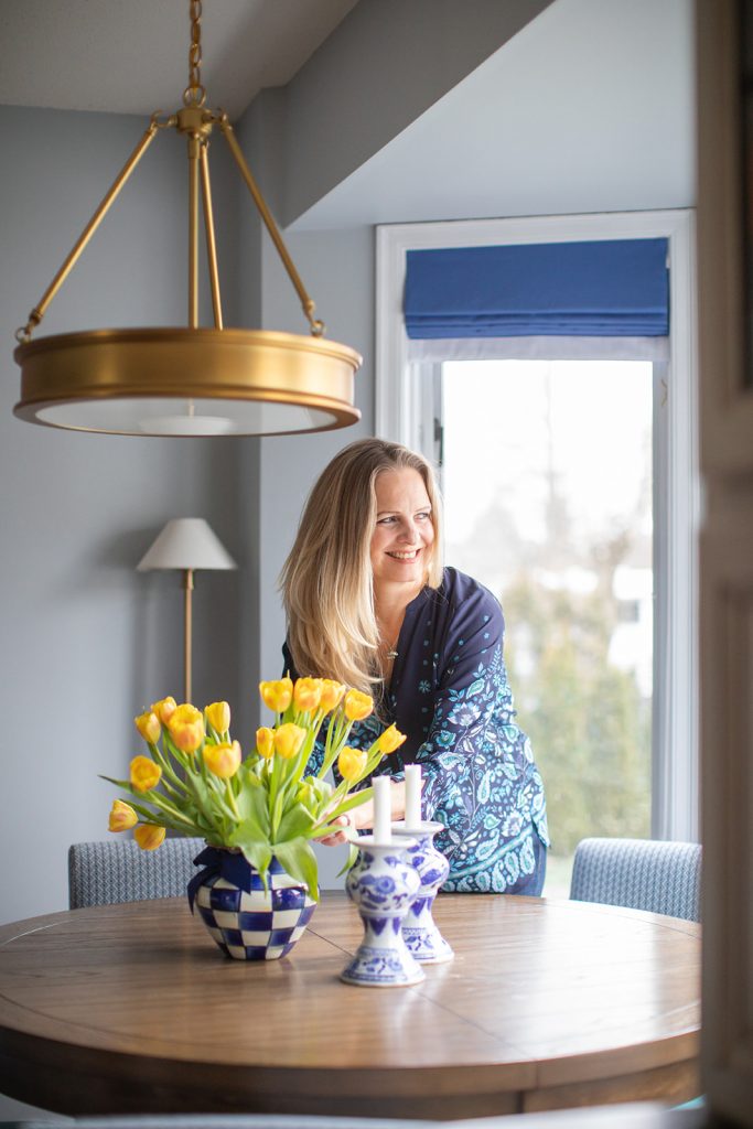
Candlestick light Restoration Hardware – similar here | Tulip Vase
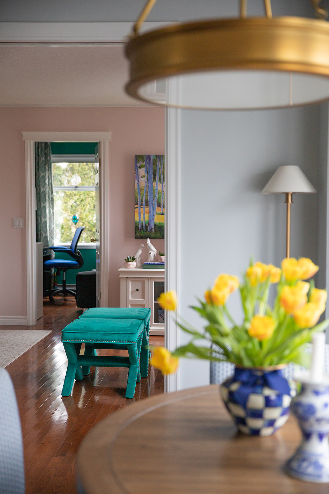
Here you can see through to the newly decorated homeschooling room too (below)!
Photos by Macy Yap Photography
Here’s the before again:
And the after:
After
Mixing old with new is not easy, but you can live with it if you do it right!
If you’d like help with a kitchen refresh, see my Create a Classic Kitchen eDesign package here.
If you’d like your home to fill you with happiness when you walk in the door contact me.
Related posts:
My sister Elizabeth’s New Coastal Living Room; Before & After
Elizabeth’s Library Room Transformation; Before & After
Tour of my Sister Elizabeth’s Home Makeovers; Before & After




I love this transformation! I’m waiting to do.something similar and can’t wait to use your advice you sent 😊
I love it and I really don’t even like the cream glazed cabinets. But I love it in this combo and I actually think it should be kept along with the counters and floor, it keeps it warm and I like it a lot. Tell you sister it’s already at masterpiece level!R
Please share the BM product on the island, (ie, Aura eggshell, natura semi-gloss,etc).
I realize that the color is BM CC-950,
The kitchen is beautiful! Your sister and her family r very fortunate to have your assistance.
Thank you,
Linda
Beautiful transformation! What color are the walls in the new kitchen? I just see that they’re SW paint. Thanks!
I have to find the colour. . . I’ll post it today! Maria
It is beautiful, Maria.
Elizabeth’s new kitchen is so much more relaxing! Did I miss the link to the light above the dinning table? If not, would you mind sharing where you found it? Thanks!
Amazing transformation, Maria. The cream cabinets look good now! Love the dining area, too. It’s so fresh and sophisticated. Elizabeth must be thrilled! You two are so cute!!!
It could just be my screen, but the light blue have turned the cabinets peachy. It’s still a fabulous transformation, and as I am not a fan of painting cabinets ( too many stories of chipping before 5 years and all that money spent, even when professionally done ) I appreciate working with what’s there and solid. Fixing that wierd island corner and the new breakfast area, love that chandelier! So many lessons on how to spend wisely for maximum impact!
I also notice the art in ever room! Ties everything together. Big impact pieces. Maria, you always have the best art!
Really well done! People are so quick to rip things out and put in the “newest” thing and it ends up looking no better and if not, worse than before! I would much rather have a laminate counter top in a kitchen that was well styled and had the perfect colors that than plop down a new expensive counter top! There is a lot of paint and styling you can do for the cost of a new counter top 🙂
Good interior design can really change the way you live in your home, and improve your life. The transformation you made in the home schooling room and in this kitchen demonstrate that perfectly. It’s even reflected on your sister’s face!
I love the changes you made. But, in my opinion, after all the nice changes, the cabinets just look dingy to me. However, overall, a definite improvement.
The kitchen looks beautiful! I have been going back and forth on how much of an “upgrade” to do to our kitchen. We plan on selling in a few years so do we just upgrade counters and backsplash to make it look fresh or do a lot more and make it look like a dream kitchen? Since we will be selling I’m
Not quite sure which route to take.
Wow, Maria! I love that you shared the first update as well as your newest update to your sister’s kitchen. I can see an increased sophistication to the way you create a cohesive transition between rooms. Really well done!
I love how you decorated around the challenges her kitchen has. Not everyone is able to rip out a kitchen and start fresh. It’s nice to see how one can decorate a room, give it a new look and feel, without major renovation costs.
Do you mind sharing the wall color? All I see mentioned is SW (no color number or name).
What a great transformation and so helpful for so many who can’t change everything all at once!
Beautiful updates! Thank you for sharing the phases process. Especially the before and after photos.
Are the walls and the other blues in the room considered “clean and dirty” colors?
No they are not clean and dirty. One way to think about whether a colour is clean or dirty is ‘Does the colour you think looks ‘dirty’ look like it also needs to be scrubbed down’. Her cabinets still kinda look like that, but that paint job will come later as I mentioned. Good question! Maria
Maria strikes again. What a beautiful refresh. You don’t even see the Tuscan laminate counter tops! Love the pendant lights, I might steal those for my new build.
Happy to see valances are still being used. I’m ready to update my 10 year old valances, but wasn’t sure they were still in vogue. I like the results of the makeover! Nice job!
I need a sister just like you Maria. Lovely decor and once again you did timeless and what fits the budget. Brilliant.
I love how you explained exactly how you worked with and freshened up this kitchen! So often the budget doesn’t include a complete rehab and then it’s so hard to know what to do. This article was great, thanks!
Looks great! What was the wall colour – I think it was cut off under the picture where you mentioned the island colour? Also, you said you’re basically ignoring the cream cabinets, but (sorry if this is obvious, but I’m just trying to understand) you still matched the undertone of the cabinets (creamy-yellow or is it creamy-pink??) with the undertone of the new wall colour, yes?
Nice work. Not easy!
Beautiful! In my staging work, I’ve found that updating kitchen handles can make a huge difference in updating the look of a kitchen. I would recommend Ikea’s Eneryda brass cup pulls for inexpensive icing on this beautiful cake! https://www.ikea.com/us/en/p/eneryda-cup-cabinet-pull-brass-color-90347515/
Oops, I see that you already have the brass pulls!
I absolutely love it! The only thing that I would do is paint the cabinets a lighter ivory color like BM Acadia White.
Yes for sure that needs to happen down the road when it’s in the budget, however a good paint job for this size kitchen would cost a minimum of $5000. Thanks for your comment! Maria
Love all of your work.
The only thing I would do is go to the store and get the very best oil paint and paint the cabinets. The white subway tile makes the cabinets look dirty. Also, Advance paint by BM is a good substitute for oil paint.
Perhaps not in the budget for now.
Its nice to have a sister like you!! Love the changes, was surprised (cause I’m not a fan of cream cabinets) how well everything flowed together, well not really surprised you work magic but from a novice perspective. Love how the blue was incorporated. Would love to know more information about the dinning room light.
Looks very pretty but I think the small subway tile with dark grout makes it look too busy in the background and still not up to date. Would have been fresher with a little larger subway tile and matching grout…
Amazing what a few changes do to make a fresh updated look! Thanks
Looks so pretty and refreshed, gives me hope for my dated kitchen with the exact same brown/ish laminate counter tops! Can’t wait to start a few updates as the finances allow. Thanks for your inspiration, and love the blue!
Oh it’s lovely!! Those island pendants are AMAZING!!!!! So beautiful. And love the rug at the sink too. It’s all so so pretty.
Love how fresh and tailored it looks. Great job and excellent example of numerous ways to update in stages and with style.
Thank you for sharing your gifts so generously! I so look forward to these posts!
I love the kitchen renovation. I like how you are practical and work with financial considerations. I would like to paint my kitchen island but everything is cherry and my husband won’t stand for it.
Anyone looking at that ugly, mismatched subway tile in 2012, must have thought “what were they thinking?” . So out of place, you can’t just insert a fad like that.
Plenty of better options to lighten up the dark backsplash.
So beautiful! The blue is so fresh!
Would you mind sharing where the water lily art is from?
When done well, Blue fixes everything!
I love your sisters colorful home! Everything flows perfectly. You are a color genius of course. The kitchen makeover is so fresh and up to date. Love the way you pushed and pulled all of the color throughout by using accessories. So amazing what you could achieve on a limited budget. I give this makeover a big 10!
Do tell us the wall color plus the island.
This is fantastic! I always am so happy when I see a new post land in my inbox. You are excellent at what you do! Her kitchen not only looks great but it relates so well to the rest of her home. It’s not all a single neutral everywhere and is well DECORATED! So. Well. Done.
I wish you could just accept that this is very beautiful.
I wish that, in this throw-away society, we were praised for creating a gorgeous kitchen without getting new cabinets, back splashes or counter tops.
You have used your talent to show us that it can be made gorgeous without adding to the landfill. Isn’t that the very best solution?
I would love to see what you could do with a regular old kitchen for under $2,000. Then see how that could be improved if, say you added new counter tops for a mere $4,000 or, even better, for $1,000. And then see how it would look with, say a new back splash, for $500. And then show it with everything you would want to see in it if you had a big budget and lots of time.
I would love to see your solution if you could not replace the back splash and counter tops. That would be a challenge that you could take on.
Your sister is so lucky to have a color expert in the family! Her home is looking so beautiful!
Wow, Maria, just WOW! So beautiful. The new homeschooling room is lovely too, but this is now a simply stunning and magazine-worthy kitchen! And it’s that much more impressive when seeing what you started out with and without any hugely expensive changes. The mocha cabinets look like they belong there, they seem to bring warmth to the room without being stylistically overpowering. You truly are a wizard.
I think you have just given millions of people a priceless thing….HOPE!!! Hope for their Tuscan kitchen!!! I love how you and sis did this more slowly; as you taught me, move in the right direction. $100,000 renovation not necessary if not affordable! Just make the right changes to move toward the goal and WOW, look at how it is now. And looks awesome at every stage!!! Maria, it’s awesome!
I hope sis is super happy. 🙂 Question – that chandelier – it’s brass “spokes” to a “disk” that looks like a cruise ship window laying flat? In the photo, Elizabeth is looking out the window (love her oh-so-natural poses!! hehe!!) and there is a large vase of yellow tulips on the table. Ya know, the stuff that’s always there. hehe! Any idea the source of that chandelier? I love it! AWESOME POST!!!!
This is a great example of how to get a kitchen you love without spending a fortune. Not all of us can do it—my old kitchen was firmly ensconced in the 1960s and needed a complete redo—but if you can, it’s the way to go. It looks wonderful!
Hi Maria,
My big wow to this makeover .. 🤩 I love the colors in the new design, especially those complex lavender-blue and marine-blue, really splendid.. The chairs are adorable, very cute mix of colors and patterns .. ☺️ Yes for sure, nobody dismantle the wooden floor, nobody wants to be stupid, besides, it matches well with the blues … So, just refreshing it from time to time is good enough !!! 👌
Beautiful transformation, Maria! I love how you mixed the warms and cools so effortlessly! They make one another sing! Nicely done!
what is new brass light?
The pendant above the kitchen table is from Shades of Light but I can’t find it. I know it’s still available though! Maria
As always, AMAZING!!!!! These are my favourite posts that you do. I love seeing your before and after photos. So inspirational! I think your comment “so we chose to ignore it and decorate instead. A trick I often like to implement.” is encouraging and very wise. Your sister is a good example of doing things step by step and being financially and environmentally responsible. Most of us are not able to redo all at a whim.
Thanks Maria for continuing to inspire and encourage us😀😀😀
Great improvements. The kitchen looks light and fresh and relates well to the other rooms in the home. All good things come to those who wait, lol. My only question is why not paint the cabinets a lighter cream and get rid of that glaze? Sherwin Williams has a great acrylic enamel that dries rock hard. Perfect for kitchen cabinets.
Because it would cost $5000 and we would have had to choose between simply painting the kitchen OR all the other decor accents we added which cost approx. $5000. Obviously if my sister and her husband were DIY people it would be a lot cheaper, but they are not. So later for the painting update! Good question! Maria
I absolutely love the kitchen now. Of course, blue and white is a favorite color scheme for me with spots of a lovely yellow here and there. What a pleasure to work in this lovely kitchen.
Y’all did good, Maria.
Thank you for showing us this refresh! I basically have the same Kitchen. Same style cabinets, similar countertop, travertine backsplash, crazy I even have the same Range. While I wish my kitchen looked more fresh and updated, I haven’t ventured to change it because it’s current incarnation, curtesy of the previous owner, was an expensive remodel. She dropped some $ on the kitchen remodel. It’s nice to think I could change a few things to give it a fresher look with out an entire redo. Thanks!
why oh why would you replace 6 bottles of champagne with pelligrino!?!? LOL amazing makeover, its the love for your sister that really shines through.
Haha that’s funny! Thanks for your comment, Maria
The transformation makes me want to sing….our house, is a very, very, very fine house! Sweet work, Maria!
Kitchen looks wonderful! The laminate counters “disappear.” Sch a great move to replace the island top and change the color.
Reading the posts makes me think some people aren’t seeing the creamy subway tile correctly on their computers and in addition one photo makes them look very white, which they are not in all the other photos.
Very nice. I think the odd cut-out was for a trash can before. The new island color is pretty, but I don’t see any panels, just a baseboard. Unfortunately my eye goes straight to the new outlet on the end–perhaps it could be swapped out for a lower-contrast option, perhaps in brass/gold to match the cabinet hardware? Or brown to go with the furniture?
Love the teal and blue chairs. I would have never thought of teal seats, but it looks great, especially when seen from a distance with the adjoining rooms.
I’m loving the updates and how it feels so European charm by letting the cabinets stay and expertly working the colour and undertones.
Your sister also looks beautiful in blue! I love the blue & white. Personally the glazed cabinets would drive me nuts now with everything else so wonderful. Patience!
I think this looks absolutely lovely. My kitchen has similar cabinets, perhaps in the future I will incorporate some of these techniques to make it look fresher. My countertops are granite, and although not a colourway I would have chosen I do not want to discard them, and the cabinets are good quality so would want to refresh the kitchen not renovate it. Blues are my favourite colours, so this transformation has intrigued me – a great evolution without ripping everything out. Lovely – especially because it suits your sister so perfectly!
love it.I am obsessed with the blue and green art on the wall by the pantry. Would you be willing to share your source ? Thank you!