Questions about how to use my BRAND NEW, MADE WITH REAL PAINT colour wheel are flying in fast and furious.
PS. Read the back, if you’re wondering why it doesn’t come with a brochure, there’s a URL with videos to watch on how to use it.
Here’s the latest one:
“Maria, Once I’ve identified the undertone of a carpet or walls, is the idea to design everything around base in the same under tone or opposite undertone?”
Definitely no.
But again, if you’re asking this question, then you need to learn more about how to decorate and choose colour. I recommend my True Colour Expert Training 2 day workshop. It’s a game changer.
But let me give you some freedom around being stuck in the world of strictly neutrals.
First, can I say I sometimes feel like two people. It’s a good thing I’m a Gemini since they already have two personalities.
On the one side, I’m the neutral queen, having invented a colour wheel for identifying neutrals. The other side of me is the biggest cheerleader for adding colour to your world.
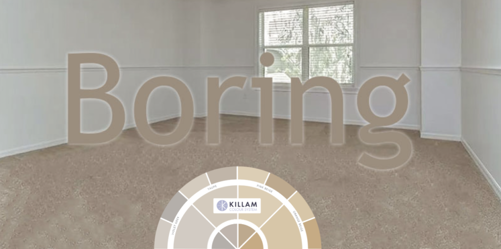
I walked into a random furniture store today with strictly sofas for sale.
Nothing else.
Just rows and rows of grey, beige, brown and black sofas. No coffee tables, no upholstered chairs, just couches.
Why?
Because that’s the first thing you need when you move into a new place. Something to sit on.
The lack of colour evident in most showrooms, however, is definitely the reason most people do NOT even accidentally end up with a yellow sofa in their living room (below):
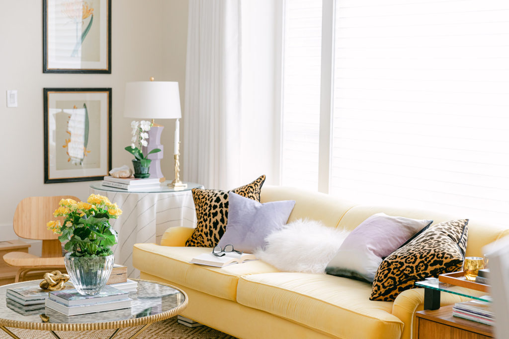
See my new living room makeover here
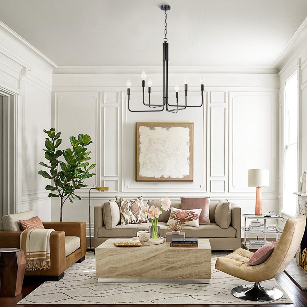
Let’s look at some neutral rooms next shall we?
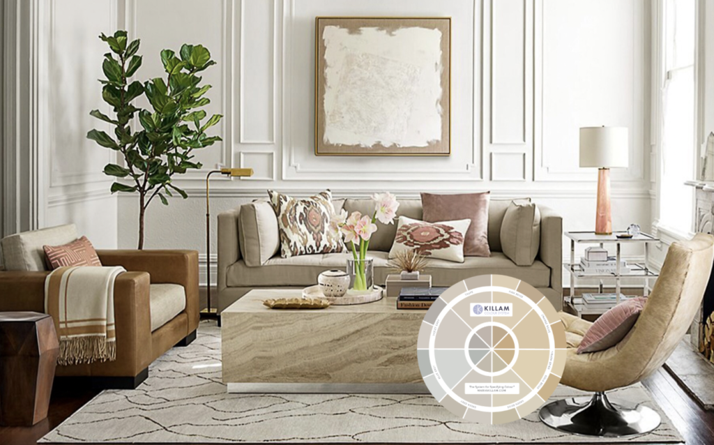
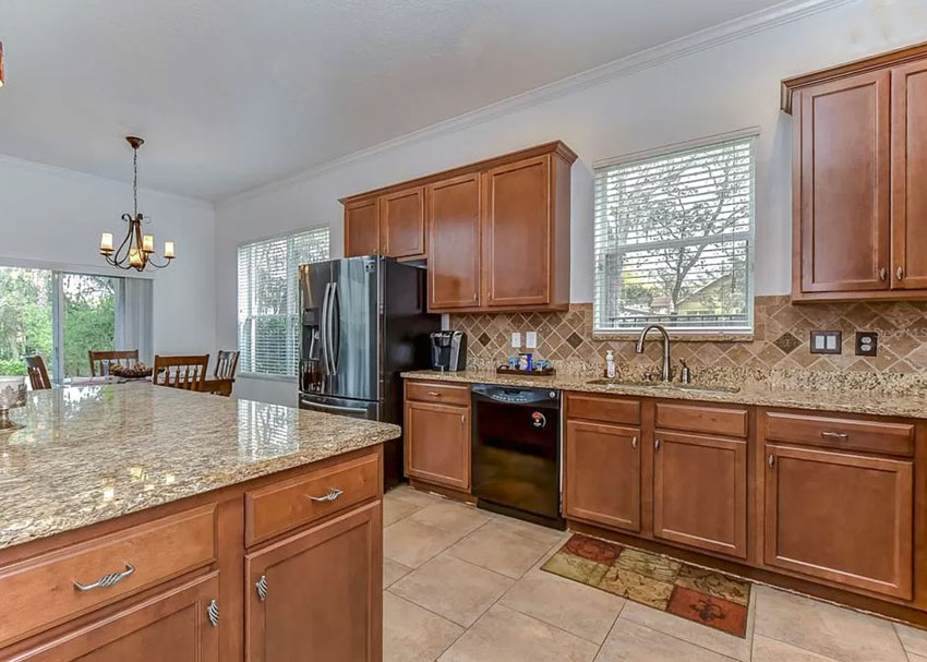
What are the undertones in this room? There are several.
If you add my colour wheel to this image, it’s easier to see them (below):
By the way, AFTER you have attended my True Colour Expert Workshop, you’ll be able to enroll in my advanced course on the Business of eDesign. I’ll teach you exactly how to run a successful eDesign business just like mine.
The sofa is taupe while the painting above leans more pink beige. The chair on the right is yellow/gold beige. And the travertine coffee table is pink beige and cream.
If the walls in this room didn’t have all this fabulous moulding to distract the eye, the white would seem very stark.
However, since the sofa in this neutral room is the bossiest neutral item and we wanted to choose a paint colour, we would go straight to the taupes in my curated list of paint colours and choose one or two of the taupe greiges to test.
Because now that the room is this neutral, painting the walls a colour would make no sense.
Simple.
Let’s move this tutorial to the real world shall we:
One of my fabulous readers sent me this real estate listing where every single room in this Tuscan inspired house (with not a stitch of white in the finishes) had been painted a stark white.
Which, notice because the contrast is so high, they ended up looking blue white.
In this case, my colour wheel arrives, you plunk it down on the bossiest neutral element. which in this case is the tile floor and backsplash and determine that they are pink beige.
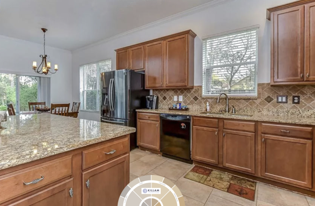
Then you go to my list of tried and true curated pink beige colours in the bonus book of colours at the back of either of my ebooks and choose one.
There is no other colour to go with here as WHITE is definitely wrong as we’ve already seen.
Did you get that?
I’m saying, we cannot paint this kitchen ANY OTHER COLOUR. See how bad it looks painted stark white? Why does it look so bad? Because there is no white in this kitchen!! Painting this kitchen ANY COLOUR other than the right pink beige IS NOT AN OPTION.
I mean if this is your kitchen and you want to paint it blue or purple or pink or green you can do whatever you want, but in the design world it makes no sense. This is the reason a white kitchen is timeless.
I have painted my kitchen island a different colour twice in the 10 years since it’s been installed. It’s easy when all the finishes are a timeless shade of white.
Hmmm. . painting everything white in a Tuscan inspired house seems to be an epidemic, here’s another house another reader sent me:
Moving on to THE MOST COMMON DILEMMA out there.
You are standing in an empty room with maybe some existing beige carpet.
And you determine that it’s pink beige, once you place my colour wheel on top of it.
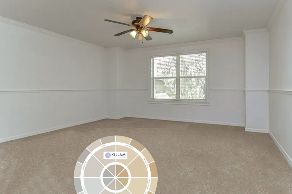
And now you’re wondering, pink beige walls? Is that it? Those are my ONLY options?

Well sure, WITHOUT any inspiration whatsoever, that makes the most sense at this point.
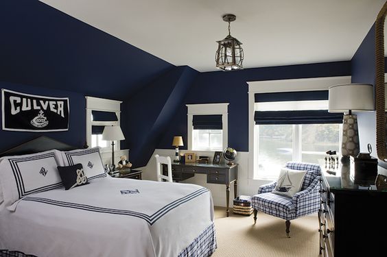
However, wait a second, stay with me. Let’s look at a different bedroom in this same house, with the same carpet, but this time with some blue accents.

And since pink beige looks good with blues, you could paint this room navy blue. In this case, I would take the striped bedding to a paint store and get someone there to help me choose the right navy blue. Without doing my workshop, that’s my best advice for getting the colour right.
Notice the carpet in here is likely pink beige but it doesn’t look as pink as the room above because the contrast is so high.
Here’s another room with pink beige carpet. This time with strong orange accents which again work beautifully here and the area rug that covers up the beige carpet also helps make this room look so inviting and pulled together.
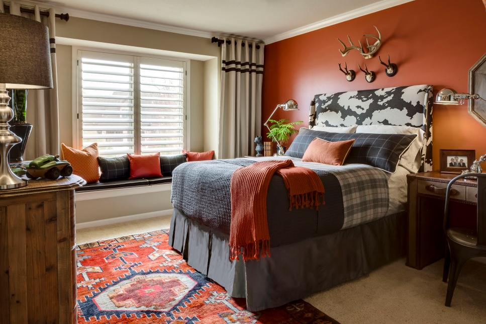
What inspired the colour palette here? Either the area rug came first, or the hits of orange found in the solid cushions came after the wall was painted orange but I’m guessing the area rug was used as inspiration here.
Imagine standing in this room choosing an orange paint colour without the rug. It would take weeks and months, you’d have random orange colours you’d be testing. Your spouse arrives and you’d say “Honey, which one do you like?” And he or she looks at you like a deer in headlights wondering “What is the right answer here?”.
And every time a friend or family member came over you’d say:
“Well? What do you think? Which one is best?”
And this ladies and gentleman, is why there are so many white, beige and grey walls in this world.
So the moral of the story is this:
You’re stuck with a neutral if:
Your fixed and bossy finishes are so pervasive and overpowering, it would look bad to simply paint the walls your favourite colour, see both kitchens above.
You have an open concept house and there’s no place to start or stop the colour.
Read more: Trend Alert: Is it the End of the Open Concept Living Space?
If neither of the above two scenarios apply to you, then break out the colour please, for both our sakes.

We need it more than ever these days!
If you have an Ask Maria question for this column, take some photos in good natural light (clean up your room please, you’ll have a much higher chance of your photos being used) and email them here.
If you’d like to become a True Colour Expert, May is coming up soon:
May 15 – 16 Chicago Area
“Create Your Dream Home” for Homeowners is filling up for April 26 – 27
If you’d like your home to fill you with happiness when you walk in the door, see my eDesign packages here.
Related posts:
Are you Waiting for Your Paint Colour to Propose?
How NOT to Choose Paint Colours; But Everybody Does It
5 Reasons you CANNOT Paint your Walls Art Gallery White


Great post!
In the living room with several undertones, if using a taupe would you consider a taupe/greige or a complex cream? I don’t see any complex creams listed as having a taupe undertone.
That’s right complex creams are the palest of the beiges (pink, yellow, orange or green) while only green grey, violet grey and taupe have greiges. Maria
A taupe greige is what I would paint that room and they can be found in my bonus book of colours, identified by undertone in either of my ebooks 🙂 http://www.mariakillam.com/product/white-is-complicated/
Well, this might be your very best post ever!! Building a room from scratch with a bland carpet is soooo common, and a common dilemma for renters for sure.
“Can’t change the carpet, so I’ll go to Pinterest and create a curated black and white room and hope the neutrals all work!”
And they DON’T. Plus, the room doesn’t “spark joy”. And now the decor money has been spent, and you can’t leave the house due to virus, etc etc.
Anyway, spot on advice, Maria! Well said!
Great post! Looking at my color wheel – how do I know which chromatic colors go with which neutrals?
There’s chromatic colours that work with every neutral. Now you’re moving into creating harmonious colour palettes using the distinction clean vs. dirty. My Virtual Specify Colour with Confidence workshop will teach you how to do this better than weeks of reading my blog will 🙂
I LOVED this post!!! I learned so much!
I’d love to see how you’d deal with the kitchens you showed — painting them navy blue is likely not an option for most renters or homeowners.
Hi Bette, I’m glad you asked this question because it obviously needed clarification. I’m saying, we cannot paint those kitchens ANY OTHER COLOUR. See how bad it looks painted stark white? Why does it look so bad? Because there is no white in those kitchens Painting either of those kitchens ANY COLOUR other than the right pale pink beige is not an option. This is why the white kitchen continues to be the most timeless option because when 10 years passes and you want a change, you don’t have to rip out your kitchen, you can just replace window coverings and paint your island, or even paint your kitchen cabinets if you kept your countertops white. IN my opinion anyway, doesn’t mean it’s right. Great question thanks!
You are so right about white kitchen cabinets. I built my house in 1978 and had the kitchen cabinets painted white. I have renovated this kitchen multiple times and repainted the cabinets white over the many years I have been living in this house and never once have regretted having white kitchen cabinets.
I know this is an old post, but how would I know whether my kitchen falls into that category of only being able to be painted neutral or not?
It was so difficult picking a paint color for my house due to the very open floor plan. Some rooms got more light, others less, and at time, we also had to work with some bossy tile that was a warmer white.
I ended up doing SW Gossamer Veil which seems to change undertones in various lighting, the strongest being green. I had painted everywhere but my kitchen and family (we painted where carpeting had to be replaced, and the only tiled area painted was the foyer as we had to use the tile areas to live during WFH for COVID). It was going to match my family room to the rest of the house, but then a pipe burst behind my kitchen cabinets literally 3 weeks after we completed the painting and carpet replacement (also painting trim and ceilings in those areas pure white). That resulted in gutting the kitchen, changing the built in bookcase/cabinets in family room (open floor plan). I thought Gossamer Veil would work with new design. Then we learned tile flooring was popping off slab WHEN the cabinets were being installed. Stuck with the color palette to match our late 90s warm white tile, it was difficult finding tile that was light enough and the right undertone to really set off the new island.
It turned out the Gossamer was a bit too dark and and the greenish tone wasn’t quite right, particularly where the painted wall met the warm white backsplash. We found SW Lunar Lite and it was perfect, and it complimented the Gossamer Veil on the few spots where it meets, but because the walls turn directions at the transition, people don’t notice it as the lighting and shadows make your eyes think it is the same color (and it definitely isn’t).
I would have loved to add some dramatic color, but since everything is connected, a drastic change would have felt disjointed. The bedrooms are the only areas that really can change color, as the walls from the 1st floor connect to the open area upstairs and there isn’t a good wall to stop and change the color.
I tried to keep everything fairly neutral, and the kitchen/family room color is repeated in the master bathroom as it compliments the remodel we did there the same time as the kitchen with warmer white tiles with a little taupe.
None of the work done was done in the “correct order” as it all began with “we have 20+ year old carpet and it’s gross and we need to fix it, but we can’t afford to touch the old tile right now, so lets make it disappear.”
Had some of our 1st floor not been replaced within the last year, we might have gone with wood floors to replace the tile downstairs, but I have kids and pets and was afraid I’d be stressed about scratching it, and I didn’t like the idea of tile by the garage or front door and transitioning to wood (no good way to transition because floor plan is so open, or with the constant spills and drips in the kitchen. The wood floors we found were also on backorder and we really needed to get home as the remodel was 3 months delayed due to shipping and insurance approval delays for flooring replacement.
This blog and it’s undertone lessons was so vital when it came to looking at my paint, counter, and tiles and while I didn’t do things in the “right” order thanks to mother nature and surprises mid-remodel, when I look at the permanent fixtures, it all seems to belong together and is cohesive.
Decorating it is proving challenging though, as I am very much a “dirty color” person, and only really like clean blues. I don’t feel relaxed in bright colors unless they are in nature. I’m trying to figure out now to incorporate some into a modern home that isn’t by the beach, most likely with art and pillows in small amounts, is really the only way I can think of it.
I’m having one HECK of a time finding furniture because I want some neutral, but also some color, and the current neutrals seem too white (I have kids), too grey, or solid black. I really need a taupe or a dirty color, but if they do have a color, it is super bright and would not fit. The hunt continues.
I have an off-white sofa and never would have considered it earlier. The living room is dim though, and lighter furnishings helped in there. The sofa’s fabric is Crypton, a “performance” fabric. We took a fabric sample back home and poured red wine on it. It blotted right up with no stain left. That sold us. The only thing you can’t do is sit on it in brand new jeans. The indigo dye will rub off into the fabric. That said, I’ve noticed other people coming into the house won’t choose the sofa first; they go for the colored side chairs. I guess visitors are scared of it.
Yes that’s the issue with white is the general grime that slowly gets added to the fabric, sorry to hear about your jeans! Maria
I think I finally got it! The color wheel’s primary use is to determine what undertone is in your existing neutrals, not to tell you what paint color to paint unless you are matching it
Or if you are choosing new finishes – bring the color wheel with you to determine what the undertone is to make sure you’re not inadvertently choosing a pink, yellow, orange, violet or green undertone
Is that right? I hope it is!
OMG I think you’ve said it best thanks Michelle 🙂 Maria
I must say that the true meaning of the color wheel wasn’t what I thought it was when I first received it. After reading others’ questions and your answers it finally dawned on me –
THE COLOR WHEEL IS NOT AN ANSWER BUT A TOOL USED TO FIND THE ANSWER
I’m happy you liked my comment, Maria, and if it helps other readers, I’m thrilled!
Even better said with that statement, keep going, haha. Maria
Hi Maria! How do you determine the dominant neutral? In the example above, when you say the back splash and floor tile are dominant, why isn’t it the counter top? Thanks for all your great advice!
Whatever takes up the most visual space so in that first image it was the sofa, with the kitchen it’s the backsplash and tile floor! Hope that helps, Maria
Hi Maria,
Thanks for all the valuable information via your blog. What would be a greige or taupe paint option for the living room above? I do see more than one undertone in the furnishings but when comparing to the color boards I don’t see a color that would blend.
I have the same question. I also don’t see a taupe-greige colour board that would be a good fit. Anyone have any suggestions?
For a not-open-concept fine, you recommend using colors on the wall. Can you share some examples?
home*
Yes here’s a tour of my house https://mariakillam.com/my-house-is-completely-renovated-here-are-all-the-before-afters/ Hope that helps, Maria