


When decorating with colour, it can be tricky to create flow from room to room. When I introduced new colours into my main living space I couldn’t ignore the rest of my house. Here’s another look at my living room makeover and a few easy ways you can create colour flow.
Recently, I shared my brand new living room makeover with Ballard Designs. This time, I’m welcoming you back to share what it looked like before the refresh as well as a few more details about this makeover.
Plus I’m sharing how I created colour flow by repainting my kitchen island to flow with the new colour palette in my living room. Because it’s important that you adapt the new colour palette in adjoining rooms as well – that’s why I focus on making colour choices on Day 2 of my True Colour Expert workshop.
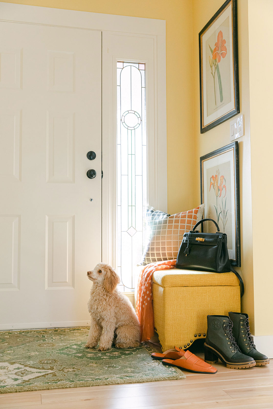
My sweet (almost 1-year-old) mini golden doodle Lucy greets everyone at the door (below).
Decorating with colour (living room before)
Here’s what my living room looked like before the makeover. I know a few of you were attached to my raspberry drapes (and I love you for it). Looking back, this room really lived up to my own advice to decorate with colours you love to give your room the greatest longevity.
This living room design made me happy for almost 10 years! But change is good, and decorating is what I do. So it gave me so much joy to reinvent this room all over again.
Before
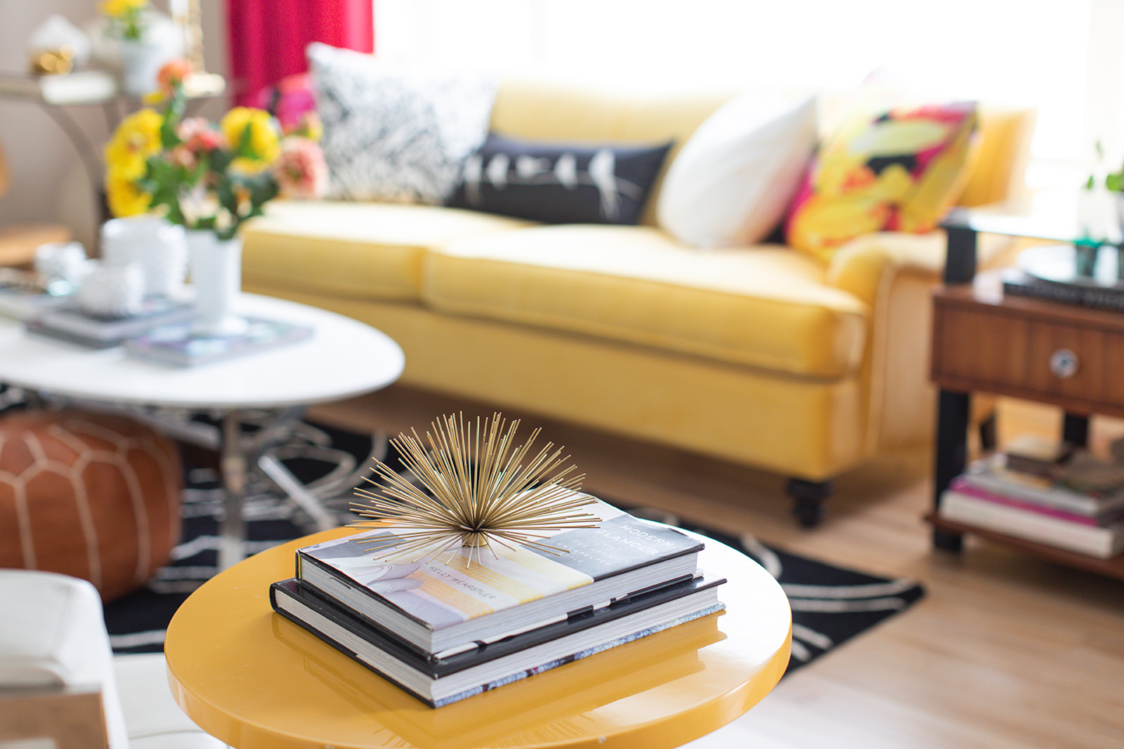
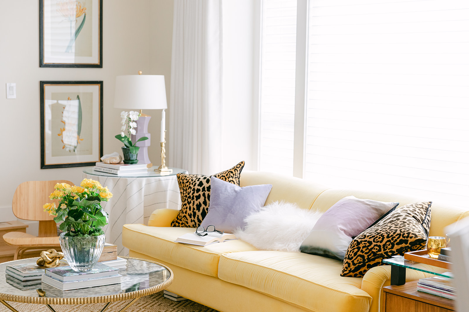
Previously, I had decorated this room around my sunflower yellow English roll arm sofa. This sofa shape is so timeless and versatile, you can’t go wrong. And since yellow is my favourite colour, I was happy to keep it in the palette for this makeover as well.
Before
How to decorate with accent colours
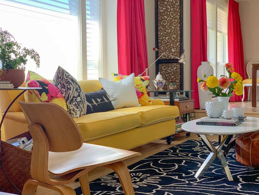
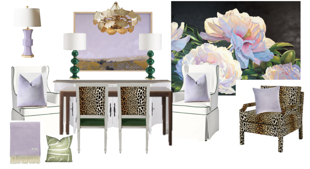
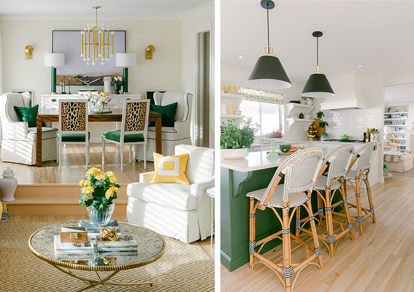
In this version of my living room, I chose a leafy green and bright raspberry to work with the warm yellow and repeated these colours around the room.
COLOUR TIP: When choosing accent colours for decorating your room, stick to a maximum of two or three accent colours, plus neutrals.
The neutrals in my room were black, white and pale greige, along with wood floors and my wood-stained parsons dining table and end table. In order to make your accent colours look intentional and balanced, you need to follow this simple rule: Repeat each accent colour at least once or twice in small, medium and large doses.
For my new living room look, I wanted to incorporate the colours from my oversized original peony painting along with my yellow sofa.
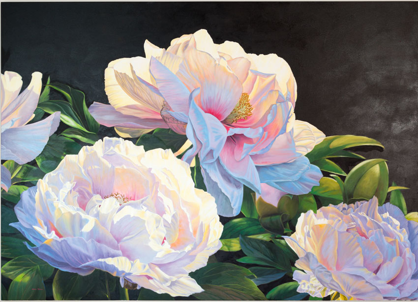
Original painting by James Wiens
This is just one of many mood boards I experimented with while coming up with the new living room design.
One of my mood boards
I incorporated a versatile leopard print to pull in the warm yellow tones. Then I sprinkled in emerald green and lavender accents to repeat the colour palette of the artwork for a completely fresh and new look.
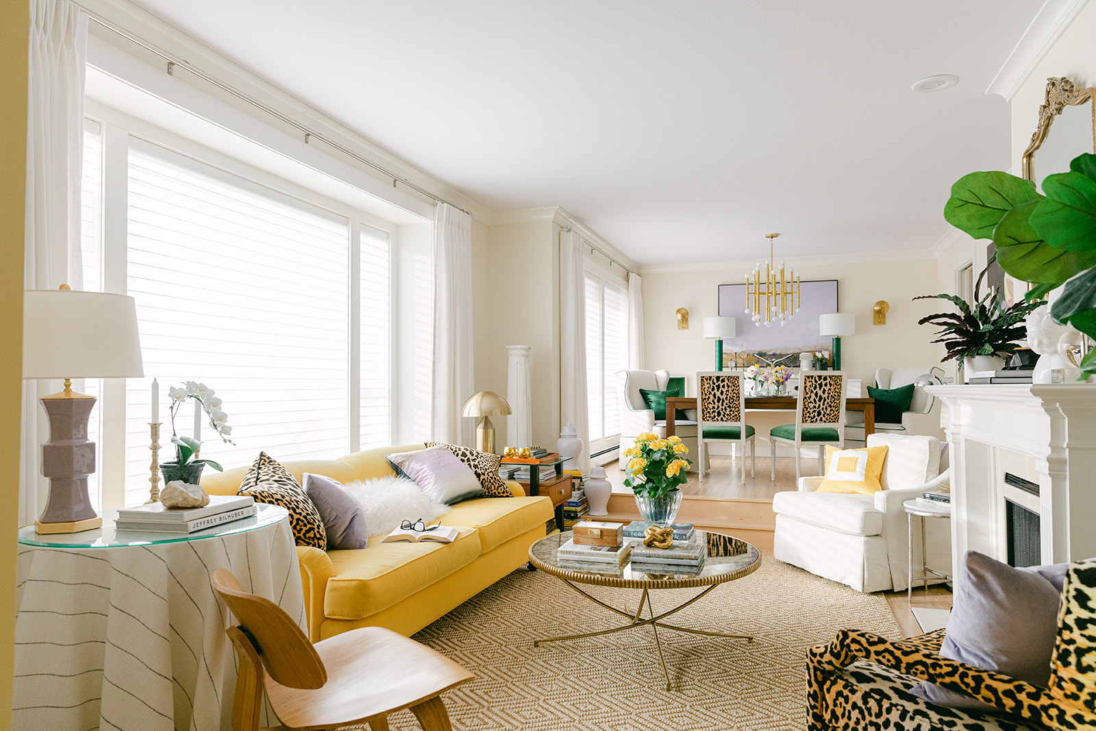
AFTER | Diamond Sisal Rug | Loren Coffee Table | Leopard Pillow
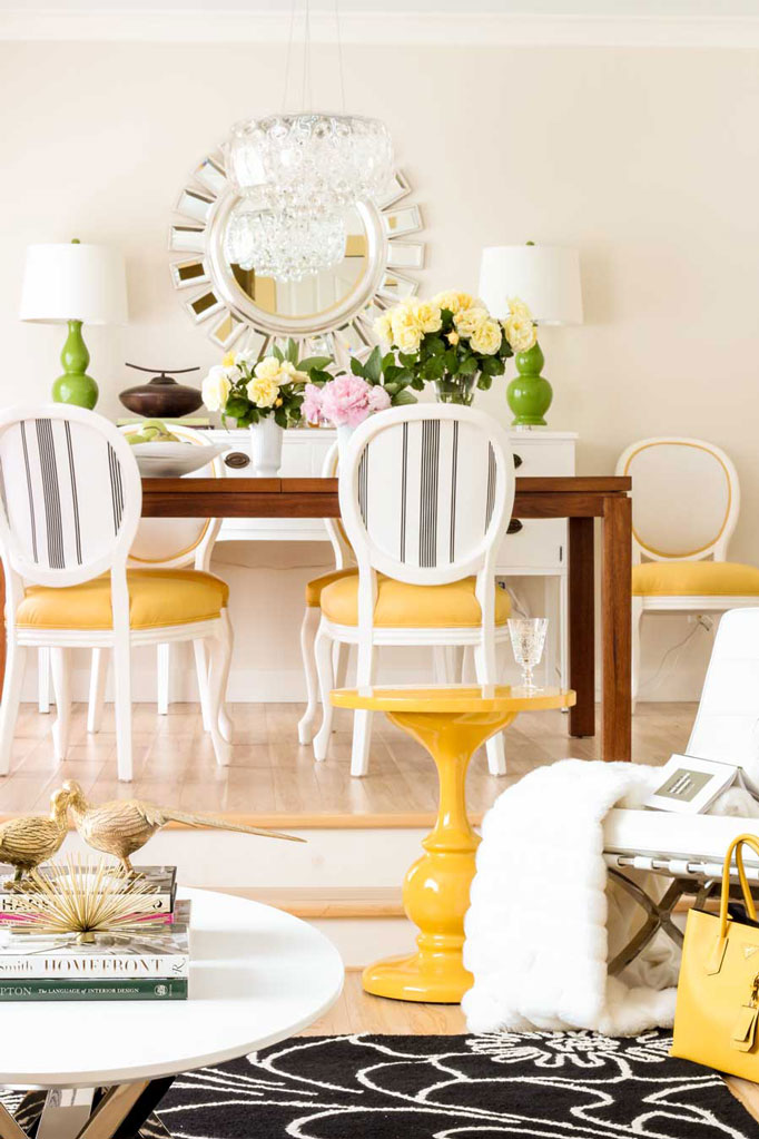
When I first moved in, I simply hung this round mirror in the dining room because it came from my last townhouse. I didn’t immediately realize that it kind of disappeared on the back of my dining room wall, but it was there from the very first day I moved in and I didn’t think too much about it.
And truly that wall was the focal point of this entire room on the long view from the entrance.
Before
Then two years ago I added some botanicals on my back wall (below). That was definitely better.
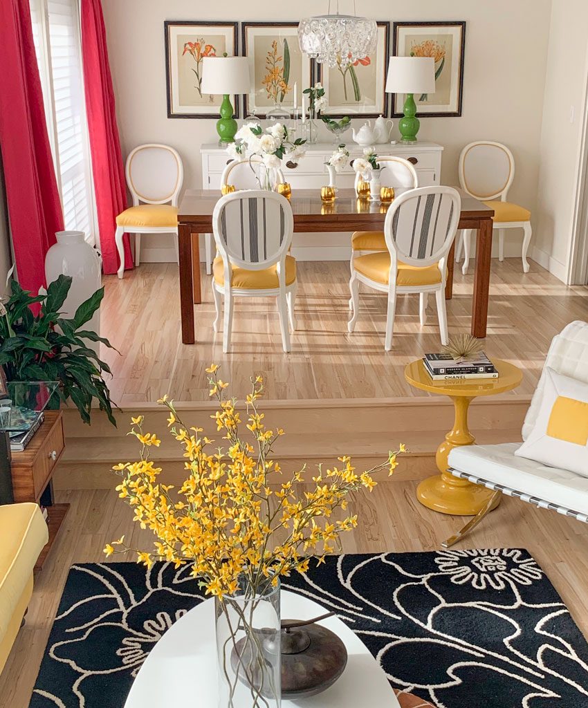
Before
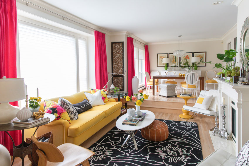
While putting together my collaboration with Ballard Designs, I realized I needed to bring the lavender to the end of the room and work a little harder at making that wall a focal point with the addition of the wall sconces.
That’s what truly took this new room design to the next level, in my opinion.
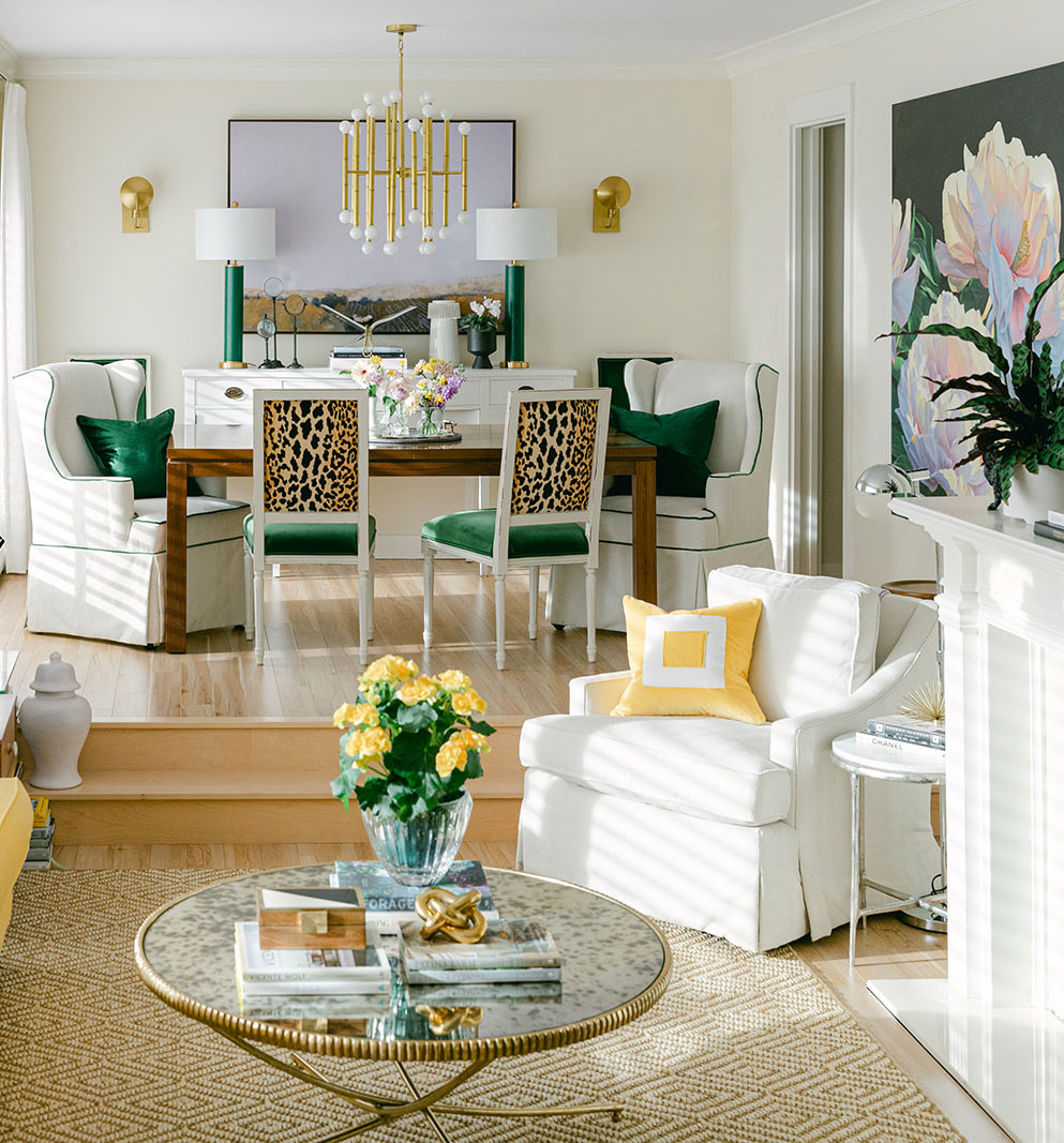
Candace Skirted Chair | Dining Chair | Chandelier | Wall Sconce | Emerald table lamp
Before
Timeless finishes making creating colour flow easy
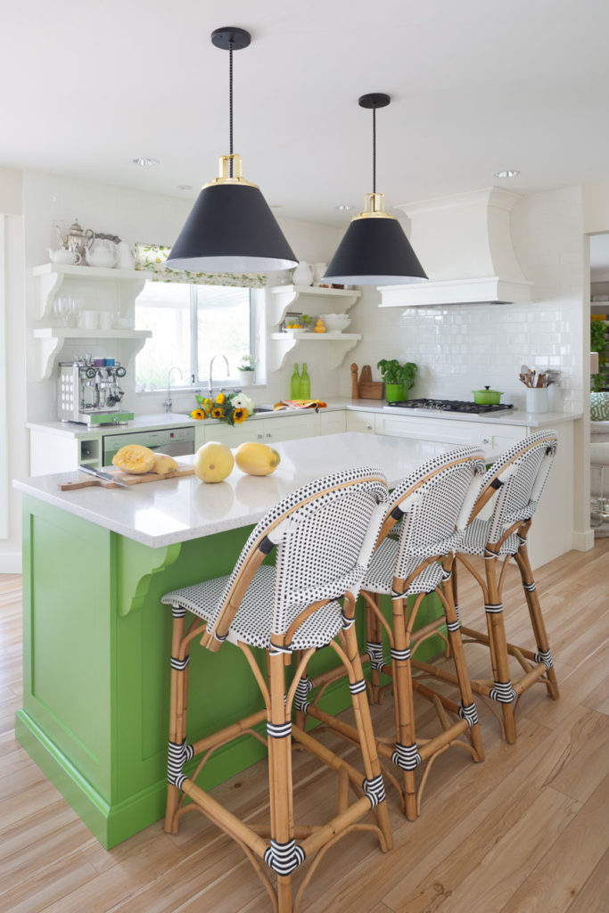
Before we go into creating flow with your colour palette, let’s talk about my timeless kitchen. Because this is a good example of what happens when you choose timeless (in the world of white or black) finishes in your kitchen (below).
I’ve painted my kitchen island three times in 10 years. My timeless white finishes gave me the flexibility to make those colour changes without ripping anything out. That’s just one reason why I preach timeless, my lovelies. It’s the smartest way to allow for colour changes into your spaces
Here’s what it looked like just after our home renovation in 2012, which *hooray* ended up on the cover of Style at Home:
![]()
Before, just after renovating in 2012
Then, 5 years later when I renovated my bathrooms, I painted my kitchen island kelly green AND added some additional millwork to it. This made it look richer and more like a piece of furniture – just as kitchen islands should. I also updated my pendant lighting and roman shades as well as added a custom-made millwork hood fan.
These small changes really elevated this kitchen design:
Before | Black Pendants | Counter Stools
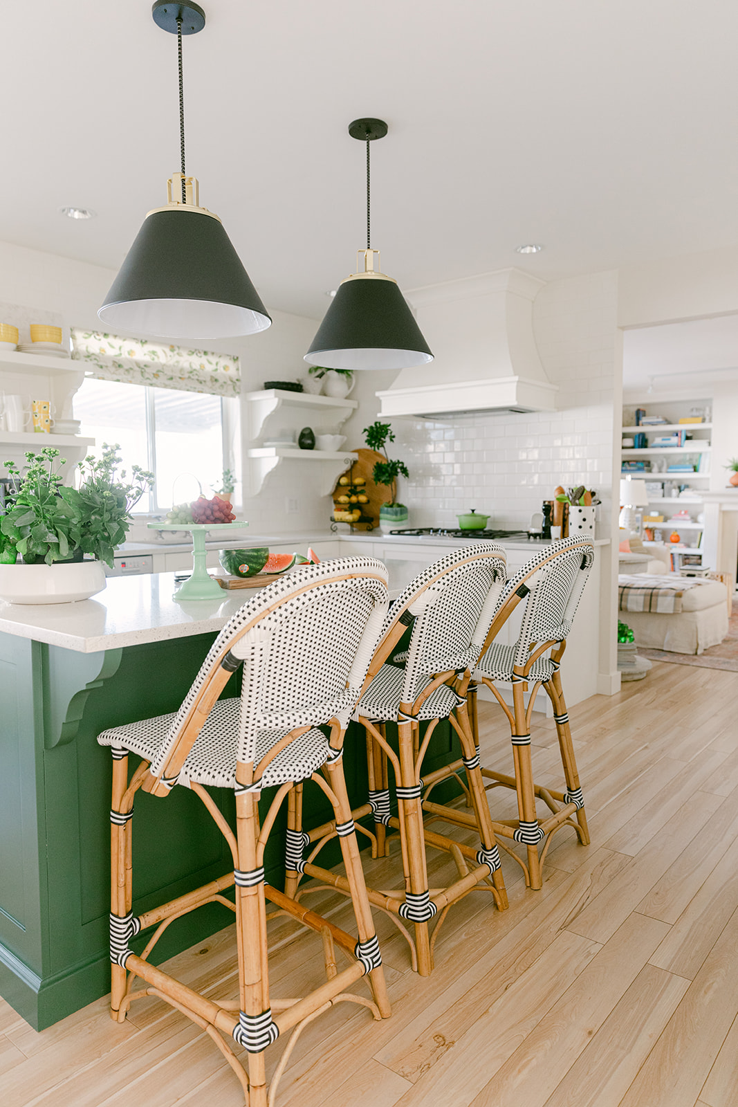
This time around, all I had to do was paint the island a rich forest green to create flow and pull in my new living room makeover.
Again my timeless, mostly-white finishes made this colour change an easy one – nothing needed to be ripped out and it still feels new and fresh.
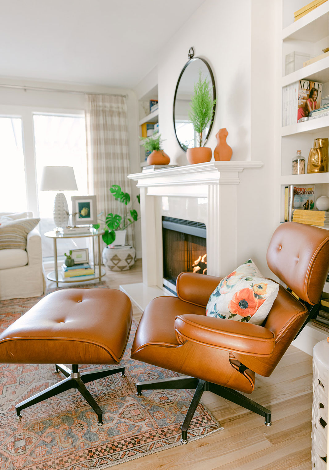
And here’s a quick look at my ever-changing family room. Does anyone else feel like you need to make small changes to the room you spend the most time in? I guess we get tired of looking at the same thing over again.
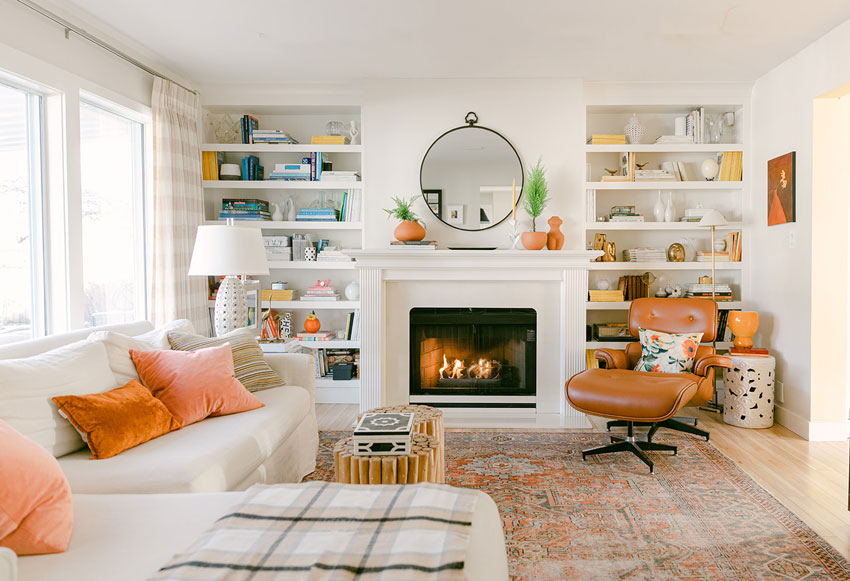
Cognac and orange work well together. And, because orange is one of my favourite colours I’ve repeated it in the family room in a few different shades.
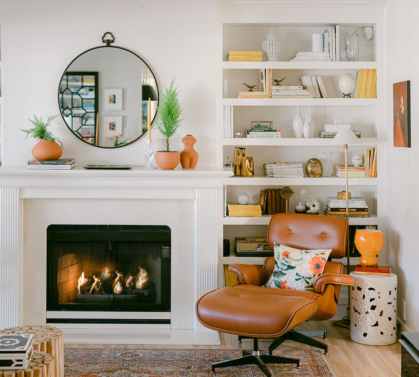
And here’s a glimpse of my new green kitchen island from my family room. So many greens are trending at the moment and this was a fun way to treat my kitchen with a little of it.
And here I am getting some work done with my little sidekick and newest love of my life, Lucy 🙂 Sometimes I work in my studio, but other times I sit here in the kitchen (below):
![]()
My new living room colour palette feels so rich and indulgent. I’m so happy with how it turned out. I still need to infuse the new palette into other rooms of my home, but the living room, dining room and kitchen feel so cohesive. Stay tuned for more updates!
Are you trying to introduce accent colours in your main living space, but struggle with how to pull the colour palette together in the rest of your house? Sign up here for my next workshop.
Related posts:
Maria’s Kitchen Refresh; 5 Years After the First Renovation
My Living Room Makeover with Ballard Designs
Maria Killam’s House Tour; Here are all the Before and Afters

I was completely attached to your raspberry drapes. I am coming around to the new look though – especially the green. (Though I will always hate animal prints – the only place they should be is on the animals. I just don’t like them and never will, although I accept that’s my personal taste.) I do love how you’ve carried the green through. What a beautiful way to create flow.
Hi Maria, Lucy is so cute! My heart melts every time you post a photo of her. Thank you for your tips on creating flow. Your blog posts on how to achieve this have been so helpful. Your refresh is so pretty, especially the green and lavender together. It’s so unexpected and beautiful!
Maria, my mentor, Irenee Riter (The Science of Personal Dress) would absolutely love you! I Love how you matched your shoes to your glasses and dressed to mimic your home decor. I’ve always been obsessed with personal color analysis and it’s a hobby of mine. along with Irenee, I’ve been trained by another professional in the field. Ironically, they teach completely opposite theories. Irenee taught me not only how to understand the aspects of my own personal coloring, but also how to how to mix and match warm and cool colors in my wardrobe and I feel you do this beautifully in your design and personal dress. You are a risk taker. I’ve only been following you for a little over a year and I can see how you’ve grown as a designer throughout the years from reading your blog posts and absorbing all the lovely pictures you post.
The first thing I notice when i look at your room is your chandelier and how you chose colors from your peony painting, which has always caught my eye, and emerald is one of my favorite colors. I’ve found some inspiration from your makeover and think I will incorporate some of the emerald that’s in the painting in my open space kitchen/dining/living room into my black and white kitchen along with the navy and white I originally chose to decorate with, maybe paint the two end chairs on my dining table emerald. Thank you for sharing your home and designs with us!
Very beautiful! Love the color of the kitchen island and the picture behind the sideboard, as well as the more sophisticated palette. But the dog and Maria — in her coordinating dress 🙂 — steal the show for sure!!
Happy rooms Maria, I just love j too our color schemes!
Maria, your blog and home are such a welcome contrast to all the white-walled, neutral rooms out there. Your house if full of personality, heart, and joy! I’ve been reading your blog for about a year now, and as I’ve started to incorporate color into my own home, I’ve realized your decorating mantra is so true— color is happy! I’m glad I found your blog as a young home owner. I will never have an all-neutral home again!
I think it was very smart of you to buy a color-coordinated dog, LOL.
Your new designs are gorgeous. I would love to sit on your sofa and read a book.
I think your living room looks much more sophisticated now. Although, I would have found it hard to get rid of the raspberry curtains simply because you gave up a trip to Italy (on my bucket list) to get them!!! LOL In any event, I find your new decor much more soothing than the old. The old was pretty, but I do like this better.
Love the matching dress!
Your living room looks much more sophisticated now. I wasn’t a fan of the raspberry curtains because I found the slices of color jarring. The quiet look of the windows now allows the rest of the room to really shine. Love everything about your dining area—chairs, fabrics, painting, chandelier. The chandelier works beautifully against the painting. And the new green of the island works so beautifully with all your other changes.
Fantastic job!
Love your new living room. I have also used accents of orange in my living room and have been looking for an additional chair. Its hard to find good furniture as I live local to you. Is the cognac leather chair also from Ballard?
Your new living room is so elegant and inviting… great job. Thanks for showing how to create flow and balance.
And dogs are a necessary part of that concept!
The update looks sophisticated and chic for sure! I love the richer green that you carried throughout and especially the last photo of you in that
beautiful dress- ooh la la. You look just as amazing as your interiors. Very inspiring!
It’s interesting to see the “before” and “after” in one post.
I love the hit of lavender on the painting in the dining room.
My favorite new piece is your coffee table! 😍 I love the detail on the edges.
Beautiful! What is the wall color in the orange/cognac family room? Does it pick up the cognac undertone?
LOVE the changes. I also love how Lucy matches the pillows on the kitchen banquette (which came first, I wonder Lucy or the pillows?).
Really beautiful re-design of your living spaces! Purple and green are my two favorite colors so I really love these new rooms. I particularly like seeing the before and after photos together in one post. For someone (me) who dislikes animal prints, what would you suggest instead for the backs of your dining chairs? As always, Lucy and you steal the show!
All l can say is that l love love love it.l have been doing things in my home by myself since l retired but l no pro,but you do give me more ideas.
Hi Maria,
Thank you for sharing your process and the lovely results. I love your new decor. I have a few tiny suggestions. Although the green lamps on your dining room buffet are beautiful, to my eye they make the room look narrower than it is. The sconces open the room up and let the art shine. Also my eye was looking for deep green on the top shelf to the left of the sink where you have the yellow pottery. Some green pottery would draw my eye ip and back to your island.
I think one of the green lamps would look fabulous in your family room above the green plant on the long table.
I thought your home was very pretty before and the update is just beautiful! I really love the way the living room curtains now blend in, making the room seem larger and more serene. And of course you found the perfect green for your kitchen island! Would you mind sharing the paint colour?
I especially like the family room, where Maria has matched the fire to the orange and cognac decor !
I love the new look! And I have a question about flow and sofa colour. If your family room was visible from your living room, would you have a yellow sofa in each room or still keep one neutral? I am asking because I live in an open concept house with two different coloured sofas and one will be replaced in a few years.
Love your makeover and all your use of color. Please tell me the brand and color of your kitchen backsplash tile. It looks really very bright white. Is it?
Love the old and the new! I could go with either one, maybe due to that beautiful sofa! 💛
I cannot express how happy I was to see that you and I have the same rug in our family rooms. And I love the new living room! So fresh and airy.
Hi Maria
Love the sophisticated update in your home. Especially love that the front legs of your yellow sofa are now placed on the rug. The before photo with the rug “floating” gave my ocd a twitch. 🙂
Hi Maria, I absolutely love your style! Your home looks happy with your choice and placement of colours. This is what I am trying to achieve in my apartment after having downsized, but my sofa is blue grey (neutral). Trying to pull teals and greens from my artwork to add some pop. Wish you could help. I also have 2 miniature poodles. One black and one white. Your Lucy is adorable.
Oh no! Did you choose those raspberry drapes instead of a trip to Italy? Are you planning to replace them with anything colorful?
I love that green with your yellow!
What colour and kind of flooring. I so love it.
FANTASTIC!!!! 🙂 Thanks for sharing with everyone helpful!