


Sign up here for this Thursday’s training on how to decorate not renovate your dated bathroom! And we’re hiring a junior colour designer and a local part time client support & operations associate. See the postings here.
Last January, I predicted that burgundy—with brown close behind—would define 2025. And it absolutely did.
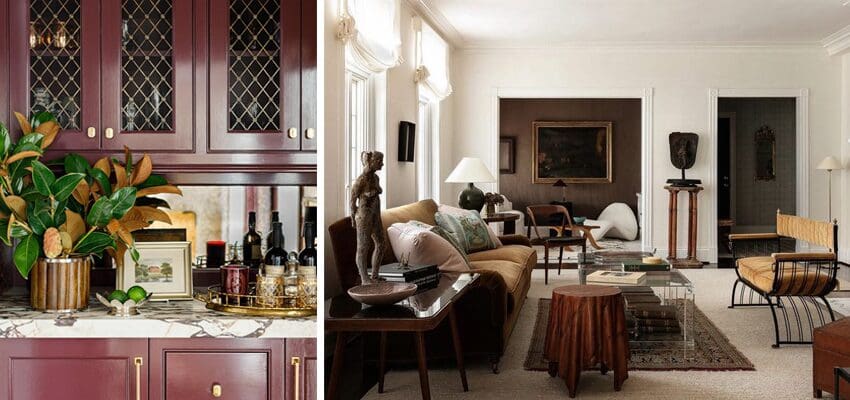
Fashion had already embraced it first. Then interiors followed. When “Ralph Lauren Christmas” became a full-blown aesthetic, burgundy cushions, throws, and accents virtually disappeared from shelves. You might find them online if you were lucky, but off-the-shelf? Gone.
What I’ve noticed since then is even more interesting.
When I look at fashion collections now, brown and burgundy sell out first. Black, meanwhile, is still sitting there. Available. Lingering. Waiting.
Have you noticed that too?
This is usually the canary in the coal mine. When the public starts moving on, it doesn’t happen gradually. It happens fast. One minute a colour is selling. The next minute, it’s over. And when that shift happens, manufacturers are left holding inventory that suddenly feels dated.
I suspect there will be a lot of black left behind when this trend cycle turns—and it will turn quickly.
That theory was reinforced recently when a local furniture manufacturer reached out, asking if I’d be interested in featuring their pieces in my home. I reviewed their collection and sent back two very specific selections: a desk and a sideboard.
Their reply?
“We’re not offering those right now, but we’re really excited to feature a similar desk and sideboard instead.”
And what colour do you think they were?
Black. Of course.
So if you’re reading this and you’re sitting on black inventory, here’s my blunt advice: move it. Fast. Before it becomes landfill.

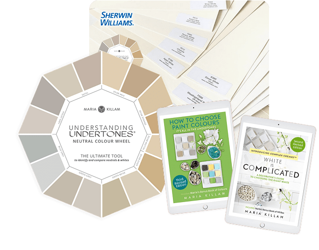
See Undertones Instantly
- Real Benjamin Moore paint chips
- All 9 neutral undertone families
- Compare directly to your fixed elements
My colour of the year for 2026 is olive green
While olive has been a summer fashion staple for years, 2025 marked the first time it showed up in a big way for fall.
It’s no secret that many variations of earthy greens were named Colour of the Year by many paint companies, but if you ask me, this isn’t about “green” broadly. It’s about which green. As black and white finally lose their grip, warmer, earthier greens are emerging as the next true neutral—and we are only at the beginning of that transition.

What’s fascinating is how predictable the pattern becomes once you know what to look for.
When sage greens dominate, blue-greens immediately fall out of favour. Turquoise, for example, was hot in the 50s, then again in the 80s. It reappeared during the brown trend of the early 2000s alongside yellow-greens, which stayed popular for a long stretch. Clean turquoise was big throughout the grey trend, while those yellow-greens cooled down, becoming bluer and bluer, until forest green returned.
I remember when forest green first gained momentum again. It showed up as an off-the-shelf sofa colour. Not custom. Not niche. I blogged about it here in June 2018. Then I saw a condo development in Toronto where every kitchen was being installed in forest green cabinetry. That’s always a sign a colour has crossed into mainstream adoption.
But then cognac arrived—and completely took over.
Cognac became the warm counterbalance to the black-and-white trend, single-handedly ushering orange back into interiors in every possible variation. And when you remove white from the equation, you’re left with black and cognac and then what do you get? Halloween.
That’s how trends burn out. Not slowly—quickly.
And now we’re moving on again.
This time, it’s green—but earthy green. That shift naturally pushes blue-greens to the background. Why?

Because Sage and blue-greens do not look good together. Once sage enters the room, turquoise, teal, aqua, and blue-greens immediately look:
- too clean
- too artificial
- too decorative
- too disconnected from nature
This is why when earthy (dirty) colours arrive on the scene, the clean colours can suddenly feel wrong. Complex dirty colours prefer other dirty colours for company.
Colour trends swing like a pendulum from fresh, clean and high contrast, to muddy, muted and complex constantly in the trend cycle. It’s not at all hard to predict if you know how the trends work.
How to work with clean and dirty colours is a core concept in my trainings on the Killam Colour System™, for homeowners and professionals.
I will be demonstrating how to work with existing finishes in a bathroom you don’t love in my upcoming FREE Webinar January 8 @ 1 Pm PST / 4 PM EST. Working with neutrals vs. colour and clean vs. dirty colour is a big part of this free training. Sign up here!
Tell me in the comments: Do you love earthy greens? Enjoy! Here’s your moment to stock up and indulge. Prefer those clean, cool blue greens? Don’t worry, the colour trend pendulum is always swinging back and forth.
That’s how the cycle works. And if you understand it, you can stay ahead of it—rather than decorating your way out of it later.
Learn to decorate with colour AND how to take a wise and TIMELESS view of the trends in your home in my upcoming session of Create Your Dream Home. The course starts January 16th with digestible modules you can complete on your own schedule each week, and weekly live Q&A sessions. Spots are limited. Sign up here!
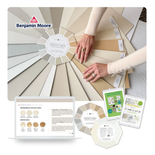
The Killam Colour System™ in Action
See the colour direction first, then shop the Colour Wheel tools that help you apply it correctly at home.
Related Posts
Trend Alert: Green is the New Black + The Most Expensive Mistake
Trend Alert: Green Cabinets + Tile: Are You Here for It?
Colour Trend Alert: Burgundy (It’s the New Red) + Brown


I am looking tonremodel/refurbish my kitchen area and 1-2 bathrooms in the next 1-3 years. I like the fresh beachy colors of blue, life-holding greens, any colors of orange that could work as accents, and yellows are always happy to me. (I don’t feel I can return to burgundy or olive and like it at all.)
I realize these colors are not always in style – what does one like me do to adapt my personal tastes and need for cheer with “dirty colors?”
While I do like earthy greens, Johanna Gaines uses them in EVERY project she does lately. That makes me think they will be forever stuck in the mid 2020’s time capsule.
They will be. . . when they are overused yes. Maria
My favorite color is green (the more natural tones from celery to fern to olive), so I am delighted! I have a 10 year old gray loveseat which is showing its age with some sun discoloration and saggy back cushions. I will be replacing it this year with one in my favorite color now that green has hit the mainstream sofa lines.
I remember last year when you pointed out the burgundy trend coming in through fashion first, and that was a great and true insight to color trends.
Would you consider sage to be a blue-green or an earthy green?
Earthy 100%
I enjoy looking at the earthy greens, and the grounding effect it has, but have a hard time committing to painting green. Green decor, for sure, through plants, etc. Blue has my heart and always has.
Looking forward to it, not because I love earthy greens (but neither do I mind them), but because it will mean some easy to find, off the shelf decor (pillows, etc.) that will give a quick refresh to my already beige interior and earthy/dirty furnishings. I had just recently realized that was the colour I can easily incorporate more of, so it’s a win for me for now.
I read about your color of the year with joy! In 2010 we painted our fireplace mantle and legs with Sherwin Williams Status Bronze SW 7034. It’s a deep olive brown. (The surround is marble.)
The bronze color matches our sofa which we purchased years earlier. We painted the walls Benjamin Moore HC30 – Philadelphia cream which is a soft yellowy color. We decorated with accents of deep yellowy gold and brick red. I have never stopped loving our living room. Though we do need to reupholster that sofa.
Sounds pretty!
I’m so thrilled to hear you say this! In my home I like to update my look with great pillows & accessories. I had green throw pillows a few years ago but they look too cool to me now. I have been really looking for just the right shade of “dirty” olive green. Glad to know I’m on the right track without spending too much money on updates. I love your blog and appreciate you sharing your professional insight. Thank you!
Thanks Bonnie! xoxo
I just put down Sundance Canyon Hickory LVP and painted my 1093 Beige Sand SW walls Creamy by SW. My cabinets are Honey Oak with Blackstar Granite Formica. I’m considering painting my cabinets as the floor and cabinets clash. Would Sage Green work? Evergreen Fog I kinda like . Any advice? Thank you!
Need photos to really know, my kitchen refresh package would be perfect here and it will also include lighting and hardware which is what breaks most kitchens: https://mariakillam.com/product/kitchen-refresh/ Thanks for your comment! Maria
Olive green. My favorite color. I’m actually sad it’s becoming overly popular. Glad for the opportunity to buy stuff in my favorite color, but bummed because I know my olive green + warm wood now will not look unique, and soon enough it will look stuck in time – 2026ish.
Same here! My favourite colour. At least we know WE are the faithful, not the trendy, Olive Green fans. It’s probably my favourite colour to wear, too. My brand-new home is VERY green, and I love it.
Green will be the trendy neutral of this next decade and when it looks trendy is if your entire house ends up green. So you’re good. Maria
I love the earthy greens! I am not that big a fan of the cleaner blue greens like teal and turquoise. I green colors that are muted, dirty and soulful. I have been decorating with the color green for many years because it’s my favorite color. It’s interesting to see how everyone seems to be jumping on the green bandwagon now. I don’t think my home will look dated once green is no longer trending because green and warm colors are historically appropriate colors for the architectural style of my home.
100% correct. Maria
I’ve liked earthy greens for over 30 years and have used some shades of it (rather sparingly, though) in our home for the last three decades. I recently replaced an accent chair in our living room with a lovely olive green velvet chair, and I absolutely love it! Of course, I redid all the pillows in the room as well. I have some large artwork that ties in various shades of green and blue, with a bit of rusty orange & red, so I’ve used those colors in decorating. I’ve always been a fan of a “fall palette”!
We just finished our new build and we love green. We used BM 448 Dakota Shadow for the kitchen island and some of the perimeter cabinets with white oak towers at the end of the counters. We love the green tone and it looks terrific with our wood floors that are white oak as well. The walls, ceiling, and subway tile are Cloud White and the entire open concept is gorgeous. Our family and friends are full of compliments.
How do I incorporate green with my grey sofa and dark blue easy chair in our familyroom? I’ve considered getting a new cognac leather side chair to put by the fireplace but now considering green.
It needs to also be in an area rug to work well. Maria
I say “amen” to Maria’s advice! Then you can also bring in other accessories like artwork, pillows, etc.
The softness of the earthy colors is a welcome change however I still like contrast and my cool blue-greens, pinks, and navy. What now?
Nothing wrong with what you have! Colour is always more timeless than the trendy neutral of the moment! Maria
Olive and the warmer greens are not my favorite, although I don’t hate them and I will wear olive occasionally. My favorite greens are more in the emerald/forest realm, or something like slate green that is dirty but bluer. I love that Maria said most greens work together and I have found that to be true. Hunter green or a cleaner olive and chartreuse go together shockingly well.
I love green – alway have. I tend towards sage green or a forest green. I live in a log house and the outdoor trim is a color a deep green. The color I had in my head was impossible to find in a paint store, so I had to mix myself to get it perfect. I wanted a deep, rich green – not too much yellow, not too much blue. I kept mixing some acrylic colors I had on hand until I got what I loved. I painted a good size swatch on white paper, took it to a paint store and had it color matched. My husband thought I was a little crazy to do it, but twice we have had people literally stop and ask what color the trim paint is because they like it so much. Now whenever I get a picture in my head of what I want the finished outcome of a project to look like, he just let’s me run free…. 😂
I’m excited to see more earthy colors. Love your blog!
I’m just so grateful to have orange back on the shelves. It’s always been in my palette and I intend to buy up everything I can while it’s so readily available! (Cognac, amber, fall foliage – here I come!)❤️💋