


While all the paint companies are looking to sell you more paint with their colour of the year picks. Colour is what I do, so I’m simply in a position to observe the trends and let you know what I see.
The colours of the year I noticed most in 2024 I expect to continue into this new year.
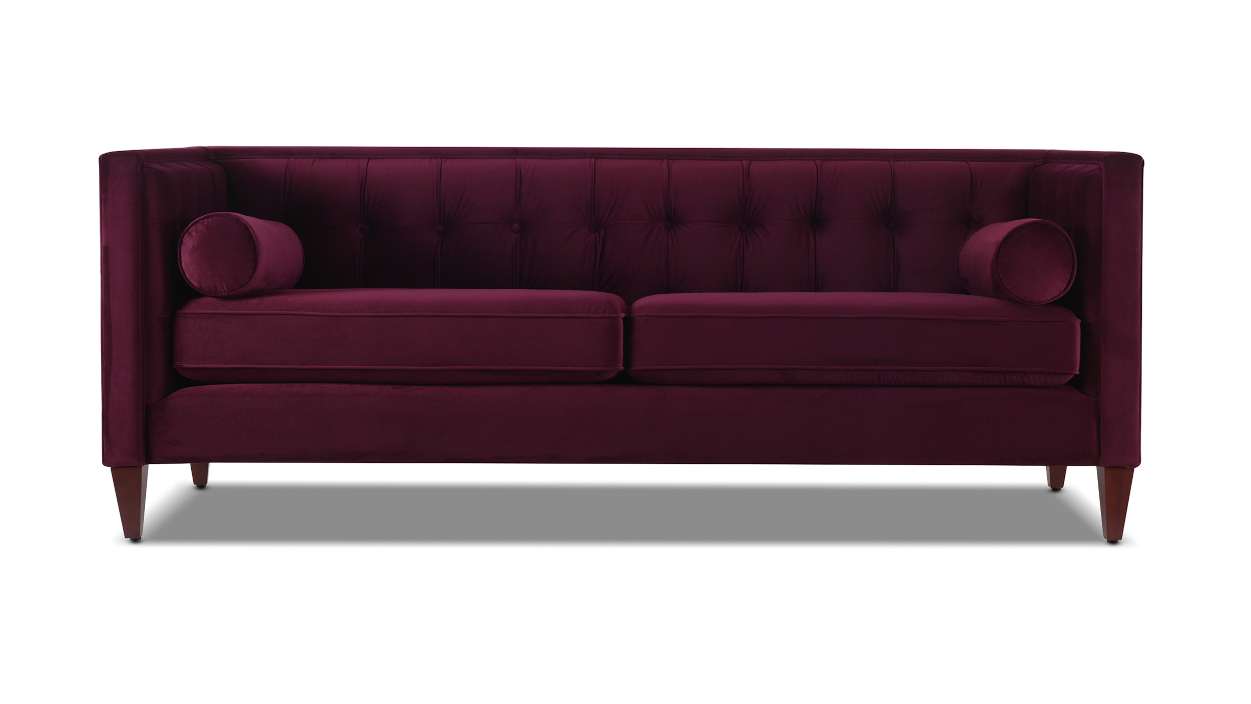
Brown and Burgundy were trending heavily this past Fall, I even read an article that stated Burgundy experienced the highest search for fashion and that makes sense. Before Fall 2024 I was searching for a second pair of burgundy pants and I could not find them.
My colour of the year? Burgundy.
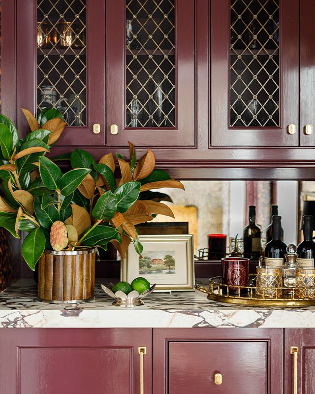
And brown
It’s taken 15 years for brown to be back in fashion. That’s because there were a lot of people who couldn’t even look at brown never mind wear it, after the Tuscan brown trend ended in the early 2010s.
But now that black has officially outstayed its welcome in 2025, brown is back as a softer, warmer alternative.
The Organic & Natural Paint Co.
Navy
Dark colours are often perceived as more neutral than other colours. It’s the reason navy has been the second most specified paint colour after black in this trend.
When I opened my emails this morning, I got an email with images of the new Finlandia Hall in Helsinki (I am a Finn after all). Their new auditorium drenched in navy.
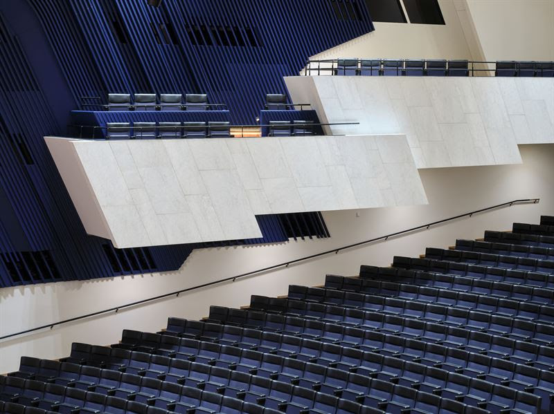 Finlandia Hall’s main auditorium offers the original design with advanced technology. Photo: Tuomas Uusheimo
Deep colours that aren’t black
It’s fair to say that deep colours in general are trending.
Because they bring drama and contrast.
And because they feel more neutral.
Why? Because there’s psychologically less choice.
When choosing dark colours you’re not faced with a conversation called:
Light black or black? Um no, because now we’re in shades of grey.
Navy or light navy? Nope not a thing.
Brown or light brown? Pink beige you mean?
Burgundy or light burgundy? Now we’re in pink.
The nuances of undertone and hue are also less obvious in deep colours because they are so shaded. Meaning choosing a navy that isn’t absolutely perfect is easier to forgive.
Black is out but drama is still trending
Again, dark colours give the look of high contrast and drama that has been heavily trending. I can always get behind a deep colour to this effect over black. Black everything has officially outstayed its welcome in 2025.
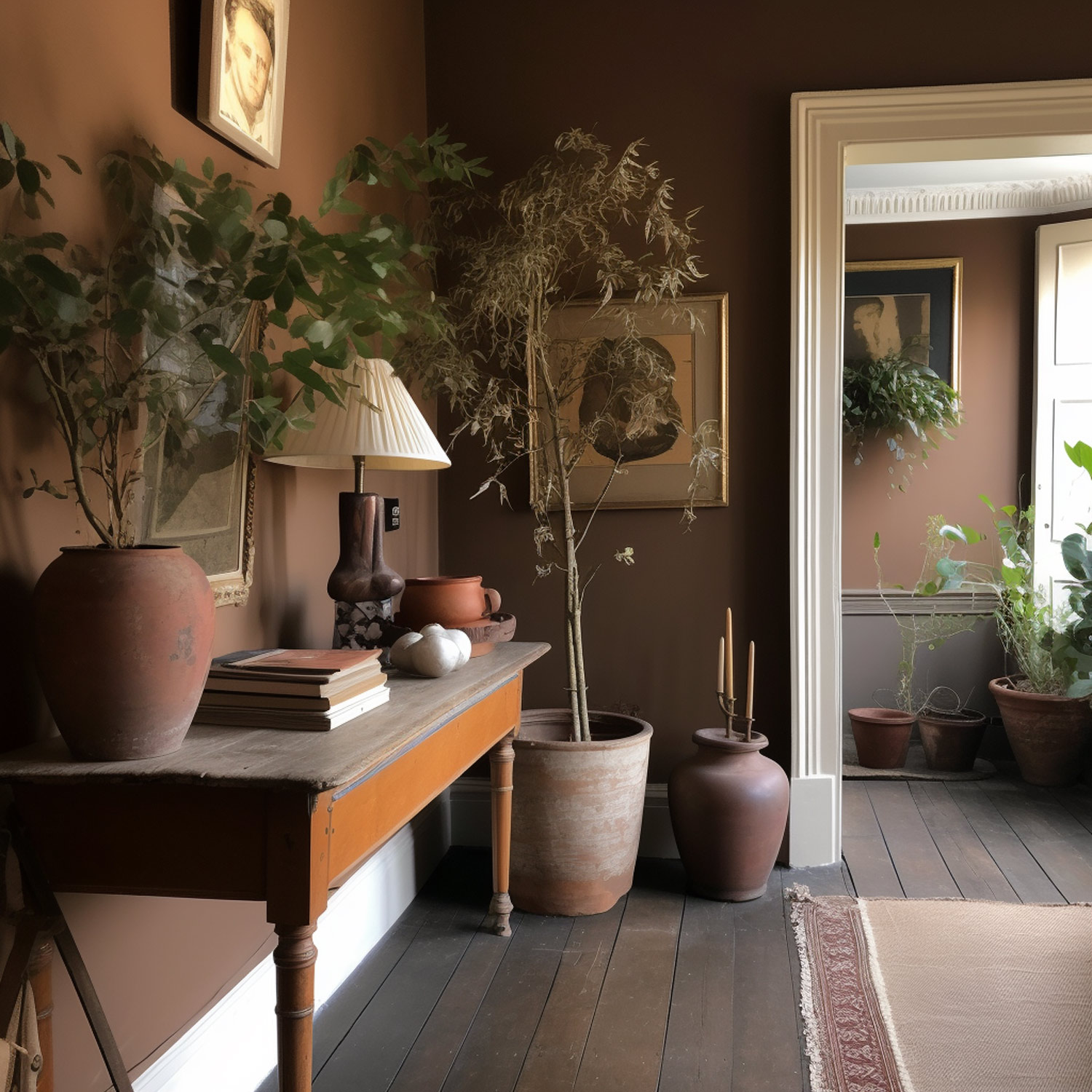
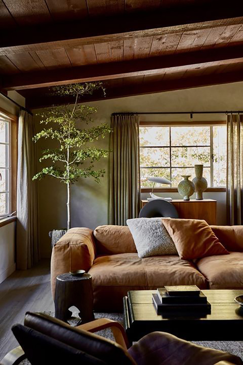
There is a branch of the trend moving to deep brown with fresh white: a holdover from the black and white trend for sure, but warmer. There’s much more to this look than just slapping stark white on the walls though. Here’s the scoop on the best whites.
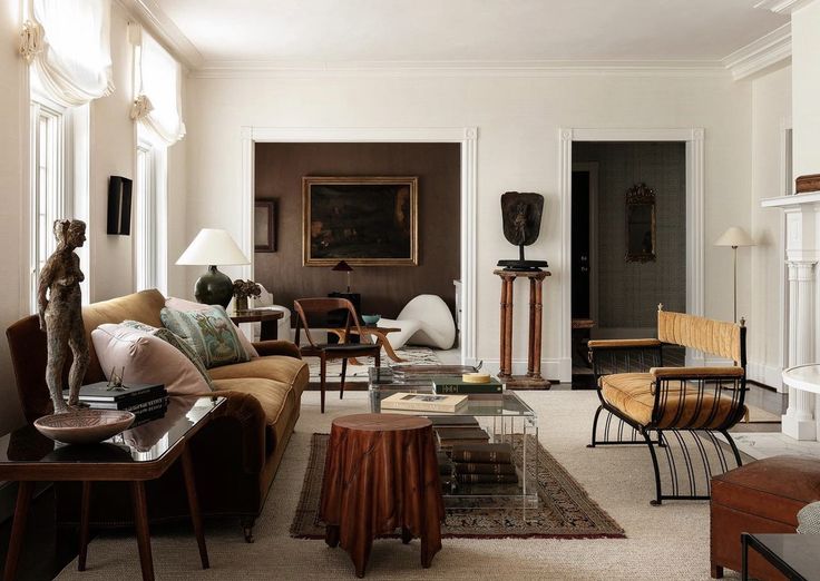
And there is also a movement back to low contrast tone on tone looks similar to the Tuscan Brown trend like this room below.
Something for everyone I guess.
As always, your input helps me see the big trend picture. So I’d love to know: have you thought about it high vs. low contrast decor? Are you in camp high contrast, using lots of white and cream with the new earthy colours? Or low contrast and mellow? Are you into brown, burgundy and dramatic deep colours going into the new year?
Here’s what’s new!
Have you wondered exactly which paint colours represent the 9 undertones and 4 whites on my Colour Wheel? You can now buy complete collections of large samples of the the equivalent colours in Benjamin Moore or Sherwin Williams directly from my website!
Buying the Colour Wheel collection is a smart move because you’ll have large, easy to see and compare samples of each neutral undertone to get even more precise with identifying the undertone of anything.
If you’re tackling a home project, from a simple repaint to a full renovation or new build, this collection is essential to get your undertones and whites right!
Related Posts
Ready to Renovate your new Black and White Bathroom?

I guess I was on trend when I ordered two burgundy lift-chair recliners last year. But I am definitely not in the earthy trend. I prefer brighter colors. No brown for me. But I can see that it would be a nice change from black, along with navy. I’ll stick with my brights though.
We’ve embraced deep blues that have blended with red into rich, moody burgundies. Regarding the next trend, I’m now looking forward to blue reversing its course, merging with yellow, and bringing green back into our homes like a breath of fresh, clean air!
I’ve always decorated my own home with high contrast even before I understood what I was doing or why. Low contrast is beautiful for other people but just makes me feel sleepy and like something is missing in my own dwelling. We’ve always loved browns, especially deep, rich brown woods. Never understood painting all that rich beautiful furniture. I like it paired with green or blue especially. We didn’t jump on the gray trend at all, we personally find it a depressing, drab color. I did notice a ton of burgundy showing up in Christmas decorations this year, I like it. I’m actually wearing burgundy nail polish that I notice while I type this, HA. Hunting for a rich brown to recover an ottoman this week for our new aqua blue and brown library.
Yahoooooo for the Samplize collection!
Our house with its orange oak wood floors loves all sorts of moody colors. My favorite is Sherwin Williams Really Teal — amazing in a north facing room!
Im glad to see brown is not as dated as I feared. We have some oil rubbed bronze curtain rods – I think they look warmer and easier on the eye than black, considering the orange wood tones around them.
I just can’t get on with brown, and burgundy reminds me of the forest green and burgundy that we used in our first home many moons ago. I’m good with the navy, though – we replaced our child-worn sofa a couple of years ago with a navy leather one, love it. My kitchen has half Hale Navy cabinets (the rest are white, with leathered black granite, I’m so out of style!! The horror!). Everything comes back around so I’m sticking to what I like. Never wore super warm colors and don’t like looking at them much. YMMV.
I’m happy to watch other people use these colors but in my own environment I still prefer white, light and color. The darker colors are just too subdued for me and would push me towards inertia rather than activity.
Hi (from a different Diane than above)!
I live in Wyoming, USA where we have long, cold winters and I’ve gravitated toward warm colors with medium contrast (not too striking, not too subtle) because I like a cozy house!
I’m also a “spring” like Maria and love to wear brown. It was hard to find a brown t-shirt for a few years, but in the last couple years, I have been able to get ivory, peach and brown clothing! Yay! I do remember wearing burgundy in junior high school in the early 80s – one of my favorite sweaters with ruffled shoulders (!) was in a beautiful shade of burgundy. I wouldn’t wear it now, but can appreciate it. I like more brown than blue in my burgundy, but then it reminds me of deep cherry wood paired with a mauve couch, which takes me back to late 80s/early 90s furniture trends, and I am definitely not attracted to that. Funny how we change!
Happy New Year everyone 😊
I still like my greens and blues although burgundy is a lovely colour. Maybe as an accent. I never was a fan of brown – too dull for me. Also I don’t like moody interiors. I need bright colour and sunlight. More contrast making a colour ‘pop’ is more my style. So fresh and airy!
I have liked some of the new burgundy when it seems clearer and brighter and more compatible with pink. I saw so many people tying burgundy ribbons on their Christmas trees this year.
The brown paint in the second room photo above is stunning!
Brown? YUCK! Burgundy and Navy both good. By the way, I notice you are now including paint colours from Farrow & Ball. Brava! When we renovated in 2015, we used F&B paint. Smells like wet mud when it’s being applied and until it dries. How nice not to have to inhale toxic chemicals off-gassing from the paint! Apparently F&B is used a lot more in Eastern Canada, not so much in the West. It is often used in institutional settings like care homes and hospitals because it is non-toxic. I hope F&B becomes more common in Western Canada. Having used it the once, I can say that I am a big fan.
Not really a fan of brown. The last two images you shared look drab and meh to me. But I also don’t like too bright of colors indoors because it feels like too much. Shades of blues are what seem to be my favorite color, although I have a lot of warm white or almost-griege color on most of my house walls due to the open floor plan making it a little challenging to use a dramatic color and just stop, shy of a single accent wall. I prefer that on the walls so I have flexibility in color for furniture and decor. I wouldn’t mind some greens but my husband isn’t a fan of those unless it’s in plant form.
I do enjoy brown when it is in the form of actual wood flooring, cabinets, or furniture–anything that shoes a grain. Otherwise it feels drab and flat.
As an ‘autumn,’ I love to wear brown. I have medium brown wood cabinets, and some wooden non-painted furniture. My walls are Muslin. All my trim and lots of furniture is Cloud White. I recently painted my kitchen chairs Tate Olive, which is dark for me, and I am now trying to figure out how much contrast I want in my dining area. I don’t think I will paint anything brown, but maybe a darker beige, and I don’t think I will buy any soft furnishings in a brown, but maybe a dark green chair.
I’ve recently done some dark colors. In a room with a navy sofa, I painted one long wall midnight oil by Benjamin Moore which is the darkest navy i could find that seemed to match the tone.
In another room with a cognac sofa that has an open floor plan, I painted part of the entry wall and around the corner to a half wall (connected) salamander by Benjamin Moore which is an extremely deep green or teal. In this room the rest of the walls are BM China white.
I’m considering just using China white in the room with the navy wall too, or simply white. Haven’t decided, that room isn’t finished yet. For me, I’m liking the balance of the very dark color against white. I get the drama and keep a lot of light, is my take.
Previously my walls were still BM grey owl which I painted in 2014.
I guess my front door is purple as of last summer and my Christmas wreath on that door had pink and burgundy. My Halloween wreath was burgundy. Burgundy looks awesome on the purple!
So much for “timeless”. Sigh.
Love that Chad Wood photo!
I am Team High Color Contrast! (vs simply black and white)
As someone with low vision, higher contrast interiors are my version of wheelchair ramps, while low contrast settings make for my version of impossibly high stairs. I recently looked up the ADA guidelines for visually impaired people and realized our public spaces need much change.
That’s one reason I love your (Maria’s) aesthetic.:)
Do you have any specific burgundy recommendations? I’m looking at Sherwin William’s.
Always loved brown and used it in our previous home in the south…..yes, the south! In our open plan home, we loved our living room which was open to the kitchen. That area was sun drenched and its vaulted ceiling painted white, bounced the light around and greeted you every morning! The dining room whic was behind the kitchen forming an L shape area with the living space. I loved the idea of using a brown/black/wheat combo grasscloth ….it needed to be on the back wall of the dining room. Since the ceiling dropped to a lower flat ceiling in the dining room without a ceiling lip into the kitchen, the dining room ceiling was the same brown as in the grass cloth. Very moody and soooo intimate. That room joined by an open double doorway to the dining rooms left, housed a library brimming with books and of course was brown and was too the ceiling. It was like sitting in a forest after a spring rain as the rainwater turned the bark to a deep rich brown black.