In my much-anticipated 2021 colour trend forecast, find out if grey is out, where green is showing up, and if all-white walls are here to stay in home design.
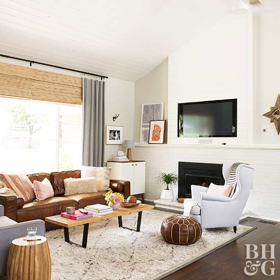
The colour for 2021 is COGNAC
Less than two years ago, I thought forest green, along with black (of course) would be the new trendy sofa colour of the decade. But it only had a brief moment whereupon it went right back into the background.
Certainly compared to cognac.
But back then, when popular home decor sites started listing forest green as a standard (not custom) sofa colour, I thought “Wow, are we really back to the 80s?”.
But, it did not catch on and wind up in every living room like it did back then. Instead, cognac did a bait and switch to the trendy neutral of the moment because it so perfectly warmed up all the grey we’ve all been feverishly decorating with for the past decade.
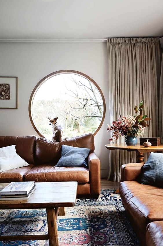
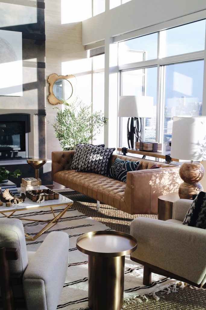
And the good news about this warm colour is, it happens to also be a classic colour for a leather sofa. I posted about this timeless shade here in 2008 when I first starting writing this blog.
Just like subway tile was trending all throughout the grey trend, so much that people started asking me when it would be ‘out’ (by the way, NEVER) this cognac shade falls into the same category.
It’s a timeless shade, but does it look super trendy right now because we’re over-decorating with it?
Yes it does.
But I still prefer it over a black sofa.
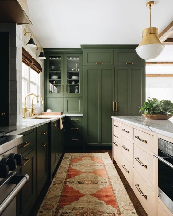
Where Green IS Showing Up
Kitchen cabinets. While a dark green sofa proved to be too scary for most, for some reason, a much more expensive commitment to green as a kitchen cabinet colour seems much more popular and I think this look will gain even more traction in 2021 as people look for ways to ground a fresh white kitchen with some colour (for those that are wisely wary of trending black).
Is Colour (over WHITE walls) Coming Back?
Well there’s a lot of trend round-ups where designers are saying white is OUT and colour is BACK, and while I would love to report this to be true, in my over 20 years of forecasting colour, reliably, every trend cycle consistently has it’s 10 year cycle and the world of white walls will be no different.
My prediction. We have seven more years of stark white before beige walls come back for the masses.
It takes time for the next trend to catch on.
I was just having a conversation with a decorator today who reported she helped her friend choose paint colours for your new house last Fall. She specified some fresh and current complex creams and thought all was well, until she received a text from her friend saying:
“I just keep coming back to grey”.
Why did her friend still think grey was the better, more obvious and correct choice?
Because it’s hard to go anywhere without walking right into a grey on-grey-on-grey room, hotel, restaurant, so because you see it everywhere, not only do you decide you love it, you think, “OMG it’s totally timeless!?!”
So, this means Grey is OUT right?
Well again, grey used well is absolutely timeless, but yes, if we are burnt out on any colour, it’s grey. Just like beige, if you choose every textile and stick of furniture in grey, you are guaranteed to be underwhelmed with your room.
Remember, grey is a backdrop colour, it exists to soften edges and fade out behind richer, more showy hues. So if you find yourself in a faded monochrome grey world, add in some trending cognac, mustard, gold, and black and white for contrast post haste.
The Death of the Open Floor Plan
With everyone stuck at home, the flaws of the ubiquitous communal and echoey open floor plan have become glaring. North America is FULL of houses built in this contemporary builder standard style though, so it’s not like we are going to just scrap it over night. And it does still hold appeal.
But I do think we will see home plans with more traditionally designated rooms with WALLS going forward.
However, if you’re in the majority, making your open layout as functional and cozy as possible in this new world of spending MUCH more time at home with the rest of the fam jam, instead of that expansive sectional trying to fill the room, get creative about creating cozy conversational groupings of smaller furniture. Rethink previously unused corners as private nooks.
Designer Jeffrey Bilhuber (my fave!) does this incredibly well. Take a look at how he lays out his expansive rooms in a liveable way.
Defining areas with area rugs (textiles like drapes and area rugs help tremendously to dampen that echo), loungey groupings of chairs and settees. Room dividers, shelving units, or even large indoor trees work well to screen off a small area.
The Emergency Home Office
Suddenly, we all needed not one, but more home offices for the kids which were home schooling too! Looking back at 2020, I am surprised I only wrote one post about a home office and that’s this one.
More to come.
Black Accent Walls
Since some shade of white has landed in every single black and white renovation or new build, the black accent wall has also hit critical mass.
Again, be careful with adding too much black. A little black is chic, dramatic and elegant. Too much black, quickly gets harsh, flat and predictable.
But it always makes sense to use paint, the easiest element to switch up in most cases, to indulge in a passing trend. Dark, moody walls are a fun trend to try. It’s easiest to pull off in a smaller, or distinct room, obviously not the best idea for an open layout. Try it in a bedroom, bathroom, study, or in the dining room for some glamorous candlelit soirees.
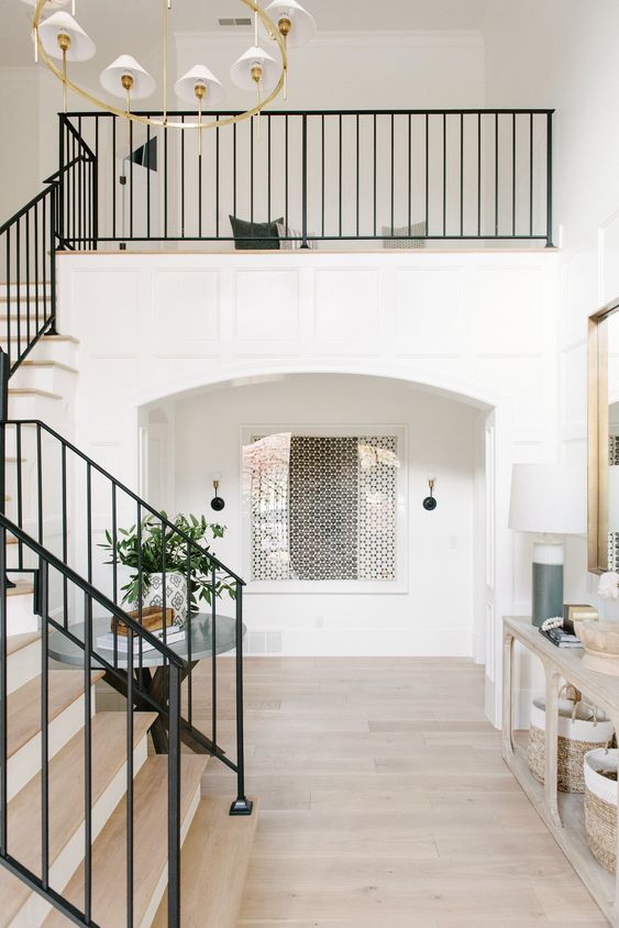
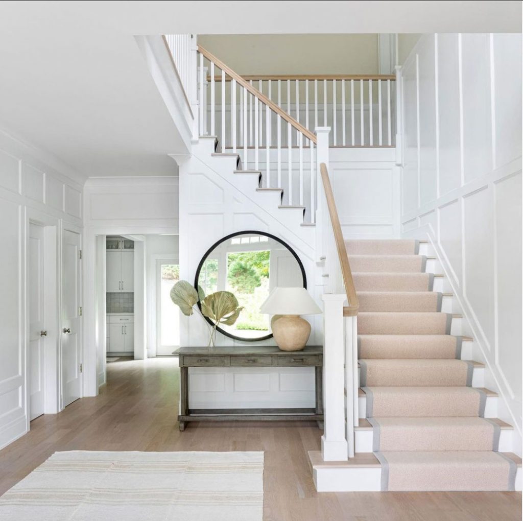
Black Metal Banisters
The simple and straight black metal bannister is appearing as an option for most new builds now and is sure to continue into 2021. It’s a fitting place to introduce trending black into newer homes with the modern farmhouse and white aesthetic. A black metal banister relates well to some black lighting and hardware. Just be sure to also introduce other metal finishes like brass or polished nickel to keep the look timeless.
Read more: Is Brass Out? How to Mix Metals like a Pro
It’s not going to be the answer for every transitional home of course. Remember that trends go bad when they are applied in the wrong context.
In many transitional and traditional homes, a wood banister with unfussy straight railings painted out in the trim colour with a wood handle will still be the most versatile solution.
Earth Tones
As we tire of stark black and white (which will always be timeless when done well), on the heels of nearly a decade of cool grey decor, our attention is turning to the warmer browns (as I predicted for 2020 here), including cognac, and a host of similar toasty hues like mustard gold, rust, terracotta and peach.
You can toss one of these warmer hues into your grey or black and white decor quite easily for an instant update.
As neutral colours in furnishings and textiles warm up, it’s best to be savvy about the undertones of beige. That safe looking oatmeal (usually pink beige or taupe greige) or gold upholstery will want to keep specific company.
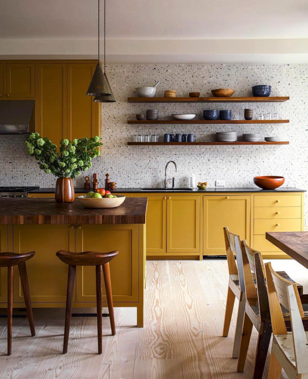
Deep Mustard Yellow
I always have my eye on yellow, my favourite colour!
And it’s back in a variety of ways from pale buttery yellow beige to the deep mustards and golds that are trending.
The yellow that I would say we are distinctly NOT decorating with is Pantone’s highlighter yellow, Illuminating. The yellow that’s trending has more to do with the grounded yellows of the earthier trends like the 70s and 90s.
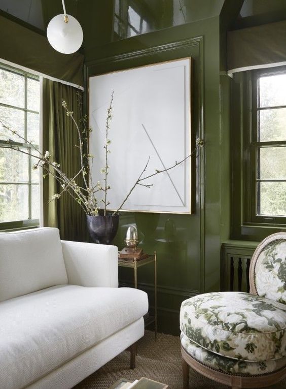
Is Green Trending? How About Blue?
Yes of course, green is always a trend staple. The trending greens for interiors are moving away from the cleaner jewel tones towards slightly murkier moss, sage, olive and jade.
However a crisp emerald or Kelly green is always timeless for a bold, polished look. You can’t go wrong with any foliage hue really ever.
Same with blue, the world’s favourite colour is not going away either as a fresh accent, or the primary colour of your room. However, it is being pushed out of the spotlight a bit by warmer colours.
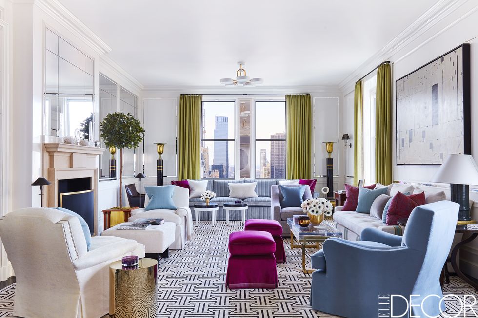
The Shape of Things to Come
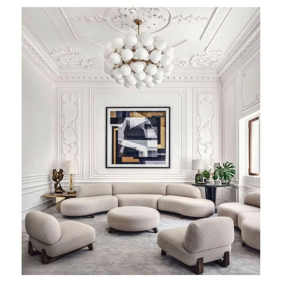
While the simple boxy tuxedo sofa will always be a classic, the TRENDING shape for furniture IS STILL flamboyantly curvy and sculptural (above).
However, it does not work in EVERY SINGLE HOUSE. And remember, it’s back from the 80s. I have an aunt who still has her curvy, low backed sofa from that era, upholstered in a mauve and black print.
This designer on Instagram did a funny reel about it here.
Simple Squared off Range Hoods
Even while furniture gets curvier, kitchen hood fans are getting boxier. A cleaner, less fussy and prominent look for hoods is becoming the norm for transitional and modern kitchens. Even hiding the hood to make it sit back and go away visually.
Also trending for kitchens, a homier, more lived in and styled look for kitchens. Kitchens are no longer the minimal strictly functional looking rooms of the industrial restaurant kitchen look that dominated the early aughts. Bring on the vintage art, lamps and personal touches in kitchens!
Oh yes, and classic handmade zellige backsplash seems to be at peak popularity at the moment. It’s the only trendy yet classic tile I wish was currently in my kitchen. Possibly because the shiny look resonates with my glam aesthetic!
Supersize it!
Gone are the uptight days of perfect proportions. The best rooms feel more compelling because they play with scale.
Oversized furnishings, art, mirrors or lamps give a room a sense of quiet confidence that feels completely current.
Try the trend with an extra large lamp or piece of art and see what it does for your room.
Add Another Layer
Stark minimal rooms are no longer the height of sophistication. I’ve been saying it for a few years. And you know I love a well layered and styled room anyway. Adding MORE to create a richer feel is officially a thing.
There’s nothing wrong with being a minimalist. But it does normally look best in a more modern, pared down space.
As a stylist, I confess, I cannot embrace minimalism. You need lots of STUFF and surfaces (which I have many) to create vignettes. A solitary table with a bowl and a vase could never be my life, unless it was my second home.
Styling by Maria Killam
If all else fails, add more lamps!! Hands down, that’s the best way to start. Make 2021 the year that you experiment with styling. It’s an art and it takes some practice, so approach it playfully, but observe a few simple guidelines to keep it from looking like clutter.
Why are trends important?
The point of being aware of what the trends are and where they are going is not to be frantically running on a hamster wheel to stay current. The point is exactly the opposite.
If you know what the trends are, you know when you are falling prey to them. You know when to indulge in them and how. And you know how to make the most timeless choices possible for your bigger ticket items and projects so you don’t realize your mistake too late.
And trends are about attention span. Once we’ve seen a certain trend too many times (yawn), we look for something more fascinating and NEW!
There is nothing wrong with indulging in trends if you’re clear that that’s what you’re doing.
I think what gets confusing is when classics become trends. Subway tile, grey, black, white and cognac leather are all good examples. We might get tired of them in our Pinterest feed, but if they are used well, they will ALWAYS look good.
A trend fizzles quickly when we start to see it done badly over and over. And some trends are harder to get right, and those are the ones that show up more as a quick fad.
Pay attention to the ones with staying power, those are the ones that have a timeless quality that are more likely to keep your attention, or, even better, escape your negative attention (I’m looking at you trendy tile!), trending or not.
Maria, what about the Modern Farmhouse trend?
Well, it’s a trend that incorporates a whole lot of classic elements that have very loooong legs. Bright and airy white. Simple, often solid finishes like marble and subway tile. warm and earthy wood accents. Pale wood floors. Casual approachability.
While designers and creators are pushing to innovate, (because trust me, when you are in it everyday, you get tired of ubiquitous trends fast), the modern farmhouse look is still a big crowd pleaser.
But if you’re building or renovating right now, it’s a good idea to be aware that the modern farmhouse look has passed its peak, so you might want to get smart on how to do it in the most classic way possible.
Let’s make 2021 the year we collectively get smarter about where we spend. Let’s create timeless homes that are versatile enough to allow us to indulge in the odd trend that captures our fascination.
Over to you my lovelies! What trend would you add to this report that I did not discuss?
If you would like help with your renovation or new build this year, I’d love to help you get it right! You can find my eDesign packages here.
Related posts:
Third Rule of Design; Expensive Does NOT Equal Timeless


Can’t wait for some new posts around offices and working spaces. You are not wrong when you say that this year has put pressure on thee spaces, and may for some years to come. Zoom backgrounds are also something I find interesting. Its been fun to see how all the regular presenters who are suddenly working from home, have styled their spaces. It’s become quite a talking point.
I feel like this year we are not seeing anything new come through. Just a rehash of previous years. Grey is dragging on, while cream is ever so slowly gaining traction. Nothing is making me sit up and go ‘Oooooh’. Is it a sign of age or are the ‘trends’ glacial at the moment?
I’m waiting for more people to start using real committed color on the walls. Been watching a young couple restore a 100-year-old farmhouse on YouTube and they are not afraid of dramatic moody color on the walls. It’s refreshing.
Have been reading that some millennials have bucked the mid-century trend and are embracing traditional decor. I really think we will see more and more of this going forward.
Does this mean they might actually be interested in some antique furniture again, or even a few pieces from their parents???
I laughed at this comment. I have two adult sons, both married with families, and they want nothing. The younger one did accept some quality hand-me-down furniture when he bought his first condo, but nothing since getting married six years ago. And their house is painted gray throughout the interior with the exception of one bedroom and a powder room. They have a gray sectional. And their children’s rooms are gray and blue for their son and gray and pink for their daughter.
I have a gray marble traditional lamp with black shade lined in tortoise. I bought it from the Ethan Allen store in 1970 and have since had it rewired. That is the only item that has any interest.
We clearly have the exact same sons and grandchildren.😂
Say hello to “Grandmillennial” style:
https://www.onekingslane.com/live-love-home/grandmillennial-style/
https://www.bhg.com/decorating/lessons/expert-advice/grandmillennial-style/
https://food52.com/blog/24846-grandmillennial-home-decor-trend
https://www.mydomaine.com/grandmillennial-design-style-4782198
This cracks me up. We are planning our new build right now. I’m specifically taking to our architect tentative plans with the pieces my husband’s grandparents and my parents gave me in mind. My husband asked why why the kid’s hallway was 4 ft wide. I said, three reasons, so we can age in place, so your parents could some day move into that side of the house, and so your grandmother’s butler desk can fit at the end of the hallway. ha! We talked with our kiddos (9 and 11) about which pieces they’d own someday too and they are already excited, which I hope remains.
Grandmillenial here and yes, many are now into color and antiques. I love the “studio McGee” look and think it’s easier for the design challenged to do and still look good and fresh. Plus I think it’s great for new builds But those of us who more able to design and decorate are very into chinoiserie, chintz, wallpaper, majolica, real art, classic furniture—instead of things we will have to throw away because so much modern furniture is poorly made. Plus with delays, we can get our hands on an antique right away. IMO classic Schumacher or Sister Parish prints will never go out of style, and I love the texture of farrow and ball wallpaper. Plus their paint color selection is so limited, it helps those of us with decision fatigue. I think the key is to mix styles to keep it from looking too heavy. Combine a modern chandelier with a chinoiserie wallpaper. Antique dresser with modern nightstands. This is much harder to do however compared to studio McGee styling. But for those of us in older homes, it looks so chic and layered to combine styles and the studio mcgee look is hard to pull of in a 1930s home.
Wonderful post Maria! The open floor plan concept has been around since the pilgrims came, it is timeless. However, even the early settlers realized a need for walls( sheets). Wide doorways are a good compromise to the open floor plan. Our current home has this and we love it! The formal dining, kitchen,family, and living room are all separate but connected. You can actually be near but far from conversations
I am in real estate and really hope the Gray trends goes away. I think with any color the overuse of it is too much in one space. I loved your post, but the open concept is the number one thing buyers want today. For a small home, it’s essential. What I wish would go anyway, are the grand entrances in new construction . Why does anyone need a large foyer?
I love that I’m at an age where I no longer care about trends because I’ve lived so many! From the orange, brown avocado as a kid, to the overblown florals of the 80’s, farmhouse Tuscan of the 90’s and beyond. I now can say “I think that trend is really pretty but I don’t need to have it in my house”, whereas before I had to incorporate it. I remember a friend of mine laughing telling the story of looking at a home about a decade ago and the older couple selling still had a farmyard scene border in the kitchen and dining room and she was like, did they just give up? Is that what happens? But now we agreed we totally get it. After awhile it’s so exhausting and while I don’t think I’ll ever be so out of touch, I really just want my house to be done! I’m much more interested in pursuing other interests than my home(but you are so brilliant Maria, that I continue to be inspired!). I used to love to cook and entertain. Now I’d rather spend that time instead doing long hikes with friends, or painting together and then eating at a restaurant. Things change and priorities change. So yes when we moved to a new home the whole house was repainted a gorgeous SW Westhighland white. Mid toned hardwood replaced all the blue carpet but the white ceramic tiles in foyer, dining and powder stayed. Would I like to replace them? Yes? Do I want to badly enough bc of the noise dirt and disruption that’s going to ensue? Not sure. I was in total love with mid mod but it’s too much work to be that minimal! Better the layered look you advocate. It’s more relaxed! That’s why I appreciate your advice, stick with what you love!
I have to agree with you on this! There are so many people who want to build their “dream home”, but what really, is that? Priorities, seasons of life, and tastes all change. What was once a dream home can become impractical 10 years later. Go with what you need at the time, live in contentment and it will be a lot easier on your wallet and peace of mind in the long term.
I love this!
Totally agree!
Hey Veronica, I could identify with so much of what you said that I could have written it myself. Thank you for saying it so beautifully and so well. So much truth and sense in staying with who you are and what you love instead of getting twisted up in the latest and greatest, as that too will be ‘so yesterday’ by tomorrow. I am an interior designer and as much as I live and breath it I am saddened by how real estate has become our new god and we are consumed and fixated on creating the perfect place. There is more to life than where we hang our hats and if we devoted more energies to building relationships we would all be better off. Being grateful for all we have and being content goes a long way. Sounds like you know that already, you are a wise woman.
Janet
Beautifully said Janet. I agree!
I think we need to create the perfect place for OURSELVES. It helps to really know what one likes and something about the history of furnishings.
Beautifully put, Janet.
I could not agree more! These are some (among many) realizations you come to at a certain age.
Love this comment. We remodeled our kitchen, family room and master bath, and have a few more areas to touch up. Sometimes I panic a little that our white kitchen, and white walls will age our house. I want to care less about things, and just enjoy our light filled rooms and the comfort of our home, the joy of having a husband I adore, and time with our family….with a little decorating for fun. 😊
I am totally with you on your thoughts. I am 75 and I still like to decorate and change things up. I recycle art that I have from decades ago. Liked them then, like them now. I am now interested in the European Fram house look with dusty darker greens, caramel, browns and touches of black.
Two-story rooms and oversized furniture are two trends I dislike intensely. While I love the spacious feeling of 9′ or 10′ ceilings, even a low cathedral ceiling, I despise two-story rooms. I live in a home with a living room that fits that description. It sucks up your your heat and light, and it is anything but cozy. Just to sit on the sofa and read, I need three lights on in the room. Regardless of the season (heat or A/C), it is always too warm upstairs and too cold downstairs and the noise from the other floor is annoying, especially the TV.
I’m also not a fan of oversized furniture. I’d like a pair of nice sized chairs for my living room, similar in scale to a Chippendale wing chair of earlier decades but in an updated version. But I also like comfortable furniture. Even the stores that carry more traditional furniture have super-sized their upholstered pieces. I have found this to be true for some years now, and it is very frustrating.
I agree, and you find that they steer you to apartment size furniture (!), which is basically what used to be in all the houses when I grew up and we did not consider it “small”. Well in comparison, I guess it is! Colonial and tudor or traditional homes in old established neighborhoods usually can’t handle oversized furniture, but it is in all the stores.
I also agree with oversized furniture. I cannot tell you how many homes I stage(I’m a home stager) with oversized fabric or leather sectionals that recline. They end up blocking doorways and ruining the flow of a room. If possible I end up taking sections out to fit the room better. I am not sure why you have to lay down to watch TV but to each their own. Why not just go lay in bed.
Wow, this was one of the best blog posts you’ve written, full of valuable information and excellent reminders! Thank you Maria!
Great post! We were lucky enough to be able to buy a vacation condo and I am filling it with loads of clean color on the walls. I’m really sick of the grey/white/cream I’m seeing everywhere. It is interesting how people who are uninterested in design respond to the trends–my friends are all getting cognac furniture without realizing it is a trend!
Hi Maria, We are currently renovating a farmhouse in a rural area. What finishes would you suggest to move it into the next decade? In your article you mentioned keeping it classic, which we are with white walls, light wood floors and white subway tile. I’m using very little black, preferring softer finishes.
I’d love to see a post on green kitchens e.g what color greens work, any issues (like issues with black).
Great write-up, Maria! Thank you!
Maria I need so much help and stuff for vignettes. I keep trying but haven’t been happy with any so far. Need a shopping trip to Homesense
Plus I just realized I have cognac running through my area rug. I was calling it rust but today it got renamed,
Excited to add some to our 500 sq ft open living space. Thanks for the I do,
I’m doing a new build and long to paint a guest room green. Anyone have a green that you feel is timeless?
I have to say that when I see a bedroom painted green, I shudder. The greens I see tend to be fairly light, and all I can think about is the horrid green cast on one’s complexion. As a guest, I would not feel happy in a bedroom with green walls.
Sandra, we used Benjamin Moore’s Sherwood Green (HC-118) for the master bedroom in a previous house and loved it. It’s a soft grey-green that almost became a neutral backdrop for the accent color, coral. I laughed when I saw Kay’s comment. Never noticed what it did to my complexion…but my husband never complained.
I’ve used Behr’s Bahia Grass (430F-5) in my last three homes. It just makes me happy. It’s gorgeous with some black accents (I have a black Windsor chair from my grandmother) but looks beautiful with lighter colors too. It’s dark but has some beautiful depth. Good luck!
My favorite greens are in the neighborhood of chartreuse. Laurel Ashley has a “Green Apple” that I will never tire of.
Loved this summary Maria! Well laid out and spot on! Thanks for your insight and positivity. We all need that right now! Happy 2021! I have many of your packages and use them with every client. Stay well
Love this post! I purchased a cognac couch way back in 2011, when I had to custom order that color. Who knew they’d be everywhere 10 years later? Not me! I just love the color.
One trend I’m noticing, and I’m all for it, is that people seem to be embracing brown wood furniture again. The only downside imho is that prices in the antiques market seem to be ticking up.
Really great content in this one!
For so many reasons… BEST post ever!!!
Looking at all these rooms reminded me of the variety of rooms we see now on TV news when an expert or celebrity is interviewed from home…in their living room, kitchen or office. I have a habit of amusing myself by critiquing the room. Some are great and some are awful…and most could use Maria’s advice! Little did I know that there is a tongue-in-cheek Twitter account called “Rate My Room” that’s been active since April. It’s hilarious and they just handed out “awards” in various categories for 2020. Enjoy. 🙂
https://twitter.com/ratemyskyperoom
I generally hate mustard yellow, but that room you show from Kevin Dumais is just gorgeous.
I love the photos of the all white rooms but to make them look good you needer lots of windows and trim work. I live in southern Indiana where the sky is grey from December to March and I only have windows on the east/west sides of my house (the worst arrangement) and 8 foot ceilings. Pure white walls would just look like I had primed but not painted yet. And those cool toned colors make the rooms seem so cold and sterile in the winter grey months. I like neutral walls with neutral and warm furniture/accents.
Hello, Maria,
Where is that fabulous mustard leather kitchen bench from, pictured in your email of 1/5/2021 and the post above? The photo credit is for Kevin Dumais. I clicked through and there is a credit for BDDW furniture but nothing like the bench is shown on that site. Any source info would be great.
Thank you as always for your design expertise!
Let’s use all of the trends in small ways along with a classic or three. I’ve been ‘over the moon’ about Ochre (dijon) & Gray for a few years now and intend to re-do something or toss in a gorgeous throw and a textured pillow with my existing great palette, just to make the statement I need to make. Love all of these photos Maira, and just had to re-pin them to my boards. Great Post!!
https://www.pinterest.ca/writer11/_saved/
Dear Lord, please let open concept living come to an end or be restructured. Christmas with my dearly beloved grands in open rooms with cathedral ceilings left me drooling in a corner! 🤪🤪
Haha you’re funny Linda, great comment 🙂
Hi, Maria…Loved this post (well, I really love them all, but this one stood out). Am I mistaken, or does cognac work, kind of like wood pieces, warming up a lot of white. My husband wants a cognac chair, but I’ve been trying to lighten and freshen up our interior, with light taupe walls and off whites in some of the furniture. Should I think of it like wood? The undertones are after me! 🙂 Love ya, Candy
We just moved to Florida with a nice view of a lagoon, so my new house really cried out to be coastal, a big change from my dark, European style. I looked at all the coastal trends on Pinterest but couldn’t find anything quite right. We aren’t actually on the beach and the house itself doesn’t look beachy at all, so it was a conundrum indeed which direction to go in decorating.
With the help of a designer, I ended up with a light, airy feeling but I am still not quite sure what “category” I ended up in, lol! Kind of Coastal Traditional? Coastal Transistional? Coastal Glam?
Thanks for your interesting blogs and insights into trends. I am still not sure if I am in a trend, but I do take your advice about classic finishes into account!
I live on a small lake, and have been looking for the same feeling! Love all the category names you came up with, to describe! Coastal transitional seems to hit it on the head, for me! ❤❤❤ Thanks.
Excellent educational, readable and interesting article, Maria! Thank you, as always. I am particularly interested in the concept of when classics become trends.
What are your thoughts on shiplap? I feel like the trend is fading. Can a shiplap focal wall be timeless if done correctly?
Sure in a cottage house by the beach! But will the farmhouse shiplap trend be something we rip out down the road. Most likely yes. Maria
“And trends are about attention span.” I love this line! So true.
Another great article Maria !!!!
What I have trouble deciding in trends is apartments. My husband and I have rentals and I understand how to choose colors for yourself and how to choose colors if you are working for someone. But….how to choose colors for tenants I don’t have yet.
What would appeal more, classic white or cream or…..a bit of color? It’s such a conudrum. Honestly we prefer to paint ourselves as we have painting horror stories for letting just anyone paint, so I want to get it right the first time.
I’d love to hear any and all advice. An article would be even more amazing. My husband and I desire to provide our customers with happy places to live from the start : )
In the section entitled “Earth Tones” There’s a wall in the background with a delicious warm paint. Do you know what brand and color that is?
I never comment on posts but I just had to make time to do so for this one. This is possibly the absolute BEST and most comprehensive (yet concise) written article on trends/color/decorating I have read. I just had to take the time to thank you for it. I’m in the beginning stages of committing to my selections for a major remodel and starting to doubt myself. I’m thankful I came across this article. Thank you, thank you!