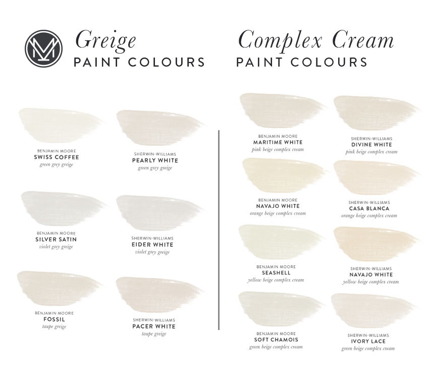
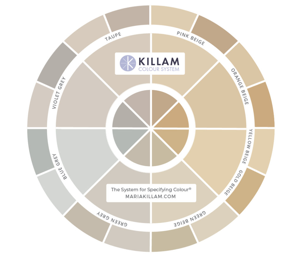
Now that beige is trending again, I thought we needed to revisit the five undertones of beige in my System for Specifying Colour®. Because not all beiges are created equal. And understanding the undertones will help you make better colour choices. Here’s what you should know about beige in 2022.
The NEW beige trend
I’m not alone in having declared that beige is back recently.
But just like any colour trend that cycles back around, it’s used differently this time. For many of us, “beige” conjures drab, airless rooms and miles of busy granite or ugly brown-ish tile. However, it’s worth looking at how this design staple is being reinvented for a new decade.
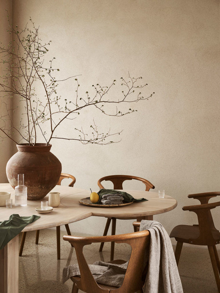
Pink Beige warms up a minimal look by Linum
Whenever we start looking at the undertones of beige during the grey trend in the last 8 years of leading my true colour expert training workshops, I’ve noticed a few blank looks from my students. And, fast forward, recently, I see even more blank expressions when I start talking about ways to update earthy Tuscan-trend era interiors with fresher, pale neutrals.
Relatively new designers or young homeowners likely don’t remember having to update spaces from the brown trend or the Tuscan trend, as I like to call it. It’s also possible that they are from areas, like either seaboard, where these kinds of interiors had been overhauled long ago. #luckythem
But in my eDesign department, we still see these brown-trend homes ALL THE TIME.
So, for many of us, it feels like we just removed all the miles of beige, brown and travertine. And now, it’s trending again?
Here’s what I suspect is happening. The flaw and challenge of the current black and white trend is that the look easily runs into a stark and harsh feel that is uncomfortable and difficult to live with, let alone decorate.
As a result, I predict the cozier, easy-going beige and complex creams will quickly become the favourite way to update and warm these rooms up.
It’s already happening with cabinetry.
Can I have a darker white?
I always tell my students that trends move quickly. And while designers may be able to get by on a handful of good whites right now, it won’t be long before their clients are asking questions like:
- Can I have a darker white?
- I’d like something creamy and not too light?
- I’m not interested in white. I’m looking for a warmer feel.
These are the kinds of requests we are already seeing in our eDesign department, and it’s quite funny. It’s almost as if folks are too afraid to say the word BEIGE – especially if they remember the last time it was trending.
That said, the beiges everyone wants this time around (for walls anyway) tend to be warmer and deeper than white. But, we are not seeing more of the drab paper bag (ie. pink beige) colour from the Tuscan era. This could shift in time, but for now, the pale beiges and the paler complex creams are the colours we are specifying.
What is a complex cream?
Complex creams are the palest of beiges. And pale, creamy walls are absolutely timeless. A few years back, the need for moving those dated brown trend interiors into the present required that I identify the palest colours in the undertones of beige.
In my Killam Colour system, I call them the Complex Creams.
And this is because creams that have some complexity of pigment (complex creams) are softer and more flexible than cleaner creams that read mostly pale yellow.
And how do you get a cream that looks richer and more complex (meaning there’s more varied pigment in the colour)? Well you choose the very palest of beiges to get there.
Having said that, don’t take a complex cream like this one (below) and run over to the paint store and say “Can you mix this for me half strength?” because now you’ll just be back to some shade of a ‘lighter white’ all over again but this time you don’t know what it is?
I teach you everything you’ll need to know about managing whites and lighting in my true colour expert training.
Farrow and Ball Clunch – Green Beige Complex Cream by Chambers + Chambers Architects
When whites are too stark, and greiges (aka the palest colours with undertones of green grey, violet grey and taupe) are too cool or grey, complex creams are a perfect choice for creating that bright and fresh balance. We specify them for walls and cabinets all the time.
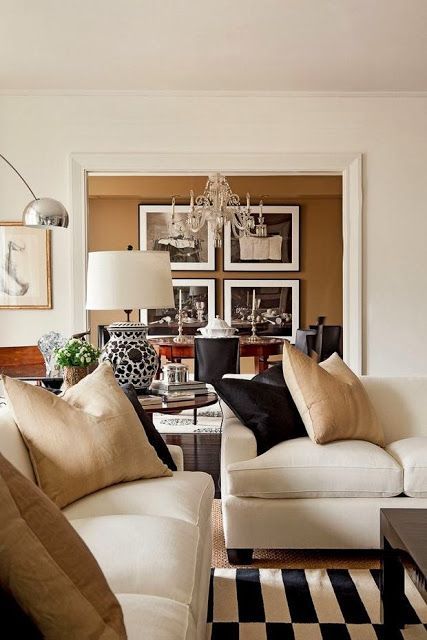
Pink Beige
Pink beige is the warmest of the beige undertones. So if you don’t know what to look for in a beige, it too easily becomes a default choice. However, it’s not the most versatile undertone of beige because it often looks too pink and fleshy. And when pink beige is next to cleaner, more yellow beiges, it looks dirty.
Still, there are a lot of common and useful interior finishes and textiles that happen to be pink beige. Linen is a timeless fabric that is pink beige. Travertine is also trending again – this time in new shapes and applications. And travertine is typically pink beige (sometimes it leans taupe or orange beige).
While I don’t recommend looking at your wood tones in order to find the right neutral for your walls, note that much of the pale, natural rift oak that is typically found in millwork, floors and kitchens everywhere, also has a pink undertone.
Lots of wool products like carpet and area rugs have pink undertones too.
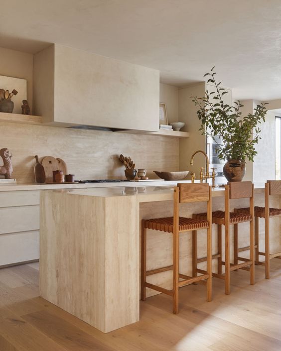
Modern Travertine Kitchen by Montana Labelle | Gozlan Group
It’s worth noting that Benjamin Moore featured pink beige in both their 2021 (Muslin) and 2022 (Natural Linen) trend palettes. These colours are both in my system and my large painted colour boards. They are great colour choices because while they DO have pink undertones, they don’t have SO MUCH pink that they become fleshy. As their names suggest, they simply look like a pretty linen.
Again, don’t choose a pink beige blindly. If you know you want to work with these materials, it’s worth considering. But if think you might want to shift into yellows and orange in your decorating, avoid pink beige altogether.
Orange Beige
Orange beige can be tricky to identify. It looks warmer than the yellow beiges in my system, but more yellow than the pink beiges.
It’s less common but often seen in trending terracotta tile (although most terracotta colours are not as neutral as a beige, rather they are more of a muted orange).
Deeper orange beige colours aren’t the most popular. But we do specify lots of orange beige complex creams. That’s because they have just a hint of extra warmth in them. Orange beige complex creams offer that warm glow we are often looking for in a creamy neutral.
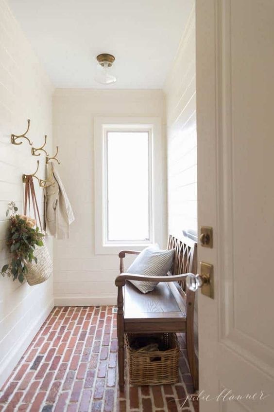
Mudroom in BM Navajo White OC-95 by Julie Blanner
Yellow Beige
Did you know that ALL beiges are technically “yellow-based neutrals”?
That’s right. The defining feature of ALL beiges is that they look YELLOW relative to other neutrals (ex. the greys and taupes). They occupy the entire right-hand side of my neutrals colour wheel.
When you look at my colour wheel (my new wheel will be available for purchase at the end of this month), you might have noticed that the yellow beige section of the wheel pops forward visually compared to the other beige undertones. That’s how you can tell a colour is “cleaner”. (You’ll notice that blue grey does the same thing on the grey and taupe side).
I often have clients and students who get confused when I tell them they are looking at a PINK beige. Because all they can see is the dominant golden YELLOW look of the colour.
Well yes, because there is a significant dollop of yellow in all beiges.
Wait, what exactly is an undertone and why does it matter?
When we distinguish the undertones of beige, we are essentially identifying which hue has the next most important influence over the colour. That is the undertone.
Why does it matter?
Because neutrals are subtle. And if there is a subtle shift from a truer yellow beige on the walls to a muddier pink beige on your linen sofa, it will look BAD.
In fact, yellow beige often simply looks like the perfect soft yellow. And it pairs well with cleaner colours.
This is why it matters. And it’s why, with beige coming back, it’s best to get familiar with these nuances of beige undertones, and quick!
How can you tell which undertone of beige you’re looking at? The ONLY way you can do it is by directly COMPARING. Compare colour to colour. But for the best insight, it’s best to compare to known colours in my system – and this will help you train your eye over time.
If you’re not comparing colour, you cannot specify it accurately. You will also learn how to do this in my virtual workshops.
Yellow beige is the truest and cleanest undertone of beige. And while it can sometimes get along with cooler green beiges or orange beiges, it tends to make the more brown pink beiges look muddy.
Gold Beige
Because yellow beige is so clean and true, when you start adding different (non-yellow) pigments to it to deepen it, you end up with a much muddier colour. For this reason, dark “yellow beige” is really its own category called gold beige.
Because it is necessarily more complex and dirty, it behaves differently in relation to other colours than yellow beige. You can, for example, sometimes get away with combining richer gold beige with pink beige without having that clean and dirty conflict.
We’ve all seen rich gold metals look right as rain with pink beige linen and travertine. #amiright
Gold beige looks more yellow-gold or rich camel than an equivalent tone in a pink beige undertone, which will have more of a deep mocha look. Gold beige is always a deeper shade.
While we are not commonly using gold beige on walls, yet… I wonder if we will progress (regress?) to deeper beiges for walls in the coming years. It’s definitely back as a trending accent in decor and accessories. And gold beige is effective in warming up the stark black and white spaces that are so ubiquitous at the moment.
Green Beige
Finally, beige with a green undertone is VERY versatile. Duller than (aka not as clean as) yellow beige, and cooler than pink beige, green beige doesn’t lean into a potentially fleshy look, which is good. Green beige can be used to calm down and update a room that has conflicting undertones of beige.
The pale green beiges and green beige complex creams remain some of the most versatile and popular neutrals. It’s a good place to start if you’ve skipped the black, white and grey trend and need to update an interior decorated in beige and brown.
Or, if your eyes are fatigued by the high contrast of your black and white scheme. A classic khaki green beige on cabinetry and millwork is lovely with black and white. And pale green beige or a green beige complex cream is a pretty, warmer choice for walls.
BM Tapestry Beige – Green Beige via Elle Decor
Who is on board with ‘Darker, warmer whites’?
My trends post for 2022 is coming up next, stay tuned!
To transform the way you see colour, register into one of my true colour expert training courses.
Related posts:


Hi, we are trying to update our Tuscan style house, and can’t pull off white. Our trim color (don’t know the name) is pretty dark (similar to SW Steamed Milk or Lotus Pod). We really want to go with lighter walls, but can’t because the trim is so dark. I have read it is sometimes recommended when painting a wall white, to use the same white for the trim and ceiling. Would this idea work with painting our walls and ceiling the same cream as the trim? Or do we have to paint all the trim in our house a lighter off white before painting the walls cream/light beige? Thanks
I love the look of trim and walls the same, and I have done the ceiling the same as well. It is very European! Look through Farrow and Ball pictures and other European style houses for how this might look. Doors look awesome when they are in an awkward place and you just pain them the same as walls. Very old world and modern at the same time!
I agree. But try talking a contractor/painter/(husband) into any mindset other than..woodwork and ceilings are white.A designer is a different story..
I love the “retired” SW beigey paint I chose 4 yrs ago. It’s beautiful in my LR and DR, so recently I continued it in other rooms. SO different. Much more yellow. I’m over it, but was surprised to see how different it looked!
I’m still not convinced the painter got the same color. I’m noticing people who saw the beige era come and go are still afraid of the word “beige” ..sounds so blah. They’re happier with “greige..”
But gray? Never liked it; never will..
Update: the smaller, one-level house I just bought, is quite bright, unlike the one I’m selling; with the entire back of the house being French doors with plantation shutters,( luckily) And there’s an atrium.Hell.80’s (which I don’t hate.)
The walls were painted a too glossy, gray-white, ugh,and the large bedroom is a too glossy blue white..again..Ugh. There’s that decades brownish granite an almond jacuzzi tub. With a step up..to get in!
Dangerous and going immediately.
In the red hot, very competitive Houston, Tx, this is the worst possible time to by a home, btw.
I hope I can pick the correct neutral, eggshell obv. Which won’t wash out, to go with the bright, w lots of glass house. The badly installed hardwood floors will be redone first. No red.
It is actually a much better house than it sounds! And I DO have a house to sell. As a widow, who’s never bought a house alone, this is overwhelming!!!
Just FYI from my earlier reply, I found this room on Erin Gates’ website, it’s her formal living room and she seems to have painted everything the same color: https://www.elementsofstyleblog.com/2021/04/my-new-house-formal-living-room-plans.html It looks like satin trim and eggshell walls, but same color. Ceiling seems to be white though. It’s gorgeous!
It can be the same color for both.
We just moved but in a new build we left, I chose aristokraft glacier gray cabinets which were really taupe with a slight pink undertone. I winced a bit when they went up bc I saw the pink in the light. However the paint and counter and floors all worked together beautifully and that kitchen was stunning! The cabinets are the only thing I miss in that house. We need a new word for passive pink undertones. It’s very pleasing to the eye when passive but no one wants to choose it! Passive is the key though!
When I chose them three years ago, you and everyone was warning about taupe…it’s it’s own look! But we were limited and the other choice for this. Shiner was a blue gray and with the open concept, the house would have been very cool and you were also warning about gray trending down. To change would have been to change absolutely everything! When we put the house up, everyone on my design blogs had some form of this glacier gray and our house sold so fast we could not believe it, for over asking. It was that kitchen!!
I am currently ripping out the Aristokraft gray laminate cabinets from the house I bought 6 months ago. In this market, you can’t be too picky, but I hated the kitchen. The sellers probably thought I loved it, but I bought it intending to change everything. Every house is selling for more than asking price here. They put those gray cabinets in the kitchen and every bathroom, and already they are swelling where moisture has gotten under the laminate. I am replacing just the doors on the bathroom cabinets with wood doors that I will paint blue, but the kitchen is a complete rip out with new mid-tone wood cabinets going in. So I am busy “de-graying” this house because it was too much gray. The PureStyle laminated line from Aristokraft has many complaints just like mine–always pick wood cabinets because you can paint them later if you want a change. The laminated cabinets can’t be repaired, so they are a tear-out for the next owners.
Yep, that’s why I didn’t choose gray, I knew I would be de-graying in a few short years, thanks to Maria’s advice!
That’s too bad that they were swelling, mine were beautiful after 3 years and after I added subway tile and upgraded counters to the limited new build options, the kitchen was so beautiful. It was ironic that when I chose them, gray was still “hot,” and the taup-y gray was risky, but it just was such a pleasing color and worked out beautifully. Wood is always preferable when you are choosing fresh and aren’t limited, I love painted wood myself. Enjoy remodeling your kitchen! 🙂
I don’t care for gray but seems wasteful the quality of that laminate material.
What I have found is that even when I don’t particularly love a color, I can learn to live with it a while if I start decorating and “go with” the color rather than fight against it. For example, I have never been drawn to cool grays but where something has gone too cool for me, I add deeper greens that compliment the cool gray or even some gold and brass frames can go well with gray, or caramel-y browns, and before I know it, I’m hooked on the color! Always try to achieve balance so that a room doesn’t give an instant impression of “too warm” or “too cool.”
Hi there! This is so helpful to hear. Can you suggest a paint color that goes well with the Glacier Gray and balances out the pinky tones? We are having a tough time deciding….refinishing our basement and the cabinets just went in – we are concerned with picking the right wall color! Help! 🙂
I loved this post. I learned so much. I, personally, can’t stand any beige – pretty much any kind but if I HAD to choose, it would always be the greyer, greener beiges. I have always disliked pink beiges and never want to live with theme ever again. It seems every apartment building when I was a young university student renting was pink beige. YUCK! I WOULD consider the complex creams, however. I don’t know why but I like them so much better. I am not a professional just a regular citizen who loves colour and everything to do with understanding how it works in interior spaces and why. This post is one of the best I’ve read. Thank you!
I agree but I also would add that I don’t like yellow beige either! So green beige is my choice!
I’m the same, I would have to choose greener undertoned beiges like Accessible Beige, and never pink beige. I’m not sure where to go when gray is out, I still like warm grays, but since I follow Maria and other design blogs, I’m so influenced by what they say that I can’t help but think I wouldn’t paint gray now.
I love beige.always did, but pink beige is the least I like,looks good by itself but it is super tricky to use for sure.
This is such a great summary Maria! I have been an actively practicing color expert for over four years now (remember the in person days? ) and these are just timeless truths. I love how you’ve further defined complex creams with undertones. It’s so helpful! My eye is trained so much better now but yes we must compare. Always compare! It’s the only way to truly know. And I’m kind of glad pink beige is no longer the big villain. It just needs to find its place. In middle Texas we still have a lot of travertine left over from the Tuscan trend and I am having a lot of success specifying BM Maritime White for my clients. I think the thing about the new travertine trend is as much as possible, it needs to be real travertine, not faux. I think any real stone is much more timeless and classic than its porcelain imitator. But of course that’s a budget issues for many. I still love every bit of your color philosophy. It’s so clear and simple I don’t know how I would design without it! Thank you!
Thanks for such a great timely post for me! We moved into a small dark north facing condo in the treetops. My gut said to paint a warm cream, I got my samples, etc but I love color & couldn’t pull the trigger. Color is a hard habit to break! So after trying to embrace the dark & cozy with painting the living room Green Smoke (FB). I’ve been dabbling again with orange colored creams/Ivory after hanging out in it during winter. I’ve landed on Orange colored White & Savage Ground by (FB) but now Im looking at Casablanca on your wheel above. Im a color nerd and always look forward to your posts. Thank you!
Marianne, I have a north facing room with lots of windows and light filtered through trees, so the light is very cool and green, like yours. We are remodeling it and I am puzzling out the color choice. My thinking has been along your lines, either a warm cream or go all in on the green. So you didn’t like the Green Smoke? Have you tried the White and Savage Ground yet? I am dying to know what you think. Thanks!
What about SW Sohji White?
I’ve taken your class, and this post was sooo helpful. It clarified so many questions I still had!
We are doing a new build. I have followed Maria’s advice for timeless finishes and chose BM White Dove OC-17 for kitchen and bath cabinets as well as built in bookcases /TV unit in the adjoining great room. The kitchen island will be BM Hale Navy HC-154.
I’m confused about what to paint the trim work including interior doors. Can White Dove be used there as well? Our builder is wanting a decision within the next week. Help please!
Maria usually specifies the cabinets to match the trim colour if you are using white. White Dove will work, its a creamy darker white with hints of gray and yellow.
Maria’s e-book “White is Complicated” will help you! good luck
Now that I am looking for accessories in creamy white, I have noticed that pink beige is everywhere.
I love when the trims and doors are all painted the same trim colour as the white in the cabinets – keeps it all cohesive and clean – I would recommend in my building experience to do the same White Dove for trims and doors – we build custom homes in the westcoast of Canada and this look is used lots.
I would suggest my White is Complicated ebook to help you make white decisions, you can buy it here! http://www.mariakillam.com/product/white-is-complicated/
This makes me happy enough to do a happy dance!
I’ve been specifying pale beiges for about a year now, and can relate to not saying the word “beige”. It truly frightens people!
It’s just that a warmer environment is more comfortable to live in for most people, although I will agree that an entry into a white on white minimal room with lots of texture is dramatic. It’s just not sustainable for comfort.
Thank you for the timely, even ahead of time, and oh so helpful posts!
Frightens the Millenials not so much the rest of the demographics though.
In the mid 90’s, we painted our basement family room in a gold beige. I did a rag off treatment and was so proud of it at the time. It looked like caramel and was so warm and cozy. I loved it. Not sure that it would work in our current home but I remember it as not feeling like a cold basement but a place where you wanted to curl up with a blanket and watch some tv. We had chunky white trim around windows and doors to lighten it up. We also had a commercial type loop forest green carpet with white polka dots that wore like iron. My kids played on that carpet for years with no wear. Good memories.
All but one of the photos has all neutral rooms. I see mostly neutrals everywhere. Maybe they are calm and soothing in these tranquil times. Maria, have you posted the changes in your home and I missed them?
The furniture for my living room makeover took an entire year to arrive so I’m finally shooting it next week as a matter of fact. You’ll see the reveal here shortly! Maria
We did a reno a year ago. The re-done kitchen has BM Revere Pewter cabinets and Biano Drift white quartz countertop/backsplash with a slight, light taupe/grey vein – I love the quiet, peaceful look of it all and the cabinets aren’t that grey or green in our light, they’re a perfect taupe. We also redid our original 1960’s gorgeous hardwood floor in its original pale beige/gold/yellow tones. For the walls in most of the house we chose BM Natural Wicker which is a pale creamy colour on the yellow tones, similar to Navajo White, above. The rooms face east so I wanted a little brightness and that’s exactly what I got – a touch of sunshine especially with the small lamps we always have on! The colour goes well with the kitchen cabinets on the small amount of wallspace in there and it also goes well with our new aqua green leather couches. The trim is all BM White Dove. I have always been a ‘taupe’ person and never a cold ‘white’ one…so this new swing in colours suits me just fine! We have always had a colourful couch and this new one is as well – the pillows change with the season for extra colour and pattern and we found the perfect jute colour blocked carpet to bring everything together. I tried to add photos but it doesn’t work here.
Love this post. I am planning on renovating my en suite bathroom. I am looking at beiges. The rest of my home is very warm with a lot of cognac colored pine wood. I feel that grey just looks out of place.
What beige tile would you recommend for a walk in shower? I want to go with something complex cream or beige instead of a white and grey marble or a white subway. But I want to use something that is timeless and not trendy. I have well water and my grout eventually turns beige anyway.
I always loved beige, hated white. Had been painting my walls beige since forever. How flaky home decor is when they decided that now is trendy to like beige, when they were trashing it not so long ago.
Glad that I like what I like and don’t need to follow other people’s tastes. But it is funny indeed to watch others jump the hoops of decor trends and read about it.
Maria, I have been following you for 7 years as a Color Enthusiast. This post on BEIGE is my absolute favorite! When I first took your in-person training, one phrase stood out. “Every home is either white or cream. Choose your lane and stay in it.” You may remember the English Tudor home we bought with forest green carpet throughout which I refused to change because I love green. The home screams “Cream” when you walk in. No white in sight. You helped me pick BM Ladyfinger orange-beige for my living room with a 25-foot ceiling. It has been lonely in the Cream Lane, until now. Hopefully, retailers will put all of their gray and white items on sale so I can shop again. Thank you, thank you, thank you!
I’m almost 70, but I sat out the Tuscan trend with a house full of white, neutrals and bits of black… and I will likely do it again. I thought that trend would never die! I didn’t really go full on grey trend either… continued my look of white with neutrals and some black. Lately I’ve been feeling a need to reduce the amount of black and keep more white with light neutrals. I don’t care if it’s not on trend. I can still accent with some trendy colors. The house we bought a couple years ago in Texas was built in 2012, but still hanging on to the Tuscan trend. I recently painted our glazed cabinets and cream trim (including our plantation shutters) all pure white–and travertine backslash is gone. What a breath of fresh air. The gold-y walls are now BM classic grey, which looks really pretty and more griege than gray with all the white, our lighting, and dark hardwood floors (have to live with those). I can’t wait to redo the bathrooms which are all beige/brown & ORB. So depressing. Give me white, clean white. I know many love the warmer tones, but it’s just not for me.
Hello. I just found this site and love the examples you provided for paint color choices. I have orange/tan, green travertine throughout my kitchen and foyer. I really do love the travertine but need to update kitchen cabinets. I can’t seem to decide what color cabinets would coordinate but also update. I really don’t like the white cabinets trend and was thinking of maybe an almost black. My kitchen has a lot of cabinets and making the wrong choice would be a disaster. My kitchen is open to family room. How do you choose best kitchen color cabinets.
Ok, Maria. I just read “White is Complicated” and have a question. Does the kitchen in the very first picture break your rules? I see warm cabinet color and floors, but a more true white, “fresh pallet” backsplash, countertop, and sink (maybe it’s the monitor). But, it’s something I feel like I see fairly often, especially in English-style kitchens (DeVOl, Stoffer): Carrara marble being mixed with warmer neutrals in cabinet color like putty, cream, warmer beige, etc. Am I seeing this rightly? It seems to work visually, but I’d love your thoughts! Does Carrara marble fit into the “blue jean” category in that it can go with anything?
Would anyone know if BM Pale Oak is a green beige?
No, it’s a taupe/violet gray in Maria’s system. I don’t see any green or beige in it at all.
I will never have a love affair with beige. It will forever remind me of my grandmother’s expensive, cold, haughty taste. It’s actually depressing that I can’t find a color scheme that isn’t centered around beige…or beige and white…or all that god awful grey. I don’t care if it’s a “warm” color. I’ve lived through the 70’s, 80’s, 90’s,…to now. I swear the only thing worse is mauve with pea green. There are so many other choices!
What a great summary of the 9 neutral paint colours & their undertones! It’s exciting to see a recap of your decorating changes over the years!
I can’t wait to see how you design your new home!
This is so helpful. I’ve always loved all-white rooms (for decades), but I now live in a heritage building with patina and white just isn’t right here. So I’ve been looking for beiges that “feel” like airy white. BM Swiss Coffee and White Dove seem to be doing the trick, but I still have more rooms to paint…