


This year, I’m predicting some playful colours being used to bring more charm to our interiors. And I’m so excited! These are the colour trends to keep your eye on in 2022.
2022 Trending Colours
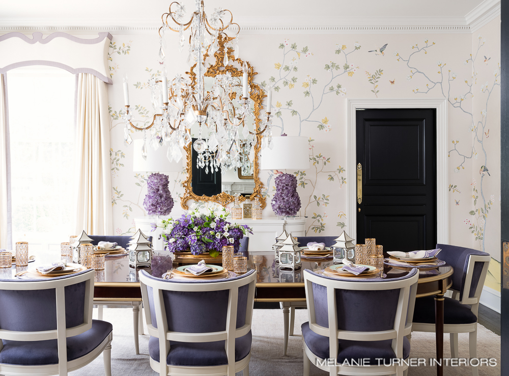
My TOP pick for the colour of the year for 2022 is Lavender.
And this umbrella includes all shades of mauve.
Those of you who are my age will remember this shade from the 80s.
Lavender, mauve and a return to charm
Tones of lavender and mauve are for those who embrace colour. So they are the perfect fresh and slightly-eccentric response to the desaturated grey, black and white interiors we’ve already seen too much of.
These colours are feminine and run into the traditional floral motifs that are also trending. It takes us back to a time when interiors were more charming and homey. Think chintz and chinoiserie.
There is nothing safe and conservative about lavender. It makes a refreshingly bold statement: Hello, I embrace the joy of colour!
And you know I do 😉
Unexpected hues are popping up everywhere. In addition to plum, lavender and mauve, I’m also seeing muted blues, greens and rust shades adding a moody vibe to interiors all over my feed. Leading designers and influencers are turning away from safe desaturated grey, white and black towards cozier, more personal, even eccentric colour choices.
And I can certainly get on board with that!
Everything is warming up, especially colour and wood tones
In general, everything is warming up. Grey floors are OUT. Thank goodness, because they never should have been IN, to begin with. Anyone who didn’t replace their honey oak floors will be thankful they kept them. Stained woods are warming up.
For a long time now (say like 20 years), warm wood took a backseat to the neutral almost black espresso finishes of the brown trend and the weathered woods of the grey trend.
First, we had the ‘espresso brown’ trend of the 2000s. Let’s face it, no one needed to coordinate wood stains in those days because espresso brown (shown below) was pretty close to black. Espresso was standard from everything to furniture, to hardwood floors and even millwork.

Then grey came along and everything literally had a grey wash to it. If you are a furniture store and you still have containers of this colour in your warehouse? It needs to go on sale ASAP.
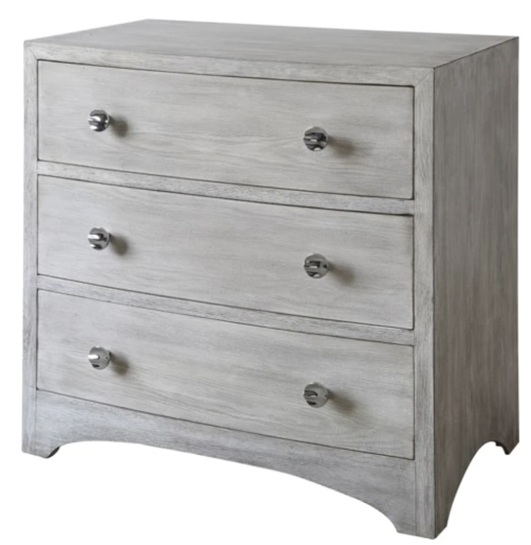
Now before you get upset if you have this colour in your home, I need to repeat AGAIN that grey came along to provide a fresh and crisp backdrop to all the cleaner colours we were decorating with.
There is nothing wrong with this grey dresser (above) if you add colour around it.
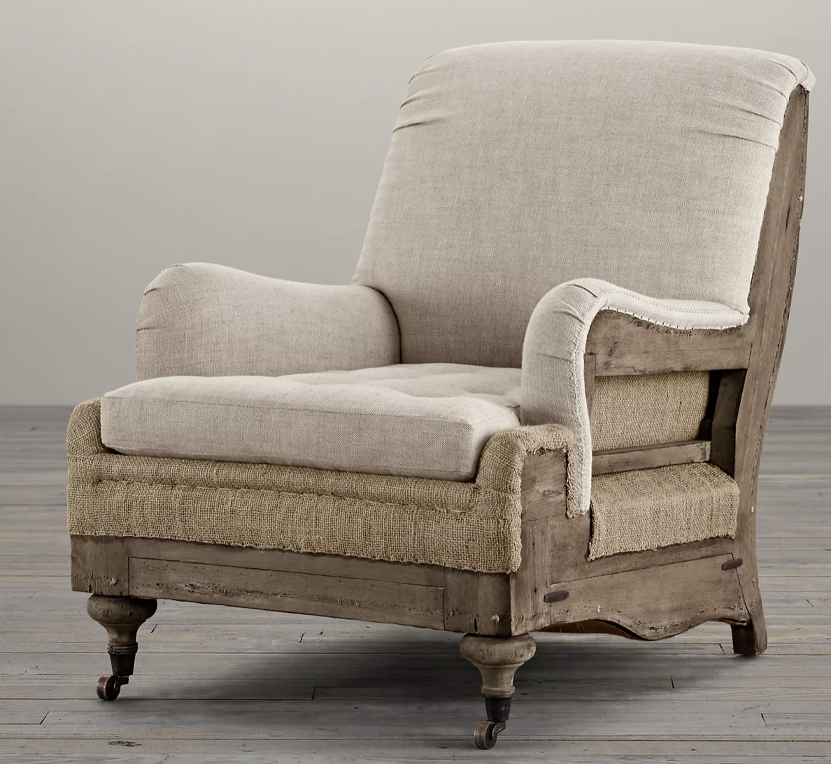
And then, some of you will remember the deconstructed furniture trend that started with Restoration Hardware (below)? Distressed and weathered, grey-on-grey-on-grey rustic, Belgian country chic became a popular signifier for good taste. And while elements of the restrained tonal Belgian or French Country look can be timeless, taking it too far is definitely NOT.
Read more: The 2022 Trends we’re Warming up To
Floral lavender, teal and green
So back to lavender.
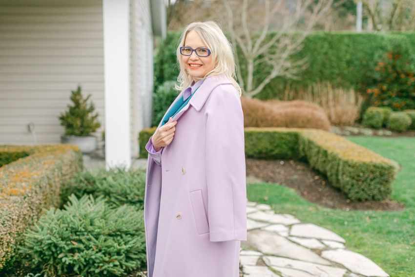
I may be biased because this exact shade is the new accent colour of my living room makeover. It’s taken a year for the furniture to arrive. [sigh]
I planned this makeover back in November 2020. And then my living room got caught up in the supply chain issues along with everyone else.
It’s a collaboration with Ballard Designs and I can’t wait to show you the reveal, coming soon!
Here’s a sneak peak:
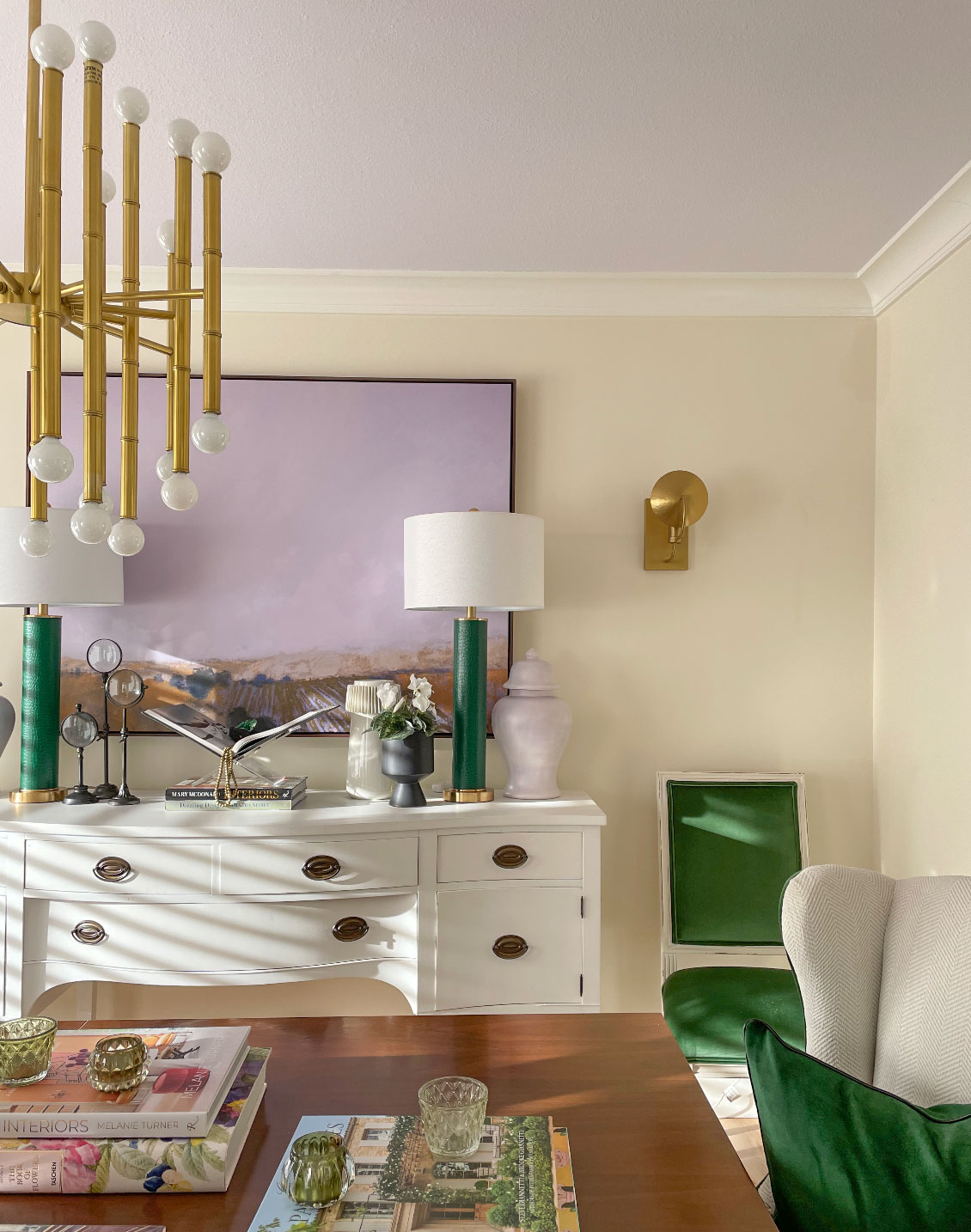
Here’s what my living/dining room looked like before.
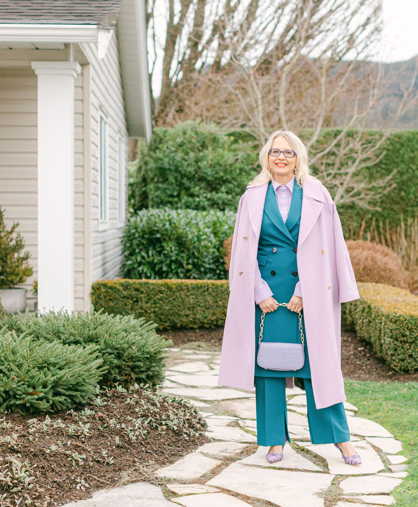
When the photos came back from the shoot, my teal pantsuit reminded me of an eDesign client’s pretty kitchen I posted on the blog in the summer (below).
Because greens are trending in kitchens too. But I said that last year here.
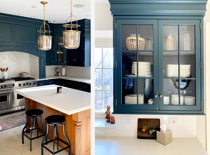
An eDesign Timeless Kitchen Refresh with Travertine; Before & After
The colourful kitchen trend is here to stay because colour (and even deeper neutrals) have moved from walls to millwork and even to trim. Because most people’s go-to paint colour these days is still in the realm of art gallery white.
The way to keep strong cabinet colours as timeless as possible is to keep the countertops in the realm of white.
And remember, when I say white, I mean cream.
When I say cream, I mean true white.
When I say white, I mean off-white,
When I say off-white, I mean true white.
When I say blue-white I mean white.
I think you get the picture.
What this means is that, unless I say otherwise, when I’m talking about white, I am talking about the continuum of white from blue-white to true white, to off-white to cream and now complex creams (which work well with many timeless quartz options).
There is no hierarchy of whites, only a useful range from cool to creamy. The best white for any interior is the one in the right gradation to relate perfectly to the finishes. In the above deep teal kitchen, the palest pink beige (as the countertop was replaced to coordinate with existing floors) is creating the fresh perfect cream look.
In the end, if all you have to do is paint your kitchen when it’s time for a change, but your countertop and backsplash are in the realm of white, that’s much easier to do than ripping them out.
Warm sage greens
My second pick for trending colours in 2022 are sage greens.
A month ago, one of my readers messaged me to ask which trim colour would look good on an exterior with Tate Olive.
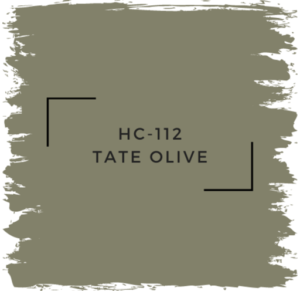
The last time I specified Tate Olive was 20 years ago when sage green was trending.
Well, all those stormy, muted, mid-tone greens from the 90s are back. And Tate Olive is included in my updated VIP Collection of large painted colour boards along with several rich greens, blues, golds and warm cognac tones that are trending.
Tate Olive; Warline Painting, Surrey, BC | True Colour Experts
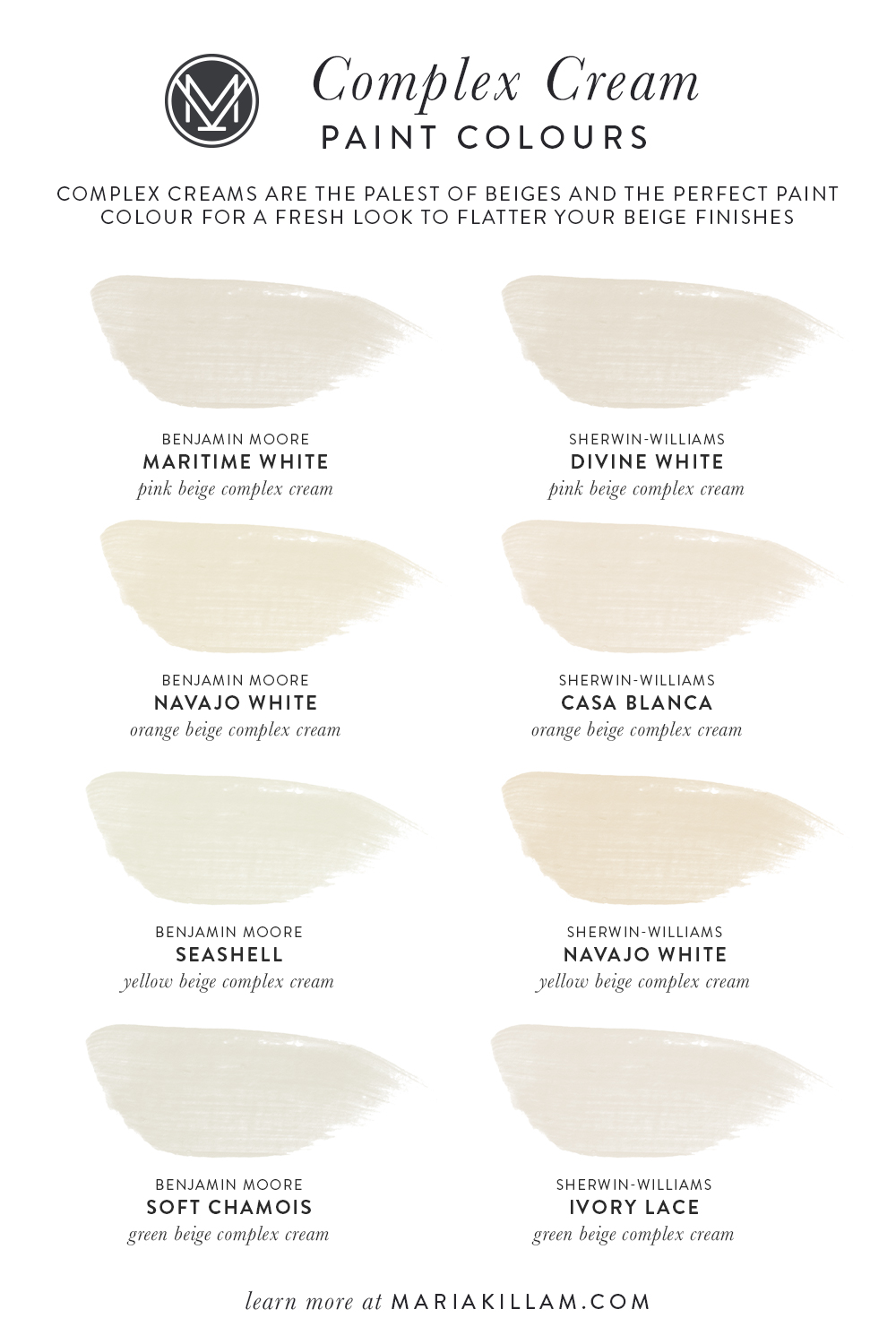
Cozy Complex Creams
My third colour pick for 2022 is orange beige complex cream – 7571 SW Casablanca or OC-95 Navajo White:
I recently visited a client’s home who had purchased a home filled with grey hardwood floors. She decided not to replace them because she didn’t think they would get their money out of doing so before they moved again.
But the combination of grey floors AND grey walls is way too much grey so I suggested a complex cream (below):
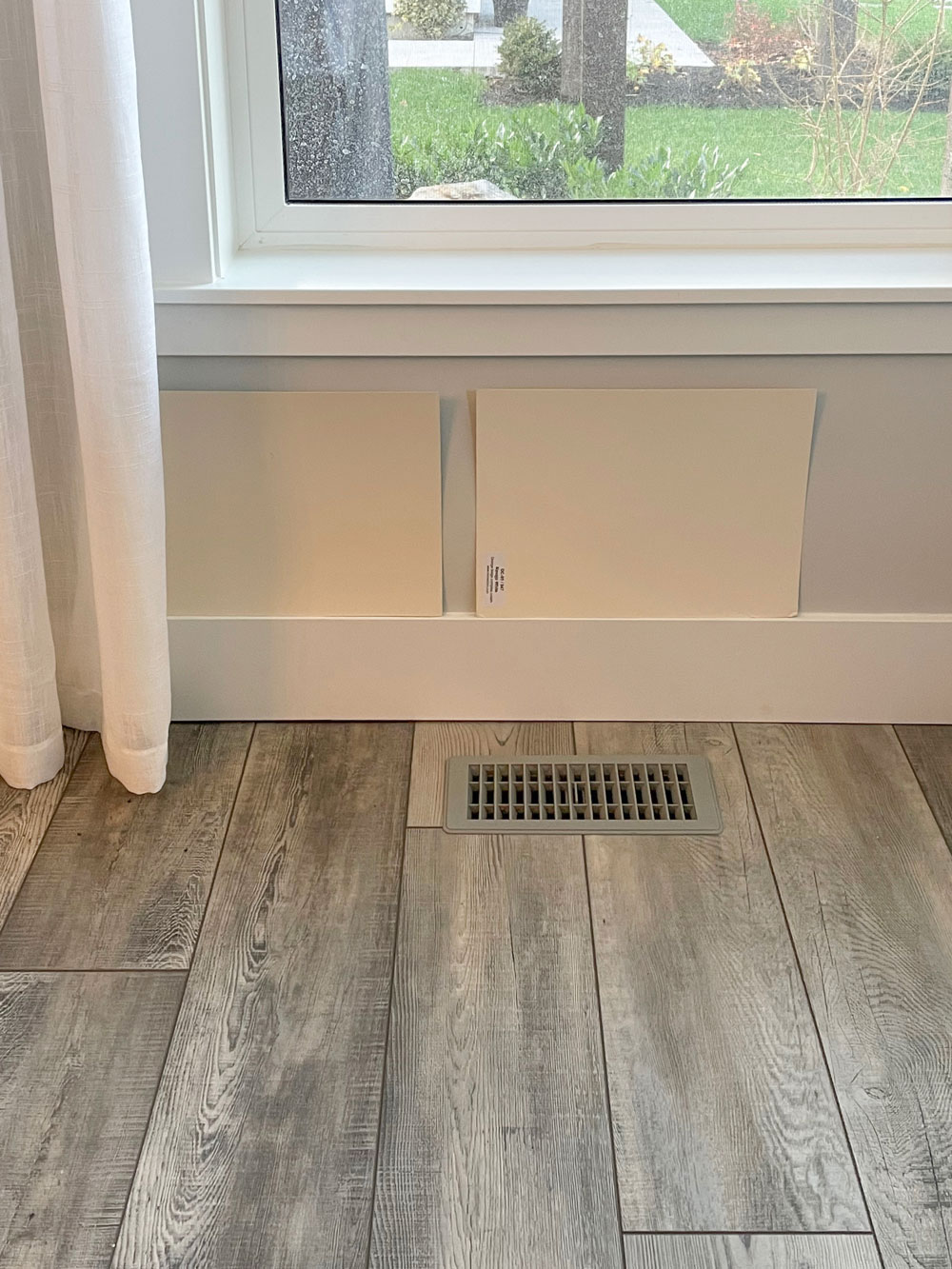
It was easy to choose a cream using my large painted colour boards. Which one would you choose (above)?
Complex creams are a great option for updating all the grey finishes installed in homes everywhere to begin to shift to a warmer on-trend look. Creamy walls are a great way to dip a toe into the warmer look of 2022, and the complex creams are perfect, they are warm but fresh and versatile.
New living room reveal coming soon
A floral lavender, green and cream palette (because my yellow sofa is still here) is what I chose for my living room refresh, and I’m so excited to finally share it with you this year!
How about you? In 2022, do you have the urge to get more playful with colour?. To experiment with layering in some warmer hues to break out of the habit of desaturated grey, black and white?
Let’s go boldly!
If it’s time to paint your house or you need help with a renovation or new build, see all our packages here.
Download my curated list of neutrals and Complex Creams in either of my ebooks (neither book overlaps) here.
Related posts:
How to be Smart in a World Filled with Dumb Colour Advice

I would choose the paint color on the right, based on the photo. And interesting, I am getting ready to paint a spare bedroom/sometimes office Ben Moore rock harbor violet, white trim, and a gray green color for bookcases. Sophie Donelson had this combo in her apartment and while she had now moved, it stuck in my mind and I decided to go for it!
So pleased to read your prediction Maria. Lavender and its cousins in the soft purple family have always been on my radar. I wear lavender and I buy bed linen and soft furnishings in that colour. As a blonde it is flattering to wear and thankfully back in fashion with the clothing designers. Lavender and soft purples look great as pillows on a grey or taupe couch.
Great post, but I’m too scarred by the mauve rooms of the eighties to re-explore it! I would choose the cream color on the left. It warms up the floors and does not pick up the yellow tones in the floor as much as the cream color on the right.
Hi Maria, I’m excited to see your collaboration with Ballard Designs! I love everything I’ve ever purchased from them. Your post today is so timely. I have been helping my daughter paint her home, some rooms we did ourselves and the more challenging spaces were hired out to the pros. She chose BM Balboa Mist for the main rooms and hallways, Smoky Taupe for the master bedroom, and Portland Gray for her office. Your ebooks gave us complete confidence in her choices and her home looks gorgeous…and has the violet tones she wanted. We didn’t know that purples are trending, just that the rooms have a subtle glow which looks lovely with her warm hardwood floors and the clean colors in her furniture. Every decision was made with your spot-on advice from your ebooks and blog (the guest room is Quiet Moments). Thank you for making it possible for just a homeowner, not a pro, to create a lovely home!
After looking at the first picture of Lavender, mauve, We are looking for a color to paint our new island and I think this would work perfect for our project. What shade and color would match the chairs in the picture?
The one on the right? I will stick to my whites and creams. Only lavender and such as accessories in the room. It’s too expensive to do major changes every time a “trend” comes out. So so glad that gray is out! I never have liked gray. You still see a lot of it in stores which surprises me. Guess they can’t get rid of it! ha Always glad to read what you have to say and/or advise. Looking forward to your living room reveal! Thanks.
Oh trust me! Gray might be out according to designers but people will still buy gray stuff for at least 5 to 7 more years, not counting hardcore fans of gray. Happens with every color trending at the moment.
That’s possibly because the market is saturated with gray and it might tend to be on sale..
Lots of people who don’t follow trends are still buying grays! Not everyone is concerned with achieving a certain look, and are totally okay with whatever is on sale at big box stores and/or what their contractor buys. This isn’t a judgment on those people – we all have different priorities! Personally I was a fan of gray for about 6 months until I started seeing gray being applied floor to ceiling in clashing undertones or all in cool tones that made it look like a prison. Recently flipped houses in my area are all that way. It’s awful.
I love lavender! It has been underused for so long. One of my favorite designer rooms of all time was a living room with lots of lavender.
You will never ever get me to like mauve though. 😉
You look great, Maria!
That’s so funny, I tend to not follow trends but use colours that I like. However, last year I decorated my bedroom in SW Hyacinth Tint and the furniture in SW Dusty Heather. I have yellow curtains and yellow bedding. My inspiration came from the colours of a Van Goth print that I had bought in a London art gallery and later framed. Thanks, Maria for all your knowledge and advice over the years.
I painted my dresser mauve a couple years ago and love it. The funny thing is, the mauve paint that I tried first was way too purple, so I ended up painting it SW Utterly Beige, which is the perfect mauve and not really beige at all.
The dresser will look perfect with my vintage 40s fabric quilt, if I ever get it done!
I love it when the trends catch up to me! Ha ha. I painted my bedroom lavender a few years ago. The other principal colors are white and off-white window coverings, nightstand, ceiling fixture, rug and bedding, a dark khaki dresser,“muslin” bed and chair, and black sconces. The artwork has some moody (dirty) dark greens, grays and purples, and black. It feels cozy, fresh, low-key feminine, boho lite.
Oh my gosh! I love teal and lavender but wouldn’t have thought to put them together. I can add some lavender to freshen up the teal – I love teal so much but probably have too much teal – lol!
When I was in high school 100 years ago my sweet dad went to the paint store THREE times to get the perfect lavender for my room. It was my favorite color.
In a house about 20 years ago I painted the living and dining room SW Evening Shadow- a gray with purplish undertones- used to get so many compliments on that!
Also I love Ballard Designs and can’t wait to see your house!
We are finding Navajo white paint under all the wallpaper in our 84 built California house 🙂
I have always disliked gray and sat out that trend- we are house browsing in the Midwest and so many homes are doused in gray floors, paint,tile, and kitchens. Ugh!!!
Hi Maria,
I can’t wait for your living room makeover! The sneak peak looks great. Do you think the green kitchen trend will continue beyond 2022? I am remodeling my kitchen and really want to put in Costa Esmeralda counters–the slabs I like are a pale to mid-tone blue-green gray with the tiniest bit of white and gold/beige veining. When I saw the slabs online and in person, they really made my heart sing and my plan to do quartz went out the window. My cabinets are a true white and shaker-style and my floors are red oak but in a neutral stain, i.e., light but not particularly pink. I really don’t want white counters–too much white–and dark counters look too harsh to me. Most of the mid-tones I see are gray or beige and I find them unappealing. I would pick a true white subway tile backsplash to keep the other elements simple. My cabinet hardware and light fixtures are polished nickel and my appliances are stainless. I don’t imagine ever tiring of the countertop because I have always loved blue-green and it suits my other furnishings. I don’t plan to move anytime soon–so I am not worried about resale. I guess my question is can I have green countertops and still have a timeless kitchen?
Great post, as always, Maria! I love the glimpse of your living room and ADORE your ceiling color. Can’t wait to see the rest.
I would choose the color on the right. Please let us know which one you and your client ultimately chose.
I can’t wait to see your living room reveal! I really adore your updated fireplace mantel decor, with the classical style mirror. But this article makes me curious, why doesn’t the classic white kitchen/white bathroom advice extend to expensive upholstered furniture? Wouldn’t it be easier to change up your decor to incorporate trendy colors and pattern if you have an ivory or cream sofa (of course in a Crypton or performance fabric)?
Well… hooray I guess I don’t have to repaint that seldom used lavender guest bedroom on my second floor. Still not sure I love the colorful trend…I am still not over mauve, my first homes color. Finally all the brown and gold from my current home has gone away… I think I’ll be staying very neutral with a few pops of my favorite blues.
Hi Maria, I would specify the lighter cream (one on the right) since it relates to the drapes and picks up the cream bits from the floor. I find the lighter version would allow for more decorating options. However, a cream tone on tone with the entire room will definitely lift it to the heights of gorgeous! Thank you again for teaching us so much and letting us have confidence to help people create beautiful homes and also letting them understand the why behind the beautiful!
Still love greens and still stuck with my “complex cream” Navajo White since walls and trim were painted that when bought our home in 1988! We spent a small fortune on custom wood wide shutters in the same color that are still in perfect shape. So we continue to repaint walls/trim as needed, because refinishing shutters is super expensive and will never hold up as well as the original finish.
Will revisit that if ever pull the trigger on a kitchen remodel with white cabs.
Mauve and floral prints coming back too? Wow I’m having 80’s flashbacks. Will the “romantic” floral print dresses, a la Laura Ashley reappear too? Goodness!
My artwork is colorful. My house is neutral. I like the juxtaposition.
Same here! Love it!
Love the pale yellowish paint posters -both honestly. I’ve used Ben Moore Windham Cream (HC-6) which is very similar to the samples, in two houses, and have loved it both times. Just a lovely, livable color.
PS You look amazing in lavender, Maria!
Maria,
Interesting blog.
One comment, it’s sneak peek, as in I peeked in the door.
Not sneak peak, as in a mountain peak.
Thanks!
Liz
So glad to see that grey is OUT. I hate grey. It’s depressing as heck. I love all shades of green, especially the warm sage tones. So excited to see I am on trend after 20 years! 🙂
Yes to Lavender! We have a lavender dining rm in our 100 year old house (SW Violet Pearl) – painted it that color 15 years ago and still LOVE it ❤
Maria. =. You are going to laugh at this. My garage is painted lavender and I have a chandelier in it.
My bedroom is a soft shade of lavender and my office is lavender. When I was a young teenager and my parents built a new home, my bedroom was lavender.