We’re about to see a lot more beige paint colours again – specifically in the kitchen. But, in order to find the perfect beige paint colour for this trending kitchen design, you’ll need to understand the 5 neutral undertones of beige AND how to compare them properly.
I’ve been blogging for near 15 years, so you’ll find a lot of posts here about beige. In fact, after a trip to High Point Market in 2018, I declared that beige was making a return. Of course, it usually takes a beat or two for colour trends to reach consumers and homeowners.
🚨 However, it’s happening now!
What’s the undertone?
This week I received an email from a follower who asked me for the undertone of BM HC-39 Putnam Ivory.
WHAT?
“Hooray! Let the angels sing and the doves fly,” I announced to my team, “Beige is back!!”
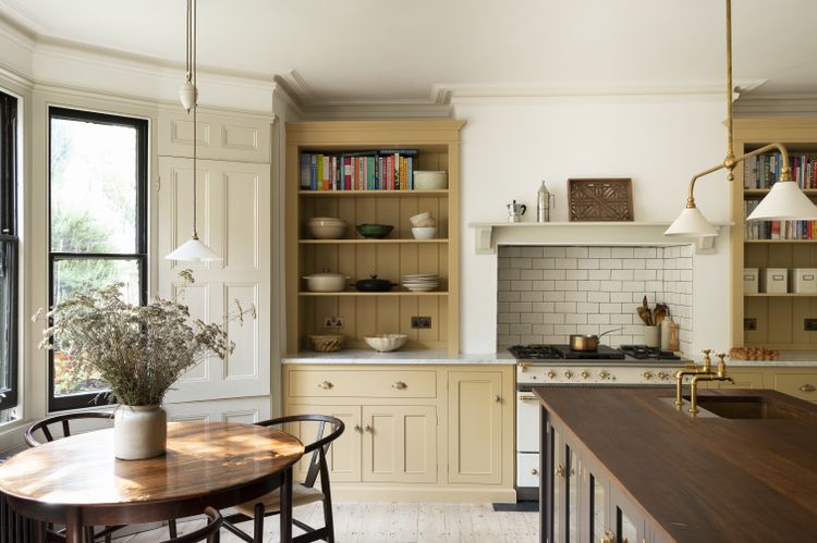
But then I realized something. She was probably looking at a cabinet colour NOT a mid-tone beige for a wall colour. The deVOL or Jean Stoffer or “English Countryside” kitchen design is super hot right now, which is why we are dissecting mid-tone beige neutrals at the moment.
But it might just be a little too soon for painting a mid-tone beige on the walls. Darn!
How to find the neutral undertone of beige
Regardless, on my Instagram stories, I ended up doing a little demo of how you might determine the undertone of a colour that wasn’t identified in my curated list of neutrals and whites.
To identify a neutral or white color, you compare it directly to a known color that has already been identified by gradation (for whites) or undertone (for neutrals) and continue this process until the closest match is found.
I show you EXACTLY how this comparison is done in my Specify Colour with Confidence workshop.
Anyhow, here’s a brief explanation.
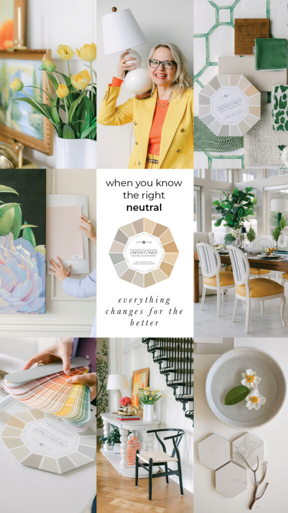
There are 5 USEFUL neutral undertones of beige:
- pink beige
- orange beige
- yellow beige
- gold beige
- green beige
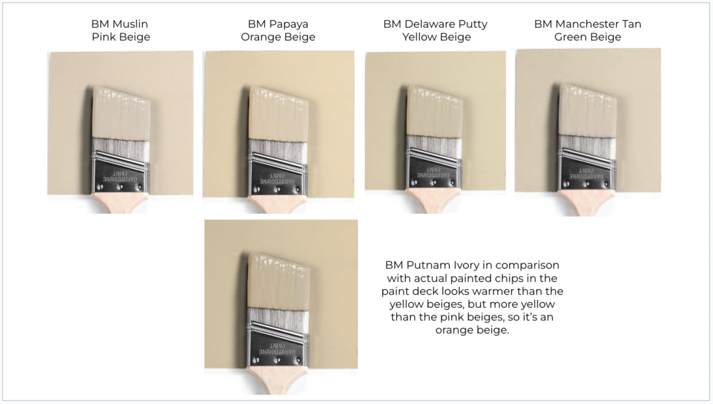
How I compared Putnam Ivory to find the right undertone
To start, you’ll need my Bonus Book of Colours, which is included with my Choosing Paint Colours: It’s all in the Undertones ebook. I’ve curated a list of paint colours from both Benjamin Moore and Sherwin-Williams and identified the EXACT undertone. That means you don’t have to guess.
You can use this list of colours to collect the paint chips you’ll need for direct comparing. Then you can compare to ANY paint colour in any BRAND to find the undertone. But the trick is to make sure you are comparing neutrals and whites in the same value. That means the colours you are comparing are neither lighter or darker.
And when I say “direct comparing” that means placing one chip on top of another. To learn how to do this right (and better understand what I mean by value), save your seat in my two day virtual workshop.
How to stay ahead of the trends
Also, in case you were wondering where you should be to know exactly where we are in any trend cycle. It’s right here. Reading this blog.
In 2016, I announced that Black was the new Grey. That was 7 years ago. It took a couple years for black to really hit so that’s why I’ve been saying we’re about halfway through black and white trend since it’s already been 5 years.
The trending beige kitchen design
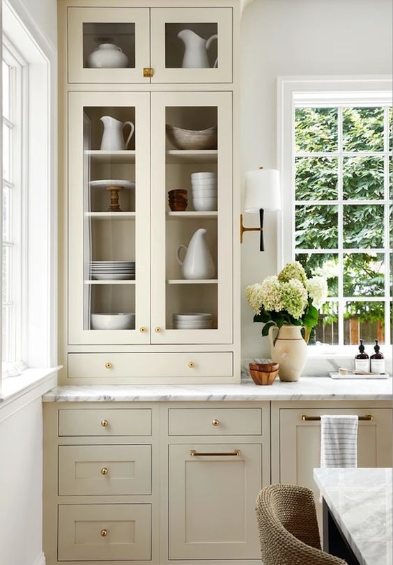
Mid-tone beige tones are very hot right now for kitchen cabinets along with a white marble countertop. And that’s the beauty of installing a timeless marble countertop, it can be paired with almost any colour.
Just be careful that you still compare the marble countertop (or marble look quartz countertop) to the neutral colour wheel so you end up with the correct neutral on your cabinets.
For example, if you have blue grey Carrara countertops, any beige will work on your cabinets but I would still avoid taupe or green grey undertones.
Basically a marble countertop in almost any shade (real or quartz) will work with most COLOURS, but if you are choosing a quartz marble look countertop in a taupe (which many of them are) or green grey, for example, be careful which beige you choose so that you don’t end up with a look that says, “We tried to match it but we failed”, just like the existing, inherited countertops in my kitchen.
Moving beyond all-white kitchens
It makes sense that beige is trending again in kitchens.
Warmth is what everyone wants as the black and white trend begins to wind down. But it’s still early. Beige is appearing in the work of leading creatives (who, like me have seen WAY too much of the black and white trend), and it’s beginning to click with the population.
So I’m anticipating more questions about identifying the undertones of beige. And that means more questions about earth tones like the muted mustard yellow in the deVOL or English Countryside kitchen at the top of this post.
One of the most important fundamentals in the Killam Colour System is by understanding undertones and COMPARING. This can be difficult to grasp without the knowledge of all 9 neutral undertones and the 3 BEST ways to describe colour.
Because the beige trend is fast moving and a bit tricky to get right, I highly recommend that you consider signing up for Specify Colour with Confidence. It’s no longer enough to just paint everything white (well it never really was, but you’ll learn why in the two days you’ll spend live with me).
Can’t wait to see you there!
Related posts:
What You Should Know About Beige
Contrast and Comparison; There’s only One Place to Really Get it








Does this mean that maybe I’ll be able to find warm-toned kitchen appliances when my 20-year old ones die?
I’ve found some really pretty beige paint colors and I love a beige kitchen, but I’ve been afraid to commit because of all of these reasons. Also, I will have a tile floor and it’s hard to figure a good color for contrast. Thank you for this.
Maria,
On your graphics (of the paintbrushes) above, did you mean to say that Putnam Ivory is a gold beige rather than orange beige? It’s always been
my understanding that Putnam Ivory is a gold beige. I used it as the main wall color in two of my homes, after it was recommended by an artist/decorator friend. I loved it. LT
Hurray!! I just finished an update of my kitchen and chose yellow beige (BM – Monroe Bisque) paired with BM – Simple White for uppers. This is after purchasing and reading all of Maria’s online books. I also chose a white, glossy, wavy subway tile backsplash with Quartz (Organic White) for the countertops. I have twice as many lower cabinets as upper so the beige really breaks up the white. It all looks clean and fresh and classic! I wish I could share a photo. Oh, and 2 years ago I used Maria’s services to help me choose a new wall colour for my open floor plan. The colour we went with is BM – Lancaster Whitewash, it’s a complex creamy white with a yellow undertone. I’m in love with my house again!
I can understand that a white countertop matches with (almost) any mid-tone beige, because after all a crisp white shirt looks fantastic with khaki pants. But does a white countertop match with the lighter beiges? Or going further, what colour countertop to choose in a kitchen with wood cupboards and a very light paint such as Simply White—find a cream counter with the same undertone as the wood, or go for a colour in the countertop??
What color would be your guess of the paint color of the mid tone beige cabinets in your post? It looks delicious!
I just picked up two gallons of BM Shaker Beige for my dining room re-do after figuring out the undertones of my fabric. I am, for the first time, confident in the paint selection. So glad to have found your blog!
I have always had a “beige” kitchen as I never felt my house was a “white” one – too cold and just didn’t seem to fit. We painted our brown wood cabinets in 1996 a nice beige. Then in 2022 we redid the whole kitchen in Revere Pewter cabinets which actually looks more taupe than grey in our place, along with Bianca white quartz that has faint grey/black/brown veins. I still love my “beige” and it’s interesting, I wear beige a lot and not white very often as beige just looks better on me…the same as my house and kitchen!
Maria, while I think of it…elsewhere i think you mentioned Navajo White? Where does that fall on your color wheel? That was the tract home wall ceiling color of interiors for new builds when bought our home in 1989. Didn’t think I’d see that again almost 35 years later! 🙂
Thanks!
Navajo White is categorized in the “Bonus Section” of both of Maria’s books. It will be the best $27 or $54 (for both) you ever spent!
I never really liked white, especially stark white so I had always used beige on things that I wanted a neutral color on. Much more cozier and inviting for me.
I’m looking forward to seeing what I’m sure will be many articles from you about beiges! I sat out the gray trend, then enjoyed decorating my light-filled California house with a lot of white paint and a dab of black metal, and now I’m in the midwest countryside in a rambling country house that wants English country decorating and BEIGE yes! Always nice when things fall in line with the trends 😉
I’ve just installed a light (pink) beige kitchen with white marble quartz. I’m having real trouble finding a ‘white’ wall colour. I thought F&B Pointing would work as it’s a pink/red based white, but it’s too similar to the cabinet colours.
I would love to know what colour is on the walls of this kitchen ?? It’s a beautiful contrast.
I used Dulux Heritage Wishbone White – perfect
Maria, I know you’ve used SW Alabaster before. Is that considered a complex cream? Or just off white? Yellow beige? Thanks!
You will find how Alabaster is categorized in the “Bonus Section” of Maria’s White Is Complicated book. It will be the best $27 you ever spent!
I have most of Maria’s ebooks – thanks! It is saved somewhere that I can’t remember on my iPad so I was hoping for an answer. Thanks!
I think the bonus here is: natural wood. At last.
I understand that many want white or beige or colors on their cabinets, and that the trend in finishes goes back and forth from paint to natural, but it’s always seemed to me to be a shame to cover woodgrain (and no, I’m not a guy). We need to develop a material other than wood for those painted finishes. Let the trees provide cleaner air and the solace of nature. If the tree has to die for our decor, let’s at least appreciate its natural beauty.
Could you please share which green beige complex cream Maria used for the walls in her beautiful new home? I have both ebooks and color wheel and they have been so helpful. Could it be sift chamois? Thank you! Also, what is the trim color? Thank you!
Love beige or greige kitchen cabinets with marble or quartz – BUT – the challenge is then the wall color and trim color. With all white kitchens, the trim always matched the cabinet color and the wall color provided the depth. How to do that with beige/greige cabinets???
Hi Maria. I so enjoy all your up to date info. It’s been a while since I did your course and it’s been so useful in my business. I’m just trying to get my head around this new trend.
so…we used to put beiges with off-whites and creams. Are we now using them with true whites too? (ie. blue grey Carrara)
Do I have this right?
If you’ve got a blue grey Carrara are your best choices:
1. match the undertone (blue grey) for cabinets (although we’re moving away from the grey trend but, gosh, it can still look just gorgeous in the right place)
2. match the white (true white) for cabinets
3. choose a beige for cabinets(!)
4. go for a colour
BUT if the marble/quartz countertop has taupe or green grey undertones you have to be a bit more careful in picking a beige because some of them are too close and will look like a bad match (eg. taupe + pink beige = too close? green grey + green beige = too close?)??????????????
So many questions! I’m looking forward to hearing more.
Oh great! I just repainted my kitchen cabinets with green and blue. I’m getting over all these “trends” and I’m just going to focus on my favorite colors and what makes me happy. Don’t wanna hear it. 😐
Oh Maria, I wish I could afford to hire you! Your eye for color is fantastic. Mine is not. We purchased a home about 6 years ago in a nice neighborhood because it was conveniently located for my husband’s career. At the time we thought we would be able to afford to renovate, but shortly after moving in the economic shift made banks less willing to lend, and we were stuck with a hideous kitchen. It is too much for words. We have insanely tall ceilings so cabinets cannot be finished neatly, brown crown moulding atop them which doesn’t relate to anything in the house, yellow cream cabinets, and green/gold/ivory granite, with yellow-orange oak flooring, and stainless appliances, sink and faucet. Walls are a pale green undertone beige which looks like a green undertone of white in bright/sufficient light. I have just let it sit as is because I don’t want to spend a large chunk of our home renovation budget and yet still hate my kitchen because I made a poor attempt at an update. As you can see, I am one of many this post applies to! Even with your great video advice, I still lack the confidence to make a choice (my husband won’t pay to correct it twice). So I’m stuck wondering if I should just live with the ugly and paint the brown trim to match the cabinets which are the wrong undertone for both the floor and countertop, or try to have the cabinets refaced. The floor will be refinished soon, but as it relates to all of the trim in the house, it’s color can only be fudged slightly toward a more neutral color rather than completely changed. The countertop is staying for now and is dictating all of our color choices due to our open floor plan. What a headache!