


When you have a tool that helps you see the nuances of undertones, getting colour right feels kinda like magic. Because choosing colour with the help of my large painted colour boards is so much easier, they practically do it for you. They are truly one of the most important tools for selecting colour — whether you are a professional or a homeowner.
Do True Colour Experts have a magic touch?
Colour experts know that the magic behind nailing the nuances of neutral undertones happens when you use my large painted colour boards.
Even if you haven’t had a chance yet to attend one of my live events, you can harness the power of my system by buying your very own sets of my curated large painted colour boards!
Blog Post Round-Up: Large Painted Colour Board Tips
AND, whether or not you have them already, this is a round-up of the MOST USEFUL POSTS related to Colour Boards! This is one of those posts you’re going to want to save or pin to your Pinterest board so you can reference all of this helpful advice later.
→ Never Pick a Neutral Without Large Colour Boards
Pssst! They do the work for you.
What I teach is a system for understanding and specifying colour. (BTW, I’m enrolling students now for 2022)
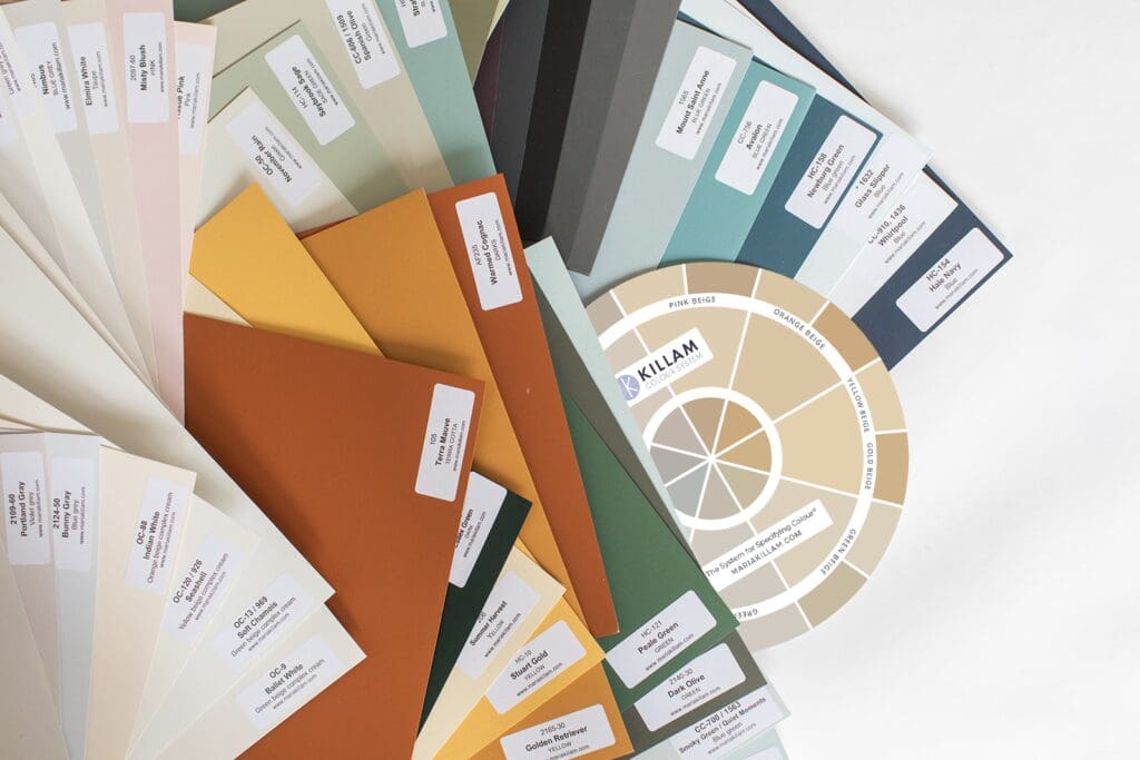
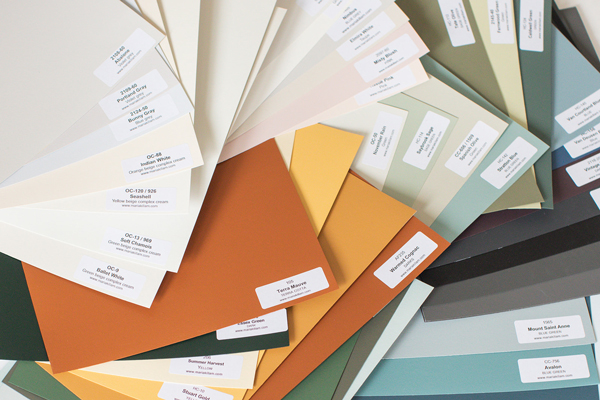
I’ve translated this system into three collections of colour boards that include the most useful and complete list of neutrals categorized by undertone. The neutrals in these collections work 95% of the time you need a neutral. You don’t need to agonize about whether neutral colours that aren’t in these collections are important to have in your colour toolbox.
These collections also include the only whites you will ever need for every time you need a white colour for your home. Whites in the collections are organized from warm to cool by gradation and once you have these, you no longer need to consider whites outside the collection.
So, if you could have the perfect collection of the best 9 neutral undertones from light to dark, and the best whites, that would be pretty amazing, right? Well, I have done it for you.
One for Benjamin Moore — The Core Collection and one for Sherwin-Williams — The Foundation Collection. Both of these curated collections of 50 of the essential neutrals and whites make them the most indispensable tool to have in your toolbox as a colour consultant, decorator or designer. You’re welcome.
How to choose the right neutral
Did you know that 80% of the colour choices you make for anything and everything in your home are made from the world of neutrals and whites?
Analyzing the minutia of neutrals is much harder than analyzing saturated colours like blue or green. That’s why it’s important to have the most useful neutrals in your toolbox any time you need to choose one.
Here’s a neutral vs. saturated colour tip: An easy way to know if the colour you’re looking at is a neutral rather than a saturated one is if you find yourself twisting your head to determine what colour it is. It’s easy to look at periwinkle and see it’s blue with a slight violet undertone, or at an apple green and see it’s green with a yellow undertone.
Determining a neutral’s undertone is trickier and starts by understanding the 9 neutral undertones. And this is where you can really demonstrate those magic powers.
Just know that getting undertones right is critical for choosing neutrals, but undertones are not the important distinction when choosing saturated colours — something you learn in my True Colour Expert Training.
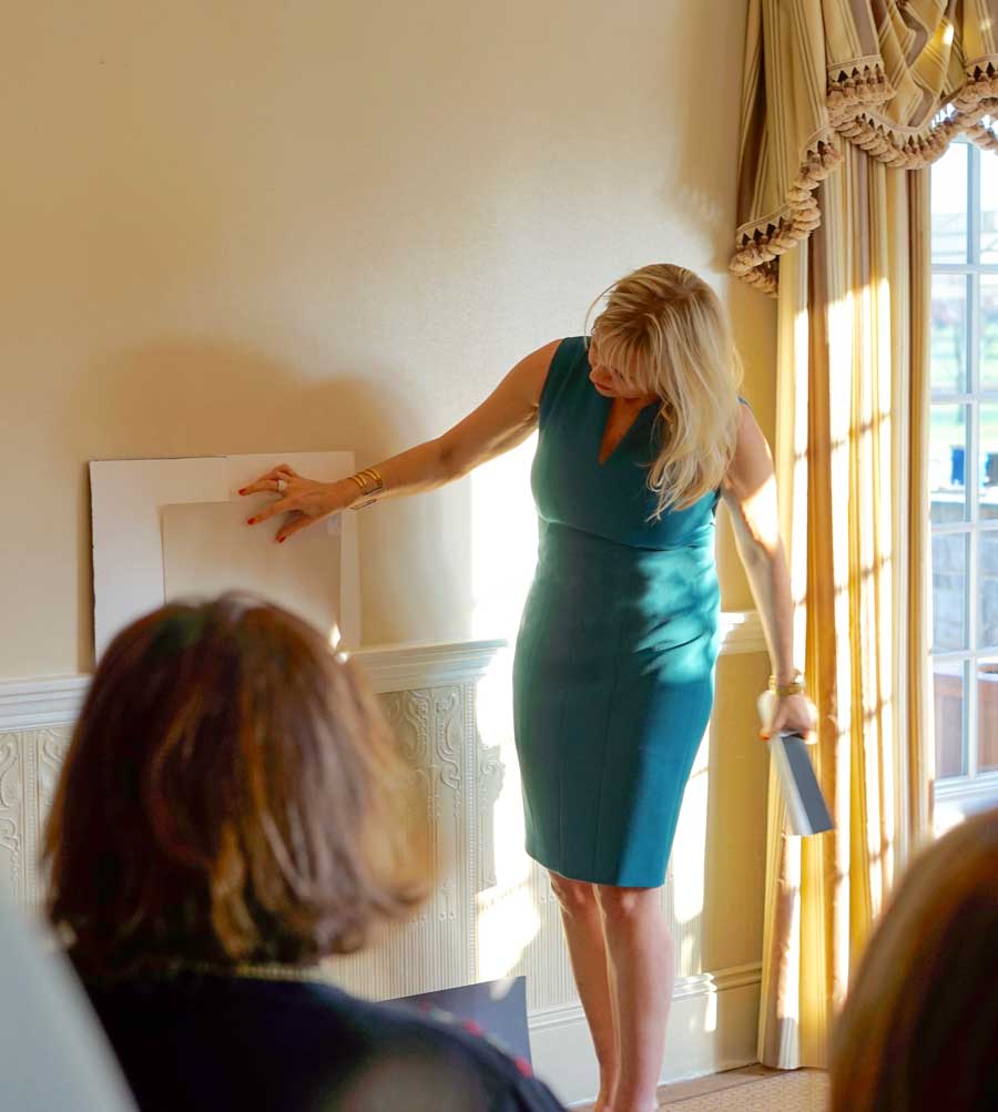
Because the colour boards are large (11×14) and painted (just like colour chips from the paint store) both YOU and YOUR CLIENT can easily SEE that the colour you’re suggesting is perfect. No more asking them to take a leap of faith from a tiny chip — they can see it plainly (and move it around so they can even see how it will look with their sofa and floors, for instance).
That’s the power of the large painted colour boards!
→ The Best Neutral Paint Colours (and how to choose the right one)
Lean in close… right here, I’m going to tell you the KEY and the most useful insight that makes my system work:
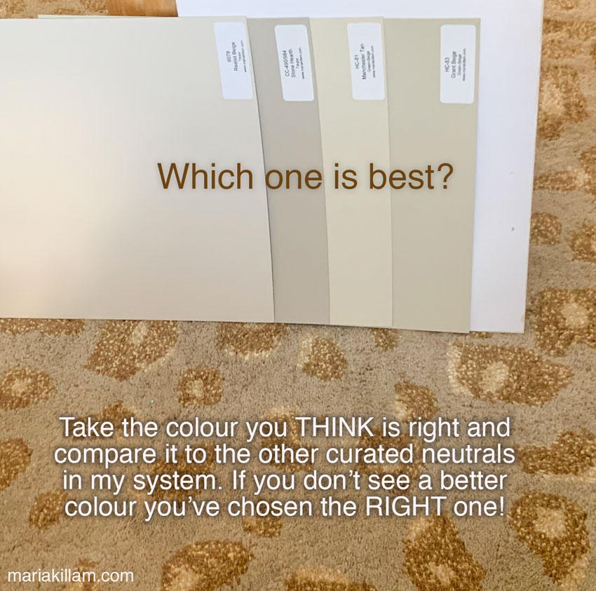
In order to accurately identify and choose any colour (especially neutrals), you need to COMPARE.
It’s simply impossible to be consistently accurate in specifying the minutia of one neutral vs. another without using large painted colour boards and comparing.
My system reduces the overwhelming world of neutral colours to the most useful tried and true 20% (aka the best neutral paint colours). And then it organizes them into a finite number of undertone categories.
That means instead of considering every neutral or white in an entire fan deck, all you have to do is work through the best representatives of the 9 neutral undertones and 4 white gradations in a process of elimination until you arrive at the best one.
Not only are the neutral and whites in these colour board collections organized by undertone (for neutrals) and gradations (for whites) they are also labelled so you can immediately have confidence when you use the boards to compare to the furnishings and finishes in your or your clients’ room.
And if you’re finding that your clients are constantly asking for whites, not only do my board collections include the best whites from each paint line, labelled by gradation from blue white, true white, off white, to cream, they also include the best barely-there neutrals which are often better options when your client wants a white. A wide majority of homes can not handle a white, off white or even a bright cream on the walls or cabinets.
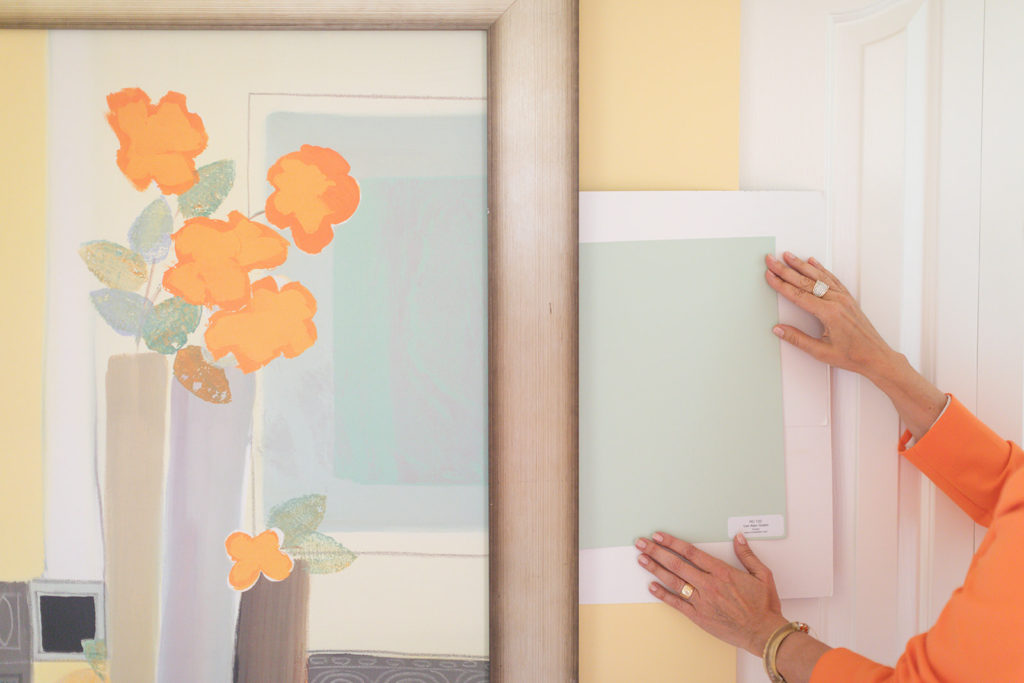
A helpful distinction I made at the beginning of the Black and White trend led me to further dissect the palest neutrals, the ones closely approaching whites, into complex creams and greiges.
They are so close to white that many paint lines include them in their whites collection. But as they behave like neutrals, with specific undertones, I have given them distinct categories in my system. Don’t forget to consider them when you are looking for a white — more often than not they hit the sweet spot.
Complex creams are the very palest colours in the beige category. They are a more refined and versatile choice when you want to update an earthier space to a “white” walls look. Or you simply want a fresh creamy look that is not too stark.
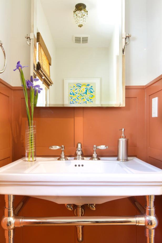
The walls (image on the right) are painted BM OC-88 Indian White
(an orange beige complex cream that relates to my botanical prints)
Greiges are the palest colours in the warm grey and taupe undertone categories. These are sophisticated shaded neutrals that create airy but subdued backdrops for decorating.
Complex creams and greiges are the fabulous bridge colours between neutrals and whites. Several of each undertone in these colours are included in both The Core Collection and The Foundation Collection.
Here’s a tip to help you identify when to use these pale neutrals: The mid-tone undertones of neutrals are much easier to see than the lightest ones. When you need to identify which undertone is in the furnishings and finishes, start with the mid-tone boards until you are confident you’ve got the undertone right, just like this example (above).
Then just pull out the complex cream or greige colour board in that same undertone, and you will have found the related beautiful colour to give your walls a soft white look.
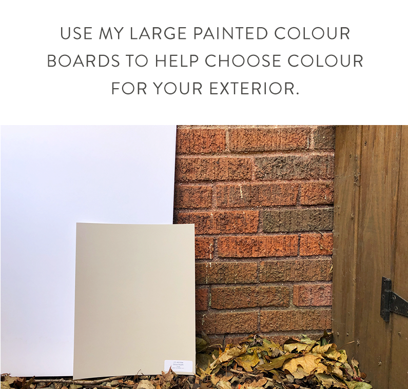
My colour boards will help you choose exterior colours too.
The same tip applies to choosing exterior neutral colours. If you are struggling to see the neutral undertones in your stone or brick, start with the mid-tone neutrals in the collection labelled by the undertone category. The darker the colour, the more obvious the undertone will be.
Once you have identified the right undertone, simply choose a lighter colour in that same undertone until you find the freshest and palest choice that also relates to the finishes on your house.
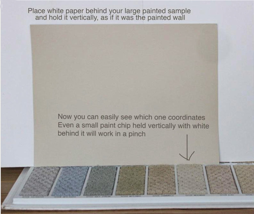
→ 4 Steps to Choosing the Perfect Wall-to-Wall Carpet Colour
Did you know that large painted colour boards are essential for so much more than just choosing paint colours?
When you are buying new hard finishes (like tile, quartz or carpets) for your home, the ONLY way to know if a specific sample is the right neutral undertone is to compare it directly to large painted boards in the system colours and, by using a process of elimination, determine what the undertone is.
You simply cannot do this accurately without comparing. And, you can’t compare effectively without LARGE painted boards. Preferably boards that are clearly labelled by undertone.
One of the trickiest finishes to specify without using large painted colour boards is when it comes to choosing carpet. And the majority of offerings in the flooring stores have obnoxious fleshy pink undertones — honestly, you can eliminate up to 90 percent of the options by comparing them to boards with more versatile green beige and green grey undertones!
I would simply never specify carpet without comparing a sample to my boards.
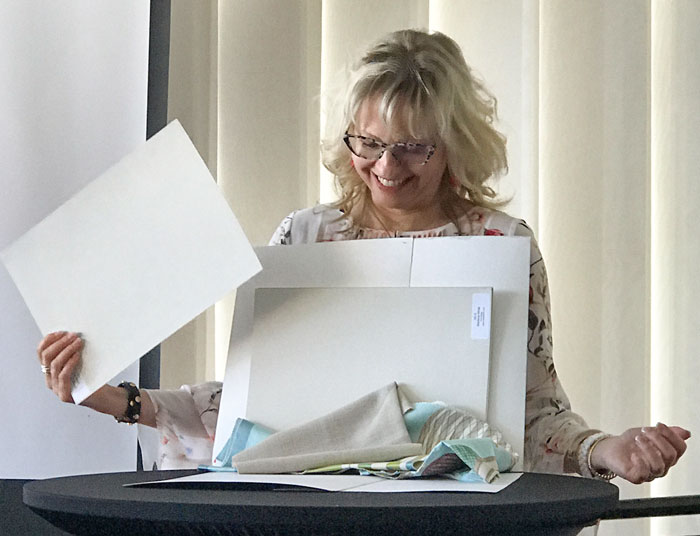
Here are my BEST TIPS on how to use my large painted colour boards when choosing a paint colour:
- Turn a few around to use the back of the boards so that you are ALWAYS creating a white backdrop behind any new paint colour you’re considering. This way you won’t be visually comparing a new colour to the old one.
- Position the colour board vertically against your walls. (Always put the colour boards in the same orientation as the selected colour will be.)
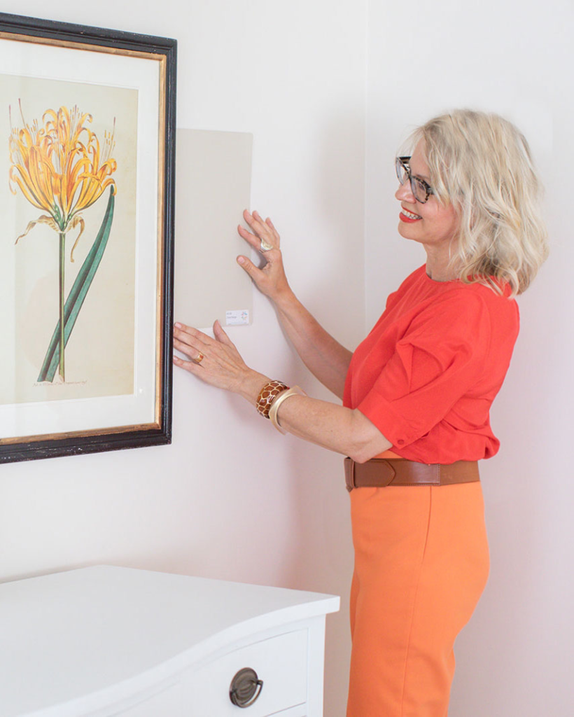
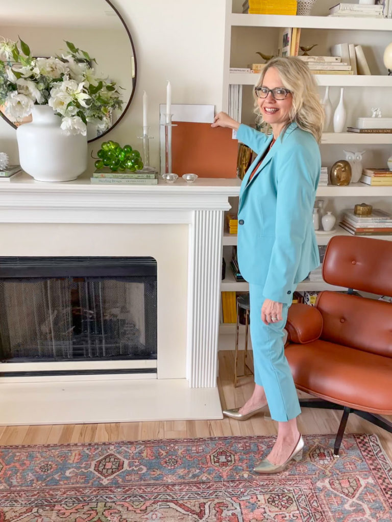
- Start by putting the colour board right by the finishes and furnishings you are trying to relate the wall colour to (still in the vertical position). Then move the colour board all around your room to make sure it looks correct. In the image below I’m propping the new colour (related to the area rug) up on top of the mantel and then I’ll stand back to get a big picture look.
→ Watch me use the colour boards in action here!
Introducing Two Colour Board Collection Updates
→ My 2021 VIP Collection Update
I recently updated my Benjamin Moore VIP Collection to include new, on-trend colours.
Once you have the BM Core Collection, which represents my system, expand your collection with 50 more complex creams, greiges, classic colours, trend colours and darks!
With the VIP Collection, you will always have the right neutral plus some soft and timeless colours plus some fun and dramatic colours and darks to help your client get excited about their paint palette!
Since green, blue and earth-toned kitchen cabinets are trending, it’s a good idea to carry a range of the best rich colours for accents and cabinetry in large painted colour boards so your clients can immediately see how the colour will look. You will be able to more easily sell them some richer colours that might push their comfort zone a bit. Much harder to do with a tiny 2-inch colour chip!
→ Sherwin-Williams Foundation Collection Updated in 2021:
I used to offer a limited collection of 25 Sherwin-Williams colours, but now that SW is just as popular and widely available as BM, I’m offering a complete set of 50.
If you don’t have ANY of my large painted colour boards START HERE:
- Benjamin Moore Core Collection or
- Sherwin-Williams Foundation Collection (newly expanded)
Either of these collections will give you the most current and popular neutrals from light to dark in the 9 undertones in my system. Plus the best whites.
If you are someone who specifies both Benjamin Moore AND Sherwin Williams, having BOTH collections is ideal so you can specify the exact colour your client will be buying. This saves them from rolling the dice by colour matching at the paint store.
If you want to try to make your own large painted colour boards, I show you how here.
NOTE: the cost of each board in my collection works out to approximately $6.00 each. To paint your own costs $12.00 each. A paint tester sample costs $9.99 or more, never mind the time and cost of poster boards, rollers etc. it takes to make up your own. It took me 2 hours to paint 8 samples.
When you think about what it would cost to make them yourself, you’ll snap them up ASAP.
⭐️ ⭐️ ⭐️ ⭐️ ⭐️Coming into a client appointment with these boards makes all the difference. I no longer have to explain why it’s the right color, they can see it for themselves. Thank you Maria!-Angela⭐️ ⭐️ ⭐️ ⭐️ ⭐️Maria, you are so right about large [boards]. I have used these to figure out the undertones of not only the paint on my walls, but rugs, artwork, and my clothes.
So versatile and handy. Love them!-Dottie
But that’s not all.
If you have yet to get your hands on my 2 eBooks, How to Choose Paint Colours and White is Complicated, this is a great place to start learning my system.
How to Choose Paint Colours reveals the fundamentals of my system — the best and clearest language to use when describing all colours, and the simplest way to view the 9 neutral undertones. This book focuses on choosing wall colours and the critical factors that will determine your success. It answers questions from readers that further clarify how my system works AND it includes my Bonus Book of Colours, with neutral colours categorized by undertone.
⭐️ ⭐️ ⭐️ ⭐️ ⭐️
“I’ve only just discovered you and your color system. It has made such a difference in the clarity of my thinking about how to use and recommend color! It’s like you have pulled back the curtain and showed us how it all works underneath. I’m just a home design enthusiast, but because it truly is a passion for me and I can’t stop reading!
⭐️ ⭐️ ⭐️ ⭐️ ⭐️
“I can’t believe that people are wowed by my color expertise and refer me to other people who may need my help! I would not have this confidence without learning about undertones from you. Thank you!” — Stephanie
White is Complicated is the antidote to the overwhelm of available whites in the paint world and builds on the foundation laid in my first eBook. It takes the arguably complicated category of white colours and simplifies them by introducing the concept of gradations. And, as with every part of my system, this book focuses on what is useful and helpful when it comes to choosing white for anything and everything in your home. As well, I’m including my Bonus Book of Whites categorized by gradations.
⭐️ ⭐️ ⭐️ ⭐️ ⭐️
“Oh,my, Maria. I just downloaded the White is Complicated eBook. How generous of you! I assumed I was downloading a pamphlet, not over 140 pages of wisdom! And a bonus book! [Now} I can dream and get started. Thank you!” — Donna
Shop Online with Colour Confidence explores how shopping and decorating is increasingly moving online. Are you ready for this new world? If you’re waiting for “everything to go back to normal”, think again. Design and retail will never be the same. But if you have the right tools and support, you can create a beautifully decorated room without leaving home. And I can show you how to get colour right when you shop online.

This online course is a step-by-step guide to help you get colour right online so you can put together a room you love, regardless of budget size.
Plus, it’s loaded with designer tips and decorating tricks to help you not only shop online like a pro, but put a room together like one.
⭐️ ⭐️ ⭐️ ⭐️ ⭐️
“I had to stop in the middle of Module 1 of your Shop Online with Color Confidence course to create a mood board for my living/dining room. This made ALL the difference. What worked and what did not was immediately clear. THANK YOU.” — Kelly
⭐️ ⭐️ ⭐️ ⭐️ ⭐️
“I loved [the course]! I can’t wait to re-decorate a room with all your helpful tips. I do a LOT of online shopping and can’t believe I haven’t tried making a mood board yet. Having one should definitely help minimize the returns I end up making.” — Bethany
⭐️ ⭐️ ⭐️ ⭐️ ⭐️

Hi Maria – Keeping you and all our Fraser Valley friends and yet-to-meet friends in our thoughts. Thanks for providing links where we can help financially.
Best – David S