It was an interesting first day at Maison & Objet. Everyone had different opinions about the trends because I think everyone looks for whatever interests them. For example, I’ll be at High Point market and someone will say “I saw RED everywhere” and I’ll think “Really? I didn’t see much red” but that’s because red is not my colour.
I think you’d have to read a few trend reports to get a real sense of what they are.
Here are the upcoming trends from my perspective.
Will I be right? Well I often am, so if you’re wondering who to follow to be in the know, you can happily follow me ; )
So first things first, texture and metallics? I feel like that’s not news because we have talked about both for a while. But let’s just say they were definitely represented.
Also if High Point Market is showing 2017 trends this year, then Europe’s biggest show is definitely 2018 and beyond. A forecast of the future of living.
One day was enough for me. I power walked through as many booths as I could and took photos. After all, I needed my strength to attend the Paris Flea Markets on Saturday and Sunday.
So let’s get to my trends report shall we?
So the first newsflash is this: There was very little grey at Maison & Objet.
What? Can it be true? Could grey be going OUT? I already said it was going out when I wrote this post last year when I lost 150 Facebook fans all at once and was completely traumatized.
No one was ready to hear that grey was out, even though that’s not what I was actually saying. You’ll have to read it again to understand.
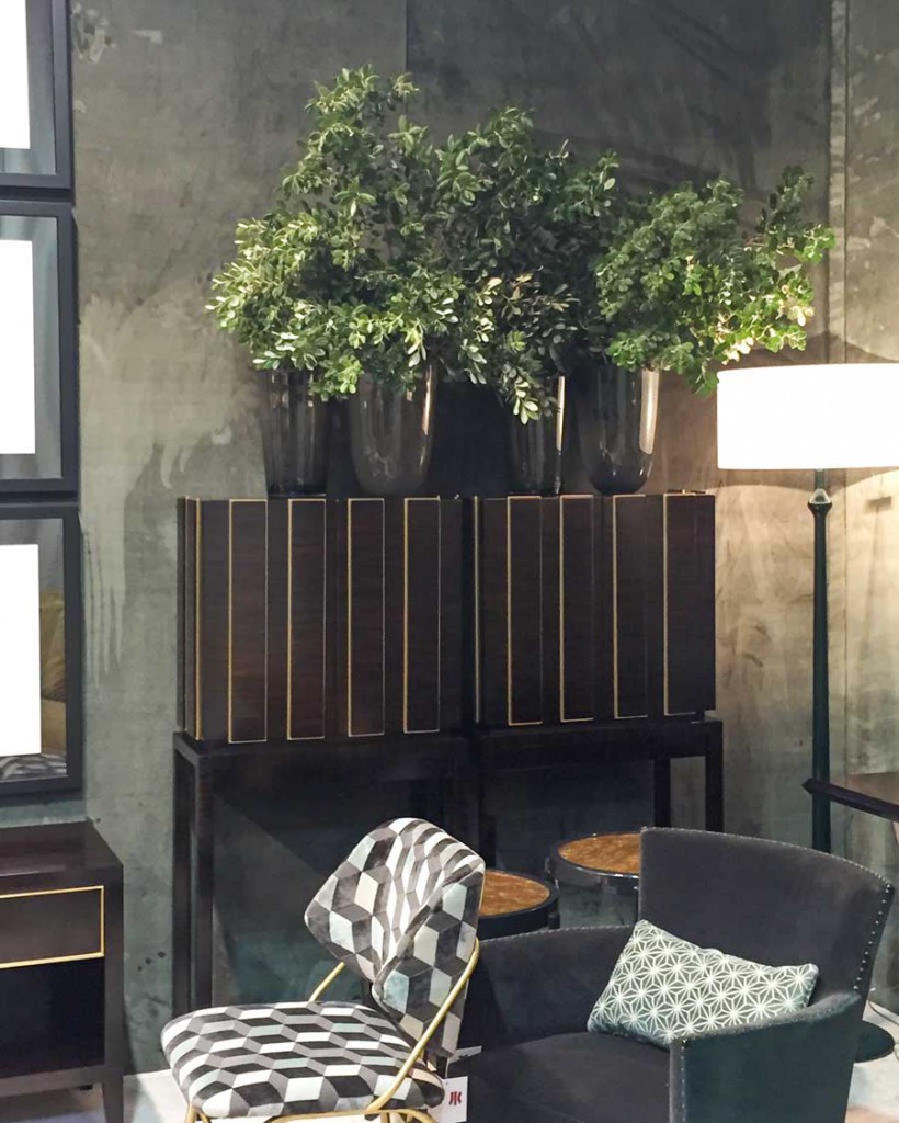
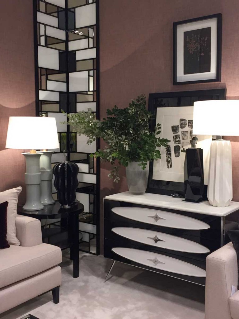
Well it looks like Black is the new Grey. Take a look:
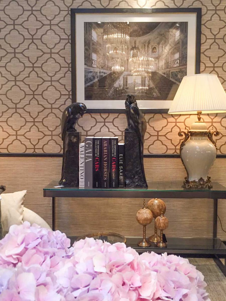
Look at these amazing stone bookends (above)! Now those are a serious accessory for a console table!
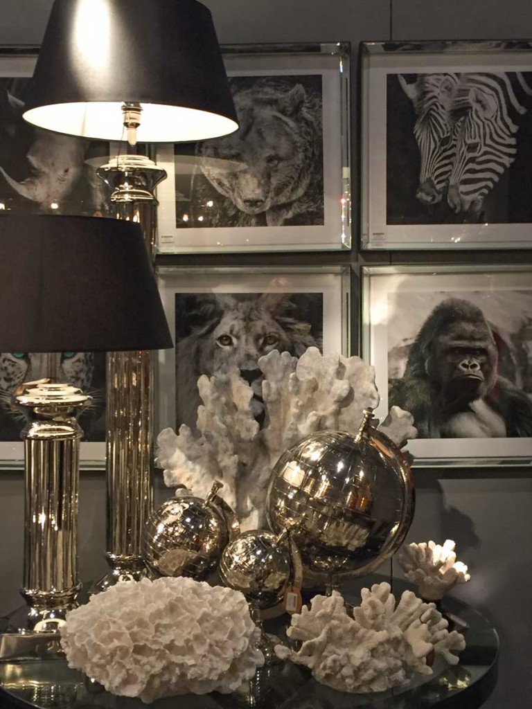
Black and white framed art was simply everywhere. As well as oversized coral.
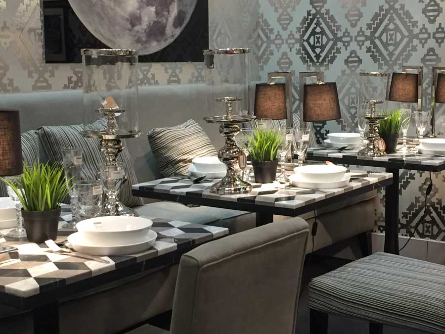
Geometric stone table tops like these (above), also found on coffee tables.
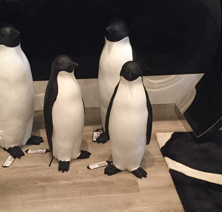
Black and white penguins to go with the theme.
Another cube geometric pattern in fabric this time (above). After all, if this is a new trend pattern announced in 2016, it’ll still be here in 2018 by the time it hits mainstream.
Related post: 2016 Trend Watch 3D Cube Geometric Patterns for Tiles and More
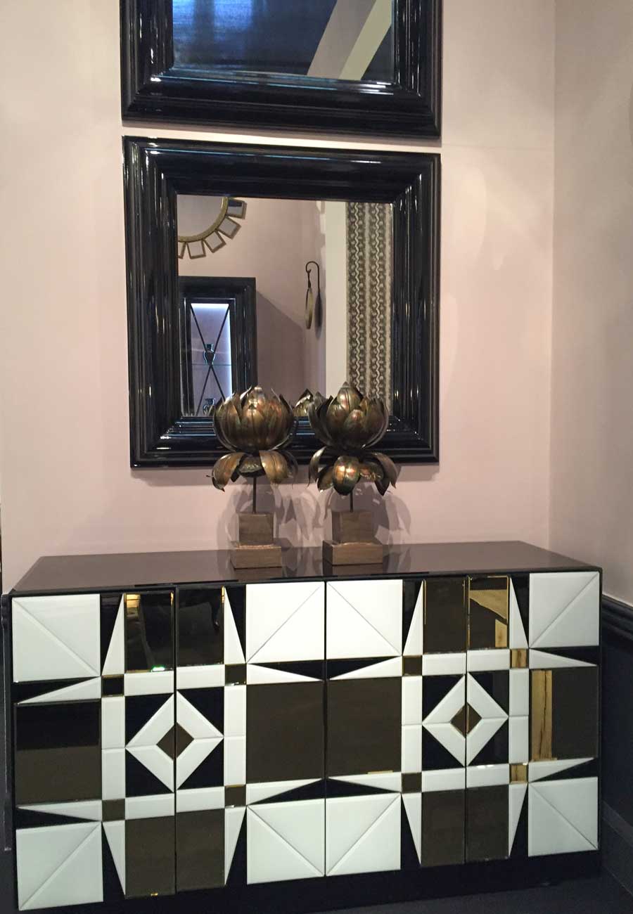
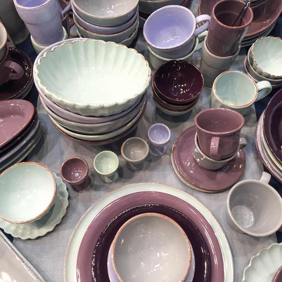
This mauve pink shade was also big at this show. As well as black and white inlaid furniture.
Another black and white lacquered geometric cabinet. Notice the black lacquered mirrors above it.
It’s like the 80’s are back. Not only was forest green the big ‘trendy neutral’ back then but so was black. There is still black leather furniture around today from that era (much to my sisters chagrin) as well as black lacquered cabinetry.
But black is back in a big way and black is glam. So are the golds and jewel tones that I saw everywhere.
Black is powerful, striking and glamorous when it’s done right, but heavy and lifeless when it’s handled badly, so I would tread lightly embracing it as THE new neutral.
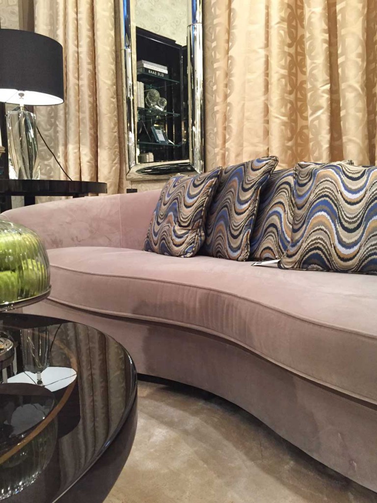
Here it is the mauve again combined with yellow beige which I don’t love but it doesn’t clash because there’s enough pink in this colour so that it reads like a colour not a neutral.
Another lacquered coffee table.
And here’s a tablescape to go with it.
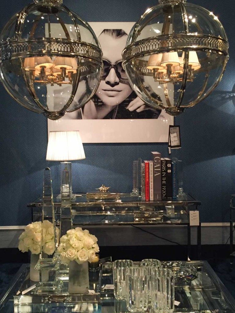
Muted blue in a subtle herringbone pattern.
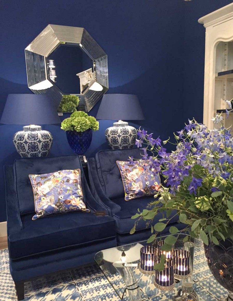
Blue and white is still going strong, here with a purple undertone.
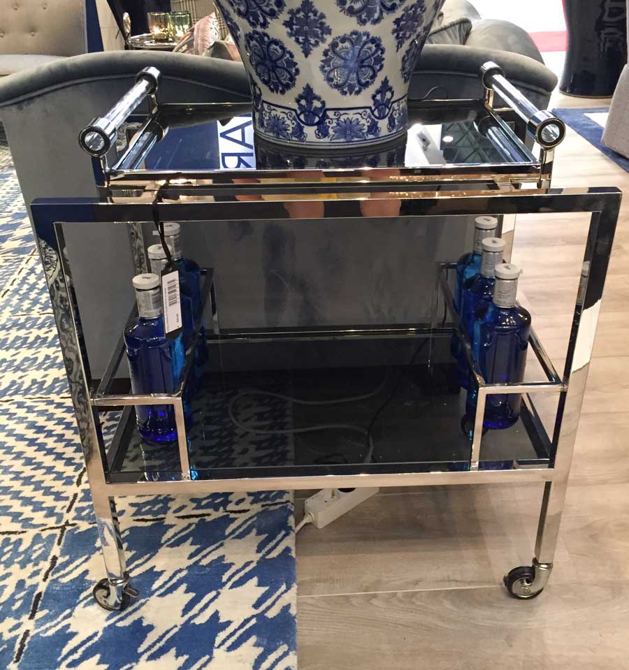
Bar carts as end tables. I don’t think I’ve seen it done before and especially not as much as it was here.
Navy blue shown against a black wall.
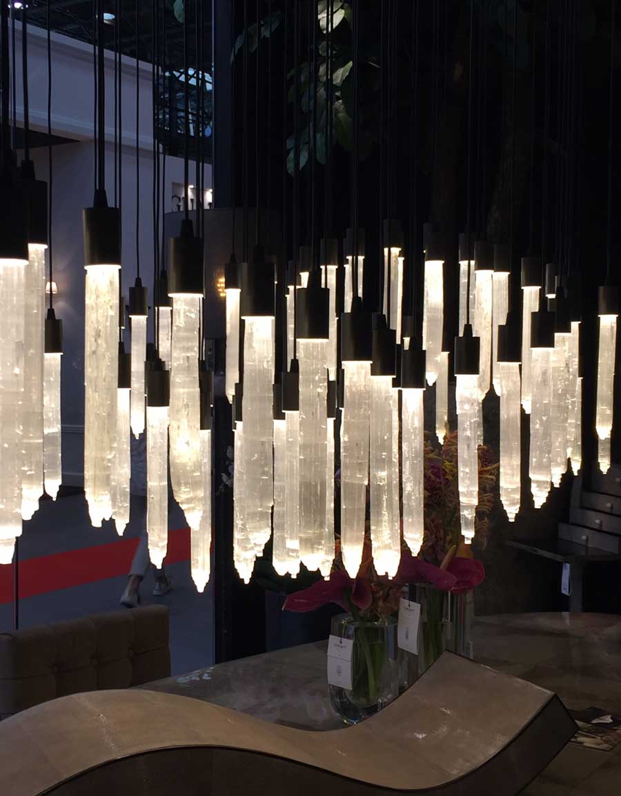
This chandelier spanned the entire length of the dining table and look how low it is. . . it was probably installed this way for drama at the show but it was very cool anyway.
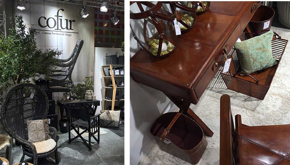
I was truly surprised to walk up to this booth and see mostly black wicker. It was warmed up by cognac-red leather wrapped furniture, also a big trend according to the rep.
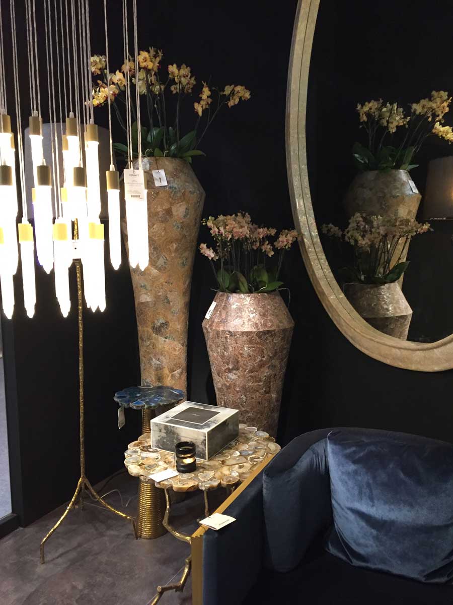
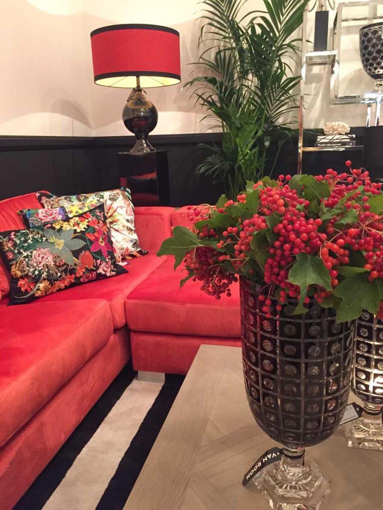
What goes with that much black? Jewel tones. Reds, hot pinks, teals.
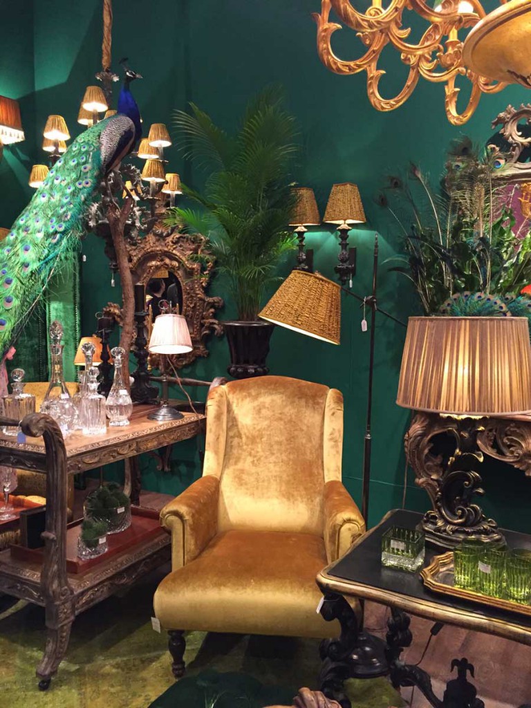
Peacock and bright golds.
A red sofa with floral patterned pillows with a black background.
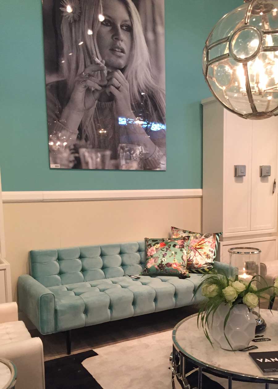
Bright turquoise which is still. Going. Strong.
When I tried to find a playful orange fabric just last month for a roman shade there was very little orange in my fabrics but plenty of turquoise.
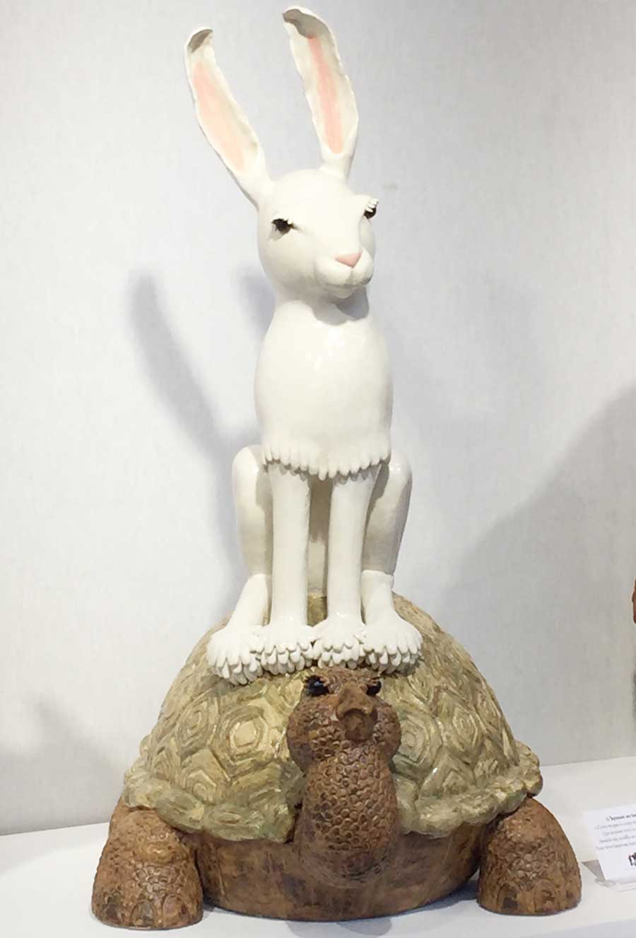
One of the first booths I saw at the show was by this artist Valerie Courtet whose animal sculptures are just happy!
Okay so here’s my take on this whole thing.
I occasionally get emails from readers asking “Maria what’s the next trendy neutral going to be” and up until this show, I’ve said “I don’t see it yet”.
I’m just reporting what I’m seeing, not making a prediction, but it does appear like there’s a lot of evidence here to suggest that it’s black.
When I was in Houston last Fall to lead of my workshops, Terreeia and I went to Nasa for a tour. There’s a newer control center now but we all filed into the old one for a presentation and all the upholstered flip down seats were orange. From the 60’s, because orange was a big colour on upholstery back then.
Then, of course, brown in the 70’s.
Then black, forest green and navy in the 80’s.
Then in the 90’s, grey was big along with a greyed sage green (lots of us had a greyed, sage green sofa).
And then in 2000 brown was back. That takes us until now with grey.
So when you think about it, there’s not that many colours that are considered ‘neutral’ and black has been in my last two trend reports in January, and at the top of my trend report in 2015.
Recently a reader emailed asking about Pantone’s new Fall colours, lots of the same colours represented in their collection as we’ve just reviewed.
After all, new colour trends are definitely chosen by the consumer and simply picked up by manufacturers.
Over to you my lovelies, what do you think? Does black resonate with you or do you see a different colour?
_________________________________________________________________
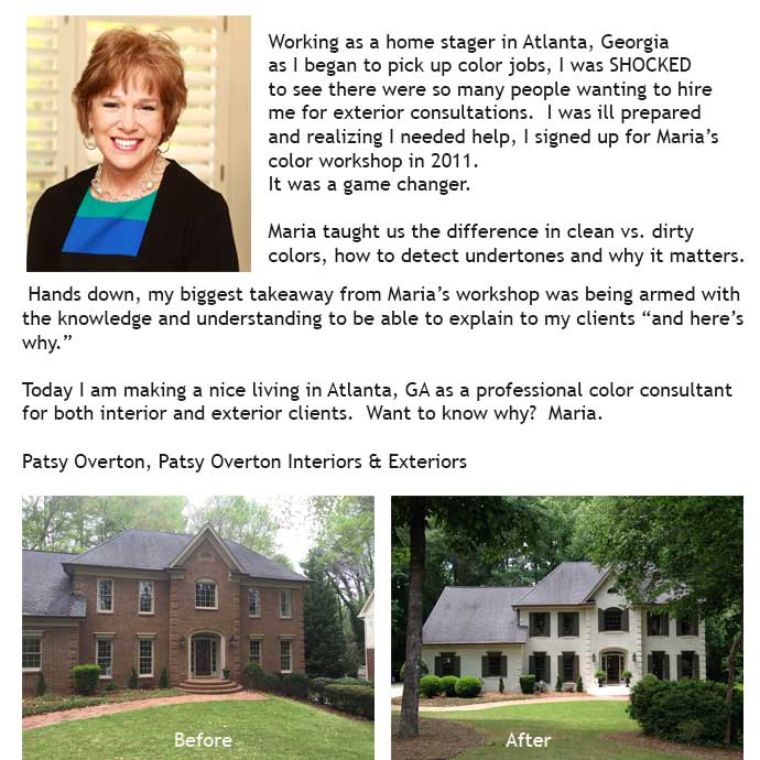
Here’s a recent testimonial from Patsy Overton who attended my Specify Colour with Confidence workshop in 2011.
Here’s what the course includes:
Three days of live, in-person training by Maria Killam
Your own complete and extensive work book filled with useful cheat sheets.
Business forms you’ll need for your business and information you can refer back to as you build your experience and train your eye
Paint colour fan decks (Value $55)
Certification as a True Colour Expert™
A $350 photography tip you’ll start using immediately.
Catered lunch, coffee, soft drinks and snacks each day
My How to Choose Exterior Colours with Confidence on-line training (Value $147)
Register here for early bird pricing in any of my Spring Workshops.
Related posts:
Maria Killam’s Trend Forecast for 2015




Soo very dramatic! I love all of the pictures and it certainly makes the red pop out. I don’t think black has ever been out. I see it as an accent but don’t think I could live with an over abundance.
Your pictures are so well done. You have certainly become a professional photographer.
Your trip sounds so exciting. Wish I could have been there! I love Paris.
Thanks Lucy 🙂
While I have felt that gray is being overdone, I am not happy about what you are reporting! Gaaaaakkk is all I can come up with. So masculine, so dark. I have one question, where does this leave us with white? And I can’t believe Facebook ppl are that fickle. Thanks Maria
Wow, really interesting to see all these images! I love the black & white, and am so glad that blue and white is likely sticking around…also turquoise.
Must say, I’m surprised at the great black lacquer comeback, and also noticed a pleated navy lampshade that took me back to the 80’s! And I’m trying to wrap my mind around the mauve curvy sofa and those accent pillows…. 😉
Your Paris posts were wonderful! I bet you wanted to bring so many beautiful things back home with you. What a fun trip!
YAY!!! My black leather sofa and chairs from the 80s are finally “in” again!!! I’ve waited a ling time! LOL.
“What has been will be again, what has been done will be done again; there is nothing new under the sun.”
Wow, these are not my trends – blacks and intense/dark colors. That black and white cabinet sure does look like something we would have purchased 30 years ago!
I was starting to think we were moving away from gray, but into a phase of white, cream and camel, natural woods and greenery, which I thought was terrific. Perhaps touches of black or more intense colors. But this is too much!
Maria, I will forever live with your “white hard finishes” mandate. And then everything else flows in a lovely way from there.
I will be sitting out this garish trend.
Totally agree with you! Stay with what you love. I can’t imagine using more than one of two of the “drama” pieces at most in my home!
I totally agree. My house was built last year, but I love white and blue. I’ve wanted a white kitchen for years, but when we bought our last home 10 years ago, the builder thought I was crazy to want painted cabinets instead of stained maple! Most of our home is a neutral warm grey (SW Requisite Gray) with white (BM Simply White) wainscoting and trim, but all of my blue accents are what ‘pop’. Our kitchen backsplash is marble subway tile and I feel confident it will stand the test of time.
Occasional black accents are fine, but I find black/gold garish – (I wouldn’t decorate in black and gold if someone paid me to). When I got engaged 20 years ago, platinum was just becoming big and most rings were yellow gold – I *hate* yellow gold. It’s about being true to your taste, despite trends. My platinum set ring is timeless and I feel the same about my white kitchen and white trimmed house.
I think trends are great for accents, but I could not live in a jewel toned, black and gold environment.
Well think of it like a fashion show, clothes that we would never wear but they get interpreted into the fashion that we do wear. Thanks for your comment! Maria
Great way of putting this – reminds me of the scene from the movie “The Devil Wears Prada” where Meryl Streep tells the young secretary how that the blue sweater she dislikes was influenced by other interpretations we do live with! Your comment I can live with when it comes to color and design!
Yeah! I still have all my 1980s furniture, including black lacquer cabinets.
Interesting to see that mauve seems to be making a comeback—and by interesting, I really mean unfortunate:/. I also saw that Sherwin Williams announced Poised Taupe 6039 as the 2017 color of the year. AND the fashion runways are showing the pink/taupe mixed with yellow too. Huh.
Yes Kelly, I saw SW Poised Taupe too, and all I could think of was, WHY?
I think it creates press for them. If they come up with a colour we expect then no one talks about it. Good press, bad press it’s all good press. And I agree with you Angela! Maria
I am happy! My sofas are pretty much that colour and the blinds are a sage-y purple. We sort of ended up there by accident and I was feeling really cross about it. This takes the sting out.
Well over 20 years ago I saw a film that showed a bedroom with floral wallpaper on a black background on all the walls. I was surprised that I even noticed, but I have loved that romantic look for a bedroom ever since. Have I ever done that for me and my husband? No, but I don’t know how I would like it now, as it’s simply easier to see things in a room that is painted in light colors, and I like to paint, not wallpaper. Anyway, I especially love white, not a fan of gray, but I also like variety. I certainly would not like to live in a home full of dark colors everywhere.
I’ve seen a lot of black lately on other blogs I read. But it’s combined with white/cream. Especially with tuxedo cabinets. Combined with a lot of textural things. And Kiliam rugs. Leather furniture.
I like that kinda look. Black with jewel tones…not so much.
Yes exactly black with white or cream very crisp, fresh and depending on style of furnishings graphic.
I am doing a kitchen with black cabinet and white marble as I write this. The client has an open concept and their kitche opens to the main living area. They have lots of black so it was a natural fit.
Done right it is a timeless combo. It does not date.
I love that look, too, with creamy white. I also love the look of white walls and ebony floors when it is done in a stylish way. On the flip side, I recently painted a small bathroom with mostly white tiles and some black ones black on the upper walls and I absolutely could not love it more! I find myself drawn to this bathroom as a nice break from my lighter rooms. It is a risk that paid off! I am not someone who would paint a bigger room black and I still like lighter walls, but the small relief of black is really cozy, I think!
Ohhhh! I haven’t been this pleased with a color trend report in years!
I have used black as my neutral for 20+ years. I believe it started with the purchase of an ebony lacquer baby grand piano for the family room. It is beautiful but BOSSY, LOL! Anything placed with it needs to be bold in color or style in order to stand up.
In addition, I have never given up the jewel tones OR brass/gold accents. Although I love bright colors, silver, white and gray, I learned my lesson in the ’90’s. I tried to switch my decor from jewel tones to the brights/whites/silvers and ended up with a hot mess! The problem is that I have a fairly open floor plan (unusual for a house built in 1979) and all of the first floor rooms must relate. I did not/do not have the funds or desire to change all of those rooms at once. In addition, I have a significant investment in art which would not necessarily “go” with bright colors. I know, I know – true art theoretically stands apart from decor. My OCD demands that everything be related in some way. 😉
So, while I have spent the last 8+ years admiring your work and the clean colors, I have had little opportunity to put your color ideas to work in my own home. I am excited to see how you will interpret the trend.
Black has ALWAYS been popular; the same with red. Personally, I use them as accent pieces. They coordinate with many styles and colors.
Ugh! What planet is that on?? How terrible! It reminds me of Bakelite jewelry, Art Deco, and mid century all wrapped up in one. Plus the 80s. What is the world coming to? I’m sticking with my soothing and restful greys and blues.
I wonder if, much like fresh colors, you’re seeing black because it goes well with gray. If we were still in the brown trend, or the sage green trend, black wouldn’t work. As an accent with gray and white, black can be beautiful, though.
Still, I have to say that those photos horrify me. They look like designers deliberately took an 80s palette and tried to force it to look good. They were not successful, in my opinion.
happy happy joy joy… my new black kitchen is in
all the pictures were amazing… so me, not my clients for sure ! but totally me
did you colour match the pink you saw ? would look nice in a bedroom with black drapery…
looking forward to your adventures at the flea market… that’s where I would spend my time !
Maria if you say Black ” then black it is”
You r normally spot on.
I do think black has been on the rise for a while .
All the black tile bathrooms
The rooms and ceilings painted black
Black is bold but white and black looks so classic
I think it never really dates
Done right black and white never really goes out
I personally love a lot of white with some black accents
You can put just about any color you want to add .
Oh I’ve been reading that white is moving more towards warmer creamier
Was the white with the black crisp ?
Thank you enjoyed reading
Nancy
I love black interior doors and black sweaters in the winter, and that’s about it. Is it ok to be “meh” about trends and just stick with what you love? Or is that considered “having no taste.” I still love white and grey and beauty with a bit of vintage. All those pics felt like an assault on my senses.
Danielle, ignore the trends and do what you love! Our houses should make us feel happy and comfortable and that is pretty much all that matters.
Love the photos and so happy with the news about black. Is it possible for you to share the brand or sources of those beautiful lamps in the second photo? Thanks.
Maria. You know how you said that you didn’t see much red because red isn’t your color? Well I still see gray in those pics lol. Gray walls, gray furniture, gray subtly woven through the black…gray accents here and there softening the black. I like gray as it goes with so much and can be paired with dull or bright colors. Anyway, I got a chuckle from your “red” comment and just couldn’t help myself lol. Fun post. Informative as always. And if I’m going to choose anyone to be the voice of the next “on trend” color, it will be you. Take care.
I saw the gray too! 50 shades of gray woven throughout. 🙂
Grey was there but NOT like it was shown when grey first came in at High Point for example. To see an entire booth filled with black wicker says to me black is here. To be used as an accent as others have said, not suddenly done from top to bottom in your house! Thanks for your comment! Maria
I think much of this is gorgeous (except for the pink). Obviously too much blank is heavy, but it’s so useful in many ways. Love those bookends!
I also thought we were moving into white, cream and pale tans – clean, natural, fresh, organic. with maybe accents of black.
I too agree that black is the new Gray. I’m personally loving the farmhouse trend. I have found myself recently drawn to black and white (matte finish) for both interior and exterior applications. It’s fresh, simple, and classic. Gray has been great but black is so crisp, even with a distressed finish.
Thanks so much for all the info and pictures! You’re so talented!
Colour me depressed. Nary a happy room in the lot. This too shall pass. Beautiful composition in your photographs. Have fun antiquing!
Yes. Some of the ugliest stuff that I have ever seen. Mauve and gold?!? Yuck!
I wouldn’t mind seeing gray going on its drab boring way as I’ve never been a fan. I love bright colors and I love black. I’m not heavy handed but I have rich green walls with black framed art, and other touches of black here and there. Black makes sense to me. I also think the interest in cement tiles has encouraged this trend. They often look best in a black and white. That mauve pink makes me want to hurl, though. That one is just pallid and unappealing. I’m alsways delighted to see what you come up with, Maria!
I wrote my response to this post before I read Rochelle’s comment. I can assure you that my black & autumn jewel tone decor is anything but garish. Rather, it is rich and warm…a desirable quality here in the frigid north.
The images Maria showed in the post are like runway fashions….a concept, not the way people actually interpret them to wear on the street.
Just bought a black desk the other day. Glad to know black is still in style.
I’ve never paid much attention to trends. Actually, I usually dislike colours that I see everywhere. Perhaps I want to be different than everyone else; it’s definitely not a conscious choice. I normally look for colours I haven’t seen in quite a while. Six years ago, I started looking for a black wood console table; after three years of unsuccessful searching, I gave up and had one made. Now 3 years later, it’s getting popular. Darn! This has happened a few times in my life: with burgundy, then yellow and now black. I specifically remember when I was looking for yellow, the few fabrics available all had flowers and birds on them. Eventually I found a striped tone on tone. 3 years later, yellow was everywhere. Maybe I missed my calling and should have become a 3-year colour trend predictor because I’m the same way with clothes too 🙂
Personally, I like black as an accent colour but for my taste, it must’n be overdone.
Those shapes, colours, finishes remind me of Art Deco – maybe that’s what’s coming back? Not my taste though.
That’s what I thought–it looks like Art Deco. I must have missed the 80s.
The 80s were heavily influenced by the glitzy side of Art Deco. Unfortunately, a lot of 80s design has a bad rap because it was executed in cheap materials that haven’t aged well, and isn’t quite retro enough yet for a comeback, at least in the US. But designers may be looking beyond MCM for inspiration now that it has hit the mainstream.
I saw an ad for light grey crib and other nursery furniture from a local discount store and thought, “Maybe the grey trend is on its way out.” I think it is going to be around awhile though.
I don’t see anything new about black. Black, white, grey and greiges, combined with all things natural looking (wood/wicker/textured/organic stuff) in all shades of brown/beige/grey) has been a big trend, in northern Europe at least, really for many years already (don’t know about the south). Not that everything IS black, but black is definitely a main stream neutral right along with grey and white. You have black in furniture, picture frames, lamps, in floors, kitchens, tiles, roofs and even black brick houses (well charcoal). Black has been around for so long that I was hoping for it soon to be over, right along with grey – guess not yet, haha. I personally don’t like black. What I have seen lately is that although crisp/clean colours are still predominant, muted/greyed down colours are coming more now, which I found interesting. Another interesting thing I picked up was that IKEA has launched a new ‘colour’ for their ever popular bookcase range ‘Billy’ in brown ash veneer (which is a medium brown).
A couple of days ago I was at the paint store and someone was buying that mauve. I hate that mauve. While waiting, I did a thought experiment of how to make mauve look modern and I thought maybe b/w. Something like your photo is the image popped into my mind (before I saw it – which is weird). Then, I dismissed the thought as too 80s. Ha!
Back in the late 90’s when I was friends with an interior designer in her late 60’s, I was surprised to see her new design studio painted TEAL. Which was 80’s and DATED back then. Now I know why. It would be hard for me to embrace a colour trend that I’ve already lived through, just like fashion. When it comes around again, those of us who have already worn it 30 years ago should just stay away, haha. Thanks for your comment Eliana! Maria
Maybe it was a color she loved? You with yellow for example…
Thank you for sharing these photos from the show in Paris. I marvel at the creativity on display. I’m not a professional, not even a talented amateur interior decorator – more like a Pinterest following fan. I see a lot of monochromatic palettes using deeper tones and it is a very welcome contrast to all the light & airy white rooms I’ve seen on Pinterest for the last few years.
Interesting reactions! I love the jewel tones and the drama. I see black as a constant – years ago I went to a presentation by the editor of Style At Home and she said something along the lines of, all great rooms have some black and some white in them. I’ve found it helpful when trying to figure out what colour to choose for a smaller piece of furniture or accessory. My house tends to be darker with a lot of original brown wood and black in small doses is a good neutral. I also love the drama of black window casements.
I think black and white photos and patterns are pretty much a classic. I was doing a room in black and white for a while (I’ve since backed off a bit) and no matter the trends, you can always find black and white patterns in crafts, all over the world. Since I move slowly I found this easier than trying to work with a specific colour trend.
The 150 people that dropped you are just having a temper tantrum because they just don’t want to hear that their stuff could be now dated, because they will love it less. My family room is a chamois color with the dreaded (not by me) oak trim. Is it trendy? No. But it is peaceful and full of light and it makes me smile everyday. I do feel sorry for the girl down the street, who just had her house painted with 30 year paint (Rhino Sheild) in gray though. Seriously, just finished a couple of weeks ago and that would really bother her.
I think what trend reports demonstrate is that people should go with the colors that thrill them, aim for a timeless look, and incorporate trends only if the appeal and work with the rest of the decor. It is hard to avoid the trends totally as they dictate what’s available and subtly influence what we find appealing.
Agree. Most of us want to live with what we love instead of with what other people say is trendy. You have to be pretty passionate about interior decorating to even think about dramatically changing your decor to keep up with trends.
Thanks for bringing us all the latest trends on clour Maria, your photos are fabulous! As for the next neutral? I think it’s white right now as oppose to gray. Even though many clients of mine are still loving the grays, I find more than ever, white is prevailing -with grays mixed in the palette as well. If you look at the covers of the past Style at Home Magazines for the year, I can (almost) safely say that all of the rooms featured are white/off whites with hits of colour in the accessories/accents. So, my prediction is that white has slowly become the new neutral and will be here for quite some time. I love black and I adore a moody room, but I think for many people that is too dramatic and the myth that the dark colour makes a room look smaller, still scares people, even if it’s not true!
We’re decorating with black now, too much of any trendy neutral is not awesome, however people will overuse it because that’s what always happens. White is definitely a huge trend and will be for a while. That’s why this is a 2018 trends report 🙂 Thanks for your comment! Maria
You did a great job with the photos! They look very professional. I have found the trends gearing toward the 80’s and early 90’s for a while. I think besides fashion showing what is coming next in home dec, TV shows can drive trends as well. Mad Men ushered back in the huge mid-century mod craze. Now shows set in the 80’s and 90’s are popular. When I look at the set of The Americans, I see a lot of current trends. Some sets of Halt and Catch Fire as well.
Now onto what I am really interested in – that rug in the blue and white room pictures with the multi-scale herringbone! Do you have any info which could be helpful in finding it?
@Melinda: IF you are referring to the area rug in the fore front I would consider it more to be a ‘hounds tooth’ design (than a herringbone one). That said; do a web search: blue and white hounds tooth design area rug European design. (i.e.: To name one that is similar — Overstock.com has one called NuLoom Handmade Houndstooth Blue Wool) also Ballard Designs has a wonderful selection of ‘patterned rugs’ so you might want to try them as well.) -Brenda-
Hi, Thank you! I realized as soon as I had posted that I wrote herringbone instead of houndstooth. I have been searching and searching! So far haven’t found one with the same patchwork design.
I just finished reading your blog post when I picked up the latest CB2 catalogue. Your trend report is all over the catalogue – black leather sofa, black cocktail tables, black accessories, etc. Most of these are paired with jewel tones, white/cream with blue and teal thrown in. Some are paired with natural elements. Grey seems to have moved into the backdrop.
As always – you are ahead of the curve.
IMO, CB2 has always been the home of light, bright and colorful – a happy modern if you like. This is a significant departure as they seem to be following West Elm.
I see what you’re saying but I think that black is a segue colour. It’s certainly very workable with the wildly popular yellow gold.
In my opinion, navy is the coming neutral.
I agree but it was the same in the 80’s navy, forest green and black. I’m fine with all of it, what I don’t like is when any trendy neutral is overused which it will be because that’s what always happens. Thanks for your comment! Maria
The shift to graphic patterns just clicked in my head with a much quicker-moving visual market… icons for phone/computer apps. A couple-few months ago, they all shifted from the 3d effect that was popular for some time, back to a sharp 2d look. Now I’m curious about the relation to home/interiors trends.
It will take the general public about 3 years to bite onto this new trend if in fact it becomes the old/new kid on the block. Personally I love black and white and have always had it as a base in my decor, however I use the black judiciously. My all time favorite floors are black and white checked marble. I use my black and whites with blue and whites and add accents of emerald, or pinks, or yellows according to the seasons or my mood. It works for me and I don’t see me changing anytime soon since this has worked for me so well over the years. Love reading what they are showing and you are so good to share with us out in blogland.
IMHO, I feel ‘black’ will always have a place in interior design no differently than it will as in fashion, however how it is used is an entirely different subject . In other words, if one wishes to be a slave to their home constantly dusting then I say ‘go for it’ …. ☺. With respect to the other colour and decor trends, I personally prefer those that you highlighted in your 2017 High Point Market post in comparison to what I see in this one, being their use may be more versatile in dressing the average (North American) home. i.e.: Though I love jewel tones, I would be cautious in how I would use them in a small space as sometimes ‘less is more’. Oh regarding the mauve; I would love to know its colour match as on my monitor it reads more of a muted pinky mauve and appears to be very similar to two upholstered side chairs that I presently have in my Living room which I only chose to go with a reproduction of Claude Monet’s ‘Landscape With Thunderstorm’ but have been toying with idea of having them recovered as not overly fond of their colour BUT maybe now will save myself a few $$$ by not doing so …. LOL!. -Brenda-
P.S.: Re your High Point Market post Maria, if you happen to be having a high volume of visitors to your blog recently; you can blame me as I posted the Bungalow 5 side-server that you featured on one of my Pinterest boards and the traffic has been overwhelming with those who are saving it and quite possibly following the ‘visit/read it’ link being yours. (Just thought I would let you know and hopefully you don’t mind.)
I should have added: re the Monet reproduction piece of artwork. It is actually a high resolution, dated and numbered limited edition ‘giclee print’. Though I wish it were real; settling for something less is one of the curses of having ‘ a champagne taste on a beer budget’ … LOL!
I’ve been loving jewel tones for a couple of years now. While I love the coastal pastels in other homes, I couldn’t get it to feel authentic in mine. I recently painted a room in a grayed down version of a jewel tone which I think makes it feel more current and less 80s. I love black with wood tones and cream.
This makes me think of my highschool art teacher who used to tell us to “find our black” when we were pencil sketching and the whole picture was a bit pale, light and insipid. She would insist that some part of the shading should go all the way to black to get the full richness of graduation in the picture.
I wonder if after all the white and grey, this is sort of the energy behind black. It doesn’t take much though to act as a foil for everything else. Sort of like the idea behind “une touche rouge.”
Shiny black is a pain too, it shows every fingerprint and water mark.
I don’t like the painted brick house in the after shot at all. What was wrong with it?
In 2010 we redid a bathroom after a flood and I did the whole thing in grey. This was just as the grey trend was creating and I recall decorating my house at that time with orange, teal and grass green (sounds ugly but it really worked).
In 2014 we built and I wanted nothing to do with grey. There’s not a drop in this house – the walls are all white and the neutral I used was matte black. Knobs, granite countertops, shower tile, picture frames, light fixtures, so on. I actually just painted our garden doors black this week. The whole thing feels really current and we get tons of compliments- I think because the trend is just starting so it’s different.
Aside from woods and organic materials, the accent colours I used are deep red and navy- so, when you think of the grey trend and all that turquoise and orange you saw with it, it only makes sense that the natural progression is black with navy and red. I had a hard time decorating my house with those colors two years ago but this summer at Home Sense they were everywhere- so there you go.
I always think there is place for black no matter what “trend” we are in (and red but undertone changes – orange or blue). Be it small bits like frames, vases, clocks, lamp bases, things like house numbers even! or maybe stronger like an accent tile, pillow, color in the rug. Not too long ago I wanted to decorate the space in a mix of cream (as the base), a blue red, and charcoal/black and add or not! a blue grey. But it did not work with our fixed elements – the wood trim. Oh well!
As someone above has mentioned, “a touch of black in every room!”
But mauve? Blech.
I’ll do my best to avoid it, though that may be difficult. I refuse to wear that drab, unflattering color but I’m guessing there’ll be a lot of in the stores. I’ve noticed we eventually end up “on trend” because that’s what’s out there and for sale.
One of my neighbors just listed her Georgian-style townhome. She was advised to paint each elegant, dramatic, jewel-toned room a “blah” neutral.
“Big mistake. Huge.”
Maria,
I think of black and white as an eternal and elegant combination when balanced correctly, just like blue and white or even green and blue. They will never go away. Yellow and mauve are not in the same category of color combining. What are some of the other eternal color combinations that you think defy trends because of their universal appeal.
I agree on black and white being eternal, what depresses me about black becoming a ‘trend’ is the overuse of it that is sure to follow as consumers buy the next ‘safe’ neutral. Thanks for your comment! Maria
Maybe because I’m a Lamp Tramp, the variety of lamp shade shapes & textures jumped out. It seems the prevailing shape has been the drum but your lovely photos showed lots of (80!) cones/PLEATED fabric cones! oh.wow–not since the 80s…
OMG you’re right! I didn’t notice that! Thanks for pointing it out! Maria
LOL! I always felt bell was a classic style. My issue with cones (and pleats) – the dust!
Mid-American Mom, Agree!
I WOULD APPLY THE ‘RULE OF THREE’ TO USING BLACK IN ANY GIVEN ROOM- BUT NO MORE ITEMS THAN THAT. ENJOYED THE POST!
Hi Maria, How do you feel about black stainless steel appliances, with white cabinets, white subway tile, white w grey marbled granite, wood floors? Think black stainless steel is too trendy? Thank you for your help!!
It’s not about being too trendy, it’s that they need to relate to something or they will look like black holes in your kitchen. If you’re going to install black appliances, I would also install black countertops.
Hope that helps,
Maria
Maria – I was looking at these pics again and realized: when i was in Paris in 1999, I went through all the flea markets and I remember seeing LOADS of black and gold and thinking it was all rather heavy, dark, dramatic, etc. Could it be that this is just, well…. Paris? And that it doesn’t mean black is going to suddenly show up on everyone’s walls and sofas again? (Hoping….)
I didn’t see black and gold at the flea markets enough to notice. . . There was lots of gold, but that’s Paris for sure. And that’s the current trend big time! Maria
Jenny Komenda of Little Green Notebook just revealed a design showcasing a 10′ custom BLACK leather couch–Black is Back 🙂
maybe my black appliances and grey travertine floor finally have some glimmer of acceptance. I have been thinking about blackish bottom cabinets and white on top. I have only seen one image with this look and was not totally taken by it. Any thoughts on this Maria?
? Thought of this post today. All those walls I see in the photos are color and we know many choose to have a light neutral. We have not yet painted our walls but will soon as we just received one of the inspiration posters – the green/blue chicago worlds fair poster- and it should work with the paint we choose. It occurred to me sure black can be a neutral but hardly anyone would paint their living room walls black (and we have color in the more private rooms and I would not even go there!). So what light colored neutral will be in trend to compliment the black, navy, forest green? My perception is either tan (and would that be a saturated beige on your wheel?) or cream as that was also a 80’s thing (cream 4*4 shower tiles abound!). Just curious!
That is a great question and it made me realize I had not talked about that. Black will show up in furniture and bathroom tile and might in plumbing as well like it did in the 80’s but you’re right black walls will NOT be the new neutral on the walls.
Thanks for your comment!
Maria
Maria, thank you so much, this in invaluable information. I’m so happy to have you provide us with the latest and hottest information. I completely agree about the black being hot, I hope that people get rid of their big bulky black leather sofas – I call them Michelin Man furniture as it’s so big an bulky!
Thank you!!!
From what I can make of the pictures above, it seems like The Market is in limbo, and cannot make up its mind. Black seems to be the only solace, in this array of mauve, gray, gold, turquoise, red, brown, black and white. It is all busy, garish, and frankly depressing in my humble opinion. The black and white may be a trendy accent, but I see nothing but confusion. Don’t rush to judgment. Wait it out a little more, to see. Eventually, it will be more subtle. People have lived too long with colors causing them to relax, to rush out and fill their house with chaos. Sure, I understand, we try to be ahead of the game, but I am thinking, other than black and white accents, there is nothing to see here.
Hello Maria. Do you offer courses in Canada? Western Canada to be exact? I live in Banff, Alberta, Canada.
Most likely in the Fall we will be back in Vancouver, however in the past my Canadian courses have been the least well attended which is why it was 18 months since I was back in Vancouver this past Fall. . . Maria
What goes around, comes around. Like fashion, if you wore it earlier in your life, you shouldn’t wear it the second time it appears as a trend in your life, e.g. platform shoes, bellbottom trousers. In decor, I believe the same thing, if you had shag carpet in the 70’s, don’t do it again even if it’s on trend. With color, I think you can pull out some accessories in a color that was once on trend but lost favor. Like black. I for one, am thrilled gray is going away. I love warmer tones of whites as backdrops for rooms. We have enough gray skies in Pittsburgh, I don’t need it on my walls. 🙂
I’ve never been a gray fan; went back and read your older post about it. I forgot you had used my quote about my dentist’s depressing ALL gray office decor! I’m old enough to remember the 80’s, so black and jewel tones are okay by me, but generally, in small doses. I still find a few older clients who have never updated their houses from that time period. I don’t press the issue when they say they want to keep it. Now it will be IN again!
Excellent post Maria and photos as well. You always have amazing photos. I personally love black and have always loved black whether it is in trend or not. So, I am happy to see black in trend. Black with the jewel tones looks so rich and beautiful. I wish I could change our entire brown trend home which is something I personally would have never chosen myself had I built it.
That does it. I saw a gorgeous wallpaper – rather floral black and white – and wanted it. Didn’t know quite what I’d do with it. Then Eureka! My small main-floor 2-piece bathroom that is currently painted “Hot Chocolate.” for drama. Painted it that colour so long ago, I can’t tell you. Needs an update. All fixtures are white in there. Would be fab. Gold mirror.
Would never bring mauve into interior. Couldn’t live with the garish colours. I, too, think the whites and creams are beautiful and they give an atmosphere that makes me happy. And I love the black, in small doses. I’m going to paint an old pine washstand in black.
Great read as always.
I really like the before brick from Patsy Overton, just so classic. The white covering that brick doesn’t cut it in my book. Love my White Kitchen though, Thanks Maria.
Laura, if you’re looking for a happy orange print, go to society6.com and look at the work of Peter Matt. I know that he can make that orange in a fabric through another site. I have that print in my living room and everyone exclaims over it.
Hi Maria,
I’m sorry, that post was meant for you about society6, I’m just having a foggy day today and I was looking at comments.
I’m going to stay in my current colour-happy place: long, lean, beautiful caramel/tobacco couch, a mix of Art Deco and Oriental chairs and cushions in a rich, soft, slightly dirty pink and dark florals, accents in black (lacquered and matte), turquoise and violet, with brass/gold details, all set on a dark walnut floor and palest, dirty pink walls and ceiling (which I chose when we moved in here 9 years ago, and still love!)
I also recently repainted my vestibule, which was an unhappy cream (too yellow). I’d thought hard about painting it black, and leaving the high ceiling white, but given that we’re in a semi-rural setting (at the top of the Appalachian Trail/mountains in southeastern Quèbec), decided that would feel to urban here. I finally chose, and had custom mixed, the most gorgeous grey with lilac tones; I call it twilight…you know, that ethereal soft mauve in the evening sky when you’re lucky?! It stunning, with BM White Dove trim and ceiling, a low, black lacquered Art Deco chest, a dark wooden console table, and the colour sets off the art in the room ridiculously well :).
Lovely sharing (what my husband calls) design porn! with you :). Warm regards ~
Kris
black light handed but present! excellent post with great photos..thanks!