


Now that beige is back and warmer kitchens are trending, here’s a refresher on the undertones of beige. Because you need to know how to get the warm beige kitchen trend right and not make this common mistake.
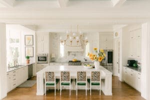
The warm beige kitchen trend is here (even the kitchen we inherited is beige) and that means we need to do a refresher on the undertones of beige.

The warm golden neutrals (aka beige)
The category “beige”, or the yellow/golden based neutrals on the neutral colour wheel, have 5 undertones in my System, as shown here on the right hand side of my Understanding Undertones neutral colour wheel. The wheel in this image (below) is propped up against a pink beige vase and an orange beige one.
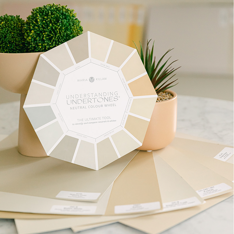
Showing under the neutral wheel in the photo above are the beige undertones in my large painted samples. You can shop them here.
The point of having the Killam Colour System collection of 50 neutrals and whites is so that you can narrow down from the ones that look ‘pretty close’, to the perfect one.
The minutia of the right neutral and the wrong one is often so slight you’d wonder how that could possibly be the case.
You can only see the subtle differences in undertones by directly comparing various boards to your decor. Yet if you slather the wrong undertone on your cabinets or walls, you’ll see it! And you won’t be able to unsee it 😭
This is the reason that the boards are such an amazing tool. They are just big enough that you can step back and easily see whether the undertone looks right.
That too is the reason you need all 50. The Killam Colour System Collections represent the complete range of neutral undertones from the very lightest to the mid tones. As well as the best whites sorted by gradations from cool to warm.
Why is that important?
Because if you order a sample or two of colours you think might work, and you don’t also compare the other similar undertones to your fabric, countertop, tile or what have you, you won’t see if there is a better one. The right one. Not the pretty-close-but-not-perfect-one.
The Shaded Cool Neutrals (aka greys and taupe)
The left hand side of my Understanding Undertones Colour Wheel are the greys and taupe. These are the cooler, shaded neutrals. They have green, blue and violet undertones.
In the grey trend and well into the white trend, people were trying to update their earthy gold and beige finishes with “warm” greys. Only to find they often looked blue! Or purple!
The secret to why a seemingly warm grey can go blue or purple in the company of golden beige tones is in the magic of undertones.
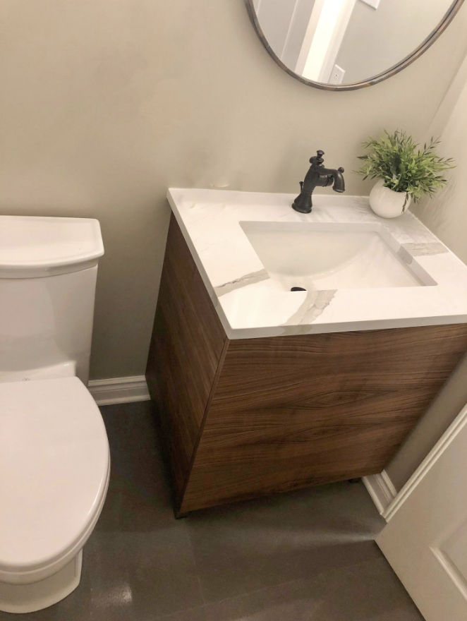
See how a popular green grey, BM Revere Pewter, looks violet in this readers bathroom below?

And how it magically looks right after the updated the hard finishes (below)?
Related post: Ask Maria: Help, My Revere Pewter Cabinets Look Purple!
Top 7 paint colours for the trending warm kitchen
I’m sharing how and why this happens on this week’s Create Your Dream Home episode on YouTube.
It’s all about getting the trending warm kitchen right. So I’m also sharing how an influencer who is currently in the testing phase of coordinating a cabinet colour to her countertop could end up in this situation 😬
I’m also walking you through the 7 best warm neutral cabinet colours if you’re updating your kitchen or planning a new build and want to do this look in a timeless way.
Watch it now! And if you want to LEARN HOW to Create Your Dream Home and make the best decisions for your new build or renovation project, sign up here.
Related Posts
The BEST Kitchen Cabinet Colours with Grey Floors

I love how Maria’s blazer matches the black-orange countertop!
Maria, please address the elephant in the kitchen, so to speak — the presence of large rectangles of cool-toned, stainless steel, i.e., appliances. All the trendy warm-toned beige kitchens I’ve seen include gold-toned hardware and light fixtures — yet the kitchens have massive stainless steel refrigerators, freezers, microwaves, ovens, etc. To my eye, it does not work.
A while back she had a post on the undertones of different brand’s stainless steel so you could make everything in the kitchen work out together. I think Thermador had a green undertone, but don’t remember the other brands.
The comparison of the Revere Pewter bathrooms before and after the finishes were changed was one of the best comparisons you’ve ever done on your blog!
Maria, I know you love yellow but you look amazing in Green!
This was very informative. Would love to see your suggested warm neutrals for kitchens in Sherwin Williams options.
Agreed. BM is nowhere near my house so I use Sherwin Williams and would love a post on those top colors.
Same, I just watched the video waiting for Sherwin williams suggestions and nothing… 🙁
Love this post and video! So helpful to better understand the neutrals! Thank you!
I don’t like watching YouTube videos. Wish you would just list the paint colors in your text here.
I want to credit my dear friends, Anna and Gabe, at @inhonorofdesign for the amazing kitchen at minute 9:17…a labor of love to choose that stunning neutral green, soft countertops and warm glowing hardware. I was tickled to be watching along and then have their kitchen pop up. For anyone who wants more, she shared every detail that went into that design on her insta and blog! Thank you, Maria, for your GIFT of colour wisdom!!!
Hi, Maria. Long-time fan of your blog here.
I wonder if you could do a post for those of us who are buying off-the-rack cabinets and don’t get options for our paint. With Ikea, for instance, you can choose flat or panelled doors, and there are only a couple of whites or beiges available.
In my own case, there was only one off-white that didn’t clash with my living room walls, so I’m having to retro-engineer all my other fixtures.I know you say never start with the cabinet color, but that is the unfortunate reality for many of us.
To clarify, I’m talking about things like Thermafoil cabinets, which are a budget option but aren’t really meant to be painted. (I know about Semi Handmade doors, and that’s something I’ll look at doing in a year when I’m not also gutting my kitchen for water damage, but for now I need help to know how to choose tile and counters to match the cabinets.)
I truly wanted to try the warm, midtone kitchen cabinet trend, but I chickened out. Those colors look timeless to me, but I have an entire house of crown and base molding that’ll be repainted white, plus new windows with simulated divided lights painted the same color. The cabinets will go to the ceiling and blend into the crown. I had to pick the window paint color before I could get my kitchen design done, so I gave up and chose BM’s Chantilly Lace for the windows, all trim, and perimeter cabinetry. Islands will be a light stained walnut, and all counters will be oiled (turns black) soapstone. Floors will be medium brown, stained red oak. Perhaps I’m installing a dated look, but I’m hoping “white” is still classic, even though it’s not the current favorite. I knew the soapstone would go with either the clean white or midtones, but I didn’t want a midtone cabinet color to forever dictate my all-house wall color and furnishings (yet to be selected). I am using classic chrome fixtures with a bit of brass (maybe lighting and island hardware). Considered BM’s Simply White and White Dove, but they just looked too yellow and dingy, respectively in my west facing space. Sure hope this look isn’t considered “dated,” but I followed Maria’s time-honored advice as best as possible for these fixed and expensive elements.