


Here are 4 ways to use the trending warm neutral colours for interiors in a timeless way. Including why trends are defined by the popular neutral of the moment; and the case for happy colour.
There is no easy foolproof way to know what is trendy vs. timeless. But it starts with an awareness of what the trends are, where they’ve been, and where they are going.
And that’s where I can help. Because this is what I do. I’ve been at this for more than 25 years, and I’ve seen a few major trend cycles come and go.
BTW time is running out to attend my Create Your Dream Home Masterclass where you’ll learn how to choose the right colour for everything in your home. Because if you choose the wrong colour, you’re going to hate your house.
So first: what defines a major trend?
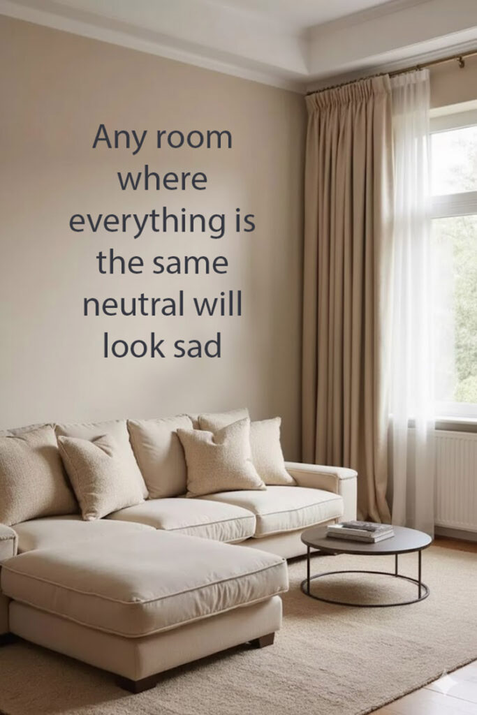
Great question! It’s not what you might think. Because while you might think you are playing it safe choosing neutrals for everything for your home, this is exactly where you’re most likely to go sideways into trendy territory.
Let me explain.
If you’re choosing finishes like tile and furnishings like your sofa in a safe neutral? The thing to know is that the specific neutral that is widely available in stores is going to be the trending neutral that defines the current trend cycle.
That’s right. It’s the dominant neutral that defines the 8 to 10 year major trend cycles.
So if you’re playing it safe and installing the neutral tile, buying the neutral sectional; then you continue on choosing neutral drapes and matching the wall colour to the tile? You’re dangerously close to creating a room that’s sure to be dated within the next few years.
At this point in my career I can walk into any house and guess in which 5 year span it was built, when the partial renovation was done, how recently the sofa was purchased.
If sticking with neutrals isn’t timeless what is?
A simple way to make timeless choices is to avoid going overboard on the trending neutral of the moment.
Here’s what the major trend cycle timeline looks like.
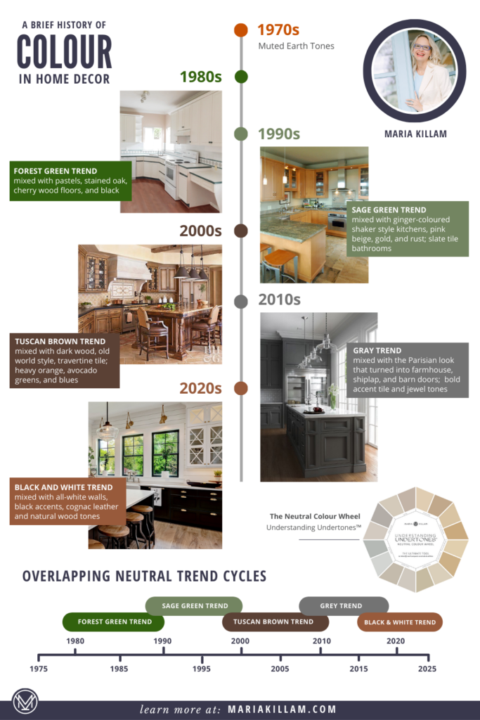
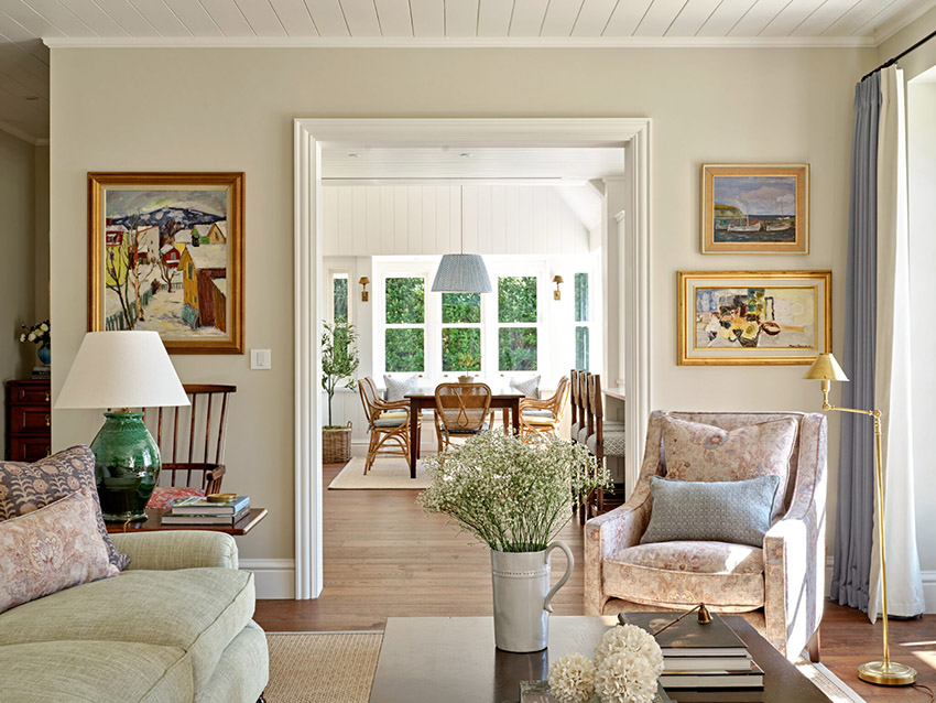
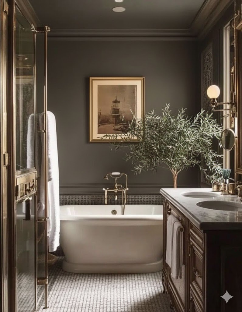
We are emerging out of the stark black and white trend right now. And going forward with warmer looks that have more to do with the sage green trend and the Tuscan brown trend. That’s because warm is the perfect antidote to the cold, hard look of black and white.
We are running away as fast as we can from this:

Towards this:
AI Altered
And this:
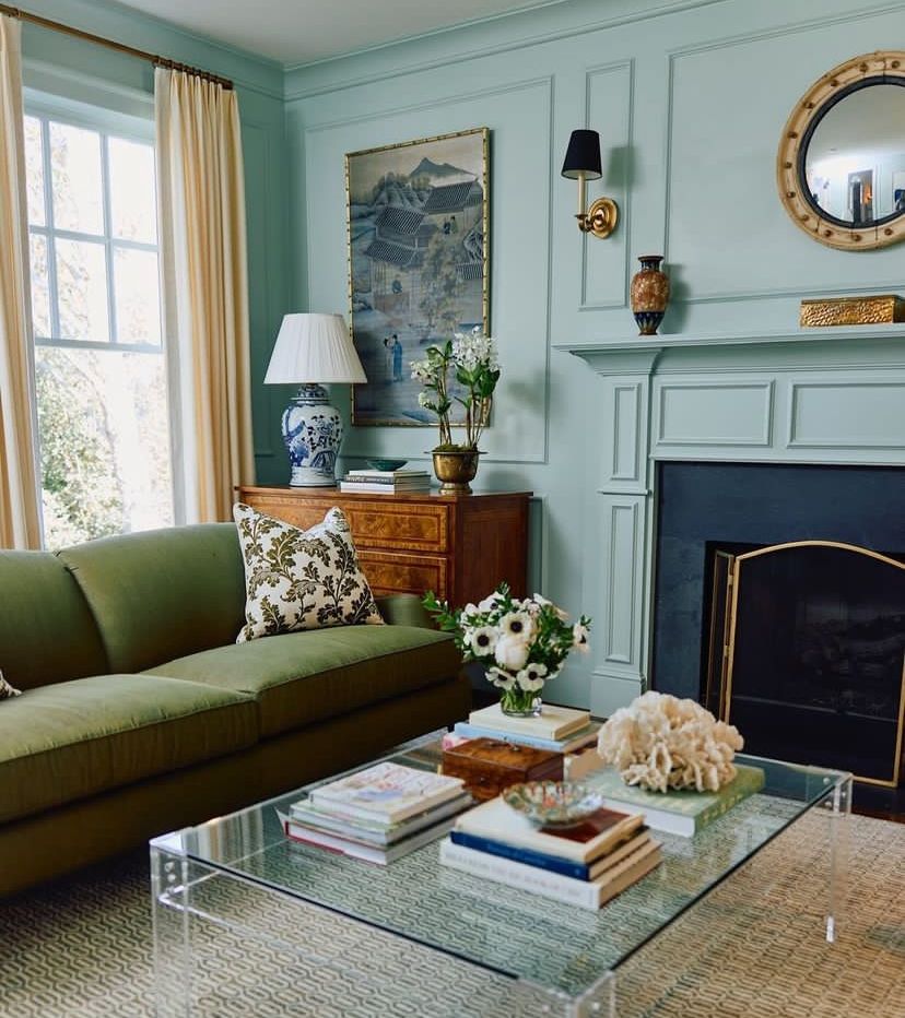
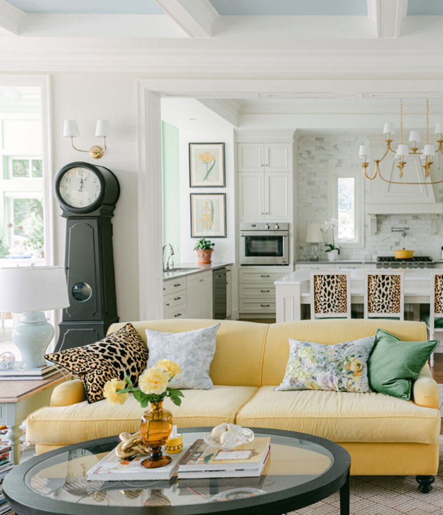
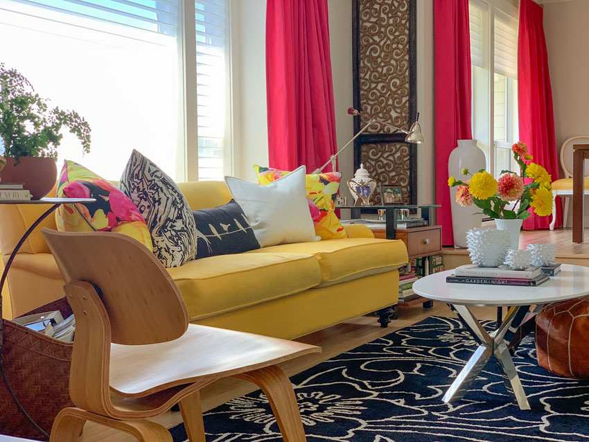
Lots of happy colour is also being used in interiors to move away from the stripped down look we’ve seen way too much of. Notice how while this room below is traditional, it has lots of colour and you can’t immediately say what year it was decorated.
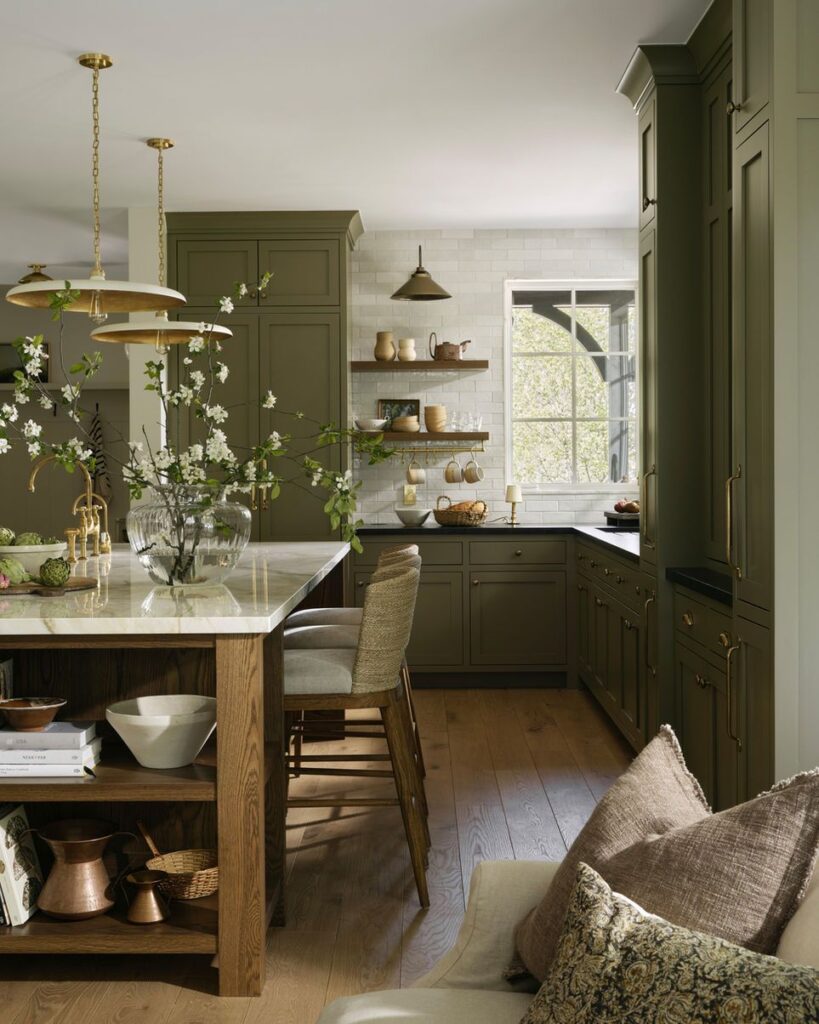
However, many of us are afraid of colour, so we are now largely in the world of beige and taupe. You can see this most clearly in the trending warm neutral kitchen. AKA the English country kitchen, or the cashmere kitchen.
There’s already a backlash on social media against “sad beige”. And there it is. Because what makes anything look dated is:
- The overuse of it
- Seeing it done badly
AI Altered
But a pale warm beige room well decorated with colour is a beautiful and timeless thing.
So the key is to learn how to embrace neutrals the timeless way.
Here are a few of my best timeless tips:
- Choose a sofa in your favourite colour – Did you notice the green sofa in the room above?
A neutral sofa, on the other hand, is the first giveaway of your decor for all the reasons we just looked at.
And if your living room is feeling too neutral, my pillow module in Styling school will not only teach you how to buy the right pillows, but how to balance colour so it looks like a designer was there. You can buy the course here.
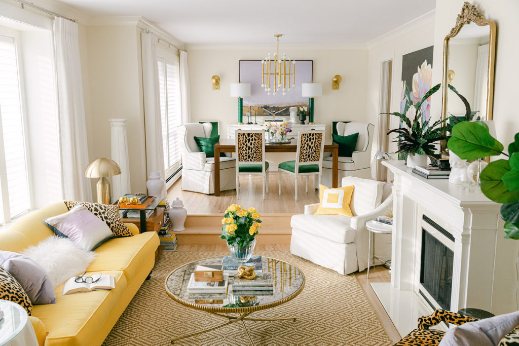
My sunflower yellow sofa has been through four makeovers in its life so far, this is the most current one:
Here it is in my last home:
And this is what this living room looked like when I moved into this bungalow:
When I first bought my sofa when we lived in a townhouse:

- Avoid installing tile and finishes in the trendy neutral of the moment. Stick to simple white or cream and sometimes, a little black, and your future self will thank you.
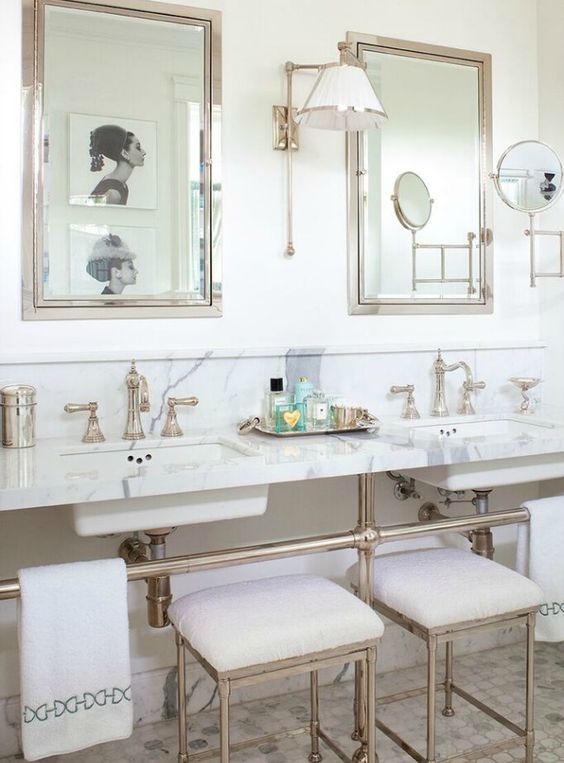
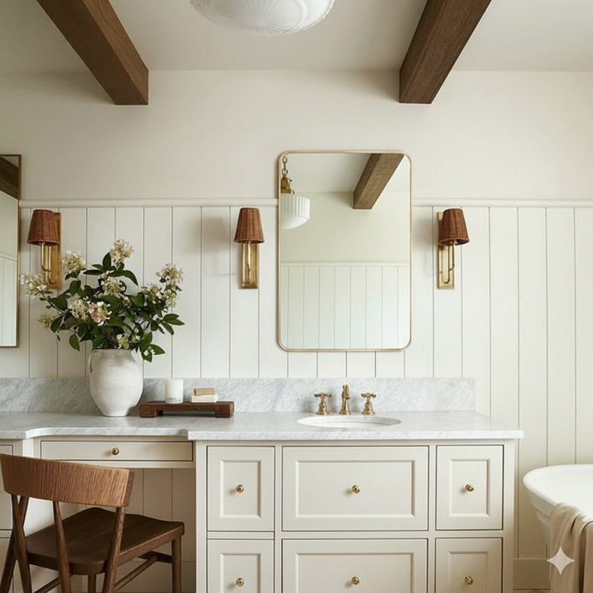
I posted this pretty bathroom on the blog in 2012 and it still looks perfect via Design Chic
3. Keep your neutrals pale. When it comes to choosing glued down finishes in anything other than white or cream, stick to pale neutrals. Whether you’re choosing warm beige neutrals or any of the undertones of grey or taupe, the pale versions of all the undertones have greater versatility and longevity.
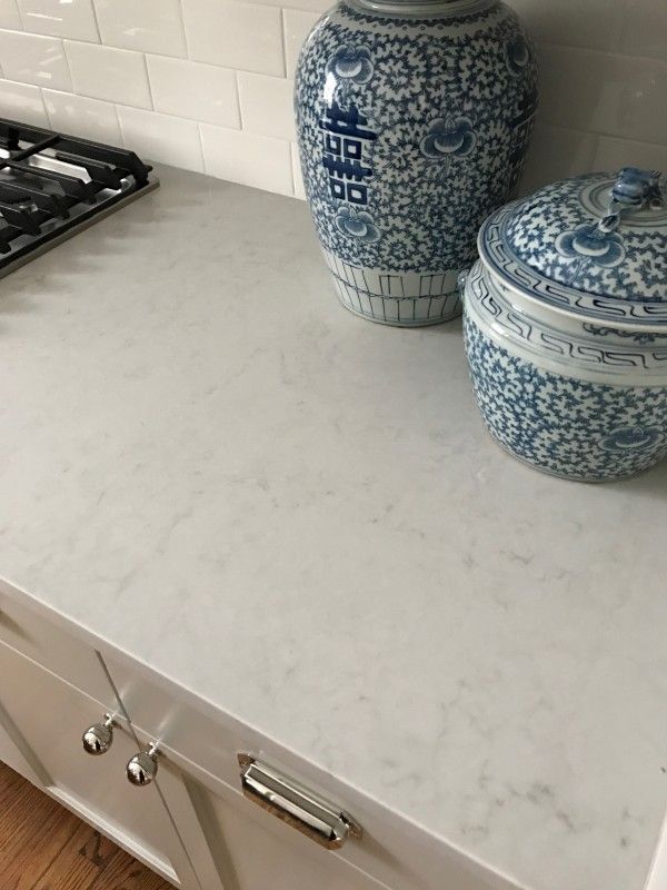
I specify this pale green grey countertop often in my eDesign consultations, it’s a pretty and versatile stone look quartz with subtle veining.
4. Indulge in all your favourite trends with paint and decorating. Paint is easy to change. Decorating is less permanent than glued down finishes. This is where to have all the fun!
The real magic of a white or cream bathroom is that you can decorate it with any colour you like. A “timeless white bathroom” means the countertop and tile are versatile white. But that doesn’t mean it needs to be clinical looking.
Let’s say you’re currently in love with Benjamin Moore’s Colour of the Year for 2026, Silhouette AF-655. You could drench your white bathroom in this colour. But still have options when you’re over it again.
AI Altered
So try flipping your thinking on what’s timeless. Neutrals are useful backdrops, they need colour and interest in texture, contrast and detail to come alive. It’s completely possible to embrace the new warm neutral trend AND timeless decorating.
Tell me whether you are team neutrals or team colour or somewhere in between in the comments!
Related Posts
My Warm Wood & Timeless White Bathroom Renovation
Better than White: My 6 Best Paint Colours for Your Living Room

I am currently looking at porcelain tile for my
soon to be finished remodeled master bath.
I have purchesed two traditional white vanities
with carrara marble top and chrome antique
style fixtures. Our home is a french chateau style
and the other bathrooms have quadrafoyle tile
in showers and on floors. I would like to stay
with warm nuetrals….but am having trouble
deciding if I should go with quadrafoyle tiles
or marble look porcelain large format tile
as my tile installer is pushing for.!!
Any help is greatly appreciated.
Thank you.
Janice Michaels
Kill the large format tile, it’s cheap and easy to install that’s why installers push for it, but it does not add texture and interest and looks way too modern. Maria
These days I’d go for Team Color (my favorite of your yellow sofa rooms is still the one with your ‘raspberry’ curtains)
Great article! How do you add “colour and interest in texture, contrast and detail” if you are using “English country” neutrals on kitchen cabinets and walls? By adding artwork and colorful items on the counters?
Yes as well as beautiful lighting and the correct hardware installed correctly will make or break any kitchen or bath. Great question. Maria
I’m just finishing a remodel of the 90s bathroom in the house we recently purchased. We did keep the marble vanities and painted the walls gypsum white because I didn’t like warm whites or taupes with the grey undertones. There is pops of brown in the bathroom as well. Now I need to paint and decorate the master bedroom and I’m not sure what color to paint the walls. White seems very stark but I do want it to go with the new bathroom. I do like green and it is throughout the home. The walls in the home are Repose Gray. Not my favorite but I’ll have to address them over time. Any suggestions on the bedroom.
I love Repose gray, but not as an all-over-the-house color. It’s too dark for me to do that. But I have it in two bedrooms. My walls throughout are Gossamer Veil. I love blues with brown, so I think that’s what I would paint my bedroom if I were you. In fact, I did paint my bedroom a blue-green gray! I used Silverpointe, which I think is beautiful with browns. But if you want to get away from grays, there are plenty of blues to choose from.
I love color but also find the neutrals restful. What is the best color to paint doors, trim and baseboards? It seems like everybody is painting them shades of beige or even black. I am leaning towards white because I do not want to paint again in a few years.
That is exactly correct. My take on this is if you have to work that hard to add colour to your all white home, just paint the walls. Easier to change. My White is Complicated ebook is perfect to choose the right white. Thanks for your comment. Maria
I’m currently doing a slight makeover on my kitchen. My husband and I laid white oak floors and are now in the process of choosing new cabinetry and countertops. I want to stay timeless with my choices because it is expensive. I am thinking of going with the shaker style Medallion cabinet in Buff with champagne bronze knobs and pulls, “Carrara Marble” Quartz counters and white subway tile backsplash. Thoughts?
Team color all day. Yes to white and cream hard finishes except my heart belongs to soapstone counters for a kitchen 😉
Hello Maria,
Thanks again for sharing your expertise with us! A quick clarification: when you use the term “pale neutral,” are you talking about neutrals that are “desaturated,” or that have a hint of gray in them (I’m thinking of colors like maritime white, white dove, ballet white, etc.) vs. ones that seem like they have more color? I know you talk about this a LOT (complex creams?) but just wanted to make sure I’m tracking!
Pale neutrals are the palest of the greys, taupes and beige undertones they have more pigment in them than just an off-white or cream which are generally too thin to work really well as an open layout paint colour in anyones home who also doesn’t have a bunch of white furniture to work with it. Great question, Maria
Hello Maria,
I was thinking of painting my sub floor in my kitchen and then stenciling it. I don’t mind the work and it’s cheaper to do than tiles. However, I am struggling over colours and design. Was thinking scandinavian tile stencil with warm white as first coat and gray with terracotta highlights.
Other options were palladium or trinidad patterns in greys and terra cotta. Problem with palladium is its 12 in x 12in stencil and may look to busy on my floor even though I love the pattern. The Trididad is big 17in pattern and I like that but not sure if it’s too busy. My kitchen cupboards are knotty maple and honey coloured now with time, so, the grey I wanted to pick would be warm in hopes it would work. Not sure. If you can give me some small feedback, it would be wonderful. But, if you can’t, all is well. I’ll just keep mining.