


There is a new warm neutral trend replacing stark black and white, embracing soft, cozy vibes with colors like beige, taupe, and warm grey. While this trend is taking over, can we make it timeless?
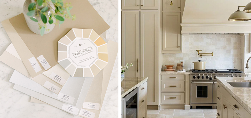
The secret to success is choosing the correct neutral undertone that relates to your home’s fixed elements. Learn how to find your perfect match, like the green beige that coordinates with my Calacatta Gold marble, using the Understanding Undertones™ Colour Wheel or the new Killam Colour System™ Paint Dot Library.
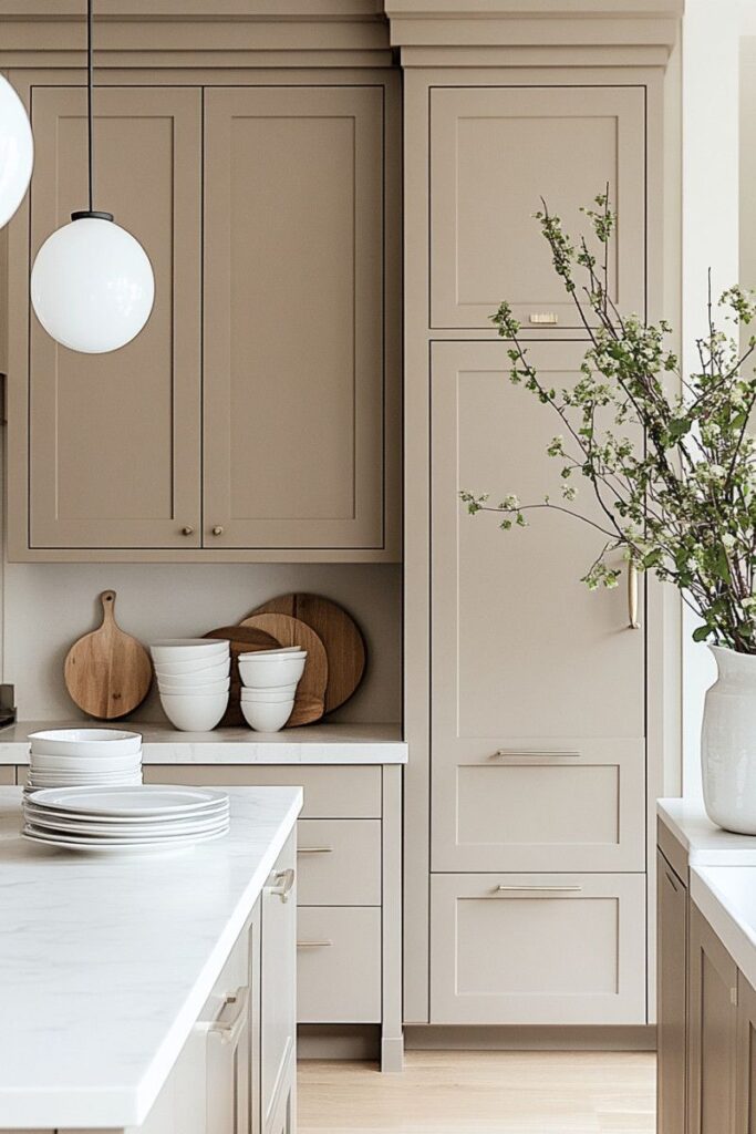
The Warm Neutral Cashmere Kitchen
A new sexy term for the trending warm neutral or English Country kitchen popped up in my feed this week: The Cashmere Kitchen. And I thought, yes exactly!

Because soft and cozy is the perfect antidote to the stark black and white trend we are all getting over fast. How lovely would it be for your kitchen to feel like head to toe cashmere? Luxurious and classic.
And yes beige.
This kitchen below is what the runway outfit above would look like if it was a kitchen.
You can see the 5 undertones of beige on my Understanding Undertones™ Colour Wheel. Pink beige, orange beige, yellow beige, gold beige and green beige.
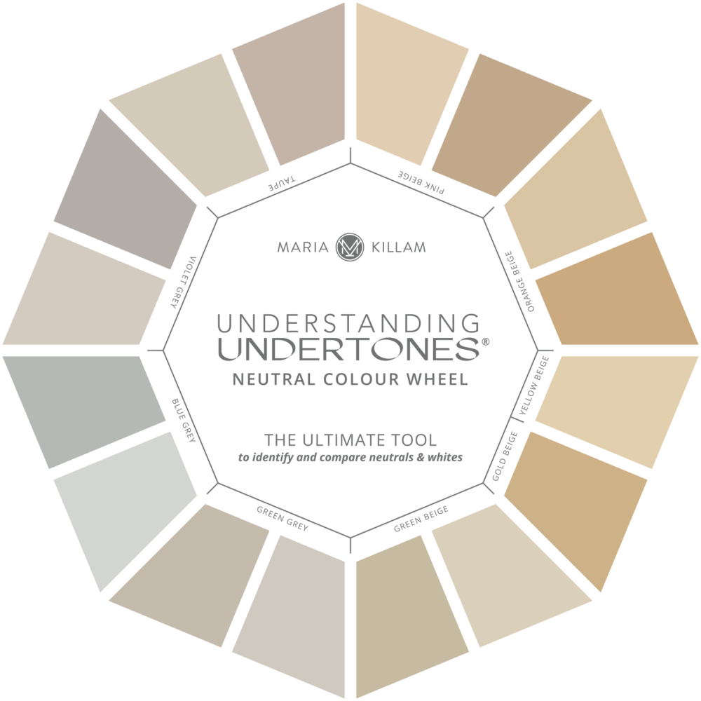
The warm neutrals being chosen for the new “cashmere kitchen” also include taupe and the warm greys (green grey and sometimes violet grey). The right one for your kitchen depends on the neutral items in your home. And you can use my Understanding Undertones™ Neutral and Whites Colour Wheel to determine the best undertone for your warm neutral cabinets. Get yours here.
But is the warm neutral kitchen timeless?
It can be, yes! Because while warm neutral cabinets are the hallmark of this trend (and it’s taking over fast!), the important details and hard finishes can be completely versatile and timeless. White countertops add the soft contrast that’s needed to keep this look from feeling too bland.
Timeless white countertops and tile will also allow for the cabinets and walls to be painted any colour in the future. If in a decade or so you’re over warm neutrals and fall in love with sunny yellow cabinets? You can have them!
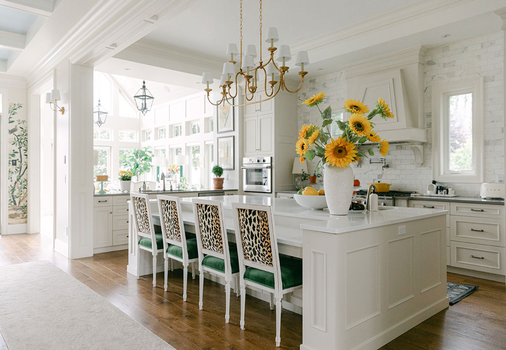
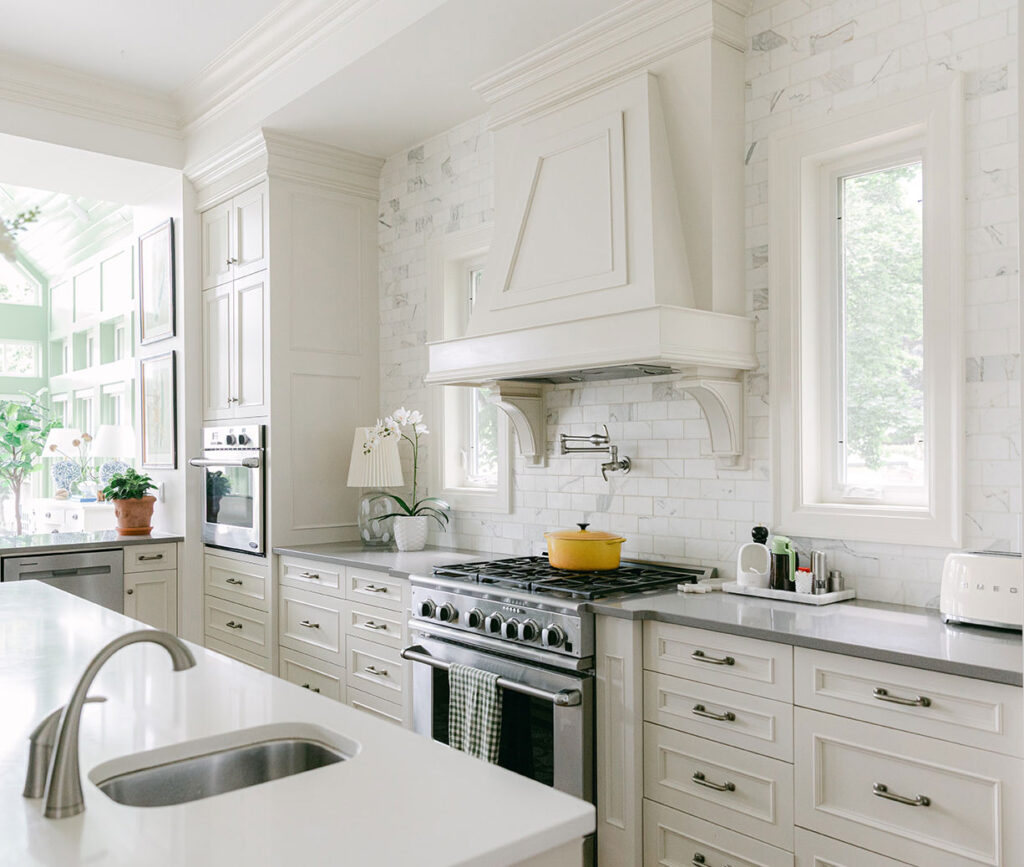
I was delighted to inherit versatile timeless finishes in my on trend warm neutral kitchen. The cabinets are a pale green beige like Benjamin Moore Manchester Tan HC-81 / Sherwin Williams Canvas Tan 7531 and they are perfect.
How to Choose the Perfect Neutral
What makes green beige the perfect neutral undertone for my kitchen? Green beige relates perfectly to the warm gold veining in my Calacatta Gold marble backsplash.
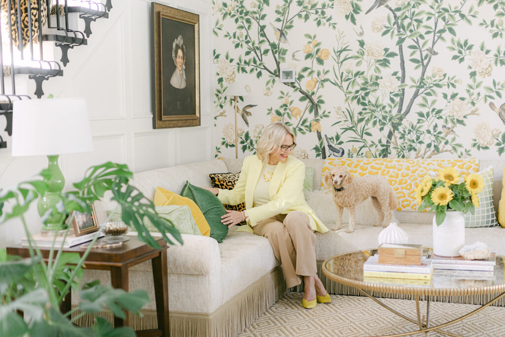
I’m happy my cabinets and walls are green beige because it’s a perfect backdrop for decorating with my favourite colour yellow 💛
I chose my wall colour, a green beige complex cream, BM Feather Down OC-6, to coordinate with my cabinets and marble. And then I had my custom corner sofa covered in green beige chenille to match. Once you have a neutral undertone in the room, you need to keep repeating it for the other neutral elements.
So choosing the right neutral undertone in the first place is key.
How do I find the right neutral undertone?
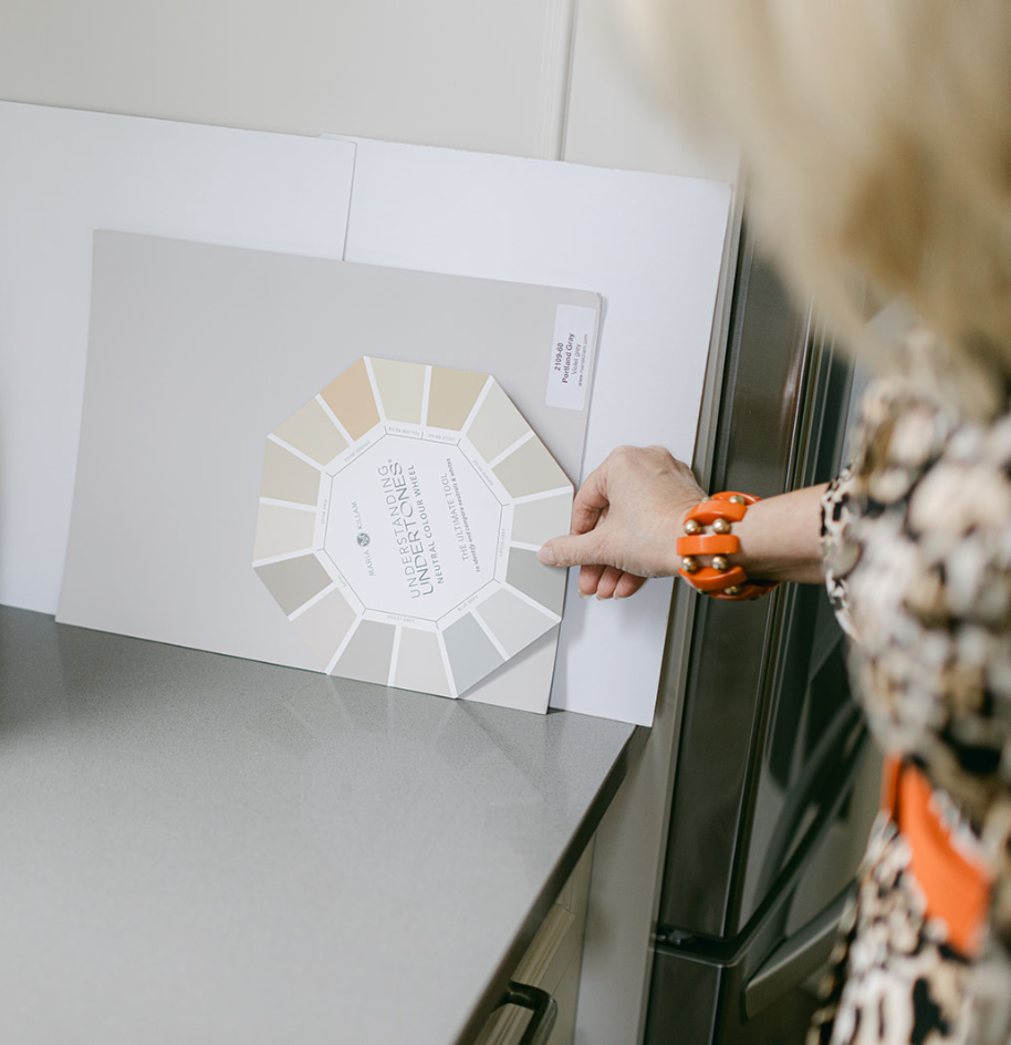
The first place to look is the countertop and backsplash (if they are not white) or the floor tile. Wood floors don’t count, they can usually be treated like a pair of jeans that go with everything. If you do have versatile, natural brown wood floors and white or cream countertops and backsplash (the ideal timeless scenario), then your furnishings are the next place to look. The undertone of your neutral sofa or chairs for example.
This is where you will need my Understanding Undertones™ Neutral Colour Wheel and eBooks.
Use the colour wheel to narrow down the undertones you need to consider and then confirm by testing with large samples. You can find my collections of large hand painted board in the best warm neutrals curated by undertone here. Or you can explore my colour wheel colour collections on Samplize.
New! Announcing the Killam Colour System™ Paint Dot Library
I am thrilled to announce the launch of my new Killam Colour System™ Paint Dot Library—the ultimate digital shortcut to finding the right colour and creating cohesive mood boards in minutes!
The Paint Dot Library is your instant copy-and-paste library of all my system colours (aka the best-approved paint colours organized by undertone) eliminating overwhelming choices and making digital mood board creation fast and accurate. If you’ve ever wanted to use those little paint dots on your mood boards, THIS resource is for YOU!
Neutrals are more complicated than whites
Everyone has been choosing from a handful of high profile white and off white paint colours for a decade now. But embracing the new warmer look means choosing from highly nuanced neutrals. And that is more complicated. So I’m here to teach you the smart and easy way.
Because installing a new kitchen is not a project where you can just cross your fingers and wing it.
Choosing neutral paint colours without knowing how tends to go like this: I’ll go with the warmest warm neutral because warm is the moment, so I’ll hedge my bets on warmest one? Only to find that the random neutral you chose doesn’t relate to anything in your home. And it’s super bossy.
There is a method to choosing the perfect warm neutral, but you don’t know what you don’t know. So if you’re about to spend a whole lot on a new kitchen, please join me first in my Fall Masterclass: Create Your Timeless Dream Home to learn how to make the perfect colour choice for ever selection you’ll need to make for your home.
Related Posts
Why a Beige Kitchen is a Tricky Design Project
What Everyone Should Know about Warm Neutrals
These are the Defining Interior Trends of 2026

I have C2Paint Kolhari and I love it
Thanks to you I’ve discovered a real love for green beige. In our renovations I’m working toward that as our main hard finishes neutral, and a sprinkle of orange beige complex cream. Warm but not heavy.
I agree with the premise of this post, that this cashmere kitchen is timeless if the homeowner can afford to repaint in a few years, as the color shown is beautiful but also trendy and I’m afraid will look dingy and possibly even dull to the homeowner eventually.
My question, while the white countertops look good here, if the homeowner chooses to paint the cabinets white down the road, will that be too much white with both countertops and cabinets white?
I love your beautiful kitchen, Maria. To me it is more timeless than the cashmere kitchen because the color is paler, or at least it seems to be in the photograph.
Thank you so much for your thoughtful comment and question. You’re absolutely right—when a new colour trend first emerges, it often appears in beautifully designed kitchens led by tastemakers who know how to create harmony with the rest of their finishes and décor. The challenge comes later, when the trend catches on with builders, who may start using that trendy colour in every new kitchen, sometimes without considering if it truly complements the countertops or the home’s existing style. That’s often when the colour can start to look dingy or out of place.
As for your question about white cabinets and white countertops: painting the cabinets white won’t automatically mean your kitchen will feel overly sterile or “too white.” It all depends on how you balance the whites, which undertones you select, and how the rest of your finishes and styling support the overall look. Layering in natural wood, warm metals, colourful textiles, or other textures can keep an all-white palette feeling fresh and timeless. My own kitchen, for example, uses a slightly lighter shade than the cashmere cabinets shown in the post, and it works seamlessly because I paid close attention to the neutral undertones throughout the space. This approach ensures the colours remain cohesive and harmonious, rather than clashing or looking dull. Thank you again for your comment
Thank you, Maria. That all makes sense, as you explain it. Cohesion and harmony make all the difference.
These colors make me sooooo happy!
Haven’t painted ours bedroom for 21 years. Yeh it’s back in style and paint is still beautiful on the walls.
What happens if instead of white, you choose Stormy Black soapstone for the countertops. What would be a good choice for a neutral for the cabinets and walls instead of white?
What is the colour of the cabinets in the runway pic? That kitchen is stunning!
Would BM Sea Salt be considered a warm neutral? It’s been described as a warm griege. Thank you !
Your kitchen is beautiful. I need to paint my cupboards a creamy color. Do you have a group of creamy paint colors that go with your different categories of neutral undertones? I need to assess my countertop undertone. I think it’s violet grey. Thank you.
I’d love to share my story of how your color system resulted in a wonderful kitchen remodel, but the “share your story link” is no longer accepting responses despite being less than a week old. Is there some other way to submit and also to get the free new paint dot system?
P. S. I also used your color consults on painting my home, Hale Navy and the selecting the green from my office. Very happy with your expertise and systems.
Same here! The link wasn’t even up for a week!
Hi Sue! Feel free to email your testimonial, head shot, and before/after photos of your kitchen project to get your free paint dots! Email [email protected]
Or, you can order it here: https://mariakillam.com/product/paint-dot-library/
Gosh, I missed out on the free dots because I was on vacation in Rome! Anyway, I have great pictures of how I managed to make my old blotchy tile look good by choosing the right neutral for the walls. I still prefer warm grays over beiges, but at a glance, most warm grays look beige anyway.
Hi Stacy! Feel free to email your testimonial, head shot, and before/after photos of your kitchen project to get your free paint dots! Email [email protected]
Or, you can order it here: https://mariakillam.com/product/paint-dot-library/