


I have been whispering about the return of beige for a while in other posts, here and here. And it’s been showing at High Point Market too.
But when it hits the big box decor stores, that’s when you know. Its truly and officially back!
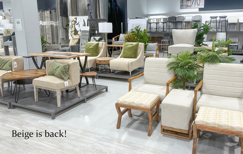
Beige is back
While Tricia, my Director of eDesign and I, were shopping and decorating all of Edmonton together last week, we visited several HomeSense locations across the city and the beige theme was consistent throughout.
It’s officially clear. Beige is here, grey is only a side player.
How to warm up your colour palette with beige
But don’t panic if you still have lots of grey finishes and furnishings in your home. For one thing, pale greys and greiges will ALWAYS have a place in timeless decor. As I’ve said before, it’s only the overuse of grey and charcoal that is looking dated.
I say this again because many of you have asked whether marble and marble look quartz with its grey and greige veining for example is dated now. NO, absolutely not. They will always be timeless. Much more timeless than some of the trending over the top stone patterns in earthy red tones and black for sure!
But if you DO think maybe you’ve gone a tad overboard with grey (or with black and white) BEIGE is probably going to be your friend.
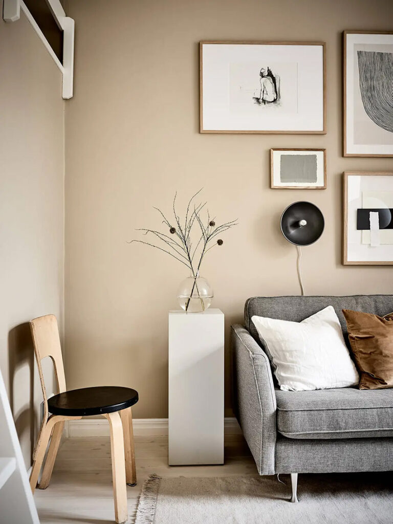
One solution we’ve been offering to eDesign clients with too much grey, especially with grey floors plus grey furniture, is to paint the walls a warm complex cream and add some beige toned pieces and textures to the space.
What everyone should know about Orange Beige (and Caramel)
And one of the most popular beige undertones right now is ORANGE BEIGE. Let’s call it the trendiest new neutral!
Technically, the deepest orange beiges are in the realm of caramel and cognac. Terracotta, it’s slightly more saturated cousin is also trending.
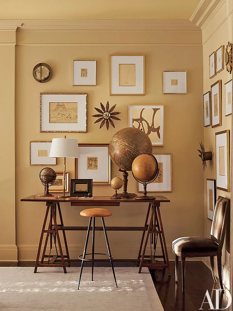
Caramel walls by Suzanne Kasler
But we’re also seeing a lot of Orange Beige Complex Creams and pale to medium toned caramels.
And truly, in an otherwise desaturated room, a mid to deep range Orange Beige acts like an accent colour to warm everything up. Just make sure you have the undertone right. And that you repeat the beige, just like you would an accent colour using my Colour Balancing Method™. You can learn this method here for FREE!
Orange Beige is sometimes hard to identify.
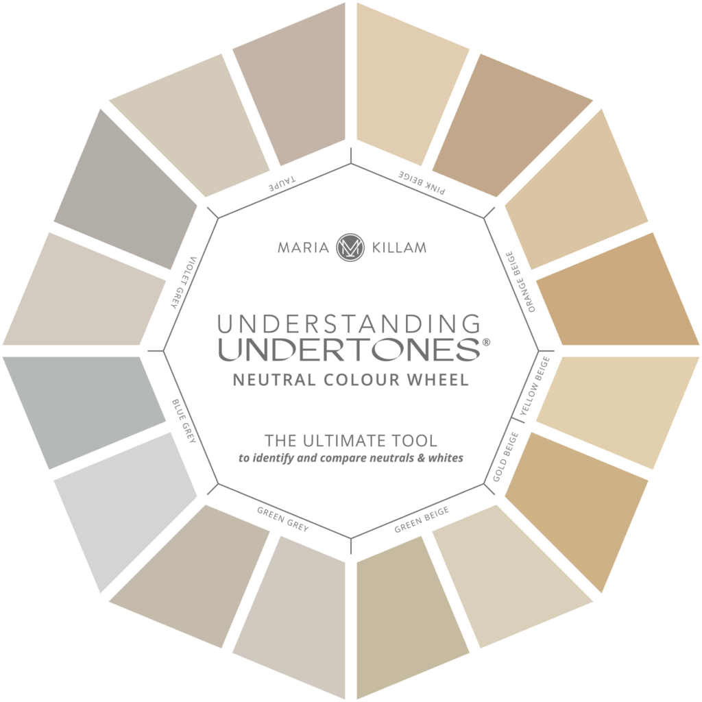
If you look at it on my Neutral Colour Wheel it’s more yellow than Pink Beige, and a hint warmer than Yellow Beige.
If you pair it with pink beige elements like linen for example, it can pull too yellow.
But if you want a cream look that is on the golden side but won’t go green or sour, look at the Orange Beiges.
Really orange is the ultimate warm colour. And warmth is frankly what many too stark and cool rooms need right now.
If your white or grey room needs warming up. try layering in more wood tones and beige.
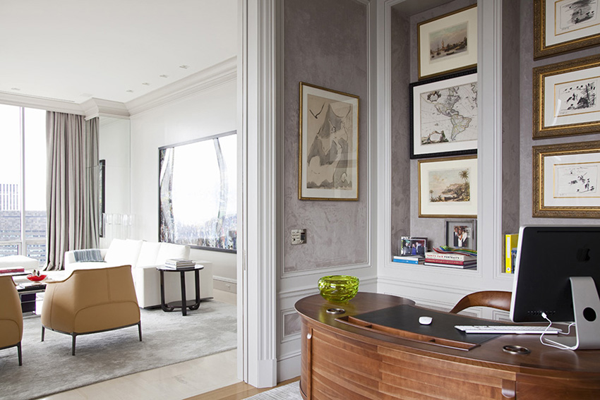
Caramel leather, wood tones and warm gold warm up a grey room by DB Arquitetos
Also, don’t forget a great art wall and styling!
But a word of caution: if your room is heavy in charcoal or black, introducing orange beige will only look HOT and stuffy. These toasty tones are best balanced with lots of white or cream.
This applies to both interior and exterior.
And in the context of many shades of grey, especially Violet Grey, Orange Beige can look too yellow. So learning how to identify and coordinate your undertones is more important than ever with beige looming large on the scene!
It’s not too late to sign up for my Expert Colour and Design Training this fall! You’ll learn your way around all the Neutral Undertones to be ahead of the curve now that beige is back! Plus you’ll learn all about decorating with colour, working with a timeless aesthetic, the best decorating and styling tips and more!
Time is running out to join me IN MY HOME for a one of a kind colour training event! You must register by September 29, 2023!
Related posts:
This Trending English Countryside Kitchen is Bringing Beige Back

Maria, please proof-read your copy before posting. There are so many grammatical mistakes in this piece that lessen its important content. There are sentence fragments instead of a comma. There is an” it’s” where there should be an “its” (an apostrophe is used in this word only when it is a contraction for “it is”). There are missing commas and misplaced commas.
It might seem trivial but for some of us bad writing is as jarring as mismatched neutrals are to you. You have truly innovative ideas that deserve equally good text.
Thank you for all you do to educate us in the world of color.
And a ‘you’re’ instead of ‘your’…
I agree
I meant to agree with Lee. Criticism like this should be sent to Maria politely and privately IMO.
Celestial, the words and spelling are important. Why I love these posts is because they are real and not always perfect. Maria is inspiring us with her creativity and flair. FYI, It is very ‘off putting’ for creative people to be told off when they are sharing their talents so freely.
Having bad grammar is not a talent. Professionals should know how to write properly or at least have a proofreader. It is very off putting indeed and makes me wonder about things. Better to tell someone than let them live in ignorance, they will pass as fools, and that is a disservice.
Is BM Navajo White a yellow-beige or and orange beige. I believe I have seen it reffered to as both. Confused…
Wondering this myself. Thanks for asking.
In my system it’s an orange beige complex cream. Compare it to the yellow beige complex creams in my system and you’ll see it. You’ll find the list of curated colours in my system go to the bonus book of colours in the back of either of my ebooks!
I guess this is good news for me, since I have granite countertops that have orange beige, pink beige, taupe and black in them. I can’t even find bath towels in ivory, everything is stark white.
This is such good news for me because it’s been a while since a neutral color was trending that I love! Perhaps it will finally be easy to find things that fit into my home (cream, wood tones, blue, green, orange).
What is the undertone of walnut?
I have the worst orange beige tile, “stone” look floors in my kitchen. And it’s paired with Baltic Brown granite – the worst of both worlds. 😬 My floors flash peach/apricot very easily. I placed complex cream paint samples next to it, and they all looked very yellow compared to the floor. The walls felt like a landlord primer white special before – way too bright and clean for the colors in the room. I found a compromise by finding an orange-based cream wall paint that coordinated with the minority colors in the granite and in the lighter shades in the floor. The complex cream looks very pale, nearly white on the wall, but it’s not jarring like the primer white. Even though it’s not a perfect fix for the undertone conflicts, it at least calms the room down a bit. I’m really not a fan of peachy colors now. 🤣
Earlier this year I painted our living room Casa Blanca. Wasn’t trying to catch a trend, but now I feel all current 😉
I love your blog and just got through rereading your white is complicated ebook to refresh my knowledge. Perhaps too late. I just painted my upstairs hallway trim coming down the steps and my first floor hallway trim Simply White. It looks nice and fresh. I still have to pick a wall paint color for these spaces. My kitchen and great room have 10 windows and one door with cream trim that color matched my off white cabinets when the kitchen was installed in1999. All the window trim looks fantastic, so I am not going to repaint that. However I need to paint my dingy, yellowed kitchen cabinets and assume that I should match the window trim in the great room. The question is, was my SimplyWhite trim okay since it is an off white and not jarring? The point is I have two trim colors when perhaps I should have made a different choice.
As I am sure you know, it is difficult to decorate over time, and the cohesiveness of rooms is lacking. The result is not awful, just not the perfection we seem to strive for which is often a fantasy for real life. Sorry for the long post. Ultimately I am looking for some reassurance. I still have the living room and dining room to paint, but not a priority right now. Thank you.
“And in the context of many shades of grey, especially Violet Grey, Orange Beige can look too yellow.”
This is what happened to me! We have very bossy and mostly grey slate tiles throughout the main level of our house. A couple years ago I was dying to paint over the blue grey walls we inherited and I was inspired to pick an orange beige by the more cognac tones in some of the tiles. While I love the color on the walls that get less direct sunlight, the west facing living room and dining area look too yellow to me. What should I have done instead?
Spent more time coordinating to your decorating rather than just the floor tile. Maria
Well I just don’t know if I’ll ever get the hang of this stuff! When we buy our next house I thought I would get one of your courses, but I may be better off buying an eDesign package instead. In any case, I think you’re fabulous and my current home does look better than it otherwise would were it not for your blog. Thank you!
So funny that for me it never left. I hate white and always used beige as my base color in my decor.
Maria, thank you for giving so freely of your time and knowledge. Your blog posts are invaluable to anyone who wants to dive into the world of color!
I just ordered your system and am now in the process of collecting small paint samples for the undertones that apply to my space. Thanks to you, I am feeling a lot less stress, actually overwhelm, in navigating towards the right color for my space.
I am telling all my friends about your color system and said – “I feel like I won the lottery when I found Maria online”.