


Introducing a bold and colourful pattern to your living room can make it difficult to nail down your colour palette – especially if you’re moving from a minimalist style. Because bold patterns and jewel tones often blaze the trail toward a more maximalist style. And frankly, that makes my colourful heart happy.
See how I help this reader find the right colour palette from her colourful new fabric as she transitions to maximalism.
I recently received this question from a reader:
‘My great room has medium-tone oak hardwoods, solid black marble around the (painted) fireplace surround, and no other fixed finishes. Plan to continue with White Dove in my great room trim and ceilings.’
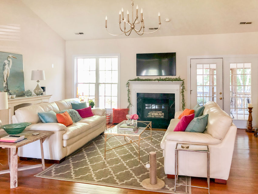
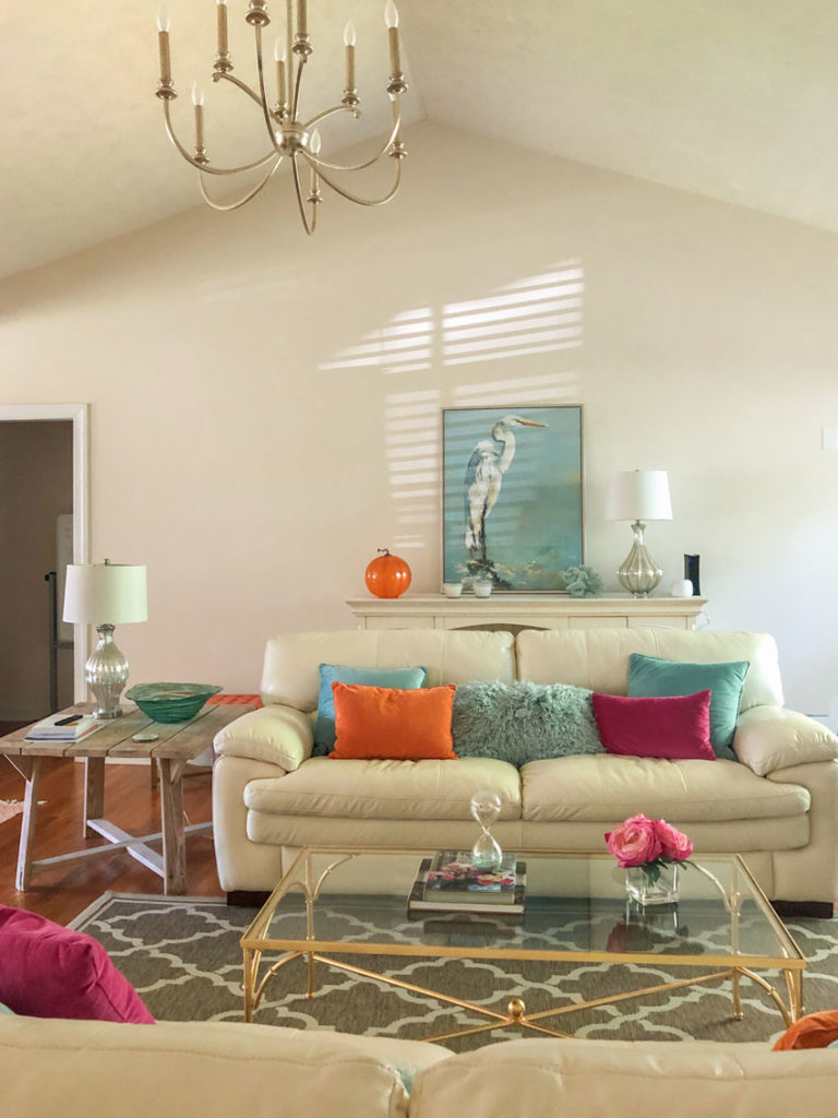
‘This room also currently has a cream leather sofa, a cream credenza, and a cream desk that might be in the complex cream family of SW Navajo White based on my Maria color boards. It’s previously owned, not bought for this space.
My “inspiration” and anchor for the color scheme of this room is Thibaut’s Honshu fabric in green, which will be my drapes. I love this floral’s happy pairing of pinks & greens with the splashes of orange.
I’m confused on what color family I should be considering for the walls with this (Complex Creams? Greiges? An Accent Color?) and in which undertone – green? yellow? orange? pink? taupe? ‘
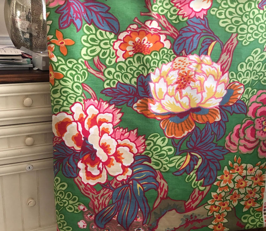
‘This fabric has so many colors it’s confusing me!
The cream furniture is confusing me as well – I fear it looking dingy – since I know from your e-books and blogs that pink-beige doesn’t get along with yellow and yellow-beige.
Is it that my cream furniture really needs to be replaced since I’m continuing with my off-white trim? Or is there a paint color that could pull this furniture and fabric together with an off-white trim? ‘
That fabric inspiration is so beautiful. But, my lovely reader hasn’t realized yet that the drapery fabric she’s chosen has just taken her living room in a fabulous new direction. Here’s what I mean by this…
What is the maximalism style?
It’s not that her leather furniture looks dingy, it’s just not the right colour or style for the glamorous direction her living room is headed.
And that style is called Maximalism.
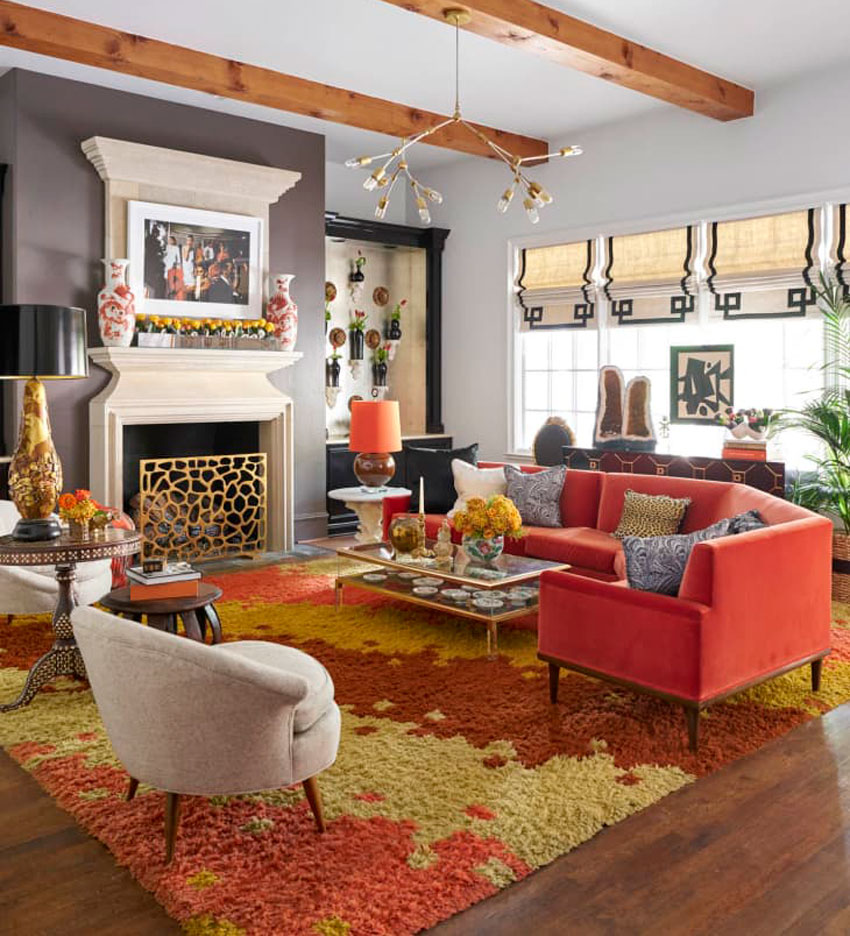
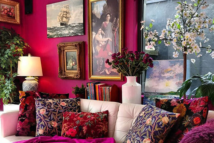
Kinda like this room. She also has some large walls to fill and they could look just like this:
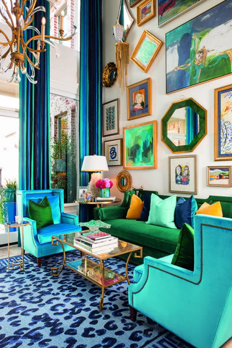
Because incorporating colour into a maximalism style isn’t just for drapery. Your colour palette should be considered in rugs, sofas, throw pillows, and wall art to really bring the space together.
This means the creamy leather sofas should be replaced with a fabulous AND COLOURFUL tufted chesterfield sofa like this one:
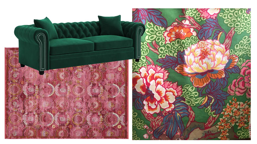
Havana Rug | Velvet Chesterfield
Because you know my favourite sofas are colourful. Colourful sofas are timeless and I’ve written about it here and here and here.
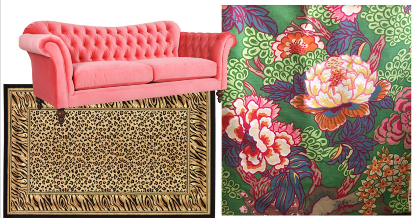
Or the world of coral, so good. This colour scheme is my favourite.
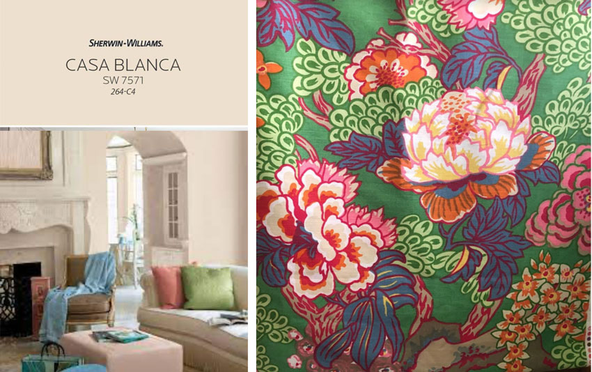
The closest to a neutral this fabric has is the creamy orange tones, so if we’re not choosing a colour from the fabric, we could go with an orange beige complex cream (below). She also mentioned BM OC-95 Navajo white which is the same undertone.
Remember the complex creams are the palest of the beiges so DO NOT cut them in half or you’ll end up with a colour too light to relate to anything.
If you search the web for this maximalism, you’ll see lots of leopard and zebra prints (below). That’s because animal prints mix so well with other prints and of course contribute to the glam vibe.
It seems the pendulum of stark white and black minimalism might be swinging to jewel tones and COLOUR, and that makes me VERY happy!
And this doesn’t necessarily mean just adding colourful walls, but incorporating colour in decorating with bold prints, fabrics and accessories, like this room below (and like my reader’s beautiful drapery).
![]()
Of course, your wall colour should pull your room together – so there’s nothing wrong with taking inspiration from your sofa colour or throw pillows and popping that colour on the wall.
Over to you my lovelies, is it time to move on from black and white to COLOUR?
Remember you should NEVER shop for one item at a time without assembling a mood board just like I did (above) so you could see which sofa and area rug worked the best with the drapery! Learn how to do that with my True Colour Expert Training today!
PS. Don’t miss my 10 videos ‘10 Finishes that Immediately Date your New Build’ on my Instagram here or Tiktok here.

Related posts:
Grandmillenial & New Traditional is Back

I’m always striving for a balance, not too stark but not too busy. I love the fabric your client has chosen. I, too, would choose the coral option for the sofa, because I like the warmth it brings. I find these posts so helpful Maria. But I rarely read a post and think nah! I’m definitely not going to piss off the decorating fairy, I learn too much from her!
Makes my heart happy too that we’re moving away from the stark black & white trend. Love the inspiration fabric for the drapes.
Couldn’t she keep her cream sofas if she repeated the colors from the curtains in an area rug and throw pillows? Or I love the final picture from the post where there was a cream or white couch, but the walls and pillows matched (though it sounds like she wants more neutral walls). Colorful sofas are my favorite, but if she doesn’t really want to ditch the cream ones, couldn’t she make them work with the new curtains?
She could, I just took it a step further with the sofas that would take it up another level. Thanks for your comment, Maria
For paint, what about a light gray with purple or green undertone? (Not saying she still wouldn’t have to switch out the sofas.) I’m just wondering about that as another neutral wall that would work. I’m drawn to the cool colors in the fabric.
Yes a greige would work here too 100% I’m glad you brought that up! Maria
It’s not the color of her sofa that I don’t like so much as the shape. To work with the glamorous fabric she’s chosen, she needs a better shaped sofa with some character. A Chesterfield is a great shape, as long as you like the high arms, but there are so many great options today that would also work and can be purchased in a color. I prefer to see the legs of a sofa rather than have it go nearly to the floor (easier to clean under as well). The Mid-century style in a color is also fabulous and feels so glam because it’s sleek.
Yes!
Love this comment, very well said Stacy! Maria
Oh my goodness! That gorgeous fabric with leopard print and the coral sofa? I love it so much 💗
Having taken your course several years ago, purchased the color boards and On line book/courses- I’m STILL confused as to how you arrived at creamy orange as the dominant neutral? I see pink, yellow, blue gray,……HELP!! And, thank you!!!
Hi Anne, the ONLY neutral to be found in that fabric is the white/cream/orange, that’s how I came up with orange beige. And I agree with all the comments that suggest the room would be so elevated with a colour! That is definitely what this room needs. Thanks for your comment! Maria
Curious how dark of a colour you would do on the walls, Maria?
The fabric seems mostly mid-tones, with some deeper blue and magenta.
Would you paint the walls a mid-tone (green, pink, coral, blue, etc.) or could a light shade like faint coral achieve that elevation?
Love your recommendations. I would add a much larger piece of art on her large wall or just more pieces. And, so happy you suggested changing out that rug!!!! Would love to see the after!
The first thing I would do — and it costs nothing — is to get rid of that rug. I cannot even wrap my head around what this room might look like w/o doing that. With the floor bare and the distracting pillows and knickknacks and art also removed, I see that the shape of the sofas is a little wrong for the new fabric (which I love). But she can keep the sofas if she gets a more colorful, complementary rug. If I were redoing this room and had those gorgeous drapes, I’d choose one color as my primary accent — the deep pink. Adding in dark green in small amounts, including in plants, would be beautiful and would complement the fireplace.
With you on the rug.
Although the maximalist rooms you show are gorgeous, I’d think it would be very difficult for non-decorators to pull together a successful room of that type. Everything needs to be layered, and the degree of help needed is at every level.
What we admire and what we can pull off and live with can be two different things.
Very well said, I think my reader comments are sometimes so much better than the post itself, thanks Kay! Maria
LOL! So true…
Why not paint the walls a color —wouldn’t that be cheaper than replacing two leather sofas? Coral would be lovely, especially with a cheetah rug.
My living room is also based around the colourful patterned drapery fabric (in my case, William Morris Golden Lily in the ink colourway). Based on my experience, I would strongly encourage the poster to paint the walls a colour pulled from the fabric. When our walla went from off-white to deep blue, suddenly the whole room was elevated, even before any art or accessories were added. The (same) furniture went from looking like it was perched in the room to looking in place. I think the reason is related to Kay`s comment that what we can pull off is not the same as what we admire. Absent the decorating chops and cash to really go maximalist, pale neutral walls don`t have enough energy to support the drapery.
OMG I love the way you expressed that, ‘The furniture went from looking like it was perched in the room to being in place” sooooo good I’m going to use that! Thanks for your comment Anne-Marie. Maria
Morris prints — yes!!!
I think it is PAST time to move on with colorful rooms. Ha ha.
I moved on years ago! Color me happy, as Maria would say.
100% true!
Beautiful fabric! I would paint the drapery wall a dark color from the drapes. That would make the whole wall look rich and let the TV be less obvious. The fireplace might need to be painted also. Find a rug you love in a color from the drapes. I’m personally not a fan of animal patterns (sorry Maria). For the time being, keep the sofas to see how they look, but get rid of the rustic end table. You are going glam, girl! Once the room is decorated in a more maximalist way, I think you’ll want to replace the sofas, but live with them for awhile. Have fun with your new room!
Hi Maria, this post makes me very happy. We are replacing living room furniture (with a plan) and with another turquoise sofa, I am deciding on colours for the chairs. Darker turquoise, or white? This post makes me think darker turquoise. It is strange how the current decorating trends influence little decisions like a chair colour. In an open concept house, I can’t go full on maximal, but I do strongly prefer it to black and white.
By the way, in maximalism, where patterns mix, does the rule of granite filling the pattern quota still apply? If not what kind of pattern would you put with granite? (in fabrics.)
I am so thrilled that I’m seeing colorful interiors again! I never gave them up. This fabric is absolutely one of my favorites, and my imagination is already jumping at putting that room together.
Love the animal print rug you suggested.
Your example rooms above are way too busy and patterned for my taste. I LOVE to add color through rugs, furniture and art, and even accent walls. But color can still have a fairly minimalist feel. Unlike multiple patterns.
We all have the sweet spot for our own tastes.
– I don’t like clutter.
– I need color or I go crazy.
– I can’t handle much pattern, probably one pattern maximum. And I find even with clothing that I tire of patterns way before I tire of textures and colors.