


Now that black is well established as the trendy neutral of the moment, the go-to finish many of us make when faced with a colour choice for our homes, it’s no wonder colour is back. Because if black, the absence of all colour and light itself, is the striking but easy route to “cool and new”, (and white is already conventional), inevitably, bold colour has emerged as the best alternative for those who want to make a statement.
Colourful kitchens
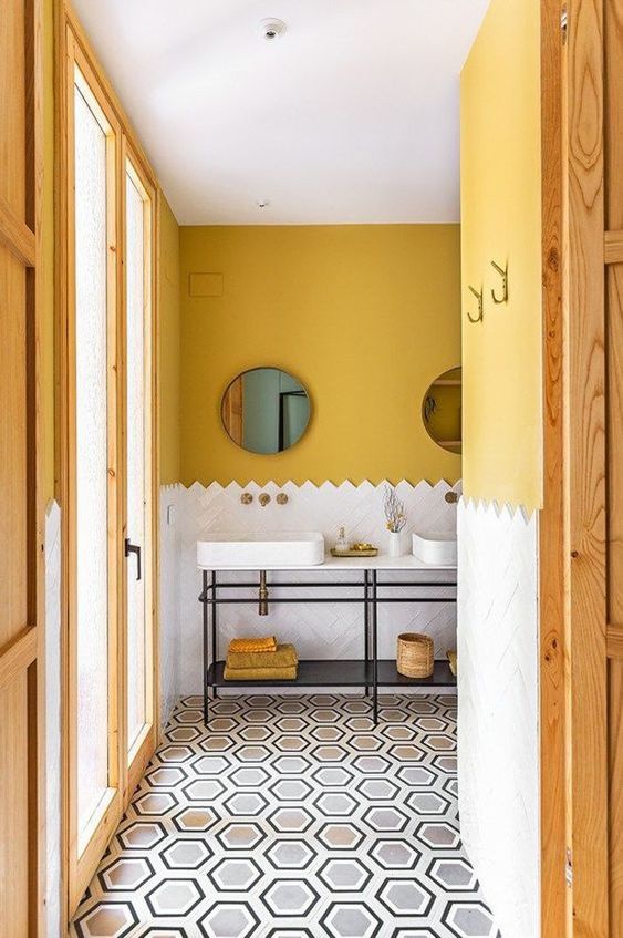
Interestingly, where bold colour for interiors first appeared is in kitchens. With all white walls dominating in homes everywhere, cabinetry becomes the obvious place to add colour. Kitchens are getting ever more colourful. Blues, and especially greens are popular choices for the heart of the home. Love the way the subway tile was installed here (below):
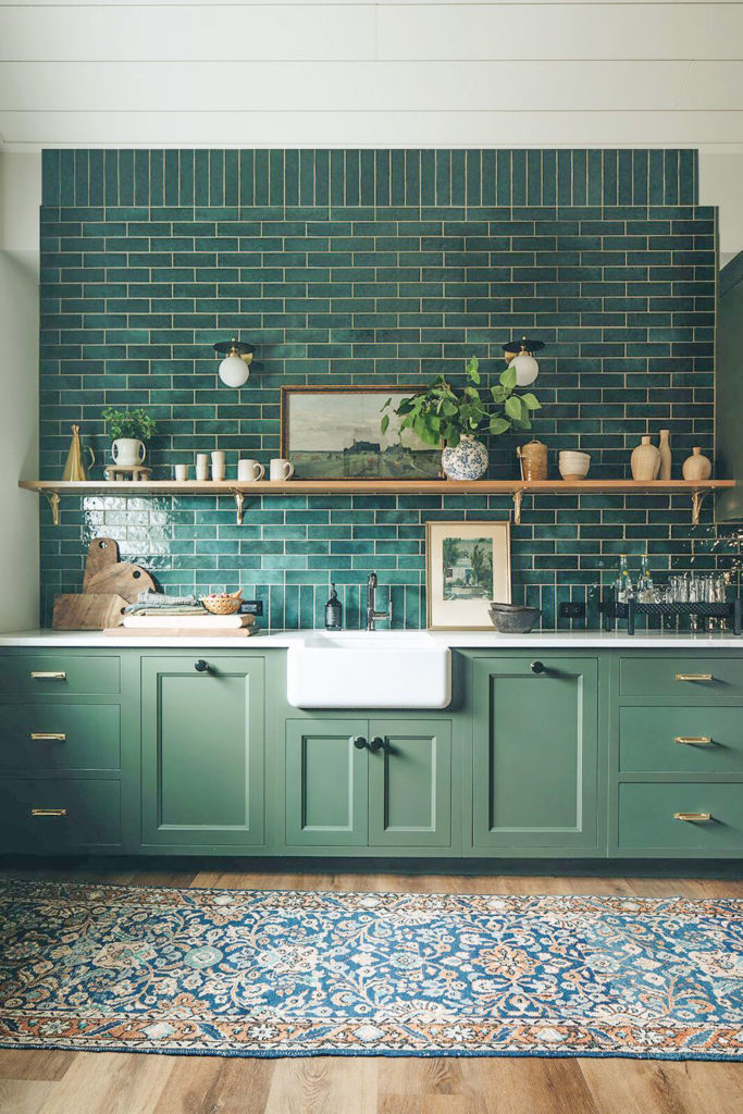
STOFFER PHOTOGRAPHY FOR JEAN STOFFER DESIGN
Colourful trim
Another, related way people are bringing colour back into their homes is by opting for a colour on the millwork, panelling and trim. This works best in heritage and traditional homes where moldings are interesting and substantial enough to pull this look off.
(Image credit: Ellie Arciaga Lillstrom) via Apartment Therapy
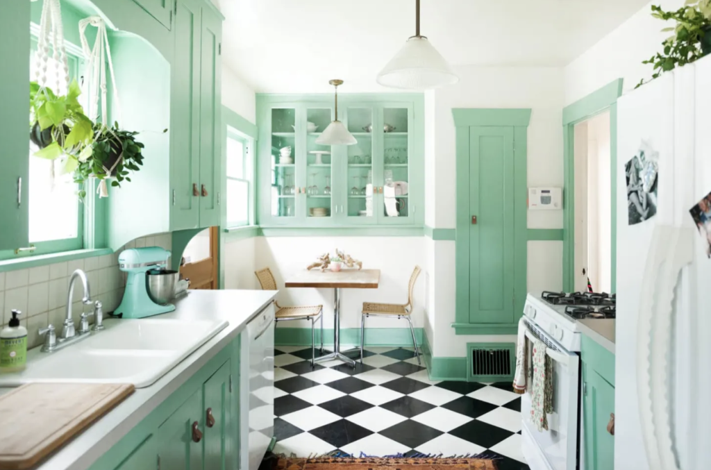
Creamy walls
Complex creams (which are the palest of the beiges) are back in as warmer alternatives to white, used in a house filled with oak trim and woodwork is perfection. The only thing I would have done different here is painted the kitchen the same colour as the walls.
I’m creating a new Sherwin Williams collection!
Because colour is trending again, I have received many requests to create a colourful collection of my large colour samples in Sherwin Williams colours, similar to my VIP collection of colours and darks in Benjamin Moore. I’m currently working on curating 50 of the best and most current colours to release a new SW collection very soon!
If you’ve been using my large colour samples, you’ll know they are a total game changer when it comes to choosing the right neutrals AND colours.
By the way if you don’t have any of my colour boards, you’ll need the system neutrals first which I do have in both Benjamin Moore AND Sherwin Williams.
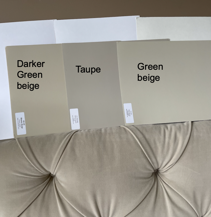
The reason the large samples are indispensable is that the best and only way to get neutrals right is to compare effectively.
Because the minute you think you’ve chosen the right one, and you compare to a few others, well, you’ll suddenly see that perhaps the taupe was better than the green beige (below) or WAIT, is the darker green beige even better than the taupe?
Hmmm. . . which one is best?
Hard to say but you wouldn’t even be this far without bigger samples, because you, or your client, or your spouse, can’t see anything until you can compare.
I’d love to hear from you!
Currently, my BM VIP Collection includes a few more greiges and complex creams, which are still the most popular for walls, in addition to the best and most popular COLOURS like trending blues and greens, pretty yellows, pinks and earth tones as well as the dark and dramatic colours like charcoal, navy and bronze.
Once you get used to working with the must-have curated collection of neutrals (in the BM Core and SW Foundation collections), and find it’s so much easier to sell any colour when it’s BIGGER.
You can move it around to make sure it relates to everything.
You’ll want to be able to pull out large samples of some of the most current choices for accent colours and deep, dramatic darks too.
People are looking for either high contrast neutrals or bold trending colours for everything from cabinetry, trim, doors, whole rooms and exteriors, so you’ll want this collection in your kit.
Large colour samples simply equal confidence. They sell colour for you and make it so much easier to commit.
Since so many pro painters use Sherwin Williams, the request for a colour collection in SW is constant!
So I’m working on it and need your help! Before I finalize this collection, I’d love to know: what are YOUR favourite Sherwin Williams colours or neutrals?
Please post your recommendations in the comments! I’d love to hear from you! And very soon, I will have my new collection ready for purchase!
Related posts:
Get Confidence Immediately with the Sherwin Williams Foundations Collection
An Inside Peek at how my Large Colour Boards are Produced
The Best Neutral Paint Colours (And how to Choose the Right One)

I’m so happy to see colour making a resurgence 🥰
Great post as always Maria. Just sharing an interesting tidbit that the green kitchen subway photo was photoshopped to make the tile wall appear much larger than it is. The original photos are posted here and it’s gorgeous (as is the rest off the house!), not sure why the photographer felt the need to change it. http://www.jeanstofferdesign.com/the-madison
Thank you! I kept looking at that photo going “something is off” and it’s because you can still see the shadows from the bulkhead it was tucked under on the edges. It looks much better in the original photo.
Also, my monitor makes the cabinets look dull and too yellowish for the acid green tile
Cathy! That house is Stunning. Amazing. Incredible. Can you tell I want to live there!? 🙂
As a graphic designer, my guess is that it might have been extended for use in print so it could bleed off the top of a page. Probably wasn’t meant to be posted online this way. Thanks for the link to the photos. I have seen the television series featuring Jean Stoffer and it has many great ideas.
What are your thoughts on green kitchen cabinets? I know color is trending, but you’ve also explained that color is more timeless than the trendy neutral. Is green the new trendy neutral?
I’m honestly loving the green but not sure if I’m just falling for the trend. Green speaks to me as an avid gardener and conservationist, but I dont want my kitchen to look dated in 10 years. I’d love your thoughts before I pull the trigger on green cabinets for my new build!
in my experience if you go with a color, green is the easiest to live with long term. it goes with most all decor from easter to christmas.
The green is lovely and it looks fresh, but I have already lived through a hunter green phase back you-know-when. Not sure I could, or would, do it again. I remember my experience plus respect Maria’s advice about using such bold colour on areas which are easily changed.
Green, and specifically that shade of green, is timeless in my opinion. Look at the homes in colonial Williamsburg. It may not be the “hot” color during certain periods of time, but it can’t be pinned down or dated, unless you go overboard with the other current trends. I love the tile, but together they are fantastic for a photo shoot, but I would tire of the combination!
We are in love with SW7625 Mount Etna- it’s the most wonderful complex navy-ish color with definite green hues in it. It’s the perfect pop on the interior doors in our new build. We also used it on the front porch of our exterior. Not too bright but a little more umph than a more expected navy. SW9128 Green Onyx is our kitchen cabinet color. I’ve loved green forever and will love it long after it’s not the trendy kitchen color… and green can function in the role of a “neutral” like it does in nature if you’re judicious in its application. We love our mostly neutral with a few pops of color home. 🥰
Favourite Sherwin williams colour (bearing in mind we don’t really have the brand in the UK) is urbane bronze. Oh my. I love that colour. I’ve also become fond of shoji white, but honestly, that’s probably because I’ve been exposed to SW neutrals by your blog, so I’m not much help on neutrals.
Ditto on the Shoji White. It’s a great neutral and a bit of a chameleon. I have an open floor plan and with Maria’s wonderful colorboards, I was able to choose this color. My painter,after seeing the results, was very impressed. He had suggested something else, which I vetoed, and afterwards said he was wrong. In fact, he brought wife to see my rooms!
I have loved blues and greens for always and forever. Our island color is SW Refuge (as is our Friends entry door, seen through the kitchen window WITH the island), and our trim, doors, & front door is all mega greige. My porch ceilings are SW Dutch Tile Blue and my laundry room walls are the same but mixed at 50%. (Main walls all throughout pearly white) I still love it all 5 years later.
Sw Oyster Bay is a fab blue/green/gray. Amazing Gray is a pretty deep greige. Sea Salt is a chameleon – it reads green in bright natural light and blue on interiors of homes with front&back porches. Tidewater needs lots of natural light otherwise it looks flat. So glad you’re doing SW colors 👏🏻👏🏻👏🏻 No more using Easyrgb.com 🤣
I love and have recently used SW Pewter Green 6208, SW Sea Serpent 7615, SW Moroccan Spice 6060, SW Acacia Haze 9132, SW Sea Salt 6204
Whites: SW White Flour 7102, SW Westhighland White 7566
In our new build I used SW Salty Dog, SW Steamed Milk, & walnut on our kitchen cabinets – walls in the kitchen & most of the house are also Steamed Milk. Truly love this classic combination and it always gets compliments. In the adjoining great room I continued with blues and added coral sofas.
SW Garden Spot on the walls of our walk in closet with leopard print carpet – love that as well. Love color!!
SW Rainwash is one of my very favorites. I also like Ancient Marble and the old svelte sage.
In your one picture you comment about what you would have done is paint the room the same color ceiling and walls due to the oak trim which is beautiful! when should you paint the ceiling the same color as the walls?
I have always loved greens and they have been in my home for 30 years! I have several favorites. Mountain Road, Hardware (just painted our exterior this color!) Connected Gray and Escape Gray top the list.
And for neutrals or whites, I think one just can’t beat Accessible Beige, White Duck, Shoji White or Aesthetic White.
I use SW canvas tan (#7531) in my staging. I’m a realtor and have found it’s a great neutral with wood or gray flooring and neutral carpeting. Yes there is oodles of carpet still in homes! I just recently painted my cherry wood kitchen cabinets and used White Sesame (9586). I kept my 90’s granite countertop and backsplash to save $$. I wish I had painted my kitchen cabinets years ago! I love your blog and follow Terreeia and her food journey! I’ve learned so much from both of you.
I love both Rainwashed and Blushing. Trying to decide which one would look best in my main living area. And Alabaster is my fave trim color.
First, I really enjoy your blog. Thanks for sharing your expertise with us! My favorite SW neutral color is Silverpoint. When we moved into our house just over 3 years ago, I hadn’t subscribed to your blog and picked a neutral Greige for my walls, but halfway through the paint job, it was too pink! So, we hired a SW decorator to help us out and she chose Silverpointe. It is not like the trendy gray seen in homes over the past several years. To me it is timeless and we are very happy with it.
In 2021 my husband and I gutted, remodeled and added on to an 1880’s farmhouse. I use SW colors throughout: Comfort Gray, Sea Salt, Krypton, Contented, and Venus. I would recommend all of them as lovely soft colors! My friends and neighbors like my color choices and I am now helping 3 of them find similar colors that relate to their houses. We all prefer soft colors over bold ones, so I hope you will include some in your new SW collection!
Maria – for SW whites alabaster and pure white
I’m loving SW color of the year London Fog
And the green grays .
Almond Bisque is a Benjamin Moore neutral and not “new” but the perfect one on the edge between warm and cool IMHO. It has a hint of green yet still plays well with grey-green, cream and cognac:
For walls, I love Notable Hue and Daydream. For cabinets, Indigo Batik is a bluer, brighter navy. I’m about to paint the wall behind the fireplace in Denim. I can’t use green paint on anything but furniture anymore–it’s too much for many people, and I don’t want to repaint my house just to sell it someday. For furniture, I like bright pops of color: Kind Green, Butter up, Innocence, and Wisteria.
SW Sea Salt for sure. Can look blue or green depending on the light. It is super popular in coastal areas.
Love SW Halcyon Green!! Also BM Hale Navy and yes even BM Burlap (looks neutral with black or navy or red).
I will second Urban Bronze!!! My previous dinning room facing south, charcoal during the day but at night with the lighting (lamps) the Bronze comes out, just beautiful!!! The colour I have painted most in my years of painting, green, all shades. My den is painted a beautiful SW Peacock Green (?) a lot of compliments for a north facing room. My bedroom will be painted ( in the near future ) Newburg green ( BM ) thanks to Maria! The paint colour I have had the most success with in a few homes is Edgecomb Grey (BM). Taupe beige during the day, taupe grey at night. The outside of my house I believe was SW Agreeable gray, I believe it was BM’s Classic gray equivalent. Although the colour is grey, outside it shows white to off white. Again, Maria, choose this color and we have had so many compliments!!!!
I have more a request than recommendation…would you be able to add nursery colors in soft pink, soft blue, soft yellow that you feel won’t look too crazy on the walls? Those colors are really difficult (especially pink) to paint an entire room in.
SW Pure White trim. Some colors with depth we have used include Mineral Deposit, Storm Cloud, Silverplate, Let it Rain, Quietude, and Cyberspace. Less depth—Passive and Rainwashed.
SW Pure White is my favorite neutral. Clean but with a touch of softness. It can accommodate so many paint colors when it’s used on trim and cabinets.
We have SW Gray’s Harbor on our master bedroom walls, a pretty gray green blue. It’s a beautiful dark denim blue during the day and moody at night.
Maria recommended SW6176 Liveable Green for our open kitchen, living room and entry. It is not a color I would have ever chosen, but I wanted a dramatic change and went for it. It is fresh and lovely with our furnishings.
YAY for SW colors!! Because we have a SW store in our little town most people use SW paint!! I mostly spec neutrals for staging but people are wanting more color if they are staying!
I’ve always loved richer colors on the cooler side of things. For rich blues and greens, I love SW Sea Mariner, SW Tarragon, SW Cascades, SW Roycroft Bottle green and SW Rockwood Shutter Green. Because I’m not a fan of warm orange browns, I love SW Urbane Bronze, SW Black Bean, SW Iron Ore, and SW seal skin.
SW6204 Sea Salt has been a long time favorite. We’ve used it in several houses and it’s the one color where guests ask, “What color is this? I love it!” It was recommended years ago by a “paint expert” as a grey tone but it’s been a gorgeous green in each room it’s been used, typically with navy blue and crisp white.
In the cream kitchen example, I can’t tell how the kitchen isn’t the same color as the walls. Is it the cabinets that should be the same color? In a white/cream kitchen, should the cabinets be painted same as the walls?
Our kitchen, family room & foyer are painted SW repose grey & the dining room, living room, study & powder room are painted the same color but at 50%.
Favorite SW colors:
Accessible Beige
Network Gray (great blue gray)
Sea Salt
Navajo White (for a beautiful pale yellow)
Natural Choice
Best whites: Pure White and Alabaster
Hi Maria,
I am not a brown/beige/tan person at all, but I might be tempted to wear something in camel after seeing you wear it with denim. See, we do notice everything lol!
Maria are you asking for new color recommendations that you haven’t previously listed in your eBooks or color board collections or ones that we still love? After reading the comments, I’m confused! If you’re asking for SW colors that we still love, I love SW Heron Plume, Sea Salt, Agreeable Gray, Hale Navy, Shoji White. Basically all the greiges and green grays too!
Just did a high-end restaurant (www.saintsandcouncil.com) in SW 7069 Iron Ore (interior walls) & SW 9166 Drift of Mist (interior shiplap ceiling & exterior stucco accents). With warm interior lighting the brown undertone in the SW Iron Ore becomes more obvious. On an exterior SW Iron Ore is a good accent color (garage doors, etc.) when the windows are bronze vinyl but the exterior lighting is black (urban farmhouse look).
SW 6251 Outerspace really nice very dark blue.
SW 6247 Krypton nice medium blue.
SW 7075 Web Gray – grayed down navy. Reads navy on accent wall or painted brick but not as bright as other SW navy blues.
SW 7604 Smoky Blue – looks nice on exteriors with lots of SW Extra White Trim.
SW 6212 Quietude – blue-green (looks similar to BM HC-143 Wythe Blue)
I am alllllll about color these days, but no one else in the Midwest get it! I’m painting my living room this weekend Dutch Tile Blue with Alabaster trim – the room has no direct light so I’m thinking the blue will bring the outside in. My “accent” colors in there is mossy green. I’m painting the trim in our sunroom (after I add substantial trim in there) Pewter Green, which I’ve also used on a cabinet in our breakfast room. I’ve used Retreat in my office, my husband’s game room is completely Urbane Bronze, and Smokey Blue is in our guest room. I’m still working on picking a color for the dining room and our library. I don’t mind neutrals in hallways but they feel so boring in actual rooms in closed concept homes, in my opinion.
In our remodeled home we installed kitchen cabinets in SW Naval – I love them more every time I walk into the kitchen! We also installed brass hardware and it reminds me of a navy blazer with brass buttons! The color is technically SW 6244 – everyone loves it!
I love alabaster. Accessible Beige is a nice neural. I second the others with Urbane Bronze for a dark. StarDew is a beautiful gray that reads very blue in my house.
I am struggling with SW greens. BM seems to have better green choices. Perhaps with the popularity of green you could do a post on greens?
Fan of Stardew also. Really Nice blue.
Another vote for SW Salty Dog. Gorgeous dark blue with just enough green that it never reads purple. It is also just light enough to never look black.
Sherwin Williams Tame Teal – it’s a bright aqua really.
I know one local builder who builds in four states, and he only uses Sherwin Williams both for walls and cabinetry if you want painted cabinets.
Sherwin Williams Grasshopper
Sherwin Williams Holiday Turquoise
Sherwin Williams Waterfall
SW Pure White is my favorite neutral white because it goes with almost anything. It is what I painted my trim, window sills and ceilings so I have versatility to change my wall color if I want without having to repaint every single element (previously it was typical builder style “paint everything the same color, walls, ceilings, etc.)
I also recently discovered a SW designer color of Lunar Lite. It looks amazing with my warmer whites in my kitchen, family room, and bathroom, and meshes up well with another nice neutral SW Gossamer Veil (it’s a gray that is almost greige). I have a very open floor plan where the first floor and second are connected by tall walls, and it makes it very difficult to find a color that works in all the common areas. The Lunar Lite was too high of a reflective value for one of the rooms to use it in and Gossamer Veil works well. I have very dark cabinets in my kitchen (stained black, but the appear very dark brown) and it looks stunning with the Lunar Lite and lighter tile we have.
I am definitely a neutral kind of gal, and I do not like a lot of bright colors on my walls. If I lived on the water, I would use blues, but they just don’t feel right where I do live. Blue is my favorite color to decorate with or use as an accent. Finding the right shades are tricky, however.
I’m delighted that color is returning. I ignored the whites, blacks and grays and continued to enjoy Salute, Burlap, and a muted gold that we have in our main living areas. Our entry hall is all Salute, including the windows, door, sashes and trim. Burlap wall paint in a kitchen makes oak cabinets look rich and updated.
One more favorite SW shade – Artifact, a deeper shade of Burlap and beautiful in halls and stairwells that have rich dark wood.
Recently had my kitchen cupboards painted Debonair SW9139 and love it!
Pewter Green (SW 6208) is a gorgeous muted green. Emily Henderson used it for the kitchen in the Portland House renovation project and it is stunning with warm woods, brass hardware and marble.
I love SW Pewter Green, SW Cyberspace, and SW Waterloo for blue/green colors! Also SW Pure White, but I’m sure you have that covered already.
Maria , I’ve followed & purchased your New Build pkg, Whites Are Complicated, & Undertones Color Wheel over the years as an amazing guide tackling a major remodel of our 20 year home that sold in1weekend in 2020 (yay & thx!) & for our current custom new build that we’ve dreamed of for years. I am a 20 yr Benjamin Moore paint girl at heart, but our builder only uses SW paints – so I’ve done my “Maria Killam homework” on SW whites/neutrals, but I am excited to see what colorful accents you will feature to complement our “classic & timeless” palettes!
Here are the SW COLORS this TX ‘burbs interior design enthusiast is loving in 2022 to “bring the outdoors in” to our new forever home with lots of windows & natural light… I hope I am on the right track as I make my color boards to bring in accent colors that give us forever happiness! 🙂
SW 7624 Slate Tile
SW 0048 Bunglehouse Blue
SW 7604 Smokey Blue
SW 9149 Inky Blue
SW 9176 Dress Blues
SW 9138 Stardew
SW 6204 Sea salt
SW 6211 Rainwashed
SW 6205 Comfort Gray
SW 7653 Silverpointe
SW 7057 Silver Strand
SW 6198 Sensible Hue
SW 9164 Illusive Green
SW 6164 Svelte Sage
SW 7746 Rushing River
Our “whole home” new build back drop until “color personality” comes soon:
Walls- SW 7009 Pearly White
Trim & Cabinets – SW 7005 Pure White
Pale Oak wood floors throughout
SW Chestnut stained beams, island
Marble & white subway tile bathrooms
Upstairs bedroom carpets green-beige like BM Edgecomb Gray
Thanks for your constant inspiration! Counting down the days to see this classic & timeless new home finally come to life!
Oh, I bet your TX home sold in 1 weekend! Especially if you are in the DFW area. We have looking to move out there and it feels like EVERY home we like sells in 2 days!!!
Crazy!
SW Waterloo
Hi Maria,
In my open concept areas of the house, I find complex creams too light to hold the space together and I am all for beige! (Muslin.) I am thinking of painting the front hall Fernwood Green to go with my green sofa. Upstairs I have Queen Anne Pink in a bathroom with lots of terra cotta tile with a linen shower curtain and it is so pretty. In one bedroom there is Serenata, and I think the other one is going to be Palladian Blue (or Fernwood, if I don’t put it in the hall.) My laundry room is Georgian Green, and the powder room is wallpapered in a floral close to Georgian Green. You know my kitchen chairs are green. I tried Bluegrass (similar to Palladian) in the open concept area but it was too much for the open space. I love colour and am happy to hear it is back. There is no SW where I live so I haven’t tried it. I love wallpaper too. Is it back?
These were the contenders for our semi-sunken basement which gets decent light:
SW Comfort Gray
SW Liveable Green
SW Filmy Green (hate the name, love the color)
It was so hard to pick, but Comfort Gray won! To me it’s definitely a soft blue-green but soothing.
Origami White. It just glows. Goes with so many other colors. Neutral, but interesting.
The green cabinets in the photos above remind me of the green trim in the kitchen in All Creatures Great and Small on PBS, the new version. And also the green background shown in the opening credits of Downton Abbey. Love it.
Hi Maria, this may have already been asked, but there were too many posts to read through – when you said you would’ve painted the kitchen the same as the walls – were you referring to the cabinets? My first thought was the cabinets were too white. I have a lot of that color wood (although I wish I didn’t) and I was thinking of a complex cream for our walls, so I was happy to see that photo here for inspiration.
I think SW has one of the best whites going: Reflective White. It’s especially good for ceilings and trim, particularly when you want contrast with pale or very light neutrals like Agreeable Beige.
I am in love with SW Morris Room Grey as an exterior color and SW Modern Gray for exterior Trim/Front Door. Green vegetation and flowers look absolutely stunning against this color scheme.
SW Accessible Beige
Sherwin Williams colors I love, probably too late, but, steamed milk, creamy, halcyon green, lullaby, atmospheric, marshmallow, agreeable gray, modern gray, Silverpointe, mineral deposit
We used SW Drift of Mist in our living areas and really like the way it blends with floor tiles (white with beige and grey streaks).
It’s a light neutral greige paint with a calming effect. It could be a good addition to your 50 SW paint boards Maria. Thanks!