


This is the simplest explainer ever on how my neutral colour wheel and large colour boards work together for the perfect colour selection everytime.
The Missing Visual That Connects My Neutral Wheel to the Large Colour Boards
If you’ve been following me for any amount of time, you already know this:
neutrals are the hardest colours to choose.
Not because the colours themselves are complicated — but because the differences between the viable ones are incredibly subtle. And subtle is exactly what the typical paint chip cannot reveal.
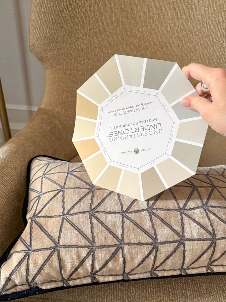
I’ve been teaching how to see neutral undertones for 17 years, and yet somehow, I have never shown you this image:
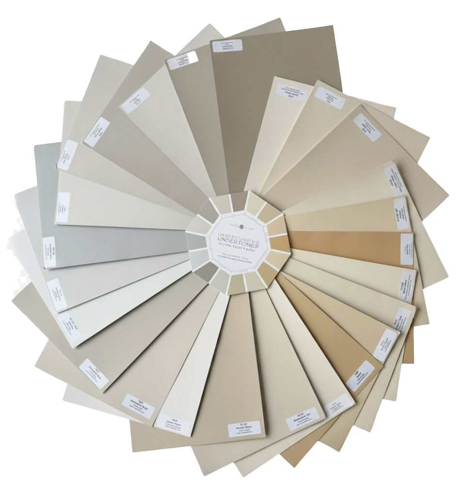
Front of the Understanding Undertones Neutral Wheel
This is the first time I’ve revealed the full relationship between my Neutral Colour Wheel and the curated universe of Large Painted Colour Boards behind it.
And honestly?
It’s the missing visual that makes the whole system click.

Back of the Understanding Undertones Neutral Wheel
And seeing them together instantly clarifies something I’ve been teaching all along:
The wheel and the boards aren’t random tools — they belong together.
You can use the wheel on its own for a small problem…
but the magic happens when you pair it with the collection of full-size boards.
You’re seeing 36 neutrals and whites from the complete curated collection of 50 above.
Why This Matters (Whether You’re a Homeowner or a Design Pro)
Let’s be very clear — if you are choosing:
- a kitchen cabinet colour
- a whole-home neutral
- trim and ceiling whites
- bathroom tile
- exterior stone or siding
- new furniture or hard finishes
… you’re not choosing from hundreds of random fan-deck colours.
You are choosing from a tiny, tightly curated set of useful neutrals and whites.
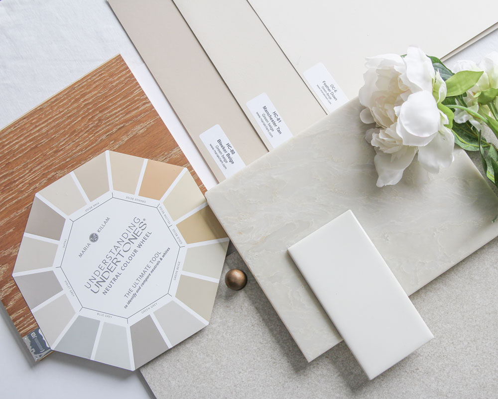
Once you determine that the countertop works with green beige (for example) you pull out the green beige samples from light to dark and simply choose (below).
That’s what the Killam Colour System has always given you.
But until now, I haven’t visually shown the powerful connection between:
The Wheel (the map)
and
The Large Boards (the actual terrain).
Here’s the simplest way to understand how this works.
When you’re decorating, the moodboard is where you gather the big ideas (below left) — the palette, the finishes, the feeling. Get my Moodboard course here, 3 modules, easy to digest, saving you hours of time.
But you would never finalize your selections based on the moodboard alone. The real decisions happen when the actual samples show up on site, in real scale, next to each other, in the real light, which is how you end up with the right colours for everything in the room (right).

It’s the very same relationship between my Neutral Colour Wheel and the Large Painted Colour Boards. The wheel organizes the concept — the categories, the undertone families, the direction. But the boards show you the real thing in context so you can make the right decision every single time.
The wheel organizes the entire system at a glance — 9 neutral undertone families on the front, each with three to five of the best light-to-dark corresponding paint colour options, and on the back, four gradations of whites paired with their corresponding system whites — so you can conceptually identify exactly what you’re looking at.
But the moment you need to compare a taupe to a green-grey or distinguish a pink beige from a green beige, the wheel alone simply can’t give you the clarity.
It’s not your fault.
The samples are just too small.
Any sample that size would be.
Which brings us to the entire reason the large boards exist.
Why You Actually Need the Large Boards to Make a Final Decision
It helps you identify:
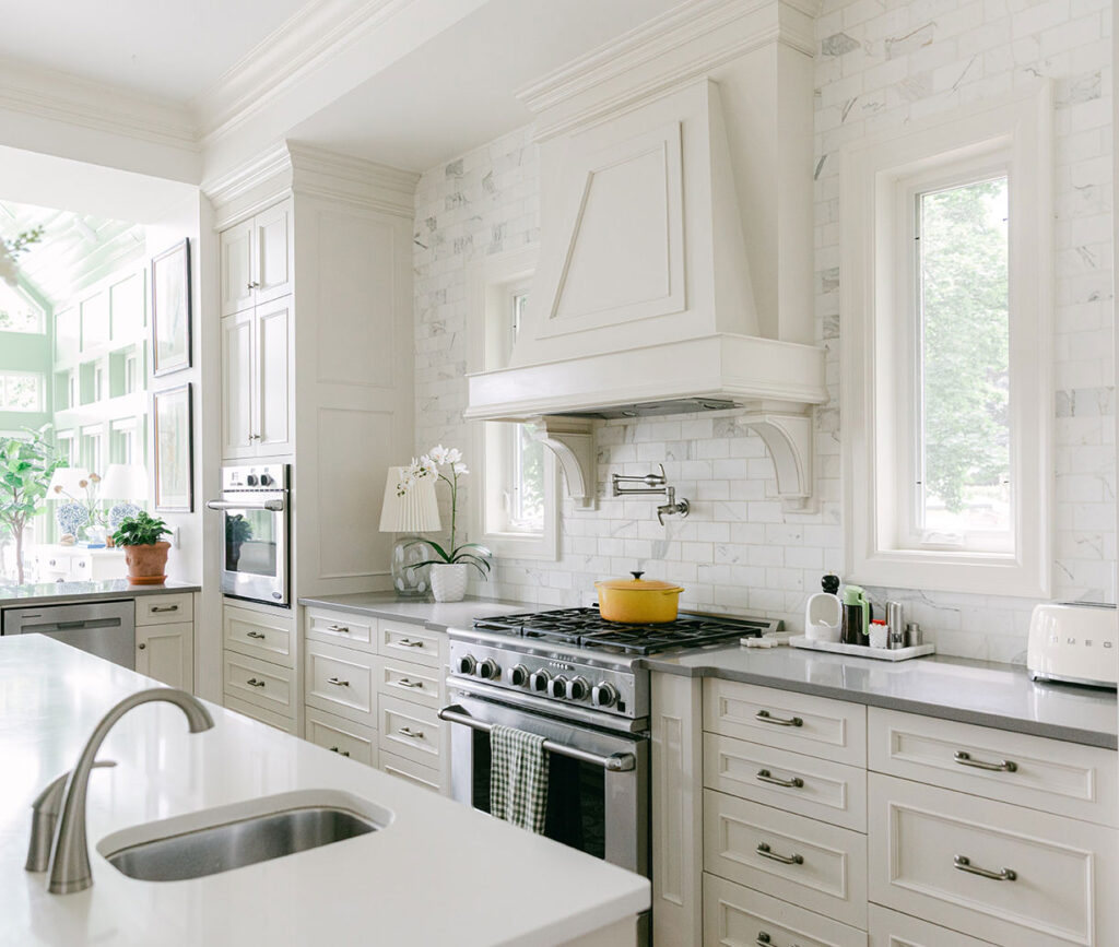
“Is my Calacatta backsplash green grey? Is it blue grey? Is it green beige?” (It’s all 3 in this case)
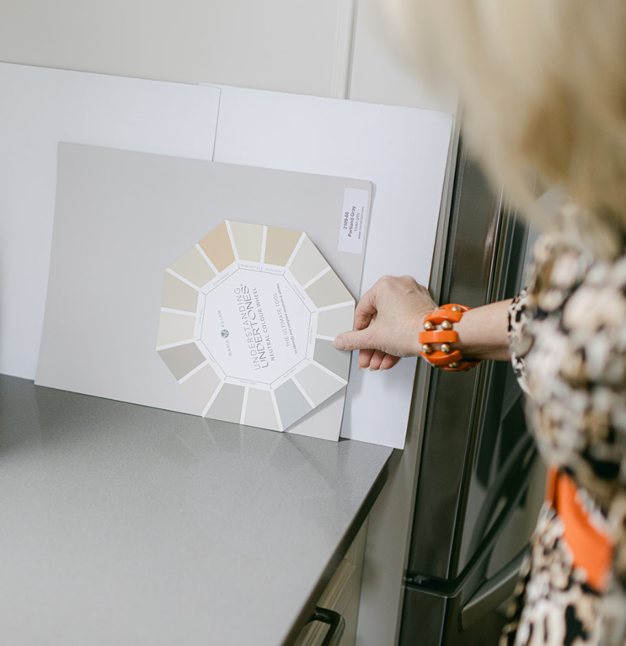
What about the countertop I inherited? Is it taupe or violet grey? (Violet grey is what you’re looking at).
But here’s the reality:
Undertones are subtle.
Fan-deck–sized samples flatten the differences.
Only the large boards can reveal them clearly.
This is exactly why so many people buy the wheel and still feel unsure.
It’s not because they’re missing the “colour gene.”
It’s because the wheel is the map — not the terrain.
The differences are so refined — especially in the current trend of warm neutrals — that even trained designers get confused without a proper, full-scale comparison set.
Homeowners?
Forget it.
Cutting corners here is exactly how renovations go sideways.
When you have all 50 neutral boards in the system, from light to dark in every undertone category, the correct colour becomes obvious.
Not stressful.
Not mysterious.
Obvious.
This is the entire point of the collection.
And after you work with my large neutrals, you immediately discover how easy it is to sell any colour.
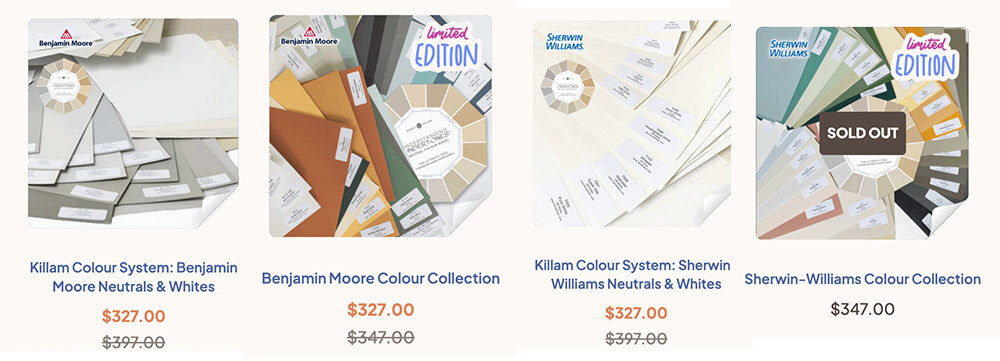
In each brand, I have two collections.
- The Killam Colour System (BM or SW) – Neutrals & Whites, these are the 50 core system colours you need to choose a neutral or white for anything. They correspond directly to the neutrals and whites on the colour wheel.
- The Colour Collection (BM or SW) – Additional colours including darks & saturated colours. A nice to have collection of amazing go to colours and darks.
Please note: we won’t be stocking The Colour Collections (2) any longer, we will just be focused on the system neutrals and whites (1). My Sherwin Williams Colour Collections are already sold out and we have 14 sets left in BM (at my last count) so get them now before they’re gone forever.
When the Wheel Is Enough
I want to be transparent:
There is one scenario where the wheel alone can solve your problem:
- You’re working on a small project
- You only need to identify the undertone you need for a minor selection like a returnable item
- You don’t need to commit to an entire neutral for a whole home or renovation
In that case, the wheel can help you narrow it down to:
“Okay, this is probably taupe… or maybe green grey.”
Then you can double-check the curated colours listed in my ebooks, and paint up those specific samples yourself.
Totally reasonable.
It’s just more powerful, especially if you’re embarking on a large project with several costly selections, to have the full collection of large samples to get crystal clear you have the right colour every time.
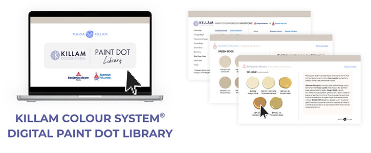
Bonus Alert: With any $50+ purchase, you’ll receive my Killam Colour System™ Digital Paint Dot Library—a $19 new digital tool that will make all your mood boards so much easier. It includes the full system of whites and neutrals in BM and SW.
And Yes — the Wheel Is Included With the Boards
Because while you technically can buy the wheel separately, the real power comes from having the full system.
The wheel helps you identify the undertone.
The boards confirm the exact, correct neutral within that family.
Together?
They eliminate the guesswork entirely, and that’s why I bundled them together from the beginning.
This Black Friday… choose confidence, not chaos
If you’ve been circling this decision — if you’re tired of second-guessing neutral undertones or repainting rooms or returning furniture — this is the moment.
Whether you’re a homeowner wanting to avoid expensive mistakes
or a designer who needs reliable tools in a warm-neutral world…
This is the time to invest in the system that keeps you from:
- fighting undertones (the #1 disaster)
- repainting rooms
- replacing tile
- choosing the wrong white
- wasting days flipping through fan decks
- guessing
Whether you’re a design pro choosing colours all day for clients,
or a homeowner deep in a renovation or new build…
You deserve the tools that make the right colour obvious.
This is the best deal of the year. Get yours here!
Want to most direct and stress-free route to the beautiful and timeless home? Get my personalized advice with an eDesign consultation!
⭐️ Never before have I put ALL my eDesign packages on sale! ⭐️ This Black Friday Sale is your chance to get ahead of your upcoming projects. You can buy the packages you need now – 10% off until November 28th – and use them whenever you’re ready! You can find my packages here. Hurry! Spots are limited, so claim yours before it’s gone!
Email eDesign if you need help deciding which packages you need for your project.
What my clients are saying:
“So Very Thankful! I am thrilled with the eDesign package, and feel it is proving very much worth it to me. I would have been totally stressed as I agonized over what to do. I LOVE what you have helped me put together!!! I can tell Maria and you all “got” me, specifying materials that are within my price range and budget, as well as materials that are in line with my home’s decor style and my taste. I feel the consult was very personalized, showing right-on understanding of the undertones of my home, what will work in my space, my style, and my budget. I am so very thankful I decided to do the eDesign! ” ~ Ann
⭐️ The Black Friday Sale is on now until November 28th! ⭐️
Related posts:
The New Cashmere Kitchen: Warm Neutrals 101

Love this
Question: I purchased the white is complicated ebook 3 years ago and it says it never expires. Recently I logged in and it’s not in my account. Are we having to buy the updated ebooks ?
Please email [email protected] and we will make sure you get it, thanks!
Is the wheel just for pint colors only. I find myself using it for other objects, i.e. flooring. Please advise.
It’s definitely not just for paint, if you shop with the wheel you can make sure you’re choosing the matching undertones for everything in your home since you shouldn’t have more than one at the most two primary neutrals in your house.
Maria, great article. You so clearly explained how the large neutral and white color boards are best used. Now, please do the same for the color boards. I’m never quite sure how they are best used. Thank you.
I’m referring to the color collections color boards.
The colour collections simply make it easier to choose and sell a paint colour and the ones in my collections are the ones that are trending and found in many home decor items making it that much easier to get a colour on the walls over a neutral. But the sherwin williams colours are already sold out so get the benjamin moore boards while you can! Maria
I’m lucky. I already had the Benjamin Moore color boards and bought the Sherwin Williams before they sold out.
Hello Maria
Benjamin Moore paint is not available in my country. Should I make large boards from the paint company that is here and match the neutral wheel or buy Benjamin Moore large boards and match the paint company that is here?
Use my wheel to find similar colours in your system and then paint up large samples in light to dark. Easy RGB will help you find the closest ones that match your paint system. Maria
I’m curious what sheen the boards are painted in? A millwork/Satin sheen looks a lot different than the same color in Flat /wall sheen. Thanks!