


Stressed about choosing colour? Frantically waving around swatches and chips and smearing yet another $8 tester onto your wall? Then it’s likely that you are subscribed to some common colour myths that make colour seem so much harder than it is!
But you’re here now. And it’s going to be more than OK.
Because I’m here to show you the easiest way to choose the right paint colour! And it has NOTHING to do with cutting your paint into smaller percentages of a colour.
How I studied colour and became an expert
Did you know I started my career in colour as a colour consultant at a local Benjamin Moore store? Back then, I had so much to learn!
Daily, I watched a parade of designers and homeowners come through the store asking for custom tweaks and tints of colours. They were convinced the colour they chose had changed in the light, or that they needed a custom tint to get it right.
I knew then that it was simply that they didn’t know how to choose the right colour in the first place. And I was determined to understand how to do it better.
Lucky for me the hundreds of in home consultations I did taught me the key insights about colour that became the Killam Colour System:
- the best neutrals and whites that work time and time again, organized into simple categories.
- a practical method using the best tools for quickly and easily choosing the right colour for any situation.
And I’ve had the privilege of teaching it to thousands of wonderful people just like you! (Now I have separate courses for homeowners and design professionals)

The wrong way to test your paint colour
So if your process for choosing paint colours looks anything like this (below) you’re simply throwing dice. And I’m not surprised you feel stressed. It’s simply not a good bet.
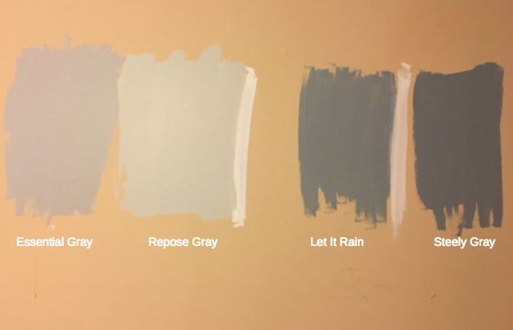
When you’re not confident in your colour choice, that’s when you might decide to dilute the colour – just in case. This is the reason why people – even the pros!- are busy having their colours diluted to 25% or 50% of the original colour.
Because if it’s almost a non-colour, surely it won’t be offending?
Also, working on a ‘custom colour’ for a client will also hopefully hide or distract from the fact that really, you don’t know which colour is truly correct for the project.
And right now, since the trend is super pale and light and most of the time ‘art gallery white’ stark walls, everyone is lightening even the palest of the beiges and greys and here’s the problem with that:
No more wishy-washy colour tints
You see, the palest paint colours don’t retain their character when they are tinted or diluted. Pale paint colours often get cooler as they lighten, especially when less pigment/colour is added to the white. And then? It becomes a completely different colour! And not what you were expecting on your walls.
But part of the appeal of the white trend has been that if you choose the wrong white, you’re much less likely to be offended than say, if you choose the wrong beige or grey.
And here’s the thing, most people do not have homes filled with white furniture which is why a true white or off white is NOT the answer. Which is why it’s worth it to spend some time and figure out which pale beige or pale grey is correct for your home, the one that works with your furniture and your hard finishes.
However, you’ll never know how good it could have been with the PERFECT pale beige or greige! Especially if you go white in a space that already has earthy finishes which means any shade lighter than the palest grey or beige will be way too stark.
Why I don’t like cutting paint colours
It’s kinda like my entry. If I had tried to cut this complex cream in half, it would not have the same rich look to it. It’s pale enough as it is, no need to go lighter. Remember all colour goes twice as bright when it goes up.
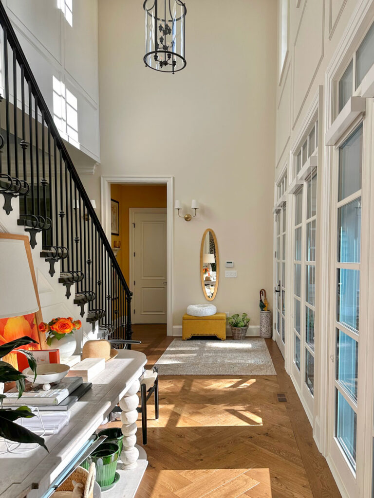
SW Divine White
I was having a conversation with Tricia, my Director of eDesign, about keeping a friend from choosing a cream colour that was much too pale and unrelated to her earthy stone. Tricia mentioned the colour would simply look too “thin,” dingy and green and reflect everything in the room. Well, exactly, it will look THIN.
The perfect colour for a “creamy white” look is often not a white at all but a Complex Cream. These are the very palest of the beiges in the Killam Colour System. And once you experience the PERFECT colour instead of a washed out tint of a colour, you’ll see the beauty of getting the colour right the first time, WITHOUT GUESSING!
The world is full of misguided beliefs about colour. It’s no wonder people are paralyzed with fear when it comes to choosing one! That’s why I start my two-day colour training by debunking every one of these disempowering myths!
It’s time to stop simply guessing with colour. I can help make your big and small colour decisions so much easier. Because every decorating decision is a colour decision, so you’re going to want to listen up!
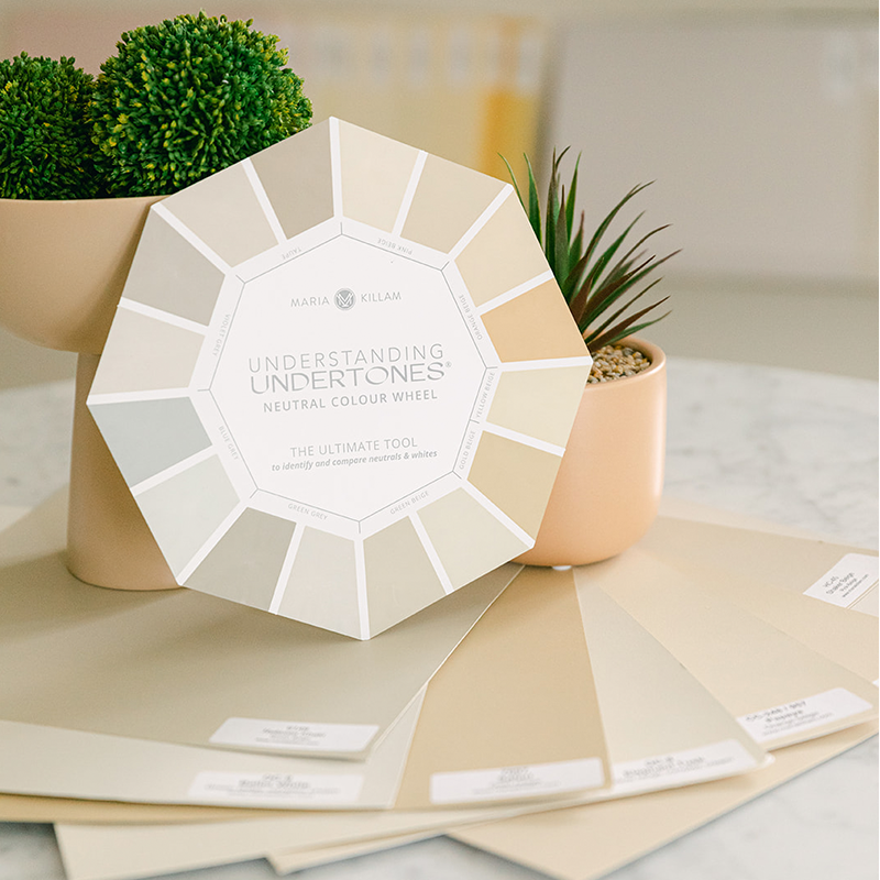
Choosing colour is easier with the right-sized paint samples
Most often we are choosing neutral and white paint colours. They are so subtle. Which is why they seem so infuriatingly complicated. But once you understand how to identify them by comparing, the mystery is gone. That’s why I designed a neutral colour wheel – to help you better identify neutral undertones of anything.
Let’s make decorating fun not stressful!
Think of the neutral colour wheel as your secret weapon to choosing the right neutral or white for anything – paint, countertops, tile, carpet, drapes, bedding, furniture and styling accessories.
Step 1 for choosing a neutral paint colour
So comparing your paint colour (or any finish or decor) to the neutral colour wheel is the first step. Put your neutral wheel next to anything, then weed out the undertones that don’t look right and focus on the 2-3 that look close.
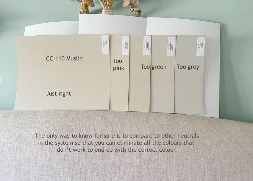
Step 2 for choosing a neutral paint colour
This is simply the best way to test your paint colour before you put it on the wall.
Once you’ve used the neutral wheel to narrow down to just a few undertones you might be working with, that’s when my collection of colour boards will help you most.
Better than paint chips or testers, these large 11×14 painted boards are the most practical way to choose paint. They’re painted with the colour, not printed like a paint chip or messy like a tester, which will give you a clean accurate match.
They also make choosing easier.
Below I’m comparing my boards to my linen headboard to see which undertone is right. With these large samples, anyone can see the subtleties of undertones well enough to see which is perfect (and which is not).
Sold in sets of 50, the boards include the best colours clearly labelled in all 9 neutral undertones in the Killam Colour System and the most useful whites , So you don’t have to pour over thousands and thousands of neutrals to get the one you need.
And unlike when you’re ordering just a couple of random samples, you have the complete range of possible neutral undertones to make sure the one you choose is the absolute perfect one.
They are on rigid card stock so you can prop them up and move them around repeatedly to see how a paint colour will look next to carpet, or other hard finishes. I promise, you’ll use them over and over again.
The Killam Colour System makes your decorating life easier
You see? Colour doesn’t have to be frustrating. I designed my colour system to be a practical, useable solution for cracking the colour code. If you’re decorating a space, renovating or building a new home, you need a system for choosing colour.
And it goes far beyond paint because EVERY finish and item you choose for your home has a colour.
The Killam Colour System is all you need. Because every decision is a colour decision.
It combines education – through ebooks and courses – with powerful tools – a neutral colour wheel, a curated list of 50 useable paint colours and sample boards, to help you see and use colour better so you can decorate more beautifully.
Once you start using the Killam Colour System, you will know which colour to use where and why. Learn all the fundamentals of this system for choosing colour in my two-day courses: Homeowners sign up here. Design professionals sign up here.
So, stop pouring over thousands and thousands of colours to get the one you need. Instead, grab a set of 50 tried and true paint colours.
Here’s my friend and True Colour Expert Claire Jefford unboxing her SW Killam Colour System Collection and laying them out in a pretty wall display. She’s a pro designer that coaches other designers and she swears by the Killam Colour System and the large painted colour board samples.
Shop my curated large paint sample colours!
The best way to be sure to get your paint colour right is to have my complete collection of neutrals and whites so you can test all the undertones in large samples that make it easy to see which one is best.
Make colour easy and get yours here.
Related Posts:
Here’s How to Embrace your Cream Kitchen; Before & After
The Shortcut to Testing Exterior Colour; Before & After
Help! My Paint Colour Looks Different on the Wall than on the Door

I bought the large paint samples over 7 yrs ago when I was building and have used them many times and loaned them to friends many times! invaluable.
Help, my color boards are getting dirty! Do you have a plastic case with a carrying handle you can recommend?