Today I’m sharing the top colour and design trends for 2023 and beyond. In happy news, I think we’re about to see the biggest shift toward decorating with colour that we’ve seen in decades. And, as always, I want to help you make colour decisions you won’t regret, while also quenching your thirst for something new and trendy.
A note about trends
Remember that major colour and design trend shifts react to overplayed looks that are badly executed.
In other words, when the trending neutral is overused in an unthoughtful way (i.e. grey or black or literally white EVERYTHING). You’ll notice that timeless interiors are always beautiful regardless of the neutral colour palette they happen to be decorated in.
The cliff I want to steer you away from in this emerging warm trend is the same as the one everyone fell off in the previous brown (Tuscan) trend. Heavy, stuffy interiors without air. Don’t fall into the mud pit.
Always remember, it’s the OVERUSE of the trending neutral that wrecks a beautiful room design.
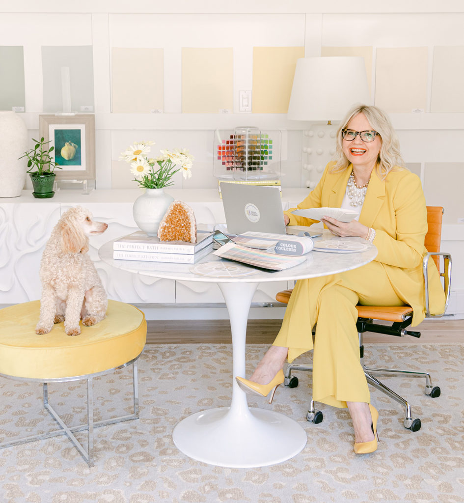
The goal as always is to keep your eye on what’s timeless. And on what you love perennially, that is, your personal style. Also, consider what works for the style of your house. If you can do that, you won’t be stuck redecorating every couple of seasons.
Here are my tips for indulging in the new 2023 colour and design trends without going overboard.
Yellow is making a comeback
In 2018, I declared that yellow was coming back but this was wishful thinking on my part. And, for the record (ha), I was at least not as way off as Pantone when they declared Mimosa as the the colour of the year in 2009.
That was 14 years ago. Back then I had just purchased a sofa in Mimosa and it was very difficult to find accessories in this happy colour.
The last time yellow was on trend was the 90s. Back then it was so popular we were using it as a main neutral. I was in many homes where my clients would say, “I love this colour actually, but all over my house, it’s just too much!”
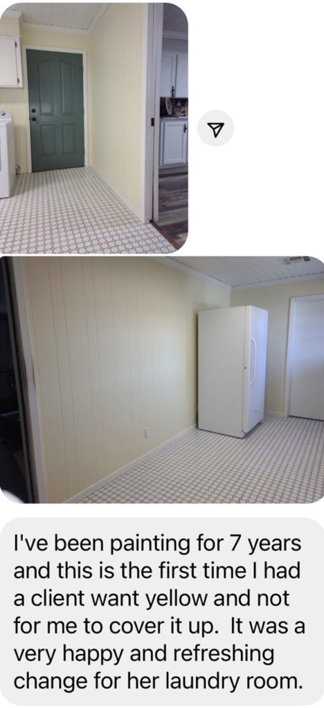
But I’m here to tell you, I have received some hard evidence that tells me yellow truly is back.
I received this message from a painter the other day:
The consumer is the one who drives colour trends not the other way around. I explain how this works in a video here.
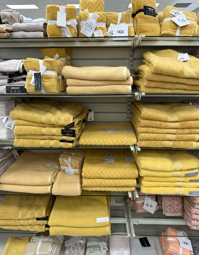
Most people don’t realize it, but the towel department is also a good place to look to see where trends are going. I snapped this pic at HomeSense recently. I think this very happy row of yellow towels is more evidence that yellow is back. Woohoo!
Colour is warming up
Overall, I’m happy to report that trends are turning towards warmer, more colourful looks. And with this we will likely see some exciting colour, as well as some potential pitfalls. This is the most definitive turn the trends have taken in recent years. As always, I’m here to help you navigate them in a timeless way.
The prevailing shift is towards warmth, mood and atmosphere. For 2023 everyone is predicting a return to cozy charm.
And while LOTS of happy colour is in the forecast, it also includes waaaayy more earth tones than we’ve seen for a couple decades now.
Many of those earth tones are neutrals with undertones. And there is nothing at all wrong with earth tones done well. It’s just that, with all this colour coming, decorating in 2023 and beyond just got much more complex. Why? Because we’re no longer working with default white walls and adding hits of black and cognac – a much simpler formula to imitate.
That means, more than ever before, my system for Understanding Undertones™ is going to be the MOST USEFUL handbook in the coming decade for working with colour. So now’s a good time to learn how to use it for decorating.
Of course warm and cozy is what we are looking for after over 15 years of often under-decorated white-on-white, modern farmhouse with too much jarring black. The trend mood right now is in direct response to the overuse of white.
AND, I know some of you are wringing your hands worrying, “but Maria, you said that white is timeless! Now what?? Omg, am I going to regret not keeping my brown finishes after all!”
Not a chance. I want to jump in here and take that worry right off your mind.
White will always be timeless
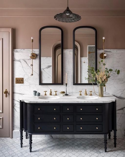
White kitchens and bathrooms will always be the most timeless and versatile choice. In a bathroom with classic white finishes, it’s much easier to cover the walls in an earthy paint colour than it is to introduce fresh colour or white in a bathroom clad top to bottom in earthy tile.
Notice we have a shade of mauve (another trending colour) here but the finishes are timeless marble. It’s a nice example of a classic bathroom design that indulged in a trendy paint colour – easy to change when you tire of it.
Jessica Helgerson Interior Design
The warm and cozy trend isn’t just a paint colour
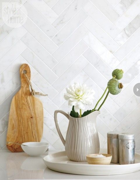
I want you to notice that introducing cozy character, the feel we are looking for now, can also be done with decorating and styling! No paint required.
Warm and cozy is the necessary antidote to the OVERUSE of white. And let’s be clear, default white walls in under-decorated spaces is the problem, NOT timeless white bathrooms, kitchens and even pale airy walls in well-decorated rooms.
Style at Home
Tips for decorating with 2023 colour trends
All trend reports point to COLOUR, especially warmer earthy hues, but also bold (but still warm) brights. We haven’t seen bold hues like red, orange and yellow-based colours being used in a long time.
And with bold colours on the horizon, everyone seems to be rethinking their white walls. Here’s a good rule of thumb. If you have distinct rooms with good moldings and passageways that allow you to transition wall colours, you can have fun drenching your walls in colour again.
However, if you live in an open layout homes built in the last few decades, it’s not the best idea to paint all the walls a trending terracotta or chocolate brown.
If you want to warm up the walls and it’s time for a change, try shifting your main neutral wall colour a bit warmer into a pale beige or complex cream – as long as makes sense with your finishes. Pale muted yellows and blue greens are also liveable and versatile options to neutral or white walls. I have curated several beautiful and on-trend selections in my large painted colour boards, available in Benjamin Moore or Sherwin-Williams.
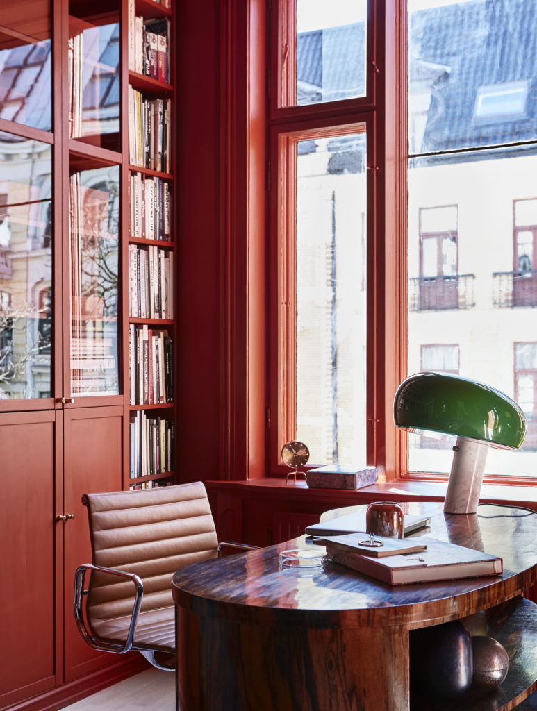
Because an important detail to notice in all the trending colour-drenched rooms we’re seeing, whether earthy or saturated, is that there tends to be plenty of really high end custom molding everywhere. And the opulent colour is slathered on EVERYTHING, trim ceilings and all. These rooms are also highly decorated. So, you’re simply not going to achieve the same effect painting a rich colour on drywall and calling it a day.
However, rich colour remains a great way to add interest, mood and character – even when architectural detail is lacking. It will be interesting to see how people with regular homes creatively incorporate this shift away from all-pale or all-white walls in the next few years.
If that’s your home, I have good news. Letting your airy light walls go is not at all necessary. They will always be versatile by definition. Just don’t leave your rooms un- or under-decorated.
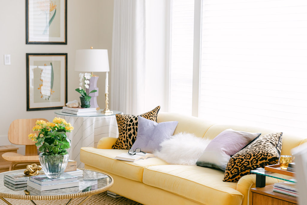
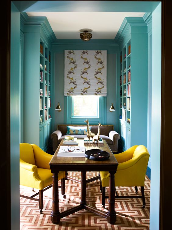
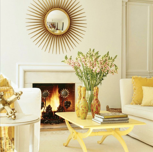
To start, simply layer in some accessories with colour and texture, as well as items that have meaning to you (hello! styling). Just like in the beautiful room below with yellow accents. Choose some furnishings, art, rugs and decor in a dramatic COLOUR and repeat your chosen hues by painting walls in bedrooms and bathrooms to create good flow.
Read more: 7 Easy Ways to Add Colour to Your Neutral Living Room
I’m really excited that my new house has ample moldings that mostly help make transitioning paint colours easy, which is perfect for my colourful style. And don’t forget about ceilings! I’ve got blue, lavender and golden yellow ceilings. See sneak peaks on my Instagram!
The Return of Stained Wood
Yes, wood is back but proceed with caution. It’s wise to incorporate the trending warmer wood tones with plenty of restraint. Rich wood elements and furnishings can be overwhelmingly heavy if you have way too many wood tones and pieces crammed into a room. Create balance with pale colours, white, and mixed materials.
However, matching wood furniture dining room and bedroom sets are still a no-go. It’s about a balanced mix.
Like any overused trendy neutral, the risk of “warm and cozy” and a move towards more wood, is to take it way too far. Too much wood slides right into stuffy and drab.
Balance is everything.
When we were exiting the Tuscan brown trend, I spent an enormous amount of my time and energy helping clients introduce white and cream to update their much too heavy spaces. This advice still holds. Don’t neglect to introduce fresh white and cream with wood tones.
In fact we’re seeing this trend as a solution to reverse the extreme all-white and too-bright rooms. Adding stained wood is a great way introduce warm earthy or richer colour into these spaces.
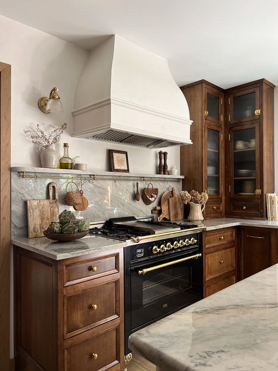
Richer wood tones are trending in kitchens too. A wood kitchen is most timeless when it’s balanced with white or cream as in this traditional style kitchen above.
But a white kitchen will STILL absolutely ALWAYS be classic. If you’re craving a cozier feel in your kitchen, this is where STYLING is your friend.
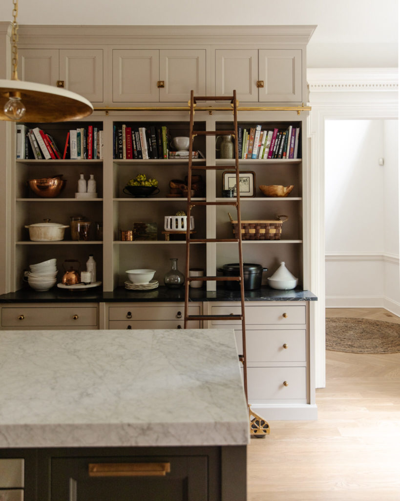
Or, if you want a warmer look in your kitchen with paintable cabinets, consider a warm green grey or green beige paint colour with plenty of white decor and finishes for a balanced look like this highly-custom kitchen below by Chris Loves Julia.
Step away from that slab of busy granite
Natural stone in bold colours and patterns are everywhere in our feeds. Mostly they are high-end, heavily-patterned marbles. And while they look “new and exciting” compared to the quiet white and grey quartz options we’ve been using, this is one aspect of the earthier trend that I strongly caution against.
Why? Because unless you are installing a high-end kitchen or bathroom where a highly-custom look is professionally designed AND you have the means to completely renovate it in 10 years when you’re completely over it, there is simply no way it’s going to turn out well. The fact is that working with strongly patterned materials just takes way more skill to get right and it’s highly unlikely to stand the test of time.
And if playing it safe feels in your renovation feels boring, here’s what you need to ask yourself.
“Why am I insisting on a busy stone kitchen or bathroom for thousands more dollars, but when it comes to buying a sofa or sectional for my living room, I have a hard time choosing something other than safe (i.e. opting for grey or beige furniture)?”
My advice has always and will always be, go safe and timeless in your expensive (aka glued-down) finishes that require renovation to replace. Instead, indulge in trendy colours and patterns in your moveable, less permanent furnishings and decor.
And as this new trend nudges us away from white-on-white, I feel the need to SAY THIS even more often and much louder: boring now STILL equals timeless later.
Mood lighting and atmosphere (always on trend here)
Well, yes. Always.
I guess now the world has finally realized that bright white walls don’t actually create mood OR better light. So, adding glowy, beautiful lighting is a novel great idea. 😏
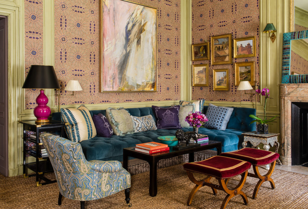
While oversized statement fixtures are definitely on trend, I recommend that you always consider every opportunity to include multiple sconces and lamps in your rooms, like in this maximalist show house room by Alexa Hampton below.
If you don’t have anything to place a lamp on, that means you need to get more consoles and end tables for your room. Because atmosphere is ALWAYS on trend.
2023 colour and design trends
Let’s review. In 2023, here’s what warm and cozy with character looks like:
- Warm wood tones (pale natural woods but also honey tones, rich mahogany, warm walnut, oak)
- Richer paint colours (both earthy and more saturated colours, especially in the realm of amber to yellow, terracotta to red, mid to deep greens and blues, and yes, even browns)
- Natural stone textures and patterns (careful with this one, installing busy stone is an expensive one that is easy to regret)
- Focus on mood lighting (as if this was ever NOT a thing?!)
And let’s hear it again for YELLOW! Hooray, I’m so excited!
Are there any 2023 colour or design trends that you are most excited about? Please post them in the comments below!
If you’d like my help choosing timeless finishes and colours for your new build or renovation project, see my eDesign packages here.
Related posts:
2023 Trend Colours: What’s Your Take?



My style for decades has been massive amounts of bright clean colors (including in my own art) combined with natural materials (walnut, white oak, copper/steel), and when I do neutral colors they at least include textures. These things have nothing to do with a trend; in fact I cringe when a lot of my ideas I planned years ago became trendy. (Although there are some benefits of intersecting with trends in that there’s a ton of choices in furniture and accessories, such as mid-century modern.)
I feel that I took the lesson from you to keep things simple, and my hard surfaces are neutral, although in a more modern style that you ever show in your blogs. I am at the point of buying a lot of furnishings and rugs now, and sometimes start to wonder “is this too much color?”, but for me that is hard to do, and I think I’ll recognize it when it happens and pull back.
I just ordered a turquoise chaise sectional, and have been debating the chair color. (The choice is a combination of the color swatches offered and the texture of them, whether they are soft and cozy, or scratchy or would pill.) Yellow is definitely one of my choices, and if I don’t use it for side chairs I will for dining chairs.
Let’s have a round of applause for the return of yellow!!! When I was renovating my home in 2018-19, yellow was scarce!! Pillows, rugs, lamps, towels, etc., were nonexistent. I was able to incorporate my love of yellow by painting my office Ivory Luster by Benjamin Moore, a yellow that is soothing, timeless and doesn’t shout “caution” and one I chose using from Maria’s VIP collection (I know those boards were the key to getting it right the first time). It’s a terrific wall color that looks great with my older pieces of traditional furniture as well as my more colorful framed posters. I also used it in my laundry room and it has a different feel with white appliances and cabinets. Hooray for the return of yellow!
Thanks in large part to your advice, we went light and airy (but not white) for most of our walls a couple of years ago, with a mostly white kitchen, and a timeless marble for the new guest bath, adding some color with towels, rugs, etc. Your best suggestion for me was to get a sofa in my favorite color, and in my 60’s I finally have my long-coveted peacock velvet sofa! My husband insisted he wanted a warmer color for our TV room and master bedroom so we went with a warm almond shade; I guess he was ahead of things, lol. As for adding punches of color to my white kitchen, I started buying Fiesta so I guess I was ahead of that one! I suspect that one of our guest bedrooms may be in for a warm and cozy makeover, using decor rather than repainting. We are still shopping for more lamps and sconces for all our spaces! Thank you for all your advice over the years!
I meant to add, thanks to you I was able to talk my husband out of “Swiss cheese ceilings” when he redid the lighting!
I agree on keeping your hard finishes timeless and investing in trends in decor pieces. I renovated my bathrooms and laundry room in 2022 and went with white cabinets and marble like porcelain tile with quartz countertops. I can change out my towels and any decor as colour trends change.
The new trend of heavily veined marble is going to be a passing one. It certainly isn’t to everyone’s taste and most would tire of it quickly. Plus, it needs to suit the rest of your home’s style and decor.
I love statement lighting. Even a traditional home can benefit with new updated lighting so it doesn’t become stuffy. Chris Loves Julia is a great example.
I’m happy to have a return to natural wood. The trend of every piece painted was not something I bought into. A piece or two in a room is fine but natural wood adds warmth and character.
Love reading about the latest trends.
So much helpful info, and beautiful examples! Thank you!
I love yellow and have a yellow laundry room that is bright and cheerful (and yes, my painter asked me if I wanted him to redo it, LOL). However! It is difficult to impossible to order yellow items online and have them arrive in a true, clear, perfect yellow, like your sofa. As evidenced by the towels in HomeSense, there are so many shades of yellow, often muddy and mustard-y. We have to be willing to buy and return, buy and return.
I am excited to see warm wood tones returning, as well as COLOR! During the pandemic we painted the walls of our sunroom (mostly windows and doors, not a huge amount of actual wall space) Sherwin Williams Terra Cotta, matching a gorgeous Persian rug in the room next to it. We love it and welcome more Color to our home! A red sunroom? Yes!!it work’s beautifully!
Hallelujah for color! I love your insights and your advice. I certainly wish people who are in the business of designing and building homes would read your blog. My favorite “Maria-ism” is “boring now equals timeless later!” The inspiration photos you included are beautiful, Maria. I don’t consider myself a maximalist in the slightest, but that Alexa Hampton room is calling my name! I just want to curl up on that gorgeous sofa and stare at the room 🙂 Thank you for sharing all your wisdom with us in a fantastic post.
Maria wrote: “All trend reports point to COLOUR, especially warmer earthy hues, but also bold (but still warm) brights. We haven’t seen bold hues like red, orange and yellow-based colours being used in a long time.”
I’m FINALLY on trend! Woo hoo! We’ve rented four homes with neutral walls since 2011, so changing paint is not an option. But starting in 2011, I have collected, for my various small living rooms, chairs in orange, purple and red—all with warm yellow throw cushions. My abstract Southwest design living room rug is predominately yellow and orange, with bits of red, purple, pink and teal. I have a couple of small dark wood pieces of furniture and a couple of red painted pieces. Two dark red lamps, a warm yellow lamp and neutral floor lamps are all I can fit, but they provide plenty of light. Because I have high ceilings, I can have two large pieces of art on the walls, mostly in red.
Our dining room and kitchen are open to the living room. The dining room has a subtle orange rug and chairs. In the kitchen with white cabinets and black counter, I have displayed my collection of Fiestaware in the living room colors. So it all flows.
I’m sure my description sounds pretty scary to those who love calm neutrals, 🙂 but decorating in your favorite colors (whatever they are), even if they aren’t trending, will always make you happy when you walk into the room. These are all colors I love, regardless of the trend. I hope the fact that bold colors are trending may encourage others to be bold with their favorite colors. And accessories like towels and lamps in these colors will be more available. Go for it!
Yellow is my favorite color, specifically butter. My living room walls (matching my sofa) have been my decorator’s pick SW Inviting Ivory for over 15 years. I always get complements on this serenely light and warm room. My bedroom is a shade darker yellow from the floral chintz draperies with a chocolate background. Still love it!
I am so happy to see the return of colour. Whites and pales are great to photograph, but by the time you’ve seen one house reno programme or flicked through a home magazine you’ve basically seen them all because they all look the same, and somewhat impersonal! I can’t wait to see more colour and people’s personality shine out in their home decor again. More vavoom! in homes 😍😍😍
I was thinking recently about what I thought the next color trend might be. Based purely on my own feelings, I was longing for something “happy” like yellow. I am personally SO TIRED of grey and white. So many catalogs still feature stark furniture and rooms that to me have all the warmth and appeal of a prison cell. After Covid and the events of the last few years, I think consumers want their spaces to spark happiness and offer welcoming warmth. I, for one, am ready!
I’m a yellow person! So glad colors are back because that makes it easier to buy what I like. I’ve always gravitated to a particular look and set of colors and it makes it hard to decorate when those colors are no where to be found in the stores. In the little city where I live, there are really only a couple of true furniture stores and they stock mostly browns and grays in mediocre styles and quality. Makes it hard to furnish a home. Thankfully, I have recently found Chairish and looking forward to finding things I can love for decades. And, thank you for the suggestion that if i don’t have places for lamps that I need more tables! I guess I needed someone’s “permission” to buy lovely side tables. Thank you!
What a wonderful comprehensive piece. Thank you. We recently completed a year long gut renovation. All along the way in making the hard finish decisions I asked myself what would Maria do? I heeded your timeless and classic approach. We have a lovely home now and I give your guidance credit.
My husband unexpectedly bought me bouquet of yellow flowers Saturday morning. My home is mainly blue, white, brown.They looked beautiful separated into 5 small white milk glass vases in my dining room table with a tan tablecloth, blue placemats, and white dishes.
While yellow is not my preferred, predominant color… it will always be welcomed as an accent color in my home. Muddy, earthy colors like the muddy desert colors that are trending … not so much.
I am so happy color is back! I look at a lot of real estate listings every day, and every day I see the exact same trendy fixtures and furnishings in the same sad colors. At least back in the day 😉 you would see trendy and modern kitchens, but in a completely different wild color than what the neighbor had.
I knew yellow was coming back when I too purchased towels in the lovely color two years ago. My laundry room counters and the walls in my kitchen have been yellow for the last 25 years!
Thank you Maria. I always look forward to your color trend reports, and appreciate your ideas on implementing them.
Yay, I’m in!! Actually, I never got on with the grey, white, black trends. My tiny, low-light apartment has happily been a deep olive for 15 years; can’t imagine it being anything else. Last summer, I did change the trim from white to the same olive, which turned out very well. Also purchased a CLJ rug that you featured on Instagram a while back and updated pillows and accessories to include blues and honey golds. Don’t have a sofa, but my comfy reading chair is green. It looked a little off-shade at first, until the decorations came into the mix. Floors are a walnut shade and beautiful lamps are not in short supply. Kitchen does have browny-greeny Uba Tuba type of granite. I’m unashamed to say that I still adore it. It suits the apartment and so it’s a keeper for me. My home will never be a show home; but it’s a wonderful thing to live with colors you love, like cozying up in your favorite sweater.
Hi Maria. Great post! My husband and and I installed white kitchens and bathrooms with medium toned wood floors in our forever home 6 years ago due to you advice and are ever so grateful! We had to swim against the tide of our pacific NW builder and friends who said we would regret not installing brown or grey fixed elements. We are happily collecting art and vintage rugs and textiles for styling. It’s so much fun!
I am confused about the banner to the lefts of your posts. I understand that no one should sell your info, but don’t you want us to share it? Also, the banner cuts off the text.
I’m happy to see more color since I skipped the gray trend and went right for color on my walls. However, I always wince when I see trim painted the same color as the walls. I just don’t think it looks good. I think it’s one of those trends that will date quickly. But at least it won’t take people a lot of effort to repaint the trim back to a normal color.
Maria, I love this post! I have a LOT of wood tone furniture, and I’m okay with saying I like it! I’m preparing for a living room makeover, and this gives me inspiration. Trying to keep what I love without it being heavy and stuffy. As far as the kitchen, I’m more of a wood tone, decorate with cream & off white sort of person as in the picture of the kitchen with the wood cabinets, but also dislike lifeless, colorless rooms. While I’m not a fan of yellow, I appreciate your affinity for it, because I’m a green gal, and I find many people like green. You’ve given me the confidence to go ahead with what I like. When you talk about painting cabinets a warm green gray, what colors do you suggest, as in what do you think is pictured there? Would those colors go well with brushed nickle hardware? I do like that muted look, but I also gravitate to more fresher, bolder greens. Not for cabinets of course. I can’t imagine what they’d look like in Pale Avacado! Anyway, thanks for sharing your experience and insight!
Maria’s recommended green greys are listed in the Bonus Book included with How To Choose Paint Colours ebook: https://mariakillam.com/product/how-to-choose-paint-colours-pdf/
I am so excited! We painted our entire 2500 sq ft home in Sherwin Williams Napery, a light cream yellow in 2020. I love it. So now I will actually be on trend. It goes great with by blue and white Chinoiserie pottery I have in every room. I am thinking of doing a highlight ed wall in livingroom…are they in or out? 💛
About three years ago, I had my couch re-upholstered. Guess what colour velvet I used. YELLOW. That couch now resides in the nook in my master bedroom and I abslutely love it. It is sooo cheery and bright. The replacement is a rich green velvet and I love that too. Before that, the couch was a very sad beige. Interestingly enough, my internal walls are painted a yellow beige and the exterior is a rich yellow – somewhat like the ceiling in your new closet. Yellow is truly a lovely colour.