Kitchen designs are expensive, but when you try to go it alone – without designer guidance – it’s easy to make even MORE EXPENSIVE mistakes that you’ll regret. Working with a designer not only saves you from these extra expenses, but also may save your sanity.
And when it comes to choosing the right lighting or hardware, these two details that can make or break your kitchen design.
But first, just wanted to share the fabulous view from our new backyard, I’m so blessed we get to enjoy this kind of sunrise on the regular!

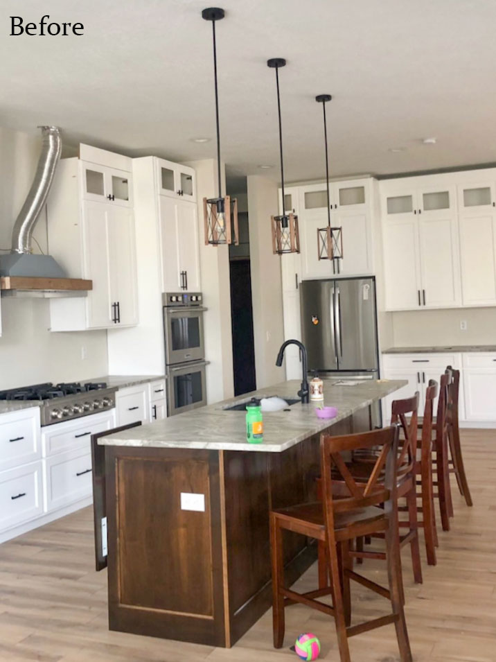
Help! My very expensive dream kitchen drives me bonkers!
Recently, I received this message on Instagram:
“There was some miscommunication with my cabinets and they turned out a true white instead of warm white. My whole house has warm tones. Then I made the dumb decision of black hardware but really couldn’t decide what other colour blended because my husband insisted on a black faucet (I saw your warnings after so I know, I know). And now my very expensive dream kitchen drives me bonkers!!
Is it just the stark white and how it doesn’t relate anywhere else? Do I save my pennies and eventually repaint? Or could hardware help? The counter stools will also change.
Also, I hate the size of the hardware which I just saw that post of yours. So disheartening and yes we needed a designer but we contracted ourselves because it’s expensive.”
My response was something like this:
Your kitchen is just fine. But if I were your designer, I would definitely recommend that you change the hardware and lighting. Because, frankly, it kills the design.
Your kitchen needs a softer look, which would be easy to do if you chose gold metal to warm it all up. And since you are replacing your counter stools, they should be white.
I also sent her this pendant lighting recommendation (to fit within her budget):
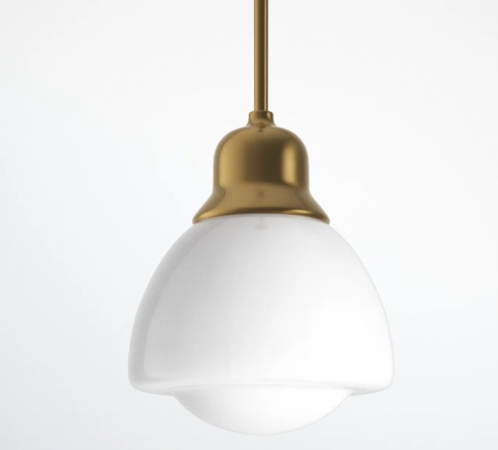
Schoolhouse pendant (similar and similar)
To be clear, if budget wasn’t an issue, she could also have installed something larger, like in this kitchen below.
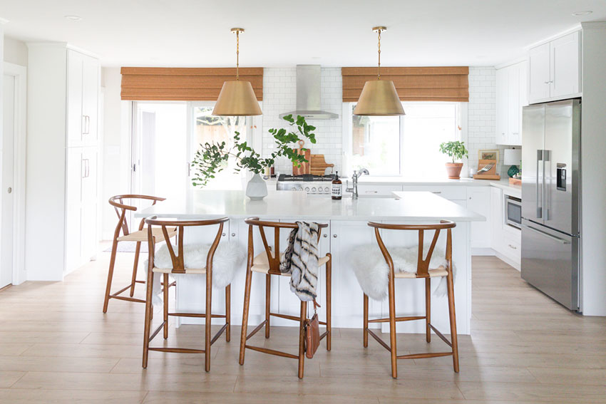
Timeless Bungalow Renovation – Similar Pendant – Another Similar Pendant
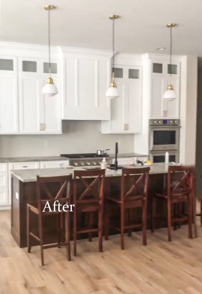
And here is her kitchen again with the lighting and hardware changes I recommended:
Later she sent me this sweet note:
“Wanted to wait for the kitchen to be finished to send but this transformation!!! So much better! I am so grateful for your help. Finally got the pendants hung and couldn’t be happier!
Now I want to change the faucet and the rest of the lighting in the house but that will come, haha. I’m really good at doing things backwards and wish I found your account pre build instead of mid build but you rescued me from painting my entire house white and I love the green beige I chose.
I’m also going to buy white stools or paint mine, but wow!! You rescued my expensive dream kitchen, thank you!”
Choosing the right counter stools for your kitchen
Ok, so let’s talk about counter stools for a second.
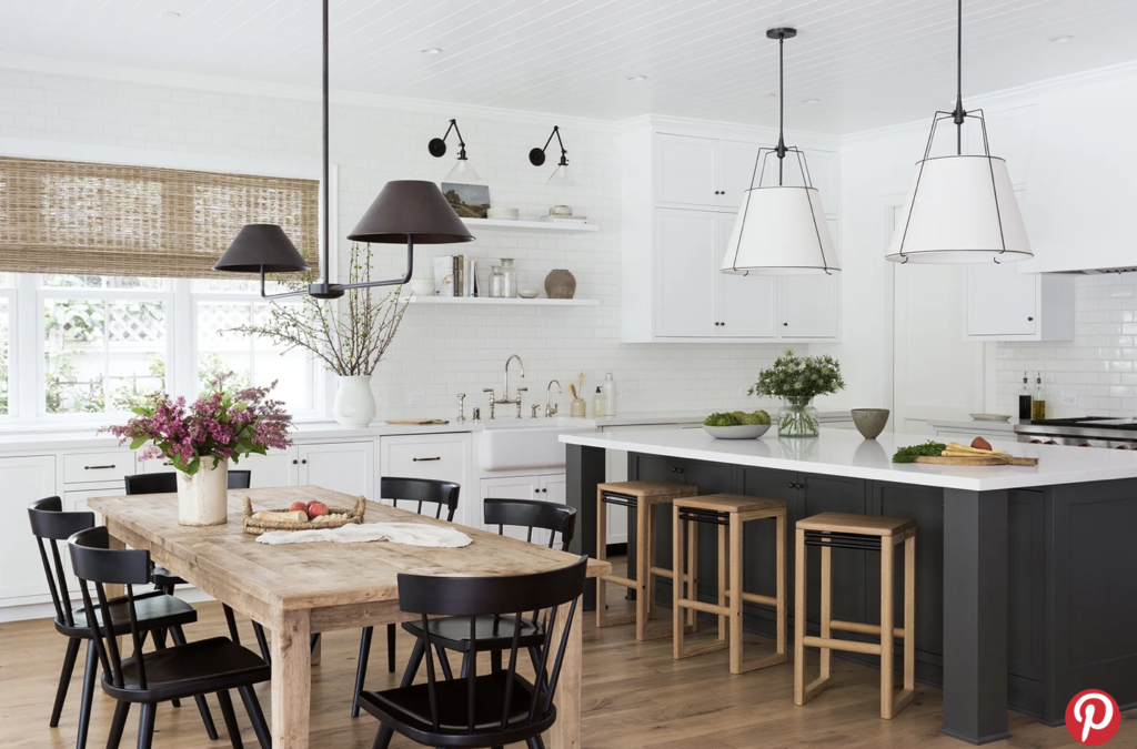
PHOTOGRAPHY BY ALEXANDRA RIBAR; DESIGN BY LEANNE FORD INTERIORS
It generally looks best, especially if your view of the kitchen is from the back of the island, to create contrast with your stools and island (see above).
So that means, if you have a black island, don’t buy black counter stools, etc.
And in this case, with a brown island, the cherry counter stools do not look the best. And my reader did already say she was changing them.
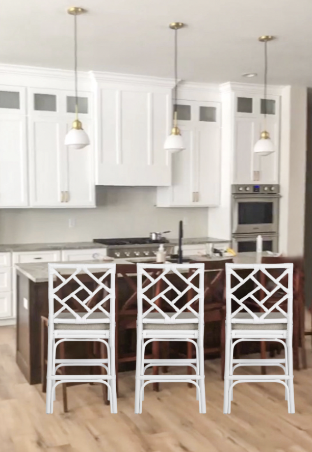
white counter stools (also come in blue and gray)
Choosing the right hardware for your kitchen
The other hot tip I have for you regarding hardware is to avoid any drawer or cabinet pulls that look remotely like this one, at all costs:
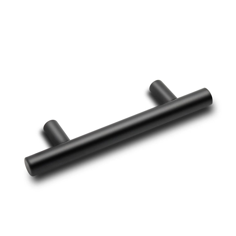
Why? Because it’s modern.
And most of your homes are traditional. Even a modern farmhouse style is still more traditional/transitional than a flat out modern home design.
Even if you choose this pull because you have flat, slab cabinet doors, it’s still not the correct to slap a 4″ pull on EVERYTHING.
And as I mentioned in this post about decorating with black, if you don’t have any black in your kitchen, avoid black hardware and faucets. The end.
Kitchen design is all about the details
Notice what a huge transformation just the hardware and lighting made in this kitchen design. Lighting is hard to choose if you’ve never done it and I can help you make the right colour and design decisions that fit YOUR kitchen specifically with my eDesign package for timeless kitchens.
Because getting the DETAILS right is what makes a design truly beautiful.
Don’t be afraid to ask for design help with your kitchen
Without a designer, many of us make isolated decisions about our kitchen. In a new build or complete renovation, we may just pick out what the contractor needs at the moment – without considering everything altogether. And that is a big mistake.
You see, one colour decision plants a seed for ALL the other colour and design decisions you will make after it. And ignoring this first decision or working without a design plan will lead to expensive mistakes.
And fixing just ONE of those mistakes often pays for the designer.
P.S. Please remember to be kind in the comments. It takes courage to admit (and then share) your mistakes with others. 💛
Related posts:
5 Kitchen Design Details that Matter; Before & After
Top Kitchen Colour Trends from the Last 50 Years
Transform Your Kitchen with this One Update; Before & After


The change in lights made a dramatic difference, so even though I’m not a mixed metals gal, I like them.
From my perspective, though, the biggest, glaring-est monstrosity in that kitchen is the massive brown island. It does not match or even complement. I would paint it immediately. Problem solved.
Agree 100% about the island. It’s clearly from the Modern Farmhouse Formula: Black + White + Wood
Geez Maria this one I’m not sure about. I think the lights are abit small and the chairs alittle bulky looking. Maybe larger lights would over the island would make the chairs seem not so bulky. Other than that it’s a very nice kitchen!
Good eye! But Maria was trying to recommend something that fit into this person’s already taxed renovation budget. 😉
Love these type of posts!
I am not a designer, just an admirer of good design. When I saw the first picture, the island and lights didn’t look “right”, but the change in light fixtures and stools made a great difference. Great suggestions! Thank for teaching us to contrast stools and island cabinets.
I have never commented on any of these posts before but I have to disagree with the above 3 posters. Such a simple fix rescues this homeowners sanity and pocketbook. I think the kitchen looks much better and I would be happy to have a simple cheap fix. Kudos to the homeowner who reached out when she did. I think it is coming along beautifully. Would be fun to see which stools she chooses.
The new pendant lights fit the kitchen soooo much better.
As far as counter stools/chairs, this is one of the RARE times I go another way, Maria. I don’t like contrasting ones because when they are in disarray, it calls attention to them and makes me feel like I have OCD. 😉 Also, I find contrasting ones to be busy looking. There might be isolated cases where I like contrasting ones, but generally no.
I do think however, that those counter chairs are too bulky – a lot of counter chairs look too bulky though.
Just realized I wasn’t clear. It’s the ORIGINAL counter chairs I find bulky. Blocky and bulky.
The ones you suggested, Maria, are better because there are some curves. But since I don’t like so much contrast, they’d have to be a different color than white if it was my kitchen.
As we see from the comments, there is no pleasing everyone. 😉
I agree. Unless a stool is an upholstered color, I think contrasting bar stools can be too busy.
What a difference those changes made! Well done! Sometimes the little things count for a lot.
It looks much better! However, I agree with a previous poster, the counter stools look way to busy. Simple white wooden counter stools would not detract from the beautiful kitchen. IMO, the white stools chosen are a distraction. Lighting looks great, maybe with simpler stools they could have been a bit larger and more of a focal point drawing your eye into the room and that beautiful range hood.
I agree Diane. If the existing counter stools are in good shape and you like the style, how about painting them the same color as the cabinets?
Maybe simpler white counter stools would work—say, with low backs. The ones shown attract too much attention, IMO.
But the changes in lighting fixture and pulls make a huge difference. When I saw the before, the lighting immediately looked all wrong. Now the simplicity of it looks great. Maybe that’s what bothers me about the stools—they are busy rather than simple. When your kitchen is simple (and it can be simple and also very expensive), good decorating is what makes it seem warm and welcoming.
I’m not bothered by the wood island. We’re not seeing what goes on behind it, if the kitchen plan is open. And once she gets rid of the black faucet, there will be nothing to remind us of the black and white plus wood trend.
It’s a lovely kitchen.
Her kitchen was not a disaster at all. It just needed a few simple fixes like you suggested. My first thought before reading anything was the lights were not a fit for the design, and I thought simpler, bigger pendants would help. I also didn’t like the pulls! Those pulls are useless! Not only are they modern, but those edges sticking out grab everything. If she had not installed anything before, I would have picked knobs for the cabinet doors instead.
While others don’t like the brown island, I like it. I would have picked some metal chairs with wood seats or cushions. Or some rattan chairs with cushions. In other words, a different material than wood. I love her countertop.
She actually did quite well! I can say, having redone my kitchen during Covid, getting what I wanted was a challenge because of supply disruptions. I did manage to get the faucet and lights I wanted, but it was hard to source things. I think some of those supply problems are still lingering.
Lovely. The good hardware and schoolhouse pendant make so much difference, and are exactly what I have been looking for. The link for the pendant says it is no longer available. Is there any other info available such as size or details that I should look for to get a similar product. My island will be 92”.
Try this link: https://rstyle.me/+r7W41SQ9bcBDfF99h8BhTg
Kristy, that is a great price at Home Depot! Beth, if it is in your budget check out Rejuvenation. The one I was looking at is around $250. It is the ROSE CITY 4″ FITTER ROD PENDANT with many options to choose from. I think schoolhouse pendants are fairly easy to find so you should have no trouble.
Thank you, to the reader that sent in her photos and asked for help. That is a super hard thing to do! And, wow, folks. A lot of really strong opinions with only one picture shown. Perhaps, there are more wood tones out of view?? And don’t forget it hasn’t even been styled yet, so there are even more opportunities to bring in color or warmer tones to the other side of the kitchen. I think the fixes suggested were absolutely helpful and moves the renovation in the right direction. The chairs suggested are okay, too, in my book, although not my personal preference. Kudos!
I too love post like this! Real homes, real design dilemmas and more affordable solutions. Much better with the new lights and softer looking hardware. But what about the top cabinets with the glass, no pulls or knobs, or just didn’t add those in the mockup?
Agree with the others about the island chairs, waaaay too busy. Not loving that hood, the contrasting metal strip, but maybe not such a standout when finished. Maria, do you know how she will complete the hood cover or your recommendation for that? Thanks for another great post!
Yes! “Real homes, real design dilemmas and more affordable solutions.” That’s what most of us are dealing with so I agree I love these kinds of posts with brave readers!
I’m not seeing a contrasting metal strip on the hood. Can you explain what you mean?
Thank you to the reader for allowing Maria to post about her lovely kitchen. The changes to the lights and the hardware look great! I’m a DIY girl, so I’d probably try to paint the existing chairs to see how that looks. Maria, while white is likely the most versatile color for the chairs, might your reader try a color that is in an adjacent room? Or maybe she will purchase and area rug and pick up a color from that? Of course, she would then have to repeat the color in her decorating of the kitchen. I love these kinds of posts, Maria! Thank you!
Another fabulous save Maria and all in budget. I’m super impressed with your morning sunrise picture, that must be very inspiring to watch. Really enjoying watching the new house progress, it looks like you’re having a lot of fun.
Wow! I’m really impressed that such simple changes can make such a difference. The kitchen looks great now.
And for everyone saying the white chairs Maria picked out are too busy—they’re photoshopped onto the photograph on top of the existing chairs and out of perspective (and probably not to scale. It was a quick mock up!) They’ll look great in person, because choosing accessories like that is one of the things Maria is best at.
I look forward to hopefully seeing the kitchen with a range hood and backsplash. I know she’ll love it after it’s all finished.
Interesting comment about interior designers being expensive. I wonder if we all need to do a better job of showing the value we interior designers can provide. Let alone reduce the stress and get the job done the first time.
I’m happy she wrote into you, she’s getting great advice now!
So much better! And that view of yours – gorgeous!
Those handles are horrible because they catch your clothing. I will only use that style turned into a U. It is the most ergonomic shape to be able to easily grab, and function over form. (No knobs, no flat pulls etc for me!)
But I’m struggling with hardware color. I’ve got slab walnut cabinets in a modern house with off-white walls and counters, and stainless appliances/sinks/faucets. I need a second metal and don’t think stainless/brushed nickel is really the right look for handles for walnut. But I’m not sure if I should fall prey to the “gold trend” or the “black trend”. Whichever I choose I’ll also integrate into the island chandelier.
There’s a metal called dark brushed brass which I’ve ordered recently in 5″ handles. I really like them for colour and quality and they won’t snag because of their shape (modern U). It would look lovely with walnut I think. It is a different colour metal so does not read as a trend. Here is the link: Hope that helps!
https://www.amazon.ca/gp/product/B08JP4MNWC/ref=ppx_yo_dt_b_search_asin_title?ie=UTF8&th=1too.
I have noticed a new bronze color recently that might work for your walnut cabinets. I want to say “champagne bronze,” but that is probably not right. It is darker than gold with browner tones but not as rustic as the antique bronze hardware from the Tuscan trend.
Could you use walnut knobs stained to match the cabinets? There are some that are simple and modern.
It looks so much softer and lovelier with the changes you suggested! I love a wood island in a white kitchen myself. Make the faucet stainless to go with the fridge and finish the softer look 👍 nice work I love when small tweaks make all the difference.
The changes Maria suggested made a big difference but somehow the big dark island hits me wrong. It matters only that the homeowner is happy though!
Ok, the BIGGEST change in this kitchen is the photoshopped rise and crown added so the cabinets go to the ceiling. What on earth was going on in that kitchen in the before ?! Criminal that someone actually took their money and installed them that way. The only lighting change that will help that kitchen is lights off. Like, total blackout. So sad for them.
Ok, the BIGGEST change in this kitchen is the photoshopped rise and crown added so the cabinets go to the ceiling. What on earth was going on in that kitchen in the before ?! Criminal that someone actually took their money and installed them that way. The only lighting change that will help that kitchen is lights off. Like, total blackout. So sad for them.
In the before photo, the renovation was in progress and the cabinetry and moldings jut weren’t finished yet — you can see on the left that the hood hadn’t yet been installed over the range and the molding wasn’t yet installed at the ceilings. The “after” photo was not photo-shopped its just that now the renovation was finished.
So sad for you. Such a negative post. I’d like to critique your kitchen.
The first thing that got my attention was the cabinets at the top with that little glass. It just looks odd to me. Maybe a longer piece of glass but not the little ones. I agree with someone who said small stools would look better and I think white is the go to color for them. The little changes have helped this kitchen a lot. Can’t tell if the island top is white or some other color but to me white would look best.
One thing that I noticed, all though small, is the bright white outlet on the dark colored wood island. I would change the outlet and cover to match or blend with the color of the island rather than making it high contrast. Diane
Stopping by to say the same 😉 Beautiful/easy updates made to save this lovely kitchen, and now the eyes are immediately drawn to the outlet in the island (similar to how in a photo, eyes are always drawn to skin color first). Sadly, because it’s cheap, our builder ALWAYS puts white outlets on everything and it was the first thing I had my husband (much to his chagrin) change out. Now when we go into neighbors homes, he always comments on how easy it is to change and at such a low cost to not only help the outlets disappear but to raise the caliber of the space.
Wonderful changes! I would, however, paint the island when finances permit. Something softer, less contrast, a color from the palette of adjoining spaces. Then continue that color in accessories for the countertop. When doing your own remodeling/contracting, paying a professional, if only for a fresh set of eyes, can make all the difference.
Lovely kitchen! Even lovelier with the updates. I don’t even mind the black faucet because the stove top is black and the oven glass is looking black. A couple little black touches – say a green plant in a blackish pot – and a black vase with flowers might keep the faucet looking like it is integrated.
All I could see were the tops of the cabinets not going to the ceiling and feeling terrible that she would have dust accumulating up there. It looks beautiful now! I actually didn’t mind the hardware but I do think the new lights are an improvement. It’s a gorgeous kitchen and I hope she enjoys it!
I appreciate posts like this with real homes and dilemmas.
The kitchen looks lovely! It’ll look even better once it’s finished and styled.
The thing I love most about you Maria (although there are many), it’s the way you consider budget first. You have a gift for seeing the most cost-effective ways to upgrade a real-life design and I love your eye and practicality. This example is no exception.
I am so grateful for your kitchen design package. I love my kitchen that you helped me redo, even though I still need to change lighting and my hood vent (waiting for budget to allow these changes.) No guessing on paint color or hardware, or if I made a mistake. Bless you always!
What great advice! Real world improvements are so much more informative.
What approach does one take in a kitchen without an island? One fixture over the table and utilitarian (un pretty) pot lights in the cooking space? A pair of fixtures, one over table and one over sink? Coordinating but not matching fixtures? This is my biggest challenge putting your lighting advice to work in my home.
I inherited the dreaded modern drawer pull in brushed nickel. I’ve hated them from the moment I laid eyes on them. After the umpteenth thigh bruise and ripped shorts, I’m finally taking the time to replace them. Here’s the problem – the screw holes are too close together as the bars are 2″ longer than the distance between the screws. I have wood cabinets that aren’t getting painted anytime soon. Am I stuck with pulls that attacks me while I’m cooking OR are too small for the scale of my cabinets.