


Have you noticed this too? Now that the black and white colour trend has saturated home exteriors, commercial buildings are starting to follow suit. And, they are mostly doing a good job of including THIS colour to help warm things up. Can you guess what it is?
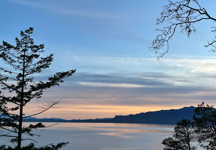
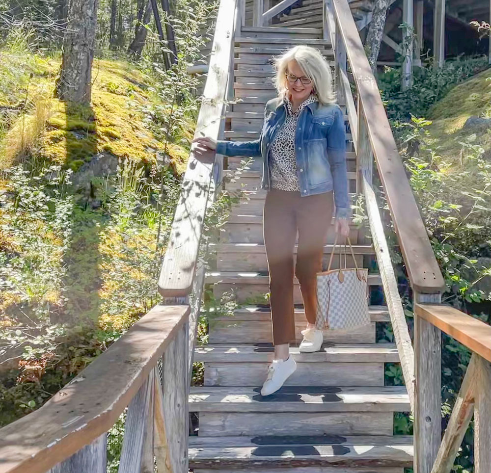
The view from our getaway this past weekend
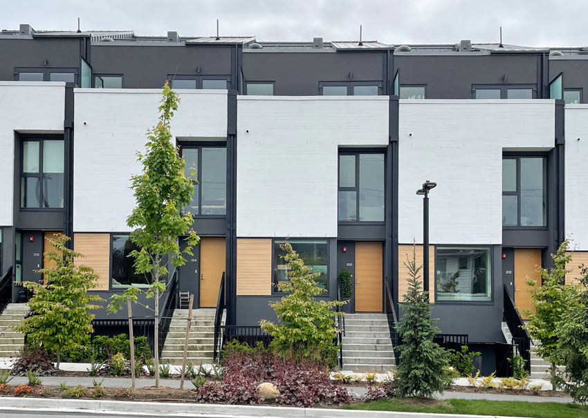
The black and white trend is quickly taking over commercial exteriors to the point where they all pretty much look the same; black + white + grey or wood (below right).
And it duplicates the trendy interiors we’re seeing as well (below left).
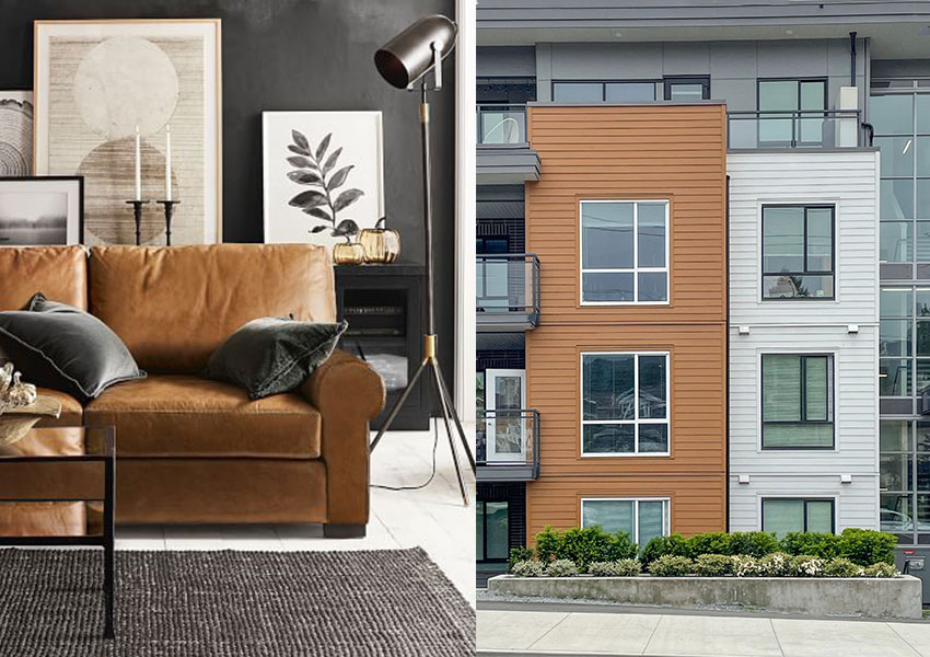
Black, White & Cognac Pottery Barn
I have been in the business of colour for more than 20 years, which means I have specified colour through two decades of colour trends. Brown in the 2000s and grey in 2010s.
Throughout these decades, we specified a range of trendy colours. Which means we didn’t give everyone the same brown/pink beige/taupe colour or greige/colour/medium grey/charcoal shade, there was range. Even though the range was still in the realm of trendy. All that being said, I can count on one hand how many times I have specified charcoal for an exterior. It has a place. It simply WAS NOT the answer for every single exterior during the time when everyone was in love with grey.
Anyway, now that the black and white trend is in full swing in the 2020s, the colour scheme is almost identical everywhere. Either a stark white or basically black or close to black exterior. ALWAYS with black windows, of course.
In my Masterclass for Exterior Colour Selection, I talk about a white exterior being timeless. But a white farmhouse with black windows? Looking the same as every other house on the street? Definitely TRENDY.
In case you’re wondering.
Now, is that trendy black and white exterior BETTER and much prettier to look at than the ALL bleak charcoal exteriors from the grey trend or the mish mash of undertones that everyone ended up with in the brown trend?
It absolutely is.
UNLESS you decided your white house had to look different from your neighbour and added some unnecessary black or charcoal stone somewhere. I talk about that in the Masterclass as well.
In my eDesign department, the theme is ‘How white can we go?’ since we get a lot of clients who have existing earthy stone that must be considered. Earthy stone immediately eliminates stark white as a possible option.
Adding a warm greige or complex cream to an earthy exterior, or painting bad stone or brick is a wonderful way to make it feel fresh and current.
Okay back to my trends review, when I was growing up, white was the ‘builders beige’ that everyone got when they moved into a new apartment.
Then, in the 80s, everyone started experimenting with colour on their walls.
Accent walls were big (they just weren’t black).
In the 90s and 00s, no one moved in without painting their entire house varying colours or calling the colour consultant to come over and help choose colours. Back then, the only place you could find a colour consultant was at a paint store.
Designers, seeing the opportunity to add this valuable service to their list started getting trained to overcome their fear of colour.
Then colour became mainstream along with open concept floor plans. Clear transitions from room to room disappeared and it became difficult to specify a different colour for every room. The concept of the ‘main neutral’ was born.
Rooms with colour are now mostly relegated to the dining room, powder room and bedrooms.
Therefore, after that brief colour history moment, you can see it’s been a long time since WHITE WALLS were actually a thing. I get the obsession. It feels fresher than anything else.
White makes you feel like you can exhale. It’s a blank slate like anything is possible. White walls reflect energy, black walls absorb it.
But white all alone seems boring. Enter black accent walls (nooooooo) and black windows (not for e-v-e-r-y house) and cognac leather (thankfully this is timeless).
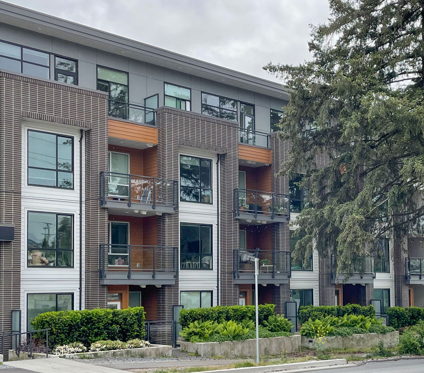
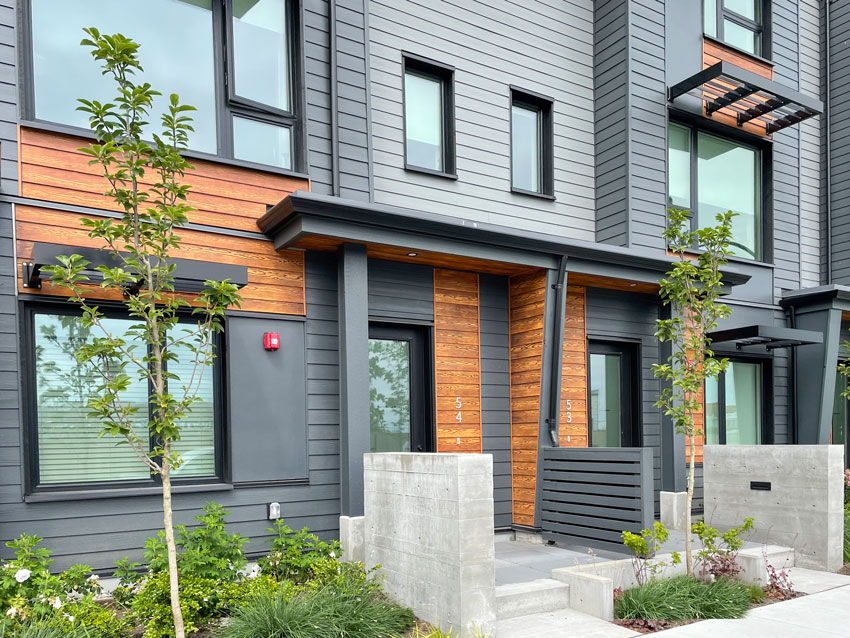
However, I find it fascinating that basically the colour of cognac leather (orange) is being added to commercial exteriors in the form of orange stained wood, to add warmth to the now-standard black and white scheme as well (below).
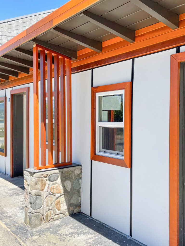
And it’s a good thing because in this case, it actually works, by default. In the grey trend, we didn’t have a warm, trending COLOUR that balanced all that grey, therefore many homes inside and out, looked simply debilitatingly drab. Which is how grey can feel when it’s overdone.
Therefore, the current, trending colours are actually way better than the brown on brown exteriors of the brown trend, and the all grey on charcoal exteriors of the grey trend.
However, where you shouldn’t add orange stained wood is to an all-black exterior WITHOUT any white. That gives you a look that reminds us of Halloween. Just like yellow and black without any white ends up looking like a bumblebee.
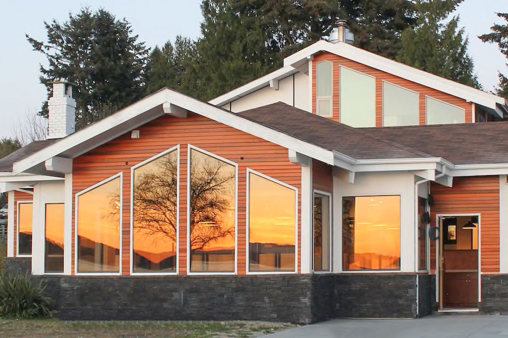
When we drove through Davis Bay (Sunshine Coast) this weekend, on our way to where we were staying, I noticed this hotel had had a big exterior renovation.
This is what it used to look like:
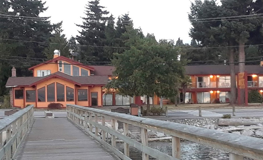
This is what it looks like now:
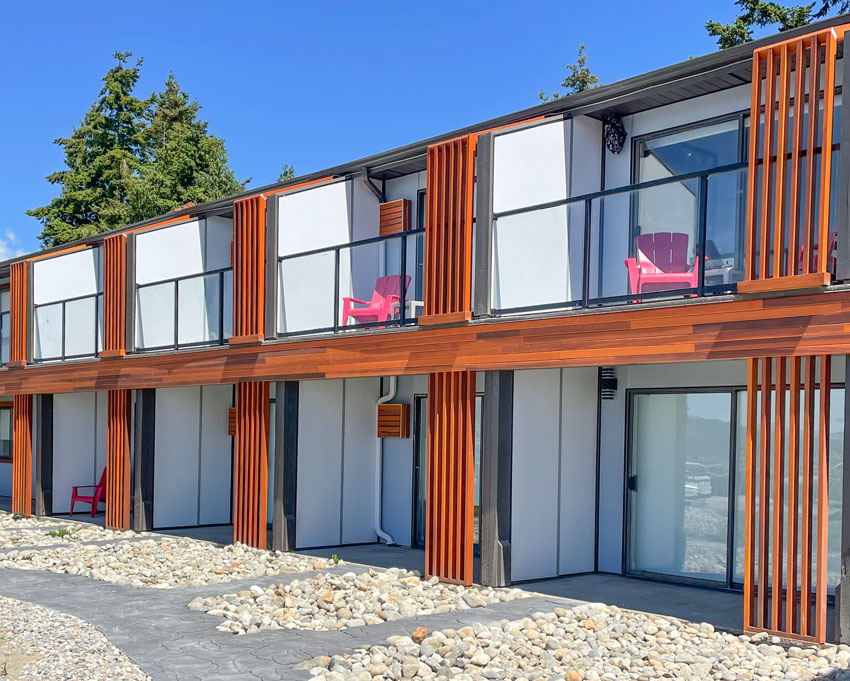
Here’s the rest of the motel. The red Adirondack chairs do hurt my eyes, this is when black would have been the right choice (below).
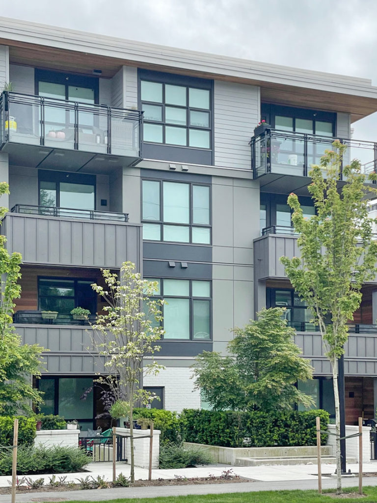
There’s a street in North Vancouver where they are tearing down homes and building condos and townhouses.
This is how it starts. I’m guessing this one was built first (below).
The orange wood stain was installed INSIDE the balcony of the first two floors and then what happened? Did they run out of cash? Or decide it wasn’t doing enough to warm up the building (newsflash it wasn’t).
Then this is next:
Better. We have contrast, a balance of warm and cool. It’s sophisticated and clean. Thank goodness for COLOUR. I’ll take orange if nothing else.
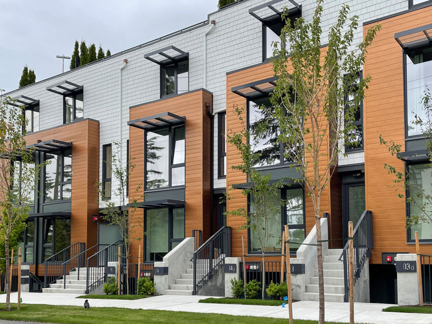
Another version (above), a lighter, more gold beige wood stain.
And here below, they’ve added liner stacked brick with more stained wood inside the balconies.
This one (below) needed lighter tones or white added. It’s heavy in mostly charcoal with orange stained wood. Which you can see is already looking like it needs to be re-stained. That’s the piece most people don’t realize. White is needed for balance and freshness along with the warmth of orange.
I’m assuming stained wood accents like this last longer in dryer climates but here in the Pacific Northwest, this kind of stained wood is high maintenance. Every two years it needs to be re-stained.
Read more: The Perils of Decorating with (Too Much) Black
Here’s my black, white and cognac outfit from the weekend 🙂 Notice that just a little black is often enough.
Over to you my lovelies! Have you noticed this commercial building trend in your area as well?
If you’d like to learn how to choose a timeless exterior colour, buy my Masterclass for Exterior Colour Selection here. You can watch it at your own pace and you’ll have lifetime access.
I just received a new testimonial this morning and this is what it said:
Excellent! This course totally exceeded my expectations! It’s easy to understand and builds on principles from your system. You have made it so practical and have given great guidelines to follow to get to the right conclusions.
Related posts:
The 3 Fundamental Guidelines for Choosing the Best Neutrals

It’s interesting how you mentioned wood as a warm contrast to grey. This is a common theme now, people mixing warm cedar type woods with concrete or other gray tones. (I’m talking more inside because the photos you showed above aren’t too bad.) But I have to say to my eye, warm wood and gray they just don’t match. Almost every time I see a photo of a house with that combination I hate it. (There are some exceptions, like dark dray with certain woods that have grey undertones.) And yet designers and architects seem to love this combination. Is it just very difficult to get the undertones between them to match and many people don’t know how? Or is it just something about my eyes that make me think it looks bad. It’s not like I’m just not used to it because it’s been going on for years.
I cringe when I look at these photos and I love orange and black both. I don’t think they go with grey at all. The grey feels like a prison.
Gray and yellow can be a sophisticated color combo, and I’m doing that with a client for a bathroom near the beach in Santa Barbara as of last weekend. She had a yellowy travertine tile with gray in it. We’re adding a new pale wood vanity plus a greige marble with gray and gold remnant quartz, plus white toilet, sink and new soaking tub and tiny black accents in the lights. It is what she wants and will be a huge improvement over what’s there from the slapped up contractor work that’s there now.
I am always amused when I drive by this newer apartment building with a solid orange balcony rail system because my first thought is that the building is under construction and that the railing system is only temporary. That’s a place where orange didn’t help warm up the exterior.
I love this combination – especially on the interior! The cognac warms up black and white, and the grey provides depth and tonal balance.
Maria, I’m wondering – If you were to choose a paint color that represented that cognac leather in the first photo, what color would you choose?
Haha I have to laugh because my house is gray (Behr Mined Coal) with white trim and our timber framed porch is orangey. And I get that the grey is technically trendy but we absolutely love it. To add some context, we are rural in the Pacific Northwest and literally buried in our 6 acre forest. It fits the setting and I love what it looks like amidst all the green trees and scenery. I agree white is much more timeless, but we would have green mildew in an instant so the grey is also practical. And it most definitely would not work without our white trim. I love it haha.
I live in a neighborhood on the edge of the forest in Arizona where we have lots of trees. I’m helping my HOA develop new color schemes, and one thing they’ve never allowed is white! Nothing over LRV of 70. It just stands out too much. Unfortunately across the hill someone built a beautiful stark white house that we see from our windows and deck…..and it’s just wrong! 🙂
Great post Maria. Personally those exteriors look cold and drab to me but I get adding the warmed wood tones does helps a lot. I totally agree with the over use of black – it won’t be too long before ppl are repainting it.
Strong disagree that orange (cognac) is timeless. We had a (classically-shaped) barcelona chair growing up, and I always hated it sole for its ugly orange color. Its orange color clashed with literally everything. (It only went well with black and white, which my parents originally bought it to go with). The orange was only a tiny step better than avocado green. Similarly, my boyfriend once lived in an apartment with cognac shag carpeting, which was in pristine condition. At the time, shag carpeting was having another moment. But that apartment could never be anything but hideous unless and until the landlord removed that carpeting. Orange is hugely limiting!
Hi Kia, I’m glad you brought this up. Cognac leather is timeless in my opinion, NOT cognac (ie. rust) coloured carpet for example.
If you’re going to buy a leather sofa, that’s the colour I’d recommend, or white potentially. And it’s just my opinion, doesn’t mean it’s right.
Thanks for your comment!
Maria
I’m so glad cognac inspired colors have come to save the day. I’ve always had mad love for cognac leather. I remember as a teenager I had a pair of cognac boots I loved and wore until they were ragged. That’s how I knew you were absolutely right when I read your blog post about cognac leather being timeless. It felt current to me15 years ago and still does today. This year, I bought my first piece of custom furniture: an oversized, super durable, cognac leather ottoman. Its the perfect piece to warm up my charcoal sectional. I know it will withstand the trends and my kiddos. And, it will jive with almost any color sofa we choose in the future.
We live in a developing neighborhood, and I can totally see the builders just caught on to the black and white trend. Up until late last year, the new builds were still gray on gray and a few brown on brown. Then, at the end of 2020, it’s like a switch flipped and now EVERY single house that has gone up is black and white. No warm woods to warm up these exteriors though. I love back and white, but alone it’s drab and even jarring, in my opinion.
Ok – so what’s next – orangey wood flooring😝
LOL yes, after EVERYONE changes their floors to GRAY first. Silver colors will be back after everyone changes their stuff to brass. That’s how it goes LOL