West Coast Contemporary is a distinct and chic architectural style. Here are some examples from a recent trip to the coast along with my take on what exterior elements are classic and timeless.
The West Coast Contemporary style is known for its vaulted roof lines, linear modern simplicity, and large windows to bring the outdoors in. It most often incorporates lots of wood beams and accents, especially cedar.
And cedar is orange. It is one of the warmest wood tones, whether it is stained or sealed clear.
How to work with orange wood on exteriors
I feel it’s my duty to explain here on this blog to explain a distinction about this kind of exterior. If you’re going to introduce orange stained wood, it either needs to be combined with either colour OR white to look its best. Because orange cedar really is more of a colour than a neutral, it needs to be balanced as such.
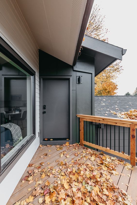
When I drove by this blue and green exterior with orange stained wood, I knew it was the perfect opportunity to show you the difference.
There is a very happy relationship between the green accents and the orange cedar. You can see that the wood is more orange than neutral brown.
I would not have chosen a coral colour for the front door. I think it ends up clashing with the orange wood but that’s an easy fix.
Green similar to Sherwin Williams 6187 Rosemary, Blue Grey similar to Sherwin Williams 6236 Grays Harbor
The green compliments the orange cedar nicely and connects the house to the surrounding trees beautifully.
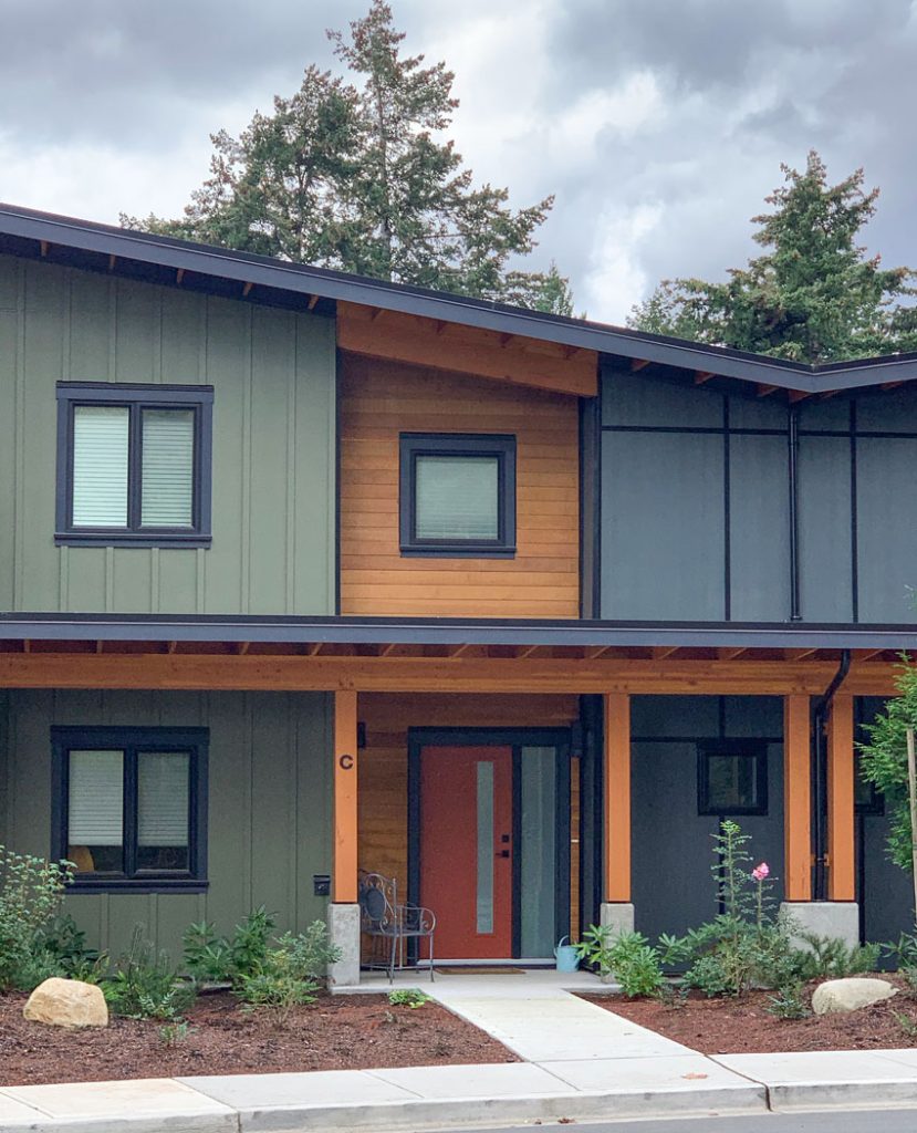
It looks like the slightly greyed, almost charcoal blue and the black were chosen to repeat and tie in the black windows and grey fascia elements. However, it is especially inspired that they chose to add the pretty green and not stick with only grey and black, which is being done constantly now in the black trend.
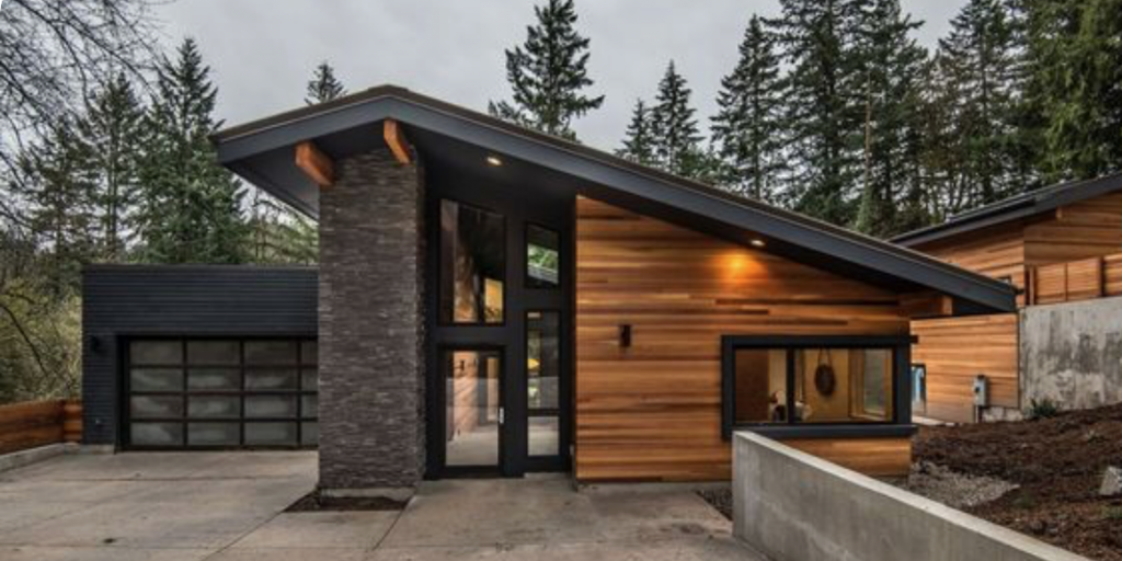
Orange wood with grey and black looks heavy
Here is a similar style home in concrete and orange below. The green grey of the concrete is fine with the orange wood, but including some white would have been fresher here. By the way, the best exterior “whites” are probably not what you think. Check out my Exterior Colour Selection Masterclass for details.
You can see that after it was done, the homeowners decided it needed colour, thus the red front door. Also, the glass on this modern style garage door is often a watery green blue – a colour that looks better with a fresher palette. It too would be happier with some white.
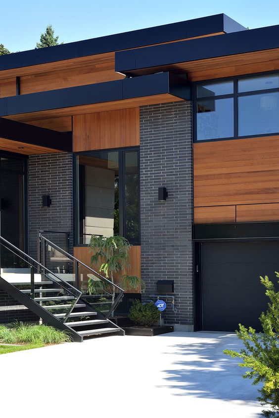
This black and orange home below looks a lot more common (especially now with black exteriors trending) and I think it starts looking a little like halloween without any white or cream added to the colour scheme.
Same with this one shown below. Do you see how incorporating some paler colours like a complex cream would be much fresher?
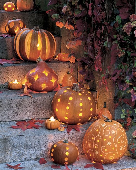
Not that I don’t love Halloween, have you begun decorating yet?

Pumpkin carving inspiration at Society 19
Love these too! Shake
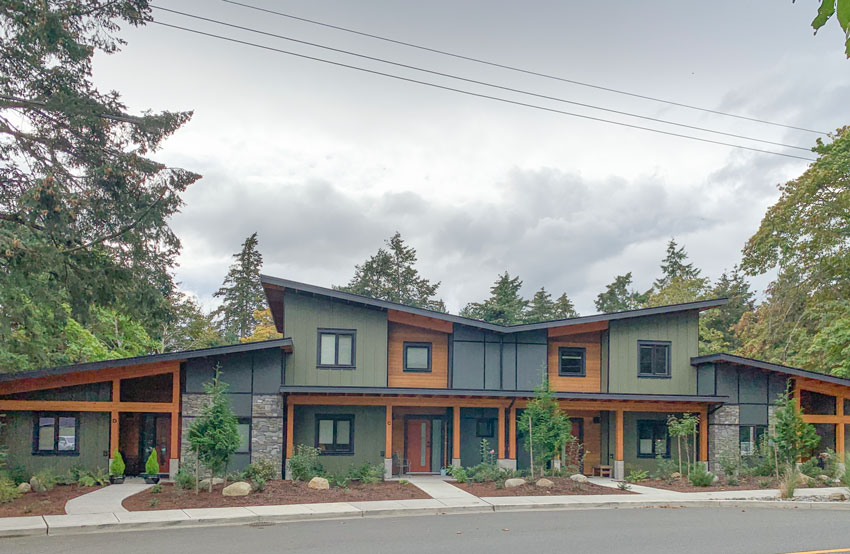
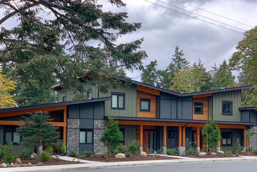
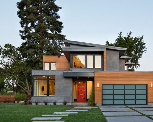
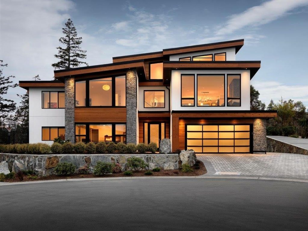
West Coast contemporary exteriors are always better with white
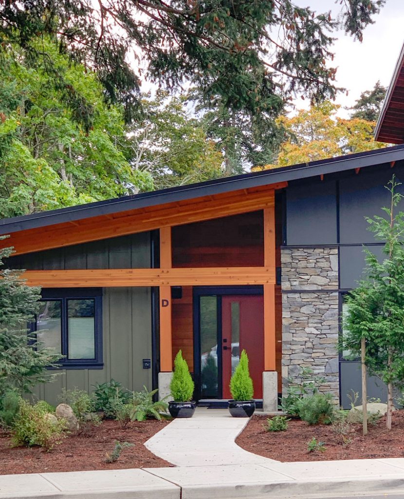
This exterior below has a just the right balance of white, black, grey and ORANGE. It really lightens up the look. I also like the stone placement here.
Often, I go out of my way to talk my clients out of simply slapping stone straight across the bottom of an exterior. I see too much of that where I live.
Below is another West Coast contemporary home that is very well done. The crisp white connects it to the clear blue sky. Without white, contemporary orange cedar and black or grey houses are too heavy; they have no air. There is nothing airy and fresh about Halloween 😉 if you know what I mean.
Balance is what creates beauty in architecture. A sense of contrast is very pleasing.
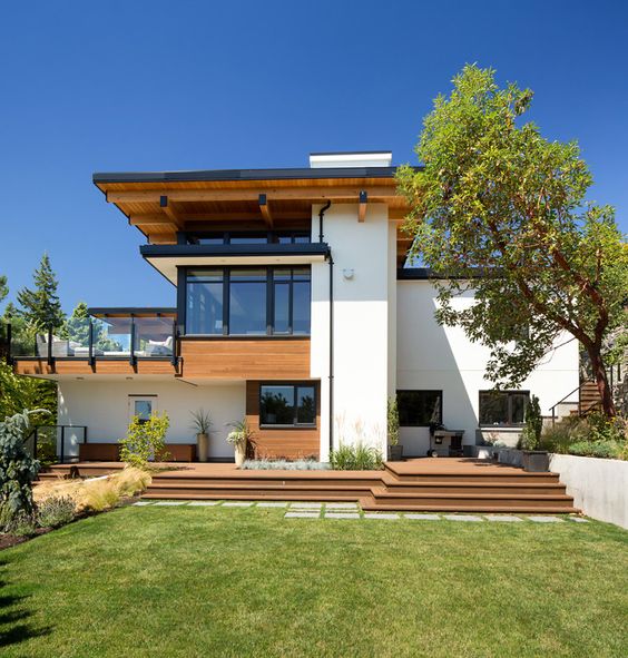
Burkehill House by Kallweit Graham Architecture
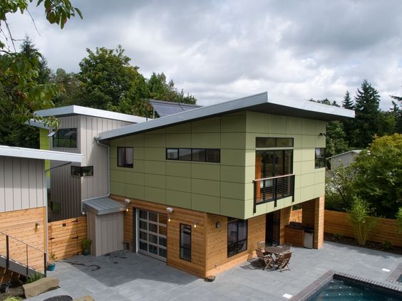
West Coast contemporary exteriors also look great with green!
And shown below is another example of a West Coast contemporary exterior with very orange wood and a pretty green accent to compliment the wood elements. The taupe siding would have been better in green grey or soft white, but the green and orange combination is so good.
There is a good deal of orange cedar being incorporated into the modern rustic and modern farmhouse trends too. They tend to have a lot of white anyway, but it’s important to keep in mind that the orange wood needs lots of fresh white and colour to look good.
In my Exterior Colour Selection Masterclass, I teach that the first thing you should do to refresh your exterior is to ask yourself, “where can I add white or cream to this exterior to create better balance and a fresher look?” and “Could I incorporate some colour here to give it life?”
Sherwin Williams 2021 Colour of the Year
And speaking of exterior colour, Sherwin Williams announced its colour of the year for 2021, Urbane Bronze 7048. It’s a colour I specify quite frequently for exteriors. I think it is a modern greyed-bronze colour that leans a bit green. It is a softer, warmer alternative to black without being too brown so it still feels current. A grey bronze is a colour I consider to be a fairly safe choice for uncertain times. How about you?
It is definitely a signal though, that black and charcoal are warming up a bit in the world of colour trends. We all need a bit of stability and comfort, and I can’t think of a more grounded colour. Haha, I decided to watch their promotional video after writing this, and grounded is exactly what they are saying.
Here it is on an exterior relevant to the West Coast contemporary home style:
Kudos to Copeland + Co. for using white to contrast with Urbane Bronze, a charcoal bronze hybrid, and rustic orange-y wood. Look at those gorgeous fall leaves. All we need are some pumpkins!
What do you think of the 2021 colour of the year by Sherwin Williams?
If you’d like to learn how to choose the best classic and timeless colours for your exterior, check out my masterclass here.
If you need help, our exterior eDesign packages are open again, you can see them here.
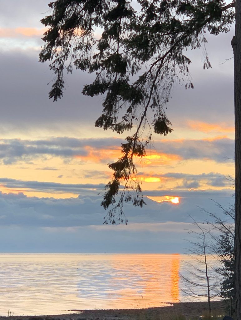
The AirBNB we were in was such a lovely yellow beach house! I ended up doing a short video on Instagram, you can see it here!

Love my sweet nephews, William & Markus (aren’t they getting big?)
Related posts:


So fun to see the PNW contemporary style featured. It will be interesting to see how the growing wildfire risk in the PNW changes the design style. We build a PNW contemporary style house, but building code did not allow for cedar as a siding material because of the fire risk. We can (and do) have it for wood ceilings of covered decks, but siding must be fire-resistant.
Dark house colors with no white create a masculine house which is bossy with all decorating.
My parents 2 story home they built in the 70’s has beautiful Redwood siding that is also a very orange wood. It’s beautiful, but they also painted the wood windows, doors and double garage doors orange. Combined with orange and grey brick, it’s so monochrome. One day I’ll talk them into change and I’ll hire you for guidance. I was thinking grey… but I know nothing! (bowing)
This is really interesting Maria! We have an American Farmhouse style home in a clearing by the woods directly above a river… cedar-tone posts and under the decking. We recently painted over the red-brown stained siding with Riverway by SW..a blue-grey-green and the cedar-color window trim with SW Nacre. It looks so FRESH…and I think….balances the cedar color remaining and makes it pop. We painted the door SW Inkwell. It’s handsome 🙂 . Thanks for your great articles…
Love contemporary house. Not many in
Texas where I live. I was thinking orange cedar and black connote Halloween instantly. You pointed it out too!
Liked your Instagram spot. I vote for green, it looks good with nature and the white trim.
I needed this exact post last year! Our 1960 MCM split level has lovely orange brick that I couldn’t stand to paint. When it came time for new windows people kept telling me the ever popular black and bronze…and I was going “Halloween?” I ended up picking a grey window that still reads quite brown (closest to SW Gauntlet Grey) but was the best of the limited choices to coordinate with the warmth of the brick and its mortar. When it came to painting the upper level board and batten I wanted to do white and couldn’t find anything. No examples, nothing. People were telling me beige, white is crazy. I have read so many of your articles I just knew it could be done. I ended up going with BM White Dove because it still reads white but has the slight bit of creaminess….and love it. Different times of day it can look more white or more creamy, but I think it took our exterior to whole new level. I should email more, I always assume my issue isn’t relevant to anyone else. Thanks for the article!
Hi Celeste, Your house sounds lovely. Would be great to see before and after pictures.
Don’t agree with white. I think it looks awful. It depends on where you live. Here in the northwest with the forest the white would look like a huge mistake. But love the color of the year
I love the PNW style. It is my dream house crush. Part of what I love about it is the darker colors and use of the cedar/wood ground the house in it’s environment. White makes it stand out too much which is antithetical to the whole point of a PNW Contemporary. In my opinion it looks like the house has lost it’s identity. California modern or PNW Contemporary?
I’d love to see a post about paint for the interior of West Coast Contemporary homes. I’m struggling to find a suitable white paint for my open-concept, 2-level, north-facing foyer / stairwell / living room / dining room / kitchen walls which will complement the orange cedar on my ceiling, similarly-toned orange fir doors, and black accents throughout (including black slate flooring in the lower level foyer). I’ve now tried 4 different white paints that either leave the rooms looking clinical, purple, green or yellow. Most recently I tried SW Creamy after reading Maria’s book on white (my thought was I needed to lean more toward warm-toned whites due to all the warm wood tones), but in some lights the walls looks really yellow and not the contemporary white I was trying to achieve. Any suggestions would be greatly appreciated!
Hi Tara, I had the exact same issue with same fir ceilings, window and door trim, black hardware etc. I went with BM Creamy White (to cover previous olive and gold toned walls) which has a slight green undertone and I think it looks amazing with all the wood.
To me the Step One Design house is the most balanced. I think the use of too much white disolves its character.
While not a contemporary style, we are building a timber frame home with cedar exterior posts and gable accents, wood fascia, window trim and garage doors. So not Maria Killam – haha! We are struggling with an exterior color as we don’t want “real” wood because of the upkeep (we’re not youngsters!). We started off with red then went to “white” for various reasons. We have a neutral stone on part of the house and from what I can tell it has a green gray undertone and matches BM revere pewter. The challenge is finding a “white” that my husband feels provides enough contrast to the stone that revere pewter doesn’t do for him. Of course, we could just stick with the currently unpopular house color, red.
Totally disagree with you about the push to add cream/light colors with the cedar/grays/darks. The examples you used to validate your opinion had absolutely awful landscaping in front of it. With a sophisticated landscape the cedar with the dark grays etc help to enhance the planting in front of the architecture and marry the hardscape (the house) to the natural in the landscape.
So many people never think about how the architecture of landscape can aid and enhance a home/property…