Today I’m sharing an example where accent tile can help SAVE a white kitchen. Yes, you read that right… Sometimes accent tile is an emergency solution. Here’s where accent tile works.

Recommending accent tile is a rare unicorn for me
It’s as rare as a unicorn I know, that you’ll hear me talk about accent tile in a positive light.
But that’s because most of the time, what we see day-to-day is just bad, trendy tile that often dates in approximately 10 minutes. However, this SOS from a reader definitely needed it to warm up her stark white kitchen – one that did not relate to the new floor or the old brick wall.
What’s wrong with accent tile?
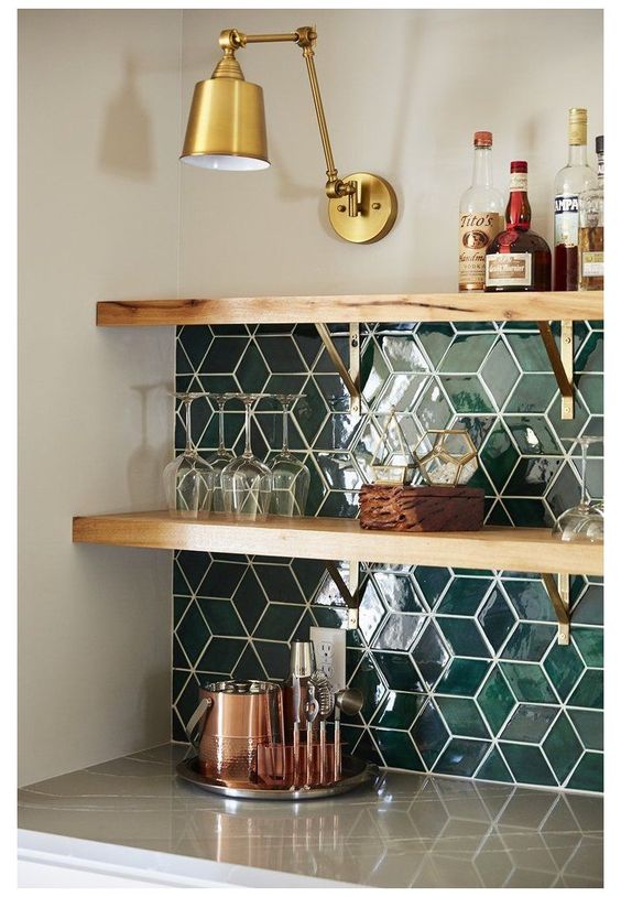
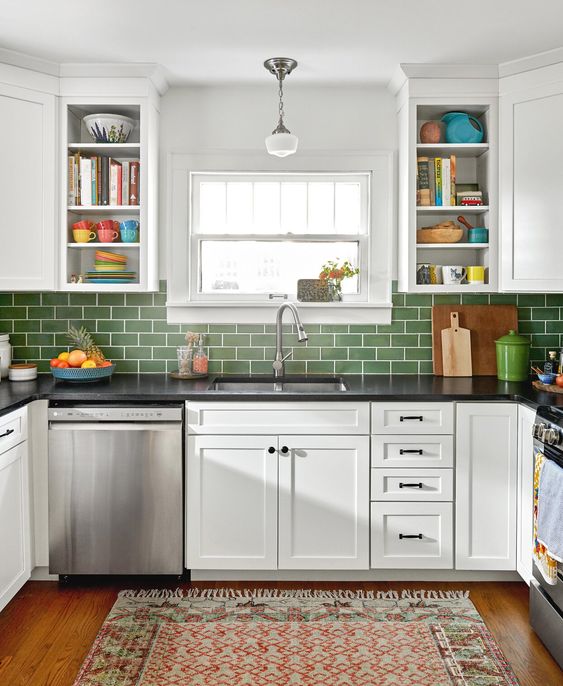
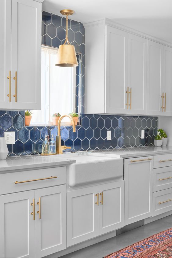
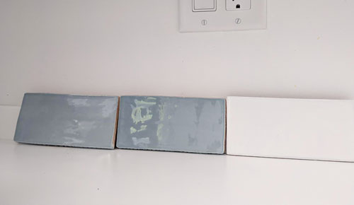
I hesitate to write too many posts that make accent tile an option because it’s soooooo rare that it really does work. In most cases, if you have a totally white kitchen – and feel that it needs SOMETHING in order to bring it to life – I’d still choose a solid COLOUR accent tile like blue or green (below) BEFORE I would install accent tile with a pattern, but this kitchen is definitely the exception.
Frankly, I think backsplash tile is something that doesn’t have to have a long shelf life. It’s not that hard to replace or update. But if you’re not handy or don’t hire professionals, then it seems like this permanent thing that can never change.
However, even hiring someone to do it, costs the same as a new piece of furniture. Or if all else fails, paint the offending backsplash until you can change it out.
Read more: Dos and Don’ts for Installing Accent Tile
Here’s the email I received:
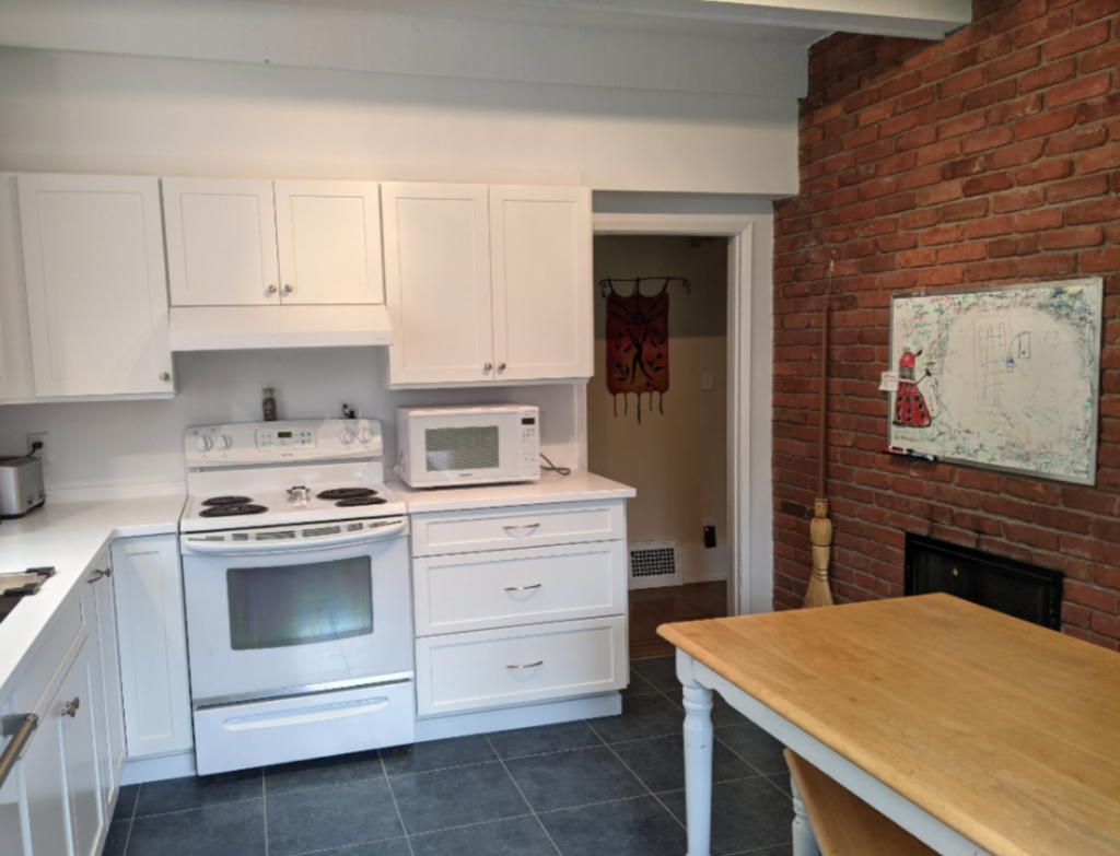
Reader kitchen
Thank you for your blog. I have learned so much from it.I have a question for you. During the pandemic we finally replaced our 1972 crumbling kitchen with a new floor, cabinets and countertop. The floor is blue, the countertop is white, the shaker cabinets are white, our appliances are white, and the paint is white (Benjamin Moore Chantilly Lace). We do have a brick wall on one side of the room.Everything is fine when the room is in full sunshine (Western exposure plus skylight), but at other times it can feel freakishly cold in there. I had assumed that I would put up white subway tiles as a backsplash.But with the white space being so overwhelming and the blue being disconnected, I am now wondering whether I should install blue subway tiles instead (below).
My new kitchen is easy to clean, feels very bright, and I love having drawers instead of cupboards because they are so easy to reach into. But I’m very uncomfortable in the kitchen at certain times of the day when the colors become unfriendly and I can’t quite figure out what to do about it since even picking a paint chip is difficult for me.
Where Accent Tile Works
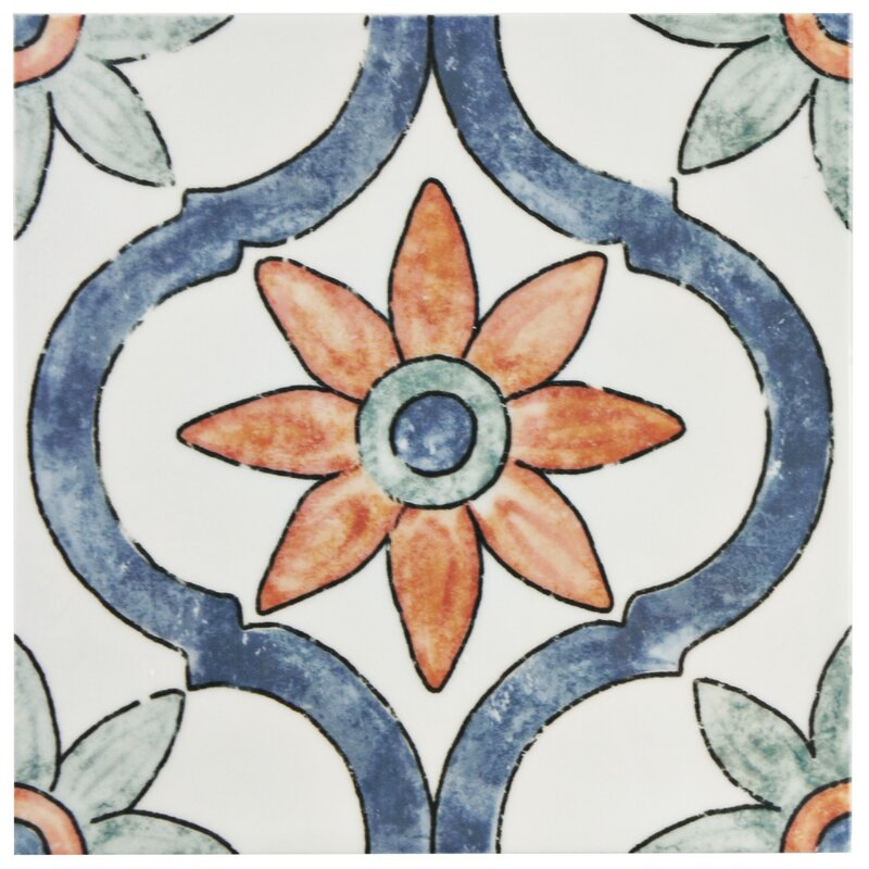
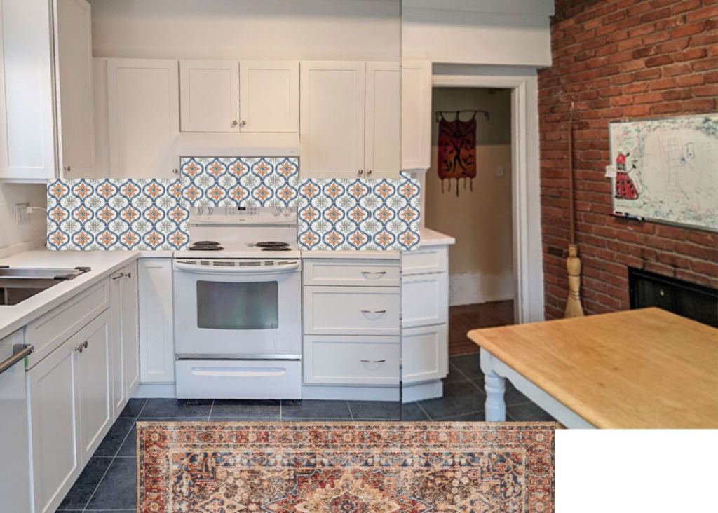
When I saw this kitchen, Spanish, encaustic tiles immediately came to my brain. Clearly the orange brick wall is staying AND it’s pretty. There’s nothing wrong with it. But we need to pull both colours together in this kitchen – both the dark blue floor and the brick wall – with a pattern to warm it up and make it feel like it belongs in this house.
This is where accent tile works.
When Pattern is Magic
This is what pattern is good for. It’s not simply for creating random “interest” in a plain room. Instead, the perfect pattern can pull together disparate colours almost MAGICALLY.
Why?
Because if you have two different colours going on in a room that are not connecting at all, the only thing to do is to bring in a pattern that has BOTH COLOURS in it.
In this case, we need a pattern for her backsplash that has not only the orange tones of the brick and the muted deep blue of the floor, but ALSO white. THIS is where a patterned tile is perfect. And Spanish style encaustic or painted tile often features a mix of these colours.
Colour placement is a big deal
The other thing to notice in this kitchen is not only the blue, orange and white colours, which is a perfectly pretty combination, but also the placement and balance of the colours. The unbroken white is all on one side, the rich orange brick on the other, and the blue floor is doing nothing to bridge them.
A patterned floor with blue and orange would be lovely in this kitchen too, maybe with a solid blue backsplash.
However, we can fix this with just the right pattern on the backsplash. And the charm it adds would make much more sense with the warm rustic brick. This also brings the feel of the brand new white kitchen in line with it.
If you make a colour mistake, just start decorating.
Don’t forget that even if this kitchen already had a solid white backsplash, there would still be a decent fix. Decorating with colour!
Here are a few ways to solve this white kitchen colour dilemma with decor:
- Add pattern with textiles and art that pick up the two colours
- Add some wood bowls and cutting boards to warm it up
- Bring in lamps! (Lots of mood lighting that can stay on all day will warm it up a kitchen more than you might think)
- Hang a large scale blue and white piece of art on the brick wall and bring in a collection of glazed terracotta pots above the cabinets
A good room needs a personality and that can come from more than the surfaces and finishes.
But I digress a bit here.
Because the big news is, this is the kitchen that is the exception to my constant cautions about accent tile.
This kitchen lets us CELEBRATE pattern!
If you’d like help with your kitchen, add your name to the waitlist here. We open up our packages once or twice a month.
If you’re stuck on which white to choose, my White is Complicated eBook will help.
Related posts:


Perfect solution. This is definitely one I’d like to see “after” photos…
I came here to say the same thing! Love the solution.
Me too! 😁 Fantastic solution!
This was a great post about how to do this, especially if that tile goes with her style. But the advice about decorating was my first thought. But that’s what
Spot on advice! This tile immediately changes her kitchen. I also agree that a little styling to bring the orange/red over to the countertops would work well to warm up the white side.
I think I would paint the brick white, and then start thinking about backsplash and decorating…
Love the brick wall! Yes, I agree, some beautiful tile that picks up the oranges in the brick wall and blue from the floor. Maybe a few shelves and a larger taller picture of maybe a terrace or picture where it appears you are looking out of a window. It will look fabulous! And is that a fireplace I see on the brick wall? 🥰
I too noticed what seems to be a fireplace, how lovely!
I was thinking the same thing: paint it white or maybe do a lime wash treatment. It feels very heavy and dark compared to the rest of the kitchen.
I would pass on the accent tile and do the decor. Right now the kitchen is naked but adding decor without the tile would really kick it up several notches. Maria, would you be opposed to her using the stick on looking tile just to see if she likes it before taking the jump to real tile?
The problem I see with that solution is that there’s just not much room on the countertops. A few nice wooden cutting boards would bring in the color, but would it be enough?
But stick on tile, or even trying out the pattern with a stencil first would be a good idea.
I think your point of “the pattern is used to bridge the other colors together” is the key for me to remember Vs. making an “interesting” choice!! Love everything you do Maria!!!
This is fantastic. I love that tile anyways, as it is a classic type of tile in certain decor styles (Mediterranean, Mexican I’m thinking of). And the way it brings this kitchen together is perfect.
I normally agree with most of your ideas, but this time I think the accent tile makes her kitchen look like it came out of the eighties. I think a solid blue color tile and then some accent pieces on the counter to relate to the brick wall color would make it look more current.
Diane, I agree. This lady has a nice, clean slate to start with now. I’d put in the blue tile and change up the artwork on the brick wall to bring in lots of the blue. Maybe add a rug with blue and rust. To me, the patterned tile is too busy. And I’m not a fan of that particular orange.
I agree with Diane, Nancy and June. Yes, the patterned tile might fix the current situation, but is it going to be a long-term fix to bring joy to the kitchen? It looks a little dated to me, especially with the beautiful new cabinets juxtaposed with the brick. How will you decorate this kitchen for different seasons, like Christmas? It will be a little more challenging. I think Maria’s thoughts for decorating is a good approach. If the brick can’t be painted, I’d look for large art (painting or textiles) to cover a lot of the brick. Definitely use a rug on the floor. I have painted three previous fireplaces and I have always been relieved to get rid of the “bossy” brick color. It was definitely freeing and a simple update.
Agree, she can do better with the backsplash, not loving it. Can’t wait to see what she decides!
Absolute perfection! Love these tips and how it immediately warmed up the space and made it feel harmonious!
Maria – the new is pretty
But that looks to me like when you talk about remodeling and trying to bring together the old and the new .
That brick wall doesn’t look like it belongs in that new white kitchen .
Or since she opted to keep it maybe it should have takin her in a different direction all together .
A all white Kitchen doesn’t fit in every home .
The BEST solution, Maria! Nailed it, as usual. Your term of “bridge” is spot on. Not only do you educate the homeowner, you do a fantastic job of reminding the professional to not get stuck in a rut. Hope to see you in person in 2022!
Wow! Never thought I’d see the day, Maria!!! LOL
I think it looks absolutely lovely with the patterned tile. I also agree that some vintage artwork above the fireplace that ties in the blue and white would add another layer. My one thought would be to suggest that she swap out the modern cabinet hardware for something a little more classic and “old world” as cup pulls, may be in an anitqued finish?
Overall, I love how a classic “all-white” kitchen can be pretty easily fixed versus going trendy and then there is no “magic fix”!!! 🙁
Oooh, I hope she takes your advice and then shares a photo once it’s complete. I think this will look BEAUTIFUL!
Wouldn’t a rug with all the colors and a blue backsplash accomplish the same thing without becoming dated too soon?
Well I didn’t choose blue because the floors are in fact a blue grey which to me was too bleak to install on the backsplash. And yes, decorating always warms up a white kitchen! I personally like the fact that the patterned tile picks up both the brick AND the floors which will make the kitchen feel like it was designed with everything taken into consideration. Thanks for your comment, Maria
I think this lady has done a fantastic job renovating her kitchen. I can only imagine (actually I don’t even need to imagine) what her crumbling kitchen looked like previously. How difficult her choices must have been if selecting a paint chip caused her problems. (On a side note, although it seems the author is a very talented writer, my mother used to correct me when I confused ‘picking’ with ‘choosing’. She said you ‘choose’ most things, but ‘picking’ is for removing fruits from trees). Now… with regard to the backsplash tiles, I think your selection is too busy. I would suggest that she pulls in the orange (or burnt orange) , blue and white. The tiles can be more modern if she prefers with modern wood accessories on the counter and this gives her more options. I’m sure my sister would agree.
There are some good comments above, however I think some rather important points have been missed. For example, Maria and many of the commentators have mentioned that the lady with the kitchen renovations should pick up the accent colours of the brick wall. And that may be true. But what about the accent colour of the Dalek from Dr. Who (yes, that is the correct spelling) that has been drawn on the white board? (Did anyone notice that? Does anyone recognize what a Dalek is?) That awesome design needs to be recognized and its colours need to be included as well. Perhaps if you can find Dalek-themed accent tiles? Or more generic Dr. Who accent tiles? Or perhaps a British telephone box theme? Just a few of these as accent tiles would work very well.
However if the lady with the new kitchen is not into increasing the Dalek emphasis beyond the drawing on her whiteboard, then I recommend simply picking up on the colours of the Dalek and of the brick wall and using a tile (not subway tile) of similar colours, with very minor or better, no pattern at all. A strong pattern will totally kill the beautiful kitchen layout. Look at the images that Maria has used in her blog article. The colours she picks are great, but the patterns (except for the green subway tile) are all way to strong. They pull the eye to the backsplash instead of letting the eye rest gently as it moves about the room. Note that the green tile is way more relaxing (though the green is not the right colour for this kitchen).
Bottom line (can you tell that i am an accountant?): Pick up the tones of the brick wall and the Dalek in the tile. Simple pattern or no pattern at all. Dr. Who themed accent tiles if some are available and if so inclined. Best of luck with the backsplash!
Favorite comment on this site ever ^^^. I certainly did notice the Dalek and wanted someone, anyone, to have mentioned it! Thanks, Steve, I don’t feel so alone now! I really want to know what the whiteboard says, I can just make out that there’s a bit of text.
Best comment ever! This made me LOL and was nice to see after reading some of the kinda harsh comments above. Thank you!
First and foremost, to cozy up the kitchen I would love to see simple crown molding on the upper cabinets; the current void is unpleasant. Then decorate to balance the white and orange on opposite sides of the room. Consider painting the white table legs to break things up. A solid blue tile would be pretty in the backsplash: a blue coordinated with the floor, but not the same color in order to avoid a horizonal striped look.
And if the kitchen is part a a great room, I would be very careful adding a pattern or color, unless is complementary to your living area decor. Maybe just rely on the decorating.
Thank you, Maria! And thank you, everybody. I appreciate your input. This is my kitchen — our first ever, and probably only ever, reno. I love Maria’s suggestion of pulling the brick colour into a pattern on the backsplash wall, which is something that had not even crossed my mind. It would solve the feeling of disconnect and starkness in the room. Also, her follow-up explanation that blue grey would be too bleak might have saved me from making a bleak mistake. I found other comments useful, too, and it’s useful to have different perspectives. (Steve Daniels, my kids think I should have taken down the whiteboard — oops! The Dalek is in washable marker, , but if we could find the Dalek and a blue phone box in a nice subway tile, we’d definitely consider that.) Maria put a link to her source for a suggested tile, and I’m going to order a sample. At first, I thought that it was a large floor tile just shown for colour, but it’s actually 8 x 8 and might work in our space.
I like the tile. To me, it’s a fresh print that won’t date and it brings your disparate colours together. The rug choice is brilliant! It brings the brick wall onto the floor and will warm up the space. I would not decorate your counters, as there is not a lot of counter space and the tile will be colourful & busy enough. IMHO
Would love to see the final result Maureen.
Kudos Maria!
I know hindsight is 20/20 vision, but would wood cabinets or cream color cabinets been more complementary? While I love white cabinets, it seems a little stark alongside the brick.
That’s what I was thinking, too. But since it is white, I think Maria’s solution will work so well for now. The tiles may need replacing one day, not an easy thing to do, I know. But patterned tile will get tiresome after a while, like print curtains. Eventually, a new look might be needed.
I think Maria’s ideas for the tile and the gorgeous rug are great! But I do like the idea of doing press on tile first, or perhaps photocopying the tile and taping sheets of it to the backsplash to see if you want it above all the countertops, or just on the range wall. Some Majolica pitchers and bowls above the cabinets would look great, along with a vase, platter, or table runner picking up the colors on the table. Exposed walls like that are common in the UK and parts of Europe, and it’s a big factor in the hominess of their kitchen.
…kitchens, plural!
While I love Mexican tile, there are several reasons I’d try decorating first. 1) The tile makes me dizzy! 🙂 2) The tile is permanent and bossy. Any other decorating you do in the kitchen will be limited by the tile. 3) I don’t feel that this particular tile bridges the gap to the brick…the orange appears yellow from a distance.
As for decorating, counter space is limited, but is there room for a small lamp or two with a brick color base to warm up the room when it feels cold? Decorative pottery above the range hood (and/or hung where you would put the tile) that picks up the brick and blue would be beautiful. A different and large piece of art hung on the brick could tie it all together too. Novica has gorgeous wall hangings from different parts of the world. And don’t forget to put something on your table that ties it all together…like a large painted pottery vase with an arrangement of dried flowers (try Michael’s craft store).
Even if this isn’t an open plan kitchen, what is the style of the rest of your home? Can you take inspiration from it? I love the wall hanging in your hallway, for example. I hope you will try these more temporary fixes before doing tile. Have fun!
Although I also believe in pulling the colors from the kitchen it doesn’t always work. I was thinking more of the Arte Loire Silver Encaustic tile since the tile on the floor has a dusty blue black hue and plus you have a black fire box with the brick, why not just keep it white with the dusty grey silver print of the encaustic tile. I definitely would like to see the outcome of this kitchen. Cheers