


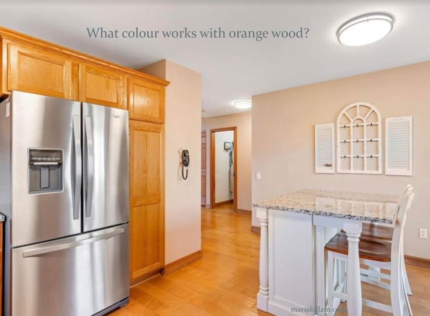
So many of us tend to get caught up in the colour of wood – whether it’s hardwood floors, trims, cabinets, etc. And it often blinds our colour decision-making process. You may be asking what colour works with orange wood, but this isn’t the only question you need to ask.
 Johnson + McLeod Design Consultants
This question is so common and I have addressed it many times on the blog, here, here, & here.
However, sometimes a new decorator can forget basic design principles, when faced with a laundry list of requests from our client. This happened to me many times when I was starting out as a new decorator/colour consultant.
And it happened to one of my students, Julia (names have been changed to protect the innocent). This was her question:
Julia: Maria, Please help! I took the True Colour Expert Training class in October but I’m finding myself unsure of some of the most basic rules. Should the undertones in a space match? For example, in a room with very orange wood floors should the walls be an orange beige complex cream OR just the opposite? Should the walls have a cooler undertone to balance things out? If so, I thought mixing colors that are opposite on the color wheel only intensified each of them. Please advise, as I’m driving myself a little bonkers here.”
Maria: Send me a photo!
Julia: The picture of the kitchen shows more accurately the floor color, which is throughout the entire house
Maria: What’s happening with the decorating?
Julia: I’m sorry, I should have given you more info. As of right now she has someone to paint the walls but she doesn’t have anything but a sofa (pic below) in a grayish-blue. It’s a lake house they just purchased so they don’t have much else to work around besides the floors, stone fireplace and sofa. I didn’t bother showing more of the kitchen because the undertones are all over the place (taupe backsplash, green beige counters, etc). She’s most concerned with the living/dining area now. I feel like I don’t know when to match undertones and when to mix them. Thank you so much for your help!!!!
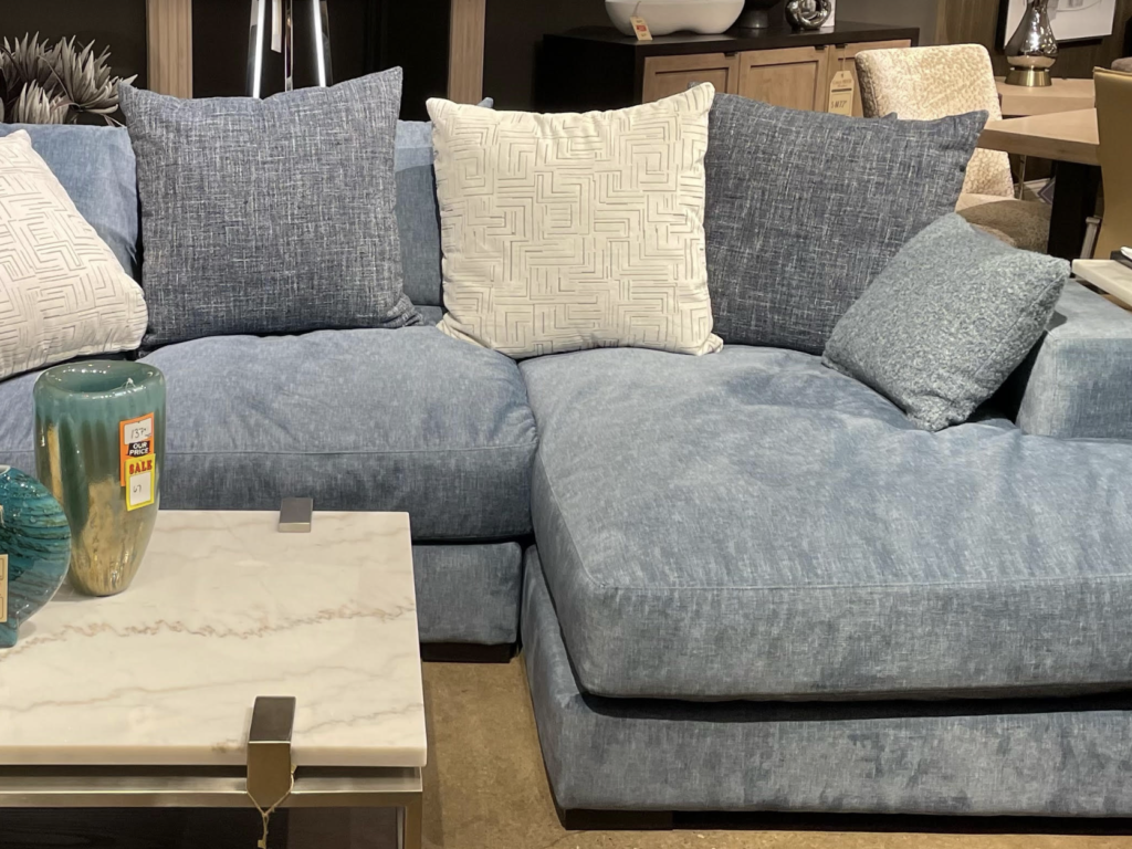
Maria: So when you searched my blog for the answer what did you find? I’m going step-by-step because I want to learn how I can make this more clear. So pretend this is your house. You have a blue grey sofa, and the wood is all orange. If the right colour pulls your space together, what is the right colour?
Julia: After going through your posts my initial thought was Indian White but I was unsure. In your post, Should I Match the Color to the Wall, you tell someone with a similar situation that “the wall color needs to contrast and balance it, not match it… The walls should not have an orange undertone to relate to the floors”. BUT, next you say a very pale orange beige complex cream would work. Part of my confusion is doesn’t an orange beige complex cream have an orange undertone?
Maria: So, it looks like she has a blue grey sofa. Your walls should relate to the decorating. I’m just wondering why a pale blue grey was not something you were considering at all? Instead, your focus is on the orange wood. Truly her walls could be almost any neutral in my system, and certainly a complex cream. . . I would avoid a mid-tone pink beige, but even a paler pink beige would not be terrible if in fact all the decorating had pink undertones.
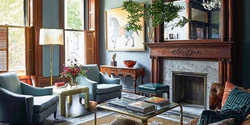
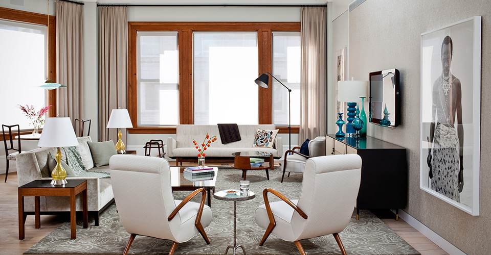
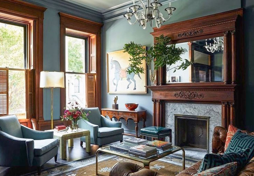
Here’s a room with the same pink beige drapes as the living room we’re talking about. Notice how this decorator cleverly repeated the orange tones of the windows in the furniture.
We then, don’t notice that pink beige with orange wouldn’t be our first choice.
Decorating my lovelies, distracts the eye from so many ‘less than perfect’ situations.
Read more: 10 Ways to Save Money Now by Creating a Focal Point

See Undertones Instantly
- Real Benjamin Moore paint chips
- All 9 neutral undertone families
- Compare directly to your fixed elements
Back to the post, here’s the same room photoshopped to look like the walls are painted in Benjamin Moore Marilyn’s Dress:
Julia: Thank you so much! I think I was so caught up in how much orange there was and how bossy that felt. It was taking my focus away from actually decorating. I appreciate your help.
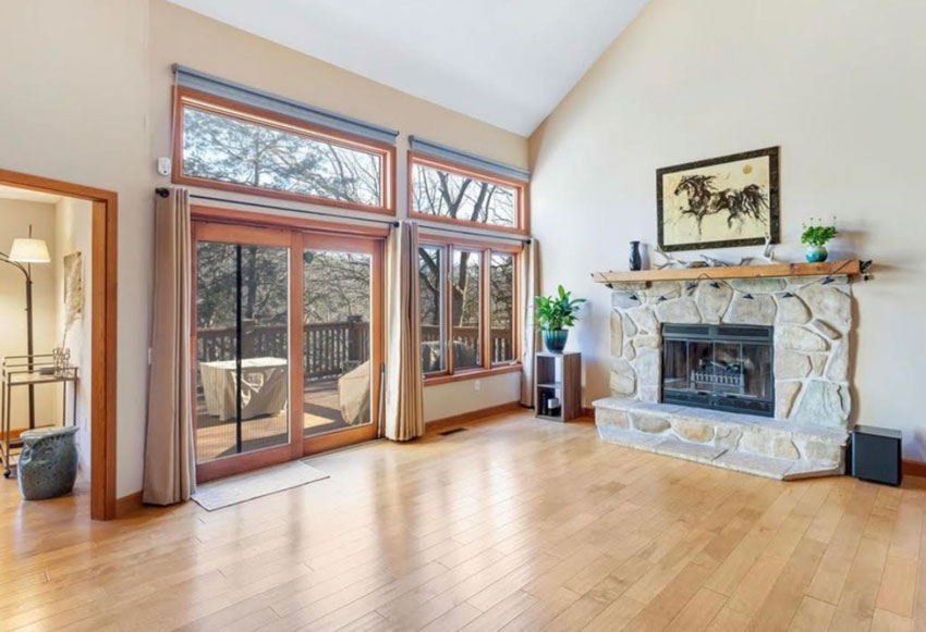
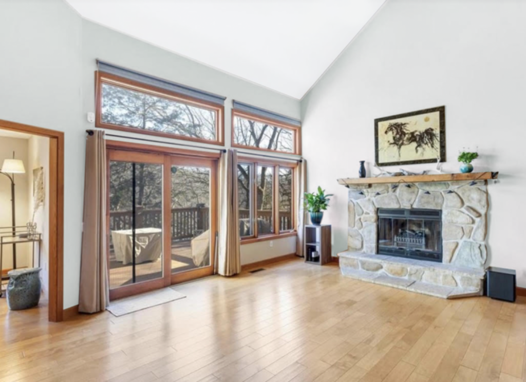
Let’s see how her client’s blue sofa looks in her living room with the perfect river rock fireplace for a lake house. Way better than trendy, stacked stone, by the way.
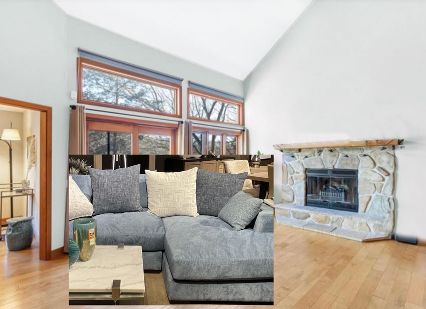
Beautiful! We have contrast with the wood trim and now a lovely balance of warm and cool.
Lately, every time I see wood trim, I think it looks the best with a colour over a neutral:
Read more: The Key to Great Design is Contrast
Want to download my “Exclusive Guide To Timeless Wood Flooring?” Click Here
 Interior Design by Chris M Shields Design
Notice again, the walls here relate to the FURNITURE! Not the orange trim.
Could the walls be an off-white? Yes because it gives the room good contrast as well, however notice this room has white furniture which makes the white walls work.
White walls in a room without a lot of sun would also start reflecting other colours since that’s what white does, it reflects.
Read more: How to Fix your white Room if it Turned Green (Before & After)
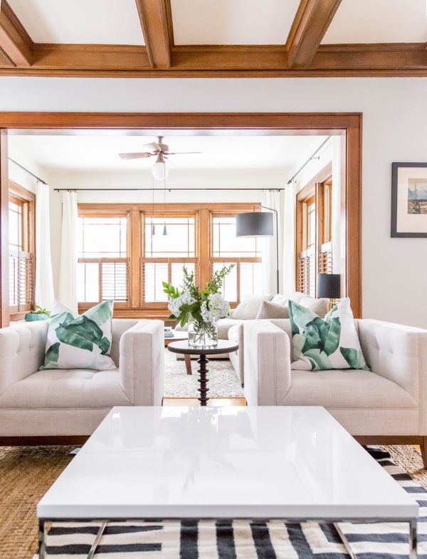
So the white walls in this case, pull together the white furniture (above). The fundamental principle of choosing paint colour is that it should be working hard to pull your space together!
In other news, my 3rd Spring Virtual Colour workshop happened last week and here are some reviews:
First, this is a comment I receive often:
It was two very long days! I was inspired, but burnt out on Monday. I am still glad it was condensed like that, and there is nothing I would have wanted to leave out, so I am not sure what could be done about it.
Packed full of information but no one ever wants me to take anything out 🙂
Thank you to Maria Killam and her team for an AMAZING class! Despite the class being virtual, I learned so much in the 2 days and I feel absolutely more confident with specifying color. I love Maria Killam’s teaching style. Her informative overviews and deep dives into color, shows her authenticity and enthusiasm. I have so much to take away from this class as I continue in my interior design journey. I LOVED THIS CLASS! Erica Banks
There were several take-aways but the one that resonated the most for me is: A color consultation goes beyond choosing paint colors for a wall, because you’re also advising on the colors for furniture and decor in order to create a cohesive color scheme that flows throughout.In the past I would focus on specifying color that works well with every element in a room, and sometimes that’s just not possible. Now I understand that it’s better to let a client know what would look better, what could be added or removed to enhance the color scheme. Joanne Williams
I liked Maria’s “rants” — they were insightful.
Loved the class. I expected Maria to teach color but not all the additional training in trends, lighting, decorating, vignettes, her go-to-List of colours, how to conduct a color consultation and much more training I didn’t expect. 😀😀😀 Deborah Koker
Ever wondered what to say when you’re client won’t listen? Here’s one thing you can say:


Register here to become a certified True Colour Expert®.
Want to download my “Exclusive Guide To Timeless Wood Flooring?” Click Here
Related posts:
First Rule of Design: Boring Now, Equals Timeless Later
Second Rule of Design: Waiting Now, Equals Beautiful Later
Third Rule of Design: Expensive Does Not Equal Timeless


Very nice!
But to throw a complication into this question, I manage rental homes so there are no furnishings when showing an empty house (other than perhaps a lamp, or a small table, or something similar, for extremely minimal staging).
We have one particular Cape Cod home with very orange trim. Since we can’t relate the wall color to any furnishings, what color(s) would you recommend for the walls that would also have the best chance of relating to most renters’ furnishings? (Floor colors are neutral hardwood on the 1st floor, stairs, and 2nd floor hallway, with neutral carpet in the 2nd floor bedrooms.)
This has been an ongoing conundrum, and we’ve done our best but have not been completely satisfied yet….
Thank you!
Well right now since everyone wants some shade of white they could be any of the whites in my system, so I would look beyond the orange trim to the countertops. If the countertops are grey, choose a greige in the correct undertone to relate to the countertops and that still works with the orange wood. If they are in the world of beige, then choose a complex cream in the correct undertone that matches. If you don’t have any hard finishes that would fight with an off-white then I would go with off-white since white is what is trending right now. Hope that helps, Maria
You are amazing friend! I learn so much with every post! I think the white walls modernized the room so much!
Happy day rock star!
KariAnne
I’m kind of with the anonymous Julia, although I have not taken your course. I assume she’s partially guided by the need to decorate around “hard finishes” — floors, trim, and in this case, a beautiful fireplace. It’s easy to paint walls, and possible to replace furniture, but it’s generally not feasible to replace hardwood floors or fireplaces. Thus, I would decorate around those things first.
PS. This post has the unintended consequence of showing me that stainless steel refrigerators (and other appliances) do not go well in all kitchens.
At first glance I could see why you say that Bette. On further examination of the photo, it looks like the countertop has quite a bit of cool gray in it so I suspect if you saw a shot of the countertop adjacent to the refrigerator it might actually work visually.
I suppose if I take Maria’s courses all her wonderful and useful info would stick in my brain. But just reading her blog I also get overwhelmed trying to keep it all straight. Is it “paint to match hard finishes” or “decorate to match hard finishes”? Is it “start with hard finishes” or “start with a great rug”?
I realize the answers to these (and more) likely depend on the dominance of a hard finish, or the amount of natural lighting, or any of a number of other factors.
Would love a comprehensive list of her rules/guidelines. Either way, of all the design blogs I follow Maria’s is BY FAR the BEST! Thank you Maria!
I do teach this in my courses yes. But those who can’t afford my courses have this free blog 🙂 Maria
A panelled fridge is always best but my second choice is still stainless. Most wood stained trim is far more flexible than people think, the reason why so many people look to match their stained wood is strictly because they have not begun decorating yet. Maria
When reading the dilemma,I thought Maria was going to advise to choose a color that would work with the fireplace!
If all else fails and you have to paint and there is no decorating plan that would have been a place to look for the paint colour yes! Maria
Interestingly (and probably deliberately!), the blue grey paint colour does pull out the blue grey in the stone fireplace and the sofa. And of course the stone also has the orange tones of the floors and trim. It all works together so well. Colour magic 🙂
Isn’t the trim more limiting? Say, if you have blue white or true white wood trim and kitchen cabinetry, a greige like SW heron Plume or BM classic gray would look better as opposed to a complex cream like SW Shoji White, or a very pale orange beige complex cream, which would belong with off white trim, correct? Maybe I need to go back and read my eBooks again. I find that a bit confusing at times.
I get the orange wood conundrum and I definitely couldn’t wait to get rid of my orange window trim and doors because of this. I understand the floors are like blue jeans now and I used to match my paint to my maple laminate floors too until I found your website!
I LOVE these kind of blog posts! The visual examples are so helpful!
Any of the complex creams in my system would work here too. Adding an orange beige complex cream to this room would’t be wrong, these are the palest of the beiges after all so they wouldn’t be THAT orange. Maria
I love how the blue toned paint colour you chose for the room pulled it together in the pic where you photoshopped the sofa in, but am wondering about the cream toned cushions and coffee table – they suddenly look dirty by comparison with the rest of the room. Would you change those out?
That is clearly a showroom photo. The coffee table appears to be white marble but yes it’s too glam for this lakeside house! Maria
Time and time again we all, (sometimes myself included), expect paint to do the heavy lifting. It’s good to remember that paint is supposed to be a beautiful background, not the star of the show. Decorating to the rescue.
My answer would have been add something in tones of orange & blue gray i.e. rug, drapery, pillow, art etc. to tie it together. Then use the accent color in the item for the walls.
Great post hon, as always!
I get that you choose the wall color based on the decorating, not the floors. However, when you are working on a room that has a giant area rug, and couch or dining room set, it doesn’t seem as hard to “hide” the floors, but what about the floors that are throughout the home, and are in large areas that don’t typically have a rug and/or a lot of furniture – such as large walkways (not necessarily an entry way)? It seems like the floors would stand out then, so shouldn’t a paint color be used to minimize the orange floor then?
Hi Christy, I’m glad you asked this question. There’s really no such thing as a colour that will ‘minimize’ an unwanted colour in a room unless you add more of that same colour to the room. And since, as I mentioned in the post, there are COUNTLESS neutrals and colours that will work with orange trim, that will work just fine in other spaces that don’t have the decorating. Hope that helps, Maria