All summer (okay maybe more than just the summer) Tricia (my eDesign Director) has been obsessing about her living room and how the green from outside turns her lovely shade of cream, green. She’s sampled a bunch of colours but really she just wants the room to be cream and not green. So I said “Paint it and we’ll post it on the blog, this is a common problem right now because white is such a trend”.
Whenever someone asks me what to do about white going green in the summer because of the green reflecting from outside, I tell them you need to add more orange to the colour to kill the green.
It’s a fine line though, if you add too much orange, you’ll end up with a peach living room in the winter when there is no green reflection.
Read on and you’ll see what happened, take it away Tricia:
Tricia’s Backyard
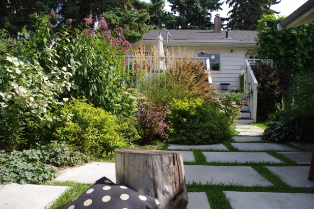
I love everything about summer. The long warm days, dinner al fresco, road trips and working in my wild overgrown garden (above). I can’t get enough of all the lush green-ness outside.
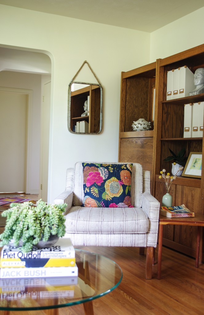
However, INSIDE, my pretty cream living room turns sickly green from the North East reflection of all that green outside. In the winter, (when I chose it this colour) when the light reflects off the white snow, it’s totally fine, but in the summer, it bothers me every day (below).
It would be fine if it was just for a couple hours of the day, but nope, it’s sour green all day long. You can see how lower down the wall, where the reflection doesn’t hit it, it’s fine.
I’m sure most people would hardly notice. And if they did, they would think, “meh, it’s green from outside,” but for colour obsessed me, it causes constant low grade irritation that erodes my very sense of well being…I know, get a grip right? But just LOOK at it! Lime-SICK-le green! Haha.
Anyway, I know this is not an uncommon problem, and my colour scientist mind wanted to know if I could fix it.
The colour is Ralph Lauren Architectural Off White. I chose it ten years ago for my trim to work with the cream floor tile we had installed in the kitchen and bathroom. I love everything Ralph Lauren, and this colour looks just beautiful on the trim pretty much everywhere in the house, especially in the south facing bathroom where it is bathed in beautiful light.
When I got tired of the green grays and beiges that I needed for the walls to contrast with my cream trim, I decided just to paint everything the same cream, which, in general, turned out beautifully.
But in my low light living room, with reflections from the giant trees outside, it has too much of a green cast, so what to do?
When RL paints were no longer available at Home Depot for awhile, I used a very similar cream for other areas of the house that was a smidge peachier by C2 paints called Breathless. It’s always beautiful in both bright or low light.
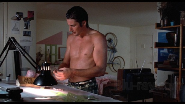
I confess that not a small part of the reason I love the colour is that it is named after an old movie called “Breathless” where a very young Richard Gere seems to constantly be just emerging from the shower 😉 His hapless girlfriend has a classic eighties transient apartment with a peachy toned cream on the walls which apparently inspired the colour 🙂
See that peachy cream colour battling the shadows in there? Oh, right, it’s hard to notice anything other than him. Anyway, I noticed it, because I am always analyzing decor in movies 😉
It is actually based on a more stylish black and white version of the film from 1960. Here’s a shot from the original movie.
A scantily clad Jean-Paul Belmondo and Jean Seberg in Jean-Luc Godard’s original version (a must see).
So I really just told you about that so that I could post a pic of Gere in his prime 😉
Also, I wanted to see if a slightly peachier cream, like Breathless, would cut down on the green cast in my living room.
I ended up testing a colour just a teensie bit cleaner and brighter than Breathless called Wedding Cake, also by C2, because who doesn’t want a space that is just a little bit brighter these days? Here’s the test board:
When a friend was over for coffee, casually flipping through the paint chips I had strewn on the table, she came across Wedding Cake and said “Eewww” and tossed it aside.
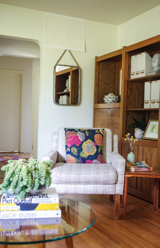
Truly, who wants peachy icing on their walls? Yet it turned out to be the answer. Just shows, you can’t judge a paint colour by it’s name, or even it’s apparent colour when it is sitting on the table. Here is the after:
Do you hear the angels singing in my head? Because I do every time I look at it 🙂
In the spirit of full disclosure, and because I’m sure that many of you will notice, yes, my vintage chair and sofa are a little on the pinky side. Pinkier than my cream walls for sure. But with all of the retro wood tones in my room (which I love because I watch too many old movies probably), pink beige was not the answer for this room. I’m stretching the rules and I assure you that in person, you would never notice, even I can live with it 😉
Here’s a shot of the other corner of the room with the big window that brings in not-quite-enough light filtered through all of that greenery.
See how Mabel is looking very suspicious of the camera? That’s because in our 9 years together, she has learned that usually when I’m “up to something” things fall, crash, and make loud scary noises 😉 But she puts up with me.
I got her a cow skin blankie to coordinate with her coat and keep her couch from getting too furry, see? We’ve had a long standing disagreement over whether the couch is hers, and apparently she’s won, haha.
Artwork by Phil Darrah at Peter Robertson Gallery
Here’s a view of the wall that gets flooded with warm West light all afternoon (above).
Artwork by Phil Darrah and Graham Peacock at Peter Robertson Gallery
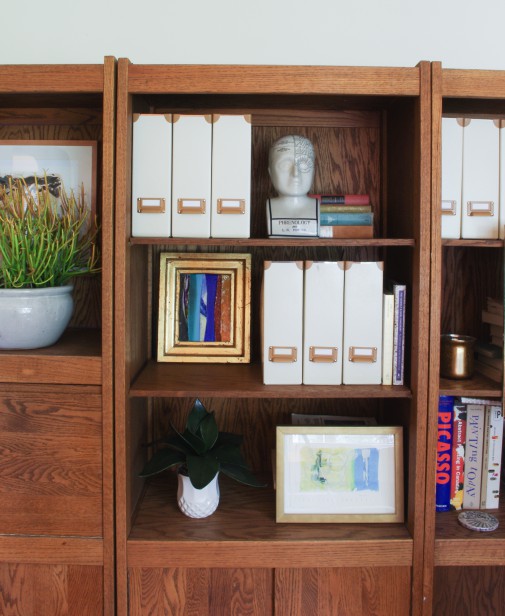
I’ve been working on styling these shelves, it’s a challenge because they are pretty dark, but I like the wood.
We so often get questions from you all about how light exposure affects colour, so I really wanted to share this with you. Reflections and exposures often do affect the colour you paint on the walls. Especially when you are working with lighter colours.
That is why it is so critical to use large samples to finalize your colour and see how it reads in the context of your room.
However, it is also true, as Maria says, that 95 percent of the time it’s about getting the undertone right first. At the testing phase you can tweak it if necessary.
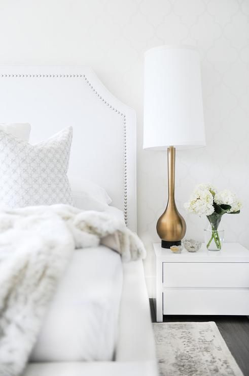
The other thing is that with everyone wanting beautiful white and bright rooms like the seductive blown out images that are all over the internet right now (below), it can be disconcerting to conclude that your own low light room can’t have the look you so crave to create.
From Four Generations One Roof
I’m putting forward trying a peachier cream (if it works with your fixed elements of course) to create a light and bright feel when greige and white feel drab and shadowy.
Understanding Undertones® – The Colour System
To get technical using colour theory, the cool end of the spectrum is blue, and the warm end is orange (yellow and red), you can battle the cool shadows with a bit more warm orange.(above)
Pinks and yellows should work the same for shadows (if green is not your issue). The reason this works for green in my case is that adding more red to my cream helps push back against it’s compliment, green. Does that make sense?
BM Navajo White Image via Home Design Etc.
So if you have a lower light room or a green cast from outside and you want to make it look brighter, try a creamier, peachier colour than you would normally consider. Good ones to try are BM Navajo White OC 95 and BM Indian White OC 88 and some of the other peachy off whites that live in that neglected section of the colour deck, can’t hurt to paint up a board and see what it looks like 😉
Thanks Tricia! This was super helpful to have a real, live example of fixing a white.
As you know, this week I was at Maison & Objet, you’ll get my 2018 trends report this week.
I’ve been with a group of designers this week, and inevitably the conversation comes back to colour when they hear what I do.
When people hear about my Understanding Undertones® system, one of the first questions I get is always about lighting.
“How do I get colour right while dealing with a North facing exposure?”
“How do I handle the new LED lights in a kitchen?”
And the list goes on.
Many people still live under the false illusion that if they could somehow predict how the light was going to ‘change’ the colour, before it went up, well THEN, AND ONLY THEN, could they FINALLY get colour right.
Well I’m here to remind you AGAIN, that getting colour right is about using large samples to get to the right undertone and then, finally actually choosing the correct undertone.
Anytime a designer confides “Maria, the colour went pink (or green or something wrong) after it went up and it was the light” I ask what the colour is. And every time, it was originally a pink beige or a green beige. So no surprise that it went pink or green when it was installed.
I have over 350 graduates on our private Facebook True Colour Expert page which is very active with lots of members posting about their projects, analyzing what to do, asking for help, and very little conversation goes on about how the light changed the colour.
Related post: What it Looks like to be in a Private Forum
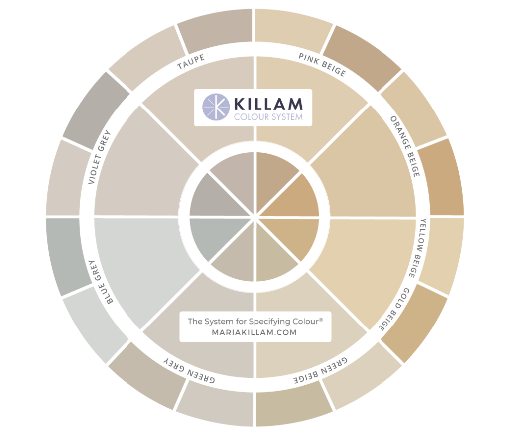
It’s also how I’m able to specify colour ONLINE. I have conducted literally hundreds of colour consultations this way. From paint to wallpaper, to fabrics and tile, it’s about knowing the 9 undertones in the colour wheel above.
The same thing applies to sourcing furniture and fabrics on-line. Once you see the 9 undertones, you can coordinate colour palettes for your clients like we do in our offices every day. I’ll teach you how to do that on Day 3.
Once you know what all 9 undertones look like on interiors and exteriors and how to spot them, how to compare colour so that you AND your client can see that you’ve chosen the right colour, well your whole world will change.
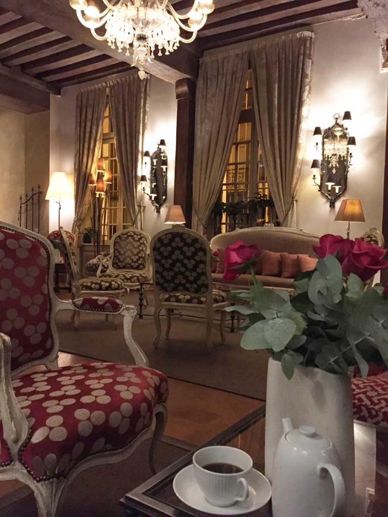
The salon in our hotel the first morning of my stay in Paris when I woke up jet lagged at 3:00 am.
So, instead of looking around at the colour and thinking “I like this taupe room”, you’ll more accurately say “Look at how this pink beige and red room is so pretty.”
Nothing wrong with the pink beige in this room (above) because it’s used intentionally. And you’ll notice that there are no other conflicting undertones to make it look bad.
Related post: In Praise of Pink Beige
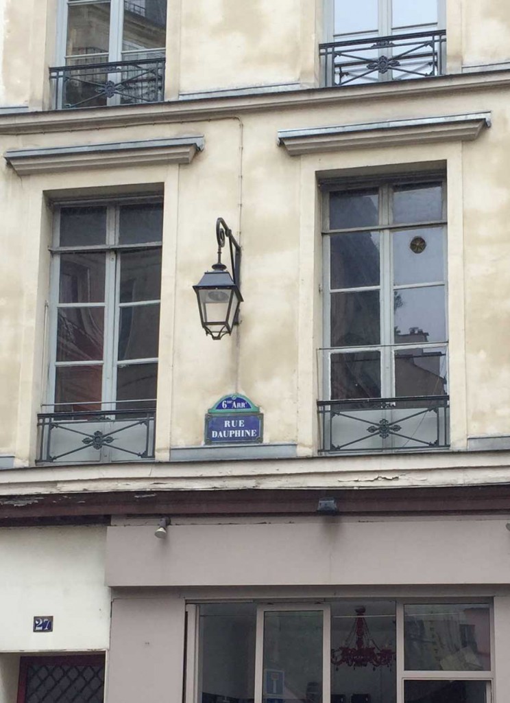
Different from the exterior of this building right outside my hotel on the same street (above). You’ll notice that the store windows at the bottom of this photo (along with the oversized casings) are pink beige and they make the rest of the yellow beige stucco look dirty. And the windows are green which clearly was not the best choice here either.
However the Juliet balconies and classic lantern chandelier remind you that you’re still in Paris, even if the owner of this building didn’t use the most attractive colour scheme.
While I was having a Spritz in the cafe across from this building the other day, I struck up a conversation with a frenchman, who after we exchanged what we did for a living and I pointed out what was wrong, he saw it immediately.
That’s the most amazing thing about neutral undertones, the minute you see them, you can’t unsee them ever again.
I spend A LOT of time distinguishing pink beige in my workshops because it’s such a tricky neutral undertone.
Related post: Why Pink Beige Should be Banished Forever
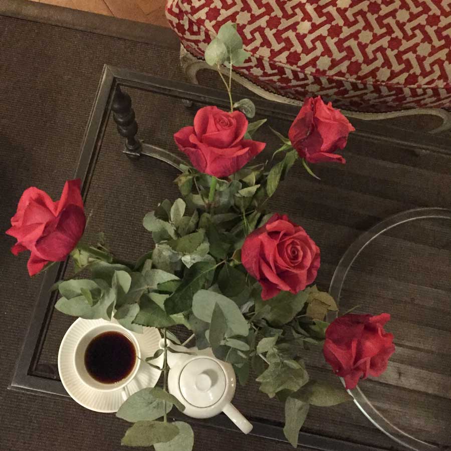
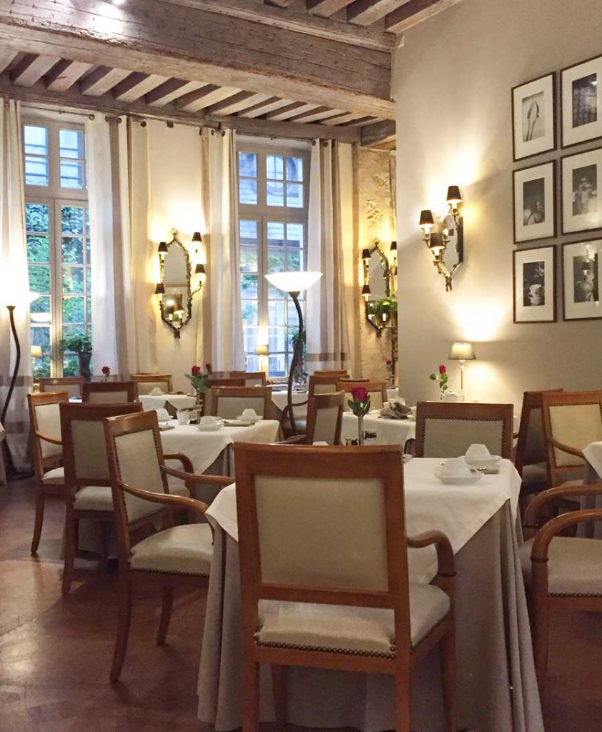
This was our breakfast room. The lighted mirror sconces were my favourite decor item in this hotel. Nothing wrong with this monochromatic pink beige colour scheme.
It’s my last night in Paris and it’s raining today. It was raining when I arrived last Monday too! We’ve had a lovely week of nice weather otherwise.
Hope you are having a lovely Labour Day weekend!





Such a great article Maria and so proud of you and your success !
Wow, what a wonderful post and so full of information! I loved Tricia’s pictures of her home and how she subdued the green that was washing her walls. I am sure it was tricky to get the right peach undertones so as not to make her walls look peachy pink. Good job! Loved it!
Maria your trip to Paris was like a dream come true. I am so proud of you and all of your effort to become a leader. You certainly are one! Have a good flight home.
What a great post.
Tricia, I love your home. (and your dog of course))
I just repainted my master bath-I decided on a color two years ago, but got to it only now..:) I was looking-very intentionally-for a very warm slightly pinkish cream.
Well, now it’s great for a half of the day. Another half-namely, mornings and evenings-it turns peach on me:)
I’d be very sad about it, if-and that’s a big IF-it wouldn’t, simultaneously, make my image in the mirror look much prettier..:)
Nothing wrong with flattering peach 😉
Brilliant post! I too have the issue with green reflection, and found BM 184 Ivory Lustre works really well.
This is a great post. I still am in awe of your talents (both Maria and Tricia) because with the sample piece of Wedding Cake, it still looks to me like the green, but it is not once the wall is painted. Amazing.
Now I know why all the existing colors, and my color samples look green-especially the off white-Cloud White. Hopefully, I will get my color consultation before the leaves fall from my birch trees. What an informative post.
I am curious though, Marie says that grieges can eliminate the shadowy white wall problem, but apparently they might not eliminate the green problem. Can a griege paint increase the green cast problem? Thank you.
Hi Gery, there are a range of greiges, and whether one will work depends on your finishes and furnishings first. Whites and off whites are definitely more likely to reflect more of the green back 😉
Hi Gery,
I have Benjamin Moore Revere Pewter (light to medium color) in my dining room and living room (I think this is considered to be greige), and it does flash green in darker light. My dining room is spot on to the color I thought it would be, but sometimes in my living room, which receives less light, it can look like a muddy green-grey. It’s so funny (and not haha funny :)) how paint colors can look different even in connected rooms! Sherwin Williams Repose Gray isn’t a greige, but a warm gray (it has some brown or taupe in it I think), and it rarely/never flashes green.
Hi Tanya,
Revere Pewter is a green grey so what that means is sometimes it can look beige in some lights, green in other lights and like a ‘neutral grey’ in other light. Maria
Thanks Maria. You hit the nail right on the head with how Revere Pewter appears in my home! Though I am still happy with the color I chose, I do like it better in the lighter areas. Seems like almost a perfect neutral in rooms with a lot of natural light! I often wonder if it would have made a difference if I had gone 75% in the darker room (living room), but I just don’t have that kind of color confidence. I guess the undertone is still there anyway. Thanks again for your great blog, sooo informative! I can’t wait to buy the book on undertones/neutrals…soon 🙂
Your little aside about the windows looking green gave me pause… exactly my problem! huge green windows that don’t work well with the light colors I’m looking to paint our stucco house in spring. Ugh! A Jolly Green Giant of green-on-green doesn’t seem to be the answer, but our present peachy yellow isn’t working either. This color thing gets really complicated when one is talking big expanses!
Great article thanks! I had a client last year that called me in for a consult AFTER her husband painted the walls an off white, unfortunately it had a green undertone, de did not want to reprint. This was a challenge since they didn’t like the greens. Hope you enjoy the end of your trip in Paris! I love reading your blog!
Tricia, excellent post as you certainly have explained to me why I see so many home exteriors that appear to be Chameleons that seemingly change in colour depending upon the season. Some for the better and sadly some for the worse and reason why when it comes time to upgrading my own place, I definitely plan to purchase Maria’s Exterior Colour Consultation package not only for her expertise but also for my sanity … ☺. Thanking both you and Maria for the lesson. -Brenda-
Amazing before and after photos. What a difference!
You lost me at Richard Gere. 🙂
Great article! I’ve had a similar problem with purple & red tones coming onto our walls from outside. The large purple leaf plums & Japanese red maples outside the windows drive me nuts. But it’s also from the neighbor’s pinky purple brick that’s worse! Houses in Louisiana are built very close together.
Tricia, the new paint most certainly did the trick!
It also makes the wood tones look richer with a stronger contrast. Thank you for sharing such an informative post!
Your sweet Mabel seems to approve. I had a beautiful Springer Spaniel for 16 years whom I still miss so much.
Aren’t they just the dearest dogs? Thanks for the comment!
What an informative post, amazing how the peachy undertone affected the incoming light and made the room looks so much better. I have been through sample after sample in my bedroom for a somewhat similar reason. The room has a small-ish western window, and so, it is one color all day, then something totally different when the sun is coming around the west side and beats on the walls in the room. I once painted the room SW Malted Milk, which had a yellow undertone, and I hated the room from the moment I returned home after my husband painted it. But now I am so confused b/c I would have thought yellow undertones would offset the orange-y sun. Nope! So what would work with that kind of light? A green? Purple? I’m confused — trying to look at the position of green and peach on a color wheel and I take it that green offsets an orange sunset just was the peachy undertone offset the green light? Am I totally off?
Hi Tanya, SW Malted Milk has a strong pink undertone, so I’m not surprised it looks bad in the strong light. The neutral that will look best in your room has more to do with how it relates to your furnishings. We can help you with that with our e design consultation for paint colour selection 🙂
I love this post and seeing the impact a subtle tweak made on your walls! Timely, as I stare at my cream walls:) Tricia, is the ceiling painted the same cream as the walls?
Hi Kelly, the ceiling is C2 Breathless. Another reason I knew I was on the right track because the ceiling never looked green 🙂
What a great post, Tricia. I just love reading about all the tips that you and Maria give. I have learned so much from you both and always look forward to your emails coming in, Maria.
Wow! Thank you for opening your home and color dilemma to us. I’ve learned so much from this post. I love that your style is different from Maria’s as well. I honestly think you are both genius and it gives me more confidence in my color choices and an online consultation! I may need a peach white as well!
My north facing, golden yellow living room turns into an ugly greenish yellow in the summer, with all the reflectlected greenery from outside. So, following this principle, it should work to paint it a yellow with more orange in it, correct? However, the large golden yellow artwork over the sofa looks bad with the orangier yellow. Now what can be done?? I love this artwork. Also, what happens to your (and my) room in the winter when the peach undertone is still there and the green is gone? I’m so confused!
HI Liza, we can look at it for you inside of a paint colour consultation if you like 🙂 Considerations outside of reflections and exposures most often trump them. The peach in my colour is pretty subtle, and since peachy blush is a colour I like, if it looks warmer in the winter, that’s fine with me 🙂
I’m noticing that in your after photo, the LR looks great but the hall behind looks pink now. Did you repaint both?
No, that’s Breathless in the hallway, it’s a full spectrum colour and often does look quite peachy. Especially later in the day 🙂
You ladies are truly brilliant. Loved every bit of this post.
I have the same problem in the guest bedroom. But since I only go in there to clean, I t doesn’t bother me. If it was my living room I’d have to fix it.
I find the type of light I use makes a huge difference in the look of my rooms – I tend to like the outside ‘white’ light, but sometimes it makes the room look to clinical, and takes away a lot of the warmth. Thanks for this article 🙂
I can totally relate to your “green” problem as I have experienced it, too! My home literally backs up to a heavily wooded ravine (the only backyard is off to the side), and the leafy tops of most of those trees are right at “window level” (and we have LOTS of windows!). We painted the walls a yellow/gold (about 12 years ago) and I intentionally went with a yellow that leaned a bit more towards red, hoping to offset that green, but it wasn’t quite enough, and the greenish yellow in the summer is annoying. I am hoping to repaint very soon, and I was thinking of painting the walls a light cream to lighten things up, so this is a very timely article for me! I will definitely check out some of your suggestions!
By the way, I remember in one of my art painting classes that they said if you wanted to gray down a color, you should add a little bit of the color that was opposite to it on the color wheel!
Thanks for the tips!
Very convincing! But what will happen this winter? Will it go back to looking peachy?
Hi Deb, I will keep you posted, but the room doesn’t get a lot of light so I’m not expecting it to glow 😉
Hi! Thanks for sharing this Tricia! I am jealous of those who can stream in the light from windows! We tend to use our shades. This seems to cut down on the color problems too. In the summer as it gets too hot here (no central air and an old house with single pane windows with the water looking like glass) we draw the shades for the day and sometimes as the light moves over the house we open and close them. Shades work well with window air conditioners when it comes to covering or opening just enough! Once we take those monster air conditioners out, we use drapes for night or drafty days and no shades. *It is refreshing to see vintage furnishings on the blog.*
You did a great job with the photos! They look very professional. Personally I have found the trends gearing toward the 80’s and early 90’s for a while. I think besides fashion showing what is coming next in home dec, TV shows can drive trends as well. Mad Men ushered back in the huge mid-century mod craze. Now shows set in the 80’s and 90’s are popular. When I look at the set of The Americans, I see a lot of current trends. Some sets of Halt and Catch Fire as well.
Now onto what I am really interested in – that rug in the blue and white room pictures with the multi-scale herringbone! Do you have any info which could be helpful in finding it?
Sorry – reply to wrong post! This new infinitely scrolling web design is throwing me off!
Hello Tricia! Love your room. And thrilled to see your chair/sofa because I have their sister sofa and recliner. Same fabric and same base. Mine are getting tired but I hate to have to reupholster them. So glad to see others surviving still. Thx for sharing!
Wow! I was almost shocked when I saw the difference. It’s beautiful!
Tricia, love your beautiful room & furniture. You mentioned cream floor tile in your kitchen. Do you have cream painted kitchen cabinets or unpainted wood? Thanks
Tricia, love you decorating and color choices. It seems to me that men have a much harder time than women when it comes time to choose decor.
Butter is a very warm color that can add charm and appeal to almost any home. It is especially effective during the dark stormy and gloomy months of winter
Just leaving a comment to see if that helps the page load the previous comments.
hi there! Thanks so much for your post. I’ve just painted a room “Crisp Linen” by Behr & I’m a bit baffled at the result in the evening. I had originally painted it Cameo white, which had more pink/red undertones, so it wasn’t totally surprising when the room in the evening was completely lavender; however, the Crisp linen has black, gold, and dark brown in it & yet in the evening it is blue (could be the black I suppose?). The color is beautiful in the day – a veryyy light khaki. Nice and warm. I would love it if you had any suggestions about how to potentially tweak the lighting / decor in the evening to make it a little less blue and more warm? Thanks so much!
Without photos, it is impossible for me to give you accurate advice. If your room is a colour you don’t like at night, I’m guessing it’s not the correct undertone to begin with which means lighting will not help you. Send me photos and I will consider it for my Ask Maria column as I’m sure this is a question that others deal with as well! Take them without flash and in good natural light and send to [email protected]. Hope that helps, Maria
Maria–
Is there a grey paint that is very neutral– that is what one would get if pure black were mixed with pure white? Apaint with no blue or green (or orange) cast? This is what I want to find! A completely “neutral” light (but darker than off-white) gray!
There’s no such thing. But the right grey will look neutral in your interior if you choose it correctly, in other words, if it relates to your hard or soft finishes. It’s like if you have a room thats decorated in pink beige, if you add a colour with a pink undertone for the walls, the walls won’t look pink. We can help you choose the right neutral in our eDesign department here: https://mariakillam.com/product/interior-paint-colour-consultation/
Hi
Is that C2 Wedding Cake you are referring to?
Also do you deal with many different paint companies for your consultations or just Benjamin Moore?
Thanks.
My system is totally transferrable to any paint company, I are not sponsored by Benjamin Moore and are not attached to specifying their paint. Maria
Oh my goodness. I could cry reading this article. I am living the same colour issue. I just had snowfall white by Benjamin Moore kitchen cupboards installed in my house and all I see is green. I’m at the point I’m going to pay to have it all ripped out and repainted. Maybe the right curtains and paint can solve this problem. Please help me I’ve shed way too many tears on this.
Hi Darlene, I need to see photos taken with no flash and in good natural light (no lights on) before I can advise you on how I can help, email [email protected]. Warmly, Maria
Interesting. I can see why you went the route you did, but in our low light settings, the off white w/ peach had a nicotine stain effect. The previous owners painted both walls and ceiling this color, in every single room, in a formula that looked like something between satin & semi gloss. It looked dirty & greasy, and closed the spaces in.
We went with a custom color off-white with a pronounced green on purpose (no black in the paint at all,) because we have a ton of medium colored wood we don’t want to paint, yet didn’t want to go with a lower LRV green because it’s so cavelike in here. Also, anything with a cooler undertone turned grey.
It’s a custom color that is slightly greener than FB Tunsgate Green & BM Dark Linen. We call it “Luna,” after the luna moth. That’s what it reminds us of.
In the north facing living room, the living room space gives the color definitely has a green glow when in a rainforest. There are juniper bushes just outside the window, which boost the green glow, particularly on the ceiling. In the south facing dining room, which has a porch & steep hill blocking a lot of the light, the walls turn more off white, but the green is still there at certain times of day.
The ceiling paint is BM seahorse (2028-70,) which what hubby & I call a cloud color with that refracting shift, and is beautiful in the dining room.
Just posting since we wanted that green cast, and you were wanting it out if there. ?
My room:
Painted Chantilly Lace
North facing (Michigan)
23 feet of door walls with some south facing windows on the opposite side of the room.
Getting green casting from lots of trees and bluish shadows with the white.
I wanted a warm room, golds and creams. The cream or yellow white paints were looking bad. Yucky green tone.
Would it help to cut the casting if I added a slightly peachy ceiling?
It’s always going to be a shade of something, it could be yellowish, pinkish, orangish, cool white bluish or greenish. I prefer the greenish shades of white because they look the most subdued.
I am having the same issue on the exterior of my pink brick colonial house. My painters start next week. I have hired two color specialists to help me, and everything is still turning green. My house is situated at the bottom of a grassy slope with a line of trees running down the side of the yard. The grass/trees are reflecting in EVERY single color I’ve tried (about 15 now). They all turn either, olive green, sage green or chartreuse. Colors I have tried so far include BM: La Paloma Gray, Plymouth Rock, Thunder, Amazing Gray, Revere Pewter and SW Modern Gray. Modern Gray turns the least green but looks an ugly shade of beige certain times of the day, so it’s not the best choice either. My designer is absolutely baffled by the situation, as she is quite accomplished in color consultations. Her name is Kristie Barnett, otherwise known as the Decorologist (Nashville). I could use any advice you can give me. I should mention that we are not painting the brick, only the trim and windows. My soffits are 24″ in depth (twice what most are) and seem to be equally as long. The soffits create shadows over all the trim. They are currently an off white. Sigh. PS: I don’t see a way to attach a picture.
This is Kristen again. PS: We are trying to tie in a light gray roof and mortar.
It is a south facing house. The colors on the back of the house look great.
Hi, so glad to stumble on this post. We are renovating and currently have a large north facing living room, and a south facing dining and kitchen. No direct sunlight. I would love suggestions a on creamy neutral that will offset the green glare from the lawn. Everything is currently an ugly gray because I’m afraid to commit to a color just to hate it. We have flooret flooring in the color Soho…and neutral furniture with brass and matte black fixtures. How do I find a sherwin Williams color with orange undertones that also matches the floor?