


When I arrived in New York yesterday it was sunny and beautiful and then today we woke up to rain so it’s a good thing I’ve been in colour forecasting meetings all day long. . .
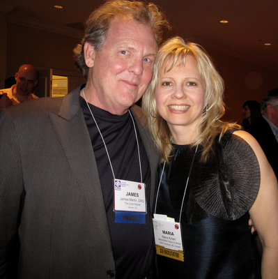
The Colour Marketing Group Conference kicked off with a reception where I saw our President James Martin (above) with the Color People. I interviewed him on my blog a few months ago, here.
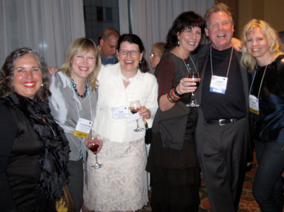
Then met some new colour colleagues, from second on the left, Jacqueline Rosadiuk, Roza, Janice Lindsay, James Martin and I’m on the right. For colour professionals we are all looking very neutral I did notice!

This photo (above) is what we work on all day today (I was a co-facilitator so I was sticking them on the board).
We determine which colours are ‘NOW’ and then everyone has prepared (in advance) which colours are going to be ‘NEXT’. Once we all have the colours we brought on the board we start to narrow it down and everyone presents their ‘argument’ for the colours they have brought!

Margit Zsedely with Margit Publications represents a company that packages colour combinations and sells them to Fashion, Interior/Home, Residential/Contracts and Industrial Markets. Her presentation had some beautiful colour boards to go with the samples of yarn but they were top secret (for buyers only) so this was all I was allowed to photograph!
Green continues to be a big story, (but it’s fresh not too yellow and I talked about the difference between the two here) it’s almost a neutral.
Orange, fresh new, rejuvenating the space using natural elements. Fresh, happy colours are mostly what ended up on the board.
Grays were there of course as a neutral and Brown was still there but that’s because it’s not going away yet, we named our brown ‘Stayin Alive’ which I thought was great!
Sherran Arthur, Marketing Manager for Canada from Larson-Juhl talked about frames and warm metals tones–that golds are coming back but not as bright as they were. Hammered and burnished gold.
I had a fascinating group of colour professionals at my table, it was a really fun day!
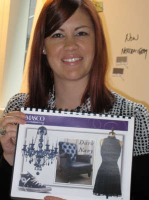
Lori Lewandowski from Masco Retail Cabinet Group, had a beautiful presentation on her take on upcoming colour trends and navy is a big story. Blue stands for water and sky which represents hope, very important still in today’s times!
Someone else said that for a few years no one was interested in seeing the wood grain of cabinetry because it was espresso brown and now people are wanting it back in the bleached out woods we are seeing everywhere.
Ceiling in the Marriott Brooklyn lobby
I was also introduced to Mix Publication which is a Global Color Research organization. They also have a blog which I can’t wait to check out!
Hope you had a great weekend! I’ll fill you in on my week when I can!
If you would like to transform the way you see colour, become a True Colour Expert.
Related posts:
The Combination of Surprise is What’s next in Colour
Five new Ways of Looking at Colour; from the Experts
If you are new to this blog click here to see the best of Colour Me Happy.
While you’re here, subscribe to this feed so you don’t miss out!

That is so exciting – you are right there in the hub, deciding what we are going to like. I always feel a bit hoodwinked when I all of a sudden start liking a colour I never liked before, because the marketers have decided it is in and we see it everywhere. Anyway, I trust you to choose some good colours for us.
I think it is funny that the bleached oak is coming in again as I'm about to paint my kitchen cabinets to get rid of it (mind you it is faux wood, which is never a good look).
Looking forward to hearing about the "new" colours and colour combinations. The comment about navy symbolising hope is interesting – I'm so pleased Ive just introduced navy to my colour scheme.
Maria Maria…I cant believe you visited my blog on my most beige post of the decade, I was mortified and I sincerely apologise! Are you okay? I hope your next visit to me is more 'Happy!'
I bit into a piece of real Turkish delight yesterday and it was the most amazing deep tea rose , it would HAVE to be a contender for colour of the year!
This is like waiting for Christmas! xxLyn (LINI)
Sounds like a lot of fun!
Hopefully you'll get a chance to also check out a few shops and museums while you're there.
-Ann
Glad you had a sunny day yesterday. I was in the city at the Gracious Home store to see Eddie Ross and creative candles, they have the most wonderful colors! He spoke of brass and color really infusing interiors, adding in an accessory for a pop of color to a neutral setting is key.
I love navy and the palette looks clear and fresh!
pve
Looks like fun! Hope you had a great time!
Kelly
Sounds like you're having a great time. Thanks for keeping us all in the loop! Didn't know about navy representing hope; happy to hear though.
Beautiful thoughts about the colour navy! The idea of being able to see the grain in wood is always something I have loved…. but I also love the darker woods with their grains (as you can tell by my post you just visited – thanks so much for dropping in!!!).
It must be so exciting to be there amongst so many other colour professionals and really getting into the 'nitty gritty' of it all.
I always remember the scene in The Devil Wears Prada were Meryl Streep dresses Andy down for her dim view of fashionistas and designers and how superficial and irrelevant Andy thinks they are ….. she runs off this big long spiel about how the designers decide what colours are 'in', create their collections etc etc, and then much further down the track the larger department stores pick up on the trend and create more affordable items using that colour. Then the 'masses' choose that colour and love it, never knowing (or suspecting) that without the original 'designer choice' of the colour, they may never have seen it on the rack or even had the chance to like it in the first place.
Very interestign Maria and looks like so much fun!! Just don't tell me I have to repaint everything!!
Karena
Art by Karena
Ooh, sounds like a fun time. I know turquoise is the color of the moment, which I love. It is exciting to see greens are up and coming, because I love them too! So refreshing and natural.
Lots of fun, Maria!! I can't wait until you can share what colour(s) you and your colleagues feel are coming next!!
Victoria
What a great post Maria! That had to be such a blast (and mentally exhausting too).
I just love color forcasts, its kind of like peeking at your Christmas presents!
-Danika
What a great job you have! and a difficult one as well…setting the color trends for the entire world!
It looks to me like the colors on the swatch card are pretty clear colors, giving a more optimistic feel to me. I can't wait to see what you all decided, and how they'll be used. I can get into navy, but I'm going to need to bounce it with something with contrast…white, yellow even pink! (I love pink!) Keep sharing!
Ooohh, I can't wait to hear all the predictions! It looks very exciting, being there in the thick of it!! And New York must be fab, I hope you have time to go out and about as well (at least you are used to the rain!). Thanks for sharing your adventures with us!
Nancy
geesh, I do love that navy RIGHT NOW – so yummy!! grey and navy are really inspiring me, yet none of either in my current home!!! (all baby blue and choc brown – pink accent), how funny is that! Next home – Watch out!
Hi Grace,
The most interesting part of colour forecasting (that most people don't know) and maybe I'll have to mention it in my next post is that there is no random, 'let's choose this colour, it should be in'. I am arriving with colours that I am choosing for my clients right now! The reason they are still considered NEXT colours is because as a colour professional, we are usually on the pulse of what's coming next because this is what we do.
Many people criticize colour forecasting and write it off to "marketers putting out what's 'in fashion' so that we spend more money" but really it's that people get tired of dark so they go to light. Then they get tired of light and they gravitate towards dark. So it's actually consumers that drive where colour is going, it's colour professionals in the business that simply notice it and document it. And that is what we are doing here.
Thanks for such a great comment, I'm sure you are saying what a lot of us are thinking!!
Maria
This is so interesting. It sounds like what you have been writing about is exactly what's happening. I'm right there with all the colors and I can see the bleached wood happening in catalogs, etc… But I have to say the bleached wood is what I'm having a hard time with. I'm interested to see over the next couple of years how it all shakes out and if I ever come around.
Fascinating! Thanks so much for sharing!
Maria, that sounds like so much fun ! You've been traveling a lot lately. So, do you think you all had on neutrals because it was NY ?
Maria, Thanks so much for stopping by. :o) I am glad you answered the reader's comment about the idea that decorators choose what colors are in. I have wondered if colors changed for the purpose of selling new products. I agree with you though–it must be the consumer who makes the choice–that's just solid economics.
Wow, I'm so glad you included the links to the interview with your president, James Martin, and your article on the color green! I have been falling in love with a spring green (decidedly NOT avocado!), and find myself longing for a room in that color. You article on the different shades was very interesting and helpful.
And I really enjoyed the interview with James Martin, because it helped me understand, so much better, what it is that you all were doing at the conference and why.
His comment about the biggest mistake people make about color is living with 'drab neutral colors' because of the supposed re-sale value really hit home with me. That is exactly why we have been reluctant to start wallpapering and painting. But that's just crazy! We finally buy our first real home and we aren't going to do anything to make it reflect us? No way am I going to settle for that. My husband is going to get to read that interview..today!
By the way, being a fabric artist and textile lover..your photo of the colored skeins of yarn was so enjoyable! I would love to see those color boards! Glad you had such a great time.
Hmmm…you all are wearing an awful lot of neutral colors there… Just kidding! :o)
Your fan,
Donna @ Comin' Home
I love the yarn picture. Clear, light to jewel intensity, none of that murky stuff from the fringes of the color boundaries – that's my permanent range of colors.
Add some wood with intricate grain, hand-woven or knotted rugs, my art collection, a comfy big leather couch and I'm all decorated.
Yes, Maria, I like bare wood (if it has interesting grain) and brown leather. And I'm not male.
So happy to hear navy is gaining momentum! Thanks for the great info, (as always!)
Such a happy post! You are so radiant in your element!!!
Can't wait to hear all about the coming colors…. Such fun!
XX
Victoria
Maria,
Great learning tool. Color has an ebb and flow just like nature. Life imitates nature so we all flow together.
Color is everywhere and sometimes we all see it quite differently. Focusing on different colors opens our world to change.
Bette
I get a bit cynical when I see the 'experts' choosing what's next I really like your response to that . . nowm it's so obvious of course we get 'tired' of dark go to light and other reasons change happens it's not just the desicion of random experts!
Hope you have an amazing trip. San Francisco has been awesome! Can't wait to tell you about it. You must come for out last weekend! I love you. say hi to Penelope for me . . .
NYC again… you are so lucky. I loved this post and thought to myself how much fun it must be.
I have always loved navy. I just bought a blue leather coat, not navy but more of a muted deep blue. Much like the last row of yarn second from the left. Love it, however the comments are varied. From "not what I would pick after all I only go for safe choices…to… it matches your eyes perfectly."
Have fun.
Susan
How interesting! I'm always choosing color by the seat of my pants, instinct or feeling. Fun to see how it's being forecasted. Would have loved to hear the debate.
Maria, Congratulations on being mentioned in HGTV's favorite blogs, how awesome !
Maria,
I came back to tell you I love what you are wearing! That top is fab, is it navy or black and what is that pleated flower?
FAb00
pve
I love it! I love to see what a group of designers come up with as the now and next phase in interior colors. My mom has been saying the last month that gold is coming back, not brass! GOLD!
Lila Ferraro
Queen Bedroom Sets
Wow… it's so interesting that a group of people actually "choose" the next "in" color!!! Fascinating!
xoxo Laura
Thrilled that you are back in the City and experiencing such an extraordinary conference on colour! Can't wait to hear all about it and see all the glorious colours that are "Next!" Getting ready to paint that glorious turquoise you advised for my living area. It's going to be fabulous!
Hugs!
Victoria
How fun that you get to help pick the trends!
Love hearing about this! It's a big coincidence because just now I saw some navy over on Absolutely Beautiful Things, then I was thinking about Lauren's dark blue walls for the nursery at Pure Style Home (love that room!), and in my ignorance thought – Gosh, is navy ( to me the colour of school uniforms) creeping up in interiors?
So I came over here to leave a question about it, but you beat me to it. Maria at some point if you have time, how do think we'll be seeing navy used in interiors? What will it appear with in terms of other colours, and will it include other dark blues or other darks colours in the trend?
Ha, don't worry if you don't have time, but I just think it is an intriguing trend.
I'm glad you had fun – too bad the weather wasn't nicer. I'm looking forward to the "new" colors coming in. They're pretty much the trend I was leaning towards as well. If you'd like, you can see it on my post here. I thought a gray cameo pin suits the neutral color trend best as seen on my blog (just my opinion). Thanks Maria!
ps – I love the name "Stayin' Alive"
http://colorspecialist-charlotte.blogspot.com/2010/04/my-color-forecast.html
I like what you said here in the comments about it not being random and that the consumers drive the colors. It should be noted that it's consumers from all the industries represented. It's easy to just think about your industry, but to see the whole picture (from fabric, carpet, residential, healthcare, office, automotive, etc, etc) is very enlightening. Those color cards sent out after the conference represent a lot of time, passion and information. I have kept them all. Thanks for your great posts!!!