


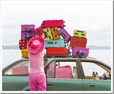
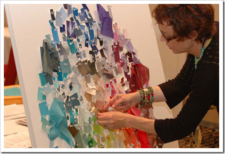
Well I’m packing tonight, and (at the last minute—eeek) writing colour reports I’ll be presenting at the CMG Conference this weekend in Brooklyn! Each conference attendee must present where colour is now, and where it’s going next!
You know what I think. But I thought I’d do a poll. Where do you think colour is going next? Will red be more raspberry? Is gray going from green to blue?
I would love to hear your opinion! (There are no right or wrong answers by the way because colour trends vary from region to region).
If you would like to transform the way you see colour, become a True Colour Expert.
Related posts:
The Richest man in Town (more on the CMG)
The Secret to having the Life that you Want
If you are new to this blog, click here to see the Best of Colour Me Happy
While you’re here, subscribe to this feed so you don’t miss out!

I think we will be seeing more blues as in blue grays.
Have fun at your convention!
Pamela from French Buttons
Where is color going next? You’re talking to the wrong guy.
But I can tell you this much, it will remind you of the 1980s. That’s the way these things work.
I’ve been meaning to ask you a question though. When you’re at parties do you enjoy talking about design because you’re so passionate about it, or are you tired of talking about it because you do it all the time?
Just curious.
I'm guessing fresh blues for now but see fresh greens soon after. I have a funny feeling Patone colour of the year for 2011 will be green.
And right behind, or along side, blue & green is reddish purple.
Good luck with the presentation! 🙂
I think I will be safe to say it is going more neutral, Neutral is the new color! I for one love color, but who can resist a bowl of vanilla?
pve
Hi Siddhartha,
I pretty much don't ever get tired of talking about colour and design. . . hmmm. . . I'm trying to think–maybe if I feel like someone is cornering me for tons of free advice. I love to contribute to people in general but sometimes it's too much!
Thanks for your comment and for asking!
Maria
It's just a little greener every where I look at present. I wonder is it a colour, happening around us, because we don't seem to have as much in nature anymore or just because the right green is light bright and amazingly fresh!!
Hi Marie, I have absolutely no idea…that's why I follow your blog! You tell me…and I'll do it..Ha!
Have fun and let me know what color you forecast. :o)
Ooohh this is fun! I will guess jewel tones.
raspberry, cobalt, emerald, amethyst and peacock.
Having said that I believe the latest fashion collections in Europe have been offering up pastels, which usually end up being translated to interior concepts.
Enjoy Maria! Would love to be a fly on the wall!
x Lyn (LINI)
I like the sound of the 'reddish purple!'
Hello Maria. Long time, no comment 🙂
I would love to attend this interesting conference.
Anyway, since you ask, here I say:
A couple of weeks ago I did I a "furniture board" and the colours I choose were red, like a raspberry tone, and dark turquoise.
Last week I went to the Milan furniture fair (yes, i was affected by the volcanic ash cloud) and these two colour were absolutely everywhere. As you said, colour trends vary, and in Europe I really believe these two are going to master, specially in furniture. I'm happy to see furniture with a bit more colour, specially when it comes to very rectilinear forms.
So, to wrap up, I think colour trends are going to be the balance between hot and sexy (red) and cold and creative (blue) on a greyish background.
I leave two links illustrating what I'm explaining.
http://elianatomas.blogspot.com/2010/04/style-with-bonacina.html
http://elianatomas.blogspot.com/2010/04/minotti-milan-fair-2010.html
Looking forward to hearing updates on your conference.
I welcome bright, fresh colors, but gee, I sure hope we don't get too much into the raspberry. To me, although it is brighter, it could become too dangerously similar to the mauve of the past.
I agree with one of the previous posts that greens will become more dominant..
Have a great time! Anxious to hear all about it.
Oy vay…Green has been all over the place this spring. I am hope to see some awesome red and oranges for 2011.
Well, I think before you explore trends, you need to take stock of what is going on around us – political & economical conditions govern us more than we realise. When the economy is suffering, you'll usually find that the colour palettes found in fashion and interiors will be sombre – grey toned and serious; as though to emotionally support and prepare us for times of hardship. Personally, I feel that we're just about to begin to emerge from a long and cold winter (politically, economical & environmentally) and so, although there are murmurings of yellow and warmer, brighter hues, they will still be quieter tones. Suits me!
Again, another great post and it's the perfect question to ask because we are all very much a part of the answer.
Ah, Brooklyn! The place of my birth! Have fun and enjoy, Maria ~ we are having some nice weather here in New York. {As opposed to the last time you were here, I think}.
Well, I already have a gray blue in my master bedroom and I've been showing a lot of the grayed down colors to clients for a good year, now. I think that will continue. I also think orange will still be big ~ just had a client talking about doing orange a couple of weeks ago.
I do love orange, and also turquoise and raspberry. Bring on the bold colors!
Being in Dallas, we've been in this "old world" design hole for a long time now…dark, red, brown, brown, brown, heavy…get my drift. It could be that I'm just sick of it, but like you, I know the pendulum doesn't swing small, so I'm expecting more bright, clear colors to abound before long. I don't know what we're going to do about all these heavily textured, faux-painted walls….
I am a firm believer in using whatever color speaks to you at the time. However, I also realize it's not easy to find the accessories and fabric if you love olive and the trend is lime. Right now I am hooked on a palette of pink,raspberry, a muted turquoise and cool green close to SW Rookwood Jade 2812.
I think we will continue to see bright colors because people need a little joy in their lives these days, so I'm thinking the jewel tones rather than grayed down tones. I know gray has been a strong neutral lately, and I really like the warm grays, but I think a stony-chocolate will really emerge as a color that makes you feel secure.
Thanks for your advice this week Maria! You're the best! Have fun with your color presentation. Looking forward to hearing what you learn there.
Pangaea
Isn't everyone on a budget these days??? I think neutrals will play a bigger role as people are trying to save and make their dollar stretch. At least that's what I'm trying to do! Neutral walls mean less repainting. 😉 xoxo
I still feel that salmon, peach, orange – just about any value of orange, will be popular. Of course it's complimentary blue will be right buy it's side but not for long. I also see greens staying very strong. Since warm grays will be coming in hot and heavy, I think they will be matched with the peach values that will already be in our homes. I don't see blue as a "set in stone" color much longer.
My guess? Dreamy peach and warm grays.
Simplify Beige 6085
Cachet Cream 6365
Sherwin Williams
Just an educated guess : )
I really think often wishful thinking is the mother of all fore casts…
Depending on ones preference. Seeing what's going on out there right now I feel there will be two trends : first a trend to bohemian mixes of colors and patterns, reds, pinks, yellows, blues turquoise and green. Mixed with a lot of white.
And parallel there might be a trend to gray blues, soft pastels and neutrals.
Earth tones and white.
xx
Enjoy Brooklyn!
xx
Victoria
I think greens are going to have more blue undertones. Orange is also gonna be big.
I think we'll be seeing more of what I call "broken" colours: sophisticated combination colours that aren't just bright and straightforward. Blue that veers towards purple; green mixed with brown; burnt orange; red heading towards raspberry; turquoise blended with mint… i also think we'll be seeing more texture in our colour: shimmering hues like those found in a peacock feather; return of some frosted makeup and nail polish; velvets increasingly appearing not just in the traditional dark tones but in sorbet shades, too.
Have a fab time in Brooklyn!
You start the best conversations Maria. Hope you have having a marvelous time on your trip! I love orange and I do think the grays/greys (is that a Canadian thing? or a color expert thing- spelling grey?) are absolutly are going bluer. What do you think Maria? That's what we want to know. 🙂
ok- I just read my comment- I only had 2 glasses of wine!
The light in Arizona is very harsh.. We tend to do a lot of earth tones and mud.. Interestingly I see a lot of cool greens and turquoise and less golden yellows and chocolate browns. Grays that are warm are becoming popular but to me they are depressing. 🙂
I dunno…I think we will see clear clean colors. Yellows…oranges…fresh growth green. I'm whitening up though. Heading away from color on the walls though.
I would think periwinkle and teal would be making a comeback. I also think flowers will be in, which is fine by me since I'm a Laura Ashley wannabe (minus the ruffles).
I'm hoping for lots of fresh colours to cheer us up with plenty of light grey tones as the predominant neutral.
I think that the '80's is coming back and it's bringing purple with it. I'm beginning to notice hints of grape soda purple again.
Oranges with Reds – Black, White & Light Grey – with splashes of phosphorescent green, amber and yellow-gold is what I'm going for. Will never be mainstream but its what I'm feeling right now for my home in New York City. Very contemporary will send you photos if you like when I finish. Love your post 🙂 Thanks
Pure and vibrant colors of nature will be used in combinationS for accents. (ie: My photo of an orange Poppy. The background is actually a photo edited example of its 'stamens'.) Their backdrops will be soothing neutrals with a hint of the same undertones.
Maria, I'm no colour expert by any means. I just know what I like and what I am craving now and it's clean, fresh, pure colour with no drabness to it. I'm leaning toward blues and greens. I've been yearning to see more navy in clothing instead of browns and blacks. But I think that's because I'm getting older and to me, navy looks softer on my skin. As far as colour in my home, I'm sure you are tired of hearing me say "turqoise, tomato red and yellow." And I love that fresh Kelly green I've seen lately as well. Those are my happy colours and they look great on me in clothing as well. So that's my two cents worth.