


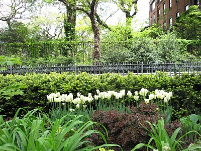
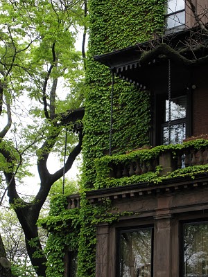
Brookyln Photos by Maria Killam
After being in the hotel for two days (and not wanting to go outside in the rain) it was nice to get out yesterday and walk around Brooklyn. It was so charming I have some photos to include in this post, especially with the fresh green of Spring all around! So beautiful!
Day two of the conference (Monday) we were discussing the direction colour is moving. Whether it’s going lighter or darker, cleaner or more saturated. What is pushing colour in a particular direction, trends, politics, consumers, what are consumers buying and which demographic is it?
 Grace from Sense and Sensibility was the first to comment on my last post and she said: ‘I always feel a bit hoodwinked when all of a sudden I start liking a colour I never liked before because the marketers have decided it is in and we see it everywhere.’ I thought this was such a great comment because that is exactly what I thought the Colour Marketing Group was before I became a member. My response was:

The most interesting part of colour forecasting (that most people don’t know) is that there is no random “Let’s pick this colour, it should be in” forecasting going on in our conferences. I am arriving with colours that I am choosing for my clients right now! The reason they are considered NEXT Colours is because as colour professionals, we are usually on the pulse of what’s coming next because this is what we do. Those are consumer colours and then there are Contract colours which are longer forecasts but forecasts are driven by the consumer.

Many people criticize colour forecasting and write it off to “Marketers putting out what’s ‘in fashion’ so that we spend more money” but really it’s that people get tired of dark so they want light [colours], there are other drivers too, the economy and empowerment is a really big driver, because of social networking; anyone can create something from nothing (like this blog) and be empowered .
So it’s actually consumers that drive where colour is going and colour professionals simply notice it and document it. And that is what we are actually doing in the conferences.
The most interesting part about it is that most designers arrive with the same group of colours.

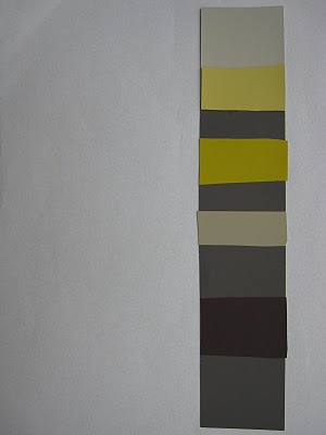
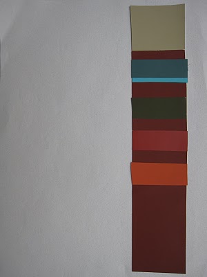
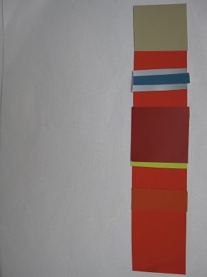
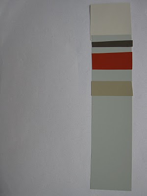
The colour combinations I’m showing were compiled by Janice Lindsay, she agreed that fresh and clear colours were a trend but so was muddy and muted–this is where gray comes in. Colours are grayed, like the combinations shown with a hit of clear and fresh. Some descriptives from the conference were:

Colour Interrupted
Pretty Ugly
Classic with a Twist
A musical chord with a ‘wrong’ note inserted in it which is then what creates the magic!

Cynthia Cornell said”the Style Story is: Fresh Air, Fresh Food, Screen Fresh, and Earth Bound. We must find the bridge between cartoonesque colour and earthbound colour”.
“The balance is Earth, what’s happening is Patina, we are going gold in accessories next but really it’s the patina, the overlay, sculpted, bronzed, the marking. The other side of fresh is dirty. Other side of being hopeful is distressed.”
 What is the bridge in between, and how do we coordinate all of it?
We are not telling you what you should wear or buy, manufacturing is responding to what the market demands.
 So that’s my colour news from the conference! It’s a dichotomy of opposites. In order to incorporate fresh colour we need grayed colours to ground them.

Janice Lindsay and Jacqueline Rosadiuk
If you would like your home to fill you with happiness every time you walk in, contact me for on-line or in-person decorating and colour.
If you would like to transform the way you see colour, become a True Colour Expert.
Related posts:
What Everyone should know about Gray
Does your Home have Colour Flow? Take the Toss Cushion Test
New to this Blog? Click here ; Subscribe to my Monthly Newsletter; Become a True Colour Expert
While you’re here, subscribe to this feed so you don’t miss out!

I love reading what you have to say about color trends and forecasting. I am constantly choosing colors for clients and think it is something I do rather instinctively! Thanks for sharing your expereinces Maria.
Amy
Very interesting! Looks like it was a productive conference and love the Brooklyn photos. Thanks for the insight, as always.
You make a great point about color forecasting being a reflection of changing consumer tastes.
There’s a bit of a chicken/egg dilemma here in that consumers are often trying to do what’s hot while designers are looking at what people are actually using to see what’s going to be “hot.”
I think in the end it’s the result of a slow moving train chasing itself around a track but technology is increasing the speed of the train. With the increased speed by which designers can aggregate consumer preferences they can make better and more accurate (and faster) forecasts.
But some customers will always want to be on the cutting edge and setting fashion so they’ll have to speed up to get out ahead of the train.
So my prediction is color preferences will change more rapidly in the future.
I wonder if you go back and look at color preferences throughout history if you’d see a correlation between the speed at which fashionable colors changed and the speed of communication technology available.
That's reassuring! Good to know that I'm doing it right…
Perfect timing for you to come and post this. I am looking forward to your next project where the 'new' colors are used. I kiss this City through your beautiful images, how I miss it!!
I love the name "Pretty Ugly"…I think that would be a good name for the palette I used in this post: http://jacquiesevers.blogspot.com/2010/03/colour-palette-evolution.html
Love the blog, which I have just discovered! Great post on colour forecasting.
it's great to know what the forecast is for the next season, but i think the gold nugget is in learning how to use color and maintain proper balances.
it's the concept of teaching how to fish (vs. just giving the fish) that brings the value and appreciation for the colorist…just my opinion.
As usual, a great post from you about color! The thing that intrigues me about color is how much it can change depending on the colors you pair it with! Looking forward to learning more!
How much do you feel that the European market has to do with color here in the U.S. if any…also, considering color is decided by context, how does that apply?
So interesting to hear!
When creating floral arrangements (my previous life),the Dutchman who taught me always stressed the importance of both negative space and imperfection. If it is too perfect or matchy-matchy, it becomes boring.
The old adage that opposites attract still holds…
Hi Carol,
I think we are totally influenced by European trends and colour. I'm not sure what you mean by 'colour is decided by context' in the realm of colour trends.
Majority rules when deciding on what's next. One trend forecaster said if he looks at a newstand and sees 3 covers in yellow he knows yellow will be big. I'm never looked at a stack of covers that way before but yesterday at the airport I noticed 3 covers in a row in white. That makes sense because white is also a great foil against fresh and bright colour.
Maria
Thanks for including all of those pictures of color samples. It really helped me to understand.
Hi Maria, I'm afraid this is where you get beyond me. I don't understand very well how the greyed out colors ground them. Is there more detailed information on this topic available?
I'm sure most of your readers are experienced on this topic, but I am curious to learn more.
By the way, Maria, when I saw your comment about the guy who saw the magazines on the newsrack, it made me brave enough to mention this.
I saw Wal-mart's new line of household goods…bowls, plates, baskets, towels, and sheets. They were all bright orange, green, yellow etc. Very spring like. I thought..Ah Ha! So that's the new color palette! But I didn't want to mention it on your forecasting blog. I thought maybe that would be too ordinary of a market to suggest anything.
As always a very interesting post. I guess so, that eventually ended up using what is trend and end up liking! It comforts me that there are people "normal" that creates this trend … That's what I think …
Regards
I'm so glad you shared that… I really didn't know. I was always wondering where the next big color choice came from. It's interesting to me that many of you were already choosing the same types of colors. I just looked back up in the comments and read what you said about the magazine colors. I know absolutely nothing about colors, but I thought that the whole white thing was kind of over… I am happy to hear it might not be.
HI Donna,
Thanks for your great comment! I love it that you are looking at colour in a new way (and so am I).
x
Maria
Maria, I'm glad you like the comment. By the way, I did read your post earlier this afternoon about gray and that was very interesting. There is a blog that I always loved but couldn't figure out why. She used gray…a lot..but with pink, just like you suggested. It seemed ethereal, calm, serene, and classy all at once. She has since added a bunch of textured tags in brown which as you said, can go with gray, but I miss the simpler style. Her banner was a beautiful scene of her and her daughter on a frozen pond in I think Minnesota. The sky, pond etc are all gray, but she and her four year old were in bright shades of pink and brown. It was a very attractive color combination. I kept thinking…that shouldn't work!!! But after reading your post on gray..I now understand. Of course..doing it..that's another thing. I'm so scared of 'change'!
Great post Maria!! Thanks for sharing some of your experiences at the conference with us, it is very informative! I really liked the quote about finding a middle ground between cartoon-y and earth-y, this I could really identify with! I am often too afraid to have everything too bold, but earth tones all over can be quite boring! Thanks for all of the insights 🙂
Nancy
The design pendulum never swings small. If we're doing bright one year, then we're doing dark the next. I think the trend of "old world" is swinging to light an airy. I guess that's human nature which explains how the public drives the color choices. I think most people think it's the other way around. I know that when a particular color reaches the mass markets…target & walmart…it's time for designers to find a new inspiration to share with our clients. When the market place becomes saturated with a particular color, it's time to move on to something else. Makes me wonder when everyone is going to tire of aqua. Great and instructive post, Maria, as always!
Sally@DivineDistractions said…
"I know that when a particular color reaches the mass markets…target & walmart…it's time for designers to find a new inspiration to share with our clients. When the market place becomes saturated with a particular color, it's time to move on to something else."
Absolutely right!
Loving those colour pallets, love saturated colours, particularly first pallet, probably couldn't use them myself – I'm such an old fashioned old lady!!! hehe
Maria… With your knowledge of colour, what works and what doesn't, what people are gravitating toward, I'm glad YOU'RE in New York with all the other experts attempting to identify the colours that are trending in the future!!
Victoria
informative post maria and personally timely. i am struggling with choosing colors for my new city shop. would love to be edgy but do not want to choose colors that will be passe in a few years. currently love greys but that does seem to be the it color. it can be very confusing.
thanks for sharing your conference lessons, i will go back and study this post
debra
Hi Maria,
Thanks for sharing your meeting results. Loved seeing Janice Lindsay there, I am reading her book "All about Colour" based on your book recommendations and it's really interesting.
It could be my monitor settings but the colours shown here seem more muted then fresh to me. I am not keen on so much gray and all the muted colours. Some is OK, but it seems to be everywhere.
Fun post, thanks Maria,
Eva
Suddenly I want pretty ugly colors.
No, seriously, I feel a trend towards loving classics again, rich navy, white, grayed out grays, pops of citron, red and green. I also want to paint everything white and fresh against it all.
pve
fan-tas-tic!
you know Maria, i really hope to see a book about colour soon on amazon. love the way you explain things.
i wish i was in this conference, i mean it!
I'm glad I could provide a good segue for you. I have to say that I do actually appreciate being exposed to a variety of colours and bonding with new ones periodically.
Interesting about the "Classic with a Twist" interpretation – sort of like what you see in fashion, where people pair dressy jeans with heels and a fancy top to go out. A little something to contrast and add some edge. Such an interesting post.
What a great perspective — I've never thought of color forecasting that way and it makes it even more interesting!
I just finished reading your posts on colors…how fascinating. From the little work I have done with Benjamin Moore, I have realized how intricate it is to forecast trends. I cannot wait to be going to the Benjamin Moore Hue awards cocktail party and hope to be surprised by some of the creations that will be unveiled.Ii am still a believer that Home is not about fashion…a very "unfashionable statement" which I discussed during an interview with the NY Times about my new showroom…let's see how they take it.
thank you for keeping us informed, francine
I always look forward to your blogs / newsletters.
I think you have such a wonderful eye and write very succinctly.
I am way over here in Hobart Tasmania and love the energy you put into your work.
Hi Maria,
I always look forward to your blogs / newsletters.
I am in the wonderful city of Hobart, on the island of Tasmania and we are entering the fallow time of the year – not a lot of colour around now as the leaves have all turned and the trees have shed their raiment.
I am so excited by your colour ways and the vigour that you bring to the use of colour – such a mature eye for a young person.
I usually post a link to your blogs for my monthly newsletter too.
Conference time is when I miss CMG the most. Most people (including me, before becoming a part of it) don't understand how the forecasting happens. But I found it really interesting, when we were in our groups with people from all different industries, is how we brought similar colors and ideas to the table. I was in a group one time where we finished so early it was weird, we all were so on the same page. And then have been in a group where it was debated over for hours :o) So inspiring and enlightening. Thanks for this post!