Decorating with artwork is a little like adding the perfect accessories to a cute outfit to make it really pop. It’s part of what I like to call “a look and a feel.”
But one of the trickiest styling details to master is layering. Just ask any designer. And that includes layering lamps in and around your wall art.
There’s only one type of person who even has a tiny inkling about layering or styling lamps in front of artwork. And that’s usually the designer or the person with a designer or decorating gene.
And it’s totally okay if that’s not you. 😉 Because I’m going to show you two ways I helped my sister solve this styling challenge in her house.
I did this in my living/dining room makeover here.
Styling masters do this all of the time
Just like any good decorating, beautiful art deserves ample lighting. But adding lamps to tables with wall art behind them is a layering skill that can be tricky for the novice home designer.
Which is also why it was difficult for my sister to wrap her head around lamps-in-front-of-her-art.
Because if you study rooms and the masters of styling, you’ll see that they do this all the time. See some examples here, the last time I mentioned this styling trick.
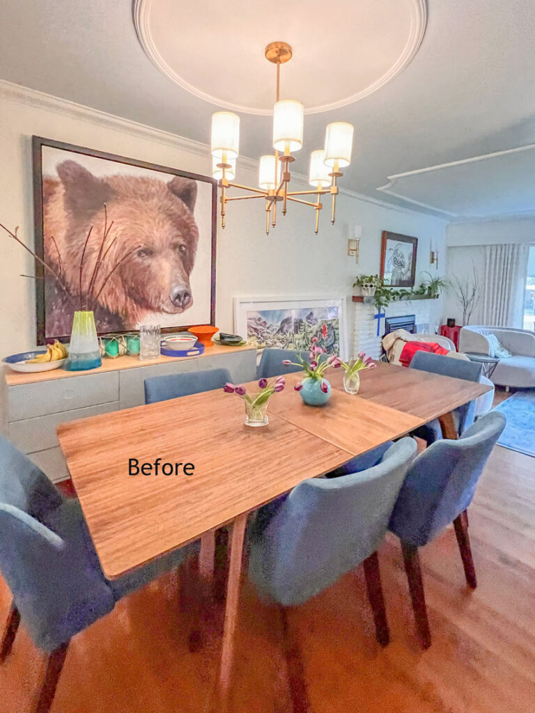
My sister Anita and her husband Aaron have been collecting art for years. And it ended up looking a little thrown together. I haven’t seen Anita in a long time (that story is coming later this week). That’s why the art hanging and lamp shopping (aka Maria the Decorating Fairy) hadn’t happened sooner.
Art is personal
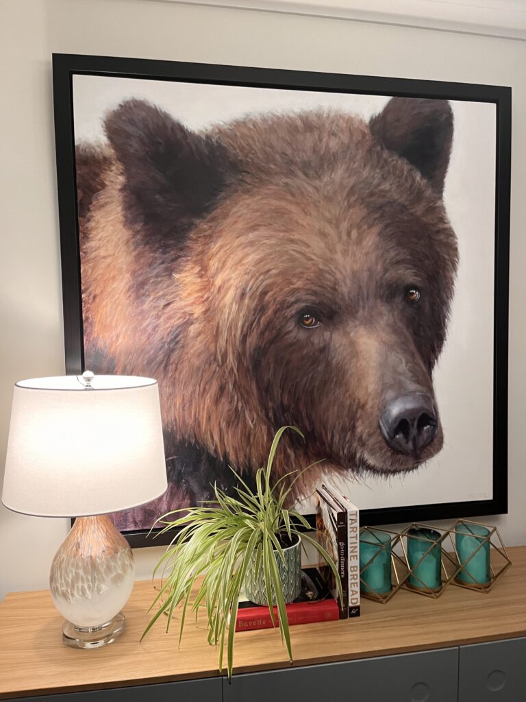
First, there’s a bear in the dining room (below).
I said to her, “Hey, doesn’t she belong in a cabin in Whistler?”
Bear artist: Doria Moodie | Turtle artist: Wyland
“No,” she replied. “I love her. I love her eyes.”
New Lamp
Ok then. But she could still use a little more light. So, we found this pretty lamp, which matched the bear art perfectly.
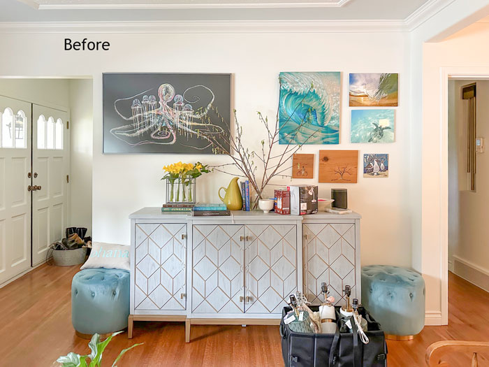
Then over her mantle she has a turtle, and it’s on the same wall as the bear (above).
I said, “Don’t you have something more mountain-related for above the mantle?”
Again, she replied, “No. We we bought Franklin [the turtle] when we were snorkelling in Hawaii. It was the first time we had ever seen turtles.”
“Okay,” I said. Franklin is staying where he is.
Styling lamps in front of art
I’ll show you how I rearranged her art later, but today I’m talking about lamps. Anita’s small 60s home basically faces north. The living room gets a little western sun in the summer but it’s DARK. So, she definitely needs lamps to bring life into her decorating.
Because lamps are also like accessories, it can be hard to choose the perfect combination of art and lamps.
The first lamps I suggested when we saw them in HomeSense were the skinny buffet lamps, which she liked best in the end. But when I spotted them in the store, she looked at me skeptically, “Really? No Maria.”
Here’s where we started.
My sister had purchased a beautiful watercolour called Springtime in BC (Joffre Lake) over a year ago and then had it framed. But it ended up sitting on her floor because it was heavy and she thought it required a handyman to hang it. So there it sat, and every day it bothered her that it wasn’t hung.
This is the story of how Anita found this particular art:
“I was at a writing workshop at Hollyhock on Cortes Island. During this weekend retreat, there were multiple different classes going on. Each evening after dinner one of the workshop instructors would do a talk on their specialty.
David McEown was doing a workshop on water colours. On the night of his talk, he had the flower painting with him. Immediately I fell in love with his work and this painting.
I talked about it for months to my husband Aaron. I went on about this artist and his beautiful watercolour art. I even stalked the artist on Facebook and I couldn’t stop telling Aaron that “our next piece will be by David McEown.” Three years post my unrelenting, “David McEown is a watercolour genius I need his work on my wall” we decided to purchase a piece from his collection as a Christmas present for us (ok, me!).
When we went to view David’s work, I asked him about the bright, big painting with all the flowers from the workshop. He still had it. Like it was waiting for me.“
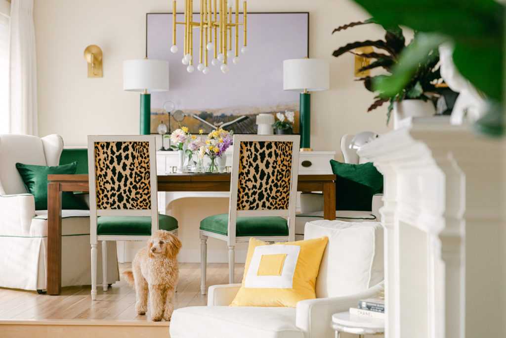
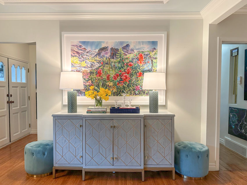
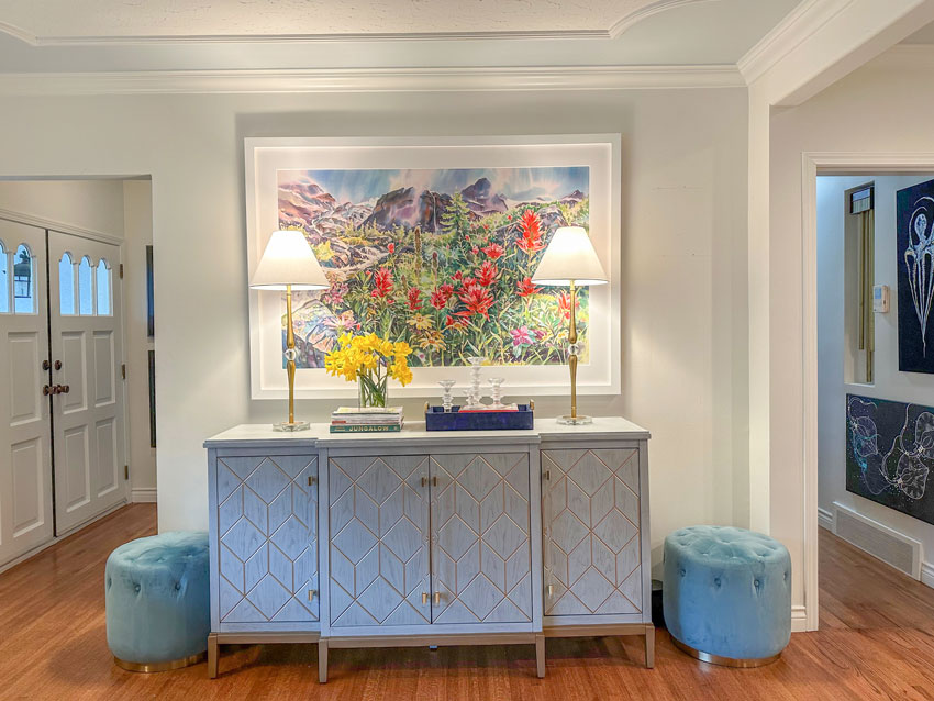
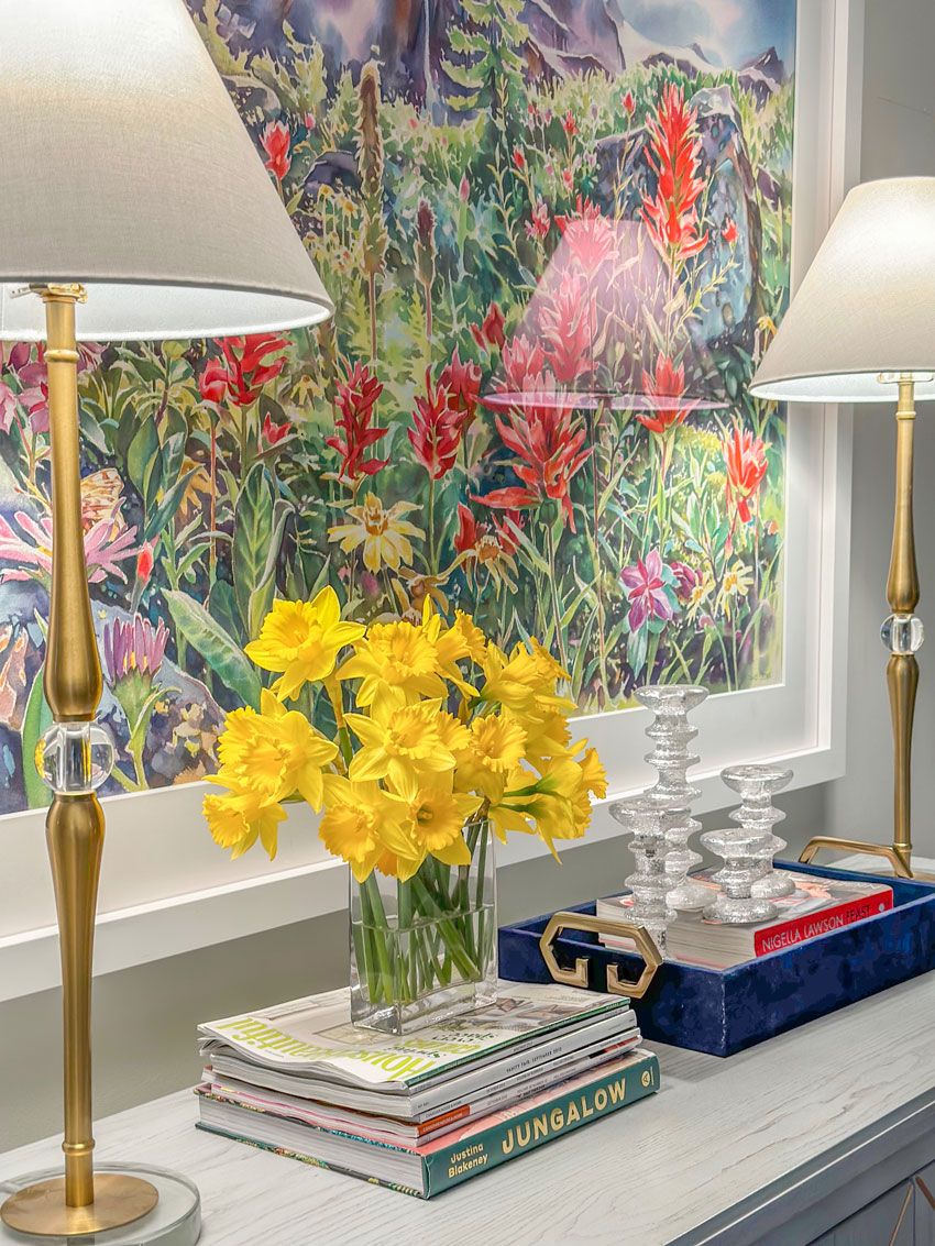
Layering Lamps Option 1
Obviously this art was special to Anita, which is why when we finally hung this piece on her wall and placed the green lamps, she was a little dismayed at the idea of covering the art with the green lamps we selected–even if only a little.
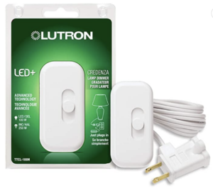
By the way, this little switch plugged into both lamps is also a dimmer. It sits on the table (you can hide it behind the lamp) and you can turn them both on with one switch:
Here’s a close up so you can see how cute these green lamps are. It looks like little leaves all over them. So good with the art, right?
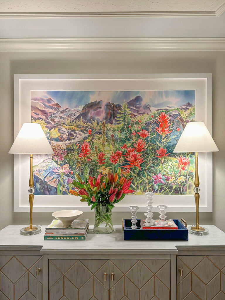
Layering Lamps Option 2
“Okay,” I said. “Then we need the buffet lamps, which are a lot skinnier.”
And here’s a look at the lamps my sister initially scoffed at:
She agreed these were much better.
And then she said, “But FYI, when you’re not looking, I’ll be moving them over to the edge anyway.” 🙂
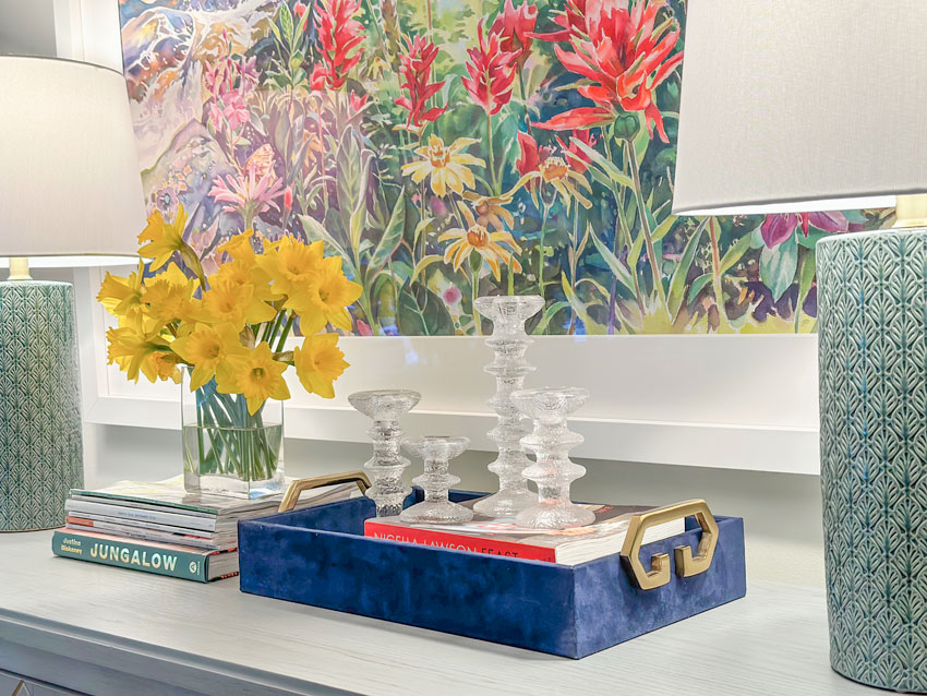
I guess you win some and lose some. 😉 In addition to lamps, I also created a pretty table vignette for her.
Good styling begins with good editing
Notice, I’ve employed the basics of a perfect tablescape or vignette formula.
It includes coffee table books, candles and flowers. Oh, and a tray. Without a tray or coffee table books (or both) to act as a pedestal, your smaller accessories are at risk of looking like Tchotchkes or knick-knack clutter rather than pretty styling. Just sayin’.
Here’s a post I wrote about how to create the perfect vignette.
Also, if you feel your house might be full of too many knick-knacks already, consider you might need some updated ones. That means you need to do some editing and remove some of the old ones.
Then, take a trip to your local HomeSense or HomeGoods and just experiment. You don’t need to know where it all goes, just buy things that you like in varying sizes and play around with them.
And don’t be afraid to stick a bird or a fish or something fun or interesting like that into your cart too.
You can always upgrade your accessories when you find things that are meaningful from a trip for example. But I wouldn’t let that stop you from stacking up some books and placing your Iittala candle holders from Finland (above) on display.
But Maria, do I really need more accessories?
I had this exact conversation with a client recently who was trying to reconcile shopping for random accessories around town for her home. And this was what I told her.
If decorating doesn’t come naturally for you, it will be hard to spot a good accessory even if you saw one on your travels. But when I arrive with my experience in styling, I can create a vignette from your authentic travels and art with HomeGoods/Homesense colours mixed in. And I promise, you’ll be a convert.
Here’s the before again:
And here’s the after.
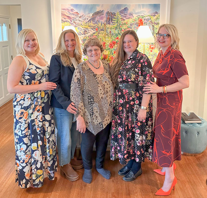
We had Easter dinner at Anita’s home last night and here are all 4 of us girls with my Mom:
And take a look at her beloved art again with a fresh vase of new flowers that arrived. She loves how the painting looks 3D with the vase positioned in the front:
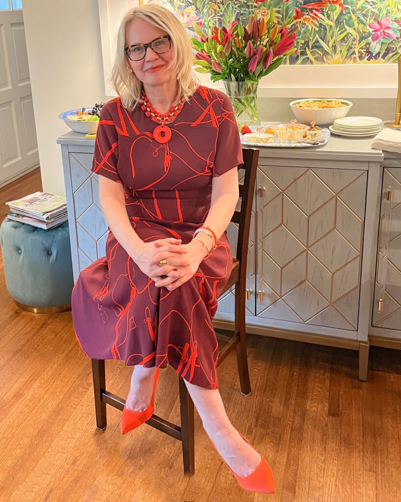
OOTD: For Easter, I wore the Victoria Beckham dress I bought at the Nordstrom Rack a couple years ago. So fun that I had an event to wear it to!
Over to you my lovelies.
Which lamps do you prefer? Then take a look around the house… do you have enough lamps?
Become a True Colour Expert this Spring, register here.
Related posts:
Anita’s Pink Beige & Yellow Living Room; Before & After
My Sister is a Food Network Star!
How to Create a Vignette or Tablescape


From the photo, I think the green lamps work as they provide more visual heft and balance to the composition. Also, they are at one-third the height of the artwork, which is a proportion I find more pleasing. But as your sister loves the art and desires to cover up less of it, her opinion matters most. It’s lovely both ways.
-longtime fan from the OTHER Vancouver-
I agree with RiceBowl!
I also like the green lamps. And a longer credenza would solve all the problems.
not necessarily; the 3d effect would be lost, and the whole composition would be too “stretched”.
I agree. I prefer the green lamps by a long way. Not keen on the more spindly looking ones at all.
I like both, but prefer the stick lamps. They open up the view to the artwork.
The buffet looks great with the bright watercolor hung above. Did you plan an outfit that also looks amazing with the painting?
I prefer the green ceramic lamps to the buffet lamps, but both options work beautifully. For my eye to be happy, I’d want to see the lamps moved just a smidge closer to the ends of the buffet — perhaps centered over the doors on the ends? Perhaps if I saw that, I d move them back, but I’d definitely want to give it a try before making a final decision on placement.
I absolutely agree that lamps can and should be layered over art, not to obscure it, but to create a cohesive grouping. Without some overlap, the art and accessories can look disjointed, as if a piece had been placed in time out.
Oooh! Love the final vignette. The green lamps are gorgeous and the perfect height, but maybe a bit wide for the painting. The chosen lamps are like delicate jewelry, just beautiful, but look a bit too tall. (Could be the camera perspective.) The tulips take it all up to stunning. Wow! Beautiful family.
I prefer the green lamps, too. What I don’t like are the ottomans which just seem like clutter and a distraction. Anyway, the art is beautiful.
Decorating magic! The art and lamps look super. Both styles of lamps look great, so maybe she could keep and switch off when the mood strikes 😉
I am definitely a lamp girl too!! From my first tiny apartment kitchen to my large kitchen now, have always had a lamp or two in the kitchen! I was recently told by my 3 daughters that my home is cozy. We have lamps and lit art work all around our large home.
I think I like the way the green lamps fill in the visual space ! I’m so glad you suggested the one large piece of art rather than lots of small rectanglar pieces next to the larger art work.
As a longtime follower of your blog, here’s what I love. You keep it real! Specific how-tos and why-fors of putting things where they need to go. While I’m sure most folks would see the “before” and think more of a mess, you shared a few super important things: art is personal, and finding things on vacay CAN work, if they are put together correctly.
So, a designer’s eye, a gentle word to a client to embrace the change, and ta-da! Thanks so much for a great post!
Love your magic! I prefer the green lamps, but your sister’s preference is what matters.
The new flowers look phenomenal with her art!
Individually, I like both sets of lamps. In this setting, I prefer the tall buffet lamps. What a beautiful vignette you created, and how much more soothing it is to look at a single, large piece of art than multiple smaller pieces. In my opinion, the ottomans are clutter — they need to go somewhere else.
PS, I meant to say, I was so happy to see the buffet being used for food (last photos). This is real life!
Wow, what a transformation! Both pairs of lamps look great, but I slightly prefer the green ones. I love the pattern and color, especially with the painting. Happy belated Easter. You look fantastic in your Victoria Beckham dress! 🙂
I love both sets of lamps but the artwork is so stunning I agree with your sister about the thinner buffet lamps. I know I’m the odd person out but I just don’t relate to random piles of books/magazines or empty candlesticks piled on top of a book in a tray. To me it just looks cluttered and like someone forgot to put those things in their proper places.
Green lamps!
This is such a good post! I like them both–the green ones are a beautiful color, cool and modern. I get that they cover up the painting a bit more. The bufffet lamps are like fine jewelry, and are beautiful in a different way. In the end, they probably fit the space better for her.
I love the vignette. It is beautiful. Love the blue tray. I really have to fuss alot with a vignette and agree that a random fish can be helpful. LOL.
I loved your dress even before I read about it. I thought. what a cool dress on Maria, and voila, a mini post with details. You wear it well!
Lovely family pic with your mother–a treasure to have. All in all a great post. And I have 8 lamps in my kitchen/family room space! I am a believer! much cozier than overhead lighting.
I did not read the whole article….I could not get past the idea of a someone telling someone to remove the bear picture….that meant something to the owner. Why??? Why does everything have to be considered “perfect” placement? Do what you like…what you feel comfortable with. Personally I would not have put the bear there….BUT it is where she likes it….so be it!!! It is pretty boring to see homes with kitchens and all rooms looking ALL THE SAME!!!! I myself LOVE antique floral plates. I was told by a friend (of many years) , “You have too many plates.” I just stared at her. Before I responded. I pretty much hate the carbon copy style she has going on in her home…see it everywhere. BUT I NEVER say anything. I responded to her, “Well, I love them, and guess what!!!…you don’t live here so don’t worry about it.” I must tell you I have 7 in the kitchen (kitchen themed), 3 in the living room and 3 in the bedroom.
She also asked if I needed help in changing it up!!!! NOPE!!!! IT has ALL remained the same.
I absolutely LOVE the final choice of slim, tall and tall lamps. The green lamps, though beautiful, distracted my eye from the gorgeous painting. These brass lamps allow the beauty of the painting to be the star! How beautiful those lilies look that match the painting perfectly and indeed, create a 3-D look. I would consider high quality silk flowers to display (when the inspiration hits).
This is a hard choice. I like both lamps for different reasons. They each highlight certain elements in the gorgeous art. One thought about your sister’s (and many other’s) objections to layering lamps or vases in front of art… it only obscures small parts of the piece from a certain angle, if you look straight on. But if you step a little to the right or left, it’s all revealed!
I LOVE the art piece that Anita chose! It’s gorgeous! Regarding the lamps, my personal choice are the green lamps but either make a huge difference, not only for bringing light to the art but for also the overall ambiance. On another note, living on the lake with our beautiful view people can’t understand why we planted trees in front of our home because they see it as blocking our view. (I have to say, there was a time I thought that also until a tree loving friend of mine helped me see it differently). What is see now is that the trees enhance our view, they are a very important part of the entire picture and we love them. Thank you Maria for helping me see the difference lighting makes I still need more lamps!!! 😉
Not a fan of lamps in front of the artwork. I’m definitely team Anita on respecting the art and moving the lamps to the side when you’re not looking. If it’s art, why have it if you’re going to cover it up? And IMO, it’s a BIG insult to the artist. (I hope he doesn’t see the post)
I agree 100%!
First of all the painting is just beautiful! I’m finding it hard it choose which lamps I like best. I’m leaning towards the gold buffet lamps. I just wish they were a little shorter and like your sister I would probably push them over a little more to the end! The red flowers in the vase make it look so pretty. Also like some others mentioned, I think the two ottomans are a distraction and the color is off from the buffet table. If they were not there it would really center in on this beautiful painting and the lamps to make it shine.
I do love your dress too. Also the jewelry and shoes.
While both lamps are beautiful, the delicate detail of the tall lamps harmonizes well with the heaviness of the art and credenza.
Anita’s watercolour by David McEown is gorgeous. I love the colours of the mountain flowers. Art is very personal. While the bear wouldn’t be my choice, if Anita loves it it should be displayed where she can enjoy.
As to the lamps, I like them both. I think the tall thin ones allow the viewer to see more of the art. They do seem a little tall in reference to the picture. The green ones are nice too and ground the vignette. In the end, it is Anita’s home and she’s the one who needs to like the end result.
Green lamps, spaced slightly wider, and relocate the ottomans!
Maybe there is no other place to put the ottomans! 🙂
The ottomans are just a smidge too much visual clutter. Might be time for the ottomans to go to Good Will for a new home owner.
I do not have enough lamps! I am working on it though. I just bought a pair to flank our sofa, but they come without shades. Is there a post on getting the right size shade for lamp proportions exist?
Absolutely love the watercolour art and though I like both lamp choices, I prefer the green ones with the great texture. And your placement is perfect.
To Anita: I LOVE your bear! The new lamp is great with him. And I love your eclectic taste. I said to myself while reading… “Just move the lamps to the side a little, Anita.” I cracked up when I read that’s what you actually said! Regarding the lamps, I honestly don’t love either pair. The skinny ones are too tall and elegant for that buffet IMO, and the green ones are a little too chunky (for me) and the color doesn’t grab me. It actually distracts me because it doesn’t connect with the greens in the painting (for me) or maybe it’s too much green. I’m no expert (other than being really picky about color all my long life), but I wonder if you could find more slender lamps about the height of the green ones in either soft purple to tie in with the mountains, or red to tie in with the flowers. Or even a brushed silver. These are just my thoughts. Do what makes you happy! P.S. I want to see Franklin! 🙂
To Maria: I LOVE your family picture! Your Mom has beautiful and unique daughters, each with special talents, I’m sure. It was fun to see your process with the lamps. If I had to choose, I’d go with the green ones…pushed closer to the edge of the buffet, of course! 😉 The red flowers were perfect. As was your dress. What a lovely time it must have been for you all.
I prefer the green lamps, which add a nice finishing touch. However, in some instances layering lamps in front of artwork might not be possible due to space restrictions. In my home, I use dimmable mini LED picture lights with either 2700k or 3000k color temperature. These barely visible lights really make the artwork come to life.
Anita has great taste in art! Your styling helps show it off. Maria, I also need more lamps. Our buffet is antique and I am currently refinishing it. I have a large, vibrant piece of art displayed above.
My question is, are two lamps necessary on a buffet. I was originally planning on having one on one side, as there are two large pieces of stoneware on the other side.
Thanks, Maria for sharing your talents with us. And thanks to anyone who can provide advice on one vs two lamps.
My girlfriend is my decorating stylist and she placed my artwork off center left on my hallway console with a sculpture layered in front of it on the left and a taller lamp to the right with a vase layered in front of the picture. FYI. I have a gold yellow and black leopard runner in my foyer. The gold in the vase and art /frame and ceiling light are beautiful with it. I also have 2 small round stools but my console has open legs.
I don’t mind either of the lamps in terms of their style or colour, but I wouldn’t put either in front of my (relatively) expensive art. I’d either install art lighting above the piece or put floor lamps by it. I personally dislike the look of a lampshade or other things obscuring art—I don’t mind something sticking up an inch or so underneath or on the side of art (such as the flowers in this example) but that’s about it. When I see large items obscuring artwork, to me it looks like either the person just randomly put something there without thinking or they don’t really like the art and merely bought it because it coordinated with the room.
The green lamps are lovely and I would definitely use them somewhere but the taller lamps look better. Also, you look stunning! Is there any color that you can’t wear????
I like the green lamps better but I understand your sister not wanting to cover any of the art and choosing the gold ones.
I definitely need more lamps in my house. Working on it 😁
Awww, I love the bear’s eyes too. That lamp and the new styling look amazing with the art!
I was Team Green Lamps initially, but now I’ve switched over to Team Gold Lamps. I love them both, so I would definitely find another place for the green, but the gold really do look nice with the art and the gold details on the buffet. (I would probably scoot them out a bit closer to the edge when you weren’t looking too! LOL)
I love the bear! I want it. I have the perfect place for it. 🙂
(I’m conflicted about the lamps. I see value in both selections. Very beautiful improvement with either choice as compared to the numerous pieces of artwork in the “before” picture. And I like the ottomans! They did seem to add to a feeling of clutter in the “before” picture, but seem fine to me once the art upgrade was complete.]
My girlfriend is my decorating stylist and she placed my artwork off center left on my hallway console with a sculpture layered in front of it on the left and a taller lamp to the right with a vase layered in front of the picture. FYI. I have a gold yellow and black leopard runner in my foyer. The gold in the vase and art /frame and ceiling light are beautiful with it. I also have 2 small round stools but my console has open legs.
Maria , the decorating fairy….if you were my sister you’d never want to come to my house because I’d never let you leave!!!! What a lovely photo of you and your fam! So, the watercolour is spectacular and both sets of lamps bring a unique look. I like how prettily grounded the green lamps are, but I like the skinny profile and the height of the gold ones. The green lamps go about 1/3 up the painting and the skinny ones about 2/3’s so nice proportion on both. I hope you continue with her other artwork dilemmas. Meanwhile my daughter just bought a bungalow with a north facing aspect and the layout is just the same as the one shown. Do you know what paint colour your sister used? Ha! What am I saying…I’m sure you chose it!!! It’s a really pretty white, and older bungalows (built in the 50’s or 60’s) just can’t IMHO take a lot of the modern whites because of the lack of lighting.
Hmmm…I know you are working with what she has, but I believe the ultimate solution would be a longer credenza, with the green lamps placed to allow the art to be shown completely unobscured. The shades could then be placed in the white border/matte area, allowing a full view of her favorite art.
Thank you for sharing your Happy Family Photo! I hope you had a wonderful Easter.
I love the painting and would do no lamps and let the artwork shine on its own.
How did you hang the heavy artwork?
Maria,
I wish you would do a follow-up post on this topic. I, too, love table lamps; I don’t have enough and I’m searching for more. But I do not understand obscuring a piece of art, especially an expensive one that you saved up for and LOVE, with lamps. In the dining room makeover of your previous home, I wondered why you perfectly lined up the lamp bases with the edges of your picture when that buffet had room for you to move them out to flank it. On the other hand, the one small lamp you placed with the bear picture made sense to me. What is the design rule/concept that this follows? Apparently, many of your other readers have the same question; please help us to understand!
I’m crazy for lamps! And every light I have is on a dimmer. It’s all about creating ambience. I would choose the green pair because they seem to anchor the painting and they echo the colours in the art.
The buffet lamps look far more appealing and attractive.