Spring is in the air and that means it’s time to choose new exterior paint colours for my house. Here are some colours I’m “trying on” to see what looks best.
Before
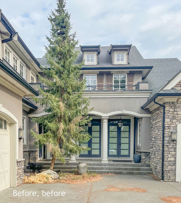
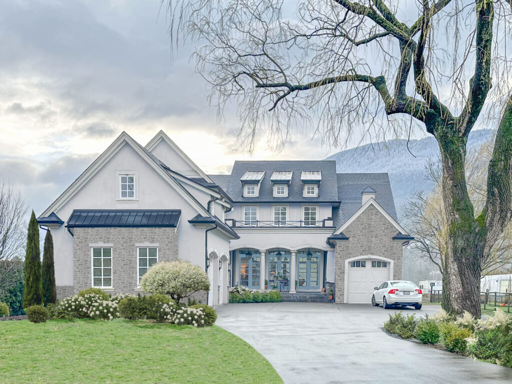
This is what my exterior looks like now:
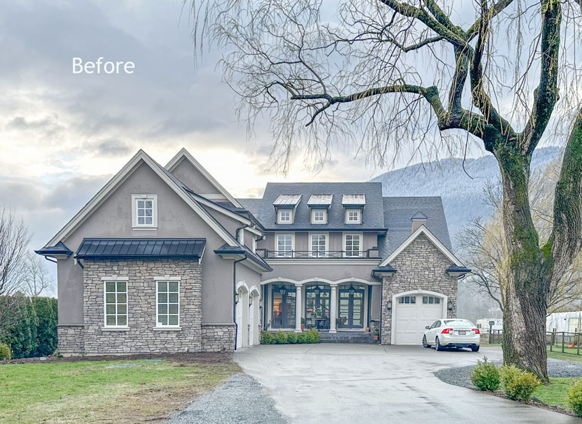
This is a French country home built in 2011. I like the design of the exterior just as it is. The only thing that immediately needs to be changed is the paint colour. This entire home was painted a mid-tone taupe inside and out. All 5100 square feet. *eye roll*
Even the exterior stone is not a complete dealbreaker for me. I’m planning to have it over-grouted, so it will be a lot less earthy and still look like a small French chateau.
Read more: Which Siding Colour Looks Best with Stone? Before & After
Choosing exterior paint colour
However, the colours that I can paint my house are still limited by the earthy stone.
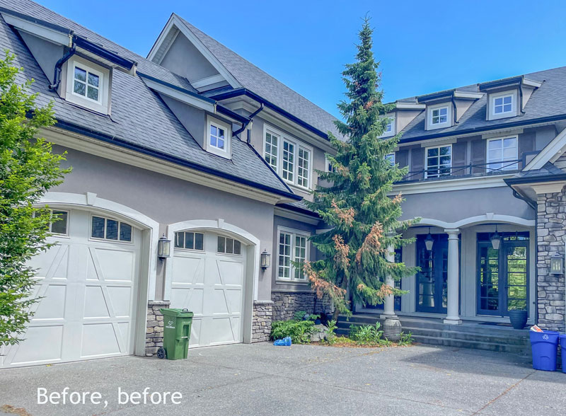
Here’s another before, before photo:
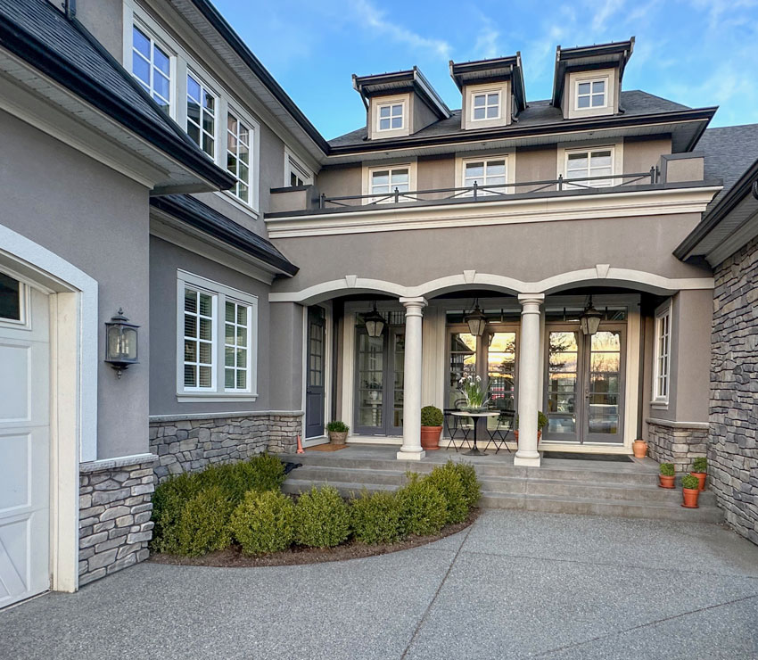
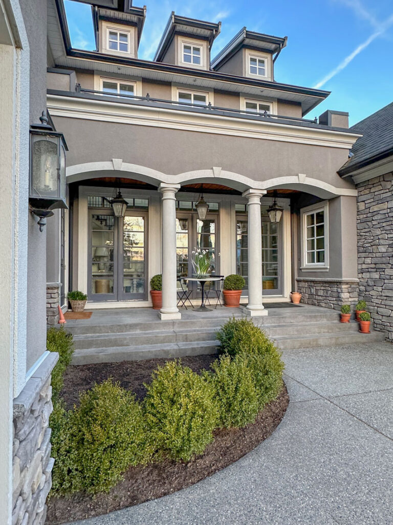
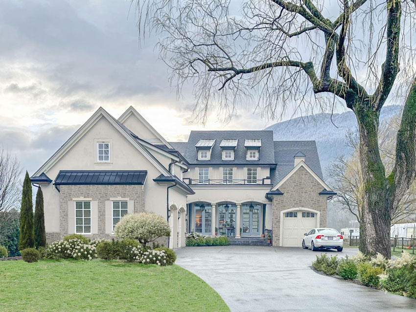
And, here’s a look at it now that the house has been power-washed and the overgrown trees removed.
You’ll notice I took this photo during golden hour – that early evening hour when everything is softly lit. This is the hour when most homes with black windows are photographed. It makes my dark purple french doors look less bleak.
I’ll be adding more landscaping too. I plan to install white hydrangeas inside this garden bed, but the house needs to be painted first.
The current taupe exterior colour
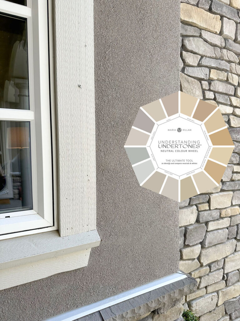
The existing paint colour is BM Ashley Grey (taupe) with SW 6149 Relaxed Khaki (green beige) trim.
The pale green beige neutrals in my system are a good neutral to use on exterior when you want the appearance of cream without being yellow. However, Grant Beige was just one shade too dark from being perfect on this house. This colour would only work if your exterior has stone that is darker than mine.
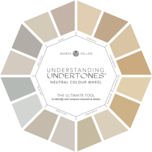
Here’s a close up with the neutral colour wheel. My existing windows are a true white. In this image you can see how green the trim looks next to the taupe, which looks pinker by comparison. The stone on my exterior is a mix of taupe, green beige and orange beige.
To learn more about how to achieve the perfect cream for your exterior and get my bonus go-to exterior paint colours when you buy my masterclass here.
Currently the french doors are painted an eggplant shade. They look darker usually because they are underneath the shadows of the portico. I am considering painting them a french blue like you see in the options I’m sharing below.
Trying on exterior paint colours
My team has done some extensive and very time consuming photoshopping to help me choose the perfect paint colour. Here are a few varying shades of greige and complex creams to work with my existing stone.
Read more: Everything You Need to Know About Choosing Stone for Your Exterior
Also the stone shown in these options is obviously not exactly the same as mine. We had to find one that looked over-grouted.
Exterior option 1 – too stark, wrong white
This white is way too stark. I’m including it here so you can see how wrong white would be with earthy stone.
I see this all of the time on real estate listings. The owner wants to freshen things up and simply ignores the earthy interior or exterior and chooses a white that looks wrong.
Get your neutrals and whites right: Order This
Exterior option 2 – a bit grayer
Here’s a paint colour that looks a little greyer:
Exterior option 3 – a bit warmer
Here is a paint colour that looks a little warmer by comparison:
Exterior option 4 – with shutters
In this option we added the shutters back. I took them down in this post.
Notice the shutters on the three windows above the doors. Can you see why black shutters would NOT work at all here?
If my shutters were black, then you would miss the pretty railing on the second floor because they would blend in with the shutters. There’s a lot going on with this house after all, so no need to make these details compete for attention.
Exterior option 5 – no shutters
And before you say, “Oh Maria, you’re just painting it a cream because that’s what EVERYONE is doing right now.”
Here’s the thing, if I didn’t have the earthy stone, this house could have been a COLOUR instead of a creamy neutral. And I definitely would have chosen one. As I have said many times, if you can identify the era when you painted your house within about 5 years, it’s trendy.
Colour is always more timeless than the a trendy neutral, especially when it’s the same neutral as every other new build or recently painted house.
But, when you have stone on your home’s exterior, it CANNOT be ignored.
The neighborhood
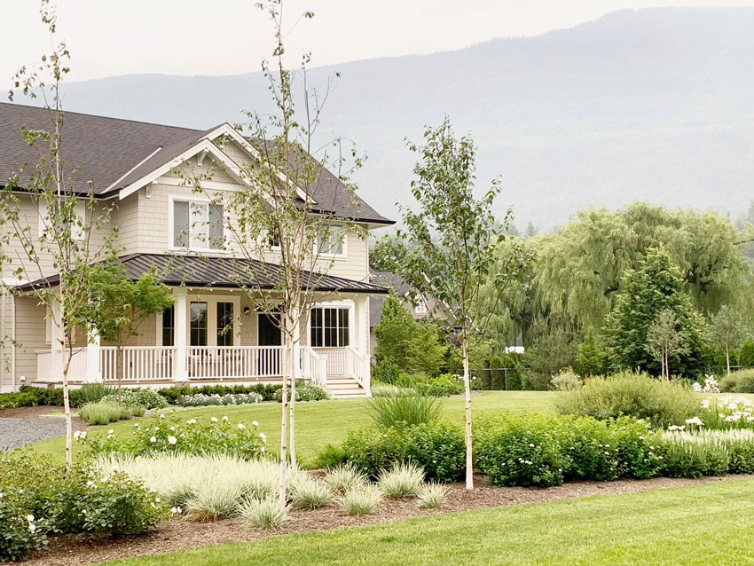
My neighbour on one side painted their new build a classic and timeless green grey and white. They also have a white-on-white garden.
In fact, I actually included this house in my Exterior Masterclass. I snapped this photo a few years ago when they built this house.
You can get a tiny glimpse of our house through the trees on the right (above).
The house on the other side of ours is black and white.
Let’s take another look at the before again, shall we?

And the photoshopped after, again:
The style of this house is perfect for me because of my love for the French look in my decorating as well. And I’m thrilled to be starting this project this Spring.
Of course, MaryAnne White has been creating a new landscape plan for us, and it’s going to be beautiful.
Do you have a favourite option? Comment below…
Real-time colour training
To create a classic and timeless home for you or your clients register here for my True Colour Expert Training.
You’ll learn how to make the RIGHT colour choices that will leave you feeling satisfied with your decisions for years to come. And we’re not just talking about neutrals. I’ll show you how to create a cohesive colour palette that flows throughout your (or your client’s) entire home.
Plus, this two-day workshop is filled with decorating secrets.
Don’t wait any longer, sign up now and let’s make your home a happy, colourful place!
Related posts:
My new Living Room (Center Fireplace) Living Room Layout
Get Sold! Updates that Deliver the Highest Return
True Colour Experts Know Colour






Is your roof really gray? That’s how it looks in the photos. I find it interesting that beige stone and a gray roof were used on the same house, but it’s also what I got when I downsized seven years ago. I’ve had a horrid time finding a paint color that works with both my roof and the stone!
Ya’ll are seriously splitting hairs on my charcoal roof 🙂 It works with any of these colour schemes including the one that’s on it right now. Maria
I would love to see a deeper color, as all the options seem to wash out your beautiful home. If your stone has green/gray undertones, why not try a color similar to the deeper greenish color on the blue gray portion of your color wheel? If you are really set on a cream exterior, then I would deepen the blue on the doors because they fade away too. I’d also love to see you add back the shutters on the stone front only and paint them the color of the doors.
Option #3.. Undecided on shutters but I think I like them! Too bad the roof is gray. I guess the overhang over the front windows to the left cannot be changed to a different color?
I like option 4 – the cream shutters reduce the mass and impact of the stone. Not sure about shutters or the upper windows and would leave these off if possible they make that area look too crowded.
Thank you for the photoshopped images. It really illustrates your lesson.
Option 4. With shutters because I think it balances the left side of the house with the small garage door in the right side. BUT perhaps you should decide on the shutters after the landscaping is finished as that may do the same, The new colour and over-grouting along with new landscaping are going to be beautiful.
Shutters on the left of the house “balance” the garage door on the right. Looking forward to what overgrouting stones looks like and how/if it changes the appearance of the house overall.
Maria, if you’re after the French look, then light beige is definitely the way to go.
Option 4 is my preference. The stone wall on the left looks bare without shutters. I agree with you Anne, shutters balance out the garage door on the right.
This must be very exciting for you Maria.
Option 4 with shutters. They break up all that stone. Any choice though will be stunning.
I love option 4 and with the French blue doors, looks beautiful. We have the same issue, dominant orange/red/taupe stacked stone above and around our front door to the 2nd story. We should have kept our roof black when it was replaced to ground the colors. We are too in process of painting and I can only find that SW Balanced Beige works for us on the body of our home.
Did you end up finding a color?
The stone looks different in the photoshopped pictures but I would say Option 3..no shutters. I think the stone is lovely and gives it that French Cottage look and love the blue doors…to tie with your ceiling inside…gorgeous.
The overgrouting makes such a positive difference.
Did it have a color option that you considered?
Would love more details on the overgrouting as well!
I will be posting about the overgrouting and the process! Maria
Option 3! What color is that?
I like a combination of option 4 and 5. I love the shutters on the two windows at the front of the house, but would leave them off the rest of the windows, as that looks too busy (IMHO). I LOVE the blue doors. Overall, so pretty!!!
Same!
Wow! Such a transformation. I like option 4, however can you paint the black downspouts cream – the ones that going vertically, my eye keeps going to them, and I am sure you don’t want to bring attention to them.
Oooh paint the horizontal gutters too! It would elevate the whole house.
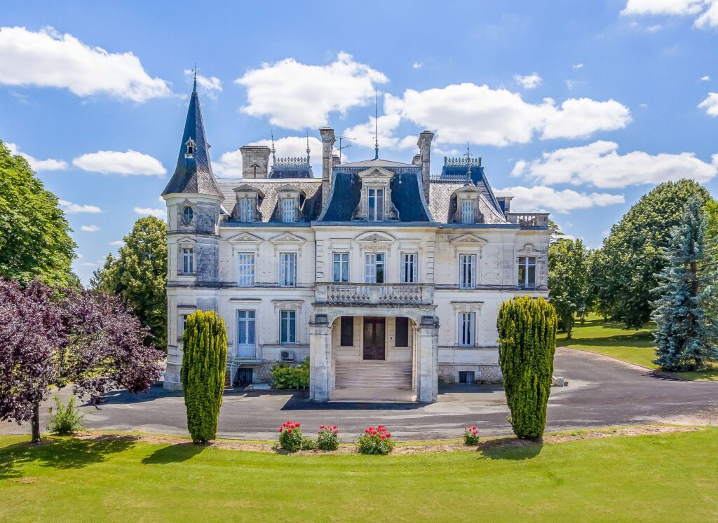
First off that mountain in the background is distracting! lol. But seriously, I don’t mind the gray. I do like the grout lightened up. I don’t like the shutters. Is that image 2, 3, & 5? I love the chateau picture you added as inspiration.
I’d like to paint the down spouts the color of the house. they look like outlines when they are so dark against the lighter stucco. One last thing, I would like to see a photoshop image of that 1/4 circle garden removed and the whole step extend and opened up all across the front. Then use containers to provide interest.
I like the one with shutters the best. It helps the stone bay on the left relate more to the rest of it. I want to see some photoshopped doors with the french blue!
Option 4 but lose the shutters on the small upper windows as it adds to the busy-ness. Paint gutters and downspouts thtp the trim color. It’s already a beautiful home and new landscaping will make it stunning.
The downspouts look like copper and should be left that way, IMO. More of the French vibe. Love the grout treatment on the stone! Beautiful!
Option 4 or 5 Maria. I actually think you should do shutters on the stone only and leave the three little windows above the door plain. It’s a nice way to repeat the cream within the stone and break it up a little bit.. I can’t wait it’s going to be gorgeous! I have a brick and stone house and I would love to over grout and paint it. It’s on the list.
You can just do shutters on the left side of the house. You don’t have to also do them over the front door. It’s doesn’t have to be all or nothing.
I don’t understand why I color would work, on the scale of clean to dirty, you would go more dirty with the earth tones. I‘d love to see the color options mocked up and explain why it doesn’t work.
Sorry to edit:‘I don’t understand why color WOULDN’T work…:
And what about painting those shutters on the left the same blue as the doors? That would pull that part of the facade forward.
What are the paint colors in the last image? The cream with the blue French doors? Looks beautiful!
Option 3. The cream relates better to the stone. Assuming the cream is a green beige to match the green beige in the stone. Love your blue doors.
IMHO, none of the proposed colors work, bc they look unnatural. The stone on the architectural surfaces closest to the eye is dark, while surfaces father away from the eye are light. To look natural, and therefore at ease, it should be the other way around, i.e. surfaces that “step out” of the facade need to be lighter, with “depressions” being darker. In short, for this house the painted surfaces need to be darker than the stone surfaces.
… because this is very much a 3-D facade. S.E.
I totally agree with you. This is a case where I think the before looks better than the after.
Love the chosen house color; for me, the roof is a wrong undertone and now it’s more obvious. Shutters seem more a personal preference, for me. But what a glorious home and setting. Can’t wait to see the landscaping and front door.
Speaking of the front door…I can’t find it. I see what looks like triple French doors, but nothing says “front entry door” to me….?
I like option 5 with no shutters anywhere. It’s already a busy exterior and having no shutters is more restful. Love the over-grouted stone, french blue doors, and the overall exterior paint color. Having that tall tree removed made such a difference! Can’t wait to see the finished makeover and also the landscape design that Mary Anne creates.
The two garage windows look unfinished. All windows and doors have proper casings, headers etc., except the two at the front, prominently on display. If it were my house, I would add vertical casings to those two windows to finish them off.
Option 3 or 4, with the downspouts painted the same color as the main body of the house. Frankly, I would strongly consider painting the overhangs a softer color as well, because my eyes go directly to them in all the pictures. You probably noticed that there are no distracting dark blocks of color below the roofline of your HB inspiration picture? Or, your house is beautiful as it is, but would be so pretty with genuine copper overhangs once they’ve aged down to a softer, interesting verde, but that probably won’t work with your stone, would it (?), and would also require rethinking the doors & window trim color. Anyhow, you asked, and that’s my opinion..but everybody has an opinion, right? That’s design in a nutshell: opinion, LOL. Whatever you choose will be lovely, I’m sure. Thanks for sharing, it was fun.
Love the new color scheme! But as other posters, I love the shutters on the left side to balance the garage doors – shutters would make a garage door less of a focal point. Also symmetry is a classic design principle found in a lot of old European homes which I think this resembles in style with updates.
Beautiful home, Maria! As to color choice I will leave that up to the expert which is ‘you’, however as a believer of ‘less is more’ IMHO I would eliminate the use of shutters anywhere . Reasons being; the number and design of the windows (muntin/grills) is more than sufficient as is plus there is the factor you may want to interior dress them. Also shall add, I feel they would only compete with the architectural design of the portico (regardless if they were painted out) as well as any landscaping.
-Brenda-
Love option 4 and really like the shutters. Pulls everything together!
Option 4 …..boom drop the mic !
🫳
🎤
I think there may be a little too much contrast, even with the non-white options. I’d go just tad darker than the cream and would go with a cooler rather than a warm color.
I like the color of #2 but with shutters.
I am usually averse to all the gray, but the taupe as it is currently looks lovely with the stone and roof. The beige creams seem a little off with the roof. Are you planning on eventually changing the roof color?
I know whatever you decide will look wonderful though! I know you are excited!
I recall you once told clients their roof was the boss. What are your thoughts about how your new color(s) would relate to your roof?
IMO, the photoshopped landscaping changes everything — the “after” is so beautiful, it softens the house and makes it more feminine.
I’m glad you mentioned your neighbors. That’s a huge consideration. Luckily, both seem to have chosen an easy-to-get-along-with palette.
Another factor — the huge amount of aggregate cement you have in your driveway. The landscaping will really help with that, too.
Forgot to vote! I like Option 5, the softer cream, with no shutters. IMO, shutters are pointless unless actually used to board up a home — and French country chateaux did not have them. As you rightly said, this house has plenty going on already without them.
Option 4 with shutters. It looks more balanced to me.
Such a lovely home, I love the front porch. The new planting in that bed looks so nice and hydrangeas would look amazing there, but could you do colored hydrangeas there instead? Can you grow mophead hydrangeas – Hydrangea macrophylla or even better lacecap/mountain hydrangeas? This dwarf lacecap would be lovely https://www.gardencrossings.com/product/tuff-stuff-top-fun-hydrangea/ and it blooms on old and new wood. The Let’s Dance mophead series is also nice. But you’d only want them blue.
I like the shutters on the upper windows only–and add the upper garage window. But I’d leave them off the stone–it just takes away from that feature. Can you do proper shutters with the hold open latches too? That provides such nice dimension since they’re not flat against the walls.
More landscaping thoughts, I think you need a substantial tree on the front left corner of the house, about 20-30 feet from the corner- it should be to the left of a line with the corner at least10 feet, 15 is better. The bed in front of the garage should continue toward the street to encompass that tree. You’ll then have a path of some sort through that bed. A lawn path interrupting the bed would be lovely–it should narrow at the back, but needs to be wide enough for easy mowing. Or you could do a stepping stone or full on stone paving. This tree anchoring the corner of that expanded bed helps draw viewers into the property framing your home and moving people toward the front entry. Without something performing this function one can feel drawn to the sides of the home rather than the front. The tree to the right of the drive takes care of that side from the street, but you might need something more substantial of to the right of the parked car in your pictures.
You’re having such fun and I’m enjoying hearing all about it.
Oh, I meant to add that you should definitely do the stone before choosing your paint color (I’m sure you know this already!). I do think the creamier color is best, but that one looks a bit yellow in these renderings. Sample on the wall after doing the mortar and I’ll vote then.
I actually like option 2, a bit greyer. It goes with the driveway colour better. I like the roof, adds contrast. Blue doors would be so pretty. Also, shutters on the front are okay but not necessary as there is already lots going on, as you e said. I agree with leaving them off the top windows. A beautiful home!
Yes! I prefer option 2 as well!
These kind of posts are blog porn for me LOL, cannot wait to see the exterior transform.
Option 3 for me, warmer is so pretty. I think this is the same as Option 5.
I love this gorgeous French house as I also love French inspired. I love shutters as long as they suit of course. I love the blue. I keep going back to option 3 and think w/shutters but agree w/post that maybe wait til Maryann beautiful garden landscape. I do feel they soften the windows even though a lot is going on already. Can not wait to see the finished look. Stunning and gorgeous
LOVE the shutters and LOVE the french doors painted blue. It is too difficult to pick the stucco paint color from a computer screen – I cannot see the undertones. I am sure you will pick the best one because you are a professional. I also live in a “French Country” style home built around 2000 with lots of real hand cut rock and copper lanterns and gutters. My stucco was a mauve and painting it a gray neutral made a huge difference.
The arches over the front entry and garage are lost in the new lighter paint color. They are such a beautiful feature and now they have disappeared. I wouldn’t make a decision about shutters until the painting is done. Also, the little window on the peak of the garage needs something.
Option 5, without shutters, painting the downspouts to blend. I really don’t like the blue doors, probably because they don’t seem to relate to the stonework. This isn’t the limestone one sees in Paris…it’s earthier. The entry light fixtures are quite distracting – hope to see something less obtrusive.
Option 4 is best. Wow, to have such an income to afford the house and your renovations is wonderful!
What about over-grouting and PAINTING the stone the same color as the body of the house? It would give you more options because then you aren’t dealing with bossy stone.
Some examples: https://www.addicted2decorating.com/painted-stone-exteriors.html
I think painted stone looks well, painted. I like painted brick but not painted stone. And I like the look of overgrouting! Maria
Love the over-grouted stone. ‘No’ to shutters since they detract rather than add. I prefer the gray color to the yellow, I think it provides a much more complimentary backdrop for your all-white garden…plus, it blends better with the large cement driveway, roof and stone. I added a soft green-beige trim (matching the green-beige stone) to the 4 larger upper windows in my software and that tied it together nicely. (Leave the trim for the windows in the roof the same color as the house.)
Great post, Maria! I’m waffling on the shutters, but in the end, I think I like no shutters a little better. My choice is #3. Love the French blue door trim! I know whatever you do will look beautiful, and I know that whatever Maryanne designs will also look amazing!
Option 4 with shutters balance out the left side while adding charm. I don’t think I’d place them on the uppers. It appears too busy and crowded and takes away from the look.
Once it’s tangible and painted you’ll know instantly about the shutters anyway. So fun learning this way with exercises regarding an ongoing project which just happens to be your home lol.
Thank you. As always.
I like the cream and I like how the shutters “soften” and finish the look of the stone.
Option 4. I like the weight with the shutters. Offsets the garage stone facade so that area (being a garage) isn’t as noticed.
Option four with shutters is my favorite. When I think of French country I think of shutters.
How cute would it be to paint the 2nd story shutters blue too? Love the new look!!
IMHO I would match the window frames at the front of the house to the ones at the door and… either remove the stone and re-stucco or if it can be done just re-stucco over the stone.
no shutters
I’m in option #4 camp with shutters, however, just on the garage because they don’t show on the second storey because of a lack of contrast. That, and the fact those windows have decent casings which, as someone else pointed out, the garage windows do not.
I seem to be the only person who is not a big fan of the French blue photo-shopped onto the French doors across the front. This colour doesn’t appear anywhere else on the face of the house and seems too light to ground that section.
Option 4 I love. Can’t wait to see your new landscaping.
Why not just paint the stone , then you can get exactly the look you want!!!
Don’t let the present stone color box you in.
I would go with the shutters !!!! 100%!!!! Especially on the downstairs stone wall. It softens the look…..more cozy look also.
Cream option 5 without shutters. Looks more french chateau.
I find option #4 most appealing. The house looks a bit naked without the shutters, imo. And besides, shutters are very French! Love the exterior color and front door color!
Hands down option 2. It sings with the stone, the blue French doors, your landscaping and your hardscaping. Beautiful French Country style with those stunning hills as a backdrop. Definitely option 2.
Did you tell us what color the metal roofs are? They look navy on my screen.
Well, I knew you’d get lots of comments on this post! Great work Maria, can’t wait to see your final full decisions.
Stunning! And that balcony railing … swoon!
I really like #4, and the charm added by the creamy shutters.
Option 4 with shutters, as many French homes have shutters and they warm up the exterior. Not sure why you wouldn’t paint the downspouts (not the gutters) to match the body of the house, as they are not really a decorative accent. Love the blue French doors.
Everyone has a different idea! It’s so fun to play.
The roof and stone are the dictators. 🙂
Love the idea of bringing a lighter paint color.
Love the grout treatment on the stone – so good.
In the closeup of the actual stone, there is a gold tone in some of the stones (on my screen).
I like the idea of a cream that leans toward that gold with the black roof and stone – very striking.
And although I like the idea of the playfulness of the blue on the doors, I don’t think it comes off well.
I think I would try going black to pull down the roof color and keep it clean.
Use flowers/plants to bring in other colors against the stone/black/gold-cream and maybe a playful rug and such.
Thanks for letting us share!
Oh and no shutters, for sure! Too dated feeling.
I’m struggling here because I like the taupe the best. The cream colors look too farmhouse to me. French Chateaus in google searches look to be a bit deeper shade leaning into orange beige (aged limestone?) with flint gray roofs. Or more entirely violet-y gray (granite?) I think that’s why I feel the taupe looks more traditional French to me and more authentic to the style. The overgrouting takes the texture of the stone away and makes it look more drab, generic taupe to me. None of the mock-ups are bad; maybe I’m a huge taupe fan and didn’t realize it. 🤣🙈
Love the overgrouting! Love the cream color in the last photo without shutters but you can always try the shutters after painting to see if you like it. The French blue isn’t my favorite. I’d like to see how the orange beige might work since that is one of the undertones in the stone you mentioned. I think the blue really brings out the grey of the roof in a negative way because by itself the roof is fine. It’s going to be so beautiful with new landscaping and exterior painting.
So funny. I’m definitely in the minority. I like option 2. Not so yellow. And I say no to the shutters. There’s plenty going on without them.
I’m curious to know why all the choices are so light – clearly I don’t have the designer gene, as I would go for a paint color with a value near the current color’s, but in the appropriate undertone. To me, the stone jumps out too much when the home is painted such a light color.
Option 3 no shatters.
I like option 4 with shutters. But would like the patio doors a slightly darker tone.
It does seem the substantial driveway will need to be taken into consideration. It’s wet in the photo and might be reflecting the blue gray of the sky. Option 2 looks the best here.
Wow! What a difference the paint and over grouting will make!! I adore number 4, with the shutters. Such a beautiful home and setting.
I’m certainly not an expert, but something seems off with the cream color. It doesn’t seem to relate to the stone at all. Maybe your having the stone re-grouted will change that, but I look at the part of the house on the left and there seems to be way too much cream above the stone, as if some roof peak decoration was removed and wants to be put back.
First time I’ve seen you ignore the fixed element in favor of your preferred color.
Just looks that way to me.
Love Option 4 with the shutters – much cozier feel!
Option 4 with or without shutters on the windows above the front doors. Your house is going to be gorgeous! Can’t wait to see it and the new landscape plan. Watching your house come together has been so much fun!
Maria. Have u thought about doing a smear treatment on filled grout stone. It is so relatable to Europe.
Stacked stone relates to MCM which your home is not.
I highly respect ur choices and also think it is so kind of u to garner opinions.
I’m looking forward to each step of creation.
Is there a slightly darker option, in the correct undertone of course? In the options shown there just seems to be too much contrast between the stone and the rest of the house. Having said that, I know whatever you choose will be beautiful, Maria, you prove yourself right every single time.
So many opinions. I am far from an expert just go by what I see and feel about your house. Personally cream and dark blue are screaming at each other and do not care for it, nor is it pleasing to the eyes. I do like the shutters. You and your team are the knowledgeable experts and will do what you think is right. Look forward to seeing it finished. 😘
I would prefer a color that helps the stonework blend into the entire house. To my eye the lighter color makes the stone the first thing Insee, breaking up the continuity of your beautiful home.
5. It’s lovely. I don’t think the shutters add anything to that style of house. A lot if people are used to seeing them as an upgrade, but they need to fit!!
I Love the light blue/cream photoshopped sampler BUT…. and it’s only based upon what has been ‘preached’ by designers….that the outside colouring “should” be paired with the inside colour flow. It’s my understanding that greens, yellows and a smattering of orange/peach/apricot here and there is the general trend in the public first floor areas. I see the blue ceiling but that’s ‘on trend’..though this trend has been around a long time…it’s not necessarily the colour vibe of your home on the inside. As such, I would have liked to see a green in the same value as the blue you sampled. I think with the terra cotta planters, white hydrangeas and a hint of black, your house will be in harmony. Even at Christmas time, with snow and holiday decorations/lights..it would be stunning! Spring with yellow & white narcissi’s also, stunning. Would love to see a ‘green sampler.’ Wishing you, T and everyone in your family a very Happy Easter!
I like the cream everywhere but on the most forward point with the small window I think it needs a touch of color on the window, perhaps the color of the awning under it. A thin header painted just a color detail, small. That big cream point draws my eye as awkward.
I absolutely love the overgrouting and the shutters in photograph number4.
I like option 3 with shutters. The shutters soften up the look of the stone. The color around the stone is probably green gray, the color of concrete. Shutters and the blue doors definitely put your stamp on the house being “French”. Have you seen those brackets that you apply to outside of garage door that gives a French look to your garage doors?
Hi, Maria…The house is so gorgeous. It’s so fun to see all your creative juices flowing. I really like the cream above the porch, it eliminates the unibrow!😁 It’s going to be absolutely breathtaking, when you are done! ! can’t wait, and learning tons from you and all your folllowers. Love ya❤❤❤
Option 4. Leave shutters for now and reevaluate after landscaping is done. Beautiful job as always!
What does the two garage doors and trim on the left look like? It’s hard to tell from the picture.
I love it!